4 steps to using variable fonts

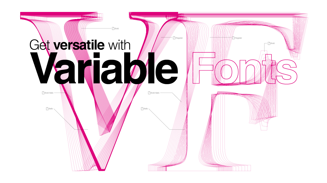
Variable fonts enable font designers to define type variations within the font itself, enabling one font file to act like multiple fonts. Standard fonts are grouped into font families that contain multiple separate font files, each representing a different style, for example a light weight or a bold weight. Variable fonts contain all this same information in a single font file.
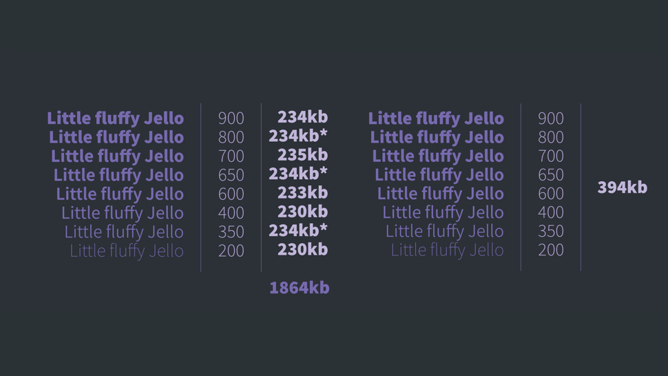
Using Source Sans Pro as an example, the variable version of the font totals approximately 394kb and comes in a wide variety of weights. If we were to use these font weights individually as standard font files, they are, on average, 234kb each – resulting in a combined file size of approximately 1856kb. Of course, this calculation assumes that all the font weights exist individually as a standard font, which they don’t. (Although if you are looking for just regular fonts, check out our post on the best free fonts available.)
If we remove the fonts that don’t exist as a standard font, the combined file size is still nearly three times the size of the variable font and with significantly fewer styles. Even if you just wanted the bold and regular versions, common in many web projects, two versions of the standard Source Sans Pro font are still larger than a single variable font. What this demonstrates is that with variable fonts we have the potential to make massive savings on bandwidth without compromising our designs and creativity.

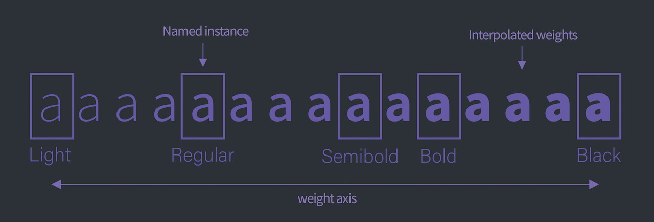
Variable fonts work by interpolating the master variations along an axis, essentially constructing new points in-between. This means you could set font weights at arbitrary points along the axis presenting a much larger number of styles and variations. Furthermore, it’s because the variable fonts can be interpolated that we are able to animate between each variation, enabling smooth transitions from say a thin weight to a bold weight – something we have never been able to accomplish before.
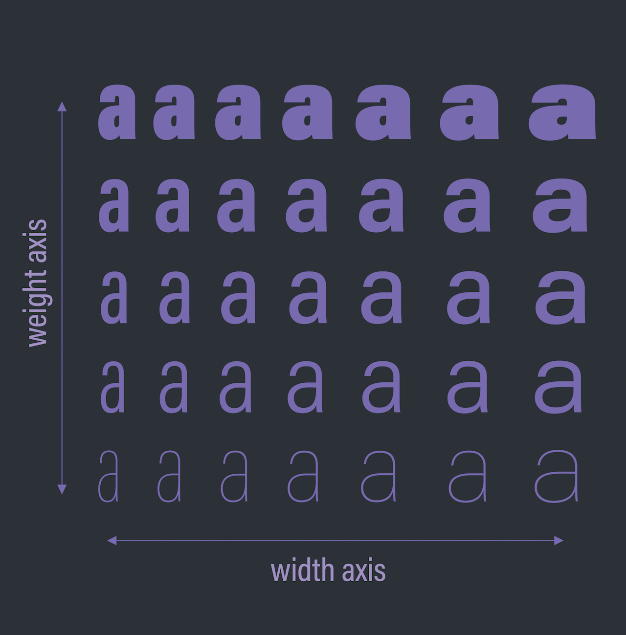
What makes variable fonts even more exciting is that designers aren’t restricted to just a single axis. Variable fonts can contain many different axes representing a range of different styles. This could include condensed, italic, optical size or other more creative or custom options.
Want to place your fonts on a new website? For web design resources, head over to our best website builder roundup and pick of top web hosting services. Or for a storage upgrade, check out these cloud storage options.
01. Understand axes in variable fonts

Using variable fonts in our CSS is very similar to how we would normally use fonts on the web: using the @font-face at-rule. However, we first need to understand the different types of axes inside a variable font as this determines which CSS properties we make use of.
Daily design news, reviews, how-tos and more, as picked by the editors.
There are two types of axes in a variable font: a registered axis and a custom axis. A registered axis refers to an axis that is common enough that it was worth standardising. There are currently five registered axes; weight, width, slant, italic and optical size and these are often mapped to existing CSS properties, such as font-weight.
Custom axes are defined by typeface designers, can be any kind of variation and only require a four-letter identifier within the font file, which can be referred to in CSS.
02. Use a registered axis

When it comes to a registered axis, we want to make sure we are using any associated CSS properties, for example, font-weight or font-style.
We can set up our fonts using the @font-face at-rule as we normally would; the change is in how we define the variations for descriptors like font-weight, font-stretch and font-style. Previously we would have set a font-weight of 200 and defined this as the light version of the font, we’d then set up another font face block for the bold version and the regular version until we had all the weights that were required for the design. With variable fonts, we only need a single font face block. So instead of using multiple instances, we specify a range of values that correspond to the minimum and maximum values that are defined on the font axis.
@font-face {
font-family: “Source Sans Variable”;
src: url(“source-sans-variable.woff”) format(“woff-variations”);
font-weight: 200 700;
}
In this example, we set a font weight of 200 to 700. Once our range is defined, we can choose any number within that range as our font weight, for example 658. Importantly if you set your font weight range as 200 to 700 and then try to define a weight of 900, even if the font has a 900 weight defined in its axis you will not be able to use it. The range defines what you have access to in your CSS.
03. Set up custom axes
Since no pre-existing CSS properties will exist when using a custom axis, we need to make use of a new CSS property called font-variation-settings. This will enable us to define as many named and custom axes as we need.
h1 {
	font-family: ‘My Variable Font’;
	font-variation-settings: ‘wght’ 375, ‘INLI’ 88;
}
In the example here, wght refers to the registered axis of weight and INLI refers to a custom axis called inline, each with an associated number value corresponding to a point along the axis of variation. While you can reference a registered axis as a value for font-variation-settings, it is recommended you make use of their mapped CSS properties instead.
To ensure support in the older browsers, we can use fallback fonts for unsupported browsers by making use of CSS feature detection.
h1 {
  	font-family: “Source Sans”, sans-serif;
  	font-weight: 700;
}

@supports (font-variation-settings: normal) {
h1 {
 		font-family: “Decovar”;
 		font-variation-settings: “INLI” 88;
 	}
}
By checking for font-variation-settings support, we can include our variable font styles inside the supports CSS block, ensuring they will only be used in browsers that can support variable fonts – with our standard fonts used in the unsupported browsers.
04. Combine JavaScript and variable fonts

We can make use of JavaScript events for situations where we want more fine-tuned control or to change the font based on events that we cannot access with CSS alone. A simple example would be matching our font weight to the size of our viewport – as the viewport gets smaller, the font weight gets heavier.
In order to create the fluid scale, we must align two sets of values and units – the font weight and the viewport size. We can access the current viewport width using window.innerWidth and create a new percentage-based scale by converting it to a range of 0–0.99. By including the minimum and maximum viewport sizes we can control the range of the effect.
var viewportScale =
(window.innerWidth - minWindowSize) / (maxWindowSize - minWindowSize);
We then determine the font weight based on our viewport size.
var fontWeightScale = viewportScale * (minFontWeight - maxFontWeight) + maxFontWeight;Using CSS custom properties, we can use our JavaScript value to update the font weight in our CSS.
p.style.setProperty(“--weight”, fontWeightScale);When this is combined into a function and attached to the resize event listener, we can update the font weight based on the new size of the window.
With this basic approach, we’re able to modify our typography based on all manner of events and experiences. Where the viewport is wide we can have more detail; conversely, when it’s smaller and in a more confined space, we might look at reducing the font width or increasing the weight, providing better control of our content and typography in terms of legibility, usability and design.
You can view the code for this on CodePen.
This article was originally published in issue 318 of net, the world's best-selling magazine for web designers and developers. Subscribe to net here.
Discover more about variable fonts at Generate CSS

In her talk at Generate CSS, the focused CSS conference for web designers taking place on 26 September 2019 at Rich Mix, London, Bianca Berning will explore how variable fonts can create new opportunities for the written word within traditional media as well as new, immersive experiences, such as AR, VR, and mixed reality.
If you want to catch this and other great talks, it's worth snapping up your tickets now. If you grab yours before by 5pm UTC on 15 August, you can save £50, paying just £199 + VAT. Buy your ticket now!
Related articles:

net was a leading magazine for web designers and web developers, which was published between 1994 and 2020. It covered all areas of web development, including UX and UI design, frameworks, coding and much more. Much of its content lives on in Creative Bloq. View the net archive on Creative Bloq.
