Use Marmoset Toolbag to present models in VR
Use Marmoset Toolbag to quickly and efficiently present VR models in a better light… literally.
Marmoset Toolbag is by no means new to the 3D art industry. It’s been out for years, and it’s known for its robustness and ease of use, especially when it comes to showing off game assets and smaller, confined projects.
Basically, Marmoset Toolbag is a live viewer that gives you instant feedback when you change lights, materials and so on. For me as an artist who’s used to making brush marks on paper or in Photoshop CC and instantly seeing the result, having to wait for renderers to finish to see the tweaks I made to my scene has always been a surefire way of getting me out of the creative flow.
I’ve used Marmoset Toolbag for many years, but only after I started working with VR modelling and painting have I come to realise just how powerful a tool it can be. It has its limitations, and it’s not good in all scenarios, but what it does, it does really fast and really well. Turns out it’s the perfect companion for VR sculpting and drawing.
In this Marmoset Toolbag tutorial, I’ll talk about how I use Marmoset with content made in VR. I use mostly four VR programs: Quill, AnimVR, Oculus Medium and MasterpieceVR. All of them can output models with vertex colours that we can then use in Marmoset.
By using vertex colours, you’ll be able to completely skip the normal UV unwrapping and texturing workflow, which will save you precious time.
01. Prepare content
From AnimVR, go to the Save tab and select Export as FBX. From Quill, go to the Save tab and save as FBX. At the moment, animation exported from Quill and AnimVR doesn’t work right in Marmoset Toolbag, so deselect Export Animation if you have animation in your file. Make sure that your scene is aligned to the scene grid, as that way your model should align correctly in Marmoset Toolbag.
02. Basics of Marmoset
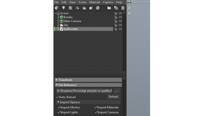
The most important elements are lights, camera settings and rendering settings. We’ll talk about each element in detail as we need them. Marmoset uses a hierarchy of elements which lets you, for example, drag a light source under a camera to make it a ‘child’ of it.
Get the Creative Bloq Newsletter
Daily design news, reviews, how-tos and more, as picked by the editors.
03. Quill and AnimVR
The first models we’ll be setting up are from Quill, but the principle is the same with AnimVR. Both programs enable you to paint in VR, without any light sources or material types.
None of the programs have any built-in post-processing features, and this is where Marmoset comes in handy. You’ll be able to tweak curves and levels, add noise, glow and various camera effects such as depth of fi eld and distortion.
First, we want to get as close to what we saw in VR as possible and then work from there.
04. Import into Marmoset Toolbag
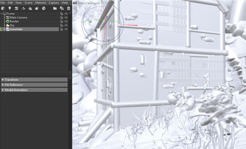
Press File > Import Model and locate your file. Hit Import. The model should appear in your scene stack. With objects exported from AnimVR and Quill, you’ll most likely have to deselect Cull Back Faces.
Since most of the time you’re basically painting with flat planes in both programs, the backside of those planes will otherwise appear transparent. By turning of Cull Back Faces, both sides are visible.
05. Light your scene
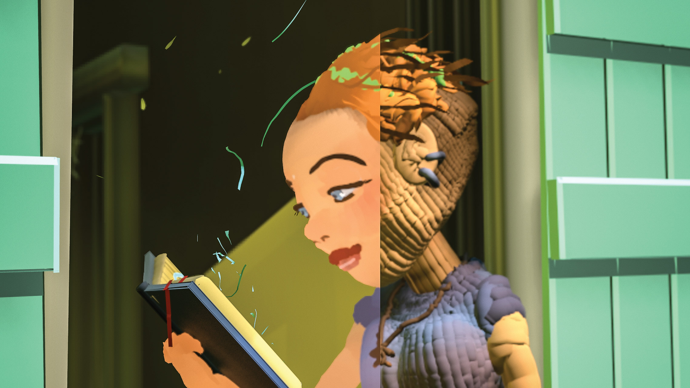
Trying to actually light the geometry from Quill and AnimVR requires a very tight ‘drawing’ for it to look good. Due to the nature of the programs, a lot of the imperfections of the geometry they output are hidden by the fact that the surfaces are unlit.
Generally, hard-surface elements do better than organic elements when you try to add lights to your scene. Also, elements made up of as simple and as few strokes as possible tend to do well. As soon as you build an element that consists of a lot of brush strokes, you’ll start to notice that it works better unlit.
It’s a good idea to play around a bit with the settings. One drawing might look good lit and with reflection and glossiness enabled, yet another might look terrible.
06. Unlit scene
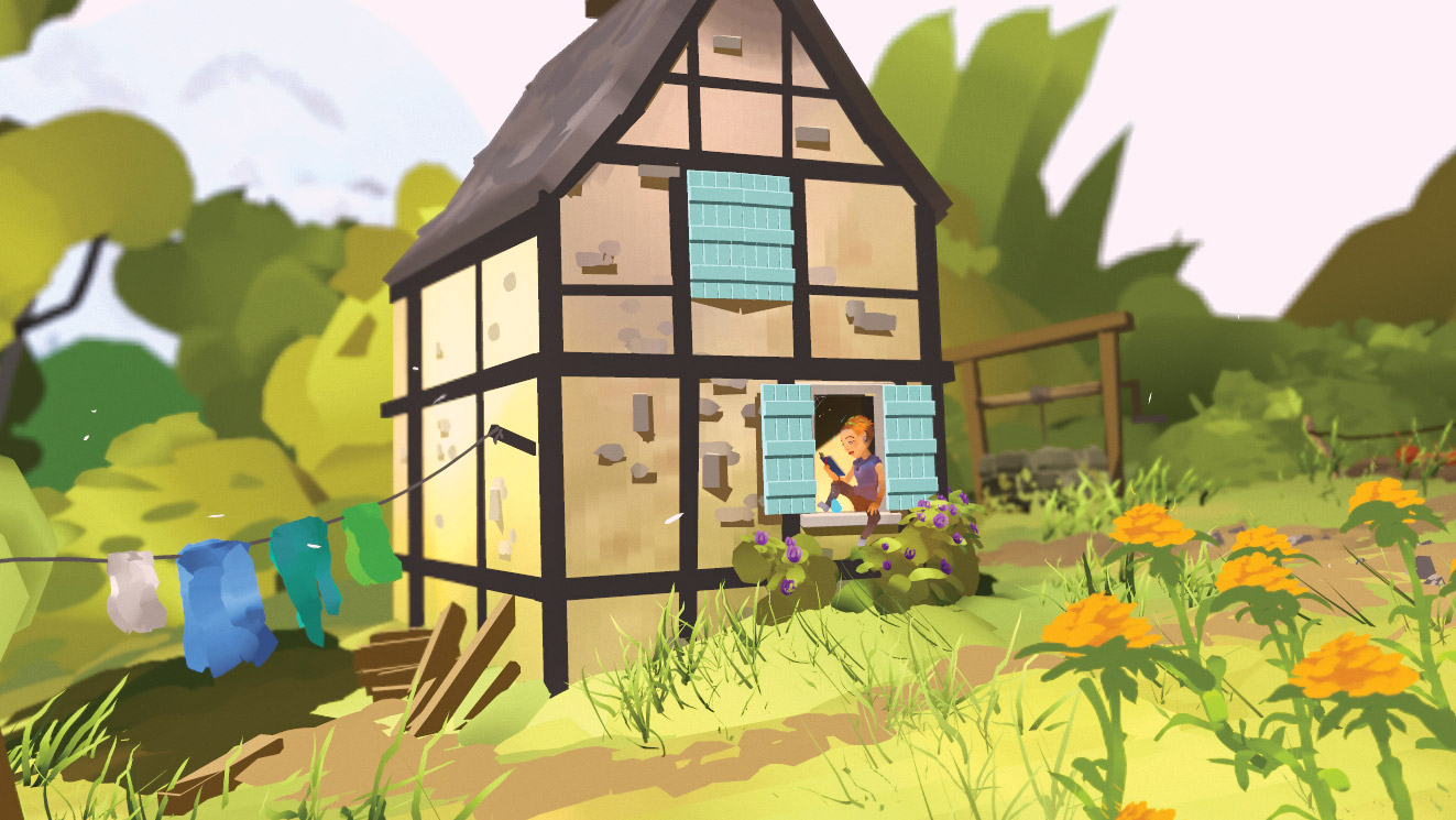
The first version is the one that will be closest to what you saw in VR. To get this result, go to your material and make sure Albedo is set to Vertex Color, Diffusion is set to Unlit, Microsurface is set to Gloss 0, Reflectivity is set to Specular with 0 intensity and finally Fresnel is at 0.
If your scene contains transparent elements, make sure to enable Vertex Alpha under Albedo, and under Transparency you should set Cutout and use Albedo alpha. Also, Channel should be set to A.
In our example some post-processing has been applied to add depth of field and to tweak the colours. We’ll get to that later on.
07. Light types
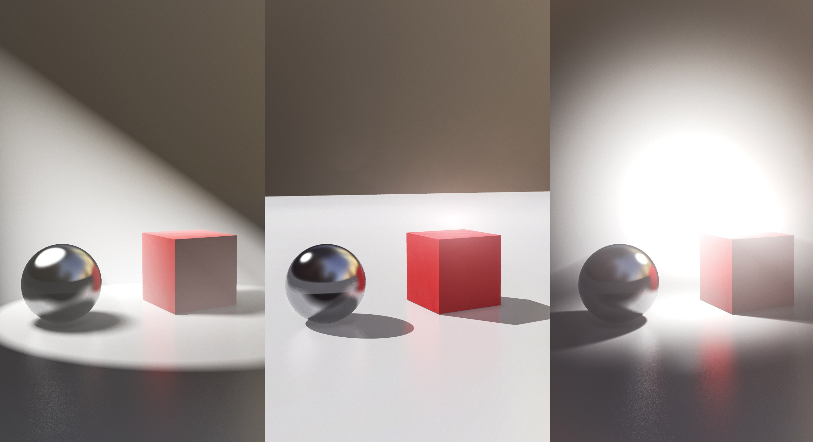
For the next two material/lighting scenarios, we need lights. Each light type in Marmoset has common settings and light-specific settings. The most important light settings are: Brightness; Distance, which has a big impact on the look of volumetric light when using fog; Contact Refinement, which does exactly what the name implies; and the shape settings, which scales the light caster and affects the sharpness of cast shadows. A small light caster gives sharp shadows, and a large one gives soft shadows.
If you experience blocky shadows, go to the rendering settings and up the shadow resolution, or try to enable the Use Cascades option under Shadows. With very large scenes it might not be possible to have sharp shadows due to the way Marmoset calculates shadows. In those cases spotlights with a small radius work best, and if that doesn’t help, up the light caster scale to soften the shadows.
In the above image, in the first example on the left I have a spotlight with a Brightness setting of 5, a Distance setting of 1.3 and a width of 0.3. Notice how soft the shadows appear, and how pronounced the volumetric light rays are. Jump to the Add Fog section of the tutorial for more information on how to achieve this.
The second example is a directional light with a width of 0 which gives very hard shadows. The last one is an omni light with a low Distance setting, a medium-sized light caster and a fog set to react to lights.
We’ll cover HDRI lights in the last part of the tutorial.
08. Lit scene
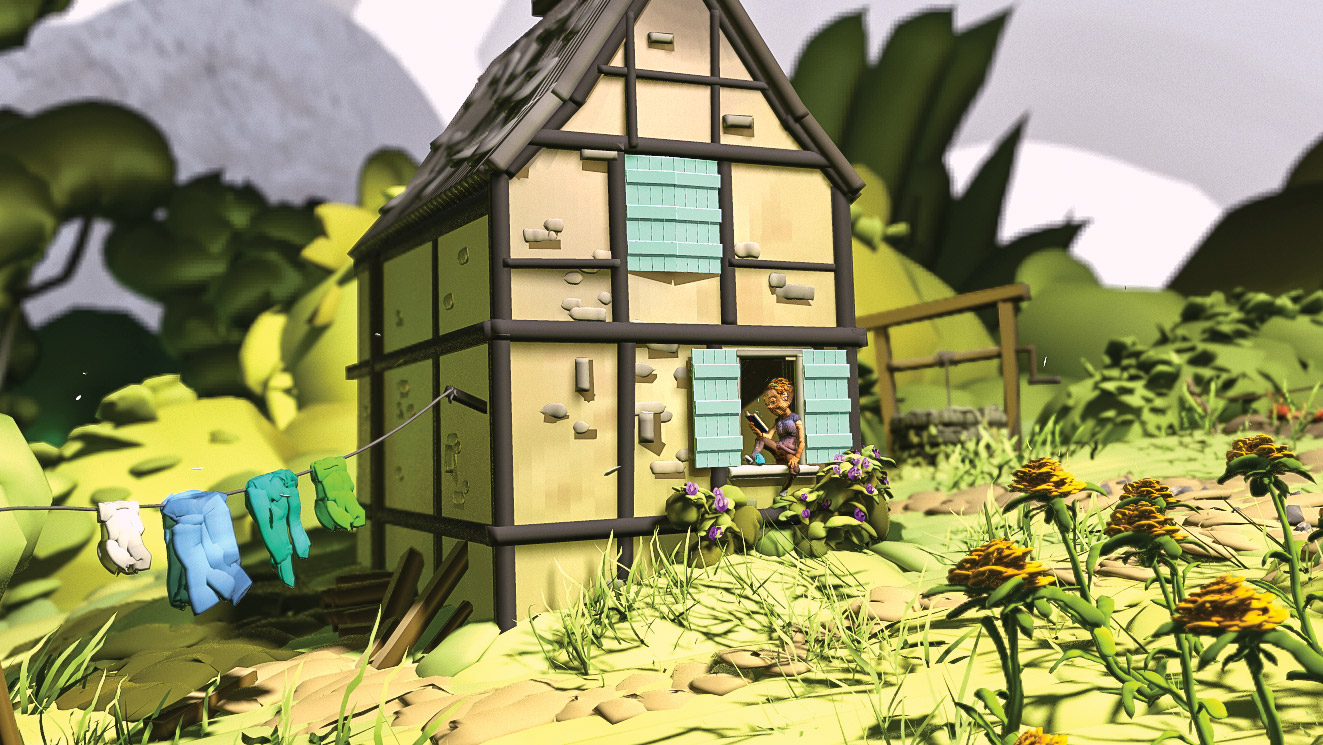
In this version, we use the same material for the whole scene. Once you get more comfortable with Marmoset, you can make as many individual materials as you like and apply those to the different layers in Quill or AnimVR scenes.
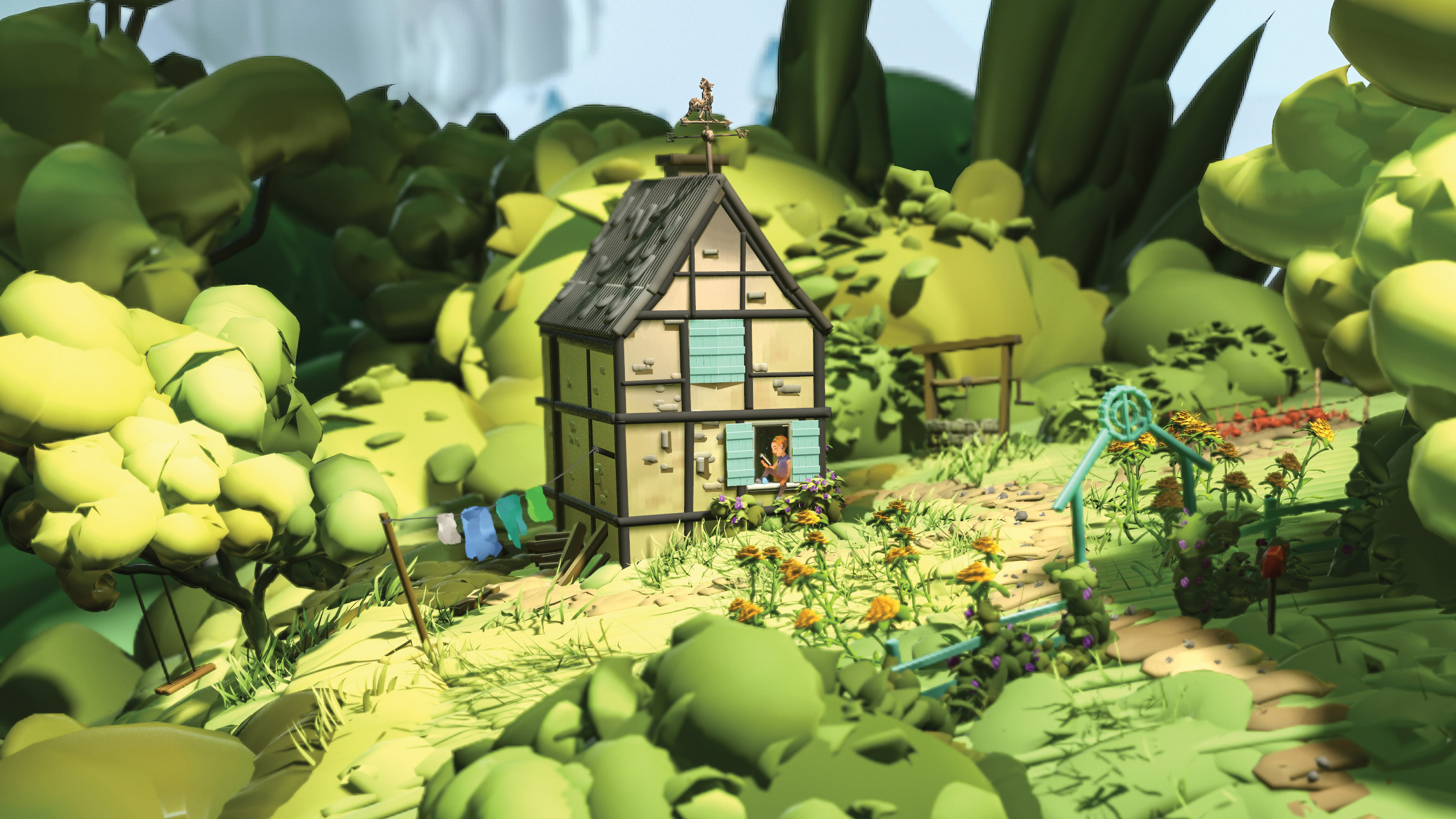
Start off by adding a light to your scene. In my case, I added a spotlight above the house with a angle setting that’s large enough for the light to illuminate the house and the surrounding garden. I can’t see the light at the moment, due to the ‘Unlit’ property of my material.
To get the material to react to the light source, you should set Albedo to Vertex Color, Microsurface to Gloss 0.3, and Horizon Smoothing to 0. Reflectivity is set to Specular with 0.006 intensity, just to get a small reflection. Fresnel is set to 1.
You also need to set Diffusion to Lambertian or one of the other techniques, depending on your material; just don’t set it to Unlit.
Under Render settings, enable Local Reflections and Enable GI. I set GI brightness to around 4. This basically turns all your objects into light casters which will bounce the light around in your scene to give a more realistic result. Depending on the size of your scene, you might have to up the GI resolution or tweak the Voxel Scene Fit slider.
As you can see, not all elements look equally good with those settings. Particularly the girl and laundry suffer from a very uneven surface. To get usable results with scenes like this, you’ll have to experiment quite a bit… or you could go to the next step and get the best of both worlds!
09. Combine techniques
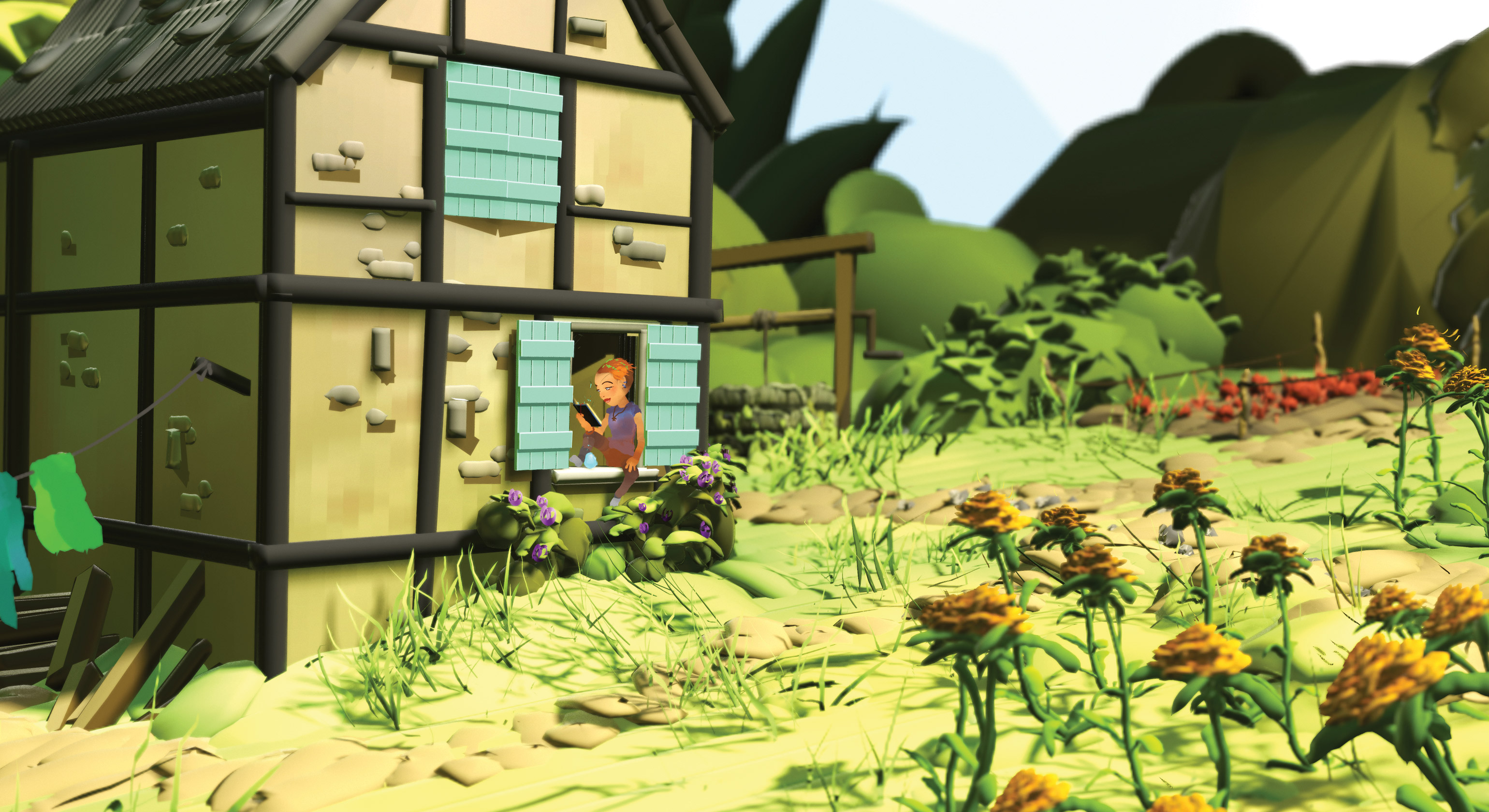
As we saw above, some elements look good unlit, while others benefit from lights and shadow. So what we can do is combine the two techniques. This is a bit of a ‘hack’ and won’t work in all scenarios. For example, you’d expect a character standing in a strong cone of light to cast a shadow. But in this case, since the girl is sitting like she is, we don’t need her to cast a shadow.
For most of the elements in the scene I use the material we created in the step above, except for the girl and the laundry to which I apply the Unlit material.
10. Have fun!
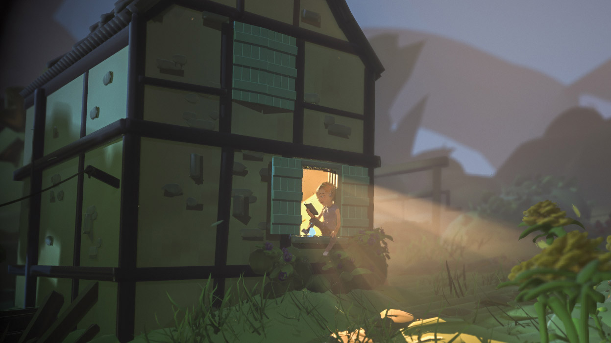
Now that you have an idea about how materials and lights work with Quill and AnimVR scenes, it’s time to experiment. In this version I tried to go for a night-time look, and kept the girl unlit while everything else is lit. I toned the vertex colour of the girl down a bit, by applying a local colour on top of the vertex colour.
There’s some pretty obvious banding going on in the grass plane, but this could easily be painted over in Photoshop for a more finished look. Being able to play around with mood in your VR drawings like this is pretty powerful for look development, concept art or illustrations in general.
11. Add fog
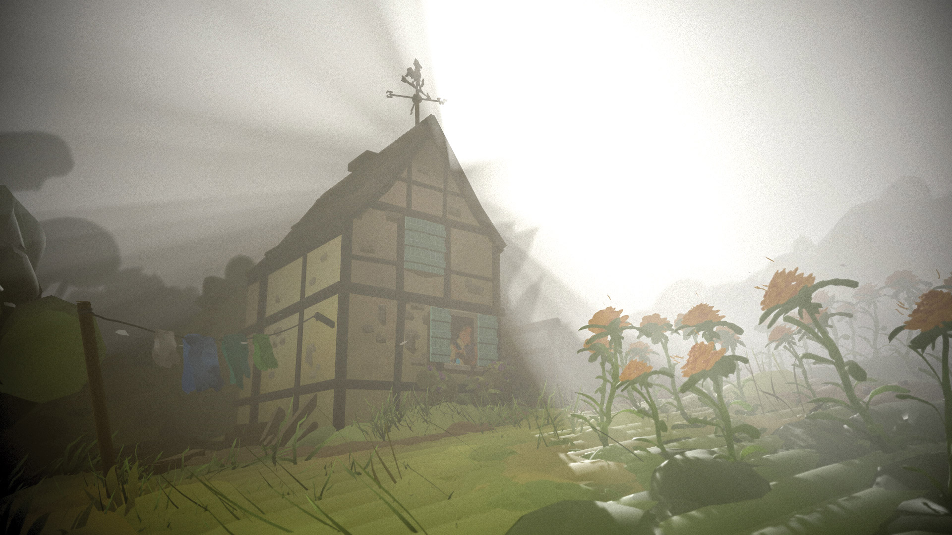
One of the biggest challenges with unlit scenes is to convey distance, and atmospherics can help with that. To add fog to your scene, click the New Fog button at the top-left corner of the screen. Play with the settings to get the look you want.
The settings under Illumination are especially important if you want a dramatic god-ray effect. To actually get the rays to show up, you obviously need a light source for them to emit from. So make a spot, omni or directional light behind some of your scene elements, and tweak away at fog and lights settings.
12. Prepare in Medium
This leads us to the second part of the tutorial, where I’ll talk about how to present scenes from Medium or MasterpieceVR in Marmoset Toolbag.
From Oculus Medium, export your file as either OBJ or FBX. OBJ merges all your layers into one, and FBX retains layers. Depending on how large and complex your scene is, it might be a good idea to decimate your model, either using the built-in decimation tool in the VR program, or through programs such as ZBrush or 3D-Coat. Generally I try to keep the polygon count below 10 million in Marmoset.
13. Prepare in MasterpieceVR
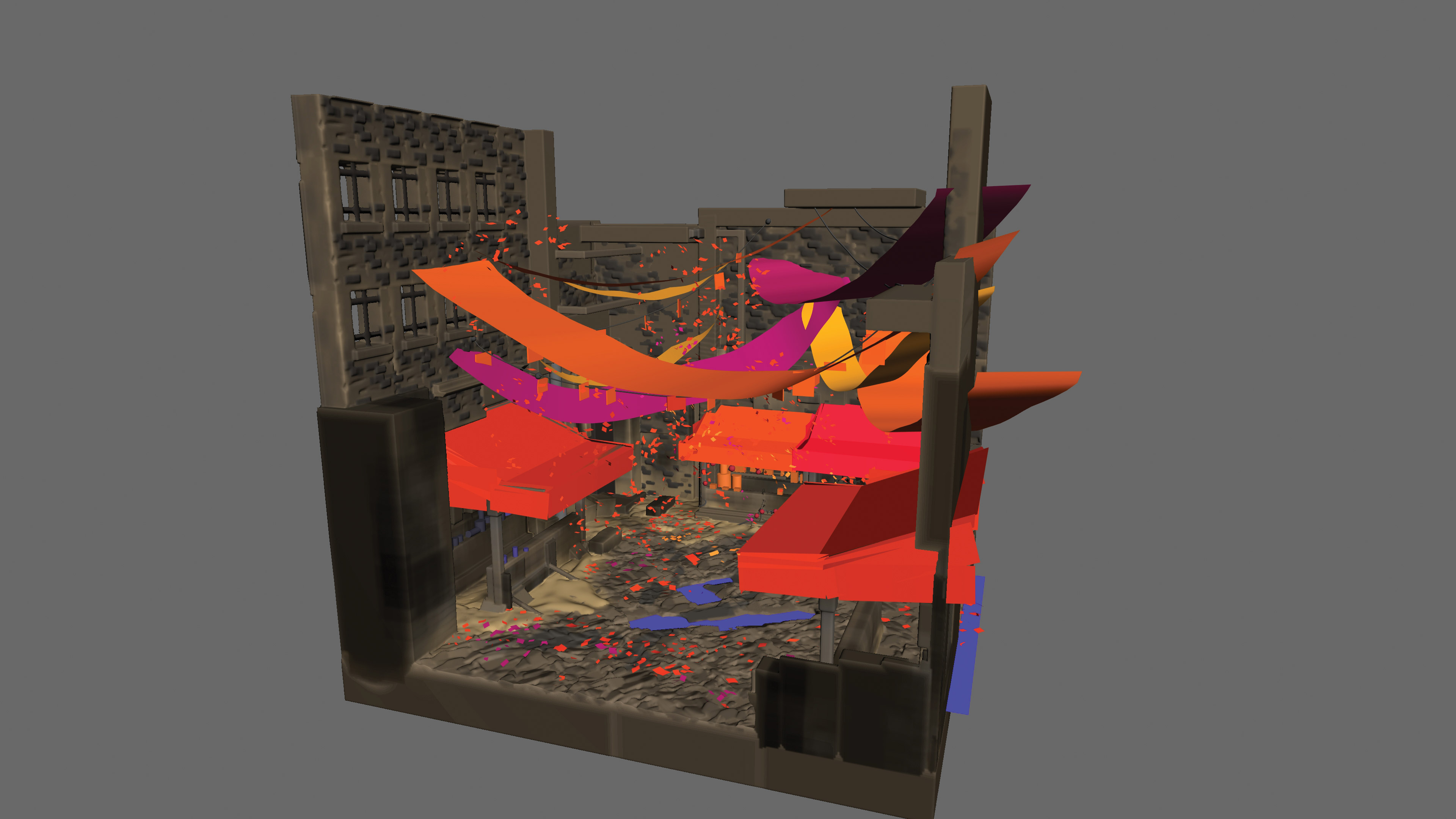
From MasterpieceVR, export your file as FBX. MasterpieceVR doesn’t support layers per se, but you can draw with polygons, a bit like what you do in Quill and AnimVR. These strokes are each exported as a separate layer if you export as FBX.
Depending on the type of scene I’ve done in MasterpieceVR, I might take the model into ZBrush to combine polygon strokes into meaningful groups, instead of having each stroke be one layer. The model I’ll be setting up in the second part of this tutorial is a quick scene I sculpted in MasterpieceVR. Speed is one of the biggest strengths of VR sculpting and drawing, and this scene took a bit less than an hour to sculpt in VR.
Now let’s see what a bit of light and materials can do!
14. Basic setup

Start out by rotating your imported scene. I usually make a new shadow catcher object and rotate the model according to that. You can make numeric inputs in the Transform category under your imported object if you need more precision. You might also want to scale up or down elements in your scene. You can switch to transform mode by hitting ctrl+R. To get back to move mode, hit ctrl+T.
15. Find a suitable environment
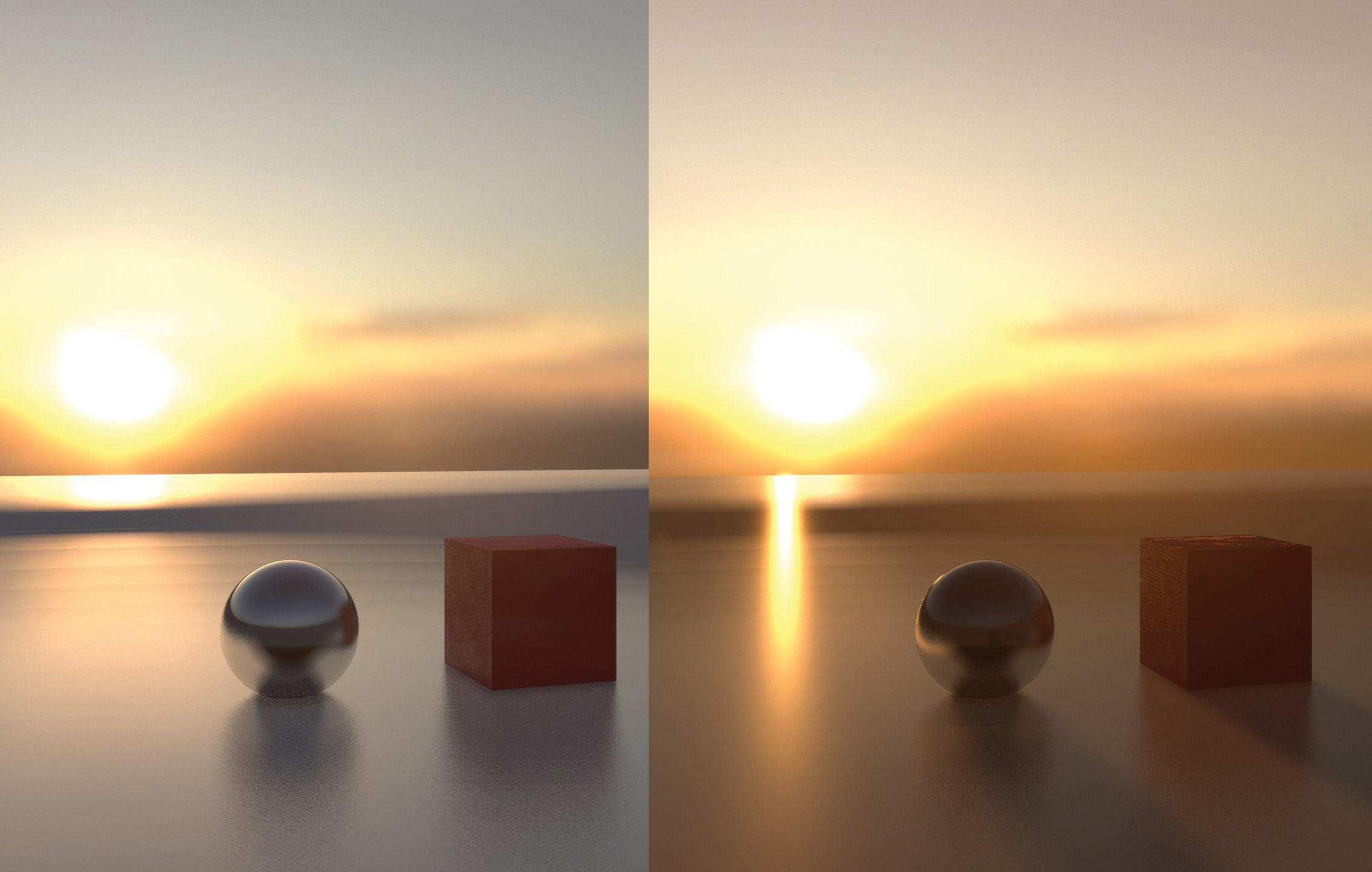
HDRIs in Marmoset are the last light type we need to cover. You’ll find those under the Sky object in your scene stack. You’re probably familiar with HDRIs from other 3D programs.
They work about the same in Marmoset Toolbag, with the added functionality of a ‘light editor’ that allows you to click the preview of the HDRI image, and place actual lights that you can then tweak based on the colours in the HDRI. In the example here you see the difference between just lighting the scene using the HDRI and then using both HDRI and child lights.
I placed a child light directly in the centre of the sun in the HDRI, which gives me cast shadows that match the sun placement. You can tweak the child lights by clicking them underneath the Sky object. When you rotate the HDRI environment, the child lights rotate too.
16. Vertex colour
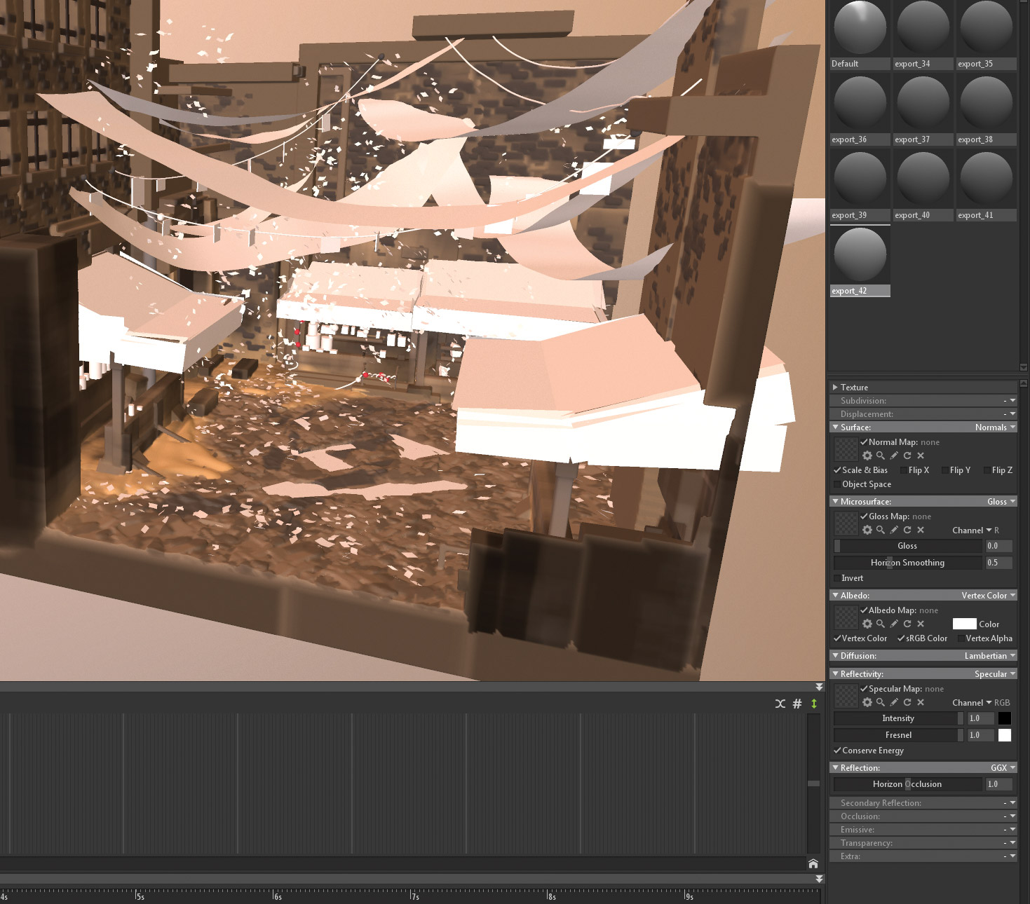
For this scene I use the vertex colour directly from MasterpieceVR. This is the same procedure as with the Quill scene. Go into the material, choose Vertex Color and tweak glossiness and reflection until you’re happy with the result. In the example, I’ve added vertex colour to the ‘solid’ part of the MasterpieceVR sculpt, leaving only the polygon strokes uncoloured.
17. Finish the basic materials
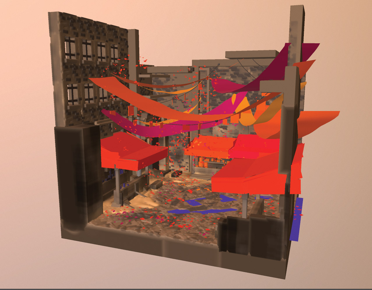
I do the same for the polygon elements in the scene. At the moment, the scene looks bland and we really need some light. I plan on having the banners cast coloured lights on the surroundings and ground floor, but for now they’re just their local colour.
18. Let there be light
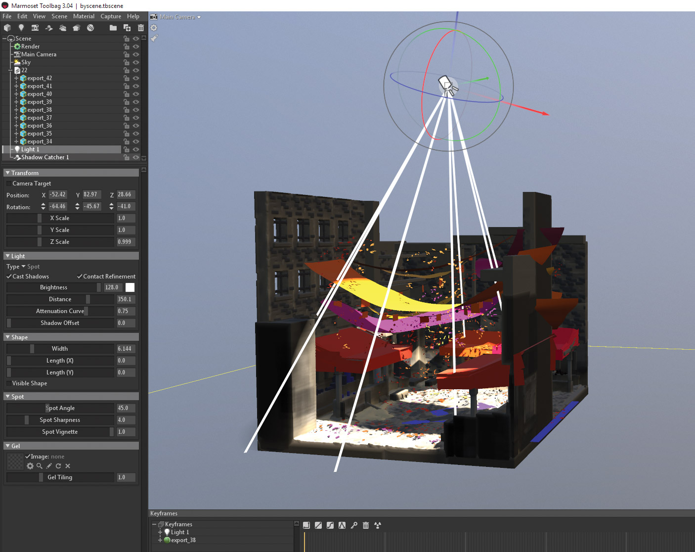
I add a spotlight almost directly above the scene and tweak the brightness and shape until I’m happy with the result. I find the spotlight is easier to manipulate than directional light when using fog and god rays, because of the distance setting.
19. Subsurface scattering
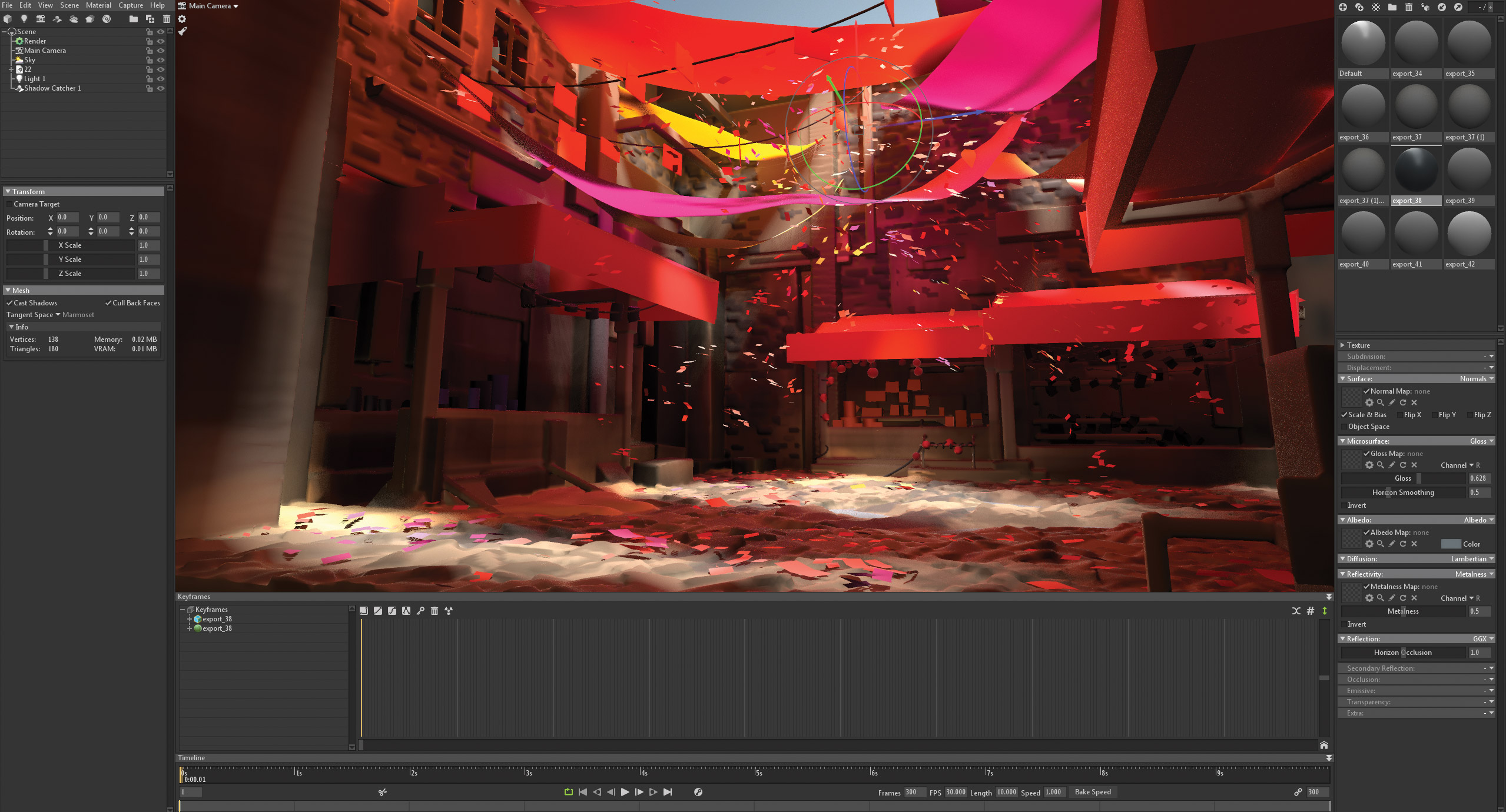
To get the effect of the light shining through the banners, I need to enable Subsurface Scatter in the Diffuse setting of the material for the banners. Remember to turn on Enable GI in the Global Illumination settings under Render. This will enable coloured light to pass through the banners and illuminate the ground plane and surrounding buildings. As you can tell, the difference is night and day!
20. Expand the scene
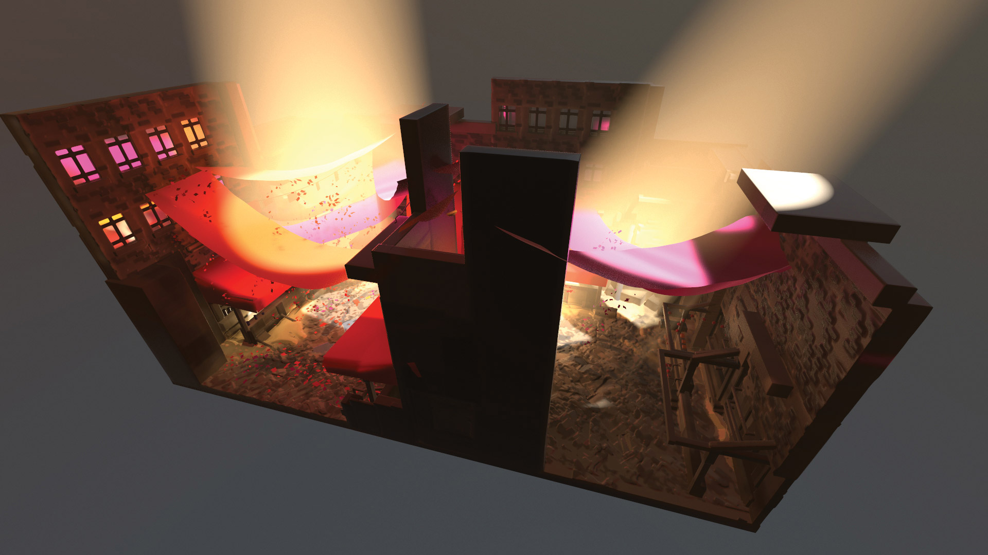
The MasterpieceVR sculpt doesn’t cover as much space as I need, so to expand the scene, I duplicate the sculpt and rotate it to increase the length of the street in a modular fashion. Generally when doing sculpts like this, I’ll duplicate elements and move them around to add variation to the scene. You’d be amazed how much you can get by ‘cheating’ like this.
21. Extra lights
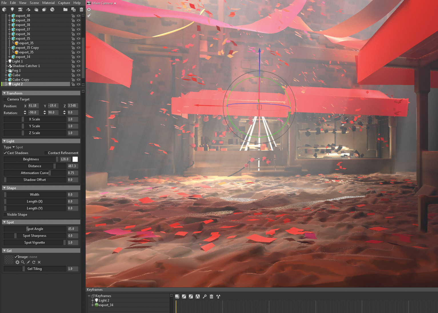
Finally, I add some additional lights in the small shops, and a Fog object to add atmosphere. I tweak the settings until I find a result I like. Notice the nice rays of light we get due to the small confetti-like objects in the air, and the banners which break the light into smaller rays of light.
22. Extra settings
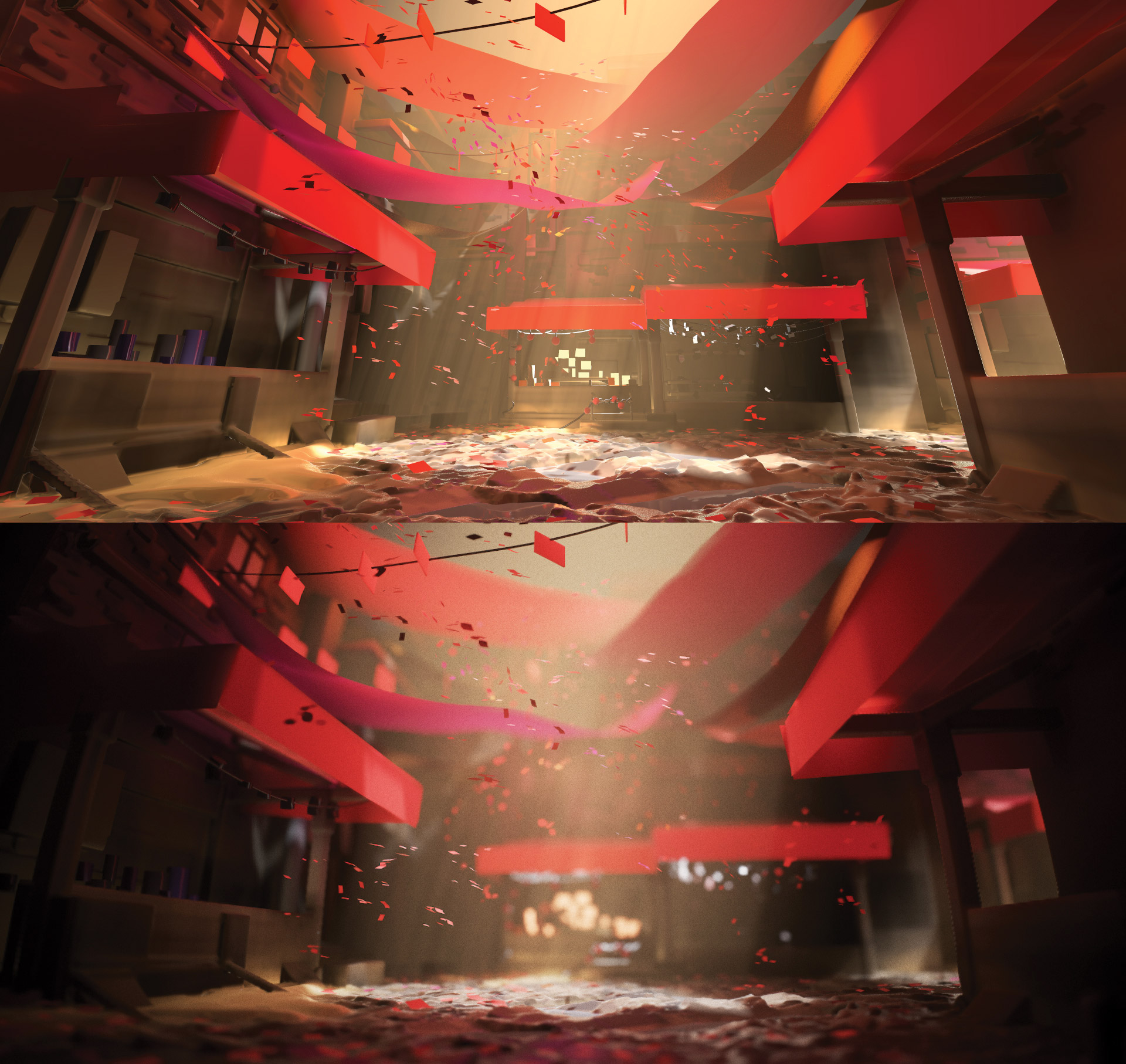
I added depth of field (you choose your focus point by pressing the scroll wheel), barrel distortion to get a fisheye lens effect, chromatic aberration to simulate a camera lens effect, lens flares, and tweaked the colour settings by changing Tone Mapping to Filmic and adjusting the curves, contrast and saturation.
I also added a vignette effect and some noise to the final image and voila, we’ve reached the end of the tutorial. Feel free to reach out over social media or email if you have questions about the workflow.
This article was originally published in issue 240 of 3D World, the world's best-selling magazine for CG artists. Buy issue 240 or subscribe to 3D World here.
Related articles:

Thank you for reading 5 articles this month* Join now for unlimited access
Enjoy your first month for just £1 / $1 / €1
*Read 5 free articles per month without a subscription

Join now for unlimited access
Try first month for just £1 / $1 / €1

Martin is a freelance illustrator living in Denmark, with more than 17 years of professional art and illustration experience. He holds a BA and MA in Digital Design from The Royal Danish Academy of Fine Arts Schools of Architecture, Design and Conservation. Martin's client list includes: Media Molecule, The UN, Sony, Facebook, LEGO, DR (Danish state TV), TV2, Adobe, WACOM, Nestlé, B&O, Spigo, MasterpieceVR, Oculus and various small and large companies.
