How to turn WordPress into a visual builder
Configure WordPress to almost completely ignore the theme and install Elementor to leave you with a drag-and-drop interface.
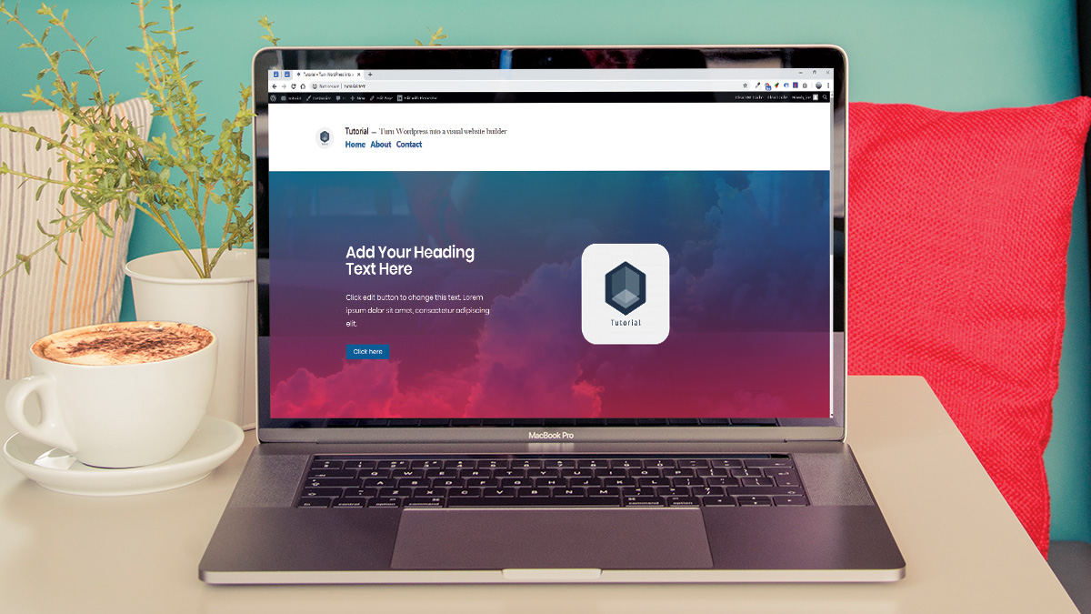
Visual builders have existed for a long time for WordPress, but have always caused division with their use. Most had significant drawbacks in terms of page speed and the code that they generate, and more often than not the drag and drop blocks in the editing screen were not a realistic representation of the final result. On the other hand, sometimes you just want to be able to design and prototype quickly without having to write code.
Using the pagebuilder plugin Elementor with the right setup, WordPress can be converted into a minimalistic visual website builder, almost independent of the theme, that wields an array of settings, allowing you to create complex designs with ease.
Using the Twenty Nineteen default WordPress theme, you can build a ready-to-use canvas that can be used to prototype or build production-ready WordPress websites. With this canvas, we will make a simple page with two sections and a contact form.
We will make the web page mobile-friendly, and using two plugins, we will address the main concern with using a visual builder and minimise the page’s already minimal load time. Alternatively, see our roundup of great WordPress tutorials to hone your skills even further.
Use the icon in the top right of each image to enlarge it
01. Install a copy of WordPress
To kick things off, install a copy of WordPress on the system you are using. We are using a program called Laragon which offers a quick install option to create an instance on my machine.
02. Remove the parts you don’t need
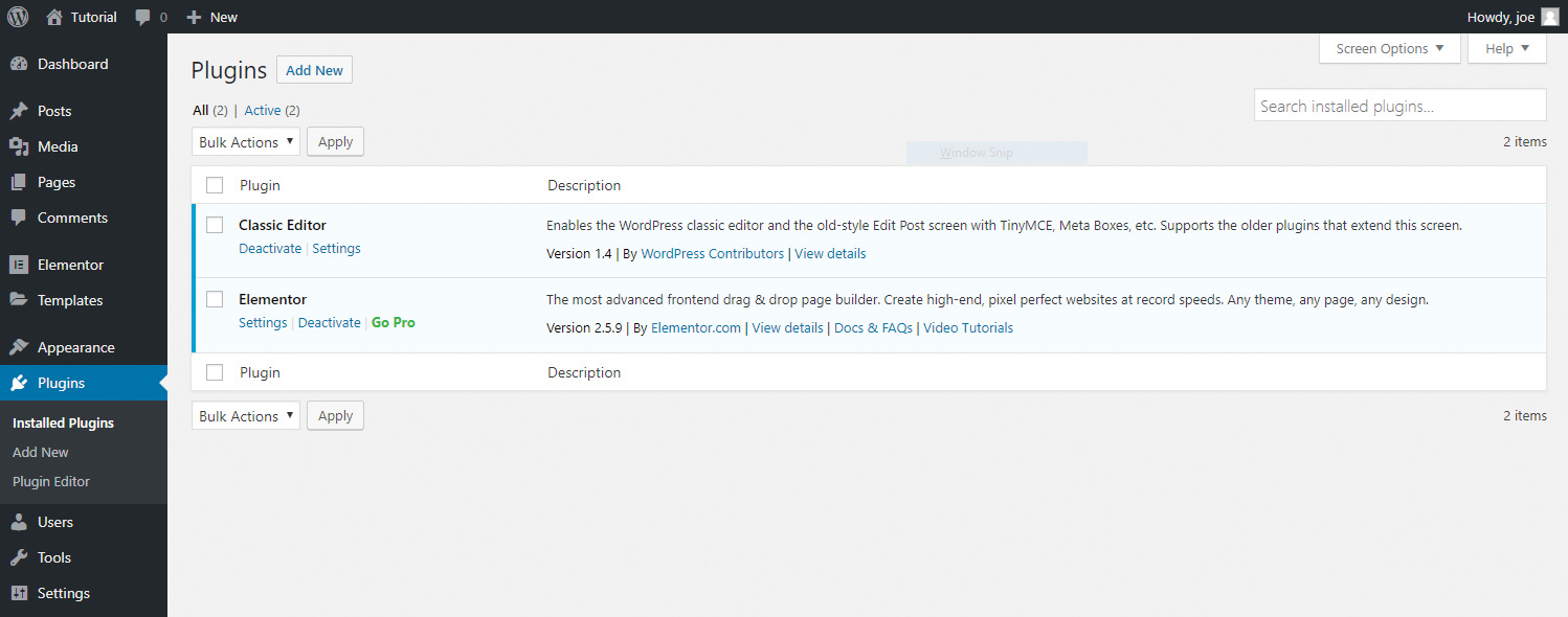
Head over to plugins, and delete everything that comes bundled with WordPress. At the time of writing, it will streamline our efforts to install the ‘Classic Editor’ plugin to disable the new Gutenburg editor. To reduce clutter, we should also go to Appearance > Widgets and remove all widgets.
Get the Creative Bloq Newsletter
Daily design news, reviews, how-tos and more, as picked by the editors.
03. Pick a theme with a header and footer
The only part of the theme we will use is the header and footer – everything else will be stripped back. We will be using the default Twenty Nineteen theme, and will show you some quick alterations to make it look sharp. When using Elementor, the less the theme does the better.
04. Install Elementor and create a page
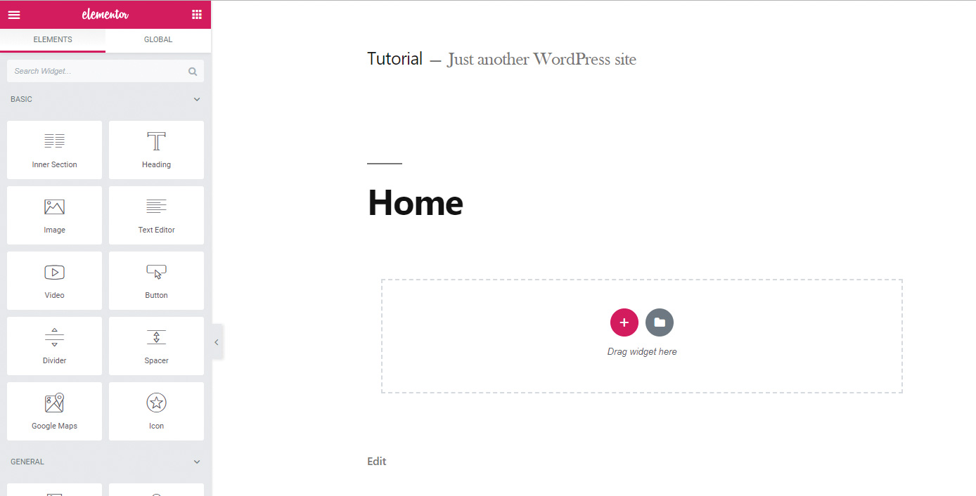
Use the WordPress plugin search to find Elementor and install it. Once installed and activated, create a new page. Name the new page ‘Home’ and save it as a draft so that it exists in the database. Click ‘Edit in Elementor.’ This will load the Elementor visual builder.
05. Full width the page
Looking at the page, it’s constrained to the boxed layout of our theme. To disable this, click the cog at the bottom left of the Elementor editor and change ‘page layout’ to ‘Elementor Full Width’. If you are making a website without many pages, you might consider the ‘Elementor Canvas’ option, which removes the header and footer too.
06. Add some content
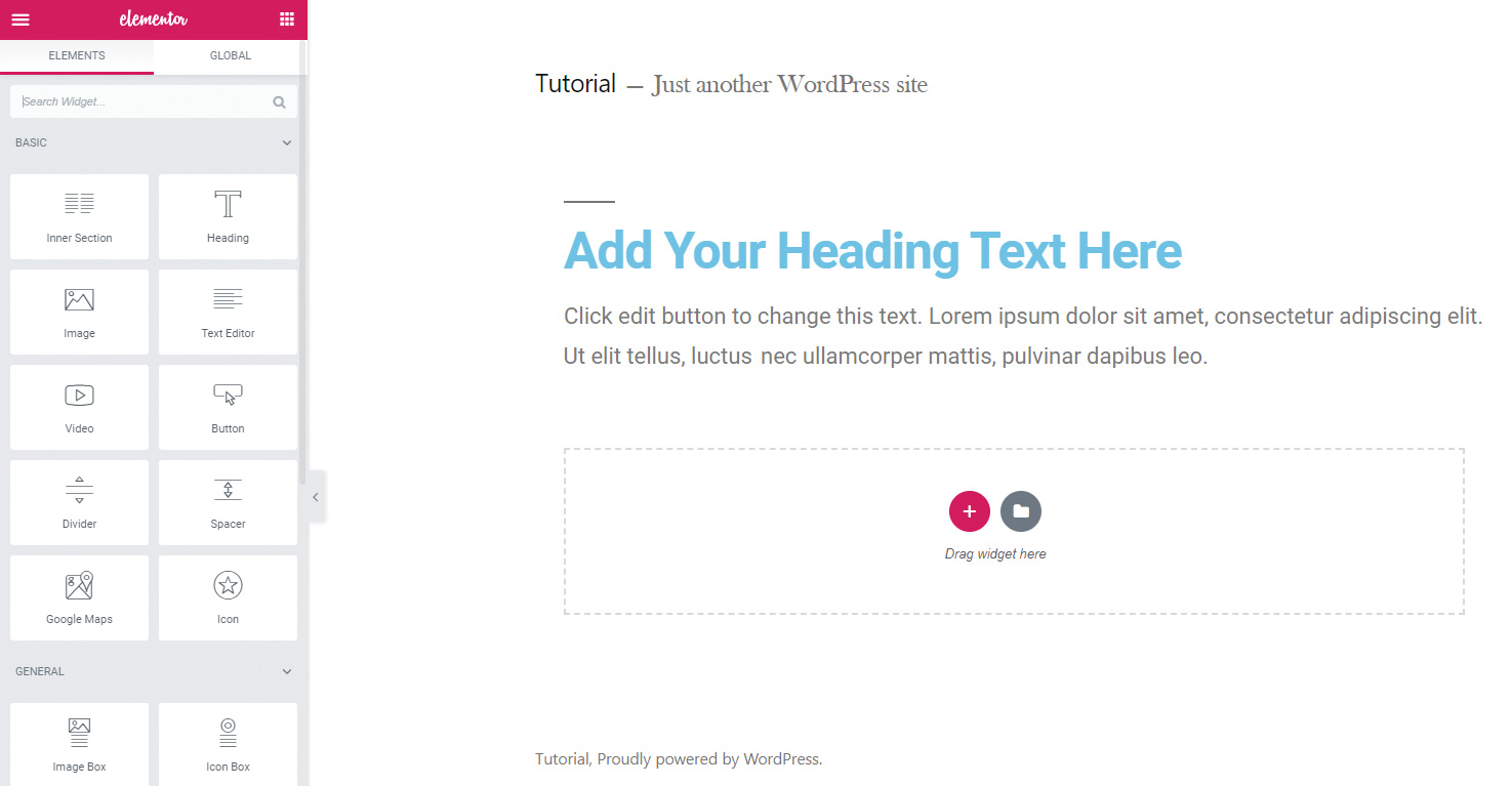
Now that we have a blank page, we should give ourselves something to work with. Click on the Elementor grid icon at the top right of the editor to see all available elements. A header block and text block are added by dragging these into the middle of the page. These two elements will help us style our typography.
07. Remove heading lines
You may notice when using the Twenty Nineteen theme that a line is rendered above all headings. Let’s remove that using the WordPress customise tool. While we’re here, I will also add a logo in the site identity settings and some menu items.
h1:before, h2:before{
	display:none;
}
08. Fix the content width

Our content section doesn’t quite line up with the header. This is because Twenty Nineteen uses a calculated margin to set the width of the header and footer. We can replicate this on our Elementor sections for consistency with some CSS.
We should also increase the content width in the main Elementor settings page.
@media only screen and (min-width: 768px){
.Elementor-top-section.Elementor-section-
boxed>.Elementor-container{
		margin: 0 calc(10% + 60px);
}
}
09. Make an opening section
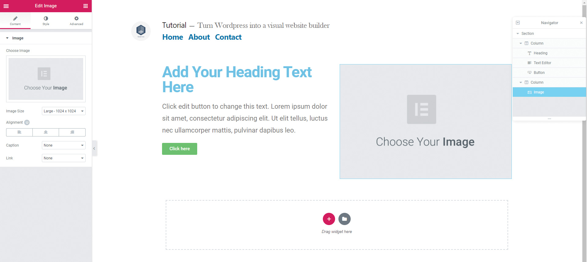
We’ll start with the top section of the page, which will contain a small amount of text and an image. Delete our section from earlier and replace it with a new two-column section by clicking the red plus. Drag in a header, a text editor and a button to the left column. On the right we’ll drag in an image.
10. Add a background
Select the section either by hovering over it and clicking the blue tab, or using the navigator at the bottom right of the Elementor buttons. You will see three tabs – layout, style and advanced.
Using the layout tab, give our section a height of 80vh. Select Style to find the options, and use the background option to set a background of #0073aa.
11. Style the text
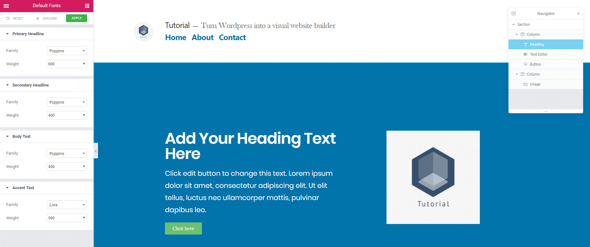
To change the font for our entire document, we can click on ‘Default fonts’ in the hamburger menu at the top of the Elementor bar. You can also click on your individual text elements and use the Style tab to change colour and other options.
12. Use a background overlay effect
A great addition is the ability to quickly add background overlays from the section style tab. Select our section and go to the background tab. Give our background an image to give it texture, then go to ‘Background overlay’, the dropdown below, and select a gradient background overlay.
13. Create a call to action
The second section of our page will be a call to action section. We will embed Contact Form 7, but anything that can generate a shortcode will work. Make a new section with two columns, or right click on our last section and duplicate it.
Install your contact form plugin and generate the shortcode for your form. In the right column, drag in a shortcode widget and paste the shortcode into the box.
14. Mobile friendly
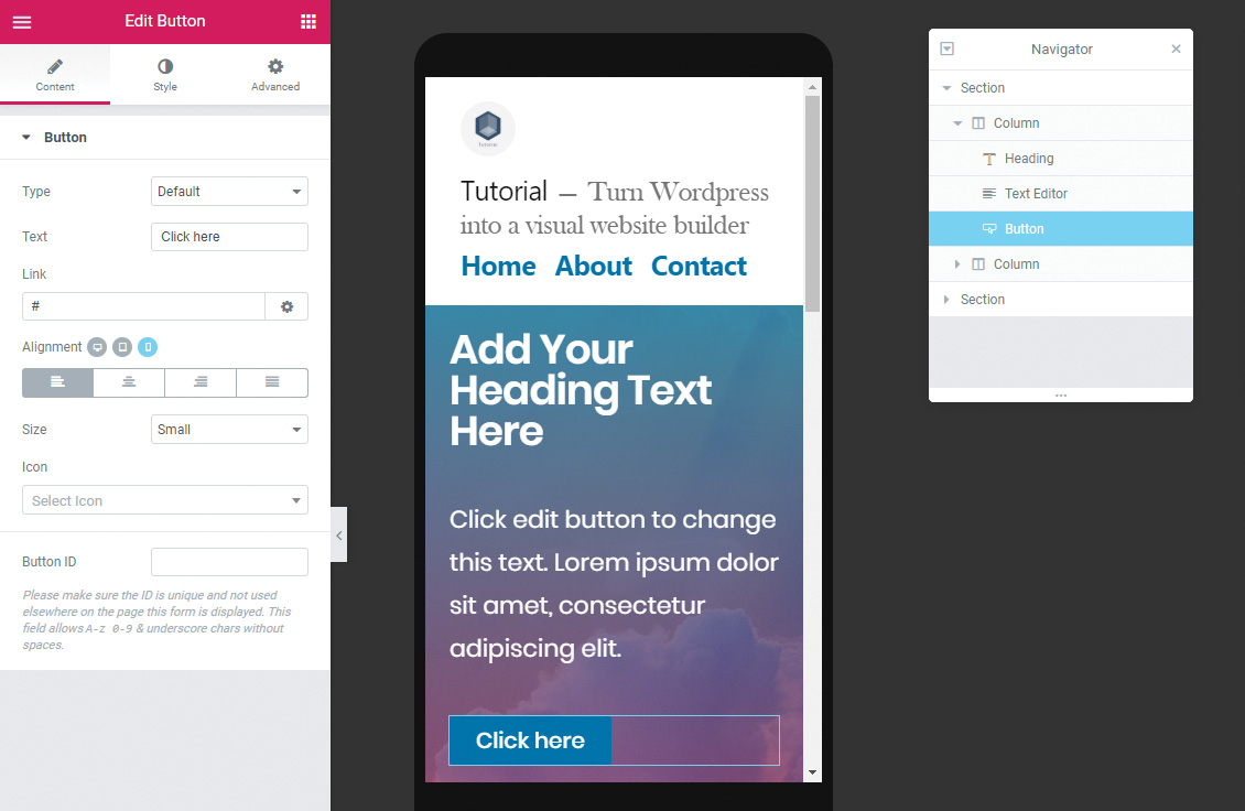
To access mobile options for our page, you will need to turn on ‘Responsive options’ at the bottom of the Elementor panel. By selecting ‘Mobile’ mode, we can see that our sections will need some padding.
Using the mobile option, which you can check by making sure there is a blue icon next to each setting, our choices will not affect the main desktop view. However, any layout changes made in this mode will affect the desktop view.
15. Optimise images
To minimise page load speed concerns, we should run an image compression. This can be done through a plugin or through your web server. For now, let’s use a popular plugin, EWWW image optimiser, to set a maximum quality and width for our images, and then run an optimisation.
16. Cache pages to boost performance
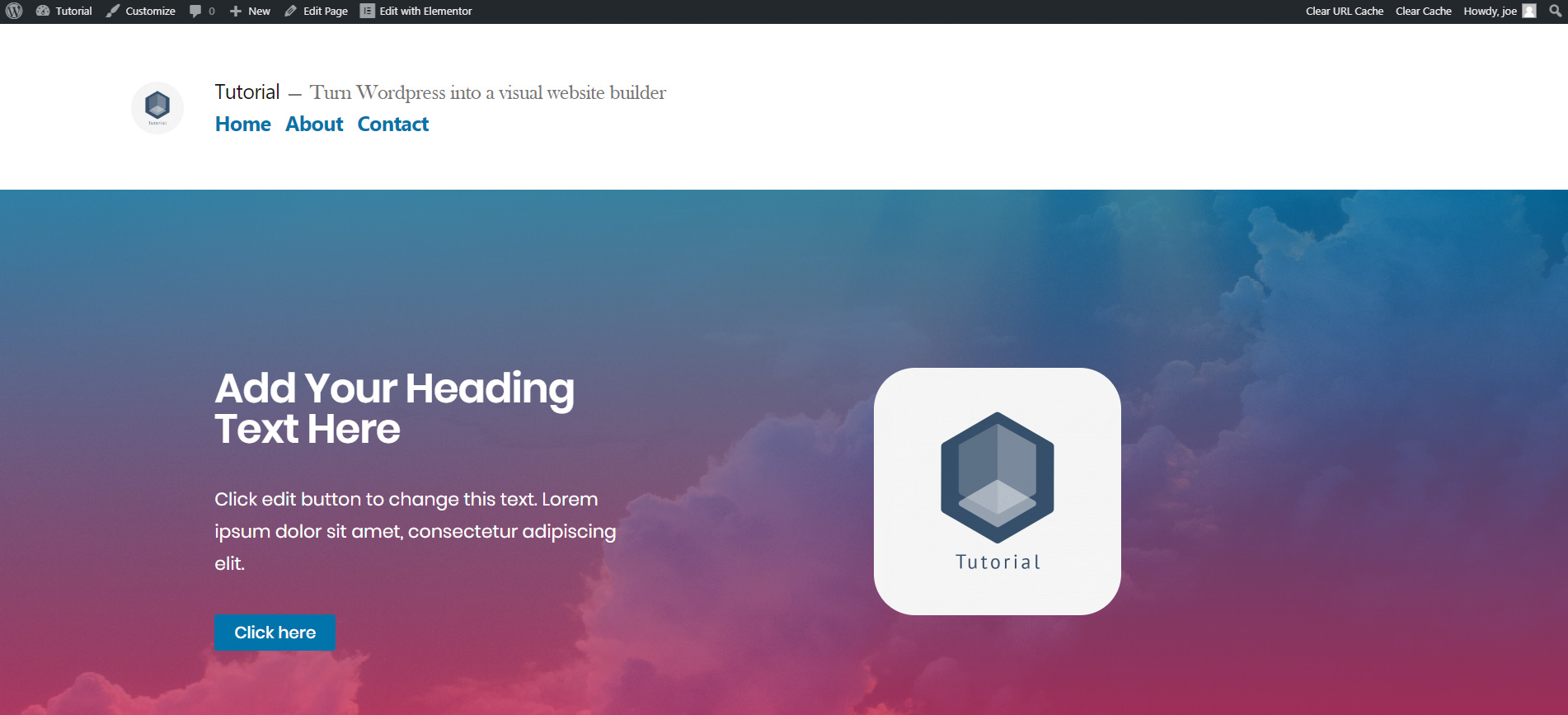
Finally, we will install a cache plugin to maximise load times for our page. There are many cache plugins out there, but currently, Cache Enabler is low profile and works well with this setup.
With the cache enabled, the website loads quickly. It also has a fully functional visual builder in the background. It’s the perfect fast-working blank canvas for you to design on.

Join us on 26 September for Generate CSS, a bespoke conference for web designers brought to you by Creative Bloq, net and Web Designer. Save £50 with an Early Bird Ticket when you book before 15 August 2019.
This article was originally published in creative web design magazine Web Designer. Buy issue 287 or subscribe.
Read more:

Thank you for reading 5 articles this month* Join now for unlimited access
Enjoy your first month for just £1 / $1 / €1
*Read 5 free articles per month without a subscription

Join now for unlimited access
Try first month for just £1 / $1 / €1
Joe has been building websites his whole life, and he now runs Corebyte Ltd, a small web development company in Southampton.
