Turn 2D illustrations into 3D art
Add a new dimension to your illustrations using ZBrush.
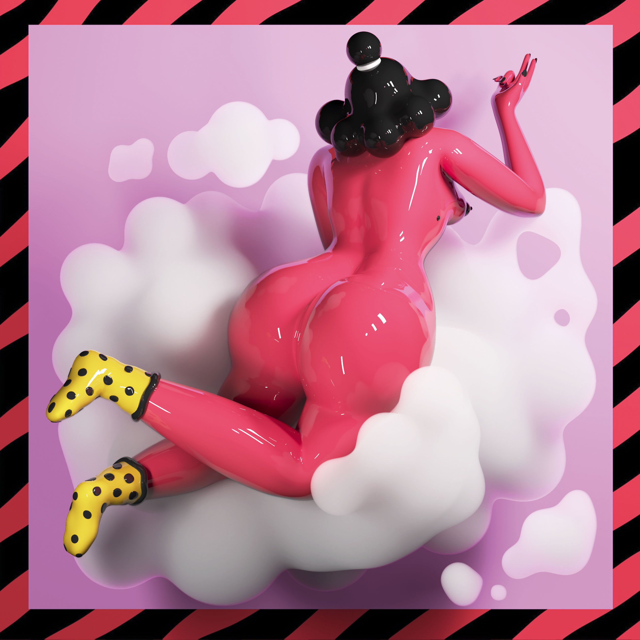
My journey into making 3D art started a couple of years ago when my brother told me to try ZBrush. Since then I’ve got to know amazing people and talented artists to learn from and to collaborate with. I've always been passionate about drawing and wanted to be able to bring an idea to life. This passion led me to become a 3D artist, turning ideas and illustrations into captivating 3D models.
01. Examine your reference

The first thing I do is to search for references to build a 3D model, or I draw one myself. I was lucky to collaborate with the amazing French artist Marylou Faure for this piece. Marylou wanted to see how her illustrations would look in 3D and I was looking for an opportunity to practice my skills on a non-realistic drawing.
The basic rule of building a 3D model is the more references the better, especially from various angles. However, Marylou only handed me two reference images, so this was an amazing opportunity to experiment with creating 3D structure in a new way for me.
The main problem with a non-realistic 2D drawing is that the original artist usually doesn’t consider turning the model around, so there might be a missing foot for the sake of composition, or there might be an element that serves a graphic purpose from only one point of view. This has to be solved when working with a sculpture.
02. Start from a sphere
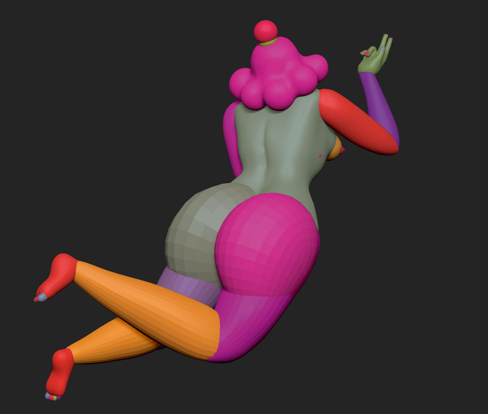
ZBrush is fairly intuitive and easy to use with some practice. I usually start from the sphere. I could use any primitive form but in many cases the sphere is the best choice, especially when sculpting a humanoid shape as it enables conferring organicity to it.
I start the project with a basic shape using as many spheres as I need, deformed for the purpose I am using them for. But it’s important to remember that the human body isn’t made out of spheres, so it is necessary to squeeze, move, trim and carve them as appropriate.
For this project I didn’t start with making a T-posed shape with symmetry, to preserve the artistry of the original picture. In fact, in this case, taking that kind of approach might have prevented me from pursuing the artistic result I wanted to achieve: the body in her illustration was purposely not proportionate but there was a balance to it.
Get the Creative Bloq Newsletter
Daily design news, reviews, how-tos and more, as picked by the editors.
03. Start sculpting
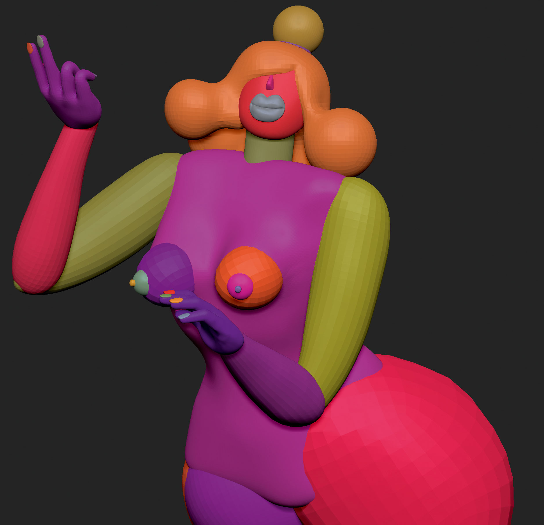
When happy with the shape, it's good practice to merge the different parts in order to create one whole piece using the DynaMesh button at the resolution needed. I then proceed with some form of retopology to lower the polycount, either using external software or hitting the Zremesher button in ZBrush.
With the basic shape ready, it’s time for the sculpting process. Sculpting a human face requires study and practice to learn where the concave and convex parts of the face are and above all, to find the right process that suits your needs. I always move the model around to check the front, side, three-quarter, up and down views to make sure I’m not sculpting in just two dimensions at the time.
A second way to examine the progress while working is to compare the 3D model with the original reference by overlapping them, to check the shapes. But the changes done this way are not to be relied on too much since the model is then going to be rotated, showing all the flaws of this approach despite looking good from the point of view of the reference.
04. Think about composition

Dealing with composition means figuring out issues that may arise from the 2D, static pose of the original illustration. A good 2D composition doesn’t always mean it’s going to work in a 3D environment, because they respond to different criteria.
I decided to slightly change the model according to the many views I needed. The front and the back views had incompatible visual needs and conflicting elements for the composition – the breasts, shoulders and clouds. Wanting to get two images from two separate renders, I decided to modify the mesh to fit the visual purpose of the views, resulting in two 3D models; one to be rendered from the front view and the other one from the back.
Another possibility I could have considered would have been finding a compromising point between different shapes and sculpting a single piece. This is the option I would take if I needed to print in 3D or to show the product in motion, for example, with a turntable display.
05. Render your sculpture
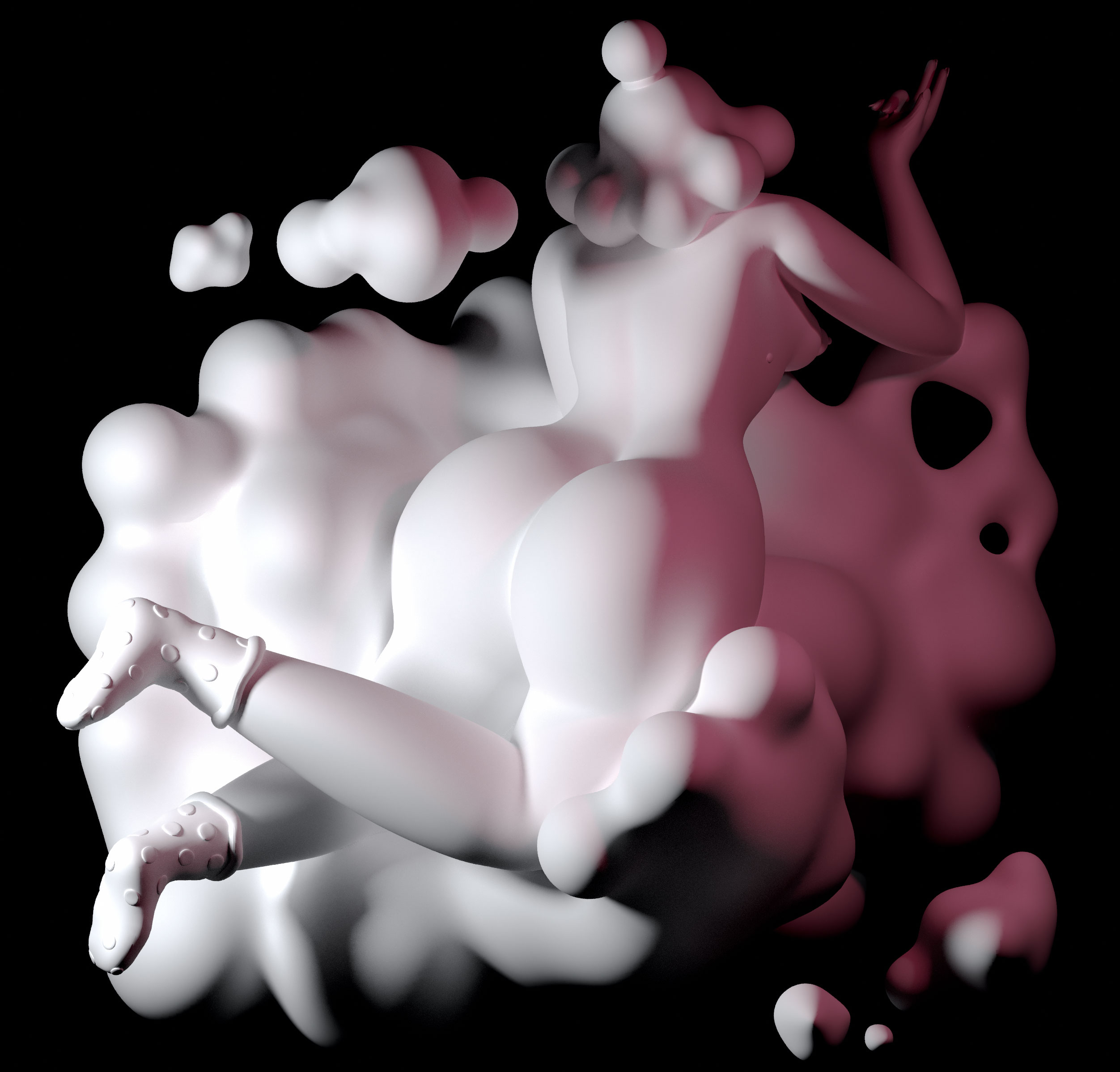
Before rendering a model, use the polygroup function of ZBrush because it enables grouping every element together, which will then be assigned with the same material. I grouped together all the parts that were going to be red, then nails, hair and the mole for the black group, and so on. I then merged all subtools and exported the file.
The program I normally use for rendering is Corona for Cinema 4D, mainly for its versatility for both photorealistic renders and more cartoonish ones. I check that I have selected Corona as the rendering engine, set Full Denoise at 0.7, activate the Global Illumination effect and then set the height, width and resolution. It is then time to import the mesh and start setting the scene, placing a Corona Camera in the relevant view for the render and creating or loading materials.
06. Think about lighting
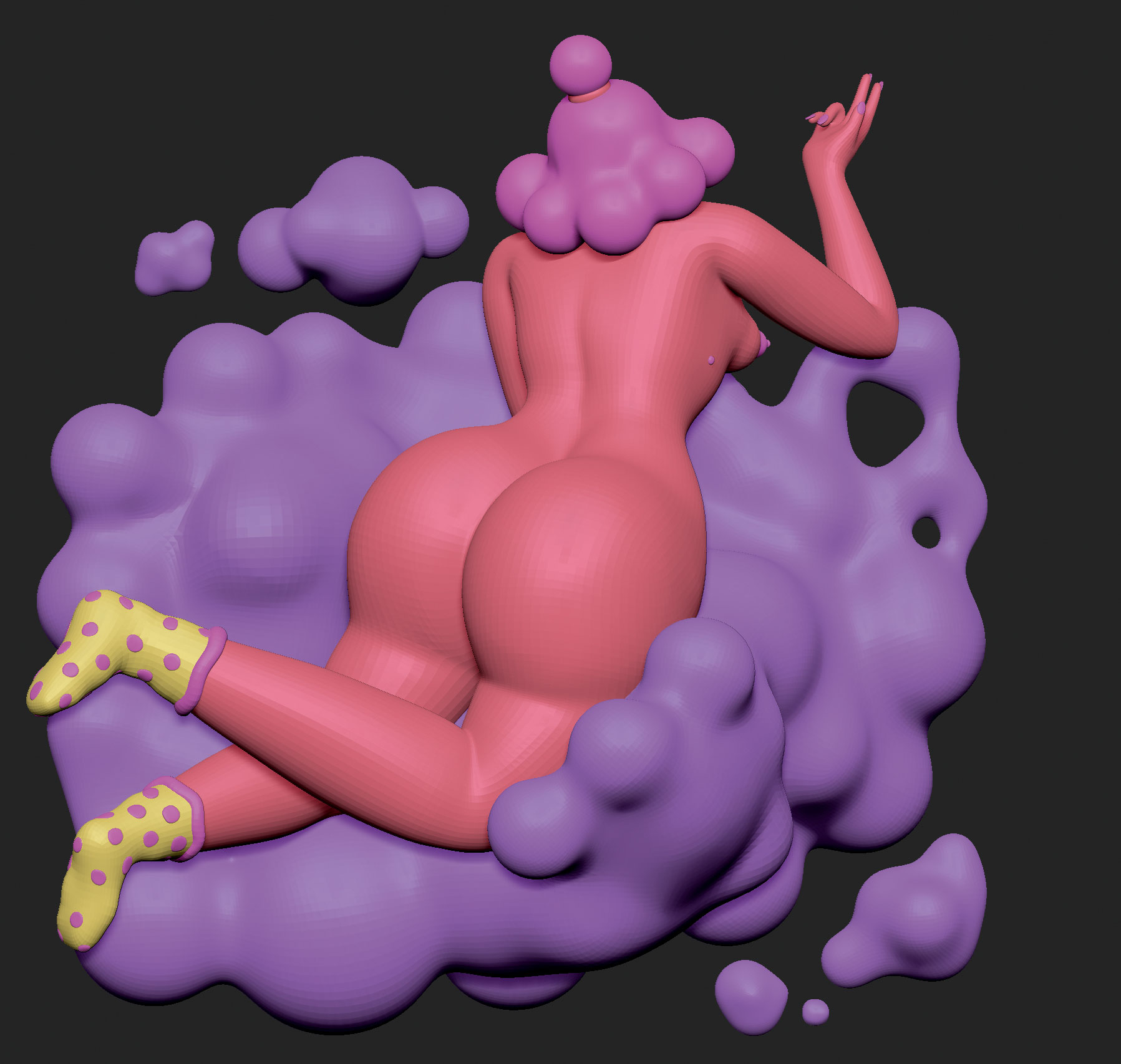
The shiny look on the skin was incredibly easy to achieve: I created a new Corona material, selected the Diffuse colour and checked the Reflection box. What makes a render so magical is the lighting. One thing to remember is not to place too many lights. It’s generally best to not use more than five, although this does depend on the model structure, especially with such reflective material. Before hitting the final render button, it is useful to enable the multi-pass function and activate the ID Pass, because it creates flat colour for each region, based on the previous polygroups. This makes it easy to select each region with the Magic Wand tool in Photoshop.
For this project I used this technique to adjust the redness of the body, which was initially too bright, without altering the red component in the other parts of the image. To get the two images, I started the render by clicking on Render to Picture Viewer and while the engine was working, I started post-producing on the Corona VFB window.
When the render was done, in the same window, I selected the Stop button so the program 'de-noised' the scene and lastly I saved both files as PNGs. At this point I had two images ready to be loaded in Photoshop for the final adjustments, such as exposure, contrast and tonal values.
This article was originally published in issue 281 of Computer Arts, the world's leading graphic design magazine. Buy issue 281 or subscribe here.
Read more:

Thank you for reading 5 articles this month* Join now for unlimited access
Enjoy your first month for just £1 / $1 / €1
*Read 5 free articles per month without a subscription

Join now for unlimited access
Try first month for just £1 / $1 / €1
