The ultimate guide to compositing images in Photoshop
Master the art of convincing Photoshop composites with this comprehensive guide.

Of all Photoshop projects, compositing images into one fantastic frame is perhaps the most enjoyable and creative pursuit. In this Photoshop tutorial we’ll show you how to shoot, build and finish off convincing Photoshop composites like the image above.
We’ve broken it down into five different stages: selections, refinement, masks, compositing and finishing touches. At each stage you’ll find in-depth advice on the tools and setting used. We’ve created a shaggy, McEnroe-inspired underdog, but you can use a similar workflow to make all kinds of amazing composites – go wherever your imagination takes you!
Download the project files here on your PC or Mac.
01. Selections
The first step towards making a montage is to cut out the parts you'd like to combine. This is where your selection skills come to the fore. By using Photoshop’s powerful array of selection tools, we can isolate parts of our images. Here's how...
Magic Wand
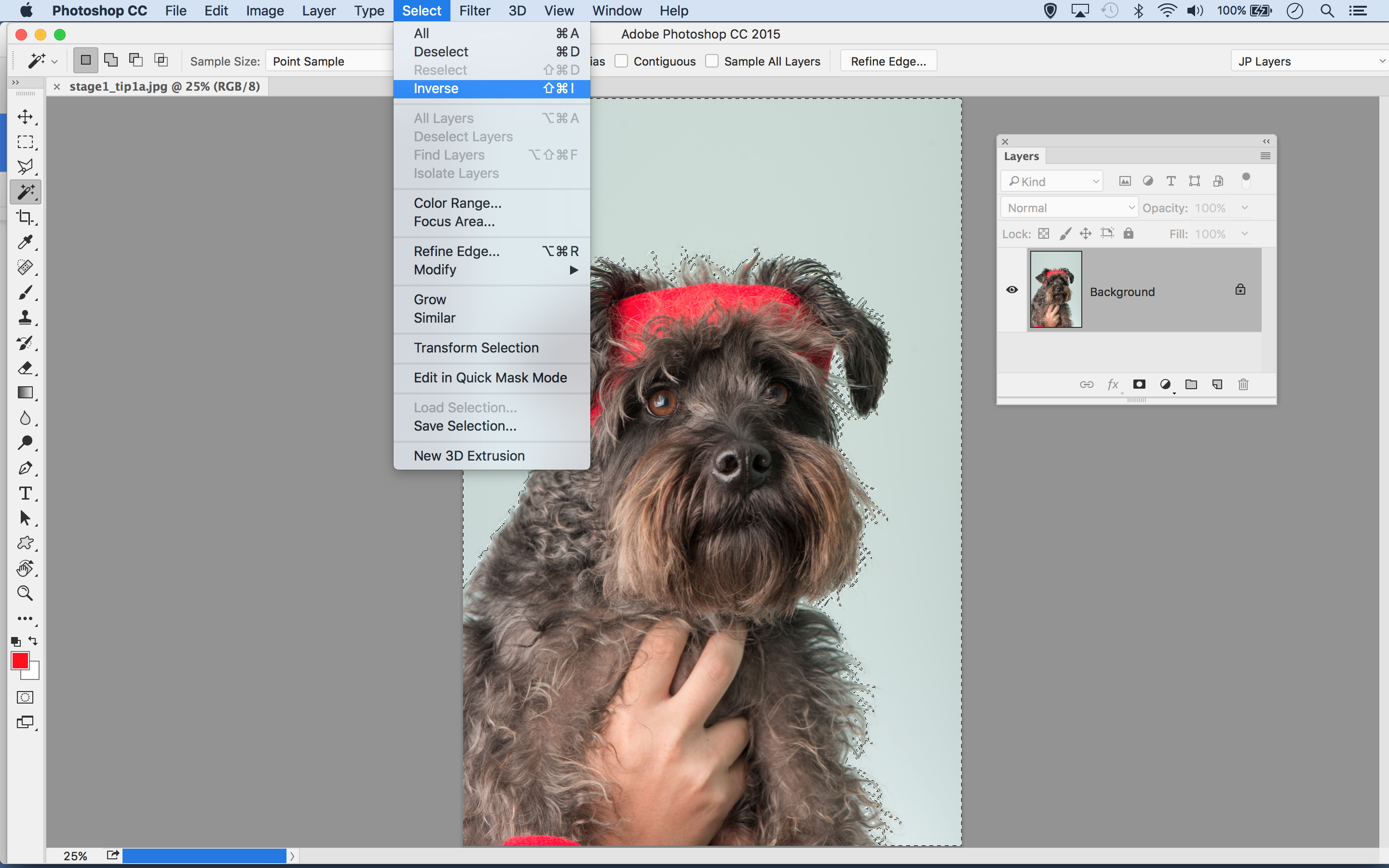
This dog hair would be a nightmare to select manually, but a couple of clicks with the Magic Wand picks up the background in seconds. Uncheck Contiguous and hold Shift while clicking to add to the initial selection, then invert it (Select > Inverse) to select the subject instead. For greater control, try isolating the background with Color Range (Select > Color Range).
Quick Selection Tool
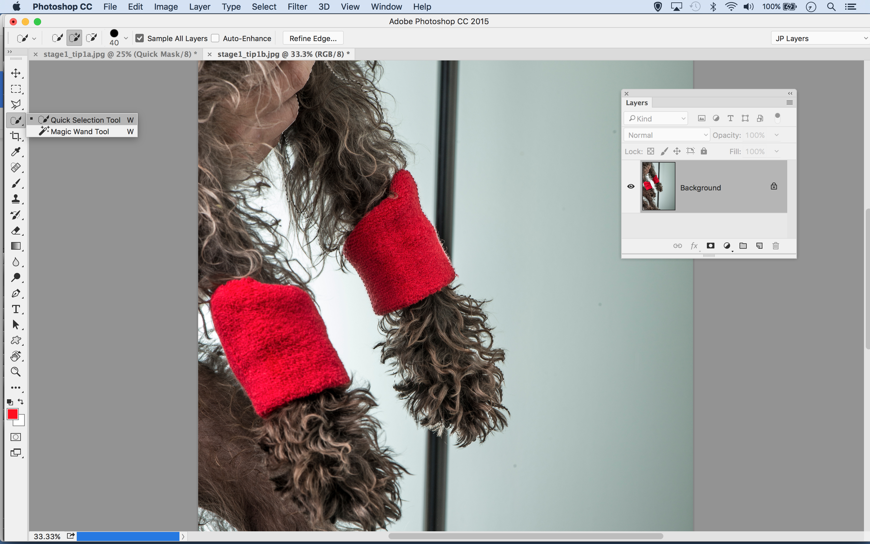
The Quick Selection Tool excels at isolating complicated objects – in fact, it’s our go‑to tool for most selections when making composites. Paint over an object and the tool will seek out the edges. If it goes wrong, hold Alt and paint to subtract. As you add and subtract, the tool learns more about the colours you want to target and performs with greater accuracy.
Get the Creative Bloq Newsletter
Daily design news, reviews, how-tos and more, as picked by the editors.
Quick Mask
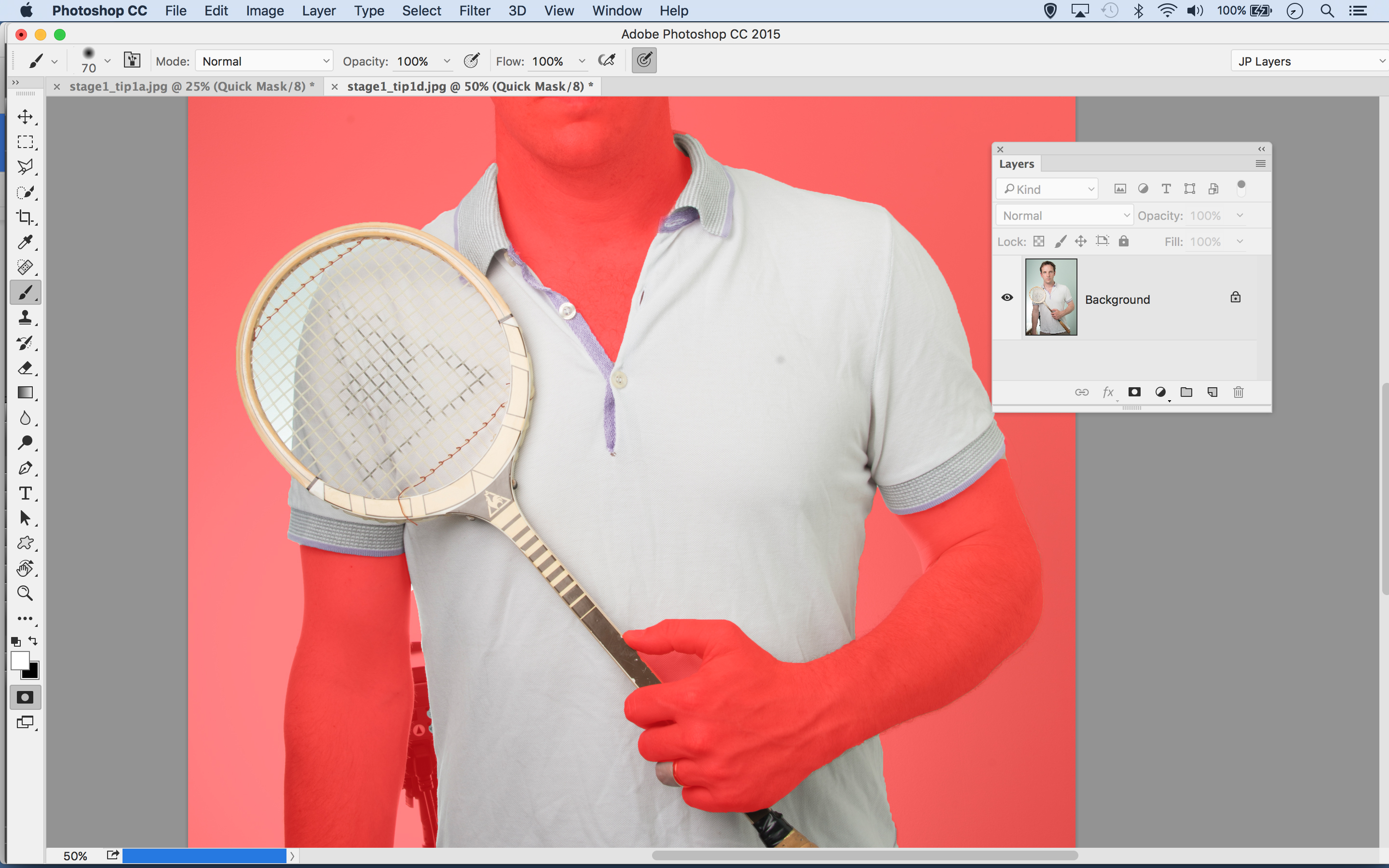
After making a selection, here’s a useful feature that lets you remove or add extra components to adjust the selection. Press Q to toggle Quick Mask mode on or off. It puts a pink overlay over unselected parts. Now you can paint with the Brush Tool set to white or black to add or subtract parts of the image from the selection, or paint grey to add areas of semi-transparency.
Pen Tool Selections
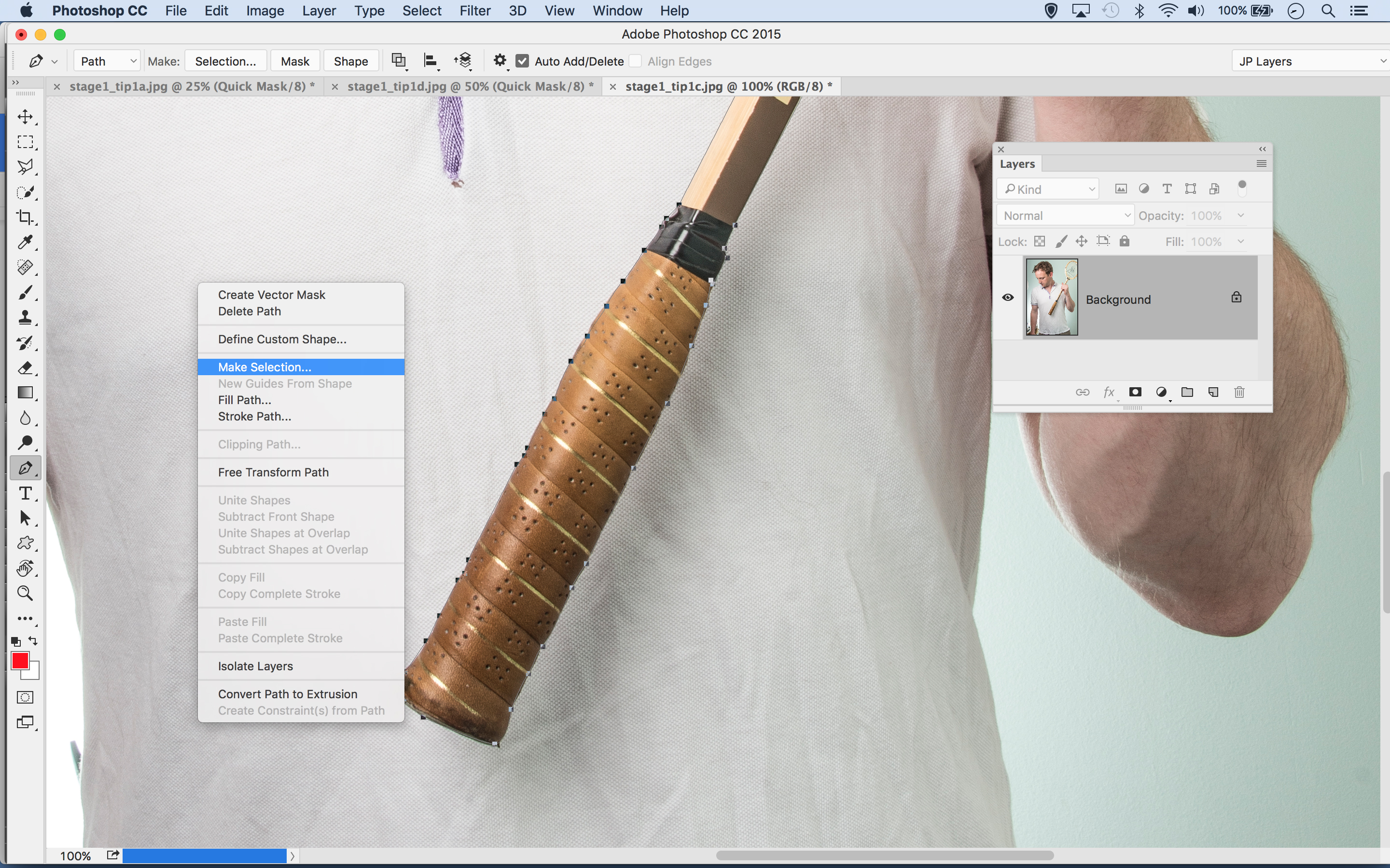
Clever selection tools like Quick Selection, Color Range and Focus Area are great timesavers, but sometimes a manual selection is the only way to get the job done. It’s especially useful with clean, hard-edged objects like the racket handle here. Click to add anchor points, and drag for curved lines. Once complete, right-click the path and choose Make Selection.
02. Refine Edge
After using selection tools to isolate part of an image, the next stage is to improve the selection to make it as perfect as possible. There’s only one tool for the job here: the Refine Edge command. As you’ll see, it houses several useful features in one…
Open Refine Edge
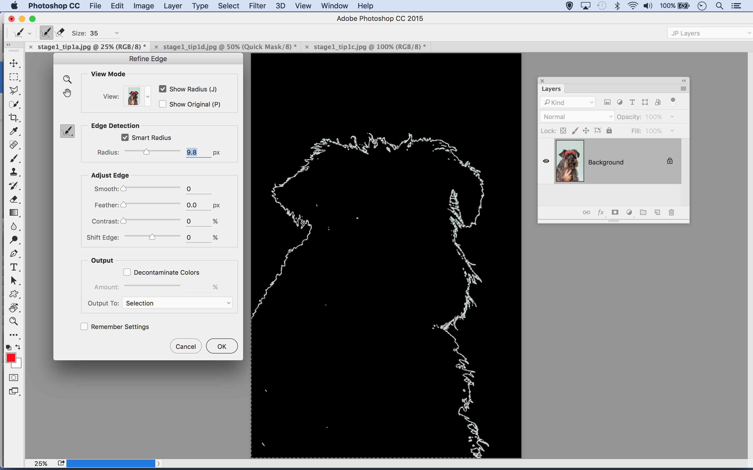
To enter Refine Edge, either click the button in the options bar when any selection tool is being used, or alternatively go to Select > Refine Edge. Begin by checking Smart Radius, then increase the Radius slightly. Check Show Radius to view exactly what is included in the area of refinement.
Expand the radius
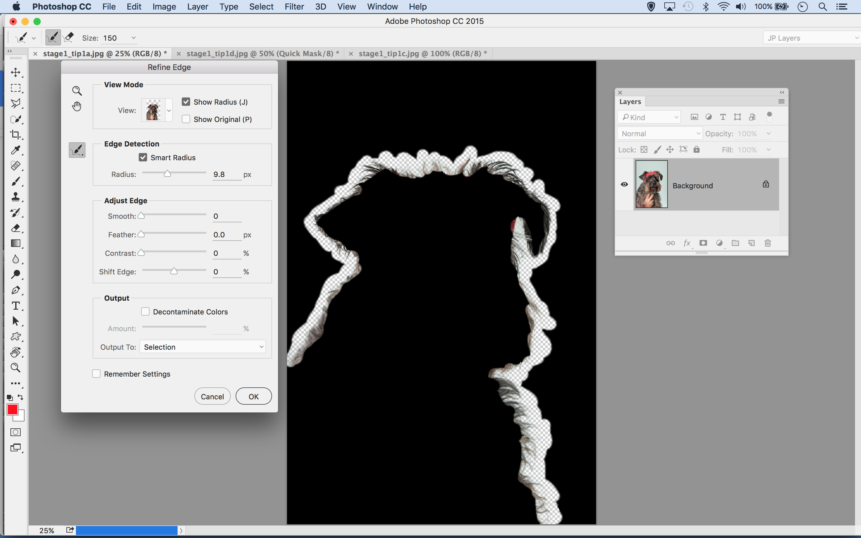
The key to picking up all the fine detail in the fur here is to paint over the area with the Refine Radius Tool. This expands the area along the selection edge in which the command will seek out similar pixels, so it allows you to grab all that extra background hiding in-between the hairs.
Fine-Tune Contrast
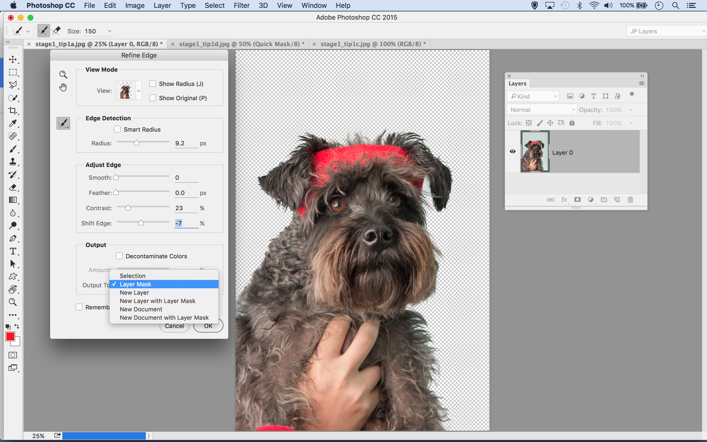
Press F to cycle through different views, assessing your work against different backgrounds. Sometimes adding a touch of Contrast and negative Shift Edge can tighten the edge around complicated hairs and fuzzy details. Once done, set Output to Layer Mask and click OK.
03. Layer Masks
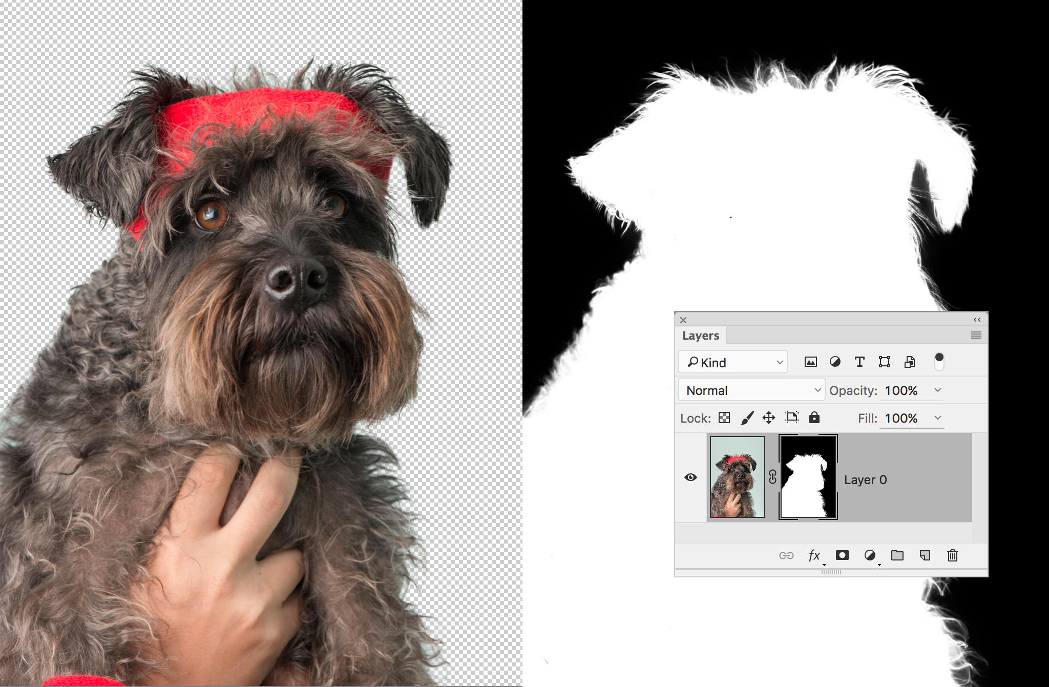
Once the selection is as perfect as you can make it, the next step is to change it into a Layer Mask. This way, you control exactly what’s visible or hidden. It might be that, if the selection is good enough to begin with, you needn’t do anything to the mask at all. But if needs be, you can go in and fine-tune what’s revealed or not...
What is a layer mask?
A layer mask is simply a function that lets you hide portions of a layer, thereby revealing the content of the layers below. As such, masks are hugely useful for making composites: they mean you can piece together different objects without having to resort to destructive tools like the Eraser.
How do I make one?
Click the Add Mask icon in the Layers Panel, then simply start painting with the Brush Tool set to black to hide parts of a layer. If you’ve already made a selection from part of the layer, click the mask icon to convert the selection to a mask. Alternatively, go through Refine Edge and set Output to Layer Mask.
Which thumbnail?
When you add a mask, a little mask thumbnail appears in the Layers Panel next to the thumbnail that shows the layer contents. The key is to keep track of what is highlighted: if the layer thumbnail is highlighted rather than the mask, painting black will simply add black pixels onto the image.
04. Begin Compositing
Now you’ve managed to cut out all the separate elements that will go into your montage, it’s time to bring them together. This can be kind of like fitting together a jigsaw puzzle. It’s where your skills at transforming and positioning come to the fore.
The Move Tool
The Move Tool is essential for positioning and transforming different shapes into a composite. Grab the tool and check Auto-Select Layer in the tool options at the top, so that you can highlight layers by clicking over an image belonging to that layer. Check Show Transform Controls too for a bounding box that gives you quick access to transforming options.
Combining Images
There are a few ways to copy different images into one document. We like to drag them across image windows with the Move Tool (or up to one tab then down into another). Alternatively, right-click a layer, choose Duplicate and select a different image in the Destination drop-down. Other options are to use File > Place Embedded, or simply to copy and paste.
Transforming Layers
As you position all the different parts, you’ll need to use Transform to rotate, resize and sometimes warp layers. Hit Cmd/Ctrl+T or (if enabled) click the bounding box to transform a layer. You can right-click while transforming for all the different options like Warp and Skew. While resizing, hold down Shift to keep the original image proportions, or hold down Alt to resize from the centre point.
Smart Objects
Resizing a pixel layer to make it smaller will actually delete some of the pixels from that element – which is fine if you want to keep it smaller, but not so good if you change your mind and want to make it bigger again. To safeguard this, you can right-click the layer and choose Convert to Smart Object. Now you can transform an element as much as you like without a loss in quality, and also use filters non-destructively.
05. Build the base
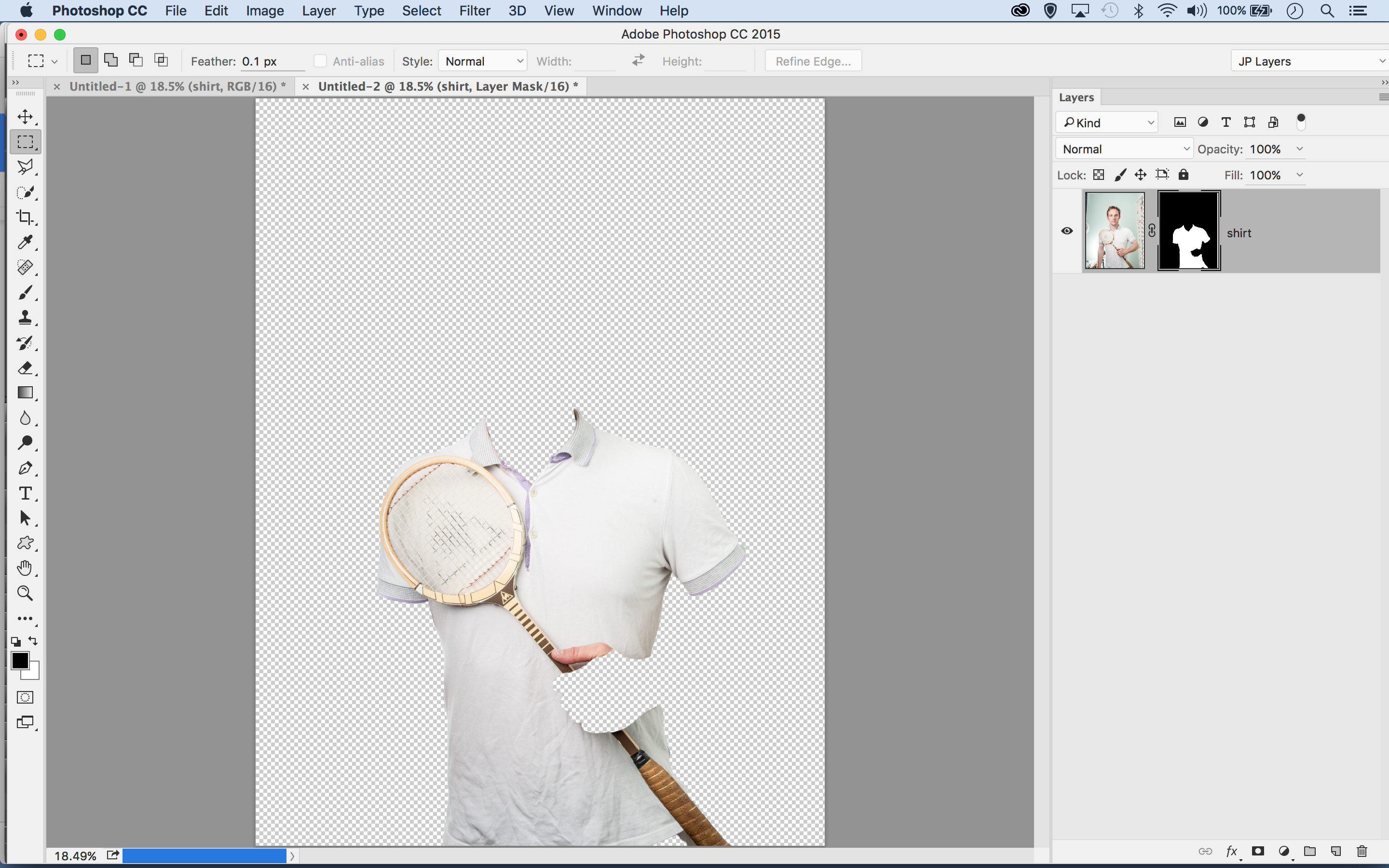
First go to the shirt image: this’ll be the base for all the other effects as you bring in different dog body parts.
06. Enlarge and arrange
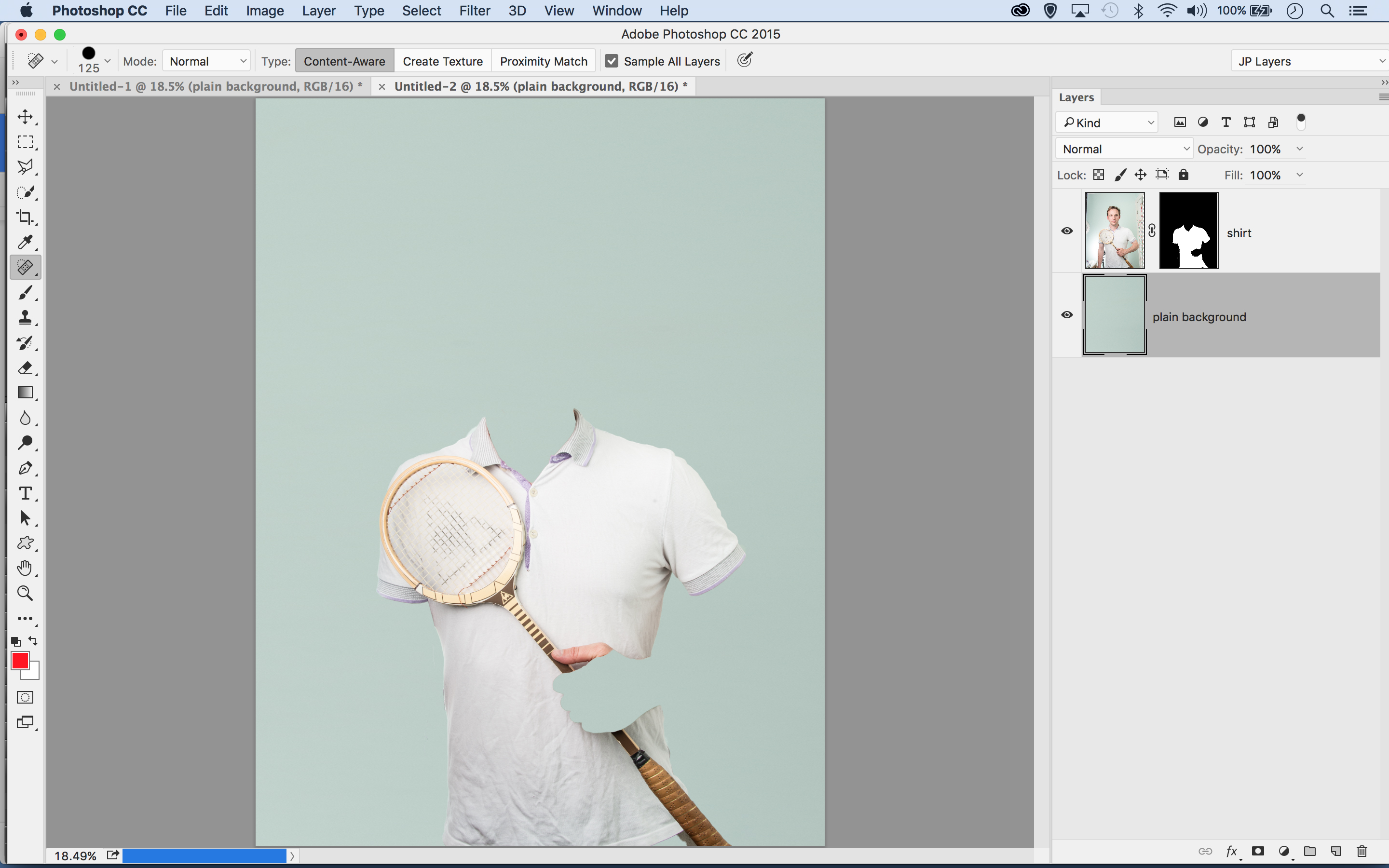
Next you can select a portion of the wall and copy it to a new layer. Enlarge it, then drag it to the bottom.
07. Drag and transform
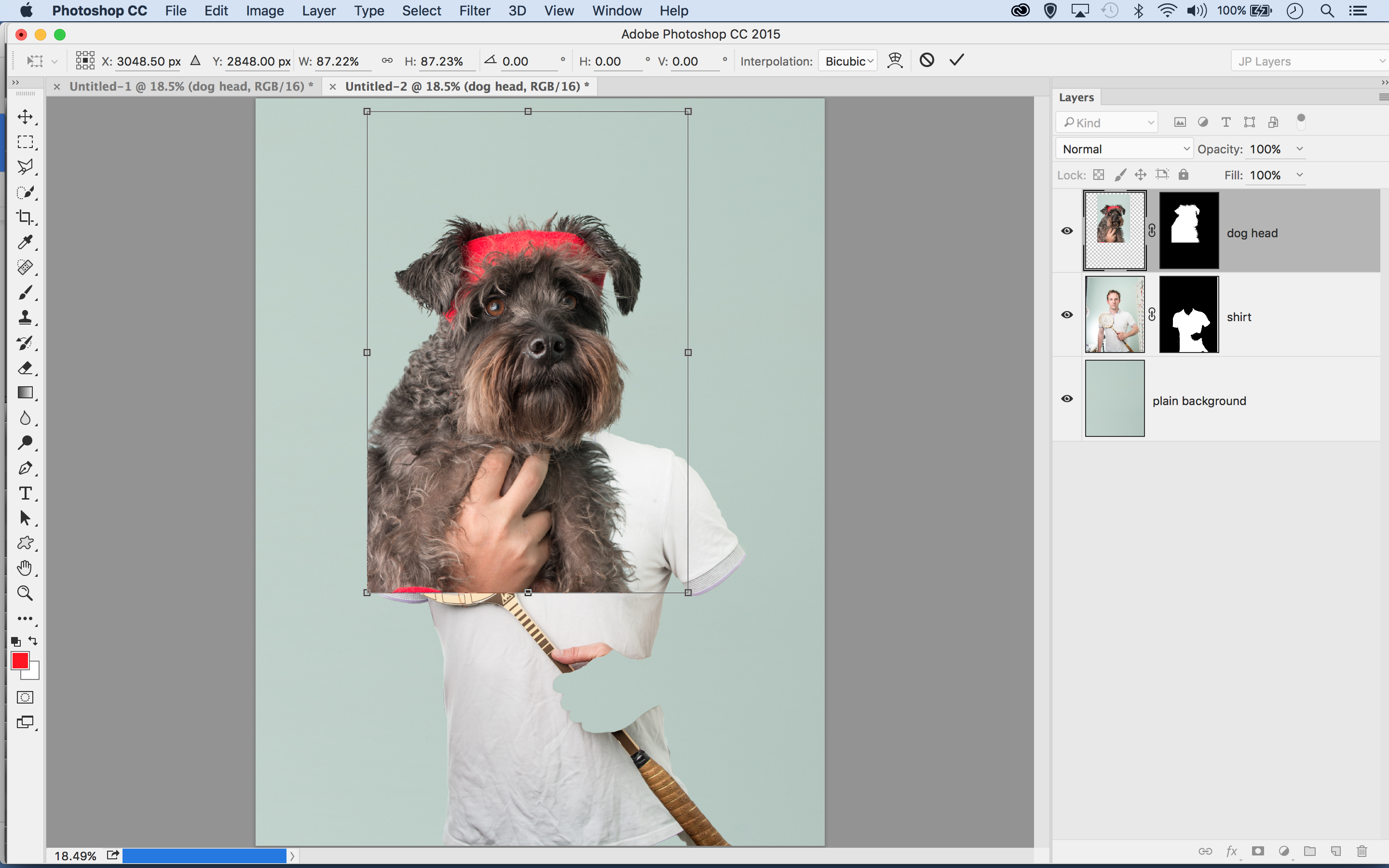
Now bring in the cutout dog head by dragging it across with the Move Tool, then transform it into place by the collar.
08. Paint to hide
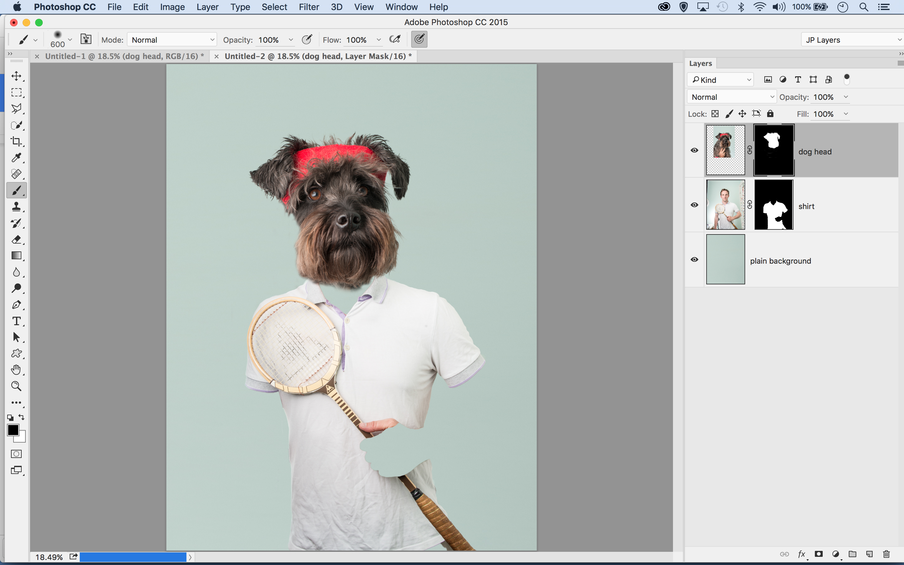
Highlight the mask thumbnail. Paint black to hide the parts of the dog you don’t want, revealing the shirt.
09. Finishing the head
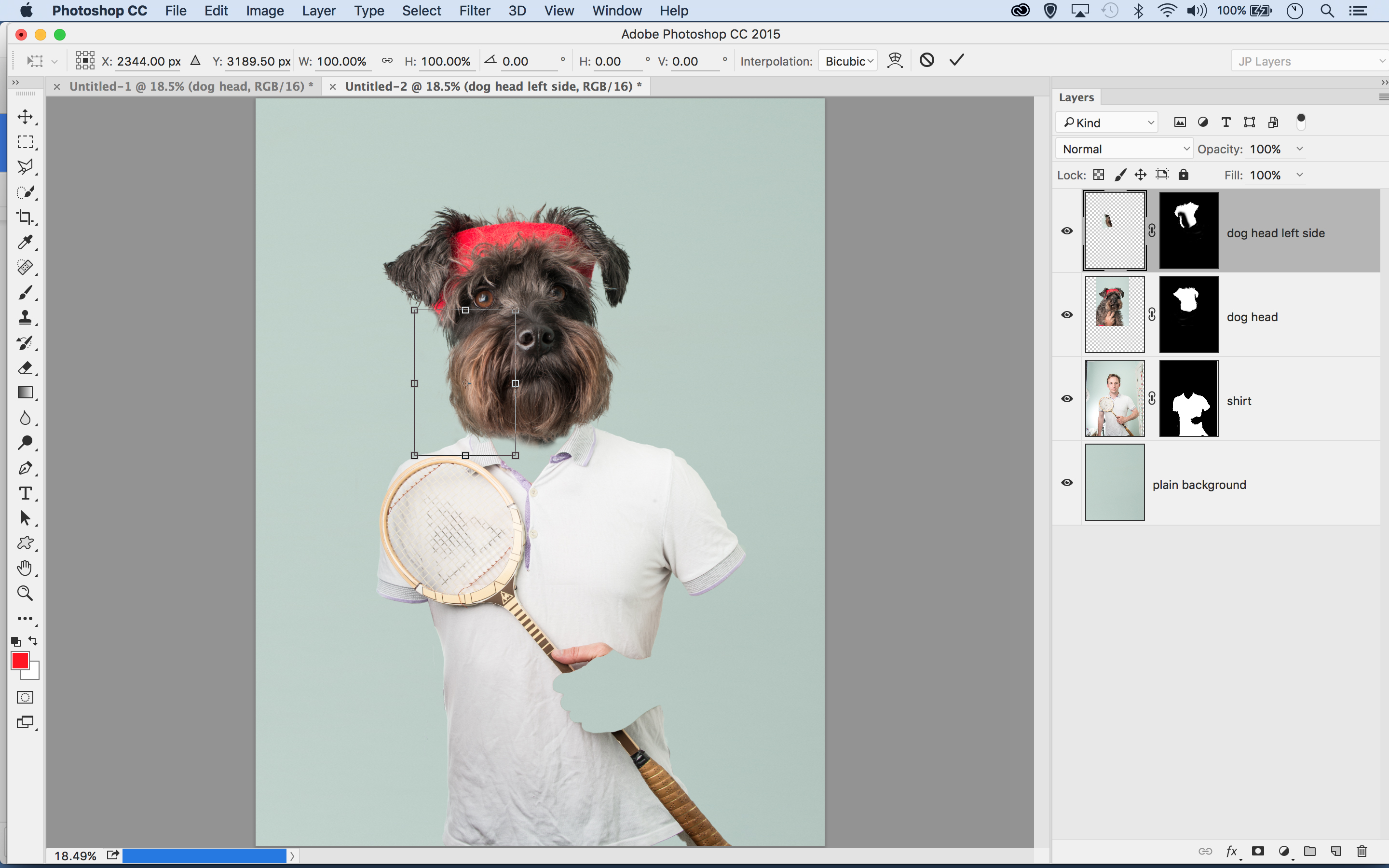
The left of the head is tricky, as the dog’s body makes it hard to cut out. Copy over a portion of the right side.
10. Creating the neck
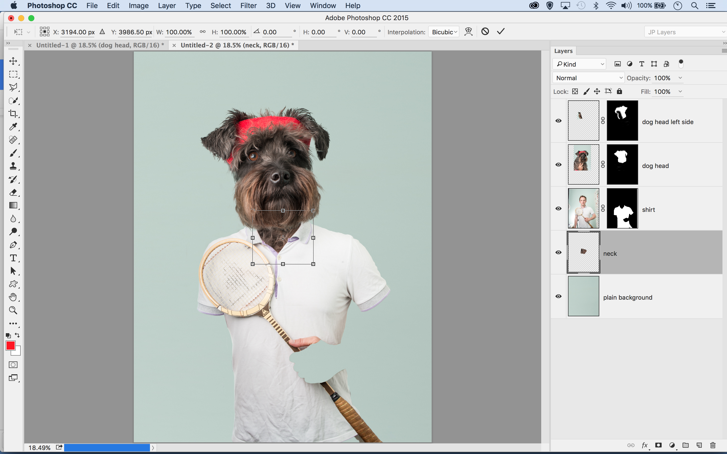
Next, fill in the space around the neck area. Select a piece of dog fur from a shot, drag it in and place below the shirt layer.
11. Position the paw
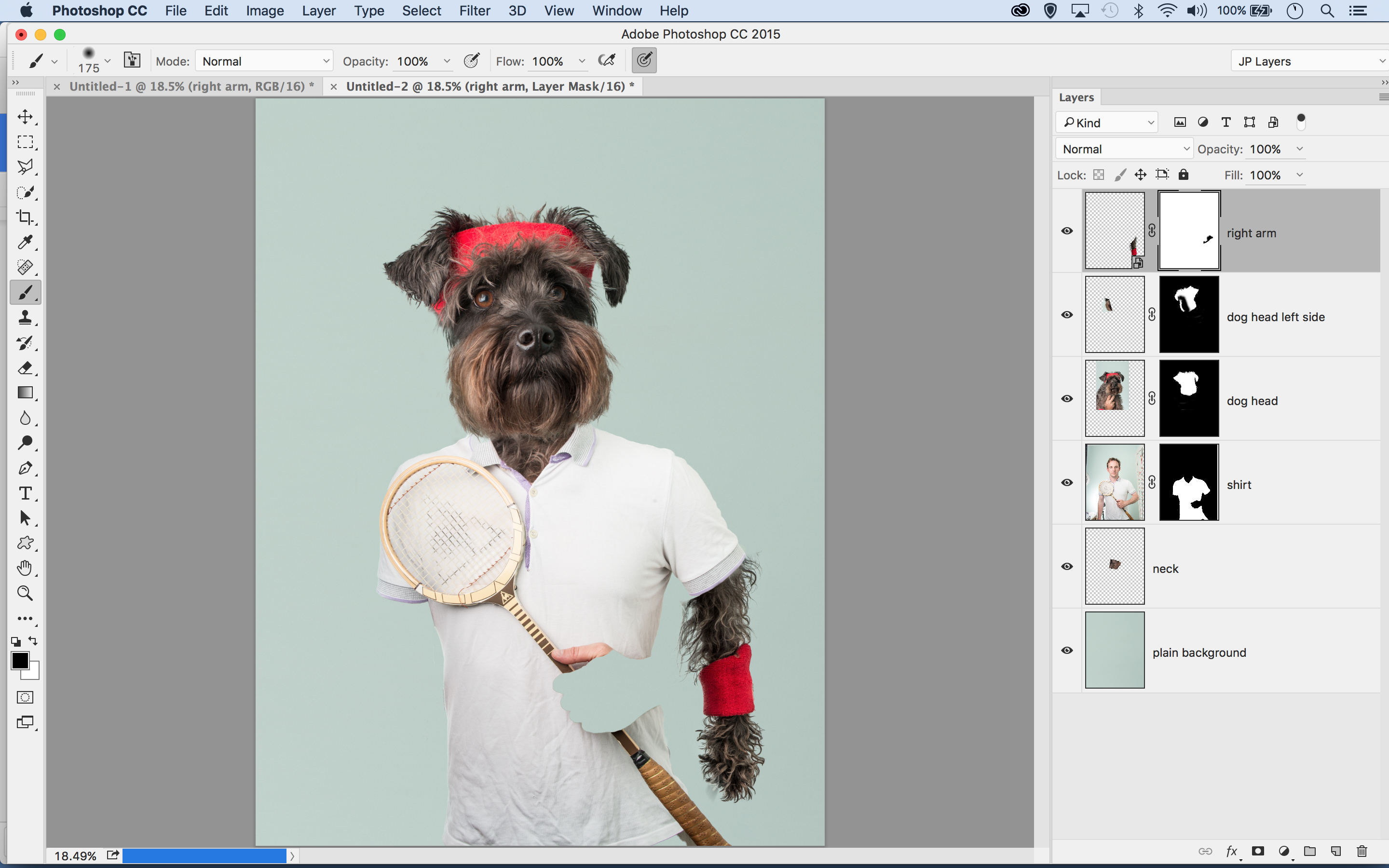
Bring in a paw, position it and convert it to a Smart Object. Add a mask to hide the top so it goes under the shirt.
12. Shape an arm
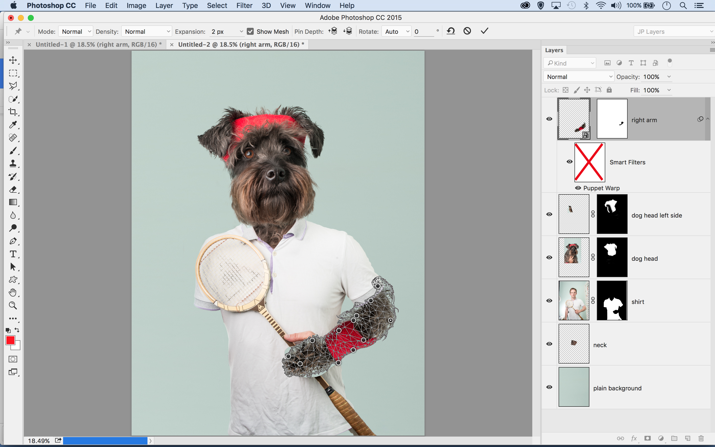
You can use Puppet Warp (Edit > Puppet Warp) to reshape the arm by plotting and dragging pins, creating a bend at the elbow.
13. Create an arm copy
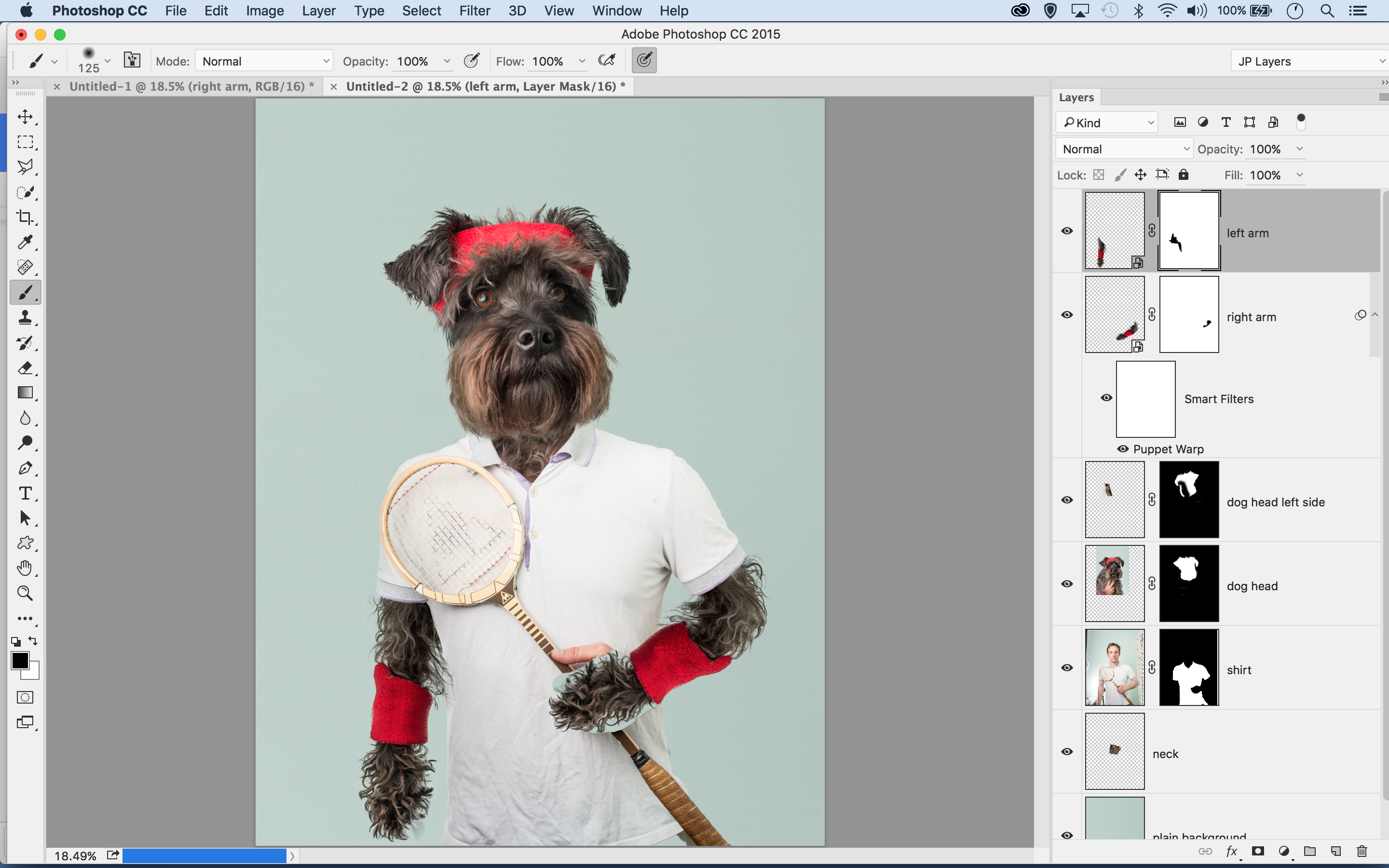
Duplicate the arm layer and discard the Puppet Warp filter you applied, then flip the layer and place it on the other side.
14. Bring in the ball
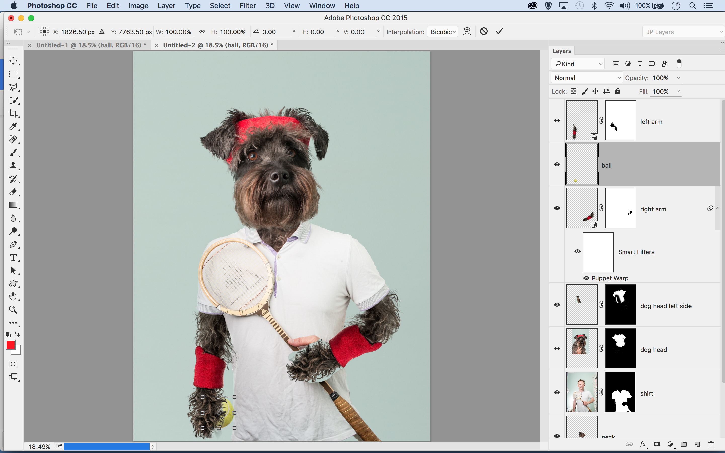
Cut out and bring in the ball, transforming it to resize it. Drag it below the arm layer so it looks like it’s being held.
15. Scaling the racket
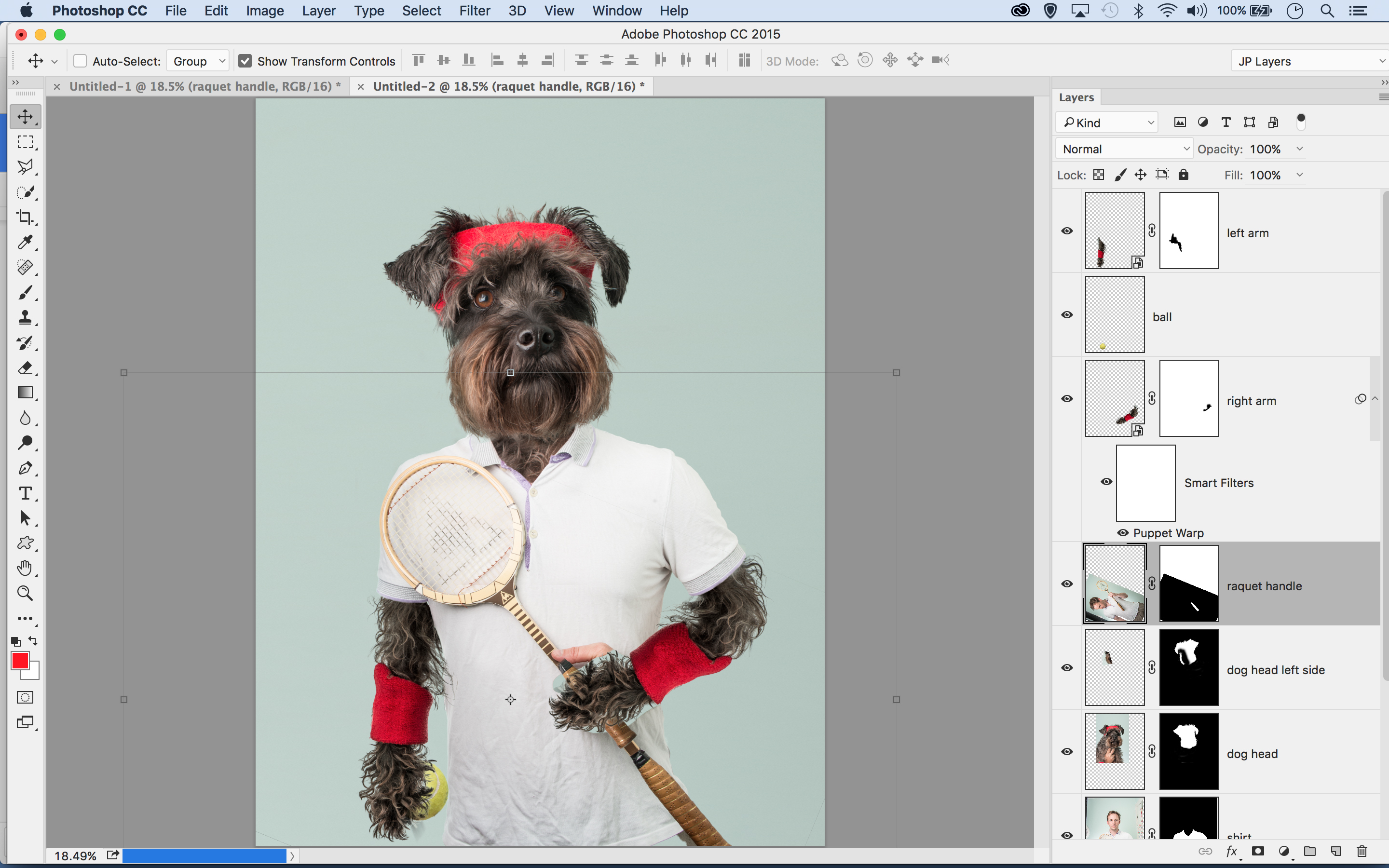
To reduce the racket handle length, bring in another handle. Rotate it to match the angle of the existing one. Drag the layer below the paw layer.
16. Creating a backdrop
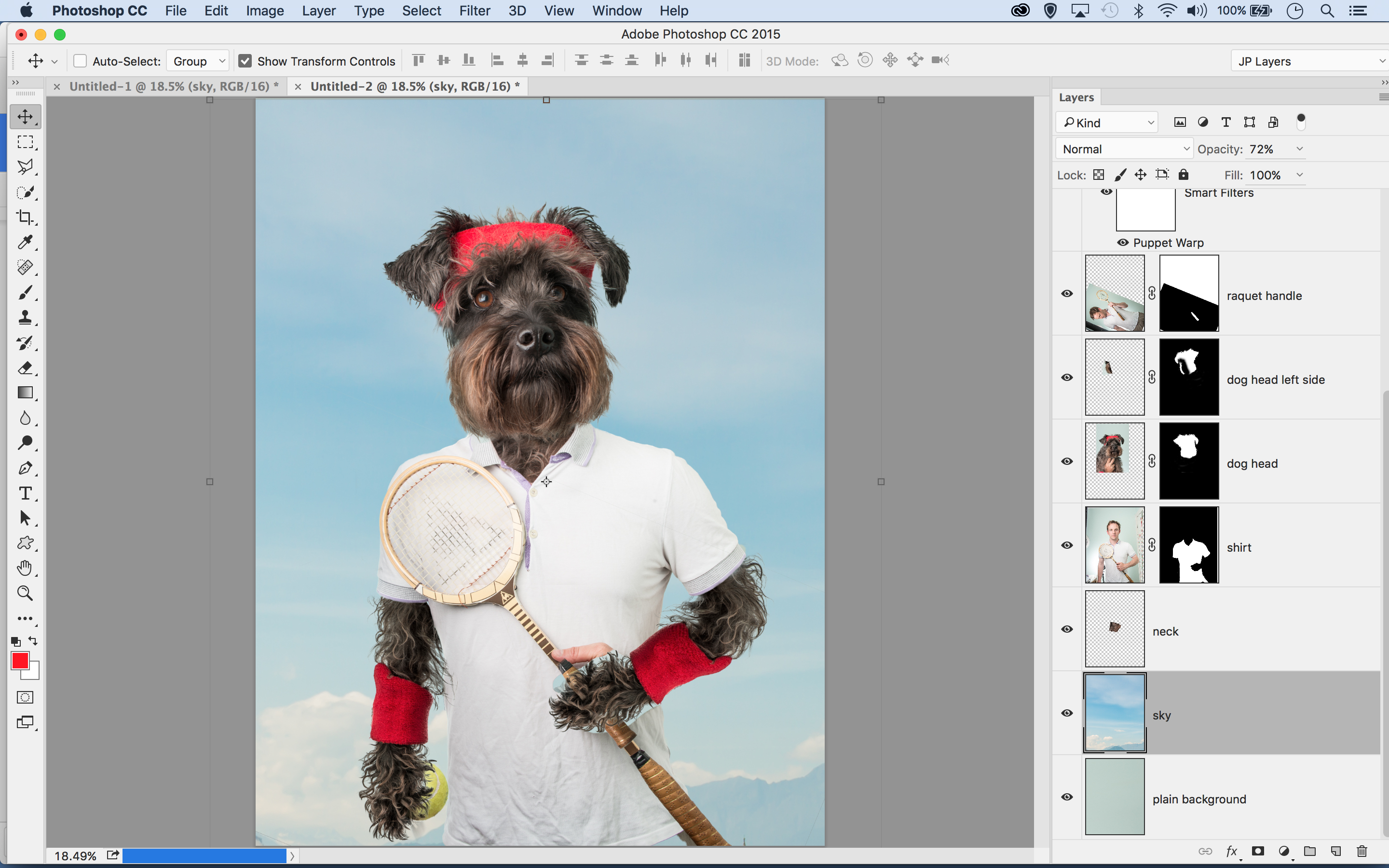
Finally, bring in an image of blue sky, positioning the layer above the plain backdrop and lowering Opacity a little.
17. Finishing touches

Once all the pieces are in place, it helps to make the scene look realistic if you add a few effects on top of everything. Think of all the characteristics of an image – tones, noise, depth of field – and then apply those same features to the composite, and everything will soon gel together…
Cloning Layers
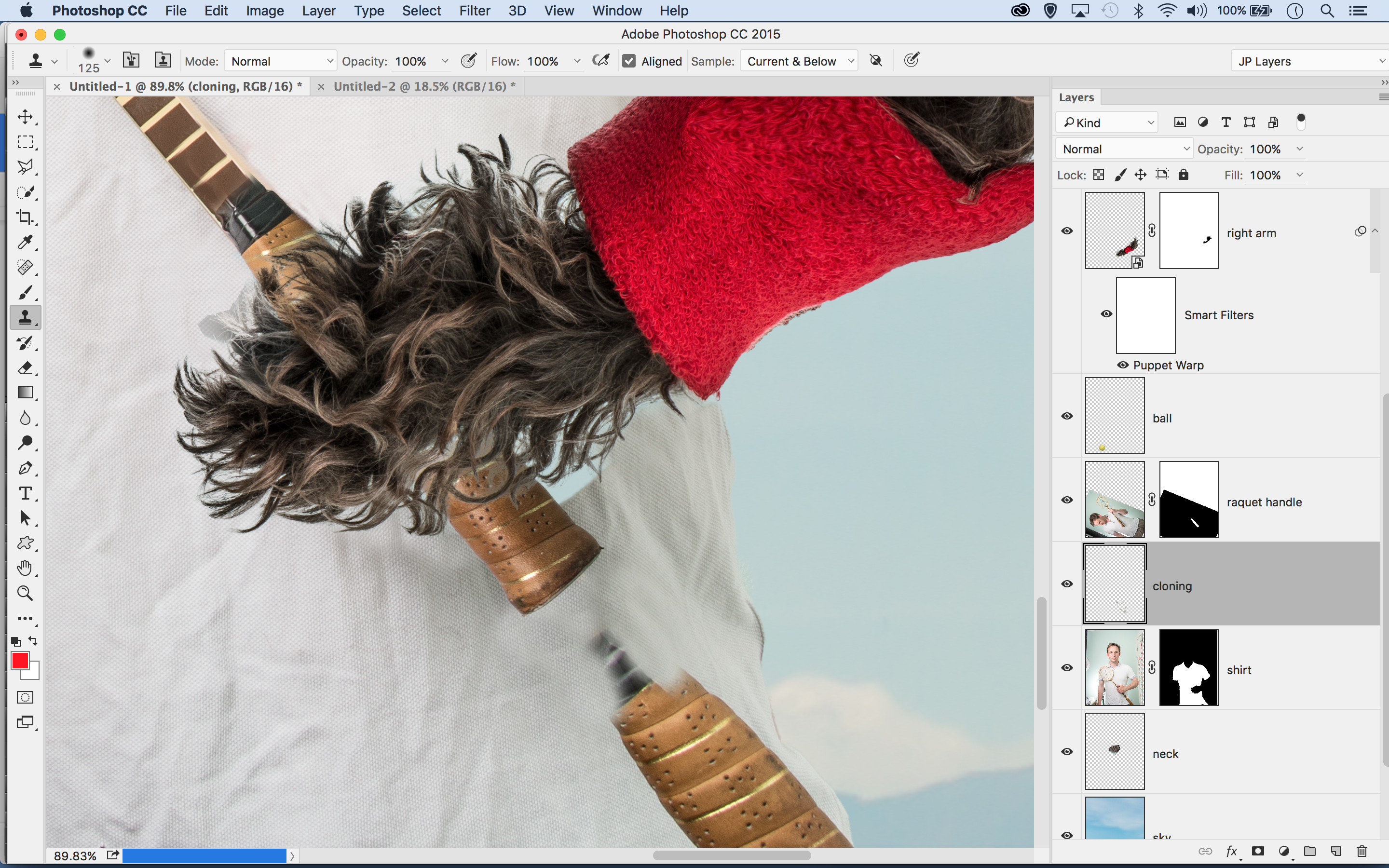
There will inevitably be a few messy patches that need tidying up. Here’s where the Clone Tool comes in. Either set the tool to Sample All Layers and make a new layer at the top of the stack; or add a layer just above the part you want to fix and set the tool to sample Current And Below so it ignores all the layers above it in the stack.
Shadows
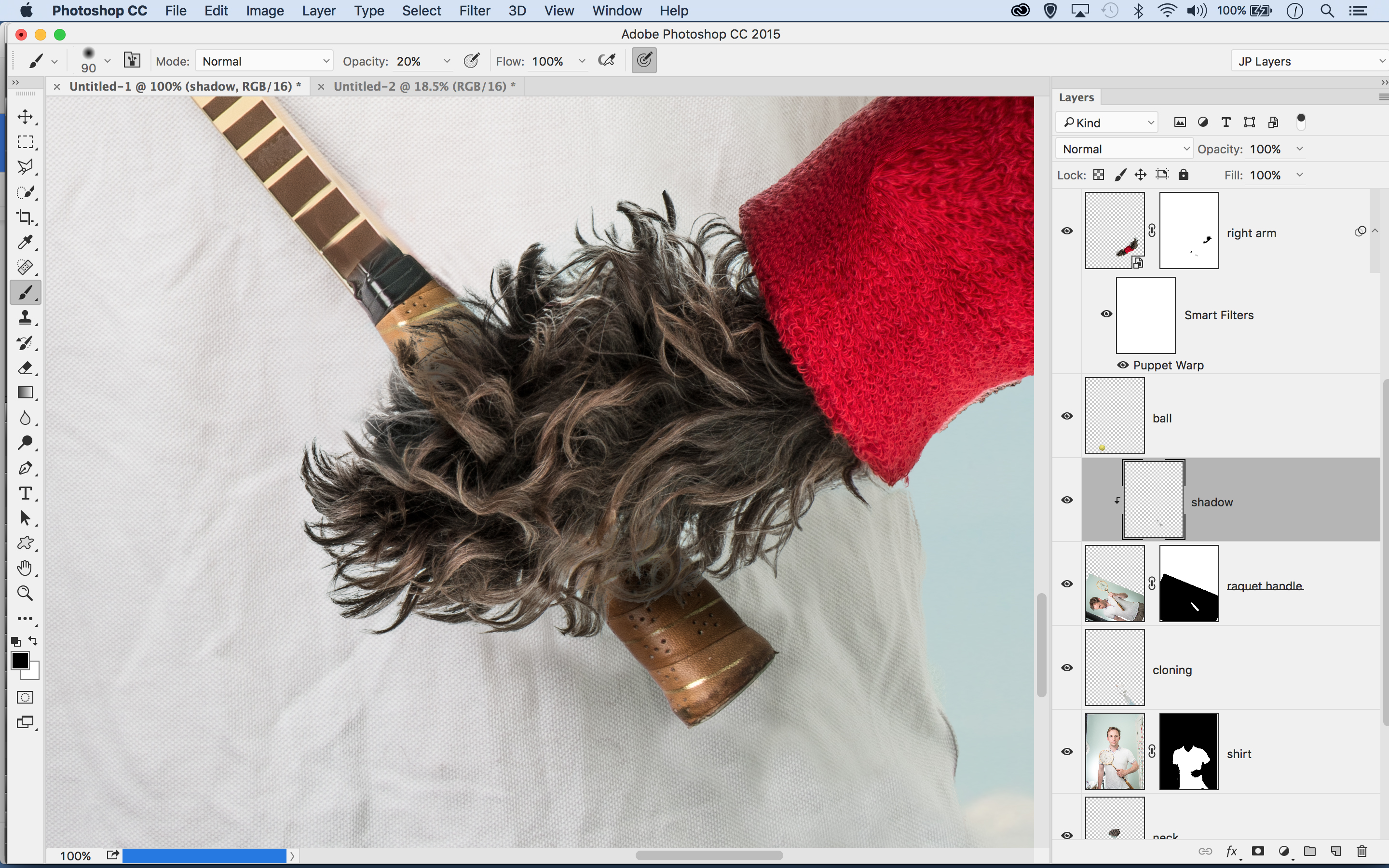
To add shadows, make new layers above the parts of the image you want to affect, then paint with black at a low Opacity. Here we want to add a shadow on the racket handle so it looks as if the dog is holding it. Drag a new layer above the handle layer, then grab the Brush Tool, set it to black at 20% Opacity, and paint over the handle to darken it.
Toning
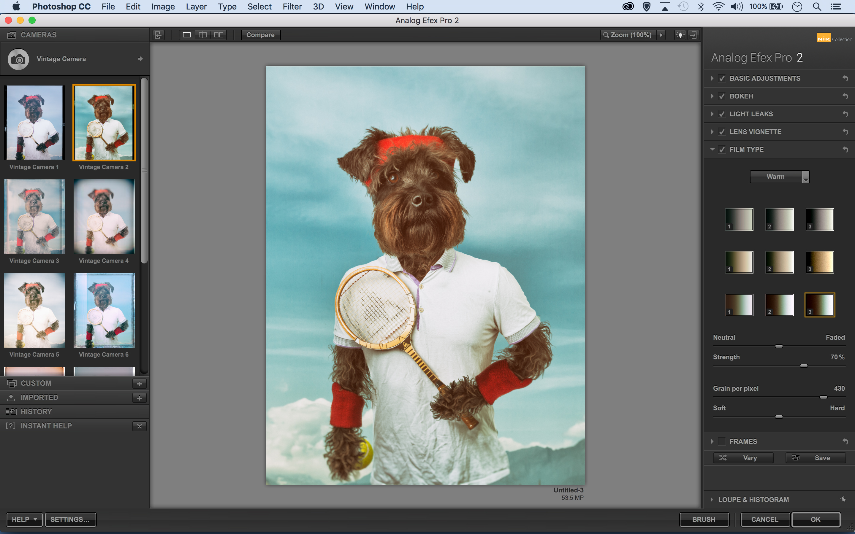
Once all the pieces are in place, add a few effects on top of everything for a united look. You can use any method you like for toning: we like Color Lookup Adjustment Layers, the Camera Raw Filter and the Nik Collection plugins. Here we’ve used Analog Efex Pro from the Nik Collection (now free) to add a vintage effect. First make a merged layer at the top of the stack with Cmd/Ctrl+Shift+Alt+E, then add the effect to the layer.
This article was originally published in Practical Photoshop: subscribe here.
Related articles:

Thank you for reading 5 articles this month* Join now for unlimited access
Enjoy your first month for just £1 / $1 / €1
*Read 5 free articles per month without a subscription

Join now for unlimited access
Try first month for just £1 / $1 / €1

James Paterson is an expert in all aspects of the photographic process, from capture to post-processing. He has contributed to numerous photography publications, including Digital Camera, Amateur Photographer, PhotoPlus and NPhoto, and his work has also appeared in Computer Arts magazine as well as several books. He is the editor of Practical Photoshop magazine, and has a well-deserved reputation as an authority on all things Photoshop-related.
