The anatomy of caricature: 15 top tips
Discover some helpful approaches to anatomy in this exaggerated figure art.
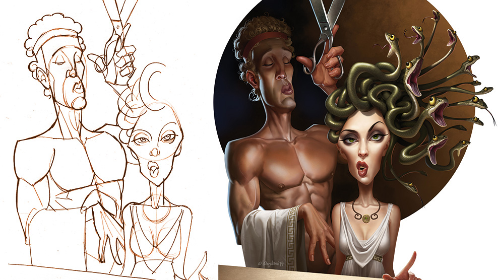
As a full-time freelancer, I'm used to working across a range of styles and drawing techniques. These include cartoon stuff for animation, mascots, children's books, medical-style technical illustrations, portraits, pin-ups, caricatures and book covers – topics that are both serious and silly. One common factor in all of these is an understanding of anatomy, whether it's for a movie poster or a kid's comic. It's even useful for adding humour. After all, it can be handy to know where the funny bone is.
In this workshop we'll take a quick look at knowing and understanding the fundamentals, some useful ways to learn more, applying knowledge for effect and breaking rules after learning them – because who doesn't want to do that? I'll also list a number of books that I've found helpful, possibly mention why I love painting hands so much and maybe even encourage you to pull some funny faces – so don't read this when other people are watching you. All this, plus some general drawing tips and more specific techniques, before leaving you to grab a pencil or stylus and create some work of your own.
Oh, and the funny bone? Despite what you may think, it's actually located between your ears.
01. Know your fundamentals

Whether you want to illustrate cartoony or more realistic character stuff, a good grounding in anatomy is pretty essential if you want to get the most out of what you do. You don't really need to know all the technical names (though it's handy to know that Gluteus Maximus wasn't the name of a Roman emperor), but you will want to know and understand the shapes of the various muscles from different angles, how they relate to each other, and how they act in different poses and actions.
02. Where to learn
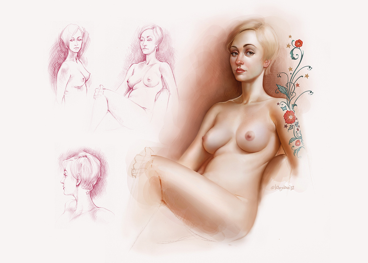
I've learned from books, analysed the works of artists and practised from photos, but actual life drawing should be an essential part of your learning, too. Books will teach you ratios, where the muscles are and how they work, but life drawing will show you that every body is different and help you to sharpen your observational skills. Don't have access to life-drawing classes? Then try something like Croquis Cafe, an online figure-drawing class that's filmed in real time.
03. Proportions and anatomy rules
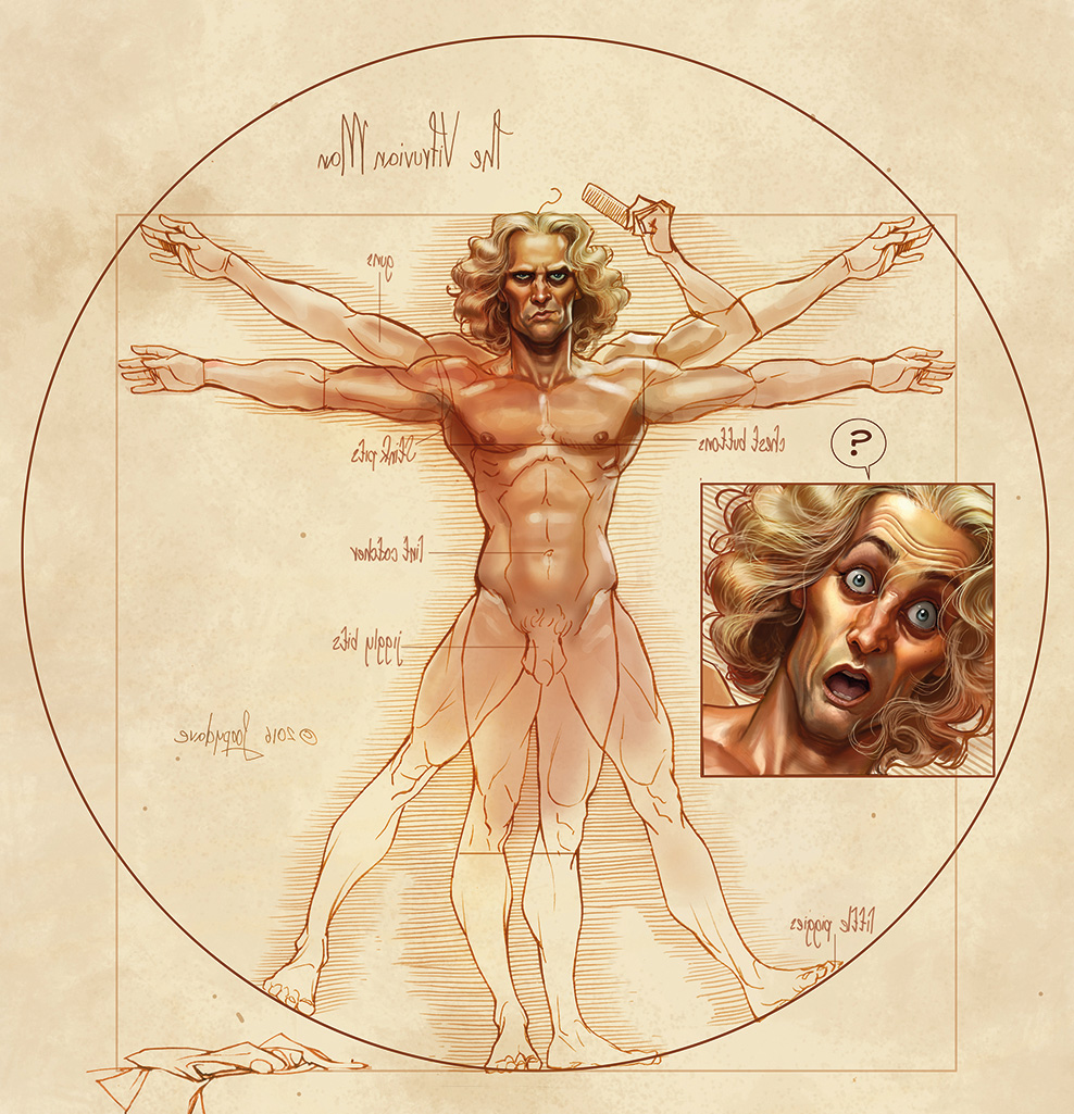
According to Leonardo's notes on his Vitruvian Man, an ideal figure is eight heads high. The common call is that an average person is around seven-and-a-half heads tall, while heroic proportions, such as with superheroes, often look more impressive at eight-and-a-half heads high. Good guides to know, particularly when you're having problems with drawing a figure, but maybe I'm just not an ideal or heroic kind of person, because I like to draw a slightly larger head and make the body more of a six to six-and-a-half head height, to give the image just a hint of caricature.
04. Build a figure from shapes
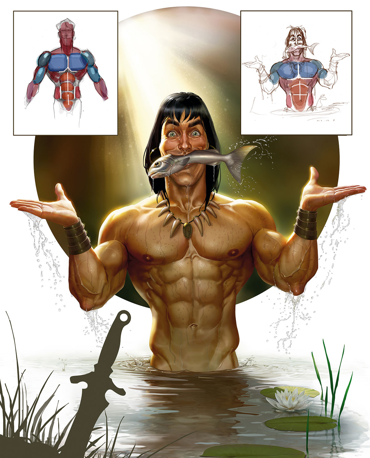
Breaking a figure down into its shapes and building it up from there is a great process to understand, particularly when repeating the same character from another angle. George Bridgman's book The Human Machine is an excellent resource for this approach, as is any of his other books on the topic.
Get the Creative Bloq Newsletter
Daily design news, reviews, how-tos and more, as picked by the editors.
05. Shaping up with shapes
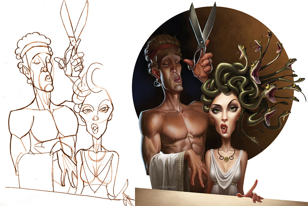
I like to work in a variety of styles, ranging from simple cartoons, to quite realistic. The unifying factor, particularly in terms of anatomy, is my love of shapes. Breaking down a figure into basic pieces and forms can be useful in understanding how things fit together. It's also fun to play with stylistically. If you look past the details here you'll notice that the image is built almost completely out of simple shapes.
06. Give a big hand for hands
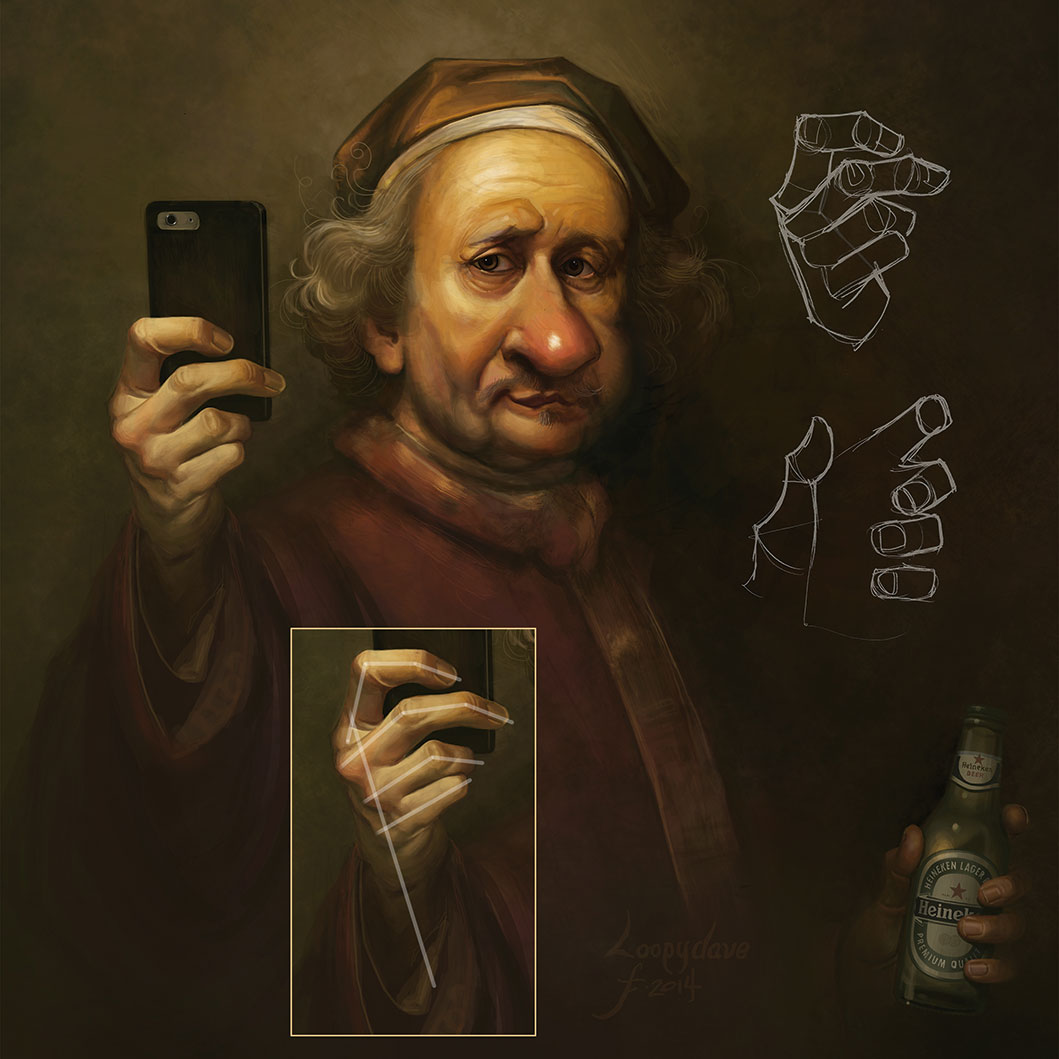
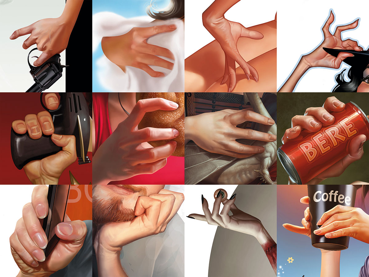
Hands are both difficult and important. They can be just as expressive as a face and, at their very least, should complement the action or pose of the character. You can't fudge your way past them either – people notice. I usually spend nearly as much time painting hands as I do faces. I've found some comic book art useful for learning expressive gestures, instructors like George Bridgman are great for building shapes, while photos and using the mirror for detail and anatomy books are good for understanding structure. My goal is one day to graduate from doing good hands to doing great ones. Rule of thumb: don't get lazy on hands.
07. Fun with faces
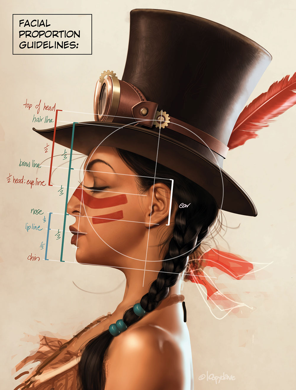
There are handy proportional guidelines for drawing faces, particularly useful when working without reference. Remember that they're guidelines and not rules, though: no two faces are alike and the fun part comes when playing with the ideal. I know I like to raise the eyebrow line higher than is natural for extra expression when I draw, as well as toy with nose length and the mouth-to-chin placement.
08. Exaggeration

A basic understanding of the structure of a figure and how the muscles relate to one another makes it possible to add a level of believability to the ridiculous. In this tribute to the late, great Frank Frazetta, both the message and the anatomy are pretty silly. The perspective is wonky, but hopefully what binds it together is the attention to anatomical detail. That, and an insanely caffeinated sugar drink.
09. Breaking the rules
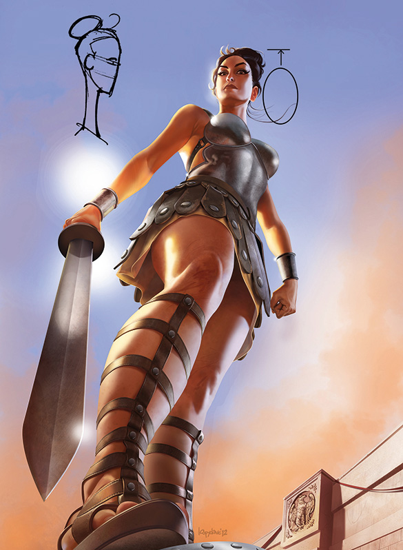
Even when I'm doing more realistic pieces, anatomical knowledge can be just as useful for knowing when to break the rules for effect as for adhering to them. For this Modesty Blaise image, which appeared on the cover of Agent X9 magazine, I deliberately gave her an unnaturally long neck. This gives the viewer a clearer picture of her face (it being the most important clue to the character's identity) and also adds, I think, a little elegance to a strong pose. The problem is, now that I've pointed this out, it's going to bother you… so let's just go back to before you read this and pretend I never said anything!
10. You can never practise enough
As a young, jobbing artist who was desperately keen to boost his skill set, I soon got into the habit of taking a sketch book wherever I went, and drew people on buses, trains and in meetings. I looked through something like a fashion magazine and drew every hand I saw. Then another day I drew every ear I saw, and so on. This way I became familiar with individual bits of anatomy and also how they vary from person to person.
11. Imaginary anatomy
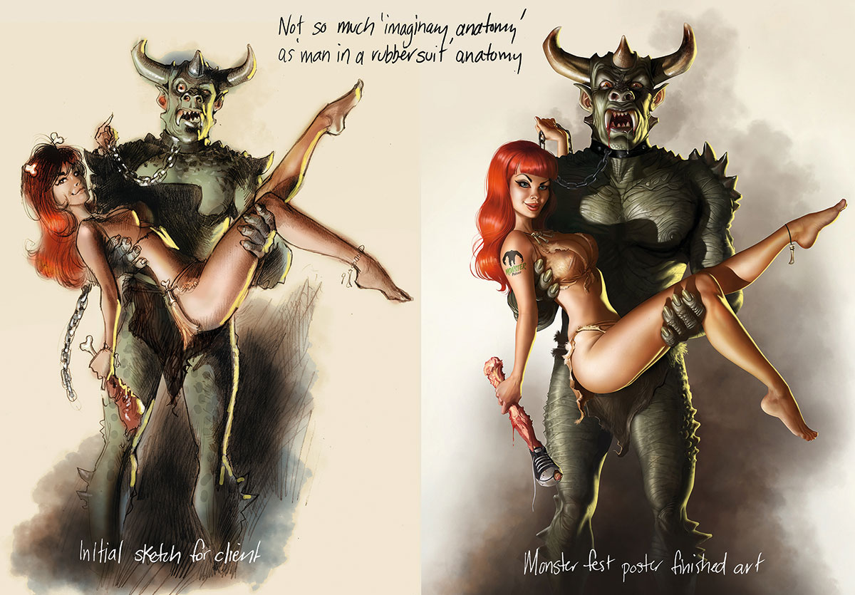
If you understand how anatomy works on something real and living, then you can apply the same principles to creating fictitious creatures and imaginary monsters, giving them more of a sense of believability and a place in the natural world. This isn't a particularly difficult stretch in this Monster Fest poster art, because the imaginary creature here deliberately has a bit of a 'man in a rubber monster suit' look about him, but the principle still applies.
12. Use shapes to depict hair in stages

While technically not part of human anatomy, I approach a character's hair much the same as when drawing up a figure, by breaking it down into basic shapes to create form and placement. After drawing up the shapes I then paint them in as similarly coloured blocks, before breaking them down into smaller parts and finally, painting individual hairs.
13. Anatomical storytelling
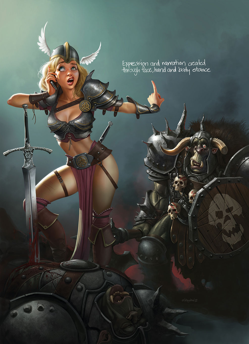
A character's pose and position should all contribute to the story behind the picture. Not only the facial expression or hand gestures, but also the stance and body language. When I was younger, I found artists with strong cartoon sensibilities, such as Uderzo, helpful for learning to tell a story through a simple stance or pose, no matter what style I was working in.
14. Turn faces into caricatures
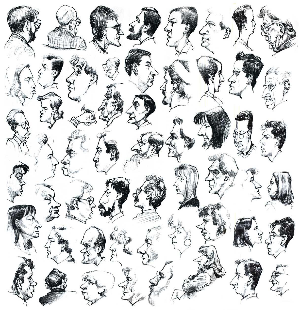
Want to improve your face drawing skills? Along with portrait practice, try doing some caricatures as well. It'll help you learn to pick up the features that define a person quicker, as well as helping you to see things a little differently. Friends and family are usually willing to sit for you, if you promise them chocolate at the end of it.
15. Some useful resources
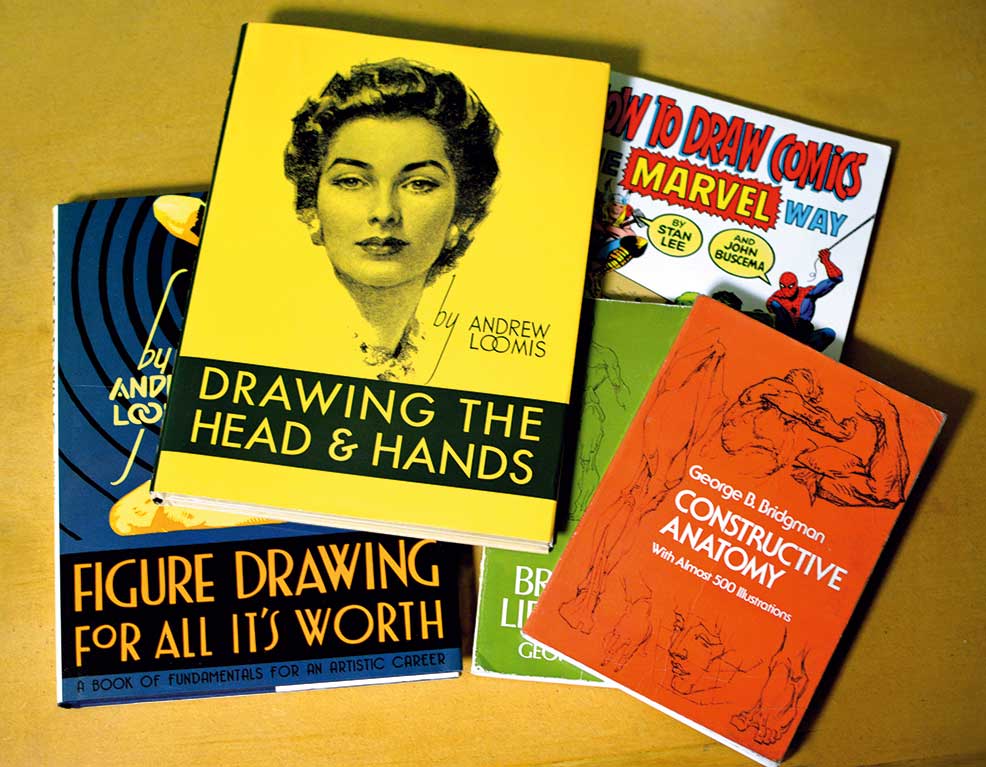
Here's a selection of titles that are well worth adding to your book collection. George Bridgman's Constructive Anatomy and The Human Machine; and Andrew Loomis' Drawing the Head and Hands and Figure Drawing for All It's Worth. Finally, the Stan Lee and John Buscemi book, How to Draw Comics the Marvel Way was useful to me as a kid, too.
Words: Loopydave
Dave Dunstan, also known as Loopydave, is a freelance illustrator who hides out in his darkened studio cave in a secret location somewhere in Australia, surfacing occasionally to restock on peanut butter and caffeine, and to blink at the sun. This article originallty appeared in ImagineFX issue 135; buy it here!

Thank you for reading 5 articles this month* Join now for unlimited access
Enjoy your first month for just £1 / $1 / €1
*Read 5 free articles per month without a subscription

Join now for unlimited access
Try first month for just £1 / $1 / €1

The Creative Bloq team is made up of a group of design fans, and has changed and evolved since Creative Bloq began back in 2012. The current website team consists of eight full-time members of staff: Editor Georgia Coggan, Deputy Editor Rosie Hilder, Ecommerce Editor Beren Neale, Senior News Editor Daniel Piper, Editor, Digital Art and 3D Ian Dean, Tech Reviews Editor Erlingur Einarsson, Ecommerce Writer Beth Nicholls and Staff Writer Natalie Fear, as well as a roster of freelancers from around the world. The ImagineFX magazine team also pitch in, ensuring that content from leading digital art publication ImagineFX is represented on Creative Bloq.
