How to create surreal portrait art
Learn to create surreal portrait art using 3D models, textures and brushes.
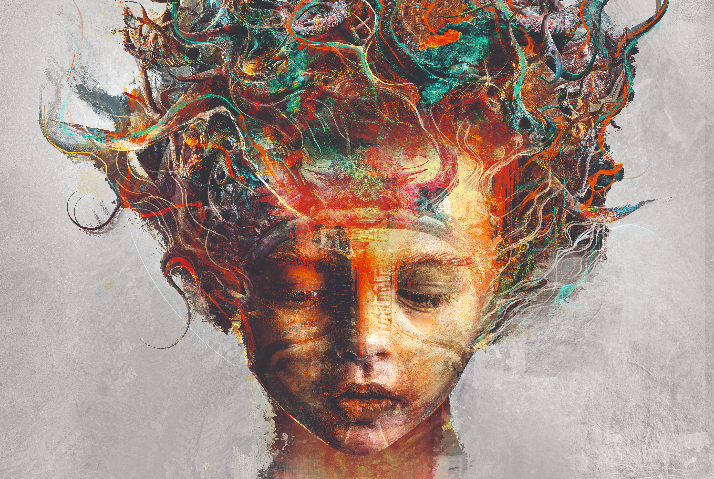
In this workshop, we’ll show you how to create surreal portrait art using your own photos, 3D models and custom brushes. The workshop uses ZBrush and Keyshot for creating 3D models and rendering. Most of the image’s shape and composition is built in Photoshop with blends of images, textures and brush strokes.
But what exactly is surreal portrait art? Well, surrealism is an art form that draws on dreams and the subconscious, ranging from dreamlike depictions of everyday objects to the downright bizarre. Surreal portrait art combines the conscious world (i.e. the subject of the portrait) with the hallucinatory shapes, colours and symbols of the unconscious world. The result is a unique and interesting aesthetic with a basis in the real world.
Want to explore your 3D creativity further? Check out our list of the best 3D modelling software.
How will the process work?
This process starts with simple shapes that are repeated, flipped and rotated to build out the artwork and find more abstract shapes to fill in the composition. We start in ZBrush, making basic spiral shapes that resemble organic elements such as horns and branches, then render these in KeyShot with three layers to create light, depth and shadow. These iterations are then saved as Photoshop files with a transparent background, so they can be dragged into the main composition to build up the overall silhouette.
Once we’re happy with the overall shape of the composition, we’ll bring it into Painter and use blender brushes such as Fractured blender and Stencil oily blender to break it up into an abstract painting on multiple layers. When we’re happy with the overall textures and abstract shapes here, we’ll move the image back and forth between Painter and Photoshop using masks and adjustment layers to finalise the shapes, tones and details, bringing the artwork to completion. Here is the tutorial, courtesy of Ken Coleman.
01. Find inspiration
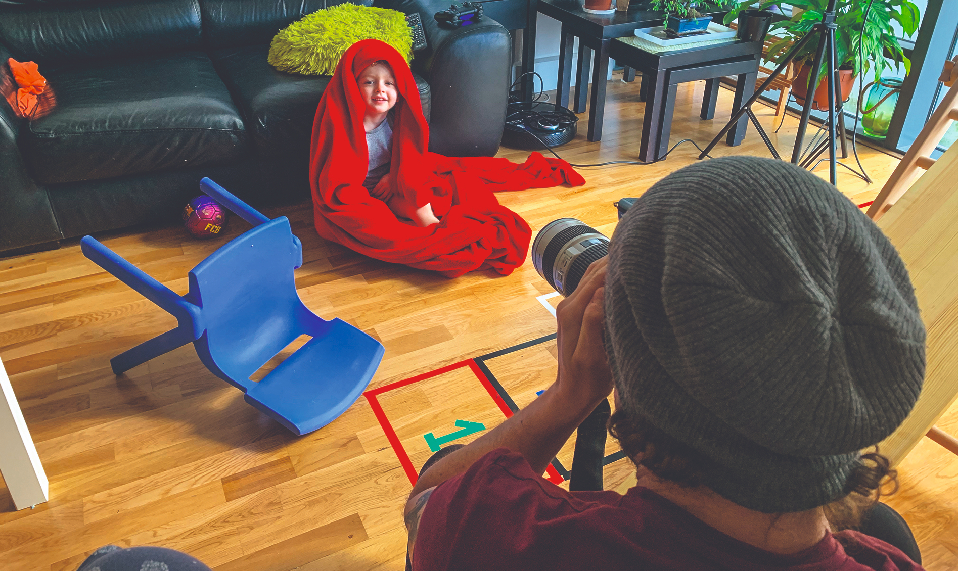
My son Luke has become one of the main inspirations of my personal work, and I often shoot images of him early in the morning when bed hair and morning light make a great combination. The main elements I use to start one of my personal works are a strong subject, stock photos of props, abstract 3D elements, and images of textures and particles that I create myself.
02. Prep your image
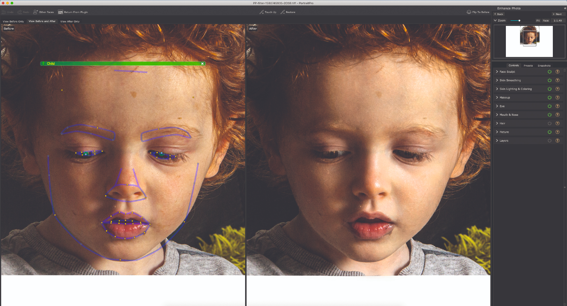
I choose an image and use the PortraitPro plug-in to save time on skin editing. My grading process that I use on all my images is to duplicate the layer, then Image>Desaturate on this top layer, followed by Sharpen> Unsharp Mask at 150 per cent at 1.5 pixels. I set this layer to Soft Light to give more depth and shadows to my image. I merge these two layers, then using the Camera Raw filter I increase Clarity and Shadows and reduce Highlights and White.
03. Create some abstract 3D
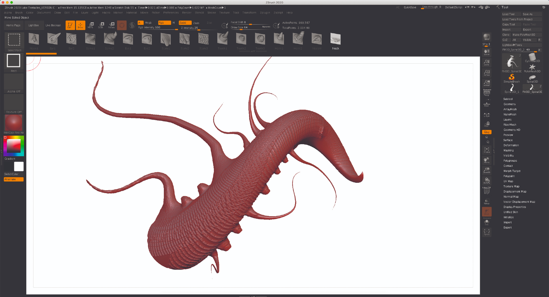
I open ZBrush and select the basic spiral shape. I press T for Transform to turn it into a 3D model and using the Initialise menu, manipulate the shape to resemble something organic. When I’m happy with the form I make it a Polymesh 3D shape. I then sculpt on this form using the Snake Hook brush with Sculptris enabled and a combination of the Fracture brush and Creature tools to create abstract organic shapes.
04. Render the model in KeyShot
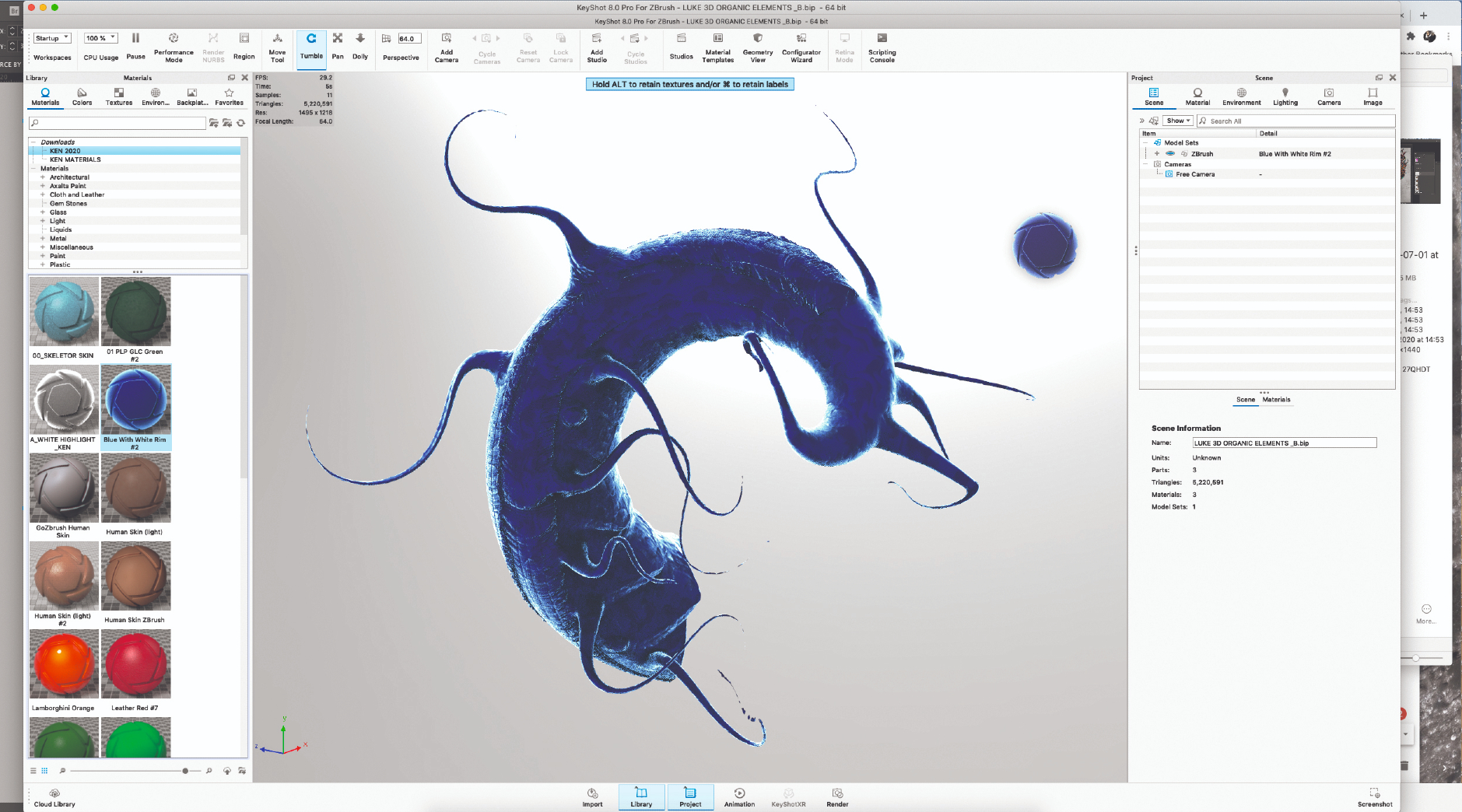
The next step is to bring this model into KeyShot. This is done by selecting ZBrush Render Menu>Keyshot, then pressing the BPR button. This opens the model in Keyshot, which I render in these materials: Red Clay, Blue White Rim and GoZBrush Human Skin. These three materials are then rendered out as PSD files and combined into one PSD file in Photoshop.
05. Texture using blend nodes
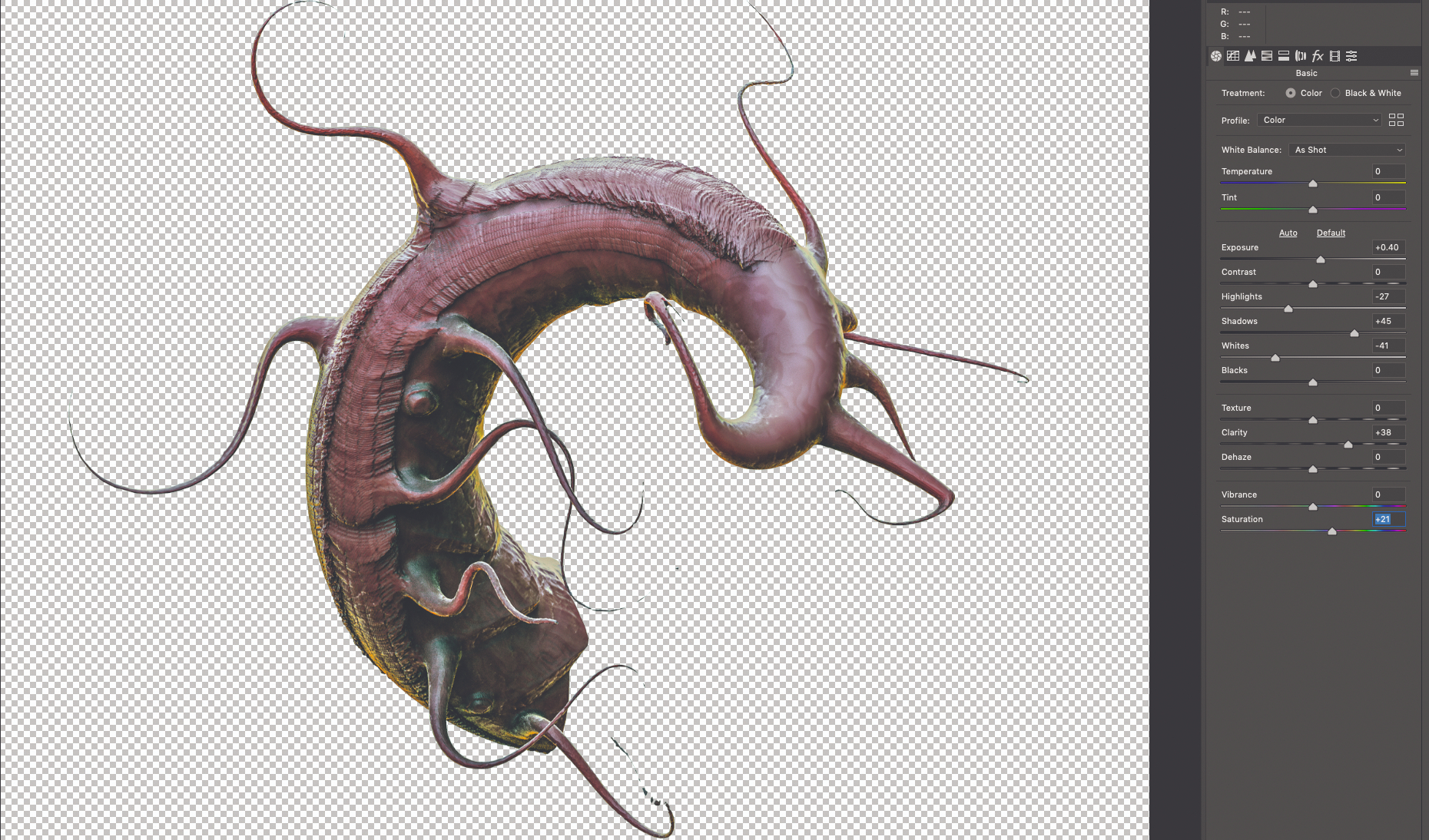
I combine all three materials using Soft Light mode with Red Clay as the base layer. They’re then Merged onto one layer. I select Image>Adjustment>Curves & Image> Autocolour to achieve the right tones. I also bring up the detail and brightness on a duplicated layer with Filter> Camera Raw Filter. The 3D parts can be either textured in the composition or by flattening the 3D model and then adding textures, again with a Soft Light blend mode. By adding a white background and flattening the image, the 3D render can be cut out with the Magic Wand, so that the render and textures are ready for the composition.
06. Take inspiration from your heritage
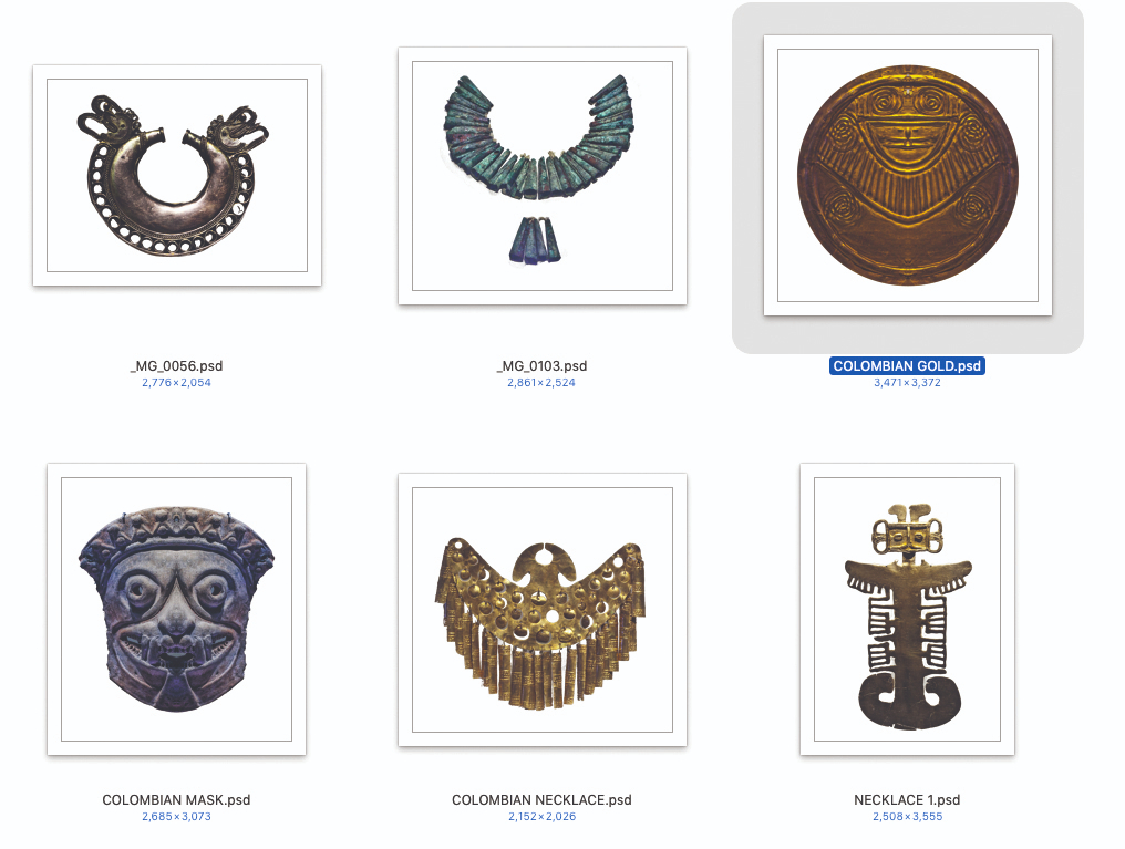
I use the Lasso tool with the Magic Wand to cut out the head and place it on the project’s canvas. I then start building the overall shape using the abstract 3D models combined with my own textures and photos. In this case I’ve opted to use my photos of Colombian artefacts, because Luke is half-Colombian and half-Irish. I use texture brushes and Filter>Blur>Surface Blur to paint the skin. I also use the AKVIS OilPaint plug-in to help guide my brushstrokes.
07. Build the composition
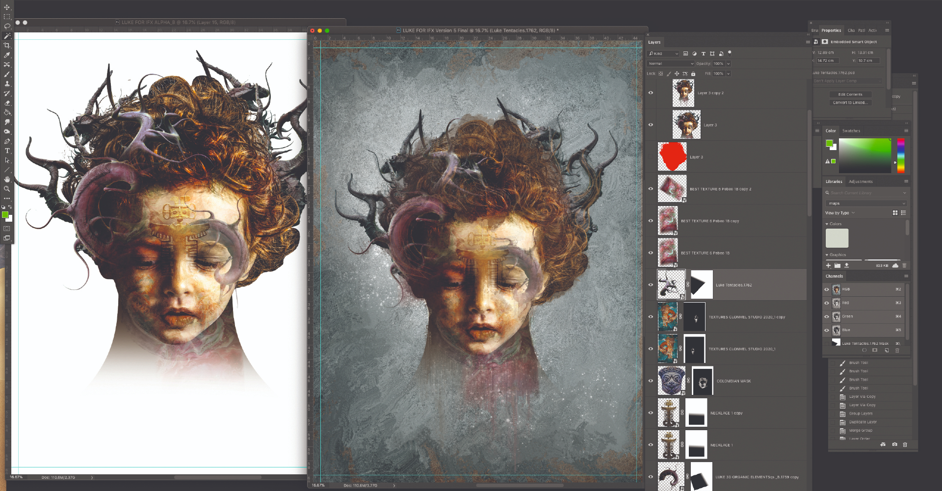
Once I’m happy with the overall layout and combination of layers, blended textures and brush strokes I press File>Duplicate to make a copy of the project. I go through multiple iterations and often take parts from different versions to build the final composite. I merge the layers to create the portrait, but merge the background separately. This enables me to make an Alpha or Stencil of the subject to copy and paste back into other versions.
08. Paint over the prepped image
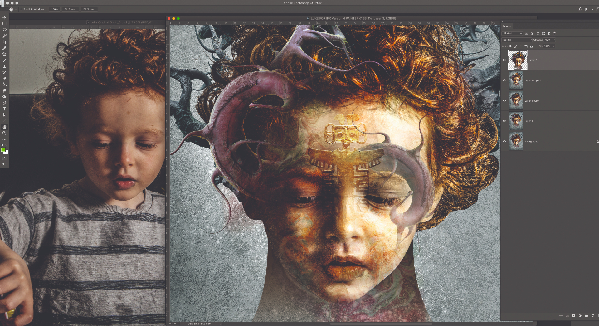
To prep my image for Corel Painter. I duplicate the subject layer twice and do the same for the background layers. I then save this file out with the same project name but with ‘PAINTER’ at the end of the file name so I know which version to open in Painter for blending.
09. Break up the image
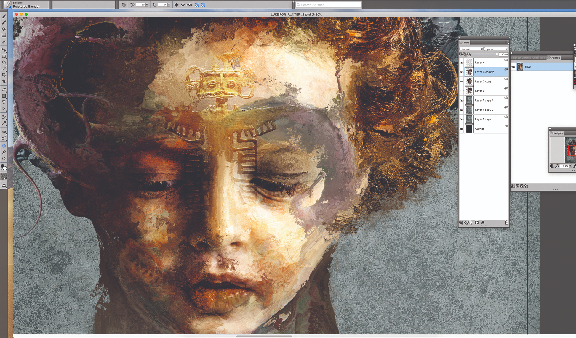
I use a combination of only three default Corel Painter brushes to start to break up my image, so that it resembles an abstract painting created with palette knives. These are found in the Brush palette. In the Blender Brushes menu I use Fractured Blender and Stencil Oily Blender, and lay down some line-work with the Spring Concept Creature brush that’s found in the Particle brushes folder. Satisfied with my abstract layers, I go back to Photoshop to refine these elements.
10. Rinse, wash, repeat
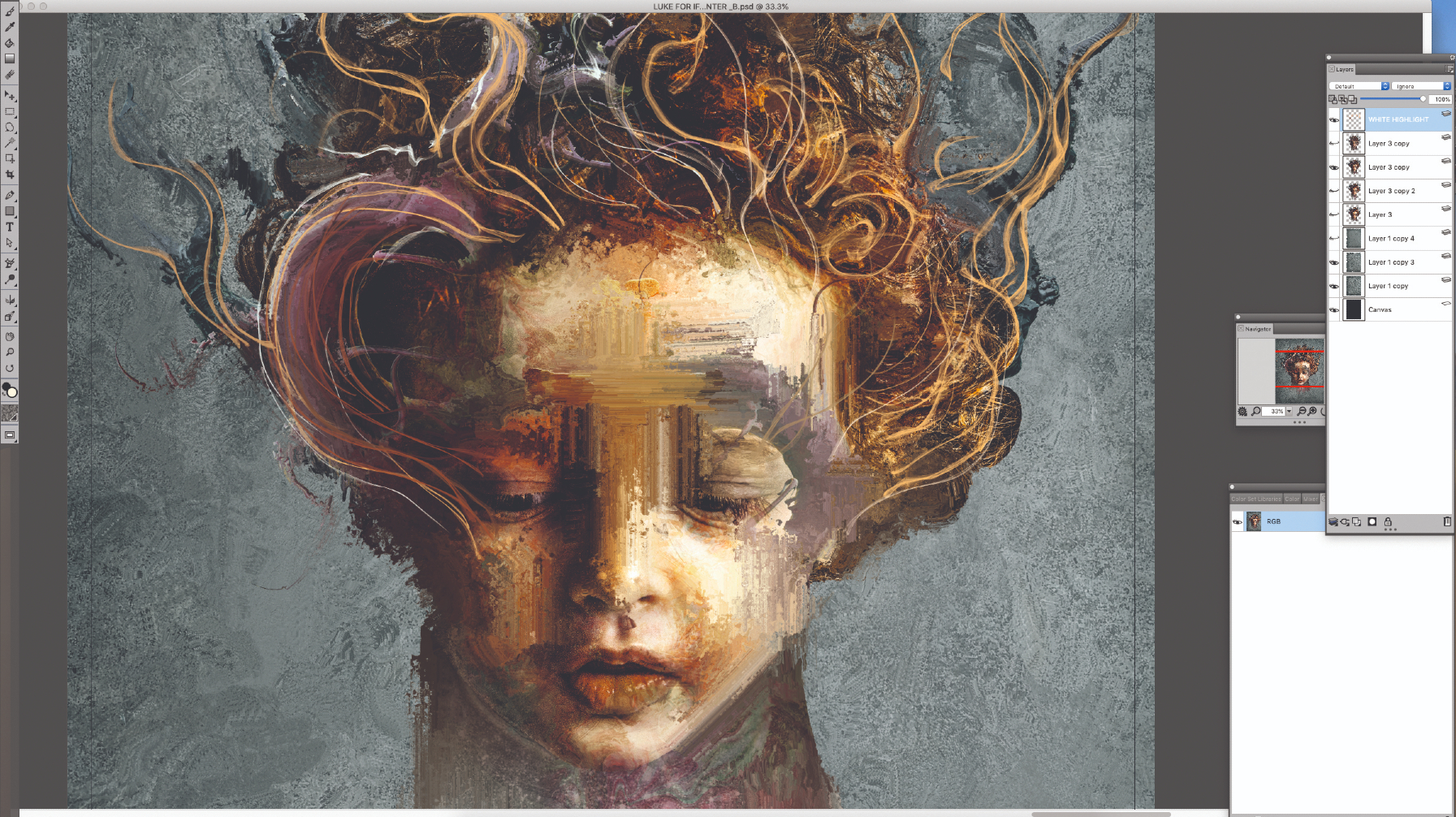
This old saying sums up my process. I can end up with three to six iterations of the same image. I often keep one as the master image and then using the Lasso tool and Quick Mask in Photoshop, cut parts from each and combine them in a master image. I also bring in more textures and 3D objects to overlay and blend into the image. I also reduce the subject’s size by 30 per cent.
11. Use symmetry and abstraction when you're at a standstill
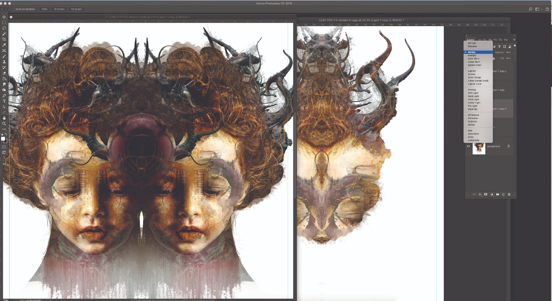
I make a copy of the image, flatten it, duplicate the layer and flip it on itself. Using Blend modes such as Lighten and Darken I move the top layer over the bottom to find abstract shapes. I merge and copy these to new layers and cut out the interesting parts. These are laid out and dropped back onto the master copy to see what works.
12. Make colour adjustments
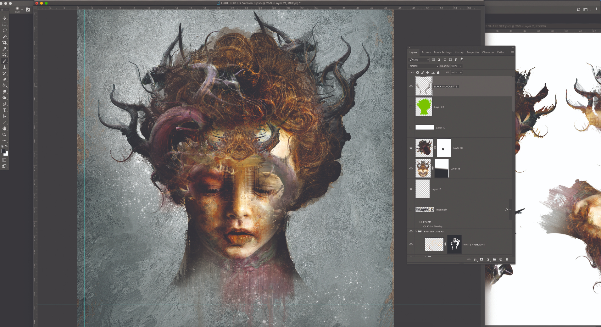
I save a copy as a new version, before merging all the layers of the subject and the background separately and creating a new Alpha/Stencil. Using this Stencil on a new layer set to Soft Light I paint in some dark edges to give the silhouette a stronger edge. This adds a new layer of depth to the overall composition. Then on a new layer I draw more fine lines on the subject.
13. Add the final photo elements
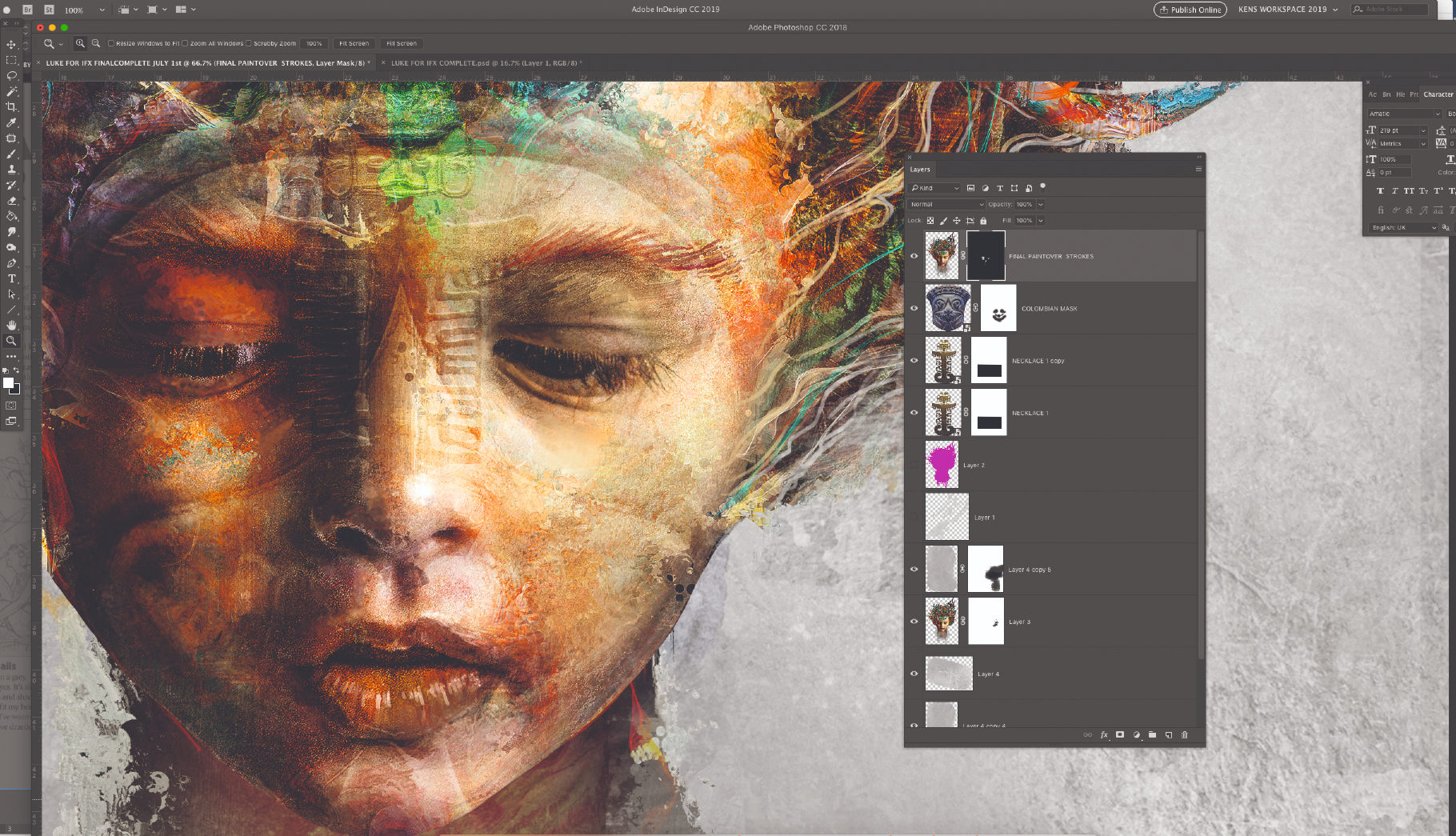
I step away from the image for a day and come back with fresh eyes. I decide to reduce the size of the neck. I then add a rim glow under the neck on a new layer using the Lasso tool and apply an orange gradient set to Pin Light blend mode. I bring back the photographic elements to strengthen the detail and cultural aspect. As the piece nears its finish I decide to create one more copy. I cut up the image again using the original Stencil layers from another file. I reduce the size of the neck, enlarge the head slightly and add Grá, which is Irish for Love written in Ogham. This balances out the cultural symbols and the painting is complete.
This article originally appeared in ImagineFX, the world's best-selling magazine for digital artists. Subscribe here.
Related articles:
Get the Creative Bloq Newsletter
Daily design news, reviews, how-tos and more, as picked by the editors.

Thank you for reading 5 articles this month* Join now for unlimited access
Enjoy your first month for just £1 / $1 / €1
*Read 5 free articles per month without a subscription

Join now for unlimited access
Try first month for just £1 / $1 / €1
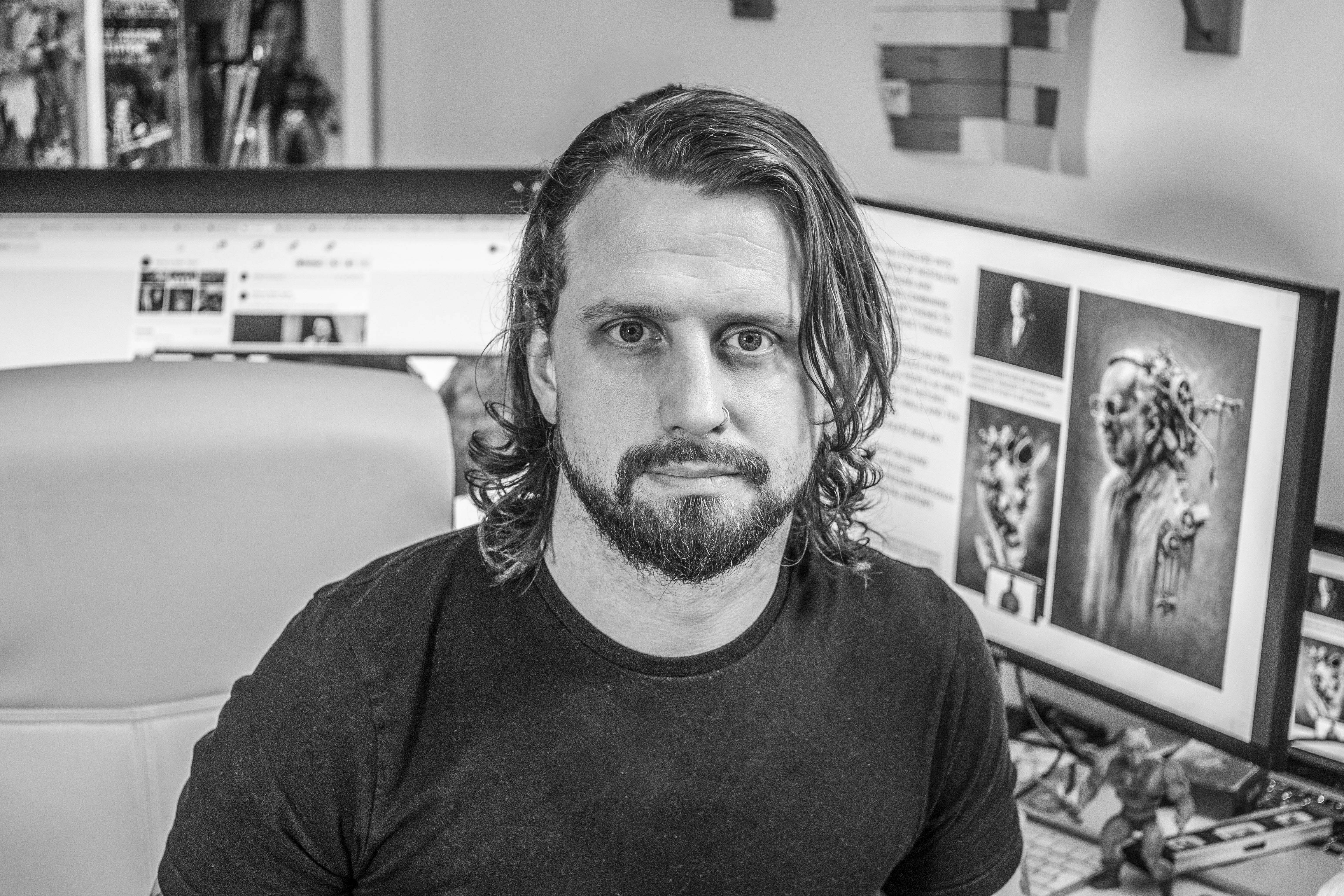
Ken Coleman lectures in game art and design at Clonmel Digital Campus in Ireland. He also designs for clients such as Catalyst Games and Morbid Angel.
