How to simplify figures for animation
The process behind creating simple yet appealing characters for animation.
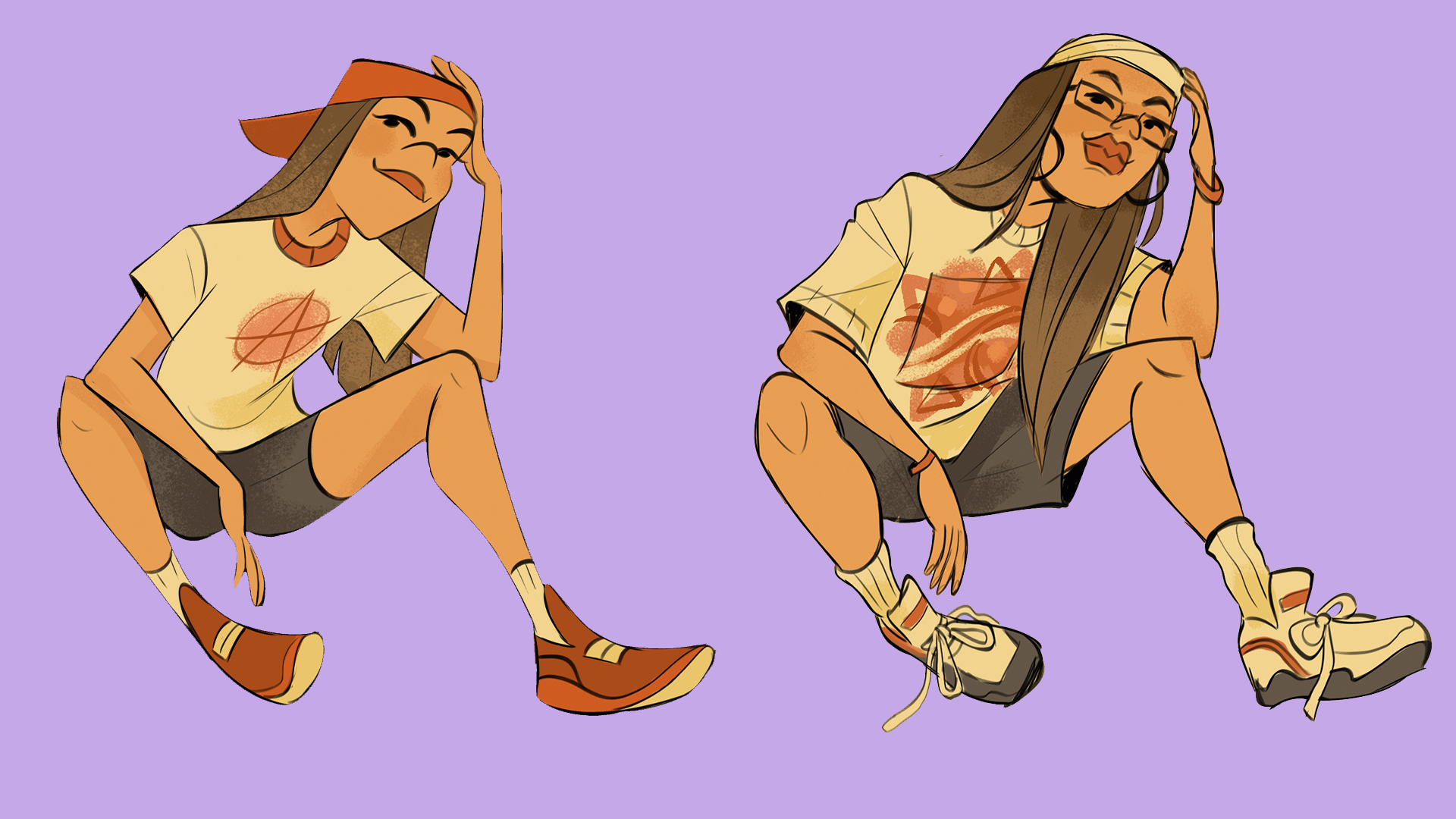
When creating characters, it’s easy to get lost in the details. If you’re designing for animation, comics or even your portfolio, it’s important to be able to design a simple character that can be drawn again and again. The ultimate goal is to retain as much information as possible while stripping your characters down to their essential elements. How far can we simplify a character, pose or expression as much as possible without losing what keeps it alive?
Animation is a tedious process and so the fewer lines you need to draw, the more efficient the animation process will be. I’ve been character designing professionally for a few years now, and am excited to share all the things I keep in mind when creating characters for animation projects. I’m constantly learning new techniques and tricks since design is a challenging and ever-evolving process. I hope this time next year I’ll have even more insight to share!
01. Simplify your character
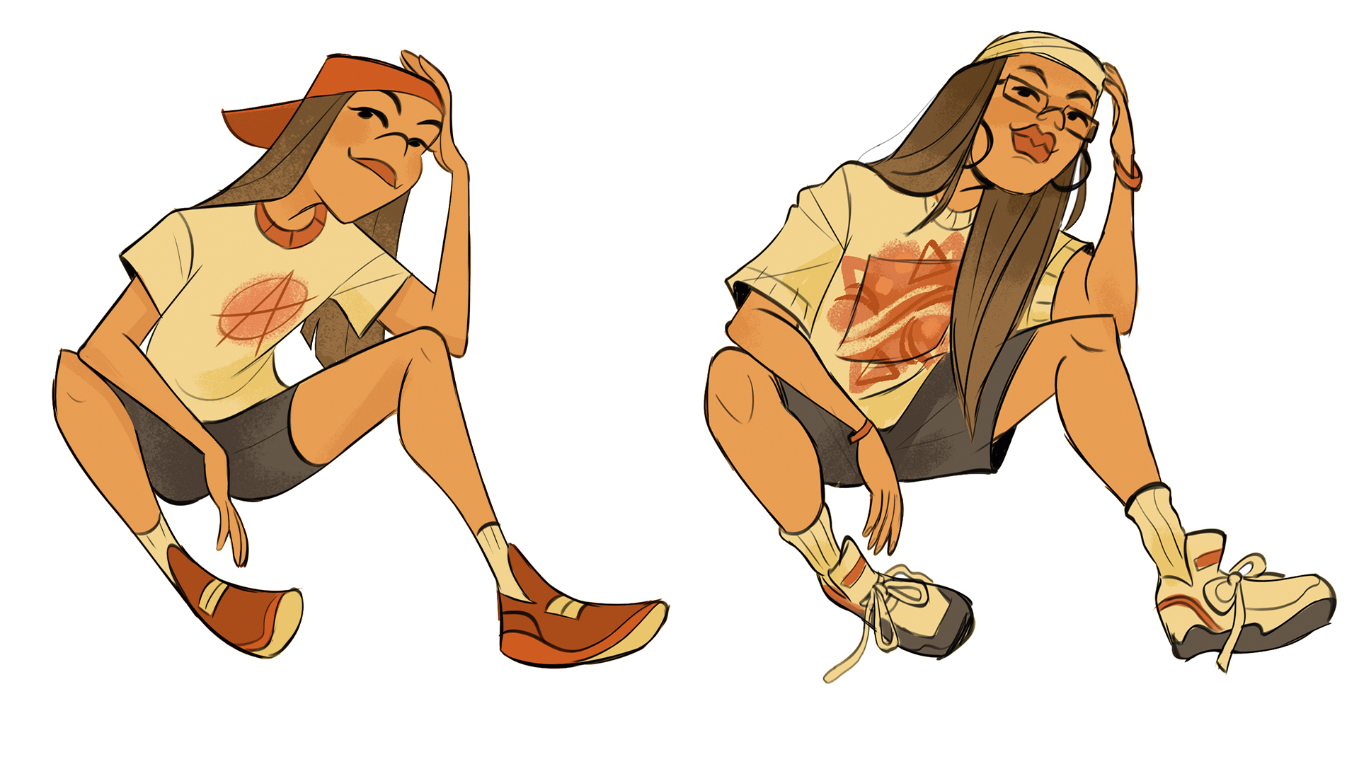
It’s easy to get tunnel vision when designing a character. Here, the sunglasses and earrings are overcrowding her face. Does it add anything to her character, or tell us something about her personality? Not really, so I’m removing it. I personally struggle with adding too many accessories to characters. Sometimes the simplest design is the most appealing.
02. Follow this handy tip!
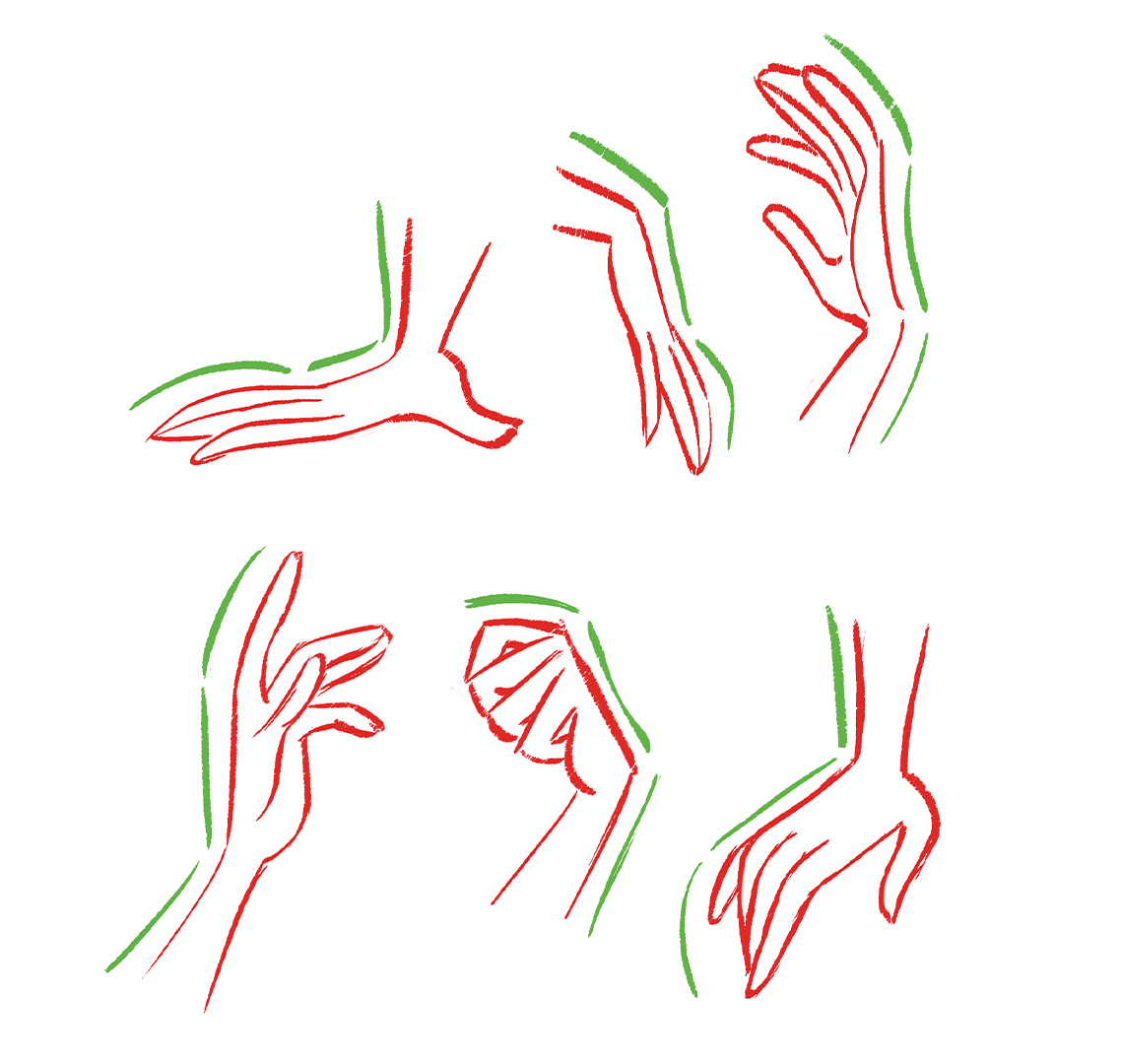
I love using three different angles to show a simple hand! Notice how I always keep the back of the hand straight and angular, while the front of the hand always has plenty of curves and intricacies. I also love breaking up the shape of a hand by separating a finger out of the silhouette.
03. Master straights vs curves
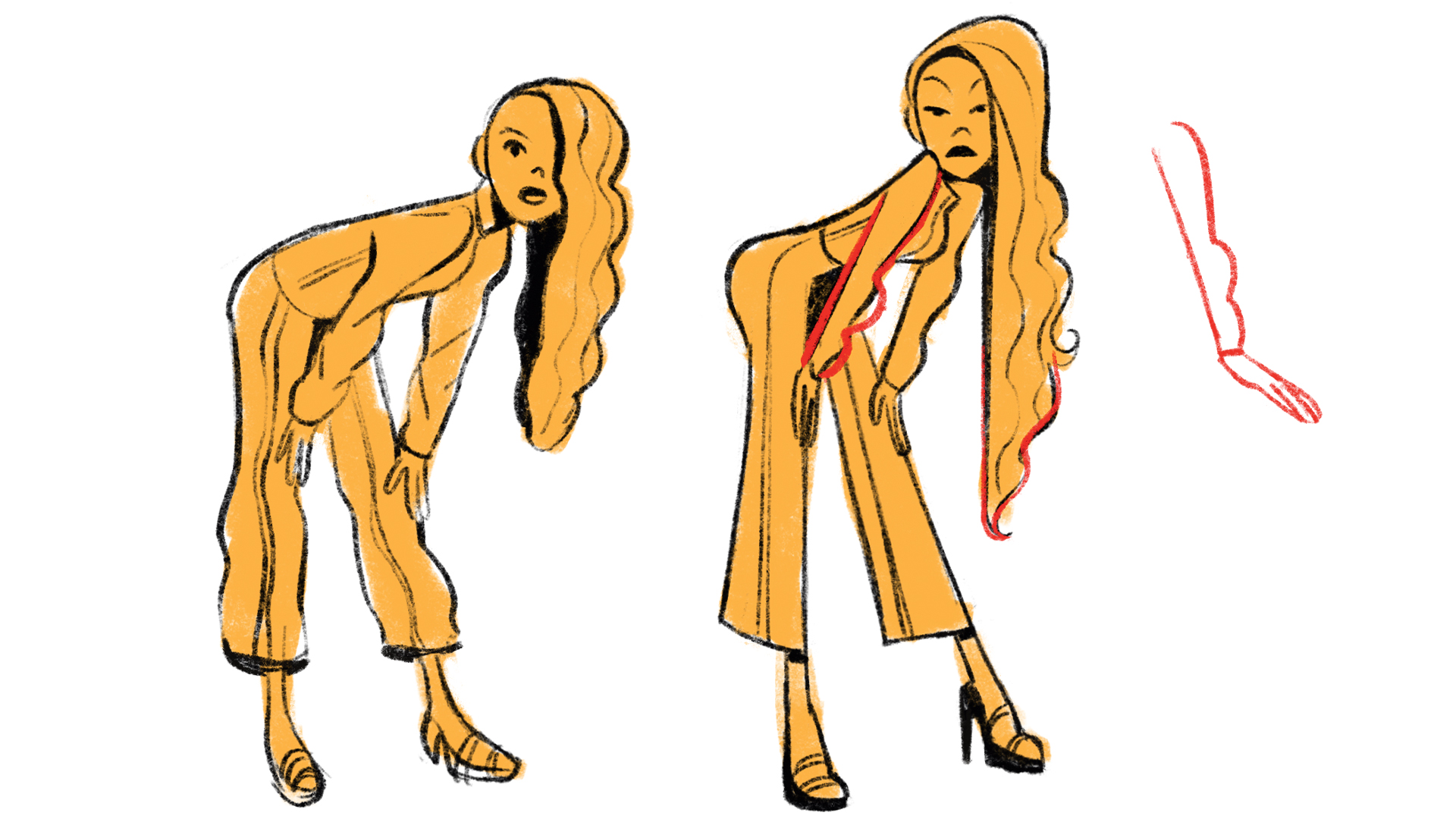
It’s important to have a healthy balance of straights vs curves because it adds visual interest to any drawing. Perhaps this is the most important element of design under my belt! Straight lines suggest stability, structure and direction. Curves suggest flesh, muscle and squashing. When used harmoniously together, they create an illusion of contrast and volume.
For example, I love keeping one side of the drawing straight and the opposite side curvy. Like a straight back and a curvy bust, or a straight arm and curvy sleeves. The harder I push this theory, the more graphic a character looks, so I either push or pull back on this element of design, depending on the project that I’m working on.
04. Identity the line of action
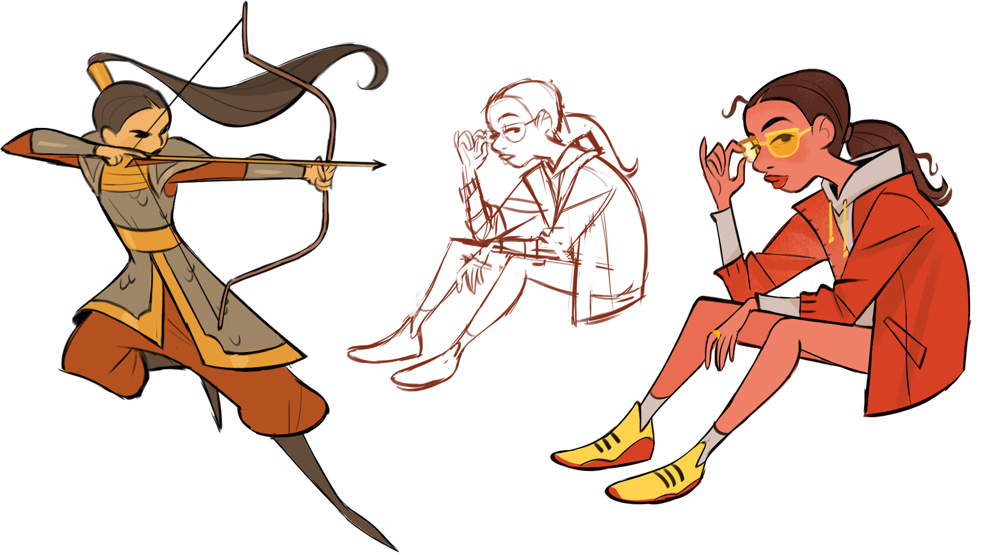
If you imagine a line that goes through your drawing, it can help push the feeling of movement – that’s called a line of action. A less curved line can emphasise a quicker movement, while a more curved line can show a slower one. However, a line of action isn’t always used for movement. Here, I’m demonstrating a static character but it’s still directional.
05. Create contrasting shapes
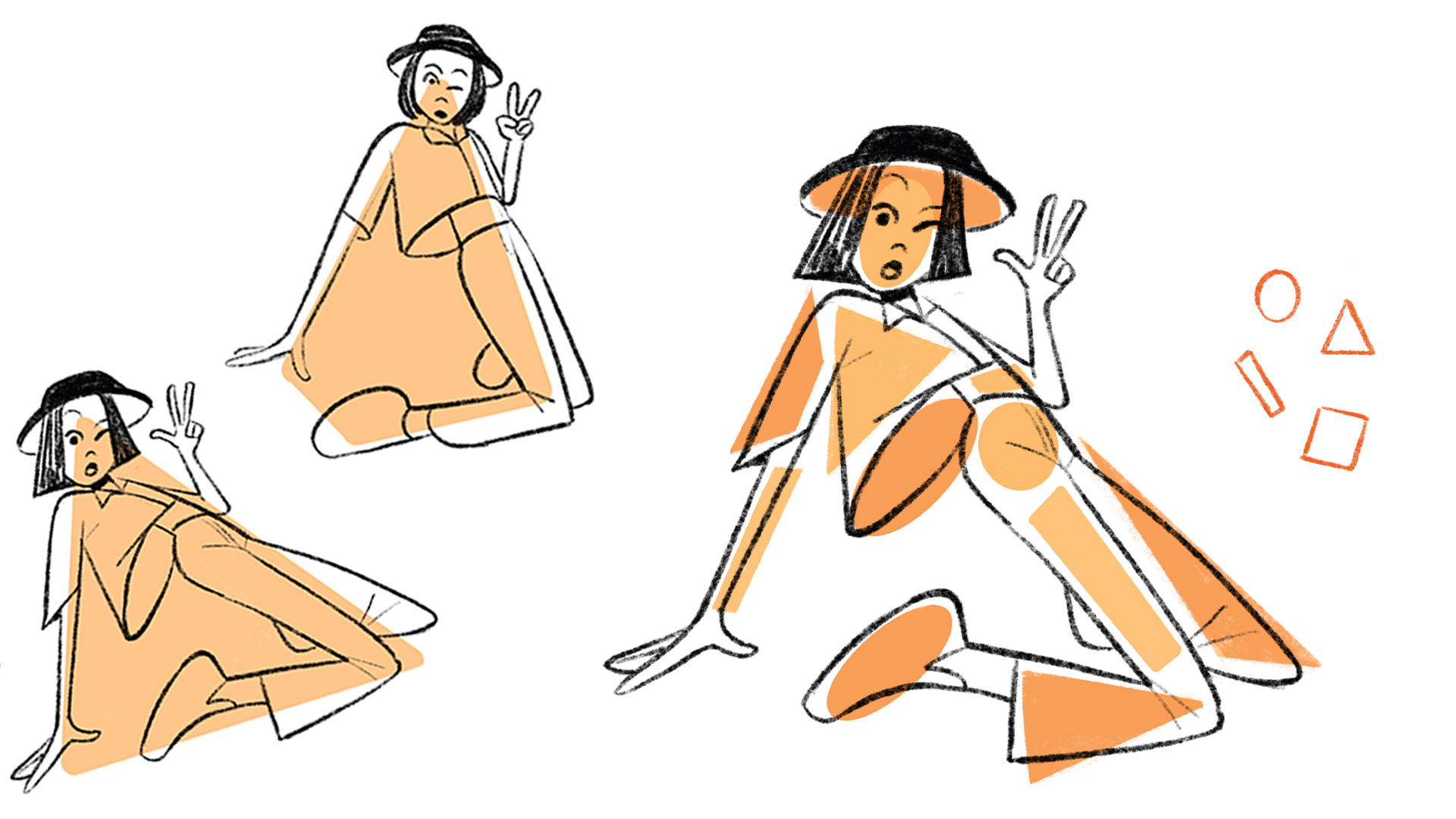
When creating a pose, I always consider what shape their body is making. I want the shape to be clear with a strong shape language. I also consider the shapes of the smaller elements of the character. I make sure there’s enough different types of shapes to maintain visual appeal. All these shapes play off each other simply by being different. Contrast is interest! Mixing round shapes with angular shapes can add a lot of visual appeal to your character.
06. Decide on lined or linessless design
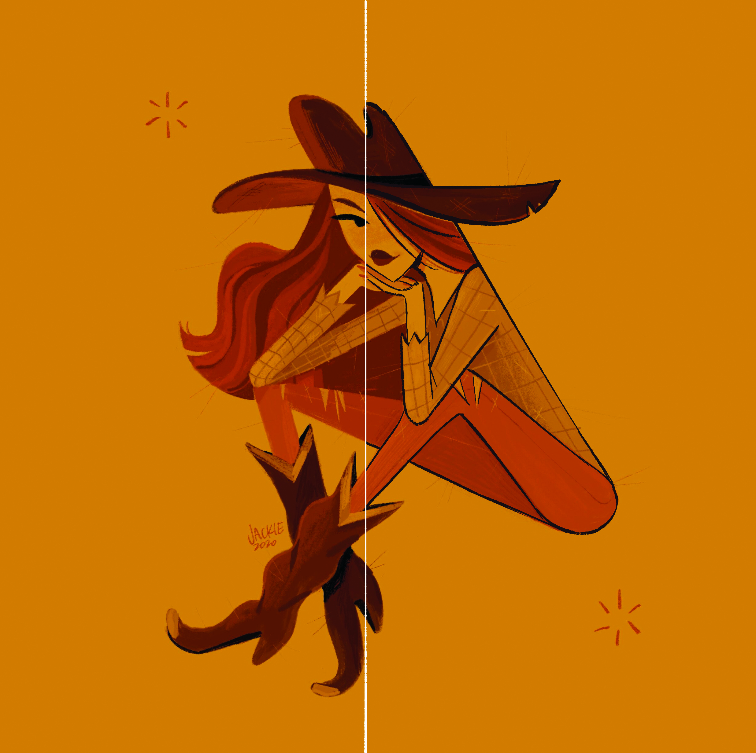
An important decision to make in your design process for animation is whether you’re going to make your characters lined or lineless. I tend to prefer a lineless drawing, where the character’s shapes speak for itself and the colours are contrasted enough to create obvious lines.
However, it’s much more efficient to have lined characters because you don’t have to have this extra step of getting rid of your lines. Another obstacle with a lineless character is that they take much more effort to stand out from the background, since there’s nothing clearly dividing them as a foreground element.
07. Avoid parallel lines
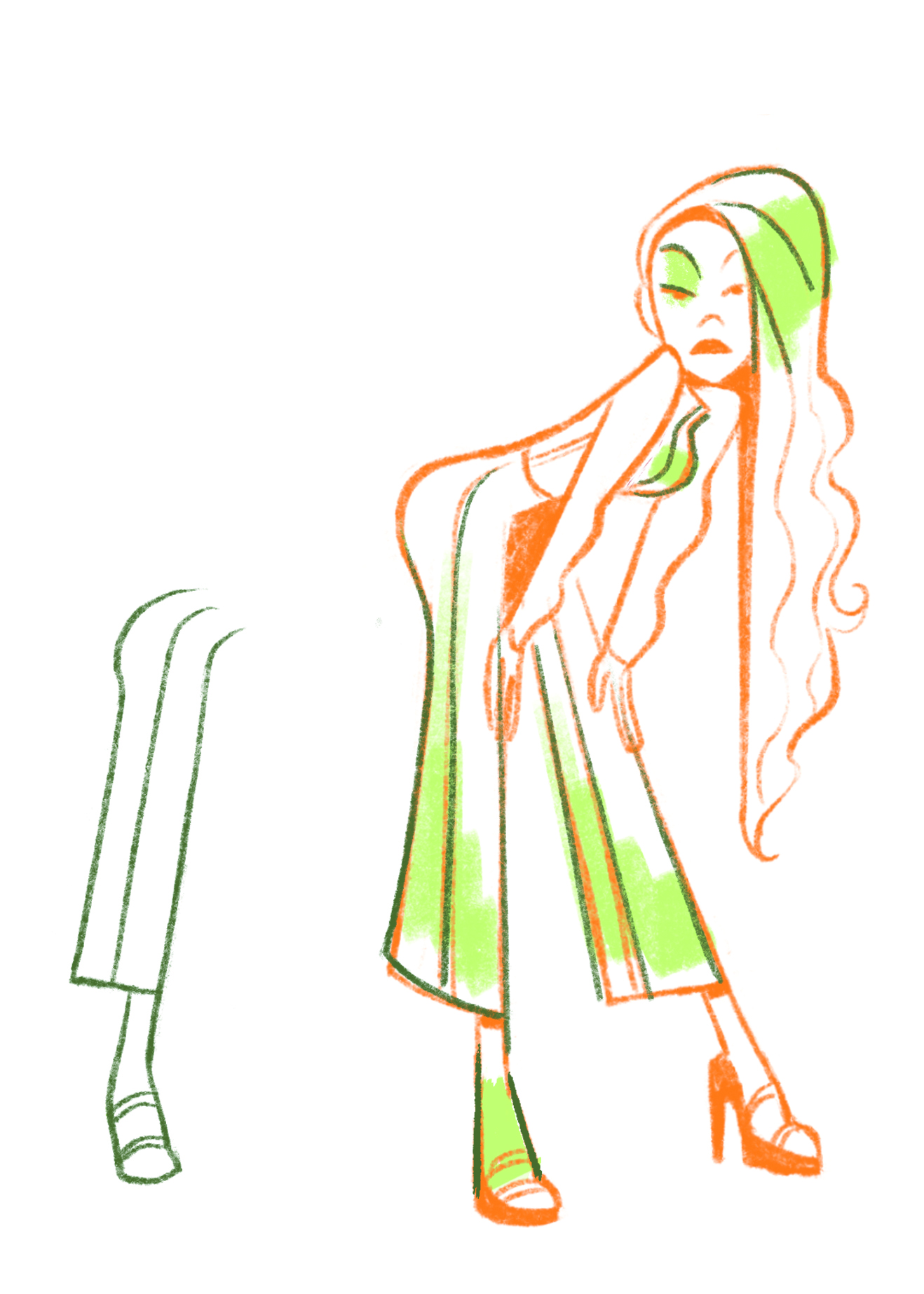
Try not to have parallel lines in your drawings. Do your best to keep visual interest and tilt the parallel line to create a new shape. When we have repetitive shapes and lines, it removes contrast and interest in the design. When I learned about this tip a few years ago, my mind was blown and changed the way I approached design. There’s so much to consider when making cool characters!
This article originally appeared in ImagineFX. Subscribe to the magazine at Magazines Direct.
Get the Creative Bloq Newsletter
Daily design news, reviews, how-tos and more, as picked by the editors.

Thank you for reading 5 articles this month* Join now for unlimited access
Enjoy your first month for just £1 / $1 / €1
*Read 5 free articles per month without a subscription

Join now for unlimited access
Try first month for just £1 / $1 / €1
Sheridan animation graduate Jackie is a character designer working at Netflix on feature films. Her passion lies in creating simple and appealing designs that convey compelling stories.

