Sharpen your sketching skills
12 simple techniques to push your sketching skills to the next level.
Sketching is a simple but powerful tool for anyone involved with making digital products. Pens, paper and whiteboards are readily available in every office; there is no need for expensive hardware or software. It's quick, it's cheap and we don't have to be artists to scribble down a simple diagram explaining our ideas.
However, there seems to be a potential barrier stopping a lot of people from taking the first steps and picking up a pen – especially for those coming from a non-design background like programming, research or product management. The sentence 'I don't know how to draw' can be anchored deeply in our heads, convincing us that, if we never had a knack for arts, sketching can't be for us.
The good news is that everybody can sketch. Sketching is not about creating works of art, but expressing ideas and making concepts visible. When it comes to sketching interfaces, for example, lines and boxes combined in different ways make up 99 per cent of our sketches.
In this article we'll take a closer look at these basic ingredients and explore some simple techniques to make our lines and boxes neater, cleaner and more confident. Whether we're using sketches to clarify our thinking, to collaborate on a solution with colleagues or to present a concept to stakeholders and clients, we'll make it much easier for everybody to 'see what we mean'.
01. Draw confident lines
Confident lines have a defined beginning, a calm and steady middle, and a solid, defined end. To practise making your lines more confident, pay attention to each of these three parts of your lines.
It can help to consciously pause at the beginning and the end to give the line a nice solid feel at both sides. You can even move the pen against the direction of the line before starting the line and after ending it to visually reinforce the ends.
02. Don't throw your lines
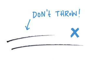
When you throw your lines, the focus is at the beginning, but gets lost along the way. The drawer loses control and the line loses definition towards the end. Thrown lines are a great way to express dynamism (for example in a storyboard), but when sketching interfaces, the focus is on clarity and readability, rather than dynamic expression.
Get the Creative Bloq Newsletter
Daily design news, reviews, how-tos and more, as picked by the editors.
03. Lift your wrist to draw straight lines
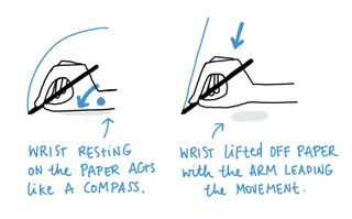
If your lines – especially long ones – all seem to come out slightly curved rather than straight, try lifting your wrist off the paper and moving your whole arm. You can use your little finger to stabilise your hand on the paper.
04. Draw towards yourself
Another way to achieve straighter lines is to draw them towards yourself. We tend to have more control over our hand movement when we pull the hand towards the centre of our body (the belly button) rather than pushing away from it. Just rotate your piece of paper when you need to draw horizontal lines.
05. Find your optimum sketching speed
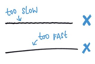
Sketching is a quick technique, but there's no need to be hasty. Don't rush your pen around the paper. Instead find a steady pace that allows you to control your lines and make clear marks.
If your lines are shaky, you're probably going too slow. Speeding up your drawing can help you to create smoother lines. If your lines are off target, you're probably going too fast. Slowing down will help you control the path of your lines better.
06. Don't draw hairy lines
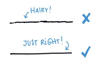
Some people have a habit of sketching a line in lots of small segments. From my experience, this usually happens when someone is not that confident with sketching yet and are trying to find the right line, bit by bit.
The resulting 'hairy' lines show this insecurity and add visual noise to the sketch. Practise making full, continuous lines. If the line doesn't quite come out as you planned, just put another, 'better' line on top. Over time, this will result in a more confident, calmer look.
07. Sketch clear shapes
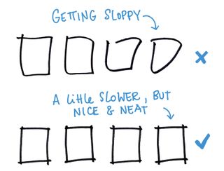
A box is a simple shape made up of four lines that meet at 90-degree angles. To sketch a neat box, draw each side individually and lift your pen in between each line. This will help you to keep each side straight and make the corners nice and defined.
Lifting your pen naturally forces you to slow down a bit as well, which is one of the best ways to avoid sloppy boxes.
08. Close the corners of shapes
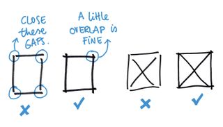
Our mind will perceive individual strokes as one complete shape, even when the corners are not properly closed. This is because the human brain is pretty amazing – especially the part that deals with visual perception.
However, leaving the corners of your boxes open creates visual noise and diverts mental processing power away from what you actually want your viewer to notice. Make a habit of properly closing the corners of your boxes. If the corners overlap, that's okay as well.
09. Sketch neat blind text
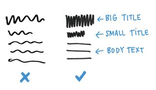
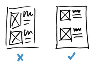
When sketching, we often use lines and scribbles to represent text. This is a quick way to sketch headings and blocks of text while keeping the fidelity low and preventing viewers from getting distracted by actual, readable content.
When we're not paying attention, it is easy to fall into the habit of using random wavy lines (like those we associate with handwriting), especially when we're trying to represent larger fonts like headings or big labels. This, again, adds visual noise and makes your sketch hard to read.
Get into the habit of using straight lines for body copy and a neat, tight zigzag to represent larger text.
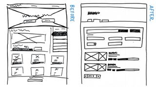
When you put all these small details together, the difference it makes to the overall appearance of your sketches is quite impressive. Remember, the goal is not to create 'beautiful' or 'arty' sketches, but to make your output clear and calm, so the viewer can focus on the idea being shown, rather than getting distracted by unnecessary visual noise.
10. Go for low fidelity to convey your concept
Hans Hofmann once said: "The ability to simplify means to eliminate the unnecessary so that the necessary may speak."
Beyond the mere technical skills of producing straight lines and neat boxes lies the much trickier, more conceptual side of sketching. Which parts do I need to sketch to convey a concept? What level of fidelity is right for the stage I am at?
My general advice is: if you want to focus on getting better at one thing, make it sketching at low fidelity. Having taught sketching to hundreds of UX practitioners, I've discovered that reducing a sketch down to its essence is by far the hardest challenge. It is very easy to get distracted by the details and to lose clarity by cramming too much into one sketch.
Practising low-fidelity sketching forces us to summarise complex concepts. It also teaches us how to spot patterns and helps us to understand structures. When we master sketching at low fidelity we become better communicators, as it helps us recognise how to show the big picture first and dive into more detail when and where it is needed.
11. Sketch existing interfaces
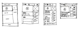
The best way to learn how to create low fidelity sketches is to practise sketching an existing website layout. This allows you to focus fully on what and how you sketch, because you aren't having to come up with a good new design at the same time.
Sketching existing interfaces can also be a great way to help you out if you get stuck in your design process. Sketching the current interface you want to improve, or the interface of a similar product, can help you find flaws and question the status quo on a much deeper, structural level. This can often lead to ideas of how to do things differently.
12. Imagine your audience
Choose a screen from a website, software interface or mobile app. Imagine you wanted to explain to someone what this screen is about and what its main parts are. To focus the exercise, imagine you're talking to a particular person: a product manager, a visual designer, a developer, a content editor, a potential investor. Depending on who the audience is, your sketch will focus on different aspects of the screen design.
Challenge yourself to sketch the overall structure first and to keep the amount of detail to the minimum. It usually takes a few rounds of sketches to get down to the essence.
This article originally appeared in net magazine issue 285.
Liked this? Then check these out:

Thank you for reading 5 articles this month* Join now for unlimited access
Enjoy your first month for just £1 / $1 / €1
*Read 5 free articles per month without a subscription

Join now for unlimited access
Try first month for just £1 / $1 / €1


