Rebuild a 2004 Flash website for 2018
Bring an old Flash site back from the dead with HTML, CSS and JavaScript.
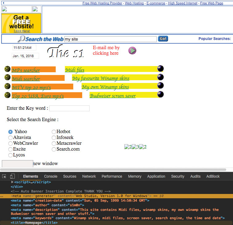
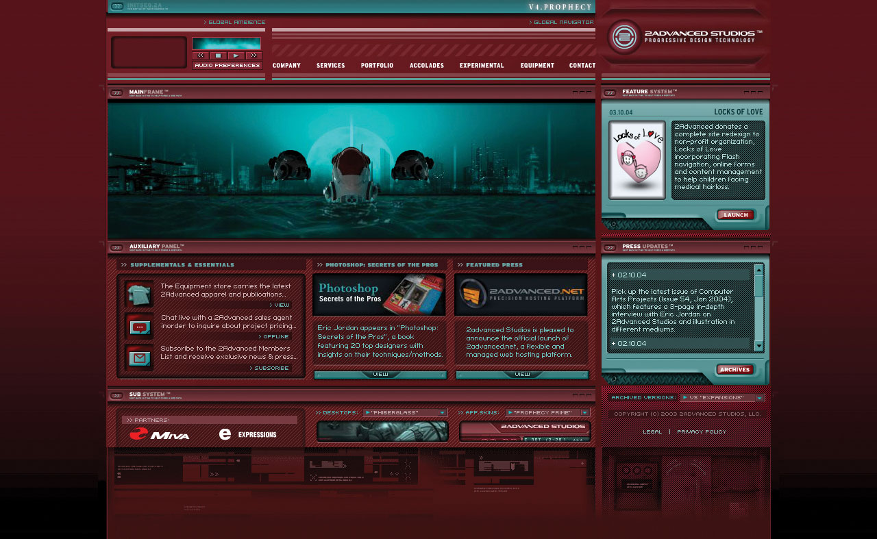
In 1999, I built my first website using Web Studio 1.0. Web Studio was a graphic user interface. It was possible to create a new landing page and drag and drop elements into it. I then set up a free domain and hosting with GeoCities and voila! I had a website. Fast forward to 2004, I wanted to go further and so, like many others, I set out to build a band website.
A lot has changed since then. In this article, I'm going to be taking a trip down memory lane and recreate the same site for the web today.
Get the files for this tutorial.
So, let's start! First off, generally every new project for me starts with mkd followed by g init. For those of you who know me, at some point, I've probably mentioned dotfiles to you. Dotfiles are files that simply begin with a dot (it took me a surprisingly long time to actually make that connection!) and they can be used for a number of purposes. Two of my favourite dotfiles are .aliasas and .functions. Let me elaborate…
In bash, it's possible to create a new directory using the command mkdir then after that you'd have to change directory cd into the directory that you have just created. Using the code I have in my .functions file, it's now possible to run mkd. This will not only create the new directory, but also have changed into that directory as well. This may seem overkill at first, but I love these micro wins. Over time, especially if running these commands several times a day, they soon add up to a lot of saved time.
# Create a new directory and enter it
function mkd() {
    mkdir -p "$@" && cd "$_";
}
The next command, if you're familiar with git, is simply git init, which will enable us to version control the project. I use git a lot, even for shopping lists! So rather than having to type out git every time, adding alias g="git" to .aliases again is a nice, small time saver for me.
These days, there's a plethora of different frameworks and technologies. For this project, I want to keep things simple. I'm going to use HTML, CSS and if required a sprinkle of JavaScript. First up, let's create the basic HTML markup. But wait! Let's stop and think for a minute.
Get the Creative Bloq Newsletter
Daily design news, reviews, how-tos and more, as picked by the editors.
Sometimes developers, myself included, can be super-excited about a project and want to get cracking immediately and go straight for the keyboard to write code. However, I find this is often not the best approach. I love to get an overview in mind of the project first. By doing this and having a much clearer vision of the project as a whole, I find it allows for much better decision making. For example, if I dived straight into the code, I might encounter an issue that I'd then have to go back and refactor. There are a few different outcomes with this approach. First, it might be that I have to delete the code entirely and start again; second, if continuing in this fashion I may end up with 'spaghetti code' making it difficult in the future to update, debug and result in performance loss; third, sometimes it does work out okay and you end up with better code, but I'd tend to say the first and second outcomes are far more common.
This project is fairly small; it has a few pages: Home, News, Gigs, Media, Albums, Links and common parts among these pages: header, navigation, typography content, lists, images, videos. When originally building the Flash site in 2004, things were a lot more simple in terms of testing. The site was built in Flash, for Flash on a desktop computer with a mouse and keyboard. These days, mobile and tablet internet usage is more common than on a desktop computer, and this trend is continuing to rise.
In order to make this a better experience for whoever views the site, I'm going to take a few things into account at the start of the project and use a mobile first strategy. To do so, and again, before writing any code, I'm going to get out a good old-fashioned pen and paper. First, I write out the sitemap; in doing so there are some key areas I think can be improved. For example, my original site consisted of different pages for each of the band's albums. At the time they had three albums and so fit nicely in the navigation. Now they have a lot more and potentially more to come, so already in my mind I'm thinking about ways in which to make the site more future proof (an oldie but a goodie is Dan Cederholm's Bulletproof Web Design).
Now I have a rough idea in my head of the sitemap and pages, next up is to create some low-fi wireframes. From previous experience building many responsive sites, mobile comes with interesting design challenges, namely how to create a navigation, but still enable people to view the main content of the site. I'm going to go along with the design outcome we've all grown to love/hate: the burger menu approach. However, I'm going to add a little twist. The original artwork used birds, so rather than the standard burger menu icon, I'm going to use bird artwork that will activate the menu and open and close its wings as a way to indicate if the menu is active or not.
Things in my mind are now starting to take shape, with an idea of how people will be able to navigate around the site. I'm now going to think about how the pages themselves might look. Starting with the homepage, it's fairly simple, with typography content. Next, news – again typography content, potentially images and then some sort of navigation to view older posts. Gigs – a list of upcoming gigs with links to purchase tickets. For Media, looking back at the previous site, I had 'images' and 'videos' as two different sections, but here I think there's room for improvement and to consolidate as 'media'. Albums, ah, yes Albums – now this is where doing this sort of thing pays off. You see, the Albums page has typography and an image, and is going to need some sort of navigation to view older posts. Sound familiar? Sounds a lot like the same structure as the news page! Having this top level overview I can look at and think things over at a more granular, component, some could even say atomic design level, if you're familiar with the work of Brad Frost.
Now I have an idea of how the site is going to work on smaller devices and reusable elements, it's time to repeat the process with larger devices. As the site is fairly simple, and with the wireframes already created for mobile, I see the larger devices being fairly similar – apart from now we have some extra room, so we can widen the content areas and also include a side navigation.
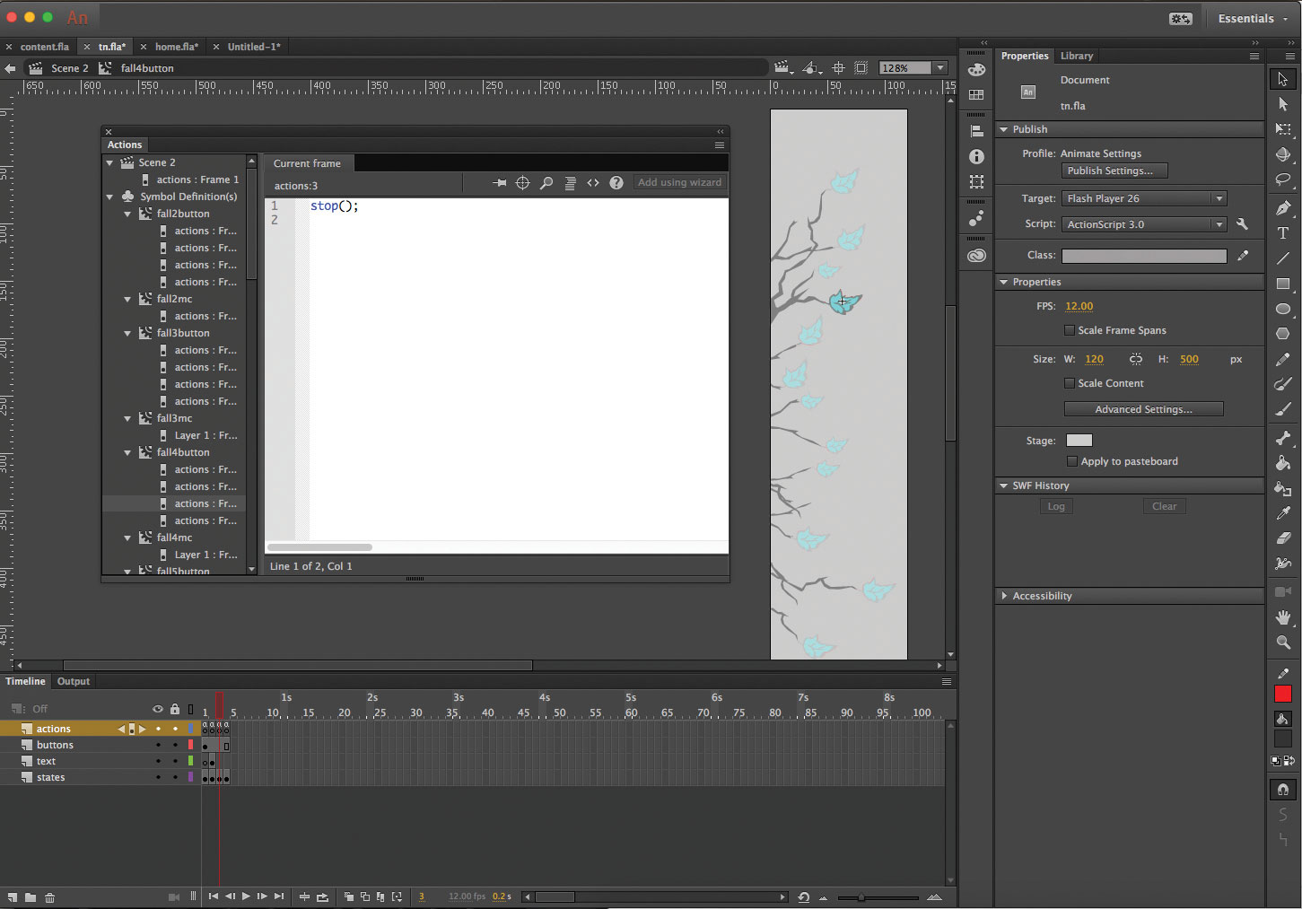
The side navigation is the bit of the site that from the offset I'm most excited about. Taking inspiration from the band's original artwork, I built the navigation as a tree silhouette with leaves. Each leaf was a button that linked to a different page of the site. Also, as you scrolled in and hovered away from the leaf, the leaf would animate, falling to the ground. Flash was great at this; it was called tweening. You could set an element at one keyframe in the interface on the timeline, create another keyframe further along the timeline and add a path for the element to follow. Taking things a little further, varying the paths, duration and speed of the falling leaves, I ended up with something I was very pleased with.
But now we're not using Flash, so how do we do this? Quite often I'll jump to CodePen or JS Bin. For those of you who aren't aware, CodePen and JS Bin are online services that enable you to quickly code and save. I tend to see CodePen as more design led, and JS Bin more JavaScript focused. For this project I'll be using CodePen to create the tree navigation for a few reasons. First, I want to start building up the main mobile version of the site, and in fact by doing this, if things were time critical, I could end up with an mvp. Although there are enhancements to the site that could be made by adding the nice leaf navigation and animation, this will take longer to produce. An advantage of working in CodePen for the tree navigation means it's isolated from the main site and code base. If things get tricky with completing it, I'm able to save where I'm at, carry on with the main site build, and then come back to the navigation. Sometimes I find that in going away from a problem, or even sleeping on it, my subconscious can carry on thinking about it. Then upon returning back to the problem, a solution presents itself.
SVGs! I love SVGs. Previously in Flash, I drew out the leaf assets in Illustrator. Amazingly I still had a working CD with the original artwork and was able to open it. These days I use Sketch and it did a great job of opening up the file. I now have the leaf assets all ready to be exported as SVGs. Why SVGs? There are a lot of reasons. If we were to use a jpg, or gif on a Retina device, we'd also have to supply bigger assets, otherwise they would look blurred. Also, with SVGs, we can use CSS. This is great and lets us simply change the colour of the SVG using a bit of CSS rather than having to create another image asset. This means it's easier to maintain, and as a bonus it's also more performant. If you're not familiar with SVGs I'd highly recommend reading up on them and the incredible work from my good friend, Sara Soueidan.
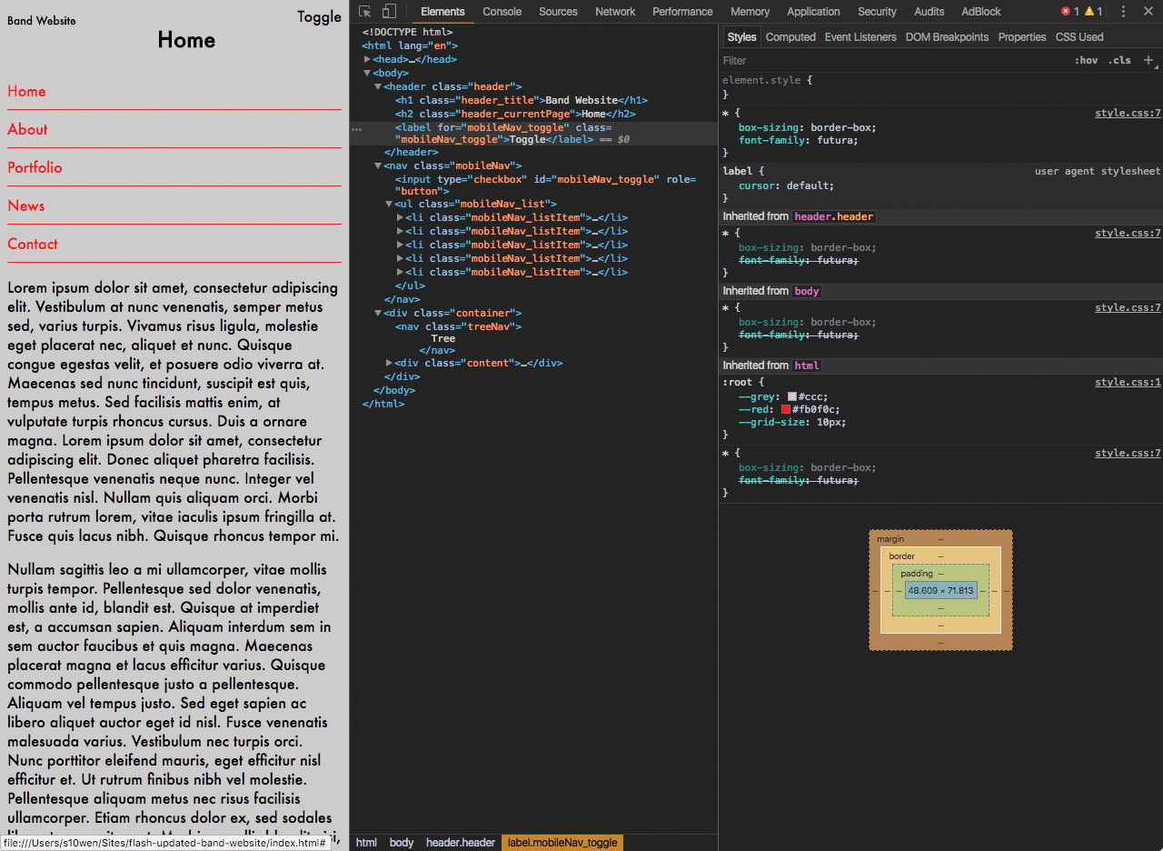
With the tree and leaf assets now in place, the final thing to add is the animation. There are a few approaches I could take with this. One would be to stay true to the original Flash path tween I did. This would mean replicating the paths and using SVG and then potentially further SVG work with paths and animateMotion. I quite like this idea from a nostalgic point of view, but CSS has come on a lot over the years, and we now have transform and translate at our disposal, so this could be another approach. Taking things a step further, we could even add some JavaScript that would randomise the falling leaves.
Both options sound good, but I'm swaying towards the more CSS-led route. Here's another benefit of using CodePen, I can quickly go and try out one approach. If it turns out that it's more complicated than I originally thought, or it doesn't feel right, I can try another approach with little time wasted. In fact this turned out to be a great idea! I'm still looking at options for this – please refer to the project on GitHub for the final result.
With the tree navigation now sorted, I turned back to the mobile first approach, building up the navigation. If you're familiar with Sass, you've more than likely encountered variables. But did you know variables are now available in CSS? They have pretty decent browser support in Chrome, Edge, Safari and Samsung Internet as well! As I'm trying to keep to basic CSS and avoid the need for any extra dependencies, this is great news. So how would we implement this? At the top of the style sheet I declare my variables:
:root {
  --grey: #ccc;
  --red: #fb0f0c;
  --grid-size: 10px;
}
Now that they're declared, I can call them, so for example setting the body background colour would look like this:
body {
  background: var(--grey);
}
Taking this a step further and to help with grid alignment, white space, vertical rhythm, you may have noticed I've also defined a grid size variable. Variables work extremely well with calc and that looks a little something like this:
// Standard variable being used, outputs 10px.
padding-top: var(--grid-size);

// Adding calc to multiply the variable unit by 2, outputs 20px.
padding-bottom: calc(var(--grid-size) * 2);
With the mobile navigation styles complete, let's tackle the functionality for hiding and showing it. For the toggle button we'll apply a label tag, then in the nav tag we'll add an input:
<header class="header">
  <h1 class="header_title">Band Website</h1>
  <h2 class="header_currentPage">Home</h2>
  <label for="mobileNav_toggle" class="mobileNav_toggle">Toggle</label>
</header>

<nav class="mobileNav">
  <input type="checkbox" id="mobileNav_toggle" role="button">
  <ul class="mobileNav_list">
    <li class="mobileNav_listItem"><a class="mobileNav_listItemLink" href="#">Home</a></li>
    <li class="mobileNav_listItem"><a class="mobileNav_listItemLink" href="#">About</a></li>
    <li class="mobileNav_listItem"><a class="mobileNav_listItemLink" href="#">Portfolio</a></li>
    <li class="mobileNav_listItem"><a class="mobileNav_listItemLink" href="#">News</a></li>
    <li class="mobileNav_listItem"><a class="mobileNav_listItemLink" href="#">Contact</a></li>
  </ul>
</nav>
Using the following CSS, we can show and hide the navigation menu; because we want the label in the header, we can use ~ aka tilde or (U+007E) so it works while not being immediately succeeded by the first element.
#mobileNav_toggle[type=checkbox] {
  display: none;
}

#mobileNav_toggle[type=checkbox]:checked ~ .mobileNav_list {
  display: block;
}
With the mobile navigation complete, it's time to implement some responsive web design. Adding in the main content for the site, then using the Responsive View in Chrome Developer Tools, I'm able to increase the viewport width until I feel there's enough room to adequately hold the tree navigation. This ends up being at 600px, and for this we can use a media query:
.treeNav {
  display: none;
}

@media screen and (min-width : 600px) {
  .treeNav {
    display: block;
  }
}
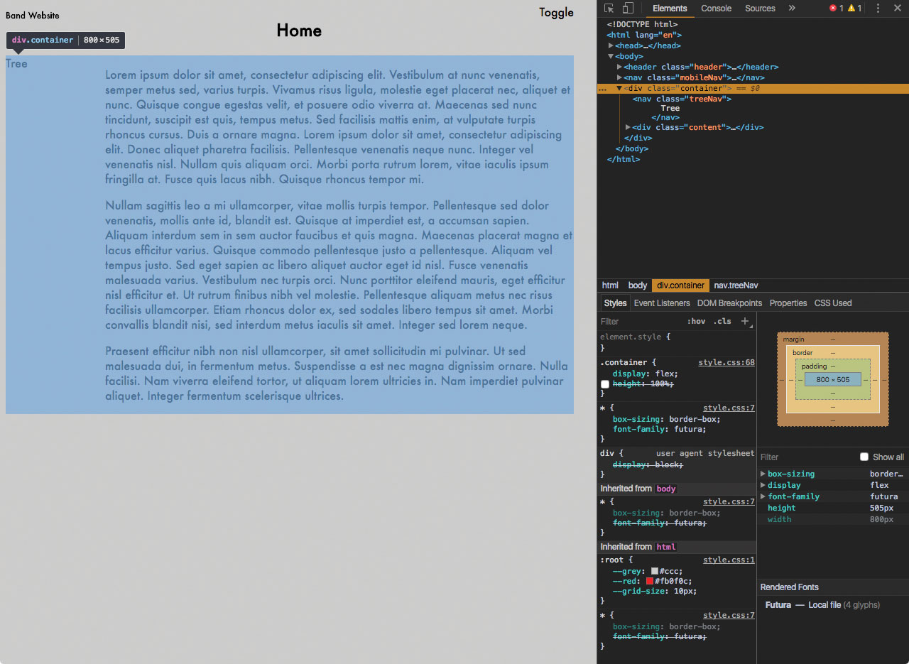
Almost there! Finally for the tree navigation to sit next to the main content area, I'm going to make use of Flexbox:
.container {
  display: flex;
}

.treeNav {
  display: none;
  min-width: 140px;
}
Now the tree navigation takes up 100% height, with the content doing the same and sitting to the right of it. This means that no matter how long the content becomes, it will never flow underneath the tree navigation. If you'd like to know more about Flexbox, I'd recommend checking out flexbox.io by the one and only Wes Bos. There's a lot it can do!
That's all I have time for at the moment, but there are still plenty of things we could do to make this project even better. If you have any questions, or liked the article, please say hello on Twitter or through my site, or send me a pull request on GitHub!
This article was originally published in issue 304 of net, the world's best-selling magazine for web designers and developers. Buy issue 304 here or subscribe here.
Related articles:

Thank you for reading 5 articles this month* Join now for unlimited access
Enjoy your first month for just £1 / $1 / €1
*Read 5 free articles per month without a subscription

Join now for unlimited access
Try first month for just £1 / $1 / €1
