How to use React Spring to animate components
React Spring can help you liven up your UIs.

React Spring can help you with animations, which are notoriously tricky to implement on the web. CSS animations are the best choice, but creating a smooth result, requires careful juggling of classes, durations and events. Throwing a JavaScript framework like React into the mix only complicates things further.
For animations that rely on user interaction, values can be computed through JavaScript and applied to an element directly. By taking this manual approach, we would need to calculate and apply our own easing to make the animation look more natural.
React Spring is a library that is built to deal with lots of the common hang-ups when it comes to animation on the web. It takes a slightly different approach, by focusing on physics over straight durations and defined easing functions. This helps to keep things feeling smooth and natural.
While most of the time this is used for visual effects, the library will transition between two values regardless of whether that value is ever used for a style or not. For example, it could be used to count up a number of sign-ups to emphasise how big a community is.
In this tutorial, we will be making a card component that allows users to rate images. The card flips to reveal a star rating and users can click to add their own. We will be using React Spring’s newer hooks implementation, which requires React version 16.8 or above. Before you start, download the tutorial files here (and back them up in cloud storage).
If you want to build a site without complex code processes, use a decent website builder. And be sure to explore web hosting options, too.

01. Install dependencies
With the files downloaded, the package dependencies need to be installed before we can start. This Create React App-based project includes the react-spring package and all the necessary local server set up needed to get started.
Get the Creative Bloq Newsletter
Daily design news, reviews, how-tos and more, as picked by the editors.
On the command line, locate the project files and install, then run them.
> yarn
> yarn start
02. Generate images in state
First, we need some images to rate. For this tutorial, we are going to hard-code some images into the application state, but this data could come from any source. Open up App.js and create some images with the useState hook from React. This will give each image an initial rating we can display and update later on.
const [cards] = useState([
		createImage(image1),
		createImage(image2),
		createImage(image3)
	]);
03. Display each image card
As the images are stored in an array, we can loop over that state and create separate components for each. The animation logic for React Spring will live inside a <RatingsCard /> component that we can use anywhere we need to.
Inside the render method of App.js, create a copy of that component for each card in the state array. It will receive every value in the state, including the image and the initial rating.
{cards.map((card, index) => (
	<RatingsCard key={index} {...card} />
))}
04. Add card structure

Before we can add the animation, the card needs some content. Each card has a front and back, which are implemented as separate <div> elements layered on top of each other.
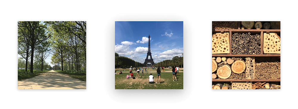
Open RatingsCard/index.js, and add the structure of the card. We need to apply the image as a background to the front card, with the back eventually containing the rating.
<div className="RatingsCard">
	<div
		className="RatingsCard__front"
		style={{
			backgroundImage: `url(${image})`
		}}
	/>
	<div className="RatingsCard__back" />
</div>
05. Apply hover styles
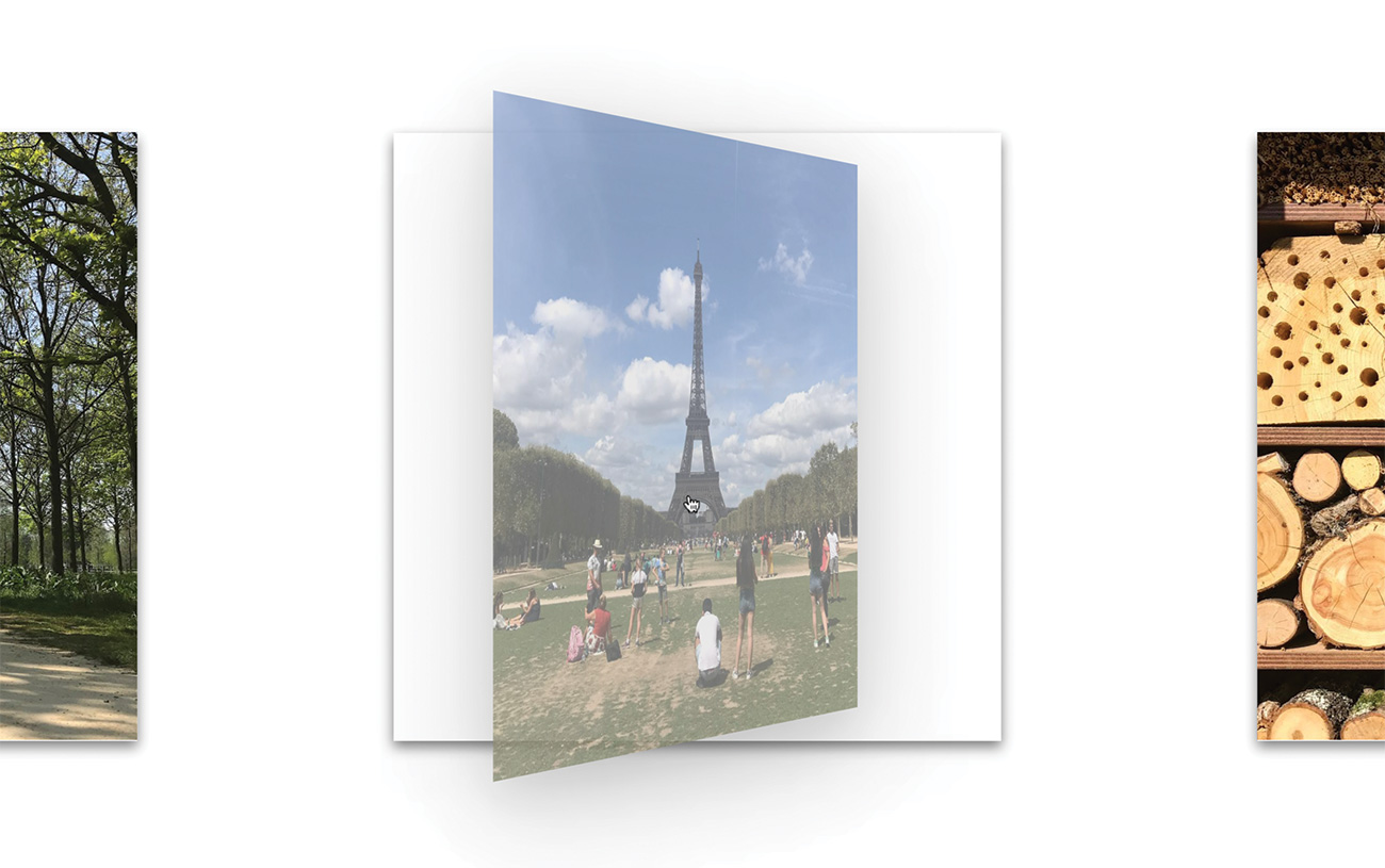
Any styles that are not directly updated through our animations can be applied through CSS. This includes the basic 3D shadow effect for each card when hovered over. Inside RatingsCard/style.css, add some extra styles to make the card jump out of the page on hover by applying a filter.
.RatingsCard:hover {
	filter: drop-shadow(0 14px 28px
	 rgba(0, 0, 0, 0.25))
	 drop-shadow(0 10px 10px
 rgba(0, 0, 0, 0.1));
}
06. Set shadow by default
A sudden shadow on hover is a jarring experience. We should therefore slowly transition between states to keep things smooth. Add a subtler drop-shadow for the card when not being hovered over. Use the transition property to animate between those two states.
.RatingsCard {
	[...]
	filter: drop-shadow(0 3px 6px
	 rgba(0, 0, 0, 0.16))
	 drop-shadow(0 3px 6px
	 rgba(0, 0, 0, 0.1));
	transition: filter 0.5s;
}
07. Hold selected state
We need to store and update information about which side of the card is facing up. We can use React’s built-in useState hook to define a start value and it have it return the current value and a method to update it.
At the start of the RatingsCard component function, create define this selected state.
const [selected, setSelected]
 = useState(false);
08. Define the flip animation
React Spring is responsible for transitioning numbers between one value and another. This can be done with a spring and the useSpring hook. We provide it some setup information, and it returns a set of values that update according to its physics calculations.
Create a spring for the flip animation. This one will fade and rotate a card depending on whether the card is in its selected state.
const { opacity, transform }
 = useSpring({
	opacity: selected ? 1 : 0,
	transform: `rotateY(
	 ${selected ? 180 : 0}deg)`
});
09. Convert to animated container
The objects returned by useSpring define their animation, but do not provide the numeric values we need. The animated factory function digests this information and then supplies the values as numbers to the components.
Convert the RatingsCard element to use the animated function. The animated.div syntax tells the function to return a <div>.
<animated.div className="RatingsCard">
	<animated.div
		className="RatingsCard__front"
		style={{
			backgroundImage: `url(${image})`
		}}
	/>
	<animated.div className=
	 "RatingsCard__back" />
</animated.div>
10. Animate the front card
React Spring is only animating the values and does not do any animation of elements itself. We can link those values to a style prop and create that animation on the fly. Update the front card to make use of the new opacity and transform values. In this case, we will need to interpolate the opacity value, which we will address shortly.
<animated.div
	className="RatingsCard__front"
	style={{
		backgroundImage: `url(${image})`,
		opacity: opacity.interpolate(
		 inverseOpacity),
		transform
	}}
/>
11. Animate the back card
When flipping the card, whatever animation we apply to one face will need to be applied in reverse to the other. When played together, they will look like they are moving as one piece.
In this case, we need to apply the same styles to the back card, but this time interpolate the transform value instead.
<animated.div
	className="RatingsCard__back"
	style={{
		opacity,
		transform: transform
		 .interpolate(inverseTransform)
	}}
/>
12. Interpolate the values
Instead of directly applying values to CSS properties, we can apply some kind of function to them, in order to map their value to a different one. This process is called interpolation.
Define a couple of interpolation functions towards the top of RatingsCard/index.js. These apply the reverse of both the opacity and transform animations when selecting or deselecting.
const inverseOpacity = o => 1 - o;
const inverseTransform = t =>
 `${t} rotateY(180deg)`;
13. Toggle state on click
The flipping of the card should be tied to a click. As the selected state value determines which face is visible, we should toggle that state when clicking the card.
Add a click listener to the outer RatingsCard element. When this happens, it will toggle the Boolean value held in state.
<animated.div
	className="RatingsCard"
	onClick={() =>
	 setSelected(!selected)}
>
14. Adjust card flip physics
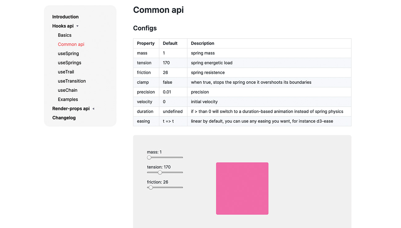
Right now, our animation works, but it seems more of a float than a flip. We can change some values on each spring to change how it behaves. Inside the setup object for the spring, create a config object to decrease the friction and increase the tension. This will give the animation a snappier feel.
useSpring({
	config: {
		friction: 22,
		tension: 500
	},
	[...]
});
15. Create spring for tilt effect
While the CSS-powered hover effect from earlier provides some feedback, we can enhance that further by having a tilting animation that reacts to the cursor position. When updating a spring at a high frequency, such as a mouse move, we can get better performance by using the set function that gets returned by each spring. Create a new spring for this animation and keep a hold of its returned function.
const [props, set] = useSpring(() => ({
	state: [0, 0, 1]
}
));
16. Apply tilt styles
React Spring can animate many different types of values, which includes arrays. Storing our values in one array allows us to interpolate them all onto the transform property in one pass.
Create a transformCard interpolation function and apply the styles to the main RatingsCard element.
const transformCard = (x, y, scale) =>
 `perspective(1000px) rotateX(${x}deg)
	rotateY(${y}deg) scale(${scale})`;
[...]
<animated.div
 className="RatingsCard"
 onClick={() => setSelected(!selected)}
 style={{ transform: !selected &&
	props.state.interpolate(
	 transformCard) }}>
17. Set values on mouse move
Mouse events provide the coordinates of the cursor at that time. We are interested in the client coordinates to get the cursor position within the viewport. Add mouse move and leave events to the outer <div>. We pass the coordinates to a function on move and reset to the default values when the cursor leaves the <div>.
onMouseLeave={() => set({
 state: [0, 0, 1] })}
onMouseMove={({ clientX: x,
 clientY: y }) => set({
 state: calculateValues(x, y) })
}
18. Calculate animation values
We only want a small tilt to avoid the card moving too much when the user interacts with it. The calculateValues function will work out the side of the screen the cursor is on and tilt it towards that direction.
Create the function to fill out those values. Dividing by 40 lessens the tilt effect to make it more usable. The final value will visually raise the card from the screen.
const calculateValues = (x, y) => [
	-(y - window.innerHeight / 2) / 40,
	(x - window.innerWidth / 2) / 40,
	1.1];
19. Show star rating

Each image has a rating that we need to display in stars on the back of the card. This logic is held inside its own component, but that needs to be applied to the back face first.
First, create a new piece of state to hold the rating, then create a <StarRating> component inside the back facing <div>.
const [currentRating, setRating]
 = useState(rating);
[...]
{selected && (
 <StarRating rating={currentRating}
	setRating={setRating} />
)}
20. Create star animation
The star ratings are going to fade in once the card has flipped. By using the useTrail hook from React Spring, we can apply springs to multiple components, one after another.
Open up StarRating/index.js and add the hook in. The first argument will define the number of springs to make.
const animatedStars = useTrail(5, {
	config: {
		friction: 22,
		tension: 500
	},
	from: { opacity: 0,
	 transform: "scale(0.8)" },
	opacity: 1,
	transform: "scale(1)"
});
21. Apply stars to component
The last thing we need to do is actually display those stars. The animatedStars variable now contains an array of springs, which we can iterate over and apply to the card.
For each star, show an <AnimatedStar> component inside the main StarRating div. Spread the style props to apply all the effects to each component. When clicked, send the new rating to the parent <RatingCard> component.
{animatedStars.map((props, index) => (
	<AnimatedStar
		active={index + 1 <= rating}
		onClick={e => {
			e.stopPropagation();
			setRating(index + 1);
		}}
		key={index}
		style={{ ...props }}
	/>
))}
This article was originally published in creative web design magazine Web Designer. Buy issue 288 or subscribe.
Read more:

Thank you for reading 5 articles this month* Join now for unlimited access
Enjoy your first month for just £1 / $1 / €1
*Read 5 free articles per month without a subscription

Join now for unlimited access
Try first month for just £1 / $1 / €1

Matt Crouch is a front end developer who uses his knowledge of React, GraphQL and Styled Components to build online platforms for award-winning startups across the UK. He has written a range of articles and tutorials for net and Web Designer magazines covering the latest and greatest web development tools and technologies.
