How to prototype a mobile app with Origami Studio
Learn how to quickly create a prototype ready for user experience evaluation.
In a world where users have high expectations of their experience on the web and mobile, prototyping and user evaluation is key. It's now common to progressively iterate on prototypes with increasingly high fidelity, and a flourishing user experience industry has grown up around this critical set of activities. Ultimately, getting software right at the prototyping stage saves you time and/or money later on.
If you're building a site to go alongside your app, keep things simple with a website builder and top web hosting.
There are many approaches you can take to prototyping, and numerous tools out there to assist. One of the newest on the block is Origami Studio, developed by Facebook and available free for macOS.
Origami Studio, which actually started its life as a plugin for Quartz Composer (a visual programming language within macOS's Xcode development environment) before becoming a standalone tool, has gained a great deal of attention over the last year.
This is not only because it is built by a big-name developer, but also because of the combination of power and simplicity it brings to developing high-fidelity, interactive prototypes.
Follow these steps to discover just how easily you can use Origami Studio to build a prototype. Got design files to save? Here are some cloud storage options.
01. A new prototype
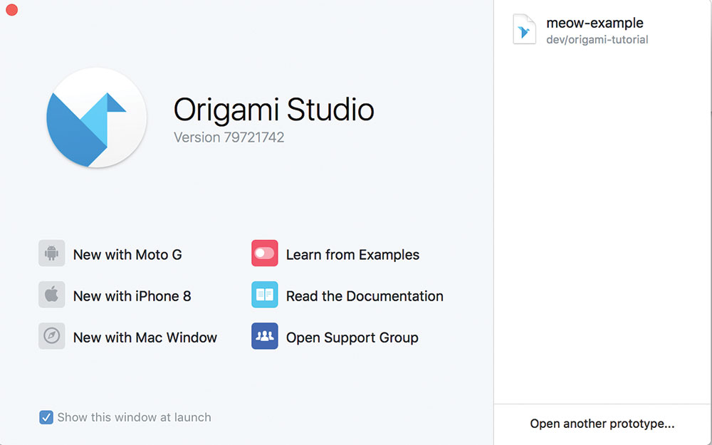
We're going to create a prototype for a mobile app which will allow us to swipe through pictures of cats and 'like' some of them. Once we've installed Origami Studio, we'll create a new iPhone 8 prototype from the splash screen.
Get the Creative Bloq Newsletter
Daily design news, reviews, how-tos and more, as picked by the editors.
02. Adding layers
We can start to add some layers to our prototype straight away. In this case, we'll add a logo positioned at the top of the screen. We add the layer using the + button in the top right and selecting 'Image Layer'. We can then resize and position it appropriately by highlighting and modifying the layer's properties. After our brand, we'll also add a heart image at the bottom of the screen to serve as our 'like' button.
03. Creating an interaction
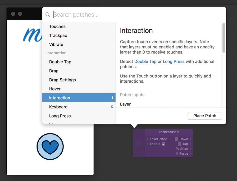
We need to make our heart button respond to user interactions. You'll notice that in the preview window, the cursor changes to represent touch on a mobile device. To respond to this, we need to create a 'Patch', which is essentially a function in Origami that takes inputs and produces outputs. Double-click the empty grey area to bring up a list of new patches, and search for 'interaction'. Place your patch and it should appear on the screen.
04. Linking interactions to layers
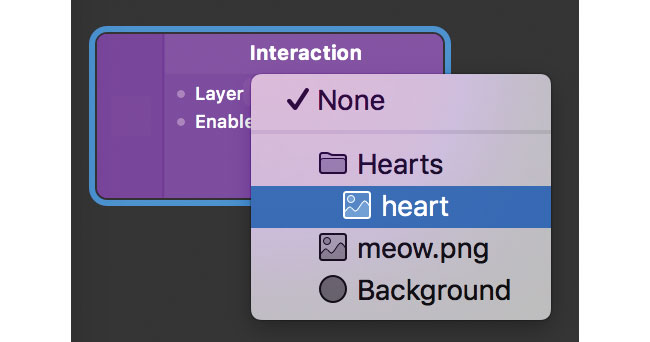
At the moment, your patch will respond to touch anywhere on the prototype. Test it out by clicking and you'll see the 'Down' and 'Tap' properties changing in real time. If you select the 'Layer' property in the patch, you can link it to the layer containing the heart image, and it will now only respond to clicks on that specific area.
05. Animations

Now we want to have something happen when our interaction triggers. Create another patch, this time a 'Pop Animation'. This is used to create a springy effect. Leave the properties as they are for now, but we'll create a link between the Tap output of the Interaction we created previously and the Number input of our new Pop Animation. We do this by clicking and dragging between the small circles next to each. If you click the heart now, you'll now see the interaction triggers a change in the 'Progress' output of the Pop Animation.
06. Transitions

The next thing we need is a Transition patch. This will allow us to specify low and high values to move between as the Pop Animation's Progress output changes. We can then link the Transition's output values to the Scale property of the heart image layer to tell Origami to resize it when it's clicked. You should now find that clicking the heart causes it to animate a brief change in size. It's not quite right, however, since it pops back to normal straight away.
07. Switches

Switch patches are Origami's way of toggling between two states. This is what we want for our 'Like' button. An input passed to a Switch patch can flip it between 'on' and 'off' states, which can then be passed as an output to subsequent patches. Let's create a new Switch and place it between the Interaction and the Pop Animation. You should then be able to click the heart to toggle it between small and large states.
08. More complex behaviour
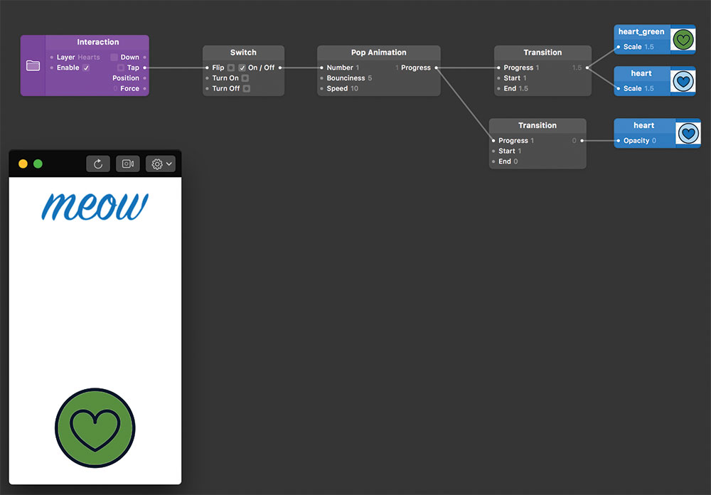
Congratulations! You've now created your first interactive feature, using the most common patches that you'll find you use time and time again. We can add more patches to create more complex behaviour. Let's create a different coloured heart layer directly behind our current one, then add new patches both to scale it simultaneously, and modify the opacity of our original layer so it's made visible. Now, when you tap the heart, it will toggle larger and smaller, but also appear to change colour.
09. Carousel
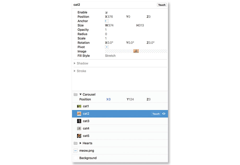
To finish our prototype, let's add an image carousel with the cats we want to allow users to 'Like'. To do this, we first need to add a group of layers. Each image will be a separate layer, with increasingly offset x co-ordinates so that they essentially sit side-by-size in a row with only one visible on screen at any one item.
10. Swiping left and right
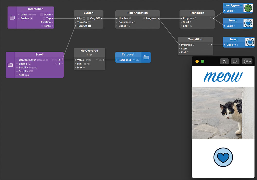
The last thing we need to do to make it work is enable left and right swipes to scroll the carousel. We do this by creating a Scroll interaction to link to the carousel layer group (not the individual images). The interaction outputs an x co-ordinate which we can then link to the x property of the carousel to move it. In-between, we'll add a Clip patch, which can be used to limit values to ensure we do not scroll to co-ordinates outside the edge of the carousel.
11. Next steps
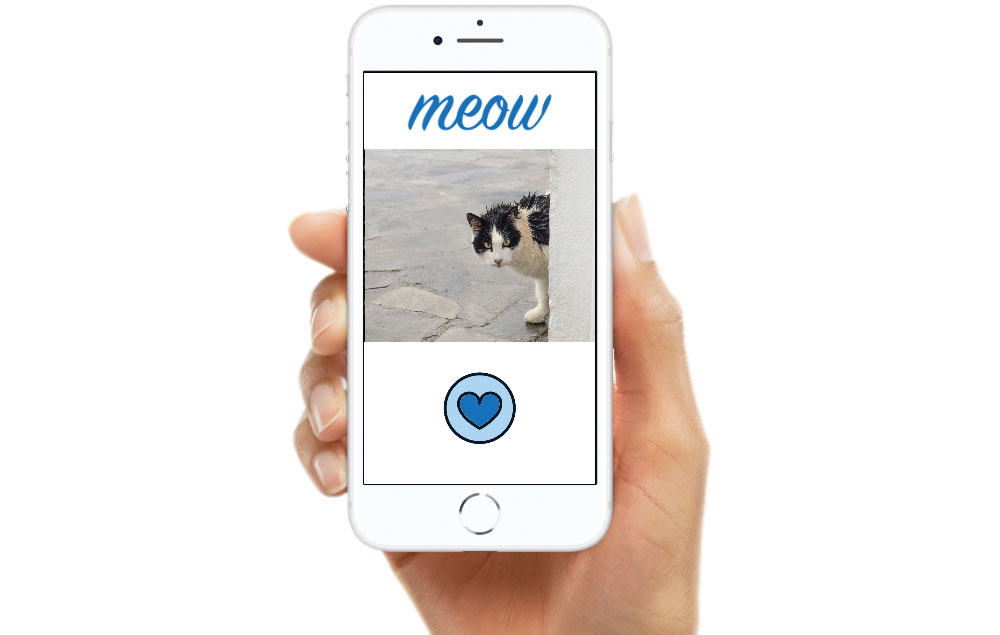
That's it. You've created a very basic app. You can also use Origami Studio's built in 'frames' to place it onto a device background, which can help give a professional finish. Now that you're familiar with the basics of using patches, you can begin to create more advanced behaviours. There are plenty of guides on the Origami Studio website, which explain how to implement popular functionalities commonly seen in apps.
This article was originally published in issue 270 of creative web design magazine Web Designer. Buy issue 270 here or subscribe to Web Designer here.
Related articles:

Thank you for reading 5 articles this month* Join now for unlimited access
Enjoy your first month for just £1 / $1 / €1
*Read 5 free articles per month without a subscription

Join now for unlimited access
Try first month for just £1 / $1 / €1

Simon Jones is a technology leader with experience managing product and engineering teams of up to 200 staff, both at startups and large corporates. He is a proficient full-stack developer, in particular with Go & React + TypeScript. He now works at Meta in London. Formerly CTO at Norwegian VC-backed startup Just, and Engineering Director at Barclays and American Express.
