How to prepare a file for print
A look at the process of preparing print-ready files.

As an artworker at Wieden+Kennedy London, I design for print regularly. There are certain requirements that printed products need that are different to other types of design. Here's my process for getting files print-ready.
When preparing an artwork file for print, I start with an approved file from the design team. I make several rounds of minor amends – copy and image updates, such as edits to the headline or adding retouched images.
Once I receive final sign-off internally and from the client, I prepare the artwork file according to job specifications defined by the design or media channel booking. This usually includes checking the resolution and colour space, so for a print job we ensure the image is a minimum of 300dpi and in the CMYK colour space.
I then set the document up to specification, making sure the document size, bleed, trim and copy safe area are correct. To ensure the artwork is colour accurate, I print a colour-certified proof to be signed off by the necessary parties.
For press and out-of-home campaigns, I will adapt the master artwork to suit specific media bookings. For example, if I’m adapting a press ad for Sainsbury’s, I receive different sizes and specifications for each newspaper and adapt the file while being careful to keep the overall look and feel as close to the master layout as possible.
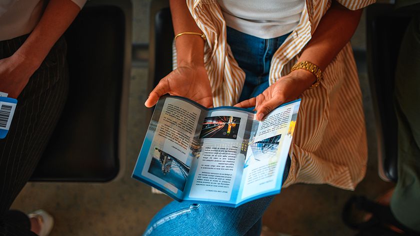
Once adapted, files are then packaged up (collecting the individual assets, layout files, fonts, graphics, images) or formatted to a particular file type, according to the printer’s requirements. We then supply to the printers or production partner ready to print.
Balancing print
The Three Holiday Spam campaign pictured above centred around people bragging via holiday snaps. As this was for print, the files were created in InDesign CC in the CMYK colour space. All images had to be a minimum of 300dpi and in the correct colour space.
Get the Creative Bloq Newsletter
Daily design news, reviews, how-tos and more, as picked by the editors.
Colour adjustments were made so that the execution felt balanced and some of the duller images still popped. It was important that the white space between the images was consistent and exact and that the copy sizing, leading and tracking adhered to Three’s brand guidelines. I also ensured the T&Cs, hashtags and URLs were correct.
This article was originally published in issue 272 of Computer Arts magazine. Subscribe here.
Related articles:

Thank you for reading 5 articles this month* Join now for unlimited access
Enjoy your first month for just £1 / $1 / €1
*Read 5 free articles per month without a subscription

Join now for unlimited access
Try first month for just £1 / $1 / €1
