How to turn photography into illustration
Discover how to use photography to inspire your next artwork.
Understanding the best way to turn photography into illustration will open up a world of possibilities for your artwork. Though being able to produce a piece based purely on scenes created by your imagination may give a wonderful sense of achievement, it's a long journey to get there – even as a professional illustrator.
There are always moments when you'll sit down in front of a blank canvas, not knowing where to start. Professional illustrator Cindy Kang suggests you take a step back and look through photographs on your phone. In this tutorial, she shares insights on how photos can help spark a new project, then help during each step of creating an illustration, from visualising those initial ideas to adding finishing touches.
If you'd like new tools to create with, see our guide to the best pencils, and for more expert drawing advice explore our roundup of the top how to draw tutorials. Or keep reading for Kane's expert tips.
01. Collect pictures as a habit
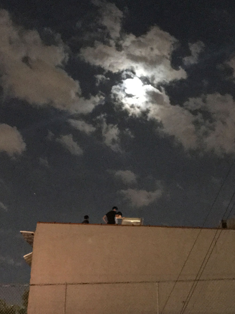
Even when I'm just going for a walk, I habitually take countless pictures despite knowing that I'll often have to free up the memory storage. My phone is full of images of urban and natural landscapes during my visits to places near and far. You don't need an expensive camera or smartphone (but if you want a new one, here are the top camera phones), and the photo doesn't have to be a masterpiece. I simply take photographs of the buildings, sunset or random little objects that I've come across with my phone.
Keeping photos is also a way of capturing experiences and memories in a visual form. Looking back at these images helps bring back the moment when I pause to think of something, and they can lead to new, exciting ideas.
02. Muse on ideas and themes
A photograph contains a range of information, not limited to the time of the day, weather and location. We can also guess the relationships between people and even their feelings. Using the information that a photo provides, we can come up with a fun story that starts with what's already in the picture.
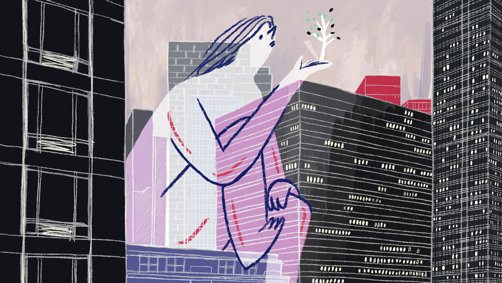
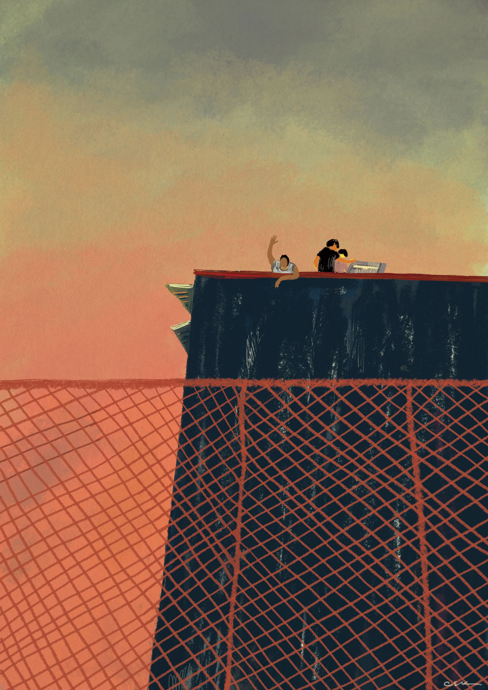
For example, looking at the tall buildings of New York City and the subway that runs between them, I thought of an idea of how nature is being missed among the crowded buildings and people living a hectic city lifestyle (which inspired the piece above). The smallest thing in a photograph can ignite your creativity and bring an interesting narrative to the illustration.
03. Test composition
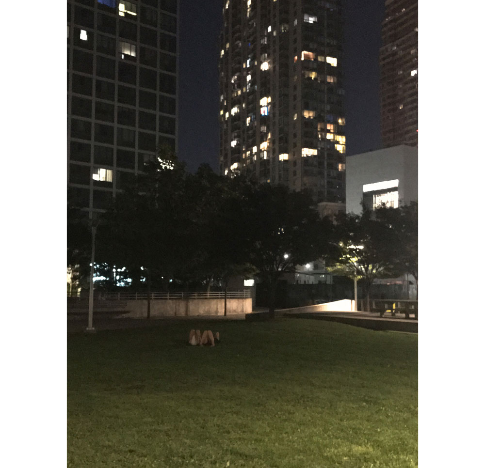
Working from photographs enables us to test out the composition efficiently before moving on to a sketch stage. By zooming in and out or cropping the photo in various ways, you can find the form that works best. The above photo inspired the piece below.
Sometimes I find it more interesting to either focus on the corner of the photograph and draw it from there, or to crop the sky above the building in the photo of a cityscape to make the composition work more effectively.
The overall composition and negative spaces play a critical role in creating a balanced illustration. With a good reference photo, you can quickly figure out what composition works best by playing around with it in the rectangular photoframe. Once I'm happy with the composition, I develop a sketch based on the edited photograph.
04. Inject imagination
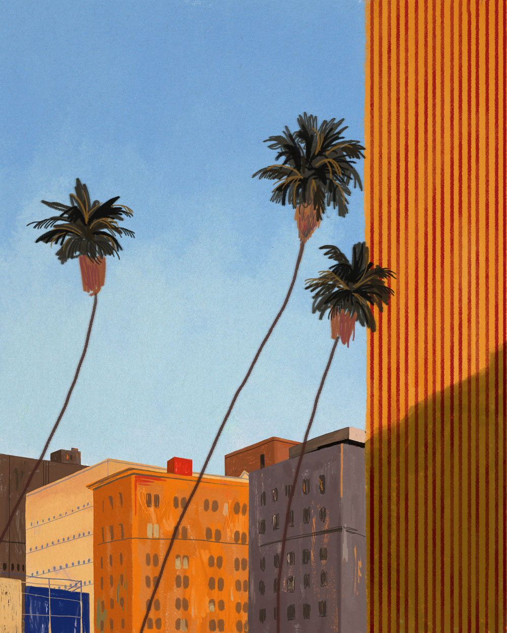
Drawing the photograph in my style is always a fun challenge, but simply by adding some imaginary elements, the story in the illustration can come alive.
Based on the photograph I have as a reference, I quickly put down the sketches on an additional layer on Photoshop. Anything that grabs my attention or any impressions I get from the photo could serve as inspiration for ideas.
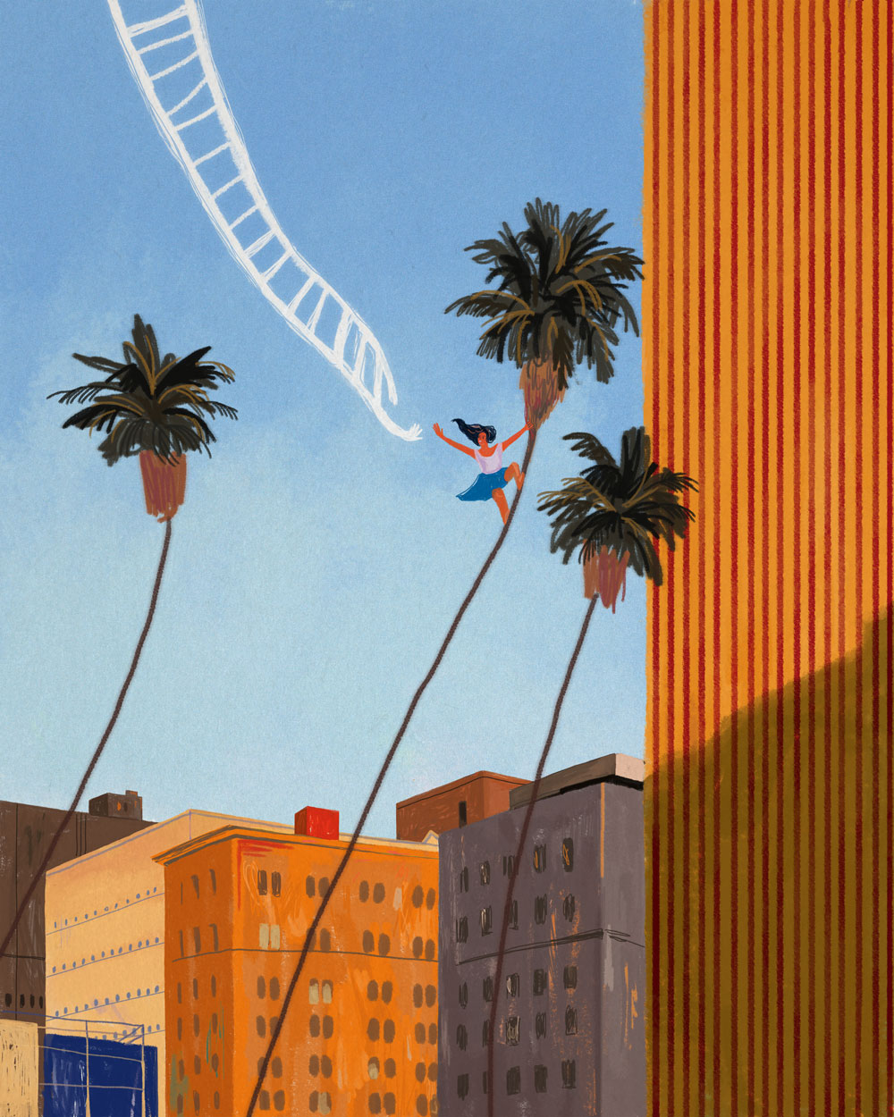
When I worked on the piece California Dream (above), the big blue sky in the photograph (at the top) made me think of freedom, wild adventures and bold challenges. To show these visually, I drew the image of a girl reaching for the heavenly ladder that was descending from the sky. Adding acts of
pure imagination serves as a mode of expression for the ideas that I aim to portray through my illustration work.
05. Be inspired by colour
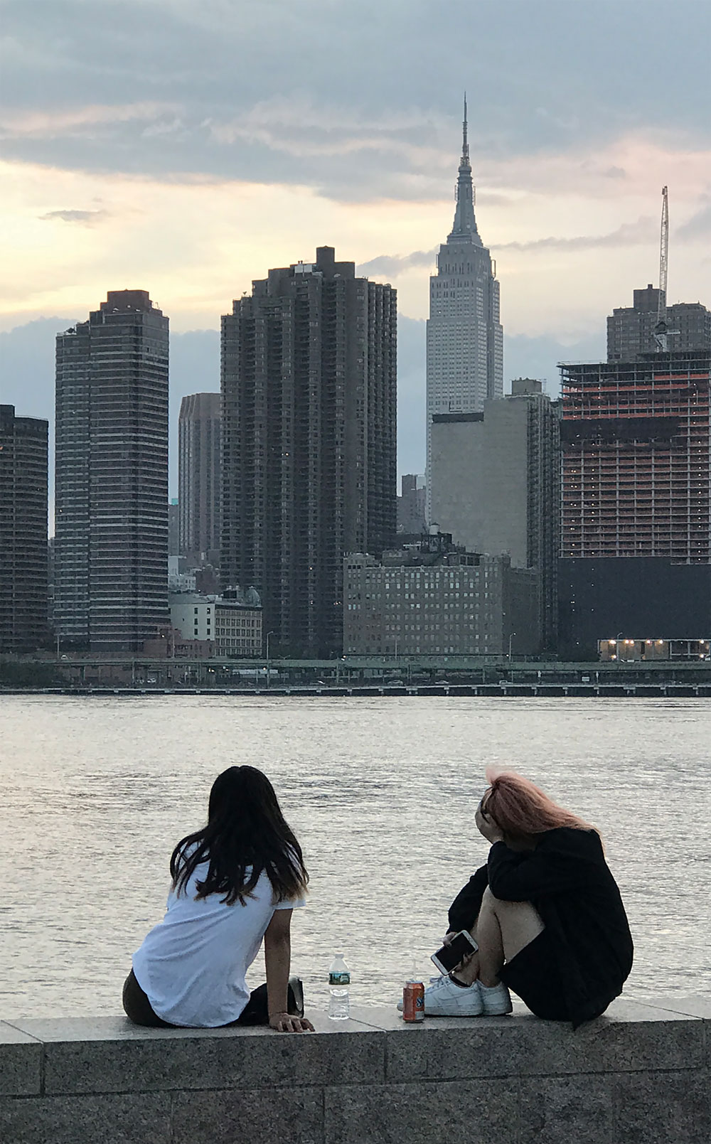
Sometimes I fall in love with the colours present in particular photographs and use them directly in my art. In addition, I often edit the colours in the photo to fit the tones and warmth of the mood I want to create in the illustration, like in the example shown here (photo above, illustration below). I'm then able to create a colour palette based on the edited photo that I can apply to the artwork.
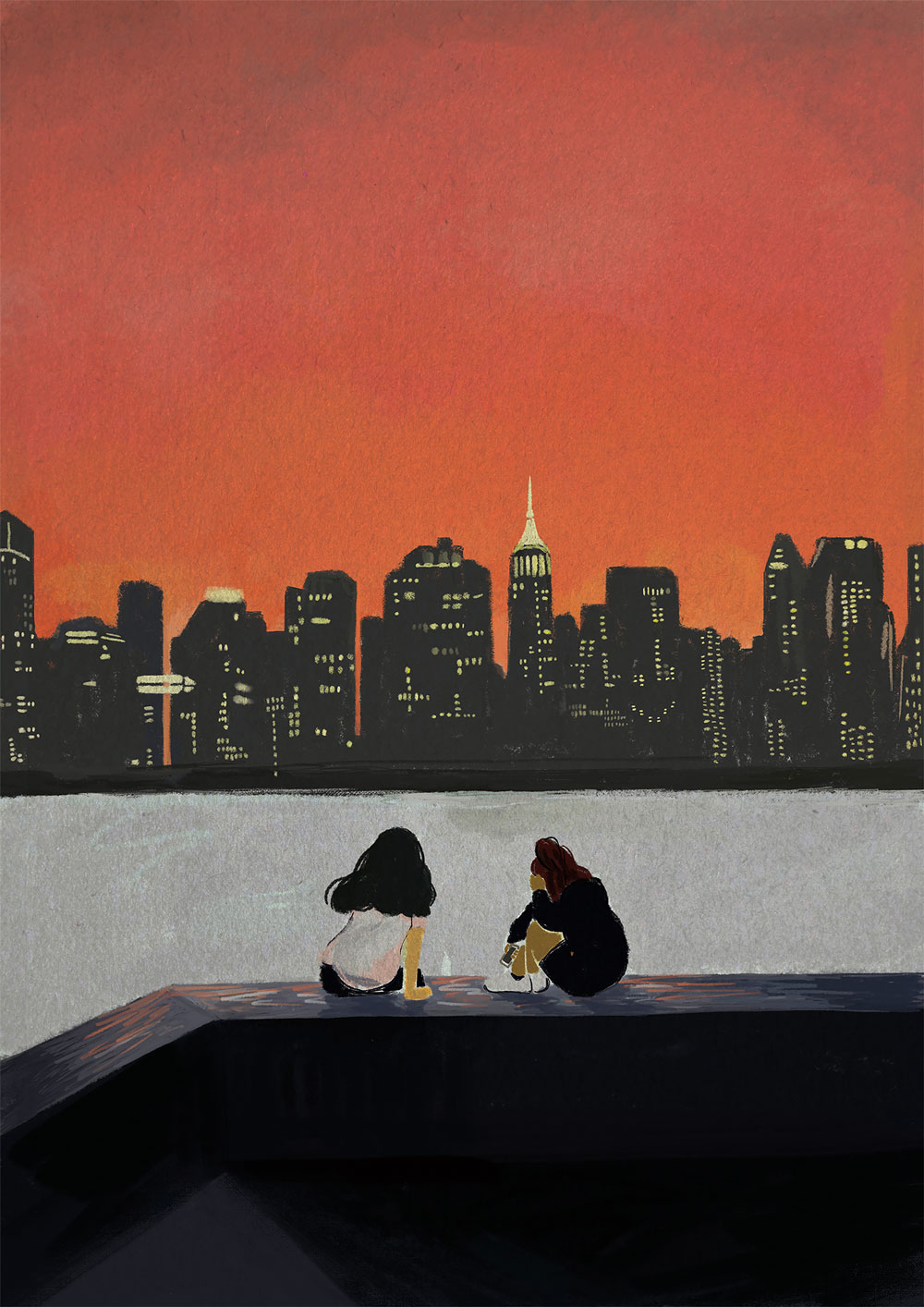
Just a tint of the colour can create a wildly different mood, so I work on colours more than any other step. Because I enjoy creating a warm story and atmosphere, I predominantly use pictures of sunsets as a colour reference.
Even when the artwork isn't entirely based on photographs – perhaps it's a flat illustration with a simple coloured background – you can still find useful colour inspiration from photographs. You might identify colours that impart a sense of coolness to the image, what colours are present in the shadows, and those colours that just work beautifully together.
06. Add light and shadow
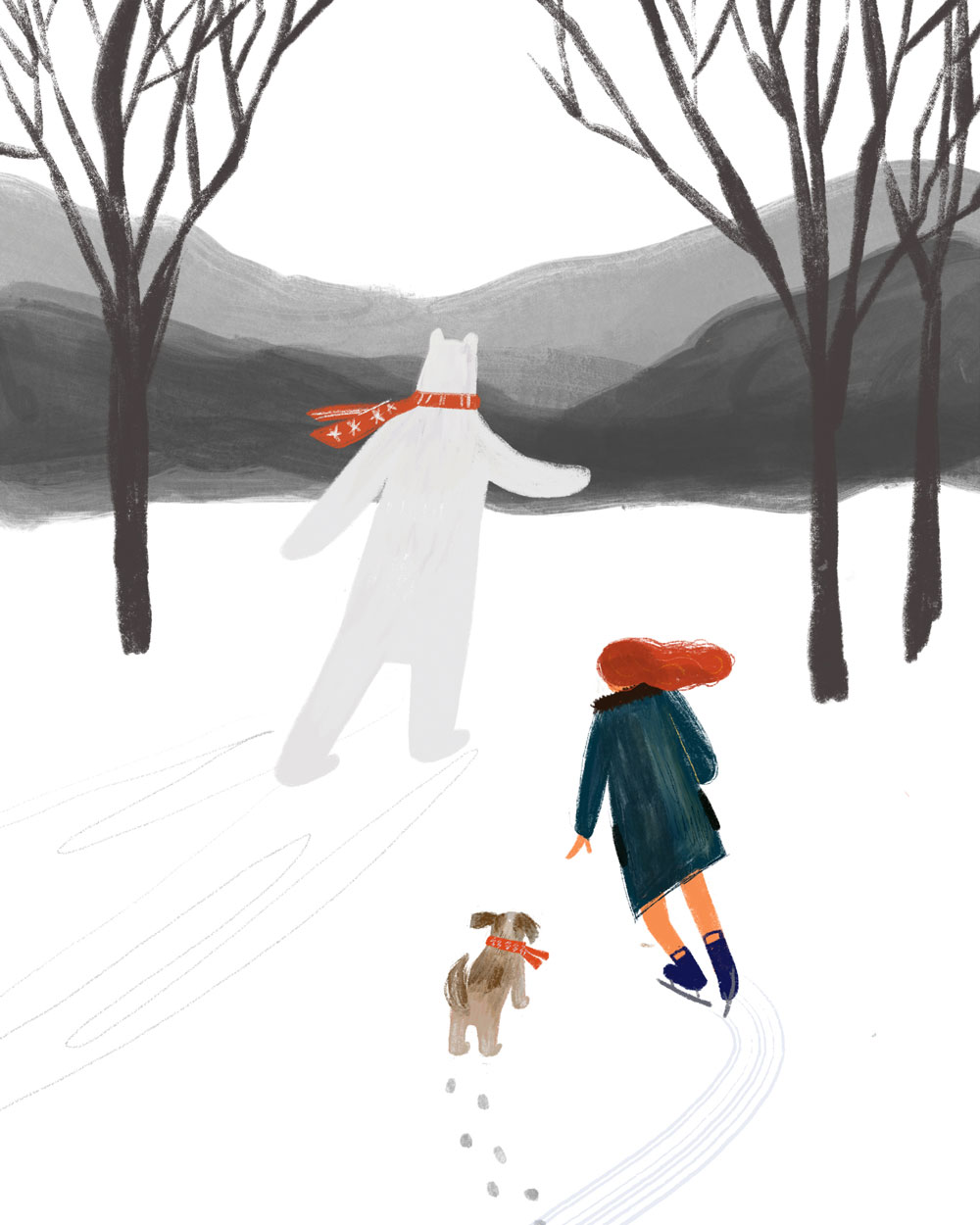
Towards the end of the illustrating process, I study the photo reference again to find out the light and shadow shapes (the illustration above is shadowless, with shadows added in the one below). Shadows can have a strong visual impact on the atmosphere of a composition. The shadow shape can be easily found in the reference photo. When you're working on a conceptual piece that's not based on a particular photograph, you can still take a picture reference of any object in front of you and figure out how the shadow is formed by the light.
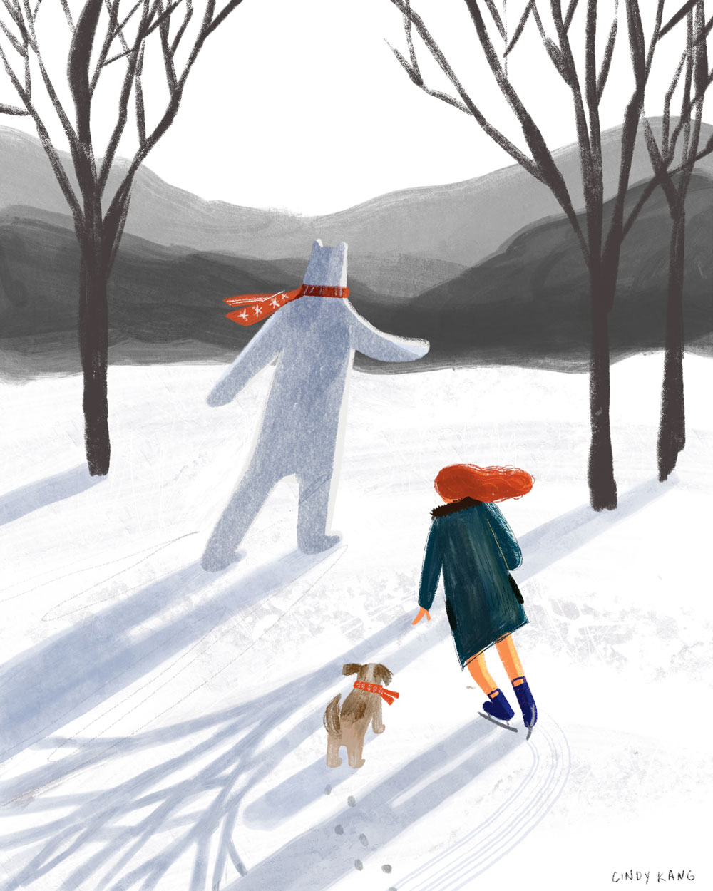
These details give depth and a surreal feeling to the illustration. By combining the realistic background, shadows and an imaginative story or situation, you'll be able to give the artwork the sense of a vivid dream.
07. Apply final textures
The final step of my illustrating process is adding the final brush strokes and the paper texture. While it's possible to configure digital brushes so that their strokes feature the texture of a traditional medium, I prefer to apply the paper texture to the whole canvas. I use a scanned photo of the paper, so that you can see the wood pulp mixed in the surface. This gives an organic texture to the artwork. I add the layer of the scanned photo on Photoshop, then change the layer blending mode to Multiply. By adjusting the Opacity or Colour Balance, I'm able to control how much texture I want to be shown in the artwork.
08. Ask for feedback
Photographs have been used in various ways in each step of the illustration process. Photographic elements such as the composition, background, colours and other little details all help to provide the starting point for exploring ideas.
I find it inspiring and endlessly helpful to start creating illustrations from photographs, and the process also becomes more interesting when the work is shared with viewers. Some people may recognise the locations, or relate to the situations I've captured in my art. The illustration becomes an excellent tool for communication, which encourages people to share their stories and feel connected with each other through the artwork. It offers a new experience by recreating our memories – just like photographs do, too.
This content originally appeared in Computer Arts magazine.
Read more:
- The best smartphone tripods in 2020
- Art techniques: top tutorials for painting and drawing
- Colour theory: The ultimate guide
Get the Creative Bloq Newsletter
Daily design news, reviews, how-tos and more, as picked by the editors.

Thank you for reading 5 articles this month* Join now for unlimited access
Enjoy your first month for just £1 / $1 / €1
*Read 5 free articles per month without a subscription

Join now for unlimited access
Try first month for just £1 / $1 / €1
Freelance artist. Cindy Kang is an illustrator and visual artist based between Seoul and New York. Her colourful illustrations are inspired by various stories around the world.
