Perfect prototypes and hand-off designs with Marvel
Design wireframes and pass on prototypes in six easy steps.
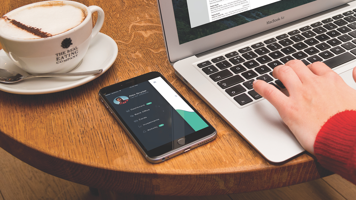
With a shorter learning curve than InVision App and brand new design handoff tools for enterprise teams, there’s no better time to explore how Marvel can be a swift and effortless solution for prototyping web and mobile applications in teams.
Marvel helps teams take their designs (made either in Sketch or Marvel itself) from sketched idea to initial to tested concept. Its collaborative tools encourage stakeholders not only to have their say but to be a part of the design workflow.
01. Create your first Marvel project
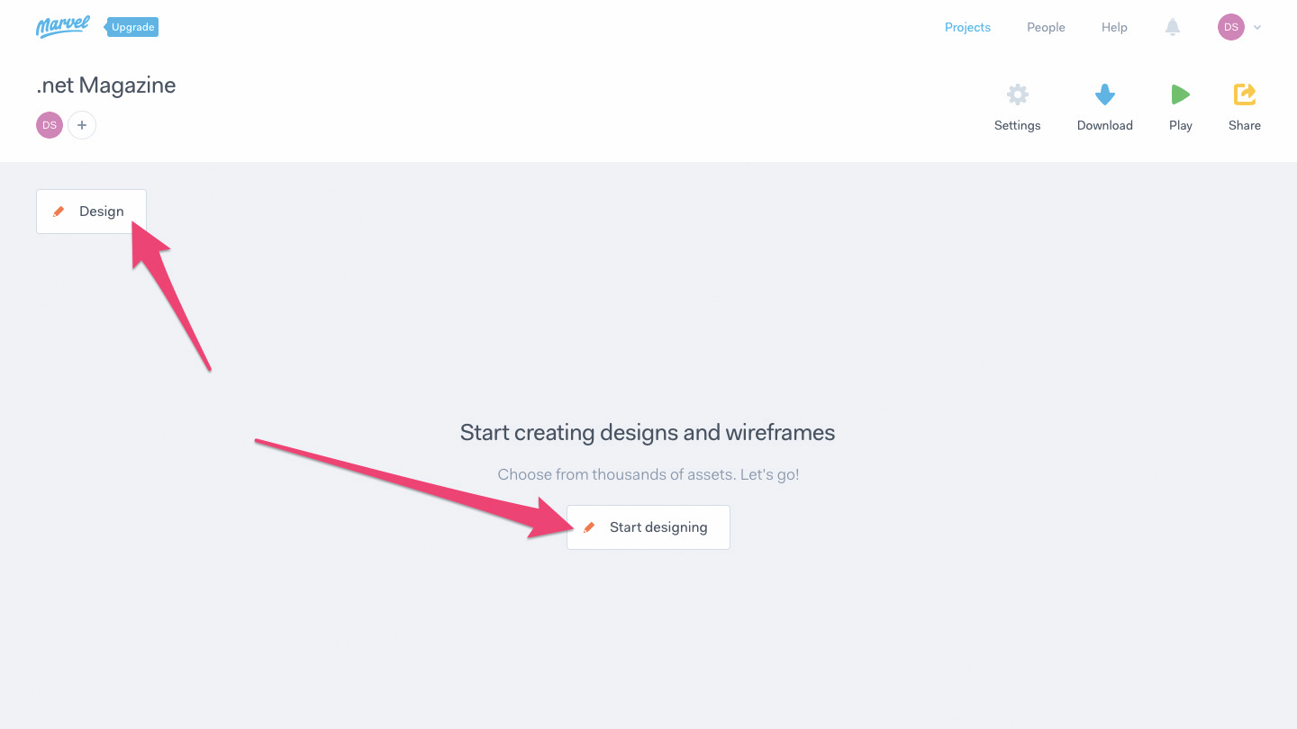
Sign up at Marvel to begin, where only your name and email address are required. Choose either Design Project or Prototype Project. A Prototype Project is when you upload screens that you’ve already designed (usually in Sketch). A Design Project is when you’re starting from scratch and you’d like to use Marvel’s own design tools to create a low-fidelity mockup (this is an amazing option for rapid iteration and brainstorming).
Choose Design Project, then give it a name, then choose iPhone X and click the Create Project button. From here (we’ll call this the project dashboard from here on out), click the Design button on the left-hand side, or the Start designing button in the middle of the window.
02. Design low-fidelity prototypes
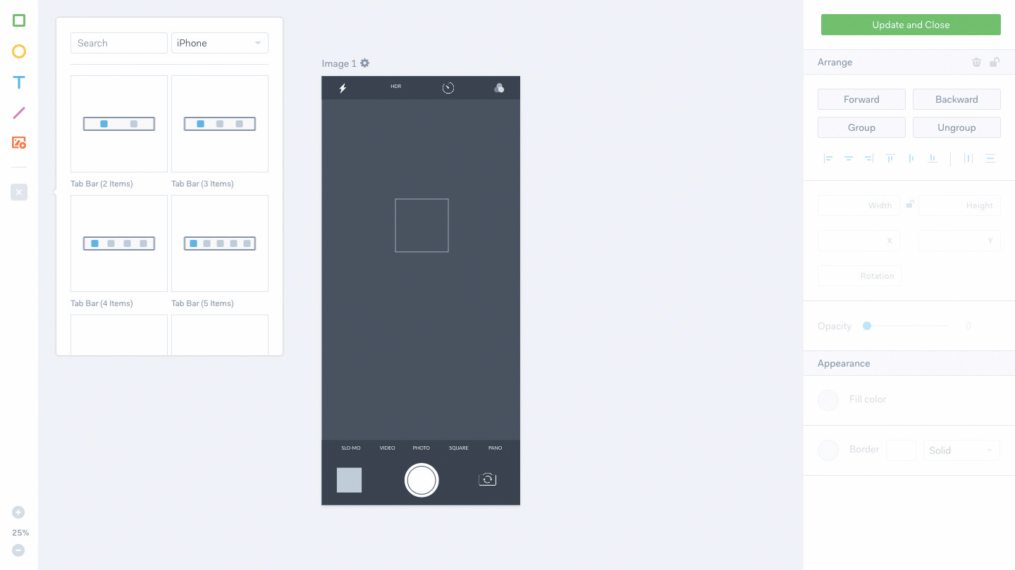
Our core aim here is to visualise our ideas quickly without wasting too much time worrying about what the final outcome will look like. From here we’re able to create shapes, images, text, ready-made components like tab bars, and even entire full-screen components like this camera screen (which was selected from the left-hand sidebar and restyled using the right-hand sidebar).
Drawing shapes, creating text layers and making simple visual changes is fairly easy even for a non-designer, although seasoned designers will love how quickly they’re able to throw an idea together and click the Add to Project button.
Although you can’t expect vector drawing, masking and other complex design tools, this interface will nonetheless feel quite familiar if you’re a Sketch, Adobe XD or Figma user (in fact, we’ll discuss importing higher-fidelity designs from Sketch in a moment). What you can expect is zooming, aligning, grouping, basic visual design tools, mouse controls such as dragging, resizing and rotating and a few handy keyboard shortcuts.
Get the Creative Bloq Newsletter
Daily design news, reviews, how-tos and more, as picked by the editors.
03. Receive feedback
However, Marvel isn’t only for designers. While it may require a designer to create the final design in an industry-standard design app, ideas should (and do) come from all kinds of stakeholders (managers, clients, developers, and so on).
No matter what your primary role is in a team, it should be super-easy to say: “Hey, could this be an idea?”, and then demonstrate that visually. Marvel’s POP mobile app reduces the barrier of entry even further by bringing these simplified design tools to mobile devices because, let’s face it, ideas can come to us at the strangest of times. Ideas sketched on paper can be converted to an interactive Marvel screen using the device camera. Design needs to be a democratised, where anybody can have a say without being restricted to using complex design applications.
04. Integrate Marvel with Sketch
After productively brainstorming low-fidelity ideas with your team, you’ll want to mock up the first iteration in your design app of choice. While you can totally upload exported PNG screens from any design app, Sketch is the recommended app because there’s a dedicated Sketch Plugin that automates the process (and even readies the design so that it can be inspected by developers later on). Photoshop support for design handoff will come later, however Adobe isn’t touting Photoshop for user-interface design anymore, since it created Adobe XD.
From the dashboard, click Settings > Integrations > Sketch Plugin, then Download Plugin. Once you have it installed, and your design file open, hit the Sync Selected or Sync All buttons in the Marvel bar (this appears above the layer list) to begin choosing a Marvel Project to sync the screens into.
05. Prototype interactions
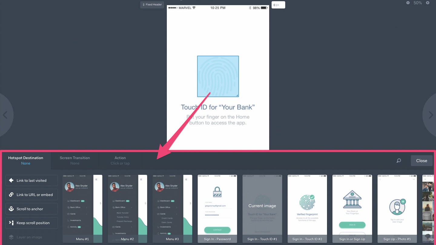
But of course we can’t test prototypes if we haven’t added any interactions to them, so let’s do that now. Moving back to the Marvel dashboard, where you’ll see the screens that we synced, click View on any one of the screens to enter screen mode.
From here we can still navigate through the screens using the left and right arrows on either side of the window, click Timer to have Marvel cycle through the screens after a certain number of seconds (useful for presentations!), or click No Comments to add your first comment or annotation on the screen.
Probably the first thing you’ll notice is the Fixed Header and Fixed Footer buttons that appear near the top-left and bottom-left corners of the screen respectively. These buttons are draggable and they can also be moved to mark the cutoff region of a header section that is to stay fixed to the top of a scrollable viewport. You can also use the text fields in the top-right and bottom-right corner to specify this value manually.
But how do we actually link one screen to another? Simple: with the mouse, drag-select a region on the screen that is to link to another screen (this is called a ‘hotspot’). Once you’ve done that, an interface will appear at the bottom of the window that enables you to customise where the user is taken to, any transition that happens during the interaction and what gesture is required to activate that interaction (tap, swipe etc).
And of course, we can use these prototyping tools even on low-fidelity mockups. In fact, it’s recommended that you do, all the while using the commenting features to discuss and reiterate.
06. Handing off designs to developers
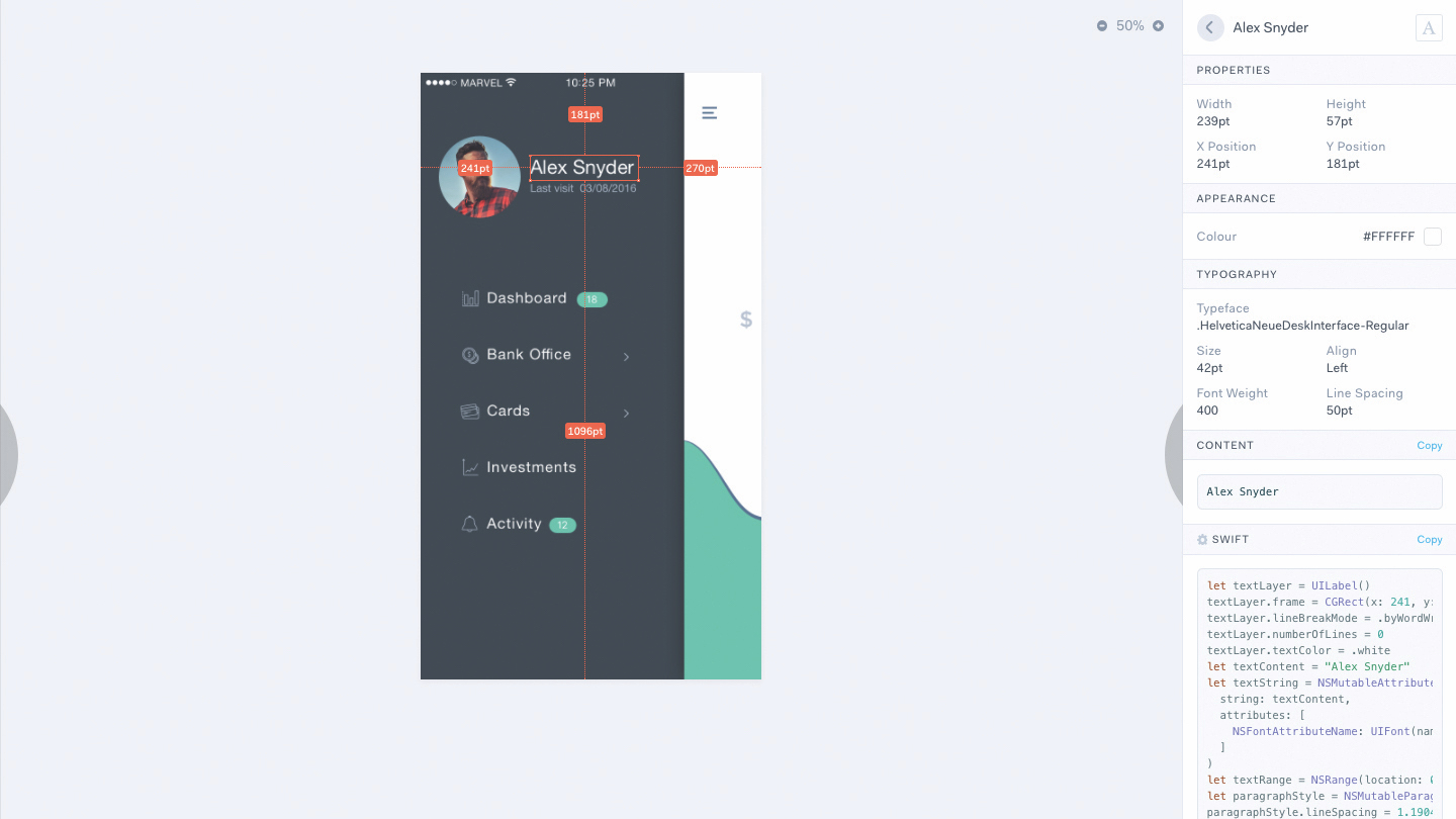
When your team retains full confidence in the final design, validated using the commenting and user testing tools, it’s time to hand it over to the developers who can then inspect and code. It’s important to remember that a designer isn’t ‘done’ once the design is handed over and that designers and developers should always communicate in harmony to oversee the development until its completion. The developer may also have some questions, so those commenting features should still be very much active.
Hit the Play button, then click Handoff in the bottom-left corner to open the design handoff interface. From here, developers will be able to click on the design elements and inspect the individual styles that make them what they are, using the sidebar on the right-hand side (much like the inspector interface in Sketch, Figma or Adobe XD). The only difference here is that developers are able to click on the Copy button to copy the styles as code to the clipboard.
This article was originally published in issue 301 of net, the world's best-selling magazine for web designers and developers. Buy issue 301 or subscribe to net.
Get more insight into iterative prototyping

When most companies need to create a new web design, the process typically starts with pitching ideas, moves to design, then development, and then goes live. But what if it doesn't work? That's a lot of time, effort, and money to spend just to find out that an idea performed poorly.
Fortunately, in her talk at Generate New York from 25-27 April 2018, Marisa Morby, head of research at Clearhead, will show you a better way to create and validate new designs that is faster, easier, and less expensive than the traditional design process using iterative prototyping and testing.
Generate New York takes place from 25-27 April 2018. Get your ticket now.
Related articles:

Thank you for reading 5 articles this month* Join now for unlimited access
Enjoy your first month for just £1 / $1 / €1
*Read 5 free articles per month without a subscription

Join now for unlimited access
Try first month for just £1 / $1 / €1
Previously a design blog editor at Toptal and SitePoint, and before that a freelance product/UX designer and web developer for several years, Daniel Schwarz now advocates for better UX design alongside industry leaders such as InVision, Adobe, Net Magazine, and more. In his free time, Daniel loves gaming, café culture and Wikipedia, and also travels perpetually when there isn’t a pandemic.
