How to draw with pastels and Conté crayons
Capture the essence of natural forms by combining these two mediums.
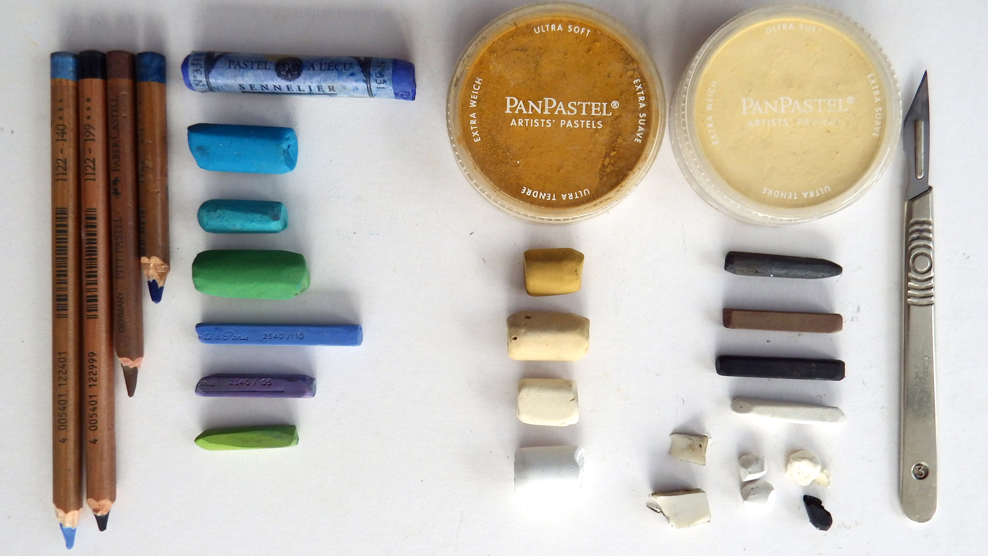
- Pan Pastels Yellow Ochre and Diarylide Yellow Tint
- Unison pastels BE1, NE4, Grey 27, Grey 28
-Willow charcoal, Conté Crayons, brown, black and white
- Broken shards of the above
- Pencil rubber, cut into small pieces
- Scalpel
- Faber Castell PITT Pastel Pencils; Pale blue 1122-140 , Black 1122-199, Brown 1122-176, Dark blue 1122-151, Green and Blue. Unison pastels including BG 7, BG14, Green 20. Conté Crayons, blues, purples and pale green.
For this tutorial, I am using soft pastels and Conté crayons for drawing, rather than painting. There is always a debate about whether pastels are a drawing or painting medium, but I think it depends entirely on the way you use them.
Here I will be using limited colour to capture the energy and texture of natural forms by changing my mark making and feeling for the flow of line. As I draw each piece, I hold it in my hand to feel its weight and use other senses as well as sight. I want to convey more than just what it looks like. What does it feel like? Is it hard and spiky, and heavy to hold? Or light and fragile, and easily crushed in my hand?
Whatever the subject matter might be, we can convey all of those sensations with the quality of our marks.
To stock up on materials, see our best pastel pencils, best pencil sharpeners and best easel guides.
01. Test our your materials
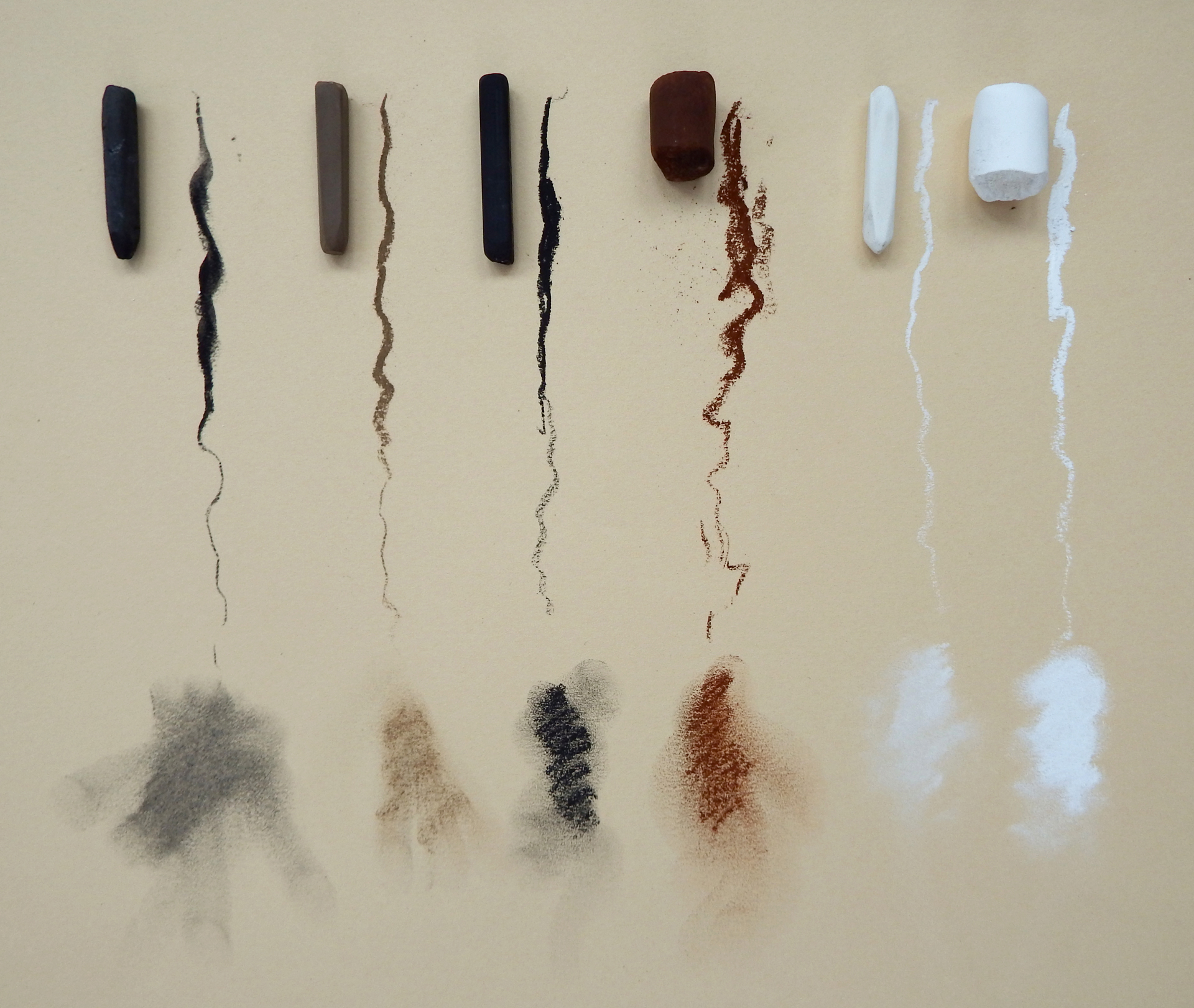
Pastels and Conté crayons vary in hardness. To test out how they behave, do lots of experiments, pressing as hard as you can, then just letting the pastel graze the surface of the paper. See how they smudge. Notice how some make an intense mark, others are subtle. You can use these variations to get great contrasts in your work.
Think about the weight and energy of your subject. Hold it in your hand, feel it with your fingers, then draw what it feels like as well as what it looks like.
02. Experiment with marks
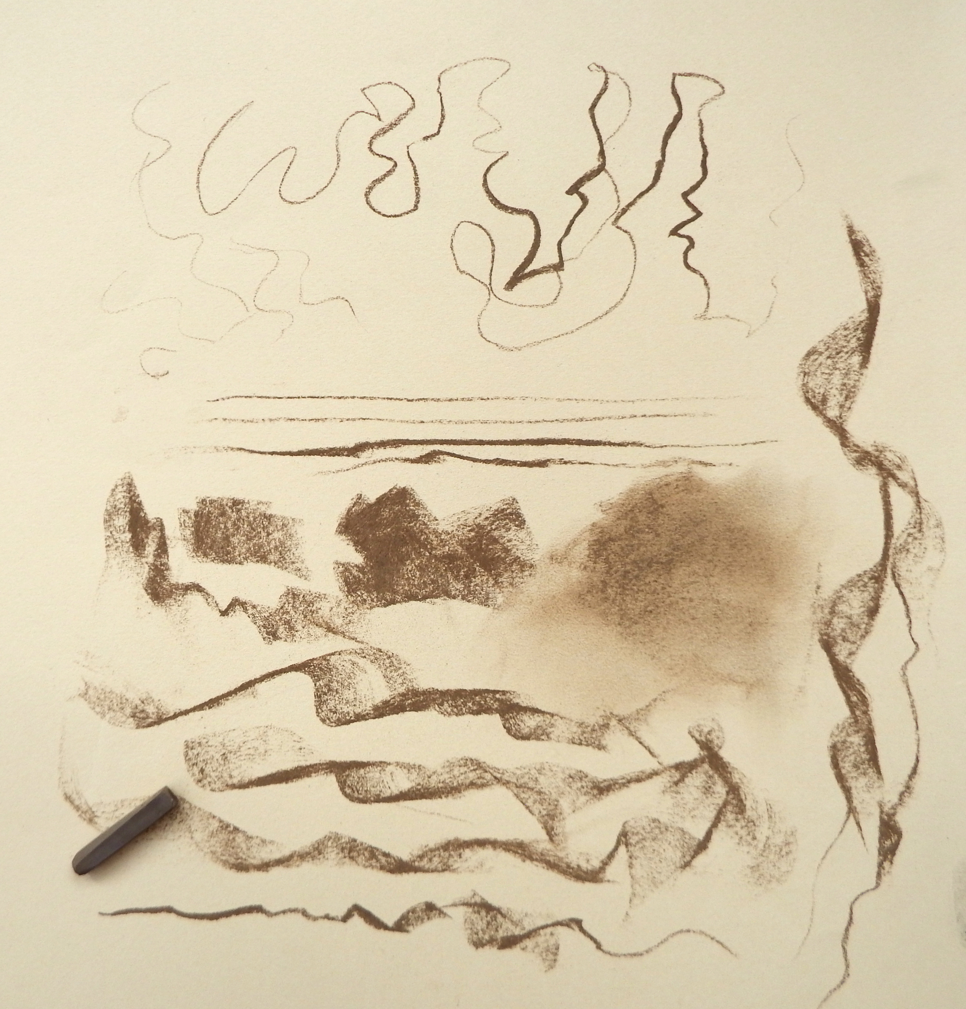
There are so many different ways that you can draw with pastels or Conté crayons. I break my sticks in half and use them on their ends, twisting and turning; on their edges for linear work; and on their sides to make broad, sweeping strokes. By alternating all of these as you draw, your pastel can dance around the surface.
03. Sketch a base layer
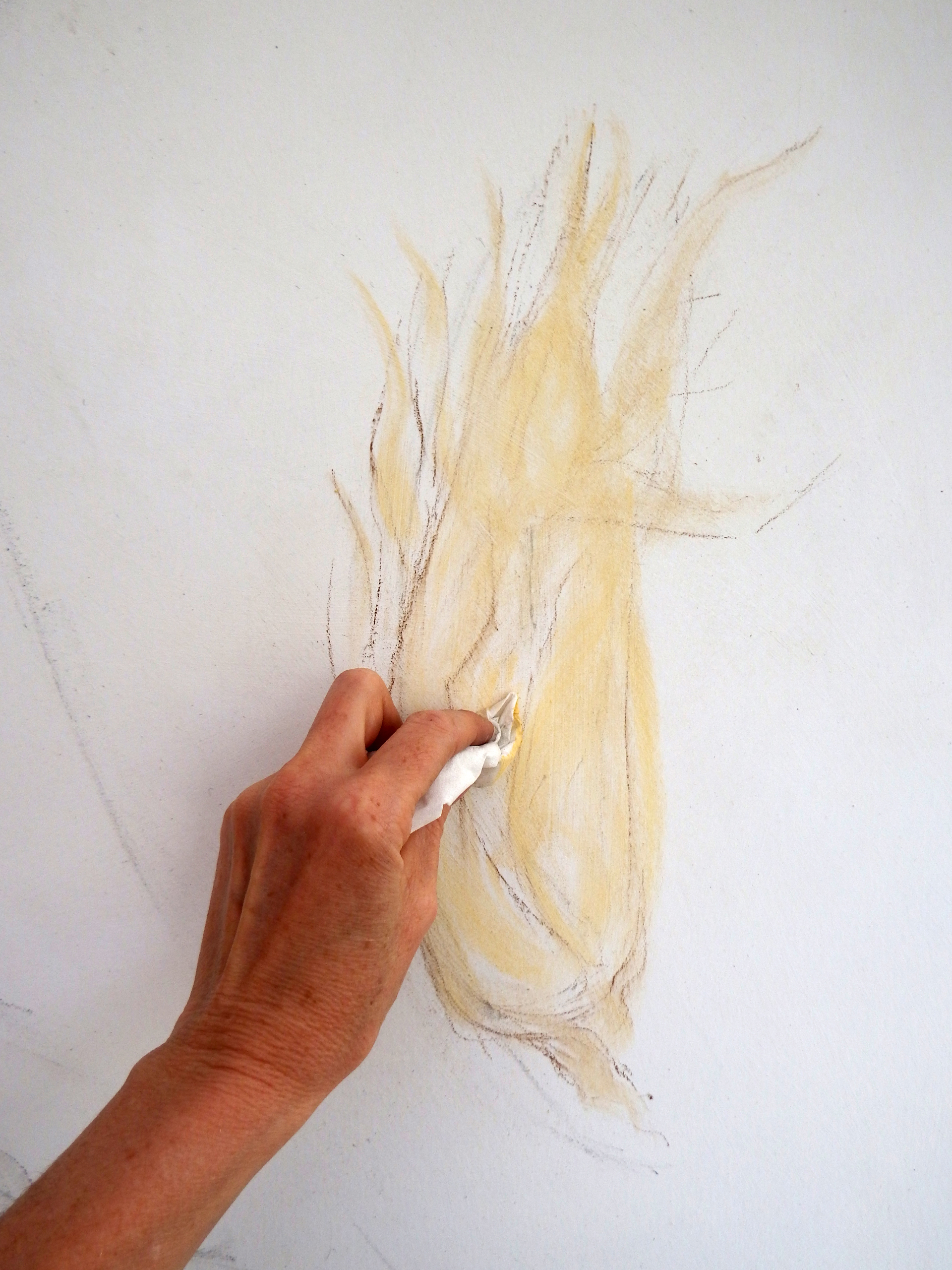
If you want to practise your drawing, it is always good to have an object in front of you, rather than a photograph. As my paper is light in tone, I loosely sketch in a mid-tone base layer, using Pan Pastel powder applied with a tissue. This gives me a base to draw over with darks and lights.
04. Go with the flow
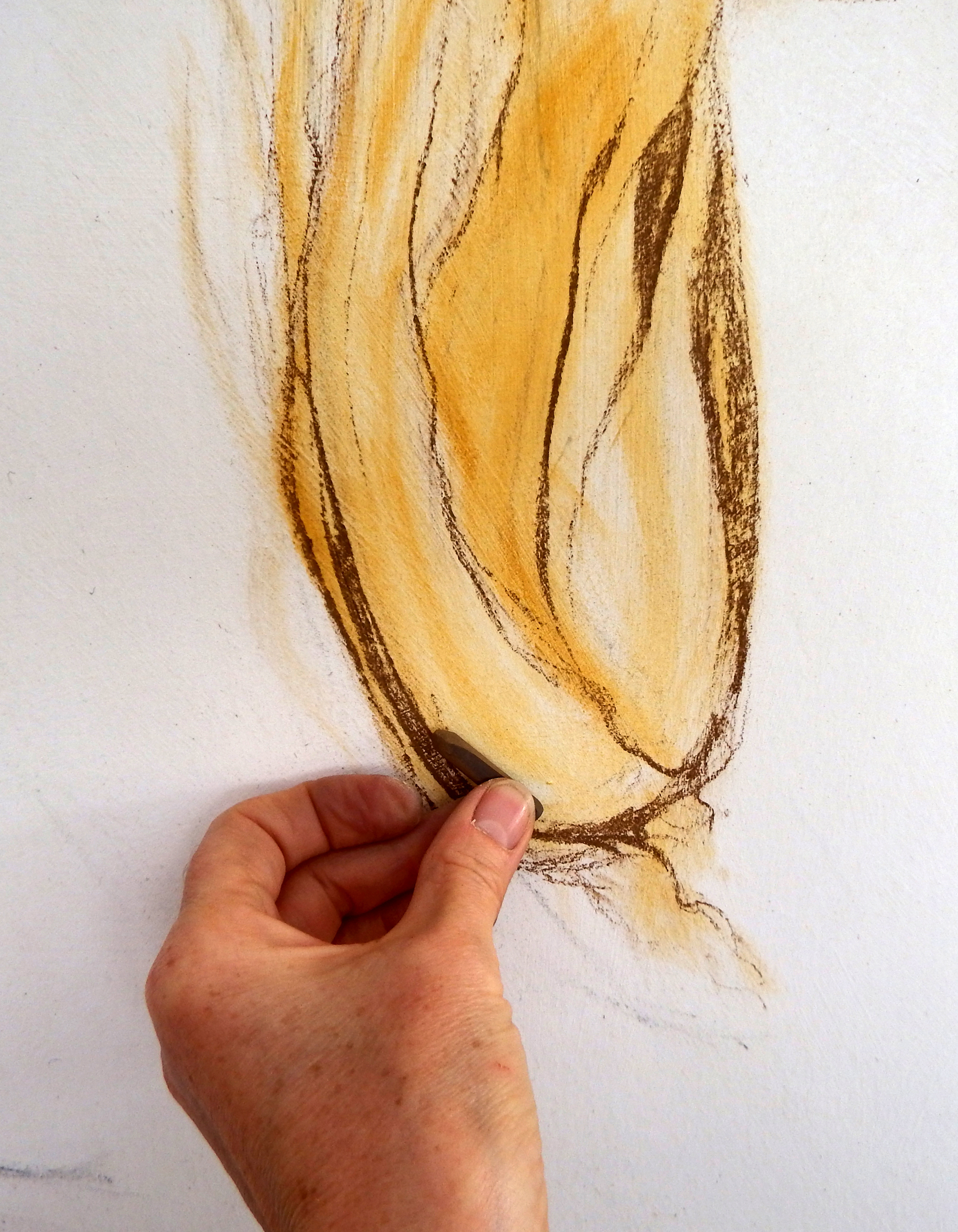
To get a feel for the flowing curves, I use a brown Conté crayon on its edge, twisting and turning around the form. At the sweetcorn base I press hard to give weight and shadow, and higher up, as the leaves grow thinner, I reduce the pressure.
05. Put lights over darks
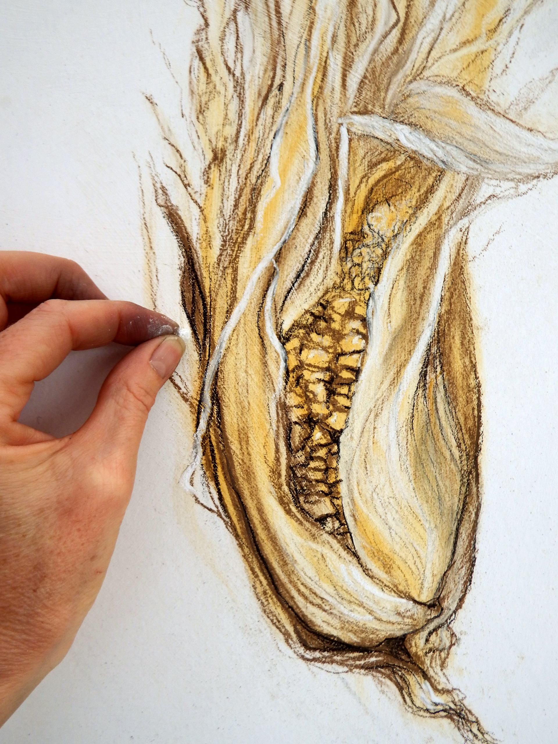
One of the many joys of drawing with pastel is when you put a light over a dark. So I draw in the fine details of the corn, and sharp shadow lines with a broken shard of black Conté. I emphasise light on the leaves with a soft white Unison pastel, and cut into edges to make shapes more delicate.
06. Draw the feather
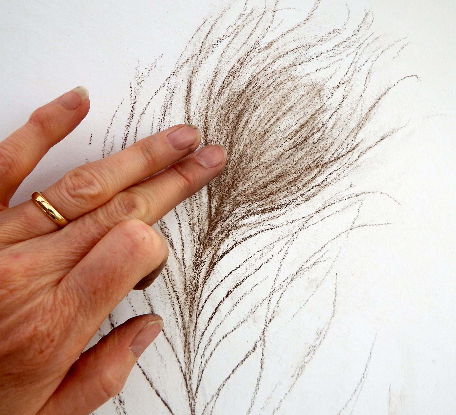
Holding the peacock feather as delicately as I can, I draw it with brown Conté crayon, equally as delicately, letting the strokes float off at the ends. I smudge it lightly to give a soft base for the eye.
07. Leave some white
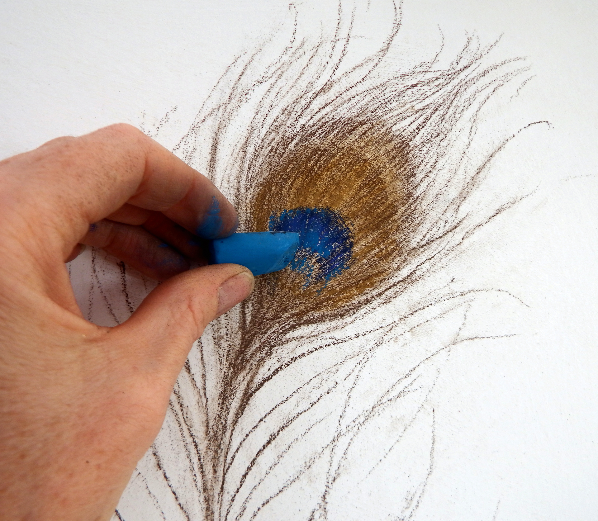
For the intense colours of the feather’s eye, I use Unison pastels and Conté Crayons. If you don’t have the right colours, you just have to go with what is in your box, mixing them on the surface. I make marks in the direction of the fronds, smudging lightly. Leaving some flecks of white showing through helps create shimmer.
08. Use pastel pencil for fine lines

For the thin lines running through the eye, and for the finest ends of some of the fronds, I use a really dark Faber Castell PITT Pastel Pencil. I keep the point on pastel pencils with a sharp scalpel, which is also useful for cutting shards of pastel for details.
09. Create strong and spiky character
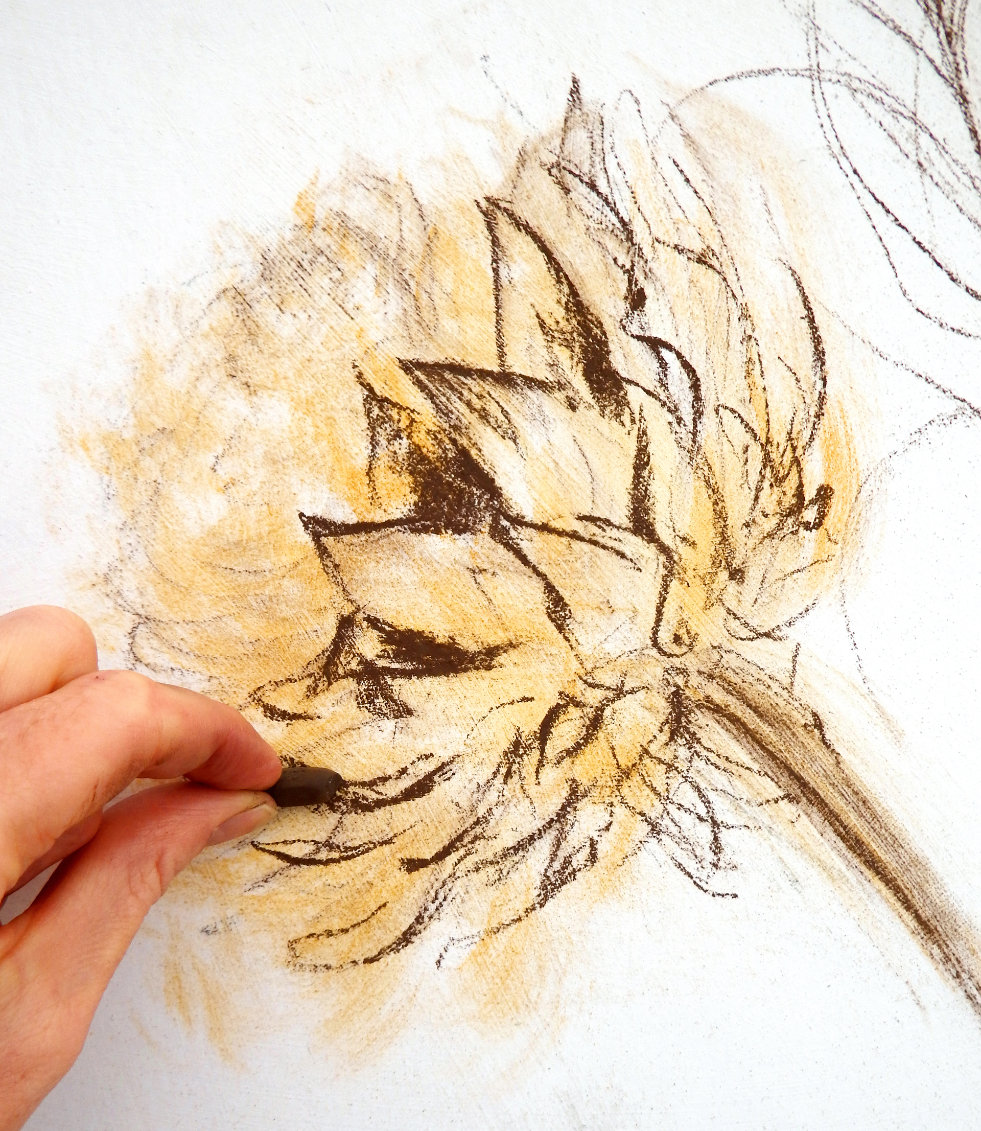
The essence of this dried artichoke head is in the hard spiky leaves, in contrast to the soft, fluffy seeds in the centre. To get that strong feeling, I make hard, aggressive marks with Conté crayons and Unison pastels, working with speed and energy, creating strong tonal contrasts. Using soft pastels adds to the weight and solidity of the form.
10. Create prickles
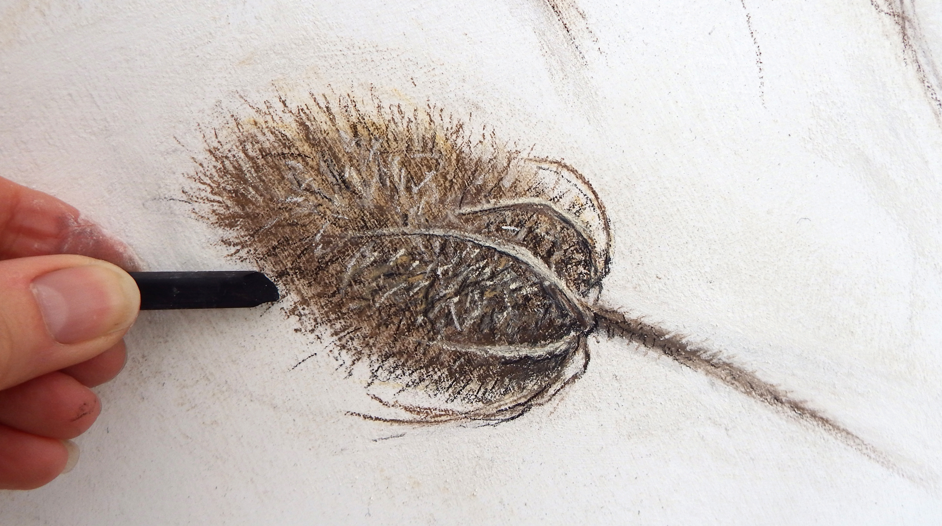
For the finest feeling of prickles, I use shards and sharp edges. If you drop your pastels on the floor and they break, keep those little bits! Remember, an edge is as good as a point. Pastel pencils are great for fine work, but if you find you need intense highlights, a broken soft pastel can give more exciting results.

This article originally appeared in Paint & Draw: Still Life. Buy the bookazine now.
Get the Creative Bloq Newsletter
Daily design news, reviews, how-tos and more, as picked by the editors.

Thank you for reading 5 articles this month* Join now for unlimited access
Enjoy your first month for just £1 / $1 / €1
*Read 5 free articles per month without a subscription

Join now for unlimited access
Try first month for just £1 / $1 / €1
Rebecca specialises in pastels, producing lively and energetic work. She teaches around the UK and in Italy, and co-founded The New Pastel School. Her book Pastels for the Absolute Beginner, published by Search Press, is available now.
