Learn to paint with Procreate to create a striking female portrait
Pro artist Laura H. Rubin shares how to paint with Procreate to create stunning portraits.
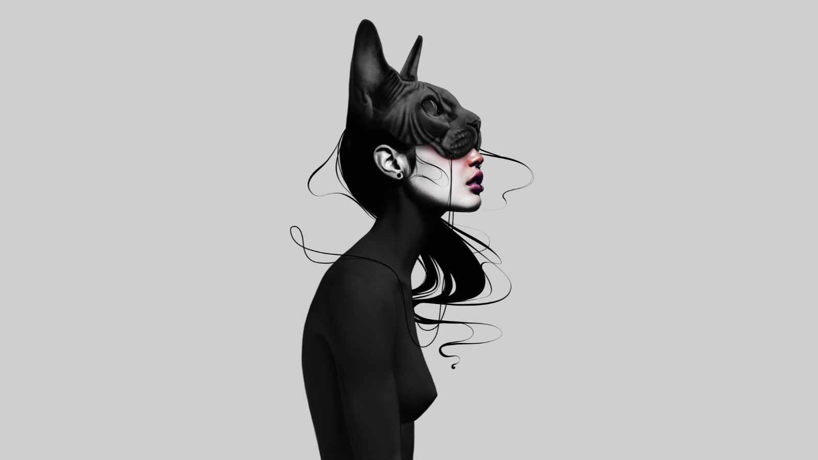
In this Procreate tutorial, I will guide you through the process of how to paint with Procreate to create a graceful yet strong female character. I’ll show you step by step how I go from a simple idea, to a rough sketch, to the final character design.
For this digital art tutorial I mainly work with my personal portrait brushes in Procreate (read our guide to the best Procreate brushes for more on how to tailor this iPad app to your needs). If you want to find out more about this app, read our Procreate review.
Drawing doesn’t feel like work, but rather a soothing therapy
Laura H. Rubin
I love to create designs with strong contrasts, but I’m not only talking about the obvious light and dark tones, but also emotional contrasts, which only reveal themselves after a longer look. A graceful and almost fragile character, who nevertheless appears to possess great inner strength thanks to simple body language and correctly placed shading.
The psychological aspect of my work has always been very important to me. Few artists talk about this, as it is not really taught in art schools, but for me it means everything. It ensures drawing doesn’t feel like work, but rather a soothing therapy. Which is why I think it’s important to talk about neuro-scientific thoughts when creating a new character, because a completed work of art always involves at least two people: the artist with a vision, and the viewer with an impression.
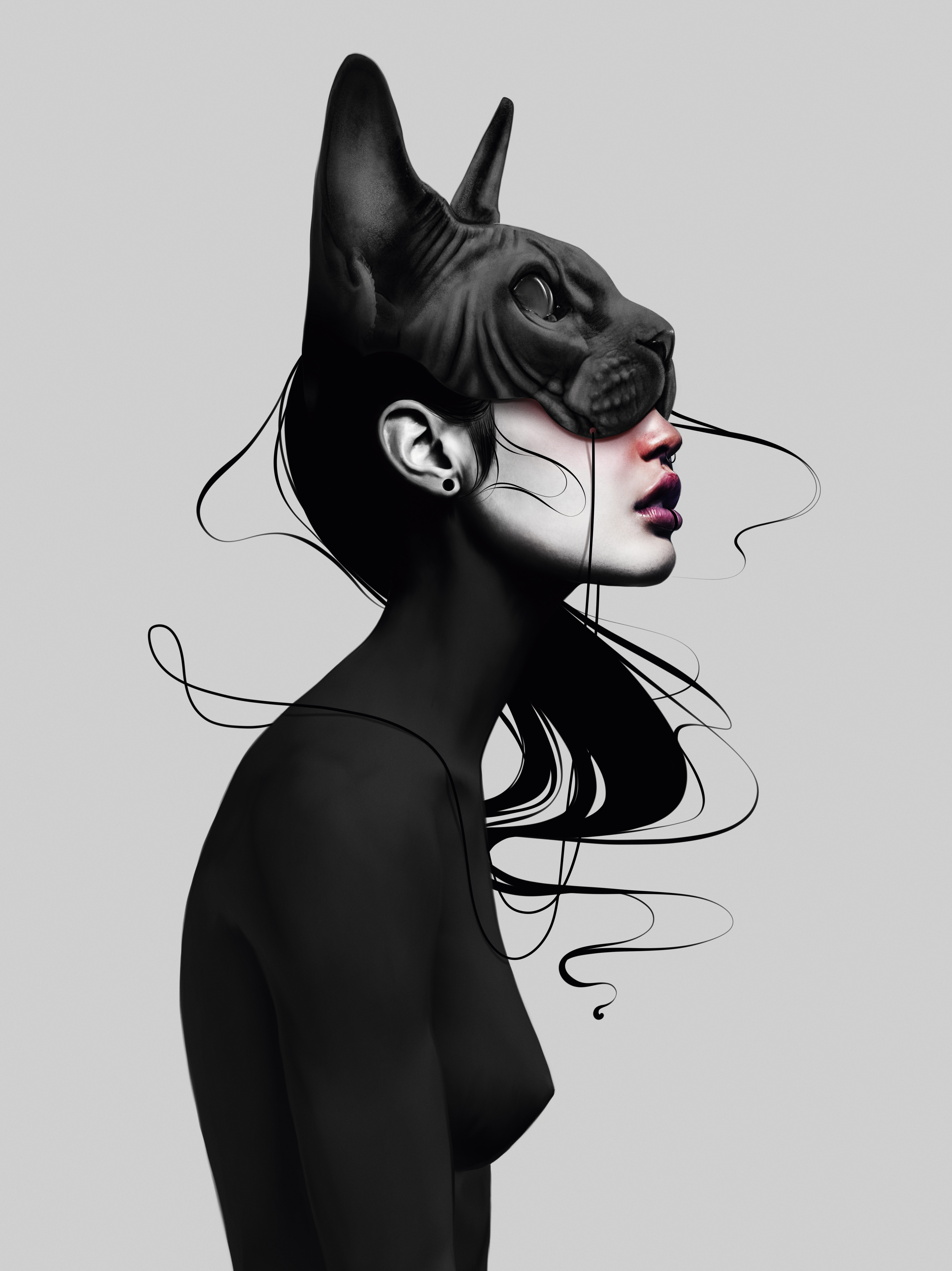
In this tutorial I’ll show you how I created 'Through My Eyes', one of my better known works, and what thoughts I had during the process. Scroll to the bottom to see the full finished piece, and read on for the step-by-step of its creation.
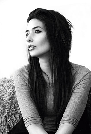
Laura is an award-winning digital artist from Switzerland, who specialises primarily in emotional character portraits. Clients she has designed for include Ubisoft, Square Enix, Crystal Dynamics, Affinity by Serif, Huion, XP-Pen, Think Jam and Simon & Schuster.
Paint with Procreate tutorial: brushes
Here are the key brushes we'll be using in this workshop.
Default brushes: HB Pencil
Get the Creative Bloq Newsletter
Daily design news, reviews, how-tos and more, as picked by the editors.
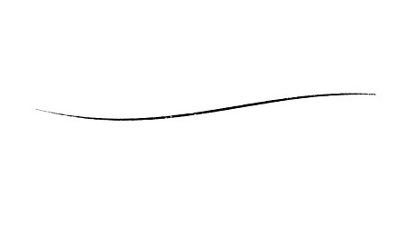
This brush is ideal for detailed sketches, because the pen imitates a sharp pencil.
6B Pencil
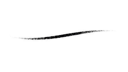
I find that this brush is particularly good for rough sketches, so you don’t get lost in details.
Paint with Procreate tutorial: create a female portrait
01. Tips for creating a rough sketch
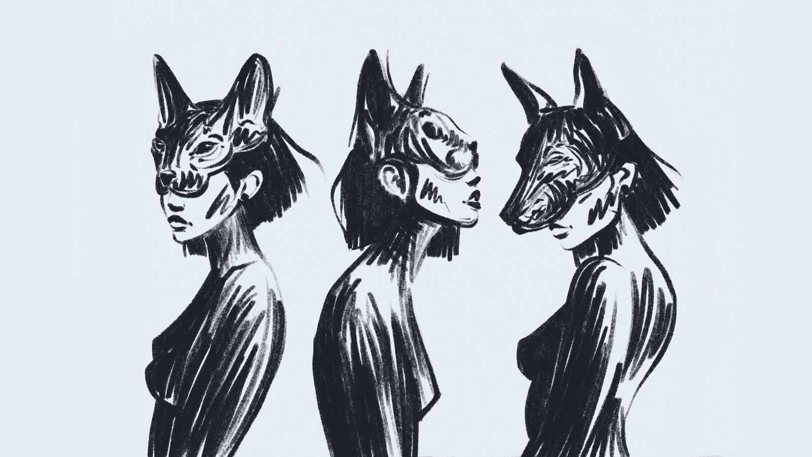
I start with some simple, very rough sketches. I use one of the Procreate basic brushes for this, 6B Pencil, which looks a bit like it imitates pastels. I can work better if I start with a rough pencil, as it keeps me from suddenly getting lost in small, irrelevant details.
I always look to generate a strong yet natural pose. A little tip: the neck points slightly forward and the shoulders tend to pull back. This way you can achieve a confident posture that doesn’t look arrogant thanks to the neck bending forward.
02. Understanding the proportions
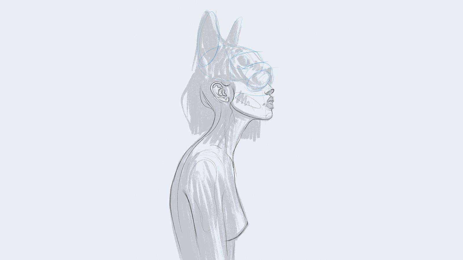
Next I choose the sketch I like best, set the layer to half opacity and paint a more detailed sketch over it, using the HB Pencil. This sketch is mainly about proportions. If the proportions aren’t right yet, I use parts of my own face as a reference.
The correct positioning of the cat mask is also very important in this step. The forehead of the cat must be placed at the same height as the crown of the character. If I place the mask too high or low, the head will look strangely deformed.
03. Working in a non-destructive way
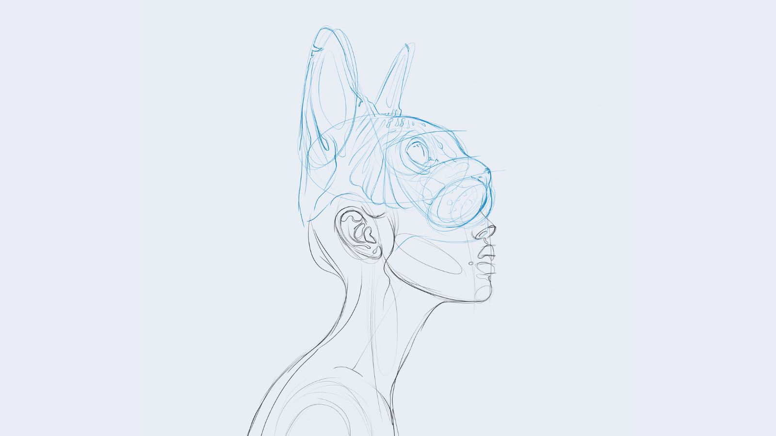
Now I hide my first sketch and finalise the new, more detailed drawing. To work non-destructively, I use as many layers as possible. I also paint the cat mask on separate layers and place them in a layer folder so that I can reposition the mask later if necessary.
Non-destructive editing is a type of editing where the original content is preserved and not changed. This opens up the possibility of undoing any operation without losing data. Therefore, I would always advise to use many layers and also layer masks to take full advantage of digital working. (Read related advice on working with layers in Photoshop.)
04. Constructing the posture, and ensuring balance
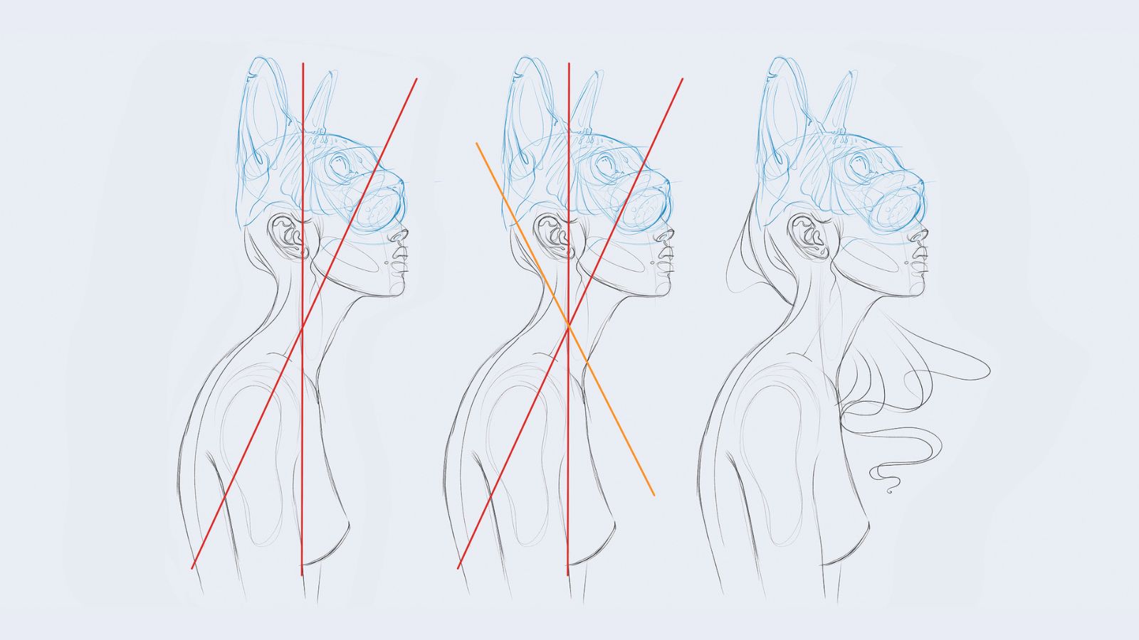
In the first example, the body is well balanced, as the head is tilted as far forward as the back is tilted backward in return. However, I would now like to have another element, which from top-left to bottom-right completes the composition (see example 2 with the orange line).
In most cases the placement of hair, for example, is suitable for this. Therefore I don’t just apply the hair from the first sketch, but change it a bit to round off the composition.
05. Colouring the selection
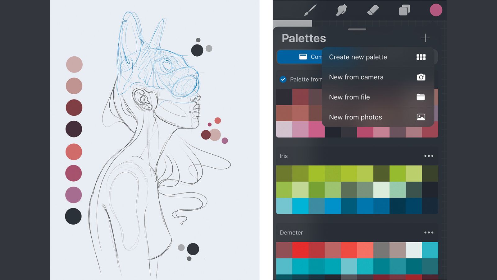
The sketch is now finished and ready for some colour. If, like me, you sometimes just need a little inspiration for your colour scheme, you can have Procreate create an inspiration palette for you from an existing photo.
To do this, open the colour palettes in Procreate and click '+' icon in the upper right corner. Then select 'New from photos' and choose a picture from your photo album where you like the colours. Procreate will then create a new colour palette for you, consisting of the colours of the image
06. Using a base colouring method
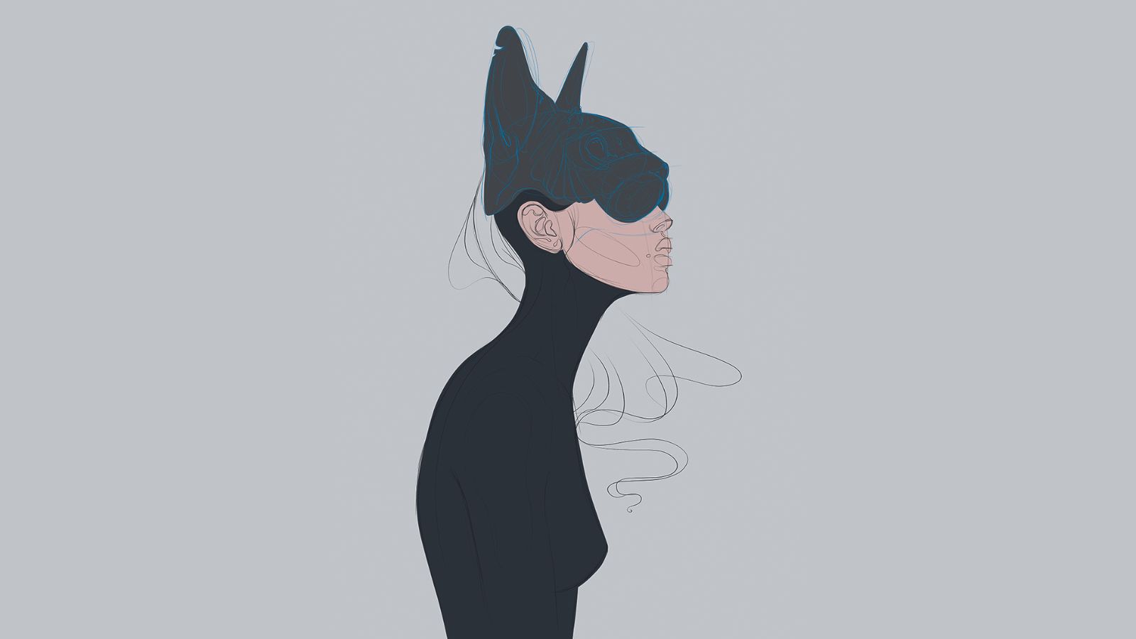
When colouring, I always start with one base colour per area. Here, for example, one colour for the mask, the face and the body. I’ll colour the hair separately later. From here on I use the brushes that I have created myself over the last few years. These are based on real skin structures, which makes my work much easier.
07. Detailed areas
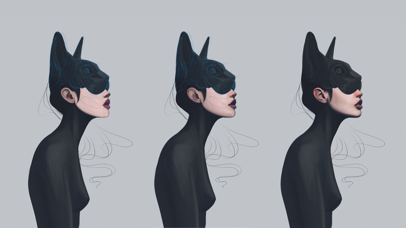
From here on I go step by step into more and more detail. I choose additional colours for areas like the mouth, nose and ears. For the mask and body, I start using a slightly lighter colour to highlight the individual body parts.
Next, I use the Smudge tool in Procreate to smudge the individual colour areas to create smooth transitions.
Once I have all the colours defined, I start shading the figure. In this step I usually hide the guides because I don’t need them to see the proportions anymore.
08. Finalising the posture
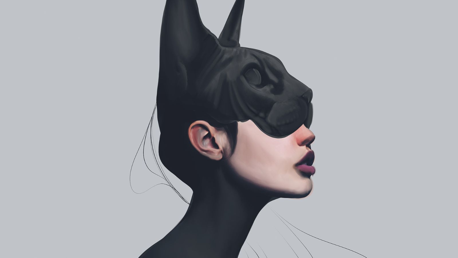
In the next step, I start with the first details and slowly venture into the facial expressions of the mask and the character. It’s important that the character’s chin is pointed upwards, so that she doesn’t look submissive due to the slightly bent posture.
I paint the mouth slightly open – she should look interested, as if she had just looked up at that very moment, looking for something. This section is unfortunately also the most strenuous, because you can see only now, through the shading, whether the pose makes sense.
If it doesn’t, the Liquify tool can help, at least for fixing minor mistakes, otherwise you have to start again from the second sketch. In this step I try to paint the body/posture already as detailed as possible, so that I can judge again whether the pose really makes sense.
09. Painting the hair
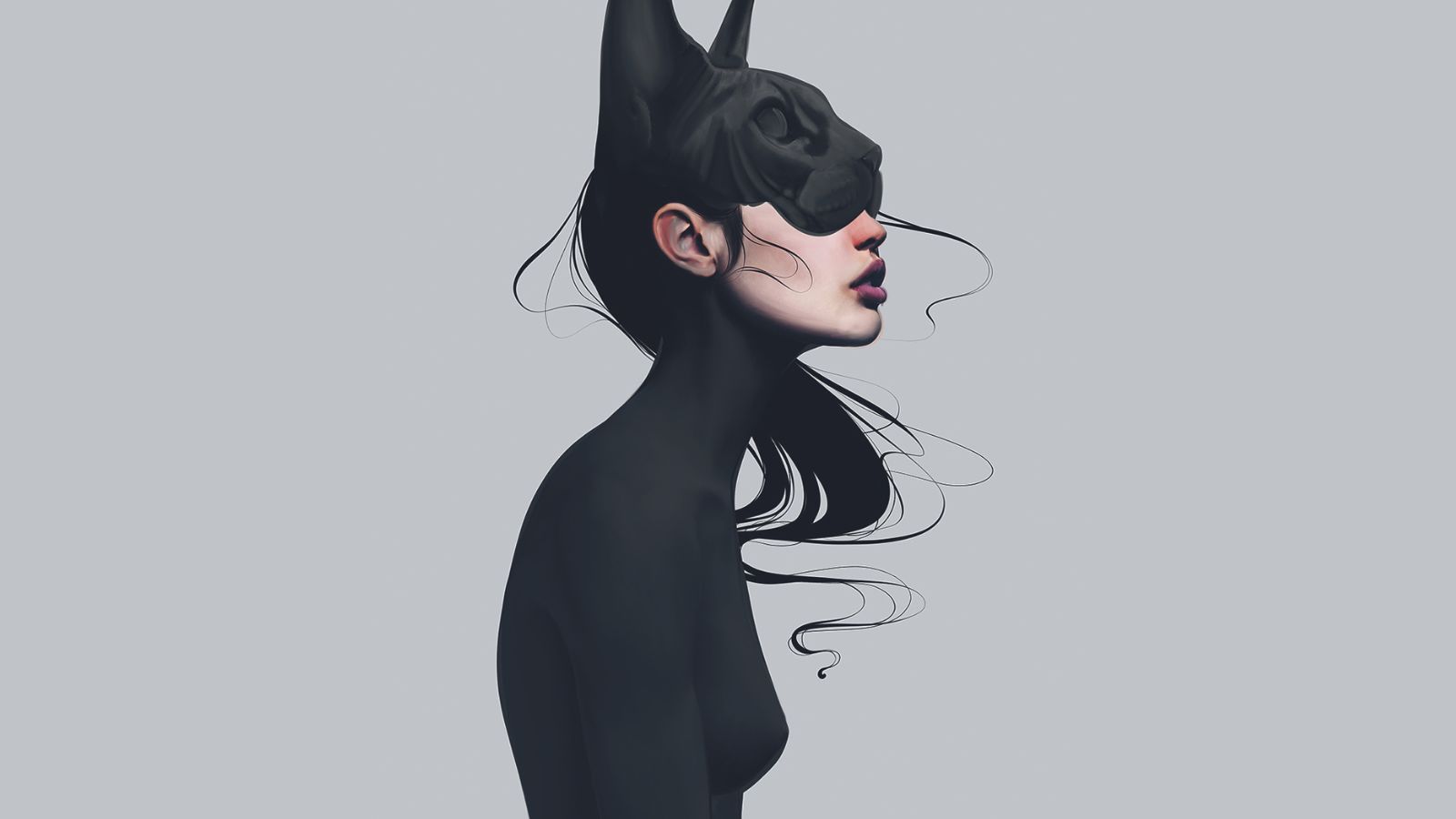
I love giving the characters this weightless 'manga-style' hair. (painting hair Even though the hair design is all black, it still looks light and graceful. I was inspired by anime and also by the 2003 animated movie Sinbad, where the antagonist was Eris, the goddess of chaos. Her body, as well as her hair, was always completely weightless, as if she was underwater all the time.
10. Painting realistic-looking skin
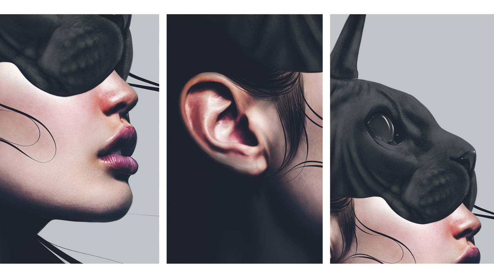
Next I paint the skin texture, pores and small wrinkles. In this case, the lips and ears are the most difficult. The use of highlight brushes is very important here for a more dynamic look. I am referring to the white areas around the mouth, nose, ears, and of course the eyes of the cat mask.
I give the character this 1% smile by lifting the corners of the mouth ever so slightly; it depends on the observer’s way of thinking and if they actually interpret the slightly raised mouth corners as a subtle smile or not. Both would be fine, because the interpretation of each viewer is different and depends on their life experiences.
The wrinkled skin of the cat mask was also tough; it helps to have good references on hand. The look of the cat mask should reflect the look of the character under it. Humans are programmed to always look in the eyes first; according to studies, we even look into the eyes of a character first – even a fantasy creature that doesn’t wear its eyes on its head
11. Refining the face's characteristics
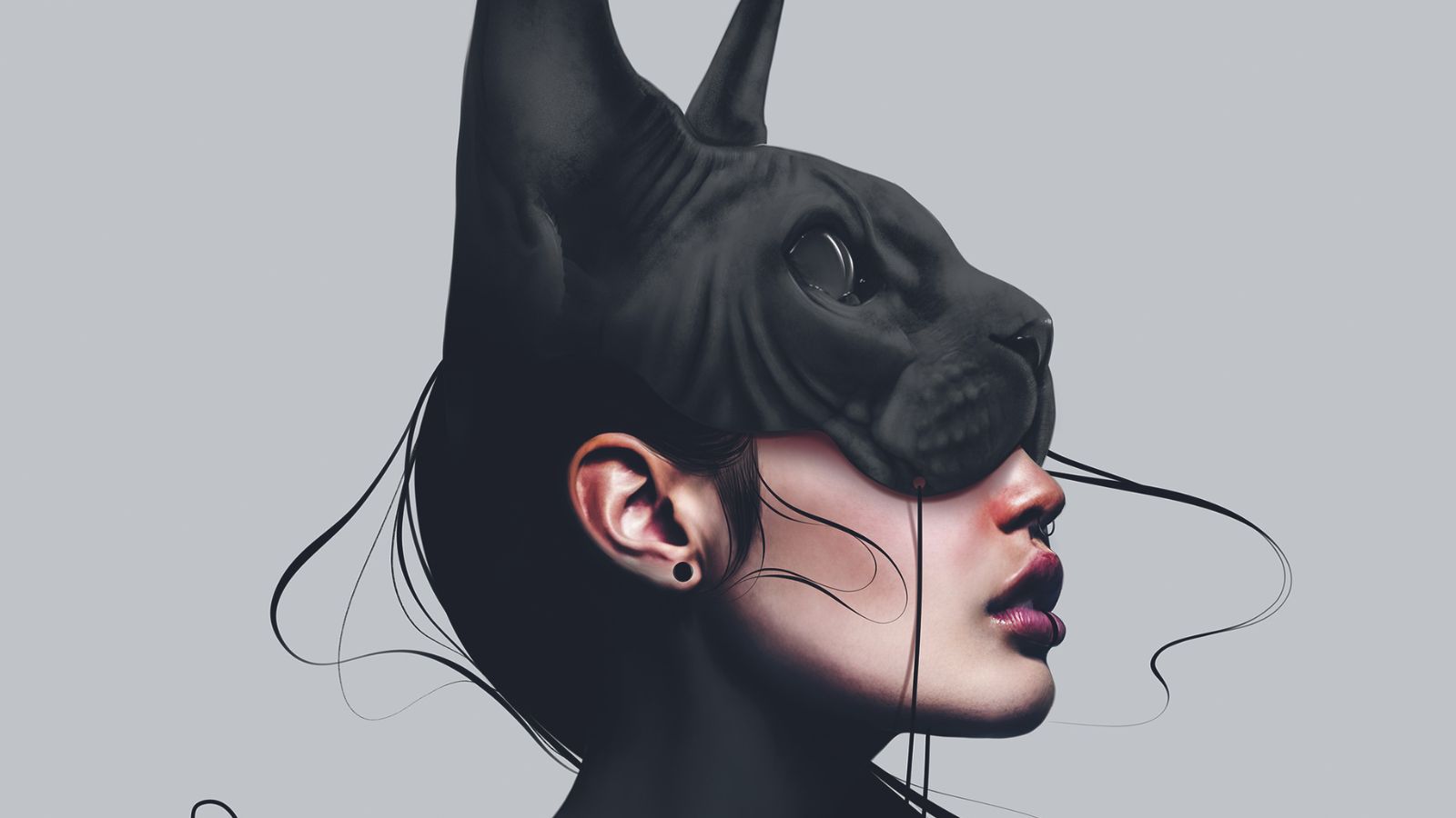
I am now taking care of the final details, such as some features that all my characters get. These would be plugs on both ears, a septum piercing and, most importantly, the line on the lower lip. Also, I add the shadow that the mask is casting on the face.
The back of the character’s head now merges with the mask, making it unclear where the mask begins and the character ends. Such details have been shown to keep the viewer in front of your work longer, as the brain automatically tries to create logical connections where there are none.
12. Finalising colour grading
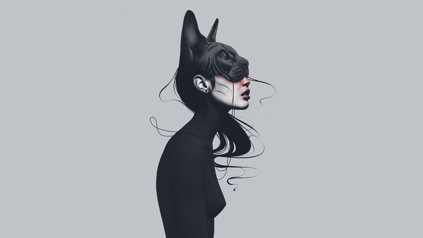
Now comes the colour grading. I want to make the character look more sensual, so I draw the viewer’s attention to the lips. One way to do so is leaving only this area coloured and desaturating the rest.
13. The finishing touches
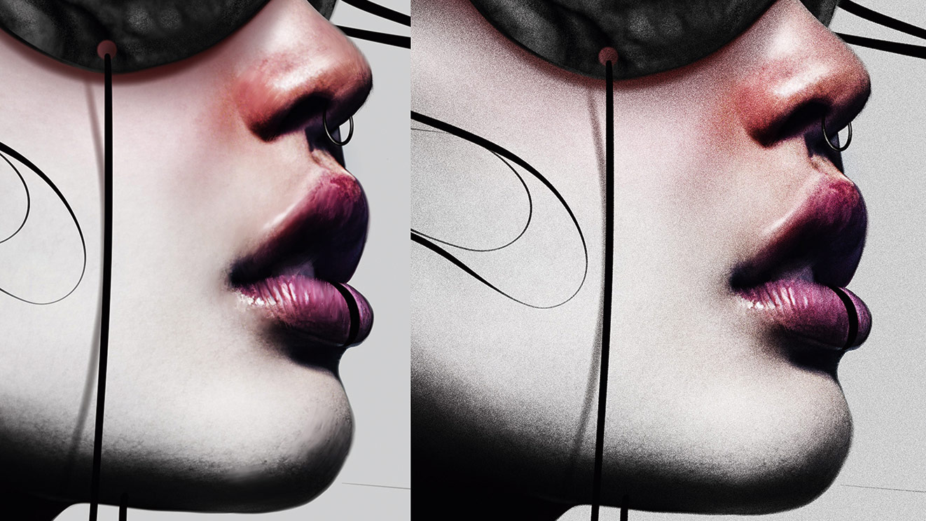
I like to put a light grain over the image. I use one of my noise brushes and paint the entire image with it, then change the layer settings to Overlay. This gives the image an analogue effect like most people know from photography. Unattractive brush-stroke imperfections or banding artefacts from gradients are smoothed out and make the work look a bit more detailed and natural.
14. Everybody needs some friends
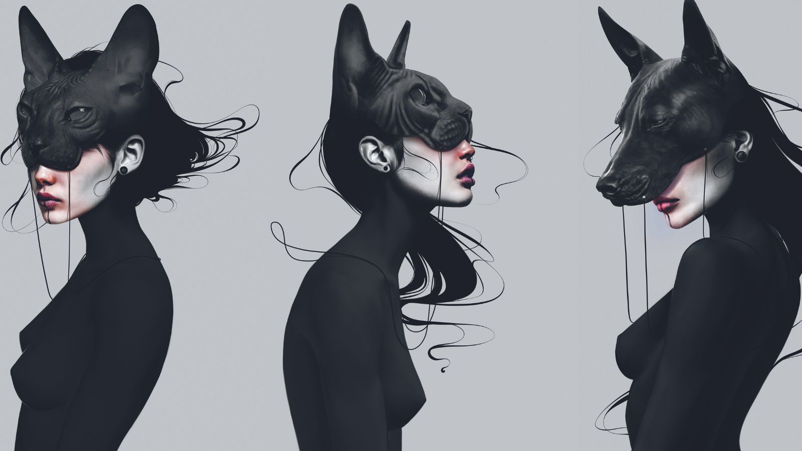
You know that feeling when you’ve completed your artwork, but you can’t shake the notion that there’s still something missing? I had that with this piece, so I did the other sketch as well. Sometimes one artwork just doesn’t express everything you want it to, which is where a series of images can help.
Get more Procreate tutorials in ImagineFX
This content originally appeared in ImagineFX magazine, the world's leading digital art and fantasy art magazine. ImagineFX is on sale in the UK, Europe, United States, Canada, Australia and more. Limited numbers of ImagineFX print editions are available for delivery from our online store (the shipping costs are included in all prices)
Alternatively, you can access us instantly through our digital options:
• Apple app (for iPad or iPhone)
• Pocket mags (multi-platform app, great for Android users)
• Zinio (multi-platform app for desktop or smartphone)

Thank you for reading 5 articles this month* Join now for unlimited access
Enjoy your first month for just £1 / $1 / €1
*Read 5 free articles per month without a subscription

Join now for unlimited access
Try first month for just £1 / $1 / €1

Laura is an award-winning digital artist from Switzerland, who specialises primarily in emotional character portraits. She has designed for clients such as Ubisoft and Square Enix.
- Ian DeanEditor, Digital Arts & 3D
