Paint like an Impressionist
How to create a lively and spontaneous modern Impressionist scene in 10 simple steps.
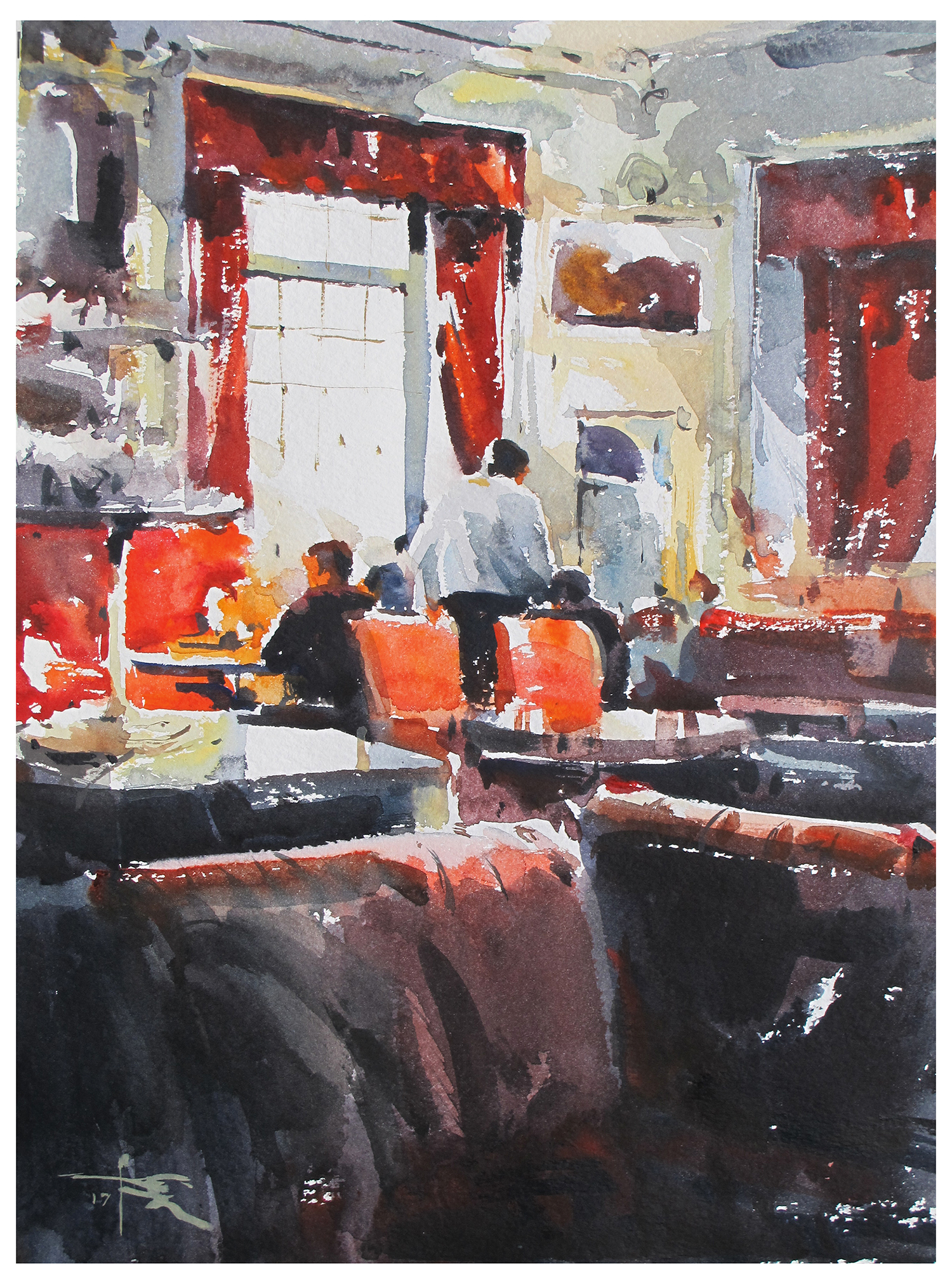
Impressionist artwork was fresh and spontaneous, and executed with bold brushstrokes that didn’t reveal too much detail.
For this workshop, I’ll paint a contemporary café scene in watercolour using Impressionist artist methods (and a photograph) for reference.
Impressionistic techniques also match the essence of painting with watercolour. Washes are applied with one decisive brushstroke, and are never corrected or smoothed out. This gives the painting an almost unfinished look, enabling the viewer to finish the picture.
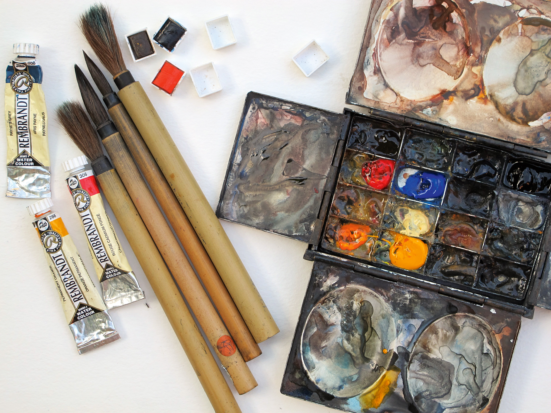
I usually try to create a painting in four stages:
01. Visualise how I want the final painting to look
You can produce a small pencil sketch or tonal study, if it helps. This stage will help cement the composition, the focal points and sources of light.
02. Start to paint very basic shapes with a large brush
Get the Creative Bloq Newsletter
Daily design news, reviews, how-tos and more, as picked by the editors.
This sets the tones and overall mood of the work. At this stage you should avoid adding any details and leave large areas of paper untouched.
03. Turn the basic shapes into more 3D objects
Next, once everything’s dry, I turn the basic shapes into more 3D objects by painting shades and shadows, reflections. I also start adding in people (though I did this early in this painting), while still avoiding any details.
04. Add details and accent colours
Painting with either the tip of the brush or a smaller brush, I use thicker pigments and explore dry brush effects. At this point, it’s best to hold back in case you overwork the composition. Slow down and paint decisively and then leave it alone. Remember, it’s for the viewer to 'finish the picture'.
With this four-part process in mind, I’ll now walk you through how I would paint a contemporary café scene in watercolour.
01. Start with light colours
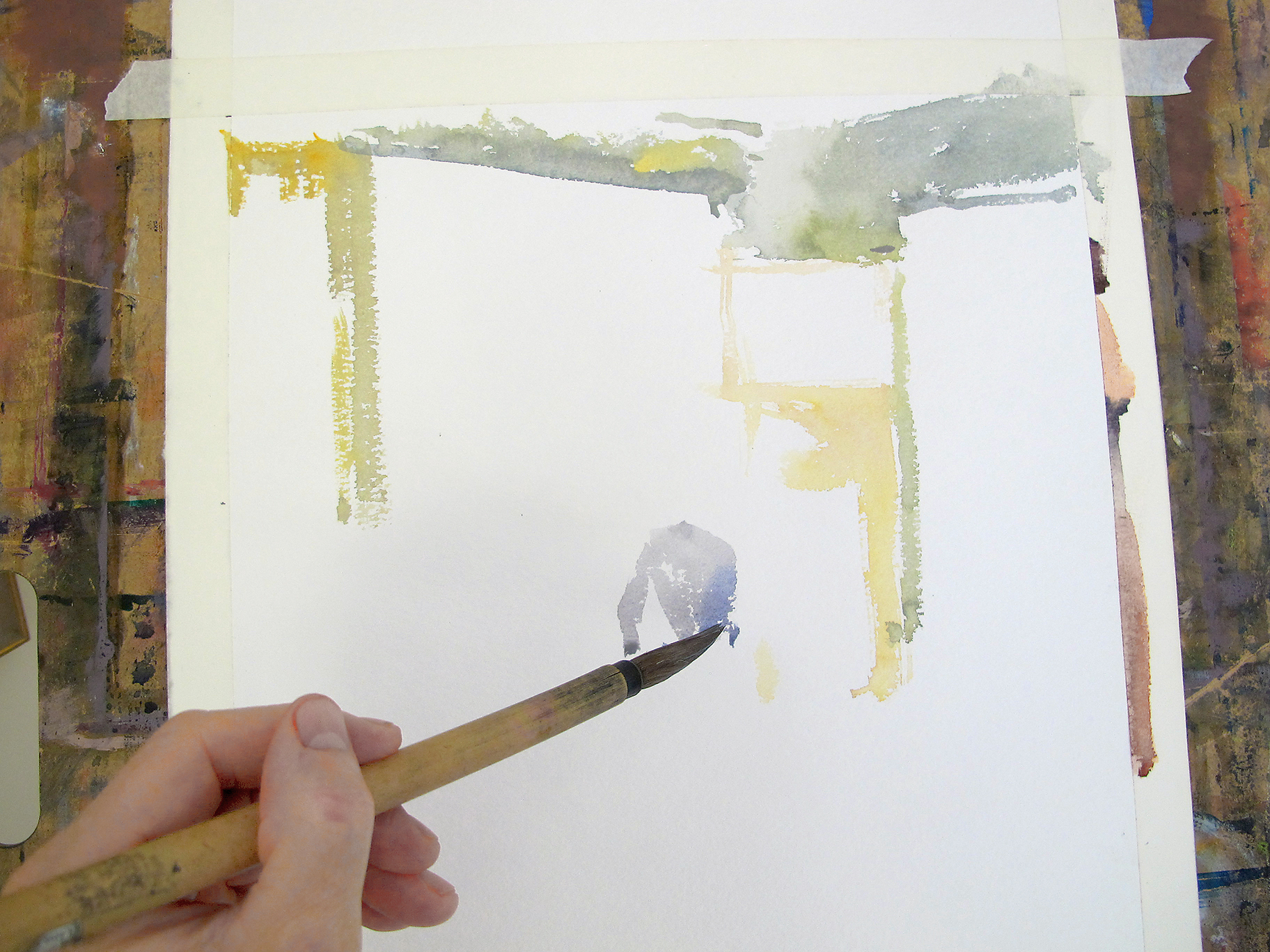
Find the focus of your painting. For my picture, this will be the window and the waiter. I mix a light wash for the walls and paint in that area. Making sure I follow the correct perspective, I have the left and right window visible in the picture. I then start to paint in the background around the waiter.
02. Add the figures
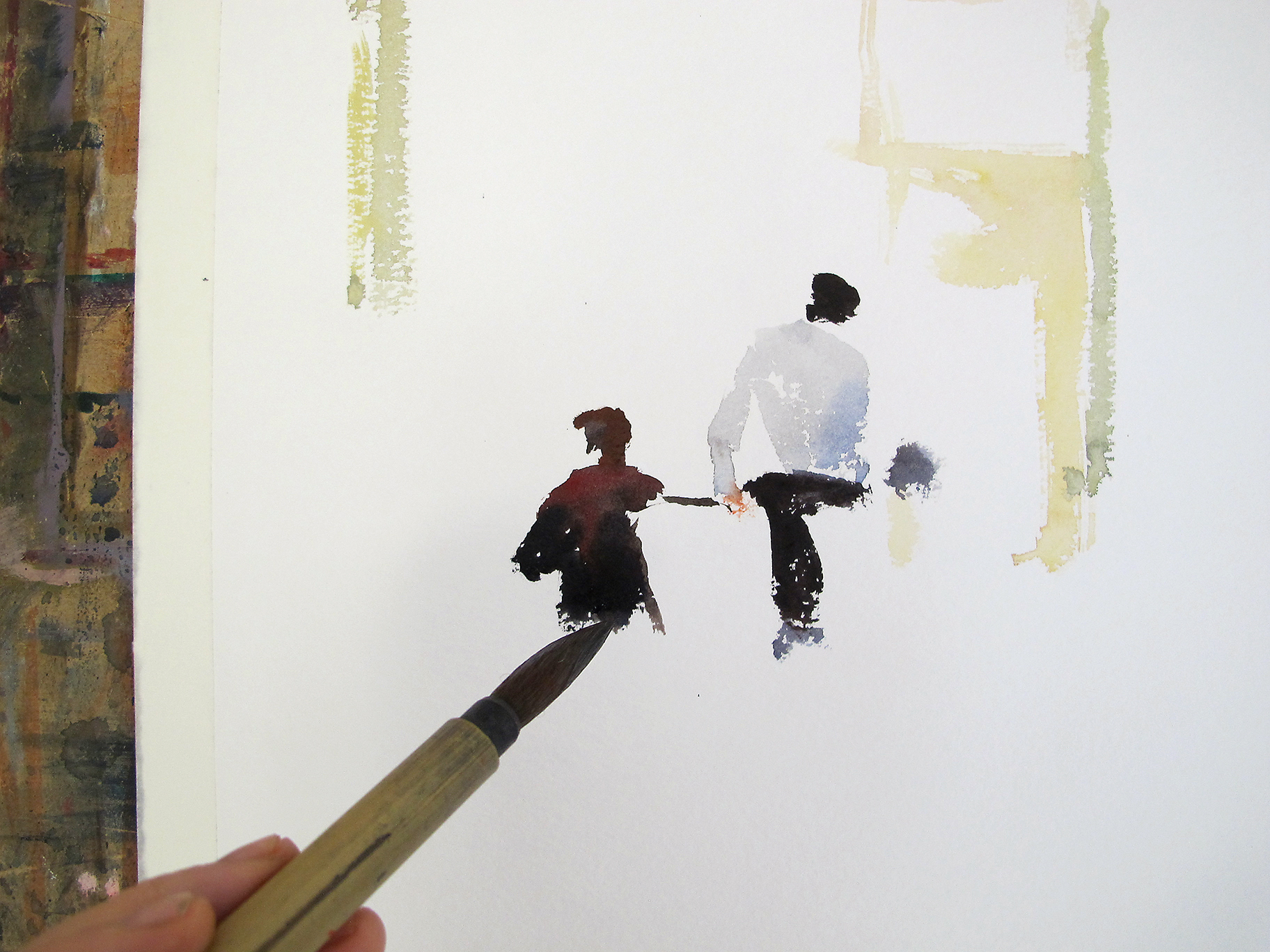
Using a thicker mix of black, Ultramarine Blue and a bit of red, I paint the person on the left, as well as the waiter’s trousers and head. I leave an unpainted area for the two chairs in front of these figures. I will use this negative-space painting method throughout the scene.
03. Paint the foreground
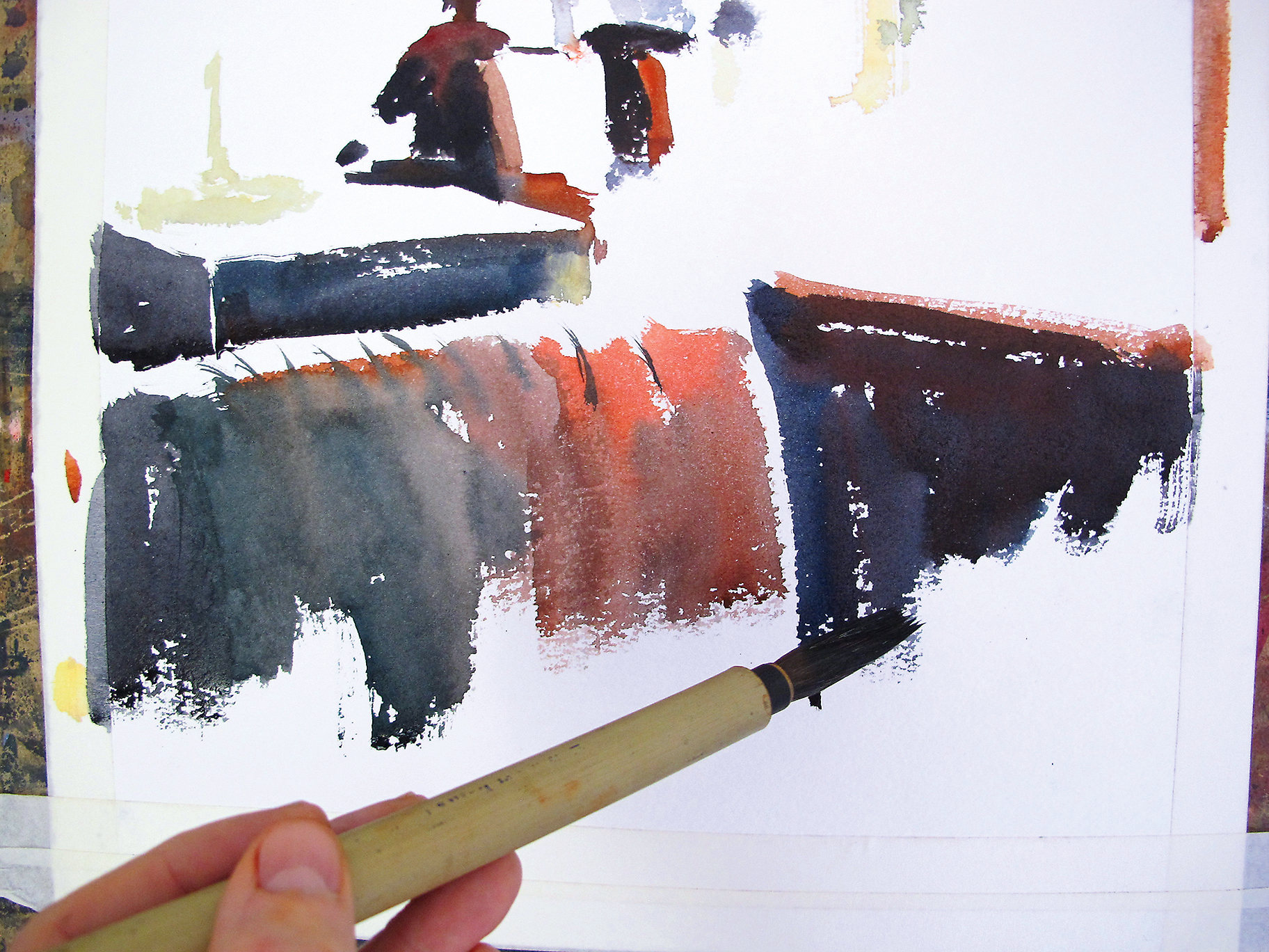
Moving to the bottom of the paper, I paint the foreground. Using lots of water and pigment, I create swift, spontaneous brush strokes with my largest brush. I leave the top of the chairs unpainted.
04. Add the tables
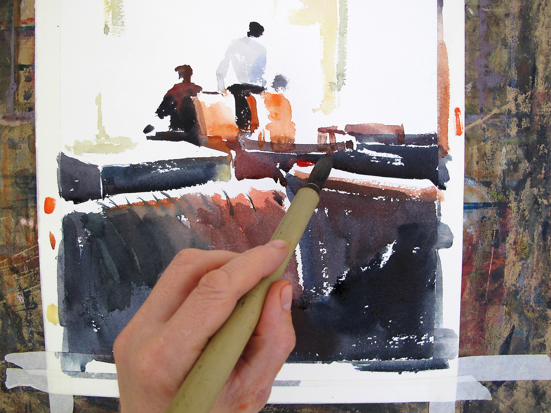
Continuing with a dark colour, I make the paint a bit thicker and hold the brush at a steeper angle to the paper, to paint the round tables. I leave the tops white and paint in the reflections with vertical strokes, using more water. Every brush stroke is done once, then left alone.
05. Curtains and reflections
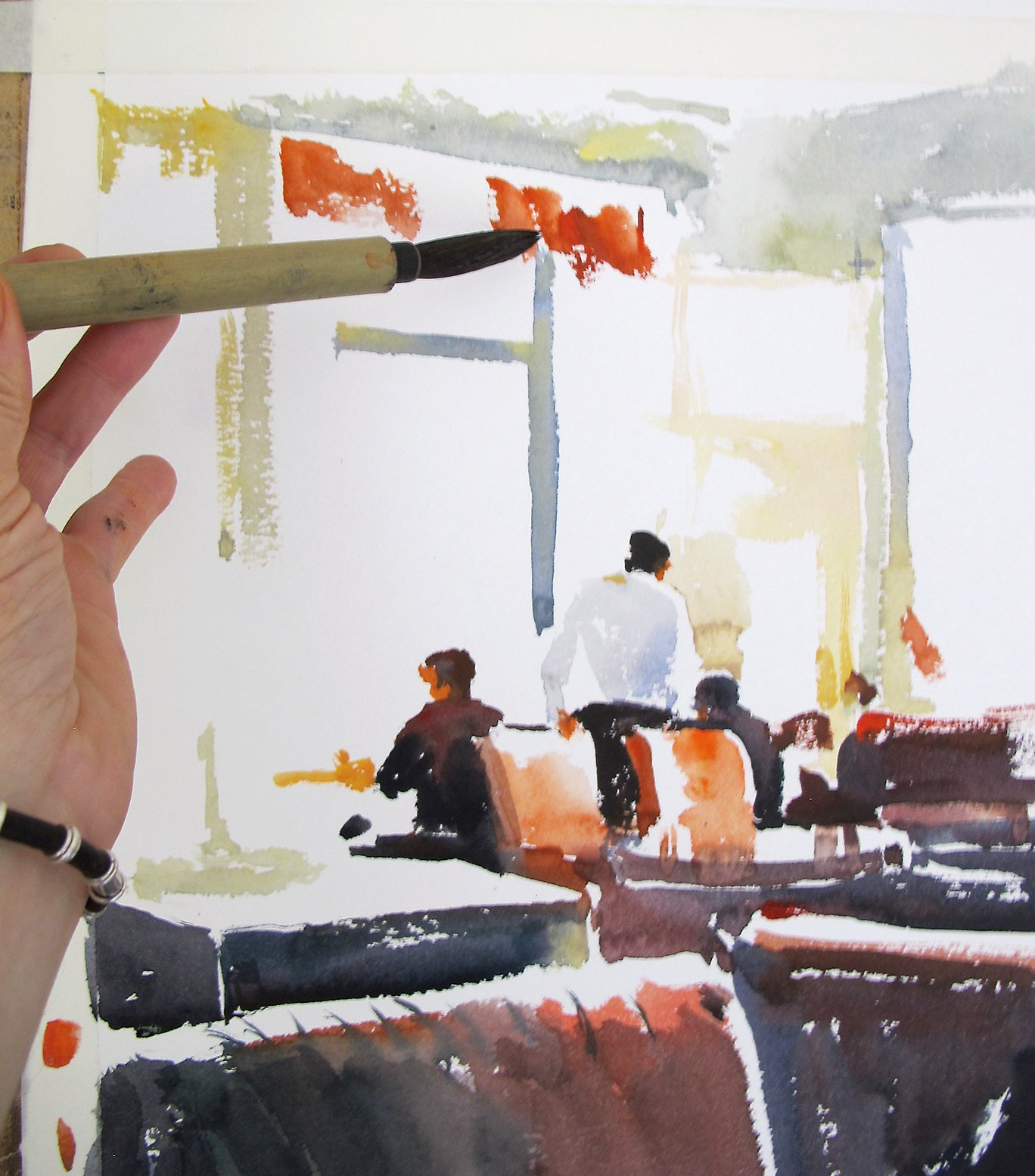
I paint reflections on what looks like two mirrors in the centre, at the top of the paper. For the red curtains I apply a dark tone on the top of them, using wet-in-wet. The colour will run a bit with this technique, but don’t try to correct anything. It’s tempting to add details, but leave them for the last step.
06. Abstract speed

Now I go to the top left-hand side to add in a grey/blue colour. I try not to be precise, because this isn’t an important part of the painting. It’s even better if it’s painted quickly in an almost abstract manner. I now step back, take a break, and assess what I’ve done so far.
07. Paint the ceiling
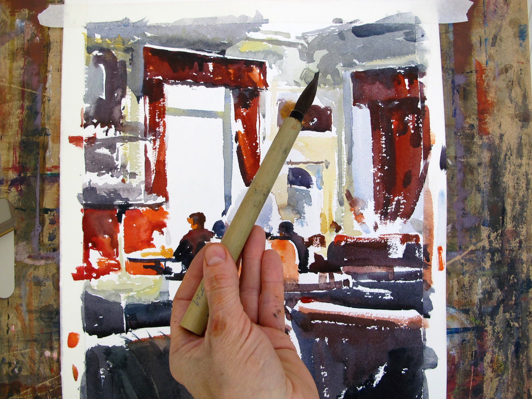
I mix dark greys and use more water and a larger brush to paint the ceiling. This is the last area to be finished before I start on the shadows. With the tip of the brush, I roughly paint in some details, such as the cornice details where the walls meet the ceiling.
08. In the shadows
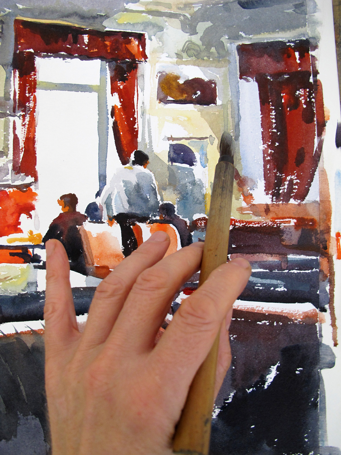
In the reference photo the light is coming through the windows, so I paint the shadow line at approximately 45 degrees on the wall. For shadows, I use a grey-blue mix. It should be watery and transparent, but with enough pigment so that I only have to paint it once.
09. Add details
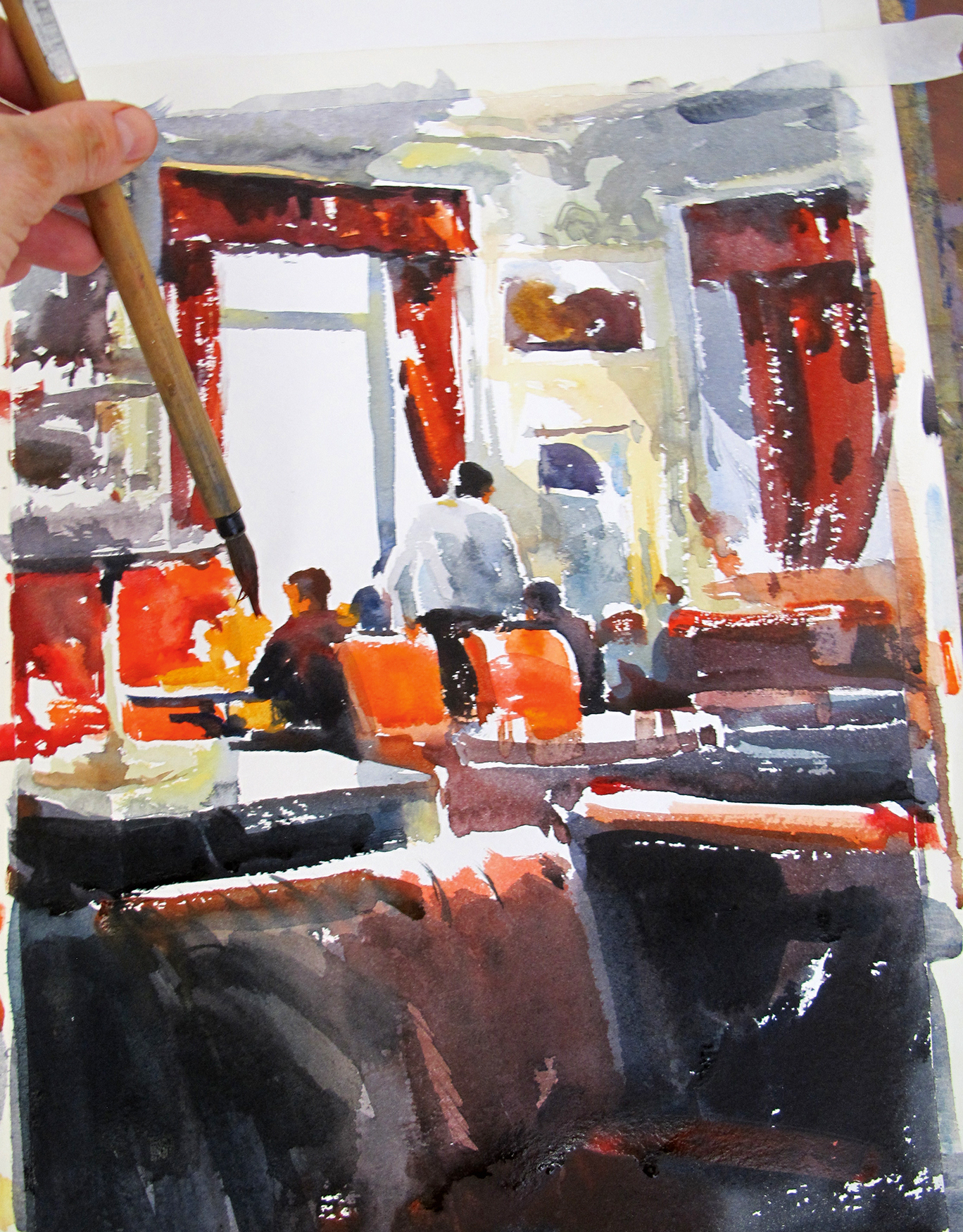
I take a thick dark pigment and practice on a piece of paper to check the brushstrokes. They should look like they were painted with a dry brush. I work with short, thick strokes, only adding in a few details from the photo. I have also added some light ochre to the bottom of the pane.
10. Final observation
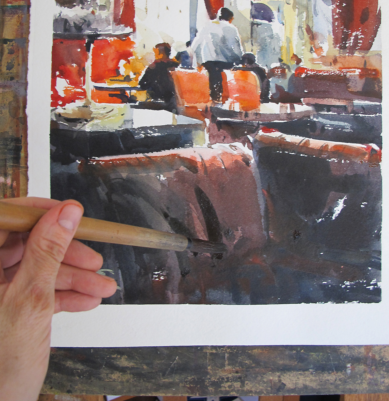
If you stand back, you’ll see many areas that could be ‘improved’ or areas where more details could be added. Don’t do it! The only things I add are a few broad strokes indicating creases in the fabric at the bottom of the picture. I also make the very bottom of the picture darker, so as not to draw attention to that area.
This article was originally published in Paint & Draw issue 7. Buy it here.
Related articles:

Thank you for reading 5 articles this month* Join now for unlimited access
Enjoy your first month for just £1 / $1 / €1
*Read 5 free articles per month without a subscription

Join now for unlimited access
Try first month for just £1 / $1 / €1
