Dutch Post-Impressionist painter Vincent van Gogh (1853-1890) created many self-portraits in his career – though some of them are not so obviously self-portraits. For example, Irises, painted at the Saint Paul-de-Mausole asylum in Saint-Rémy-de-Provence in the last year before his death, is a perfect example. A white flower stands alone and defiant in this very moving painting.
The self-portrait can take many guises and gives the artist the opportunity to say something about who they are, what they are, and importantly, what and who they want to be.
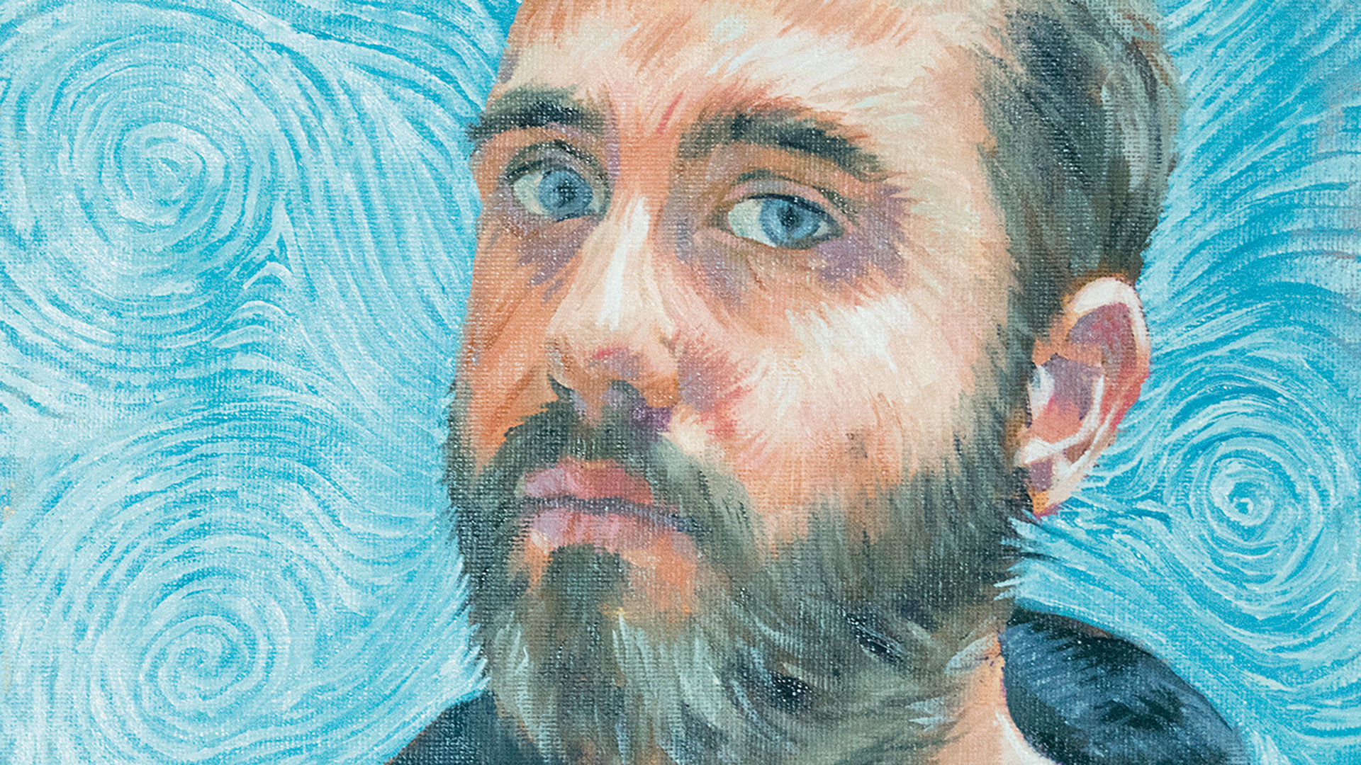
In this workshop we're going to go through the stages of developing a self-portrait from start to finish and also try to give it a hint of the great master, Vincent van Gogh. You can see some of our self-portrait techniques in action in the video below.
Below are our 10 steps to create a self-portrait inspired by van Gogh's most famous self-portrait, Self-Portrait 1889. Follow these steps to paint a portrait that everyone will admire (click the four-way arrow icon one each image to see it bigger).
01. Set up your environment

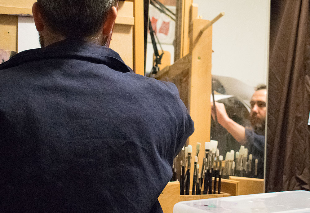
Get yourself comfortable and make sure you have everything close to hand. Spend time getting your mirror and easel in the correct position. You need to make sure you're facing the mirror or canvas and that you can see the other by simply moving your eyes, and not your whole head.
02. Start your charcoal sketch
![Sketch in the main features with charcoal [click the icon in the top-right to enlarge the image]](https://cdn.mos.cms.futurecdn.net/YrcNzM62XnBonScGRyVeqH.jpg)
Using a sharpened stick of willow charcoal, start to sketch the main features in. Remember to begin with the larger forms and add increasing levels of detail as you go. This is just a dress rehearsal, so don't worry about adding form shadows. However, it'll be helpful to add the extreme edges of cast shadows at this stage.
03. Fix the drawing in place
![Use a dark acrylic to fix the drawing in place [click the icon in the top-right to enlarge the image]](https://cdn.mos.cms.futurecdn.net/mknaxoYRbNXNhfCUGjQ4oH.jpg)
Fix the drawing in place using a liquid acrylic marker. Here we've chosen a purple acrylic ink for the construction lines, but an earthy red or blue would work just as well. Just make sure the colour is dark enough to show through the tonal stage that's coming up next.
Get the Creative Bloq Newsletter
Daily design news, reviews, how-tos and more, as picked by the editors.
04. Build a tonal painting
![Build a tonal painting, not worrying about colour [click the icon in the top-right to enlarge the image]](https://cdn.mos.cms.futurecdn.net/fkhtR73n7dr7PxmvmULvqH.jpg)
Creating a tonal stage helps break down the painting process. When you're thinking about tone – in this case using Alkyd Burnt Sienna thinned down with a little bit of turps – it's not about colour at all. Just concentrate on tone, which you'll use as a guide when you get to releasing the colour later.
05. Pre-mix your colours
![Time to get mixing [click the icon in the top-right to enlarge the image]](https://cdn.mos.cms.futurecdn.net/xQbEhH5kVoaJDxyyeHhypH.jpg)
Start by mixing a base tone for the skin – here we used Yellow Ochre and Scarlet Lake, along with a touch of Green Lake to knock the scarlet back. This orange-brown is then lightened for skin tones and darkened for shadows. You can also mix your own black from Alizarin Crimson, Blue Lake and Bright Yellow Lake and create greys to mix with the skin tones.
06. Block in the composition
![Start the painting proper by loosely blocking in areas of light and dark [click the icon in the top-right to enlarge the image]](https://cdn.mos.cms.futurecdn.net/9rGPdrhXayTmzDyFggNMoH.jpg)
Begin to block in the main areas of light and dark. Squinting your eyes helps to keep this stage as loose as possible, to retain a feeling of spontaneity as colour goes on the panel. You'll be working more into this, but the brush marks you make now will inform the ones you make later, so start off on a good footing!
07. Add more detail
![There's still time to experiment in these early stages [click the icon in the top-right to enlarge the image]](https://cdn.mos.cms.futurecdn.net/2BEhMiSKfKgJcMdDFt7qsH.jpg)
Once you've established the main areas of light and dark in the face, break them up into further areas of different tone and colour. At this point, start to block in the torso and look at a colour to use for the background. Allow yourself to experiment in these early stages.
08. Unify the elements
![Take care to ensure that all the elements of your painting work together [click the icon in the top-right to enlarge the image]](https://cdn.mos.cms.futurecdn.net/ph6AS7qLULwbQ9BocNgkzH.jpg)
You should aim to have all of the canvas worked at this stage. Consider the painting as a whole and judge how the tone and colour of each area relates and affects the others, even if you still need to add further details to certain areas.
09. Add some van Gogh-inspired flourishes
![Start working in some van Gogh-style flourishes [click the icon in the top-right to enlarge the image]](https://cdn.mos.cms.futurecdn.net/on6qkwQd3ppQKCC23SCTuH.jpg)
Now that you have your base, it's time to bring in some touches of Vincent. As we said, this painting is mainly based on a self-portrait Vincent painted in 1889, heavily influenced by the Impressionists, and Pointillists in particular.
Using the blocking-in as a guide, apply Vincent-style dabs of colour, allowing the brushmarks to follow and describe the form as you go. Pay close attention to areas of dramatic shift in tone, as they enable you to create some interesting and bold marks. Look out for colours that jump out at you, and don't be afraid to exaggerate these for effect.
10. Fine-tune and finish up
![If you make a mistake, scrape it off and have another go [click the icon in the top-right to enlarge the image]](https://cdn.mos.cms.futurecdn.net/vLgp43tdstBe7ZA9kTeVuH.jpg)
When adding details, knowing when to stop is an art in itself, so hold off adding highlights until the very end. Try not to work over areas too much. If there's a problem, just scrape it off and try again. You should have plenty of premixed colours left – just remember that you don't have to use them all!
This article originally appeared in Paint & Draw issue 7. Buy it here!
Related articles:

Thank you for reading 5 articles this month* Join now for unlimited access
Enjoy your first month for just £1 / $1 / €1
*Read 5 free articles per month without a subscription

Join now for unlimited access
Try first month for just £1 / $1 / €1

Rob Lunn is a self-taught painter, and loves to paint in oils. His influences are Vincent van Gogh, Caravaggio and Ilya Repin. He has taught art workshops since 2012 and gets a real buzz from teaching people to draw and paint. He has contributed to Paint & Draw magazine and bookazines, and has also provided traditional art tutorials for Creative Bloq.
