How to paint a dreamlike fantasy forest scene
Learn to oil paint unicorns in an enchanting classical 18th century art style.
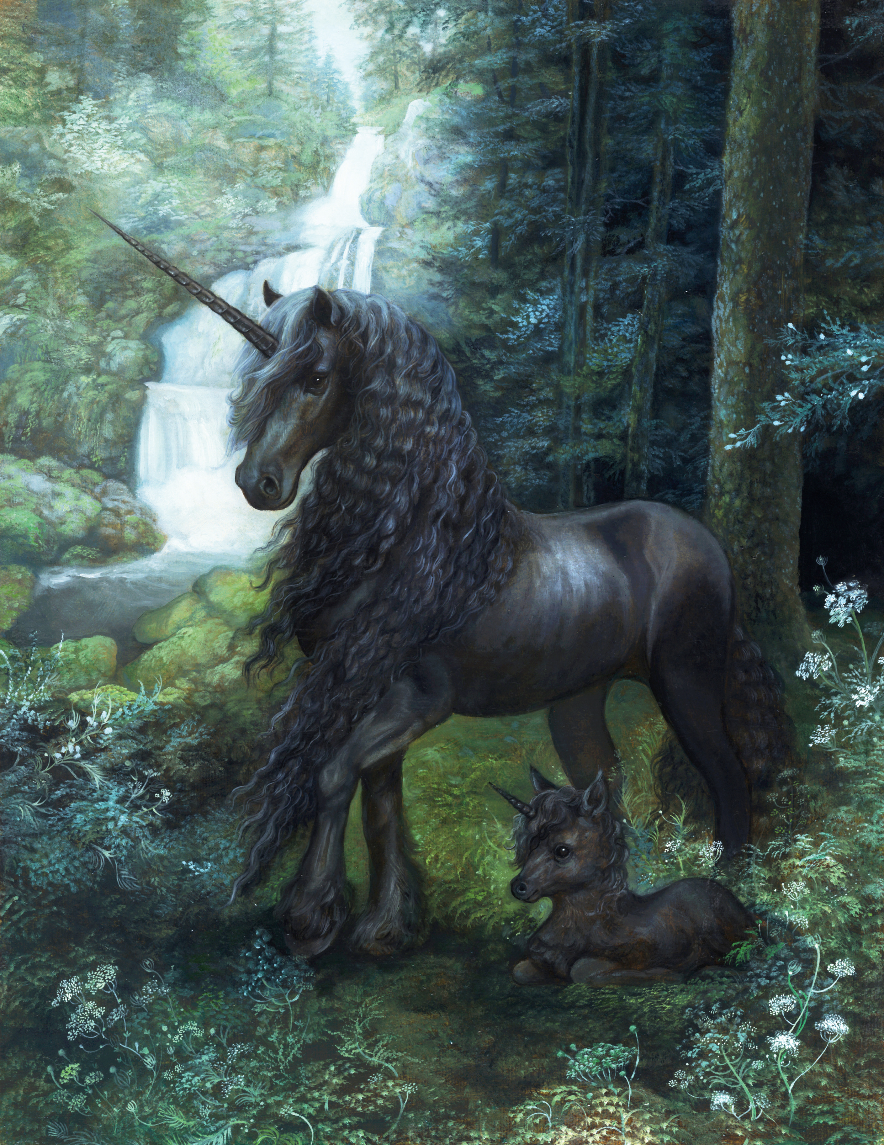
The 18th century Rococo painters used imagination, dreamlike palettes, romantic atmosphere and lively brushwork to create a wonderful atmosphere of enchantment. This period was one of the first times in art history when painters sought to truly transport us to different worlds and fantastic places.
In this workshop we’ll discuss how to illustrate a scene in oil that has this classical, Rococo sensibility to it. You’ll learn how to use an underpainting to achieve a lighting effect that captures form and volume. Then learn to use glazes to enhance the colours and create a jewel-like effect for your painting. Finally, discover how to apply details that bring your characters and their world to life.
- Christmas offer: Save up to 47% on a subscription to ImagineFX
We’ll be working in traditional oils for this painting, but the principles here can also be applied to other mediums. Art shouldn’t be defined by the medium used, but rather the message the artist is communicating. Don’t be afraid to try oils out, even if it seems scary at first. Every time you push yourself and experiment, you improve and expand your own abilities.
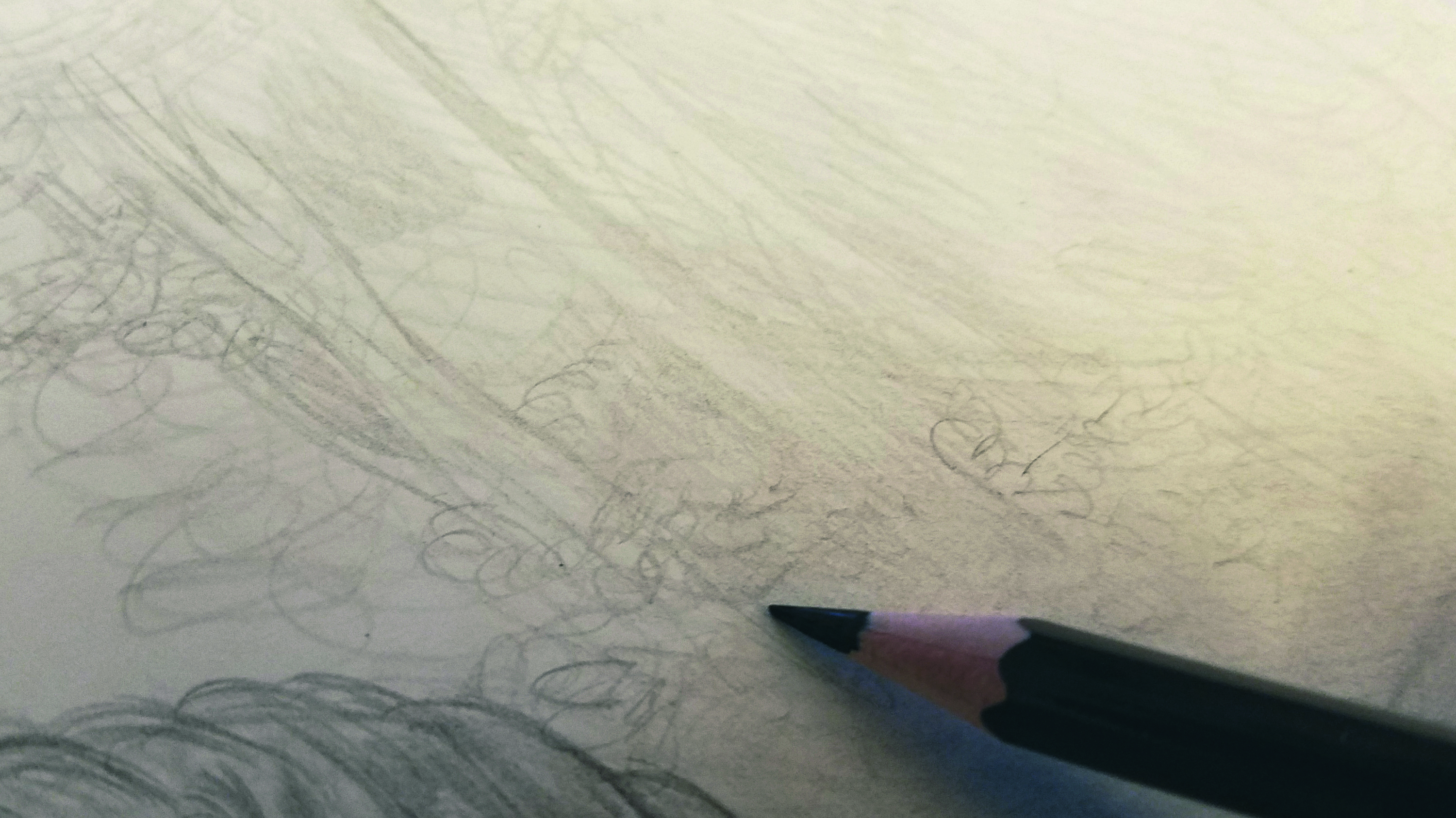
To draw, we used Prismacolor Col-Erase pencils on a toned two-ply Bristol board. We painted with Old Holland oil paints on a 100 per cent cotton Gessoed canvas with Isabey Isacryl brushes (a handmade synthetic brush) in round, bright, flat and filberts of different sizes. We also used Walnut Alkyd oil as a medium.
- Buy Prismacolor Col-Erase pencils in assorted colours: UK | US
- Buy Old Holland oil paint set of 6 x 18ml colours: UK | US
Let's get started.
01. Develop the drawing
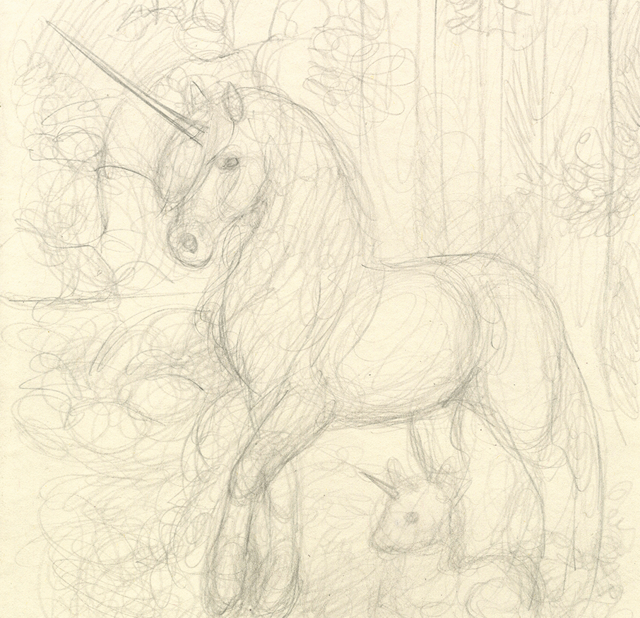
Before starting my painting, I create a sketch to better understand my image. By mapping out a rough foundation you can ensure the subsequent steps of the painting will go more smoothly. For this image I’m going to be using three different pencils on a smooth toned Bristol paper.
In the early steps I prefer to use a Light grey Prismacolor Col-Erase pencil to loosely sketch the figure using basic round shapes. I like to keep my pencil in constant motion and always in contact with the paper during this step. It’s fine for this image to be messy. The lines help build form, and will allow for the figure to have more life and dimension later on.
Get the Creative Bloq Newsletter
Daily design news, reviews, how-tos and more, as picked by the editors.
02. Refine the sketch
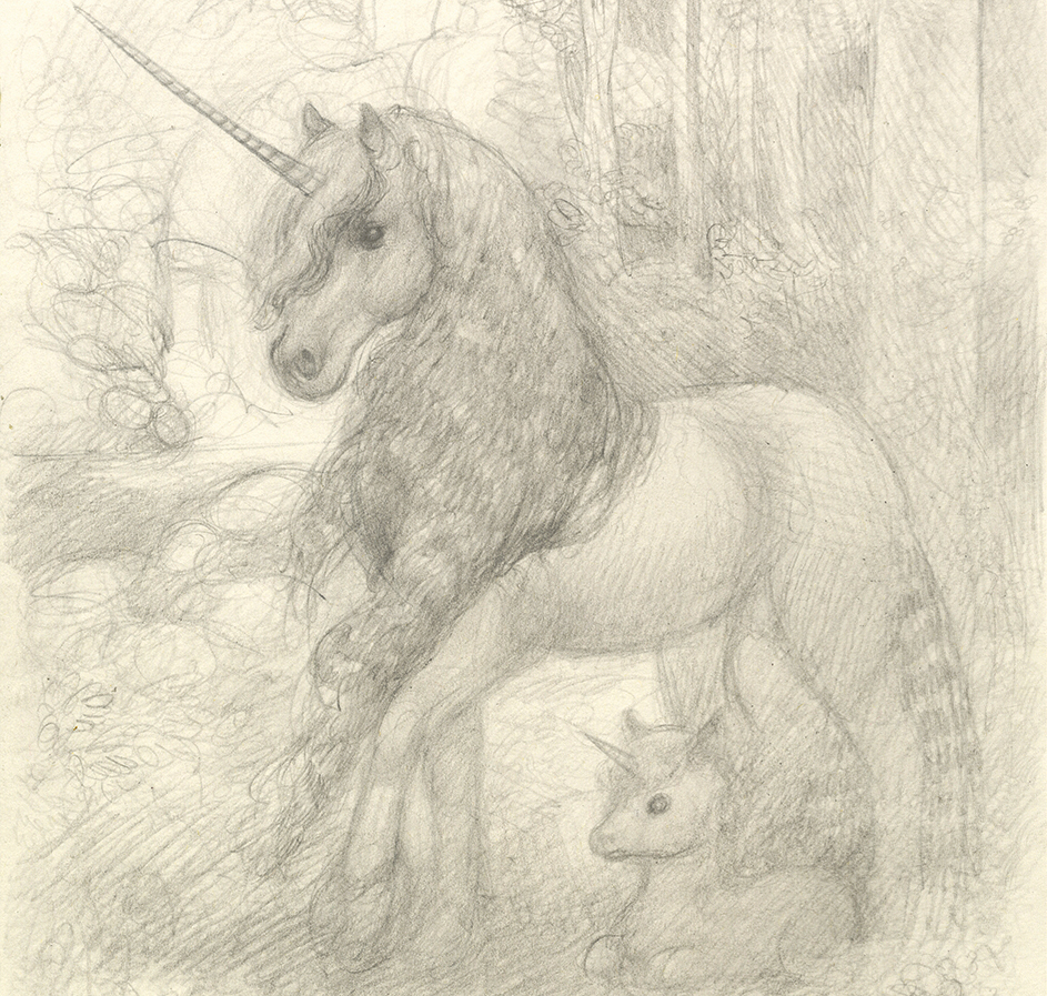
I feel more comfortable adding value once the general idea of the image has been established. The smooth surface of the toned Bristol board enables soft and light shadows to be created easily. I work in a circular motion with a dull grey pencil. I prefer to work with soft forms initially. Darker and sharper lines will be used later on, near the final stages of the image.
03. Apply finishing details
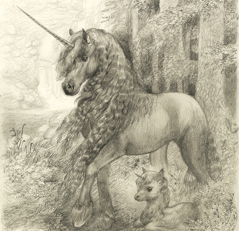
By tracing over the many lighter pencil lines that I’ve developed in previous steps, I can give certain areas in the sketch a more focused and polished appearance.
I darken areas of interest, such as the figures, using passes of black pencil. The 3B prismacolor is perfect for achieving much darker tones. Motion and flow can be defined by using thin lines. While I focused on overall shape before, this is the stage where everything comes into sharp and defined detail.
04. Transfer the image
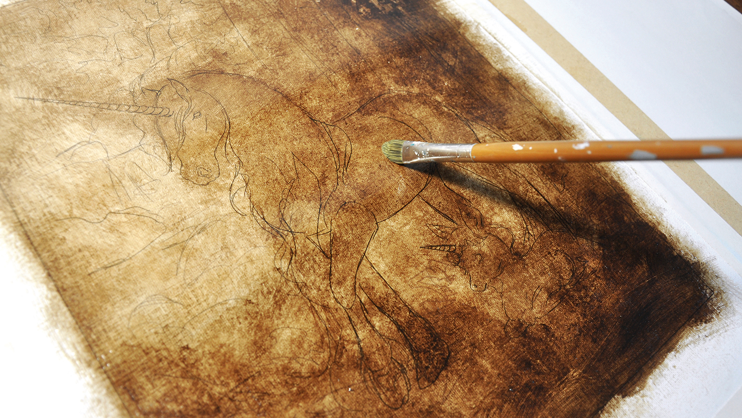
I tone my canvas using Raw umber paint. This gives the image a nice mid-tone to begin the underpainting. Once it’s dry, I’m ready to transfer the drawing. I scan and print it on a piece of copy paper that’s sized to fit my canvas, and apply a thin layer of pastel chalk to the back of the paper. Then I tape this down to the canvas, and trace the image with a 6H pencil. This will transfer a sharp, clean line down on to the surface.
05. Begin the underpainting
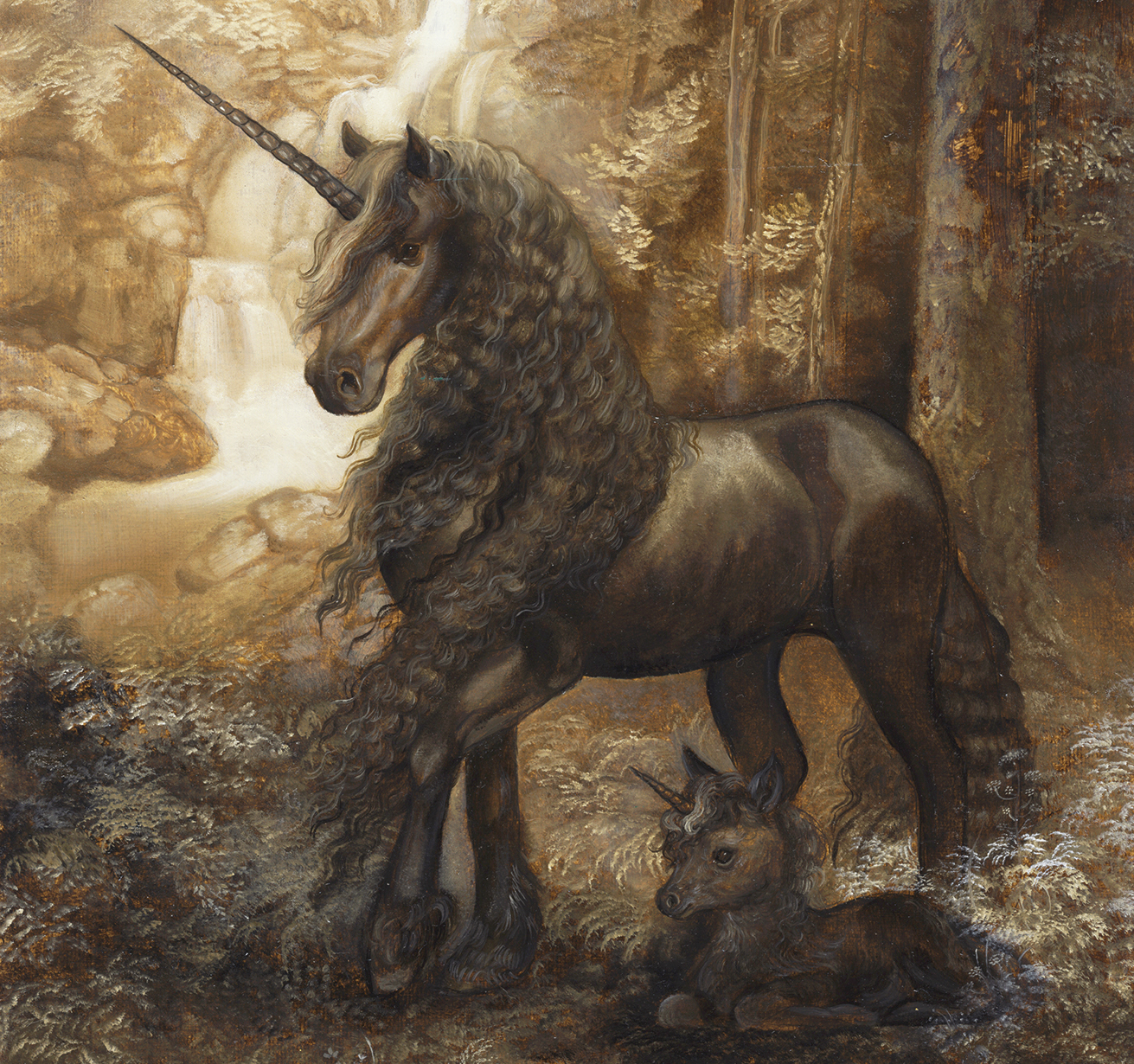
I begin to paint the foundation of my image using Titanium white for the highlights and Raw umber for the shadows. This part of the process is focused solely towards achieving accurate value. Because of this, the contrast of tone is more significant than the final image will be.
I continue this process until all elements in my scene have been depicted. Because the unicorn is going to be darker, I mix Scheveningen black with the Raw umber for some darker values. While working on this step I’m most concerned with capturing the lighting effect. This stage of the painting acts as an important guide for subsequent layers.
06. Apply glazing colour
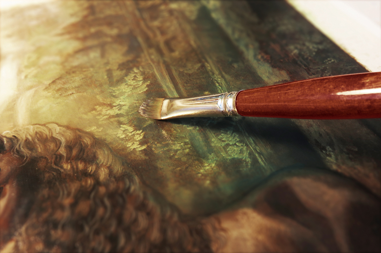
I start adding colour to the background. Because the environment for this painting is inspired by the Black Forest in Germany, I’m going to be using blue tones for the foliage: I apply Cerulean blue mixed with Titanium white over the surface. If the paint needs to be thinned, Walnut Oil Alkyd can be added.
To create the illusion of depth, atmospheric perspective is created by using more subdued and lighter colours. Because this is the most distant point in my scene, I’m not going to render this part of the image as heavily as the foreground elements.
07. Define the environment
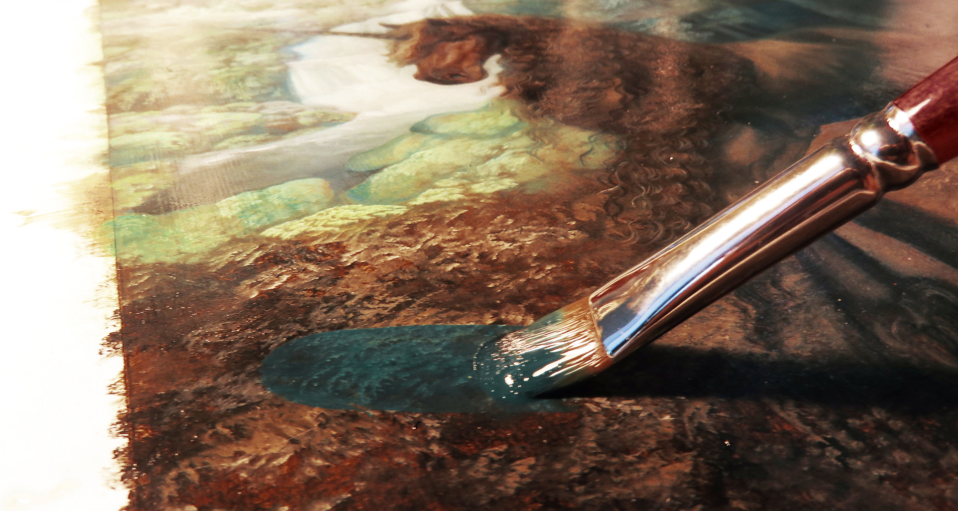
The rest of the environment is toned using more blue and green tones. Payne’s grey helps to neutralise the Raw umber in the underpainting. I apply washes of Green Umber over the foliage. Light washes of Bright Green is painted over the moss-covered boulders. More defined and detailed leaves and moss can be painted by building Titanium white on top of the existing foliage.
08. Colour the unicorns
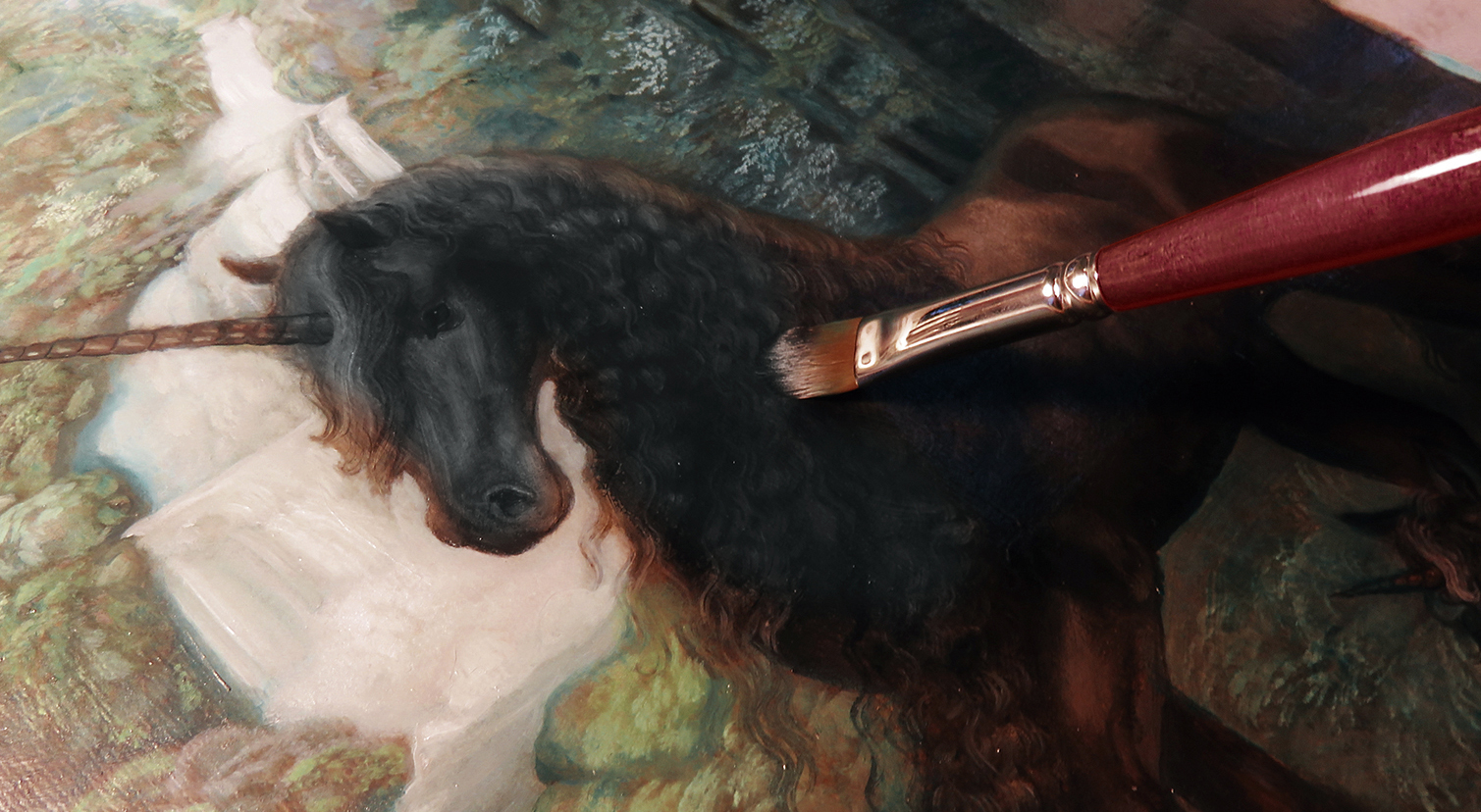
Now that the cool tones of the background have been established, the Raw umber in the scene appears red by comparison. I apply a wash of Cerulean blue and Payne’s grey to the unicorns to help integrate them into their environment. The blue tones will be a better base for their black coats.
09. Refine elements of the unicorns
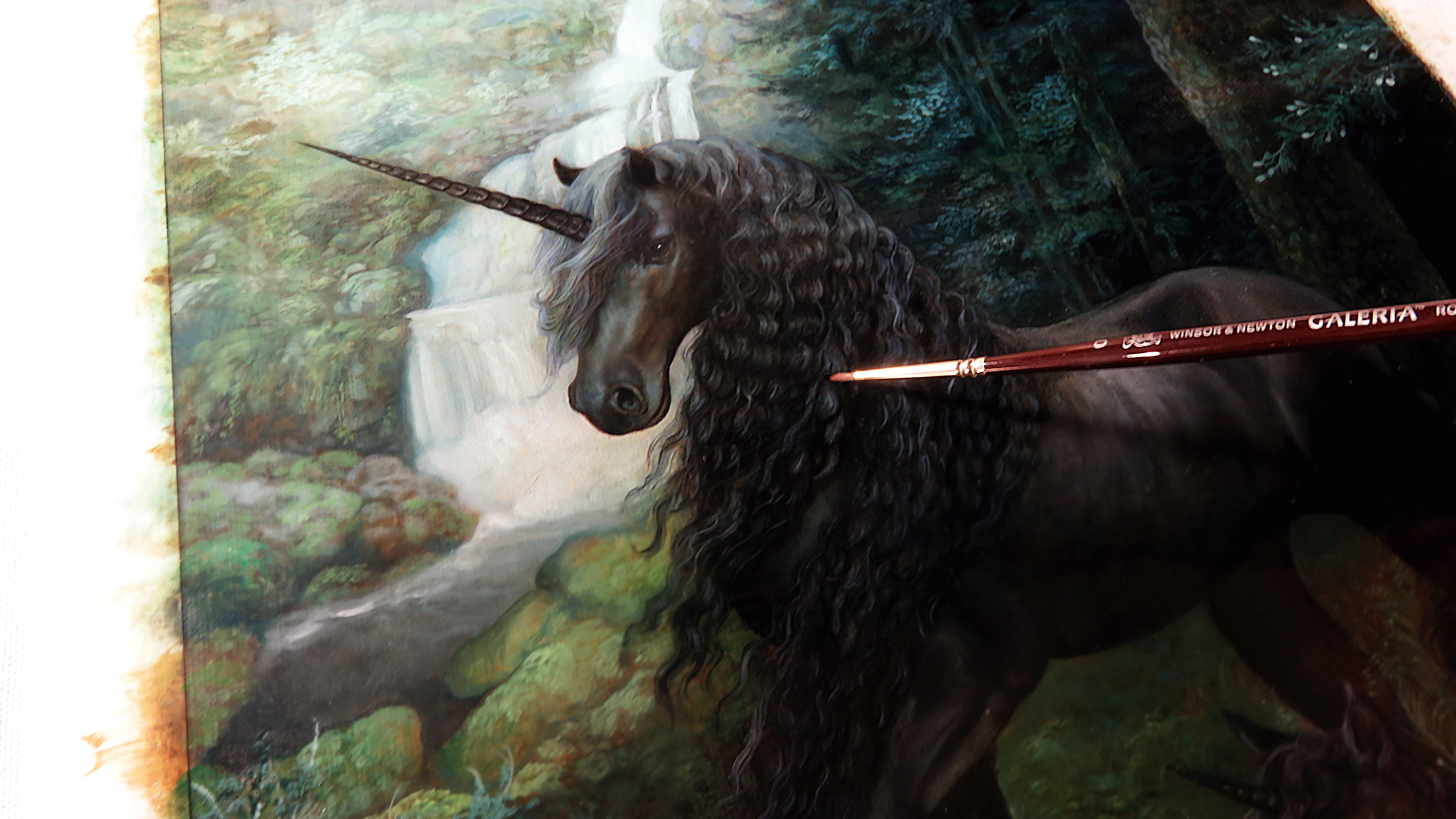
Once the blue layer on the unicorn has dried, I can begin to detail the rest of the figure. Payne’s grey is perfect for the shadowed areas. Because it’s being layered over the underpainting it appears black.
I find that by mixing different hues instead of using straight black pigment alone, the colour has more life. Titanium white is used to detail the strands of hair on the mane and tail. Any areas that are too bright can be darkened using glazes once they are dry.
10. Add final details and finish up
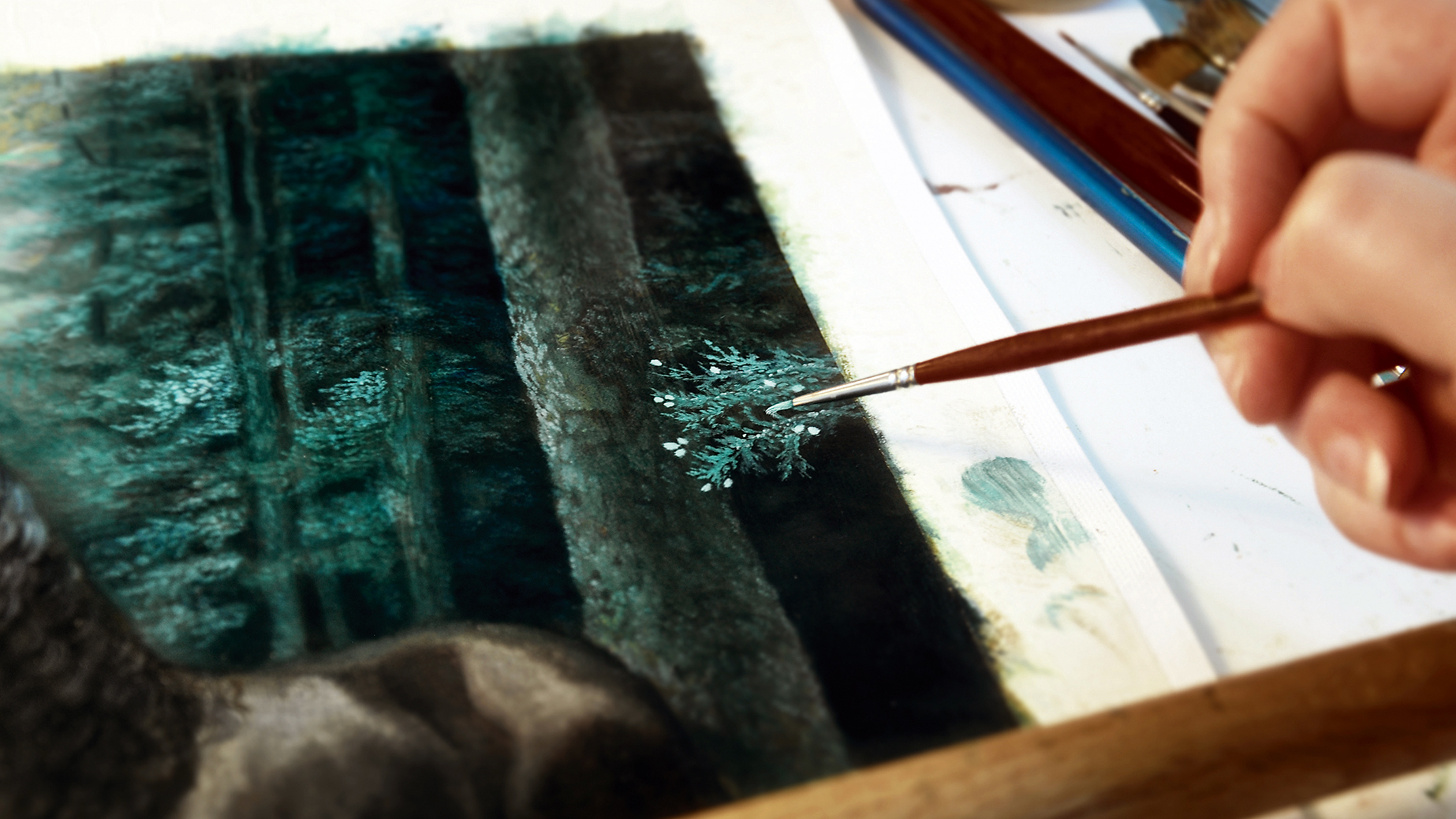
Now that the values and colours have been established, I begin to detail the image. I prefer to work on each new layer only once the previous layer has completely dried. This layering builds a more vibrant and dimensional effect. I pay close attention to individual elements in the scene.
I apply separate colour washes to the different objects to help them stand apart from the background. Green umber mixed with blue creates dark, rich shadows. The smaller details also begin to take shape during this finishing stage.
This article originally appeared in issue 152 of ImagineFX, the world's best-selling magazine for digital artists – packed with workshops and interviews with fantasy and sci-fi artists, plus must-have kit reviews. Buy issue 152 here or subscribe to ImagineFX here.
Special Christmas offer: Save up to 47% on a subscription to ImagineFX for you or a friend for Christmas. It's a limited offer, so move quickly...
Related articles:

Thank you for reading 5 articles this month* Join now for unlimited access
Enjoy your first month for just £1 / $1 / €1
*Read 5 free articles per month without a subscription

Join now for unlimited access
Try first month for just £1 / $1 / €1
