Paint a classic fairy tale scene with Procreate
Use expert painting techniques to create an iconic moment from a fairy tale.
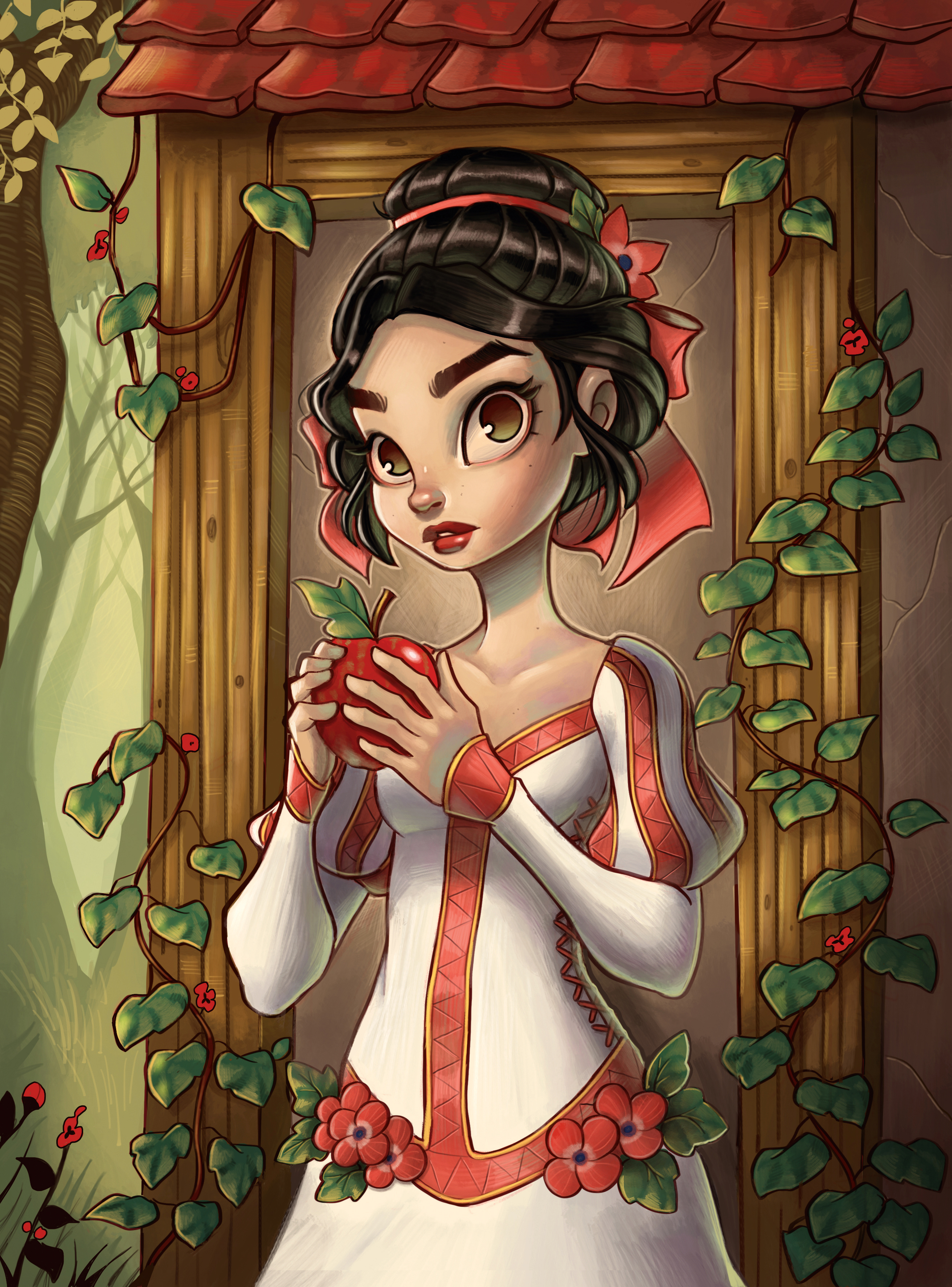
Procreate has quickly become my go-to digital painting app. Thanks to the portability of the iPad Pro, its appeal to me was to be able to create high-resolution digital paintings from anywhere, with the same quality you would find in a desktop program.
Procreate’s clean and simple interface makes it welcoming to new and novice artists alike, and once paired with the Apple Pencil, I found it to feel the most natural way to draw digitally. Don’t be fooled by appearances, though: this application offers all the tools you’ll need to create higher-level artwork. The more I use this app, the more new tools, Procreate brushes, adjustments and shortcuts I find.
For this workshop, I’ll be painting entirely using the Procreate app. The process is similar to working in Photoshop: making use of multiple layers, colour adjusting and using a variety of brushes.
All of the brushes I use are straight from the Procreate library, but the app allows for easy import of downloaded or imported brushes as well. I try to work in the least amount of layers possible, so it feels more like painting on a canvas.
I decided to pay homage to classic fairy tale illustrations for this piece – in this case, Snow White and the poison apple. I love the old storybook paintings, and decided to try my take on the subject matter.
01. Start with a sketch
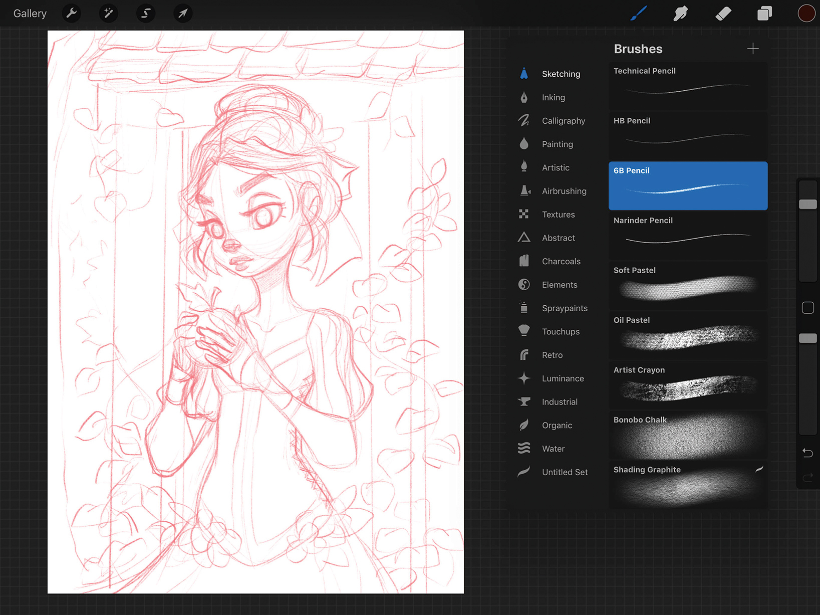
Procreate has a great selection of 'sketching' brushes, and my go-to is the 6B Pencil brush. I loosely sketch out the concept of Snow White and the apple, not worrying too much about details and specifics, but just blocking in very general ideas. I know I can change and tighten ideas later on, so I keep the sketch simple.
02. Refining the idea and inking
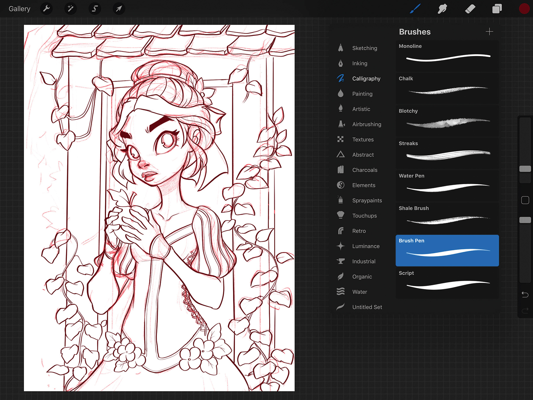
Next, I lower the Opacity of the pencil sketch layer. I create a separate layer on top and choose the Brush Pen from the Calligraphy Menu. I choose a dark brown colour to ink, avoiding black (for now) for a softer look. Using simple strokes, I ink over the drawing.
Get the Creative Bloq Newsletter
Daily design news, reviews, how-tos and more, as picked by the editors.
03. Blocking in flat colours
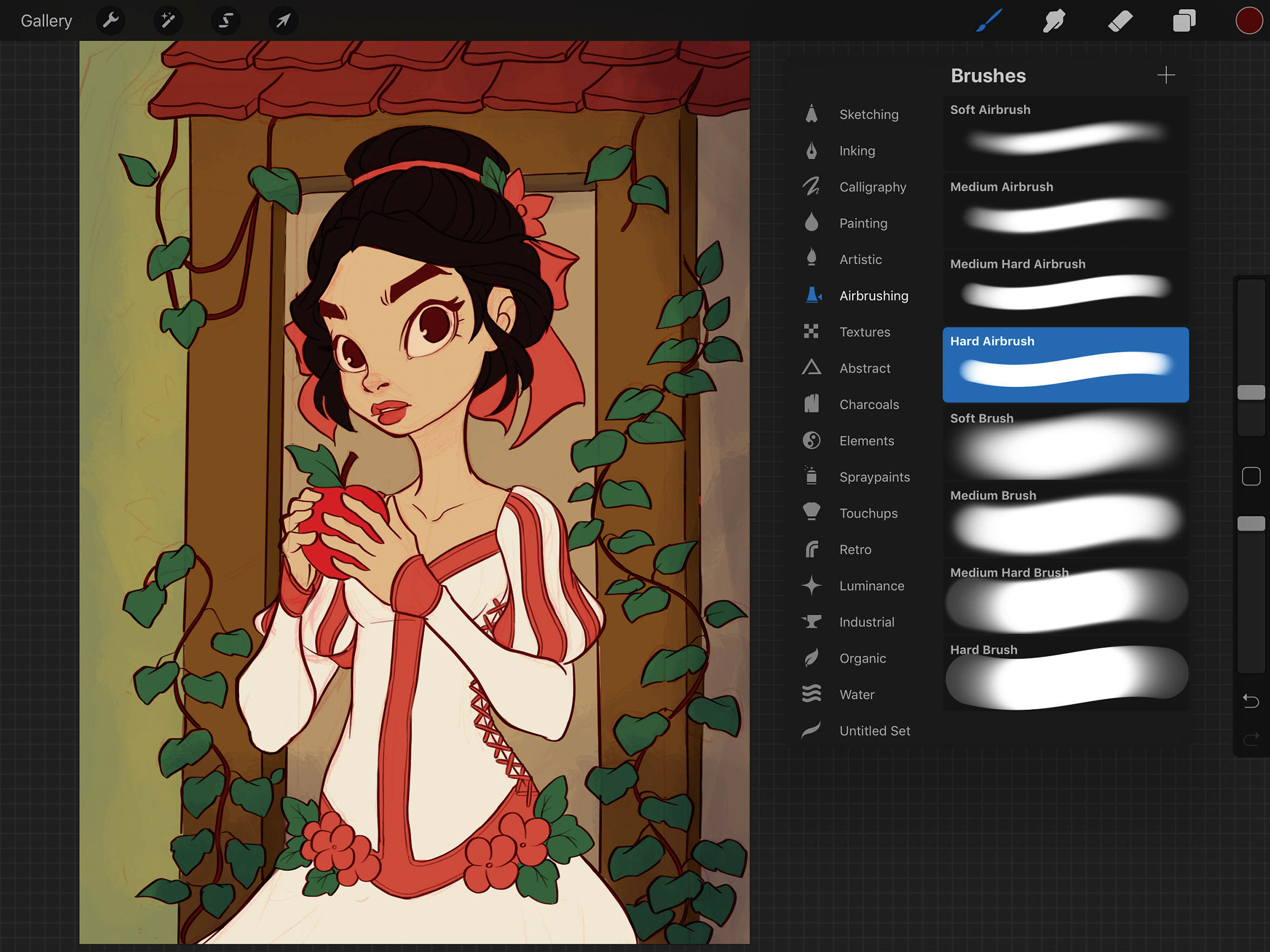
Now having both the light pencils and inks, I merge the two layers and set the combined layer to Multiply. Then I create a layer underneath and then fill the background with a green colour using the Paint Bucket tool. Next, I select the Hard Airbrush and fill in the very basic, flat colours of the drawing that are underneath the lines.
04. Know your light source
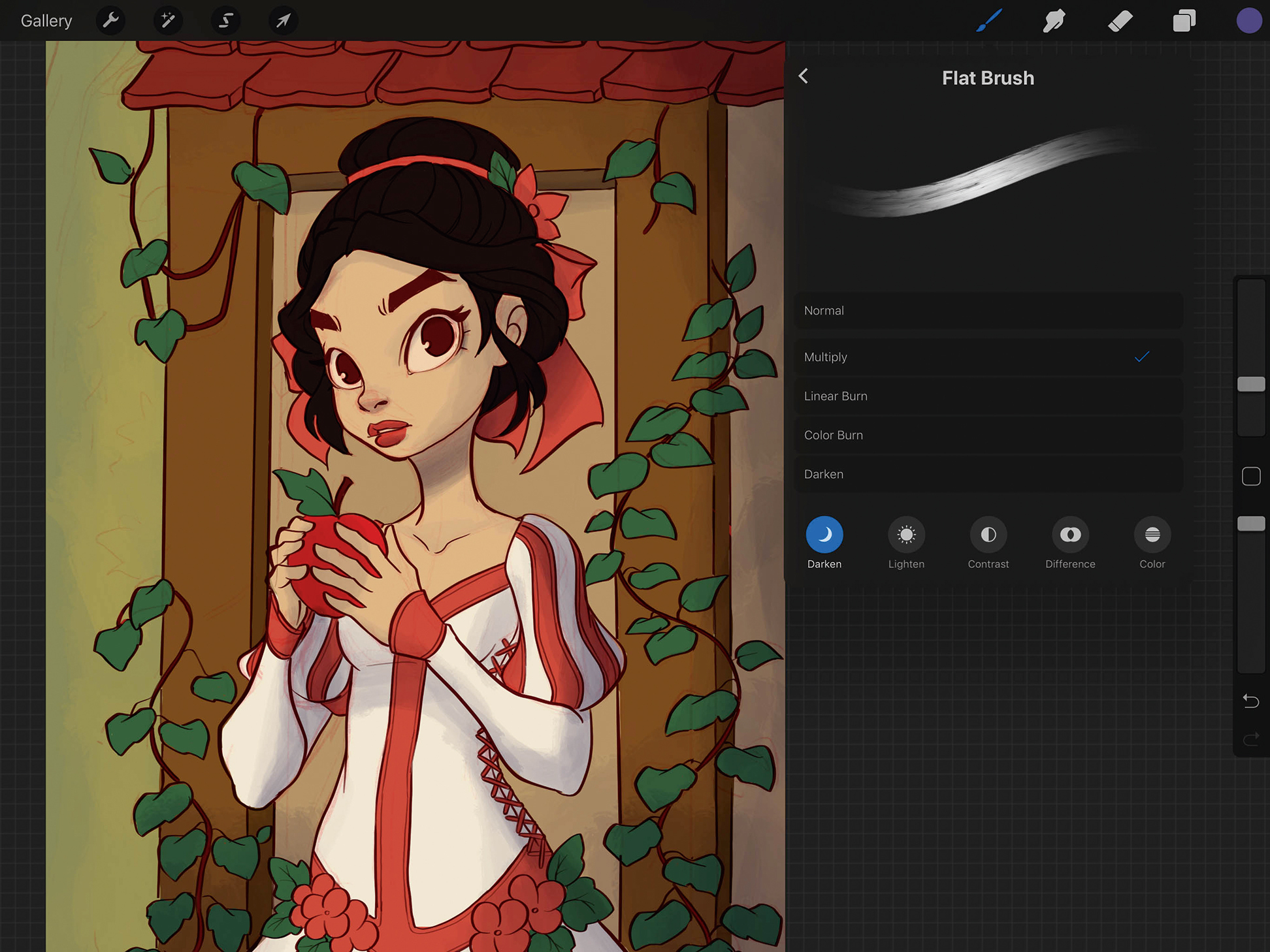
I select the Flat Brush and set its brush properties to Multiply, before choosing a grey-blue colour. I decide that one light source should come in from the left, so I lightly paint in a thin layer of shadows on the figure and start to define her shape. I tackle a bit of the shadows in the background at the same time.
05. Time to paint

Now that I have the basics laid out, I create a layer on top and set the Flat Brush properties back to Normal. I eye-drop the colours, then choose lighter colours to push things forward and darker colours to pull things back. I also try to choose colours that are already on the screen, which keeps the colour palette cohesive.
06. Pushing the values
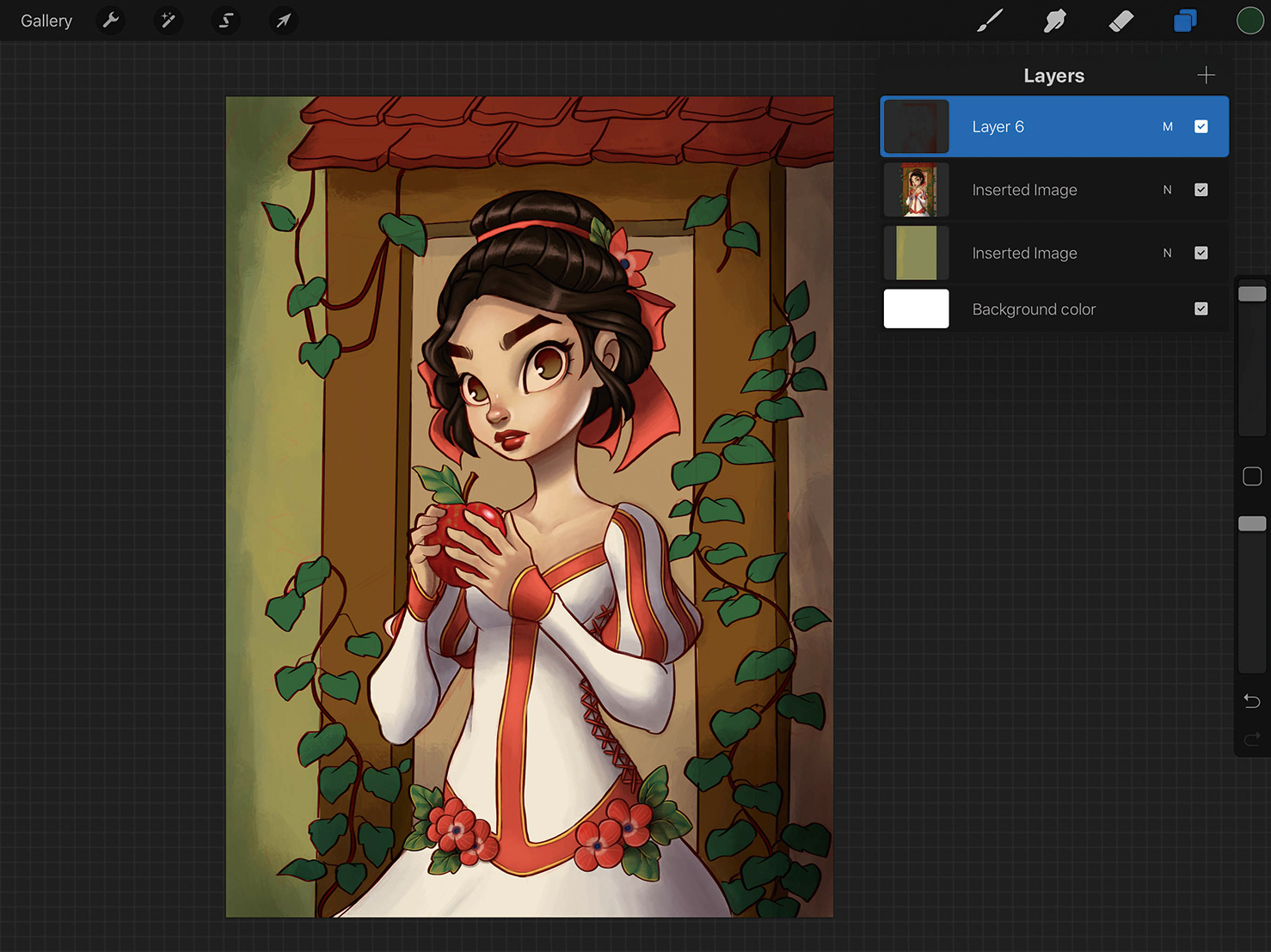
Now that the basic textures are painted on Snow White’s face, dress and hair, I create a Multiply layer on top. Still using the Flat Brush, I lightly go over the painting with a dark brown colour to intensify the shadows. I also make the four corners darker, which places more emphasis on the centre of the painting.
07. Painting over shadows
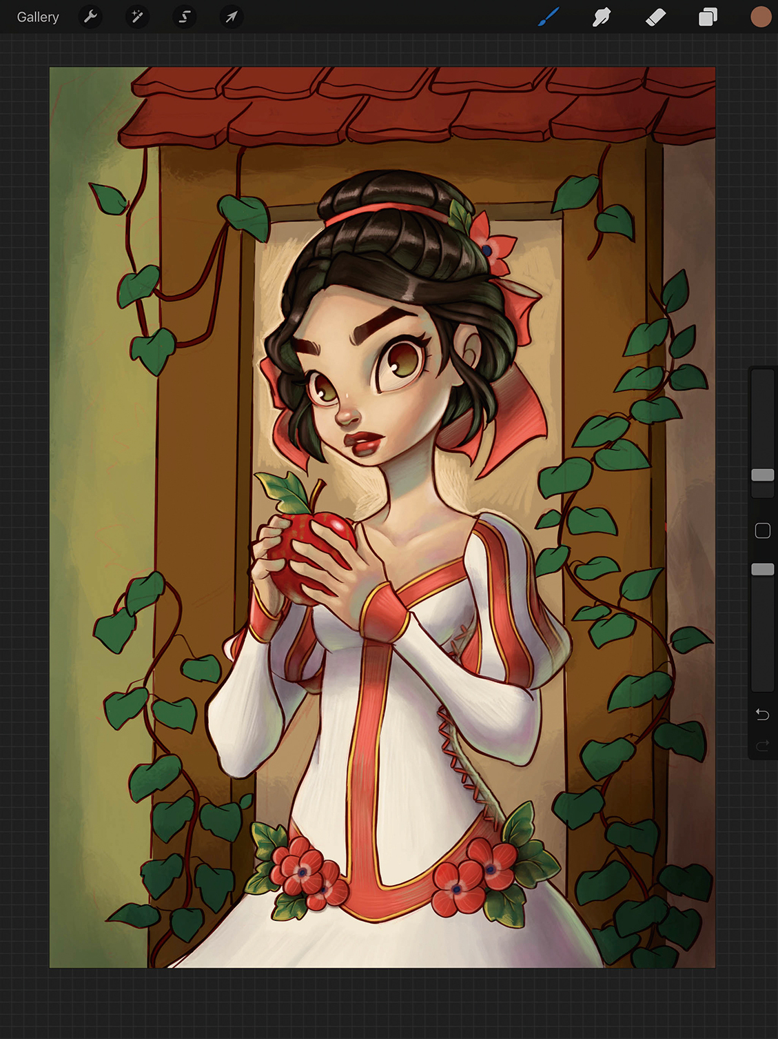
I like to pick a lighter colour (in this case, a light turquoise/blue) and paint inside the shadows. I do this in thin, gradual layers and build up the Opacity where it’s closest to the edge or where it’s the darkest. This can help to create a rim lighting effect.
08. Playing around with curves
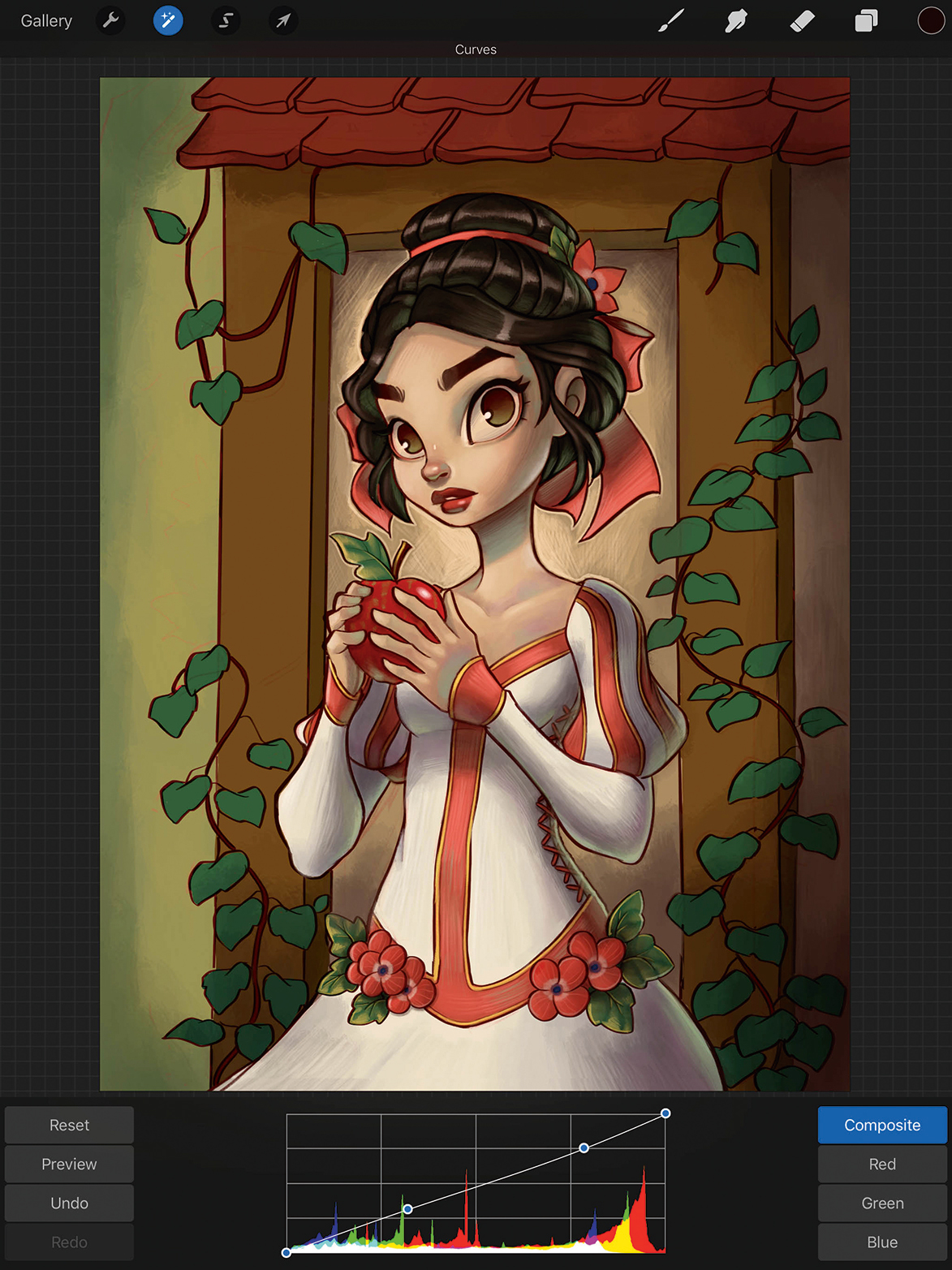
Procreate has different colour adjustment options. I like to use the Curves tool to play with contrast, and Color Balance to tweak the colours in the shadows, midtones and highlights of the painting. Since I’m working in one layer at this point, the adjustments change all aspects of the piece.
09. On to the background
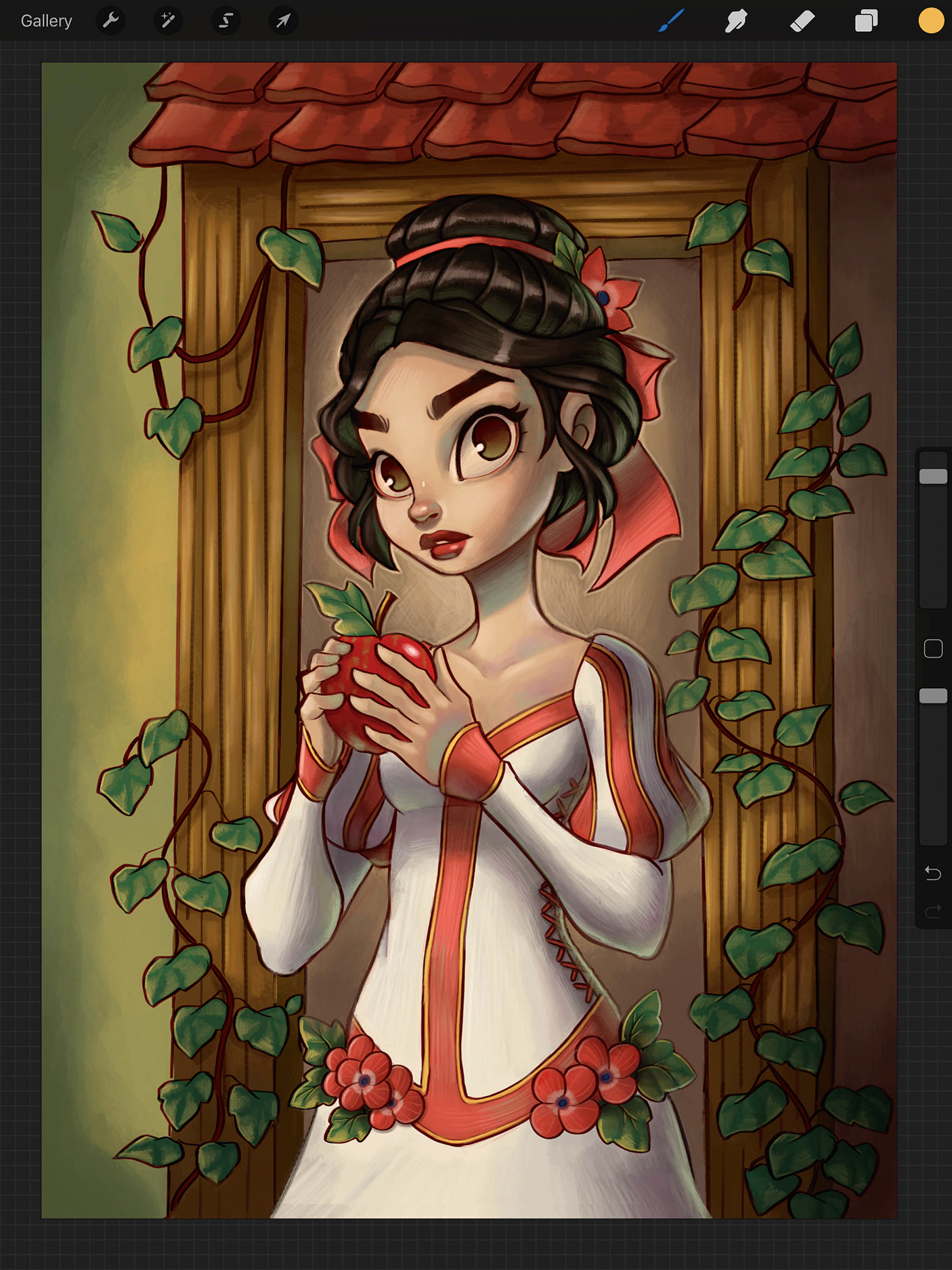
Using the same principles as painting Snow, I start defining the background. I use colours that are local to the painting, eye-dropping yellow for highlights and dark browns for shadows. I slowly start to render out the leaves, roof tiles and wood grain, still using the Flat Brush.
10. All about the details
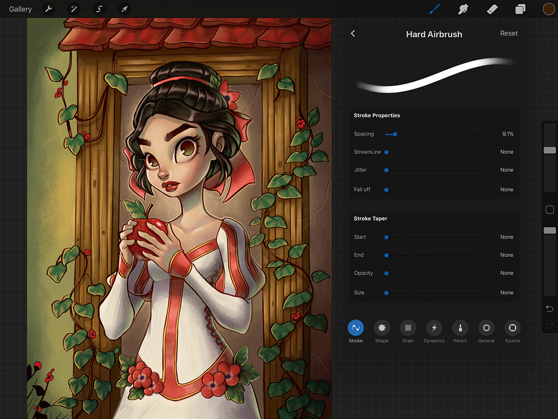
After using the Flat Brush for the bulk of the painting, I select a Hard Airbrush to focus on details, reducing the diameter to make the brush head smaller. Since this brush is opaque, I try to make bold decisions in colour and highlights, giving the painting a crisper look.
11. Brighten the composition with the Color Dodge setting
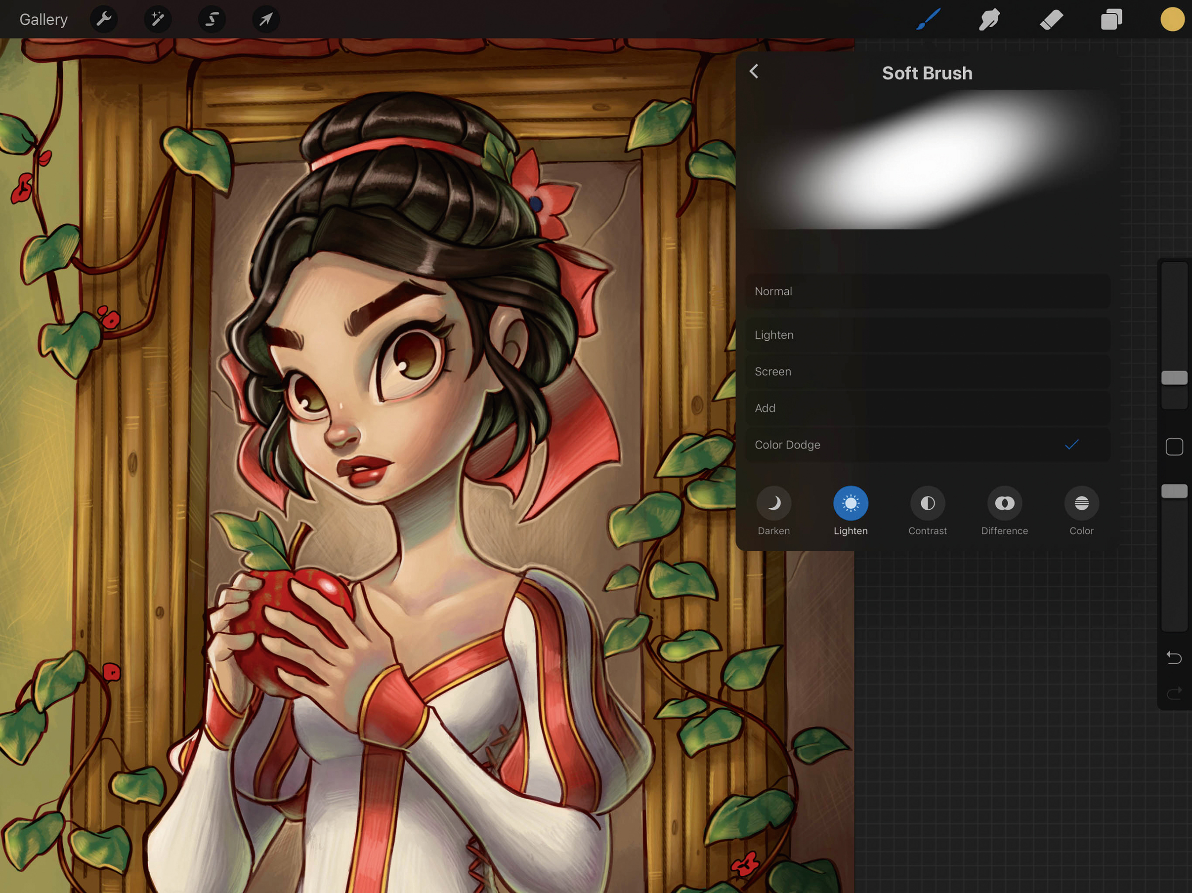
Now moving on to a soft airbrush, I pick a local yellow colour and set the brush properties to Color Dodge. Then I very lightly paint in some highlights around the leaves, wood and face of Snow White. I try to keep these highlights to a minimum to avoid a heavily airbrushed look.
12. Going a bit further
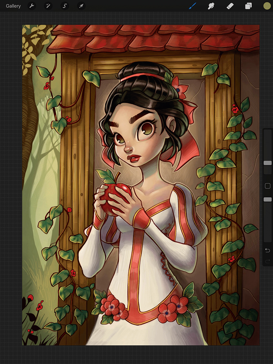
Next I switch back to the Hard Airbrush and add elements that were not originally in my sketch. I paint in some trees, flowers and a subtle background to suggest a forest location. I use the Brush Pen from the Calligraphy menu to paint tree branches and grass blades, because it tapers off nicely at the ends.
13. Adopting a different perspective
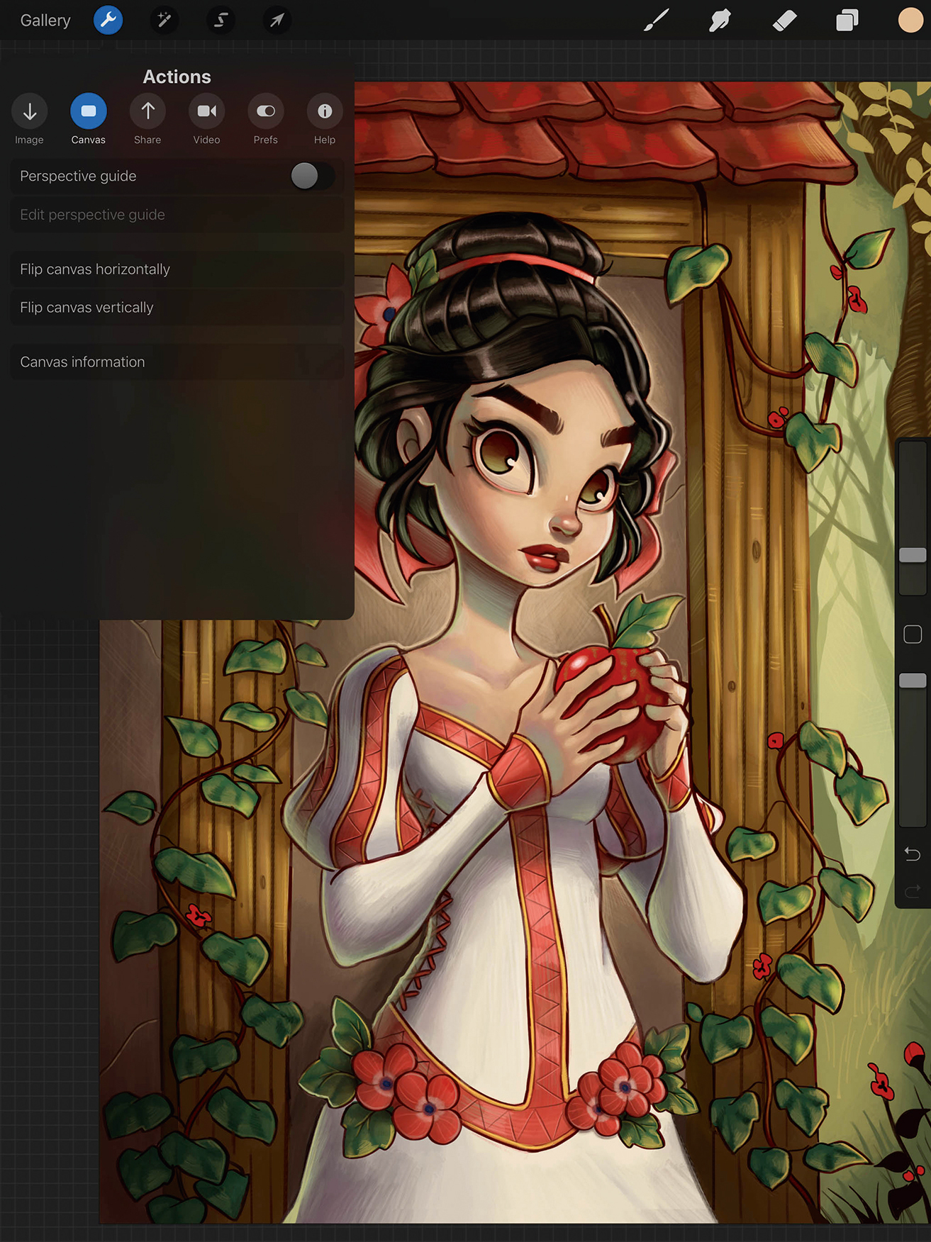
Throughout the process and more often at the end, I like to flip the canvas horizontally. If something seems off, seeing the mirrored version of the painting usually helps to identify any problems. This is also a great way to check symmetry. The painting should make sense both normally as well as mirrored.
14. Taking a final glance, before calling things done
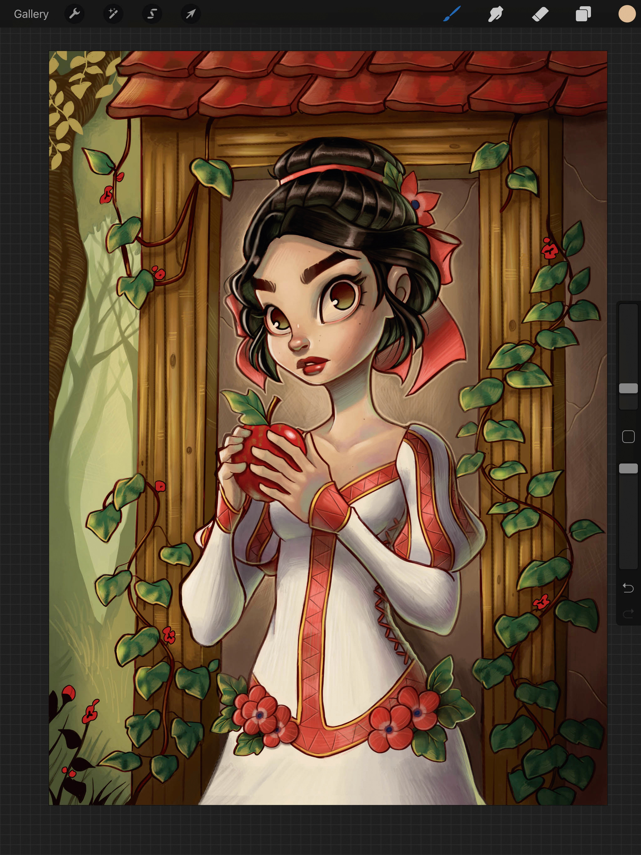
I feel like I’ve come to a point where the painting is almost complete. Using the Hard Airbrush, I look for places to add minor details and make any adjustments and tweaks. This is also the point where I play with the Curves and Color Adjustments one last time. And with that, the painting is finished!
This article was originally published in issue 156 of ImagineFX, the world's best-selling magazine for digital artists. Buy issue 156 here or subscribe to ImagineFX here.
Related articles:

Thank you for reading 5 articles this month* Join now for unlimited access
Enjoy your first month for just £1 / $1 / €1
*Read 5 free articles per month without a subscription

Join now for unlimited access
Try first month for just £1 / $1 / €1

Chrissie is a Connecticut-based illustrator who has created artwork for comic books, posters and toy designs. She has a curious collection of all things yeti-like.
