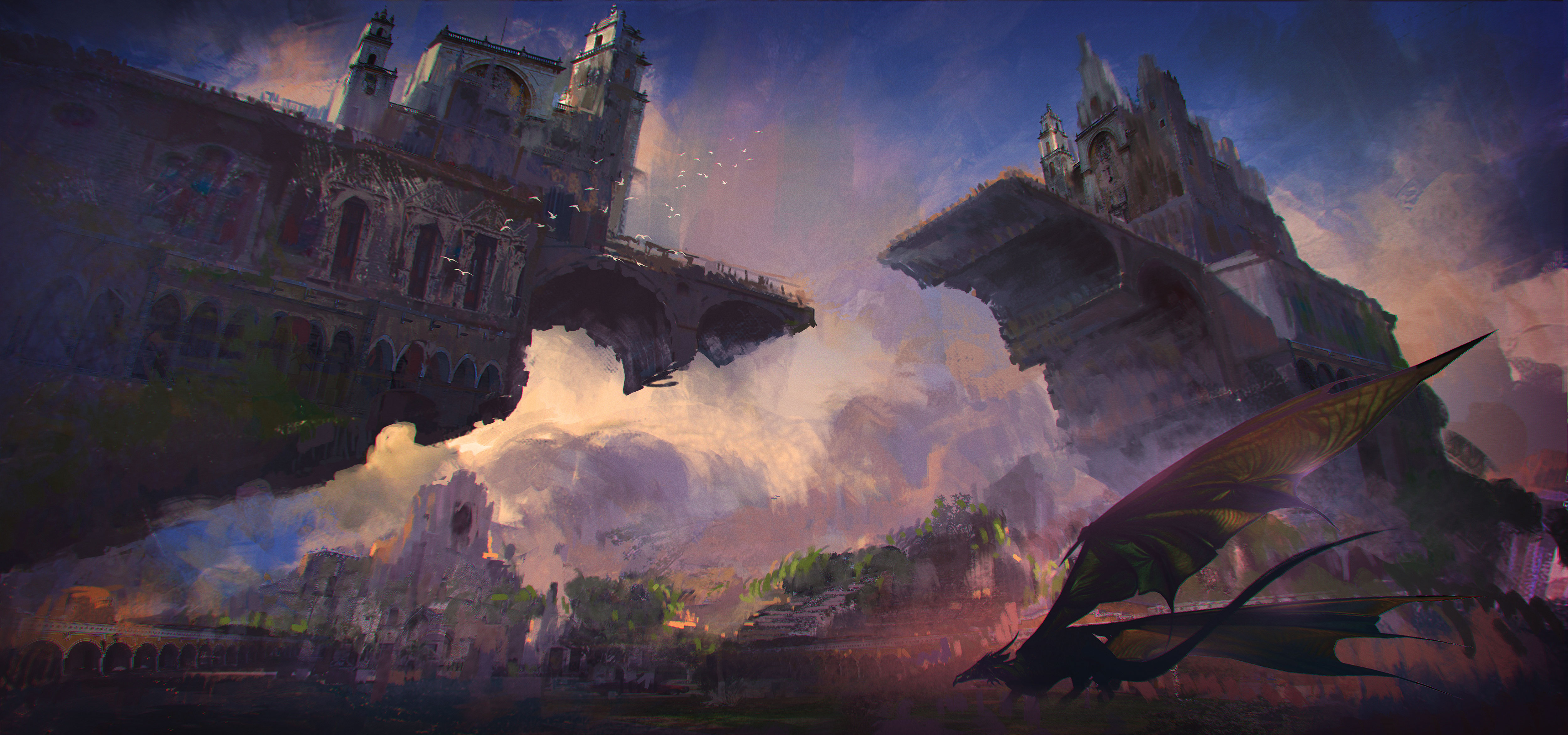
There are a range of art techniques that can help with your digital painting, but there's no denying that creating 3D art from scratch can be confusing. Picking the best angle for a complex structure such as this castle can be challenging, and if you're not a fast modeller, attempting to make a 3D base might slow you down.
Enter SketchUp, a simple 3D drawing tool that is surprisingly easy to learn, with functions to speed up the painting process. Here, we'll take you through how to use this free tool to create 3D bases. We'll then move into Photoshop CC to turn our 3D model into a digital painting.
In this article, you'll learn how to understand a complex scene from every possible camera angle, as well as a few key digital painting notions such as value structure, applying textured brushstrokes, adjusting colour temperature, painting over photo textures, adding character for scale and so on. Let’s get started.
Use the icons in the top right of each image to enlarge it
01. Explore SketchUp's core tools
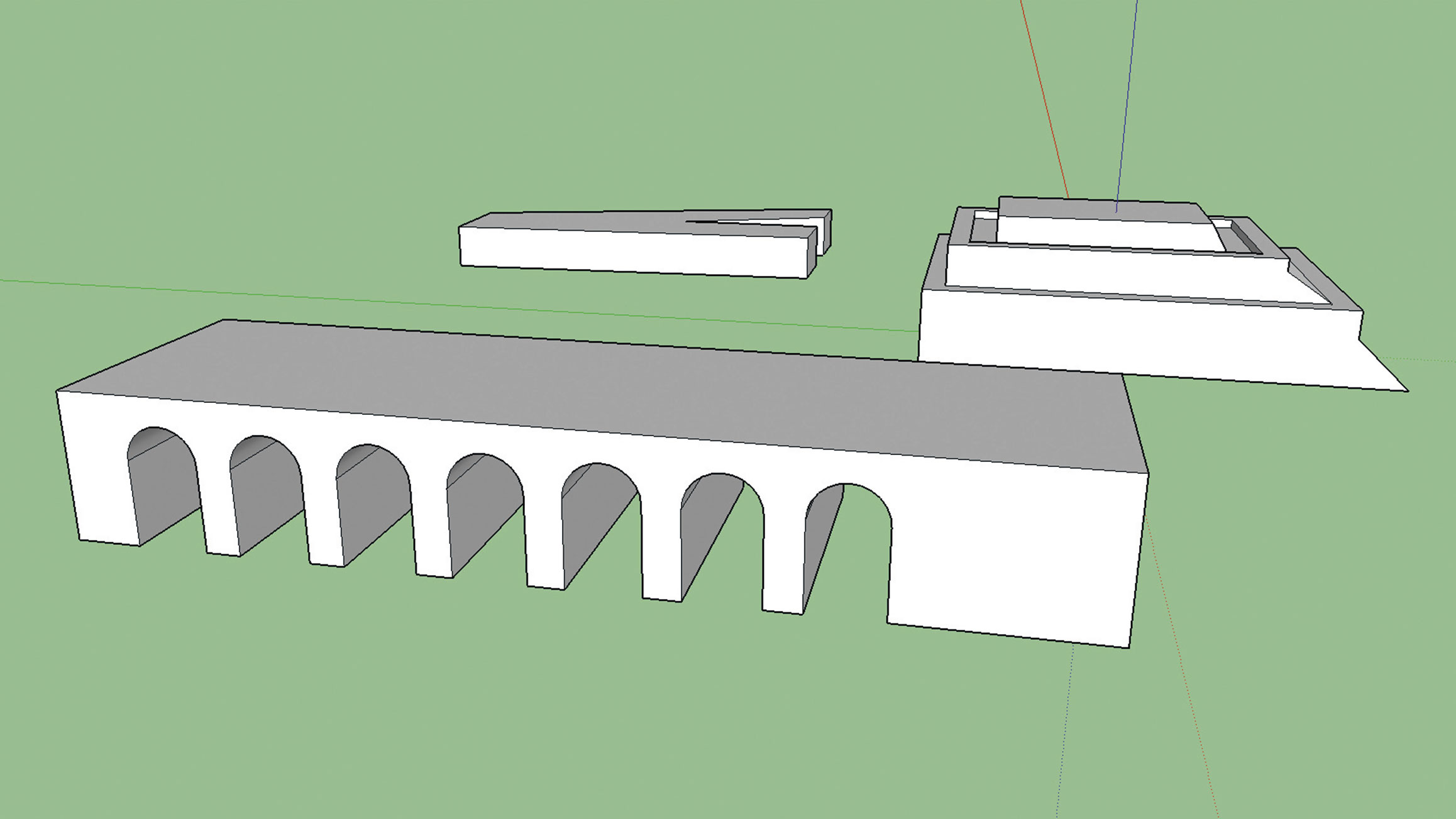
Our goal with this software isn’t to master it completely, but rather to get to grips with the essential tools that you need to accomplish the modelling process quickly and effectively. The tools you'll probably use the most are the Line, Arcs and Rectangle tools, the Push/Pull and Offset tools and also the manipulation tools, such as Move, Rotate and Scale.
02. Add recognisable architecture
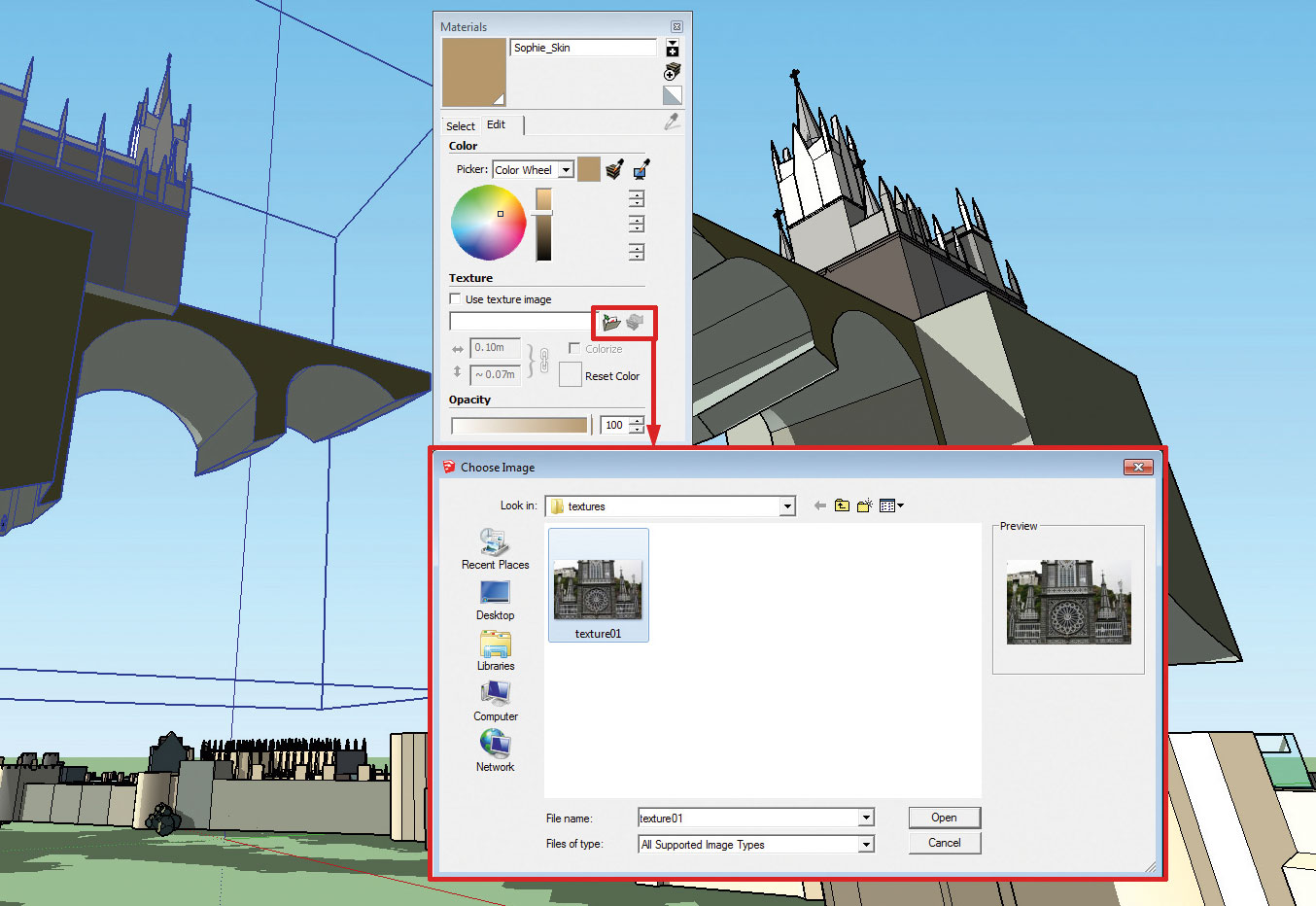
To speed up the modelling process, use real-world architecture references to help you place features such as windows, arches and towers. Here we cropped some photos of Las Lajas Sanctuary, in the Columbian city of Ipiales.
To apply the textures, click the object faces, then select the small folder icon within the Material panel to browse to the texture you want to use. Placing this rough texture pass on the basic 3D volumes helps you decide when you're ready to continue with a more detailed modelling pass.
Get the Creative Bloq Newsletter
Daily design news, reviews, how-tos and more, as picked by the editors.
03. Model a simple 3D base
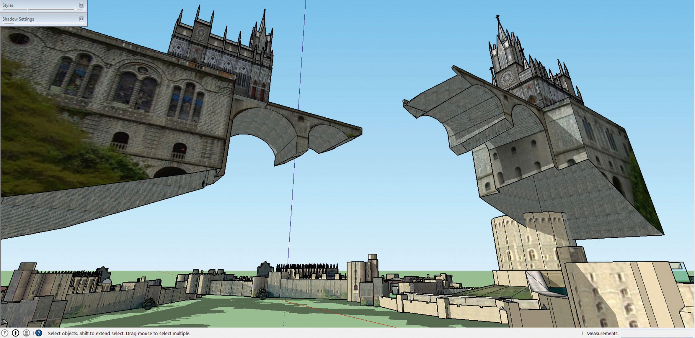
Here’s the model we're making in SketchUp. As you can see, this isn’t a fully completely 3D scene. Some structures are floating in the air, and the edges can be worked on a little bit more. But this is more than what you need as the base of a painting. Don’t fall into the trap of making everything perfect in 3D. We’re making concept art here, not a 3D final product.
04. Use SketchUp's various Style mode
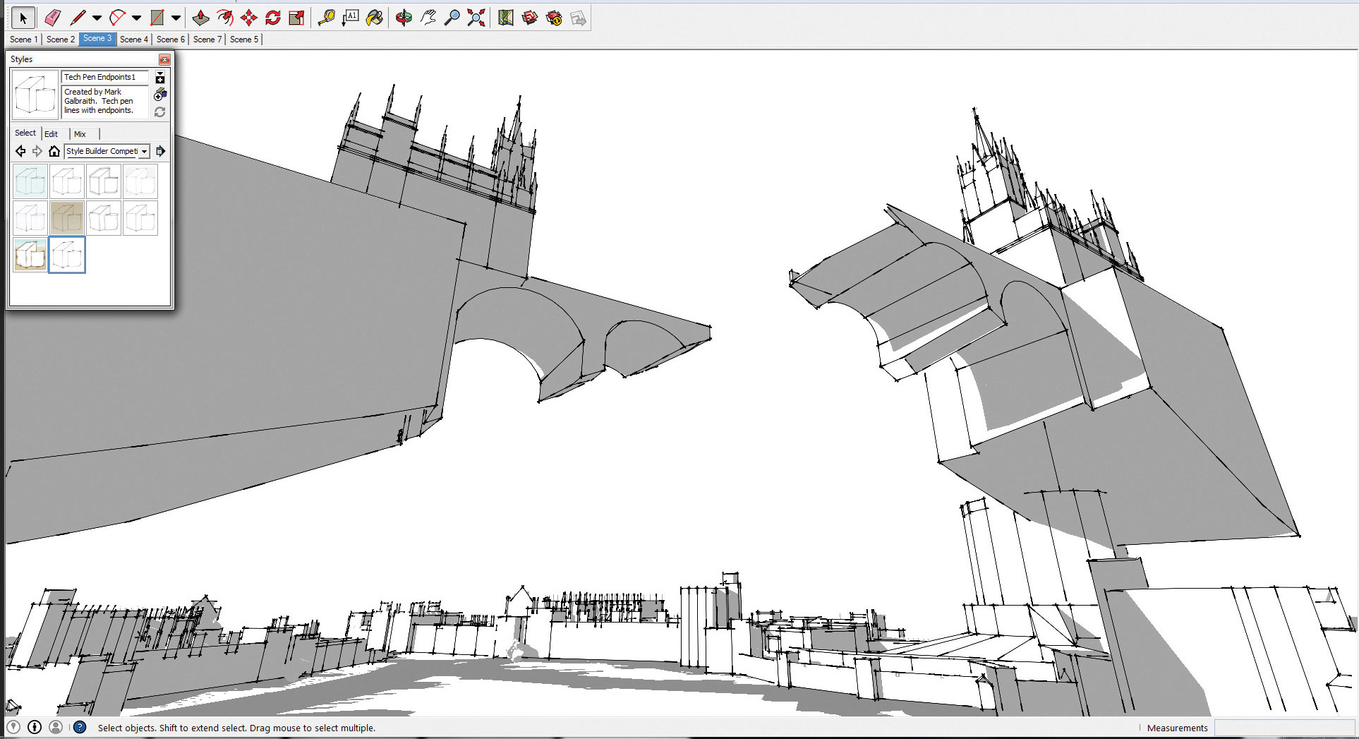
Styles dictates how your model will be displayed in SketchUp, a bit like the filter effects on images in Photoshop. You can view the model as line art, brush work, simple textures and so on. For this painting base, we need two Styles: line art style and the simple style. We’ll use them as passes to guide the painting process.
05. Enhance the shadows
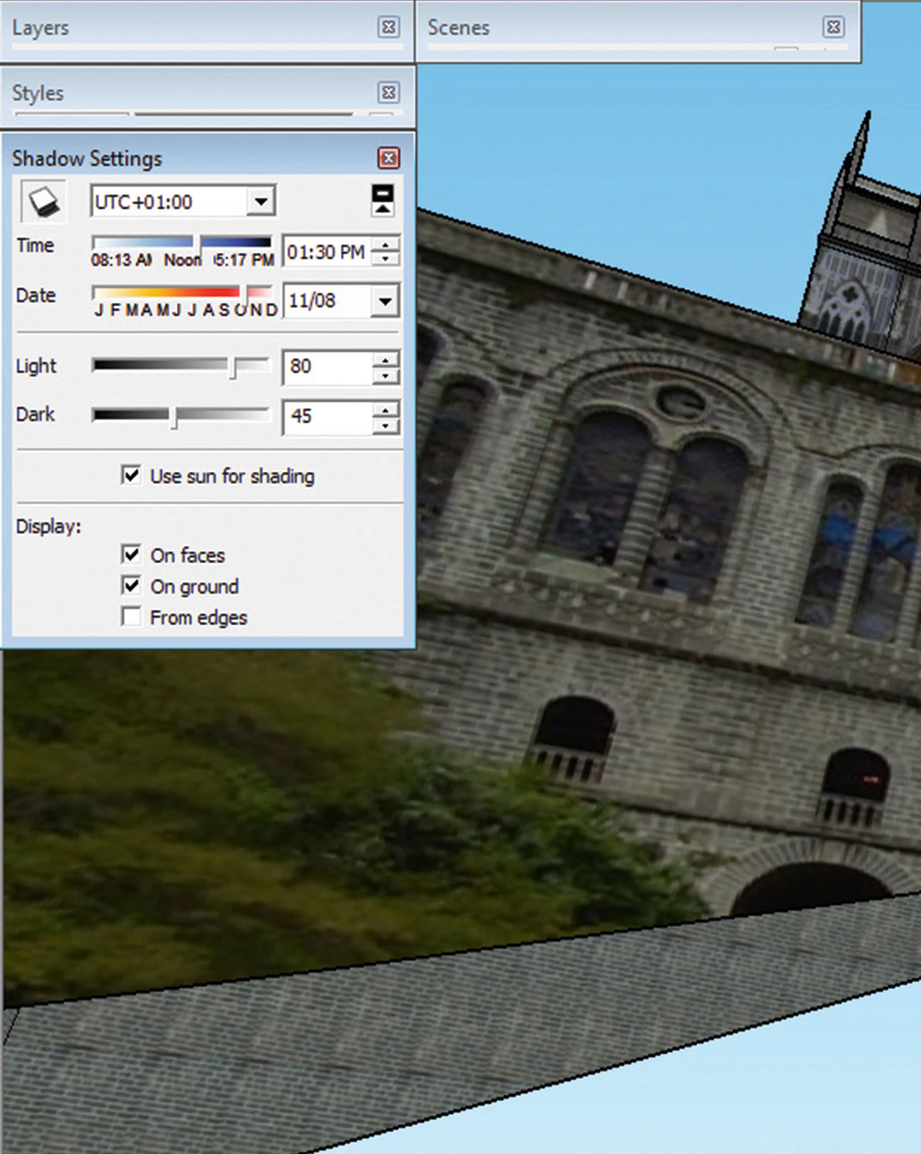
Shadow is a powerful tool to create interesting compositions. The Shadow setting in SketchUp enables you to pick a specific time zone, date and time of the day, to see the effect of different shadows and light on your model.
06. Explore different camera angles
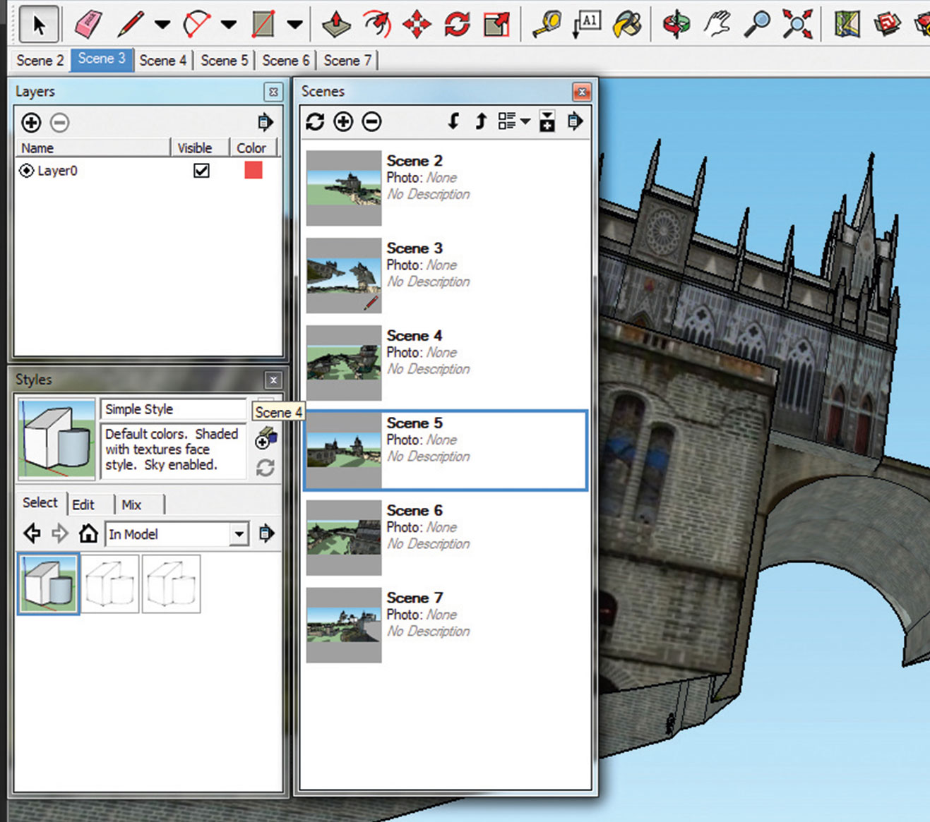
SketchUp's Scene Management tool enables you to save different camera angles. Being able to examine your scene from 360 degrees is probably one of the biggest advantages of having a 3D base, compared to traditional thumbnail sketching.
Not only you can rotate your camera freely, you can also easily adjust the field of view. This makes it possible to use a wide lens and telescopic lens. In the Scene Management window, you can click the different thumbnails to switch between the saved camera angles and to pick the best option for your painting.
07. Move into Photoshop
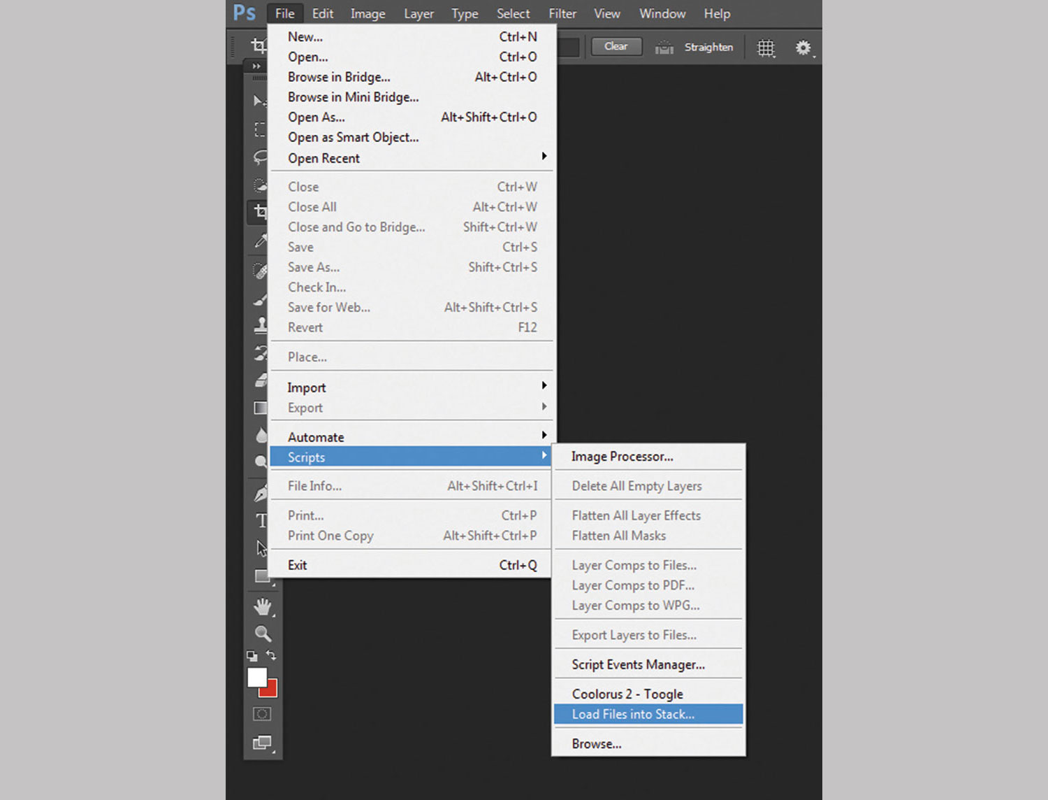
Now after all the hard work you’ve done in SketchUp, bring the passes that you need into Photoshop. Just in case there are many passes to be imported, you don’t need to open each of them and drag them one by one into the painting window. Photoshop has a great function for this: simply go to File > Script > Load Files into Stack (hit the icon in the top right of the image above to enlarge it).
08. Spread on some colours
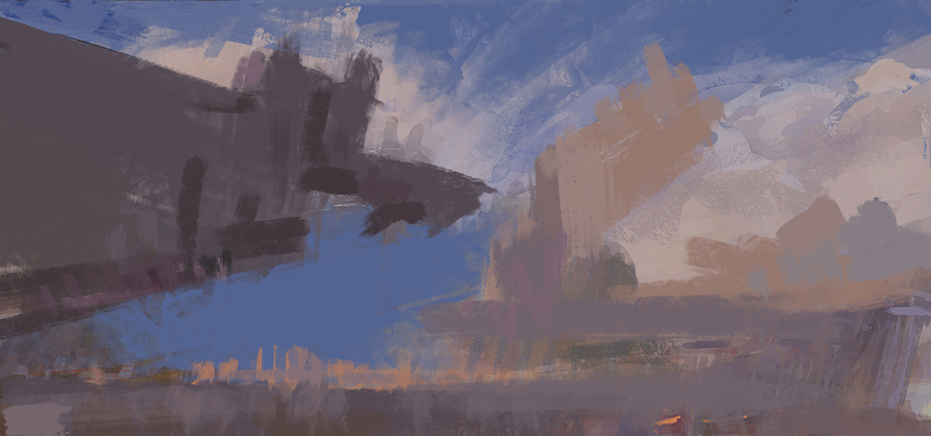
It’s important to let the 3D passes work as a guide for you, without allowing them to limit your creation process. Here we reduced the simple texture layer’s Opacity and created a new layer on top of it. We then used a textured brush to spread colours freely on the canvas.
As you can see, you don’t need to let the colours on the basic texture layer dictate the palette – we used a light purple/blue tone to bring up the colour vibrancy in the painting.
09. Overlay the 3D layer
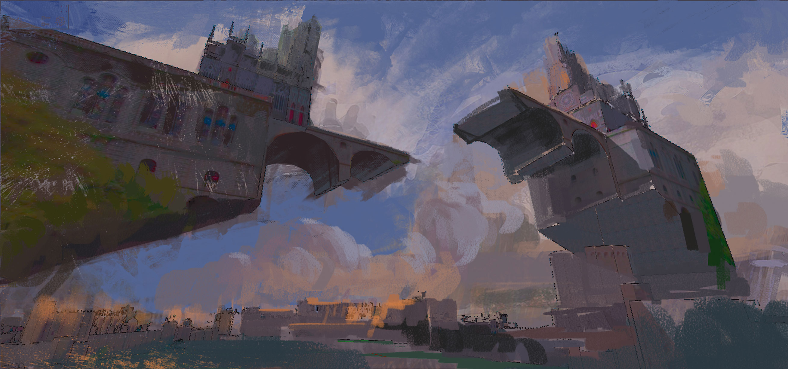
At some point during this freestyle painting process, you'll need the 3D base back to give you more guidelines for the architectural structures. So, duplicate the simple texture layer and overlay it on top of the painting. Adjust the Opacity of the layer to blend it with your image.
10. Add depth and lighting

Take a step back from the painting to analyse its value structure. Here we planned to do a backlit lighting scenario, so at this point we brightened the sky to pop out the castles’ silhouette. We also applied a fog layer at ground level, to give the foreground more breathing space and the image greater depth.
11. Bring in photo textures
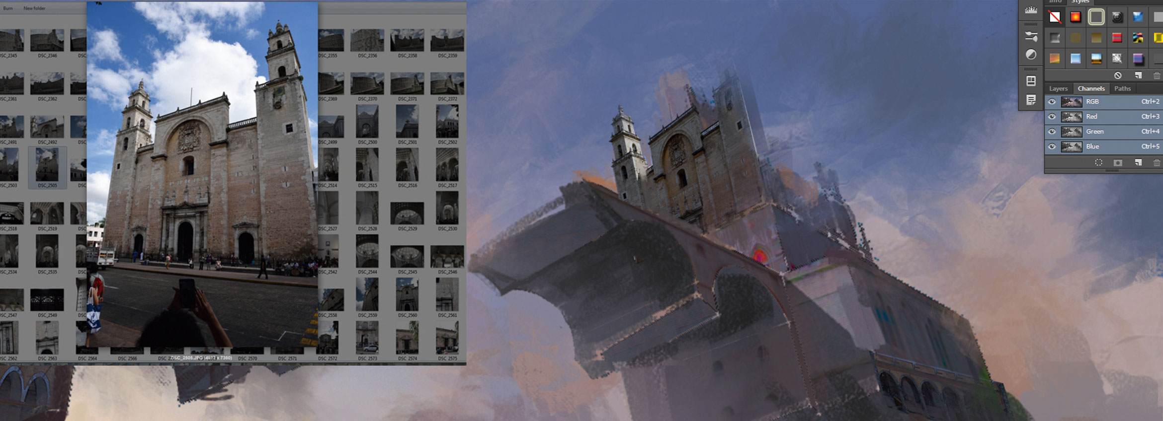
Apply photos to the top of the painting to add more details to the main castle structures. Here we used some cathedral photos from a trip to Mexico, as the architectural details are ideal for the upper part of the castles. We cut out the parts that we needed and used the Transform tools to distort the perspective to make them fit nicely with the painting.
12. Paint over the photos
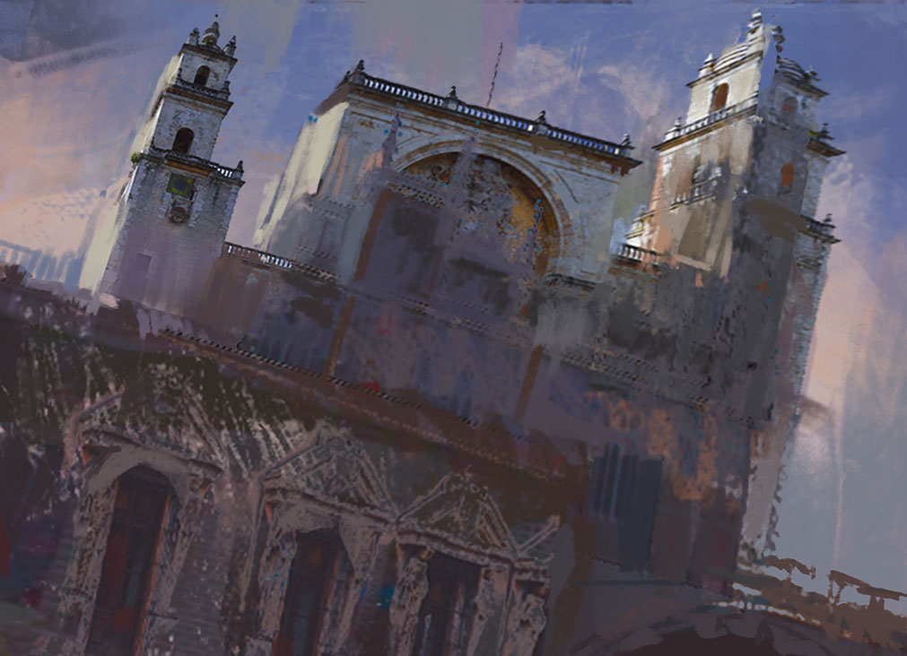
Be careful with the photo integration part, because you don’t want it to destroy the nice brush feel that you’ve developed so far. Use a small textured brush to continuously paint on top of the photos so they can blend better with the rest of the painting. Paint on top of the photos and erase part of the photos, repeating this cycle for as long as it’s needed.
13. Develop edge contrast
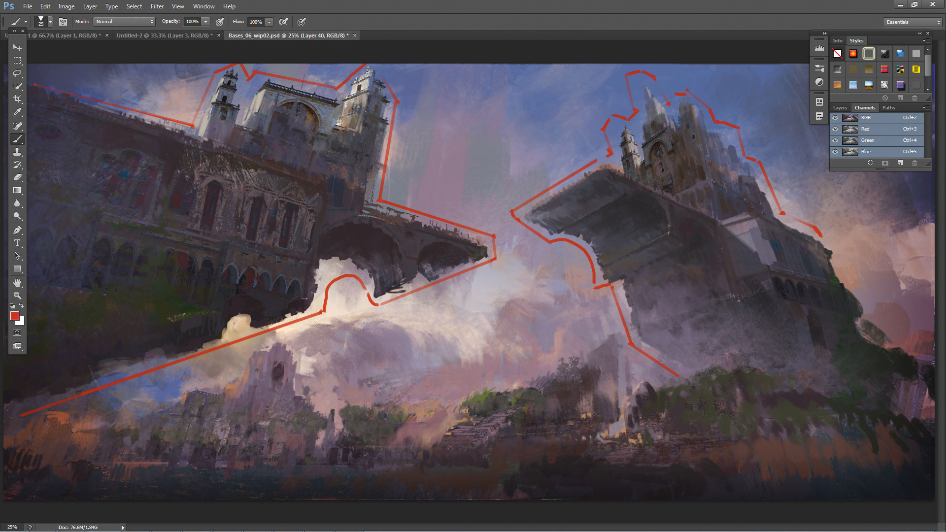
To keep the brush feel in your paintings without the impression of losing details, use edge contrast. Every important form, object and character in your art needs a clean silhouette. The silhouette can be painted with textured brushes, but its value needs to maintain certain contrast levels with its surrounding values.
This ensures the viewer can distinguish the forms without being distracted by the brushstrokes.
14. Add life and hint at a story
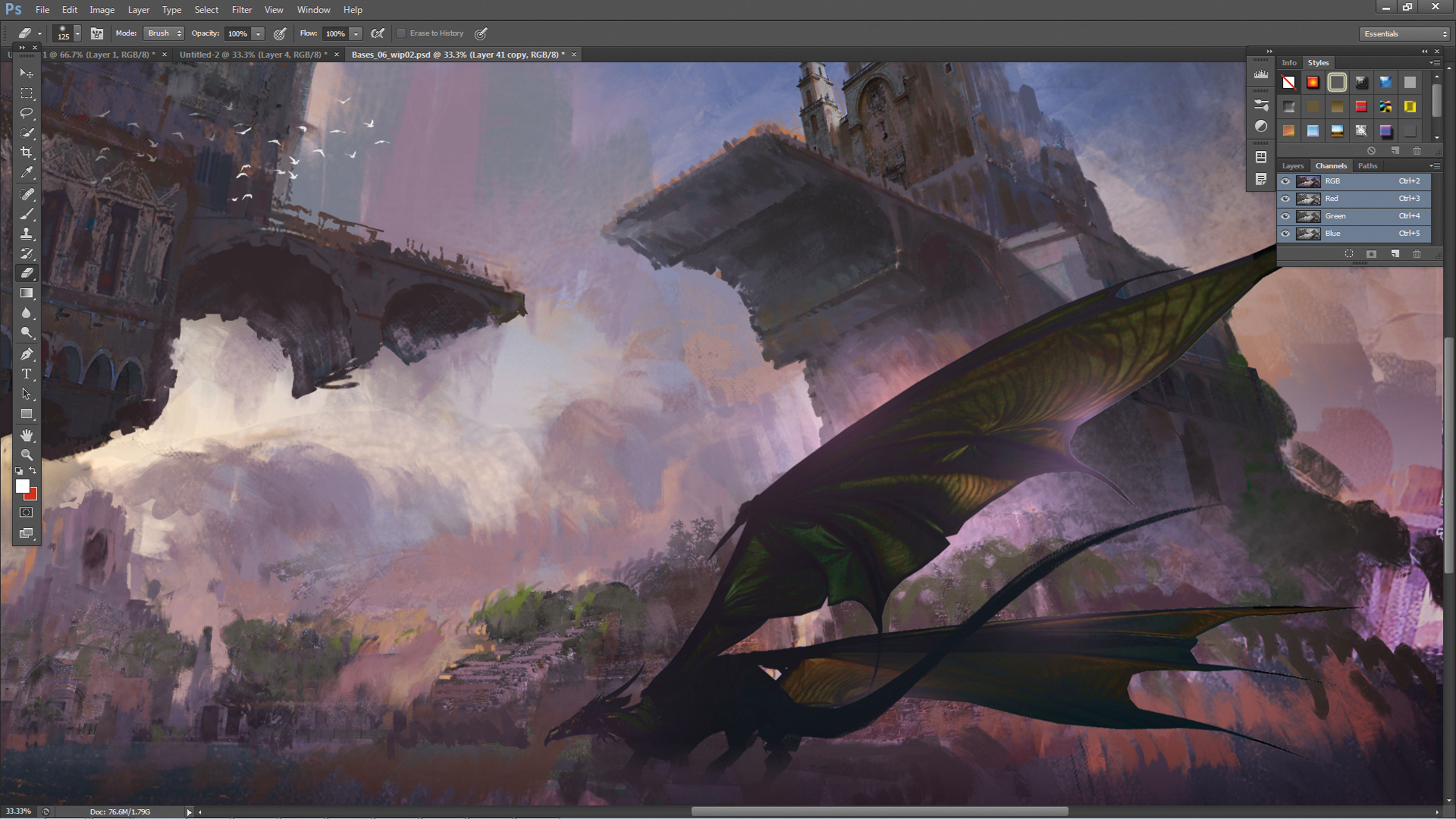
We are almost finished. At this stage, add some characters to show the scale of the scene and to hint at some vague storyline at the same time. Here we added a dragon to further enhance the fantasy theme of the painting. We also added some birds in the sky – an old but effective trick to bring some life into large-scale compositions.
15. Make final adjustments
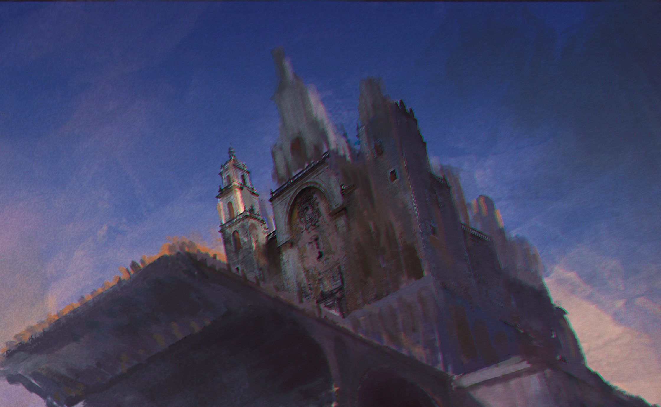
Finish your painting with a few adjustment layers to tweak the contrast, colour temperature and brightness of the scene. You could also apply a subtle chromatic aberration to the image (simply to go Filter > Lens Correction… > Custom, and play with the Chromatic Aberration sliders). Click OK once you're happy with the result.
This tutorial originally appeared in ImagineFX magazine. Subscribe here.
Related articles:

Thank you for reading 5 articles this month* Join now for unlimited access
Enjoy your first month for just £1 / $1 / €1
*Read 5 free articles per month without a subscription

Join now for unlimited access
Try first month for just £1 / $1 / €1
