How to paint over a 3D environment
Learn to model a 3D environment before bringing it to life using Photoshop.
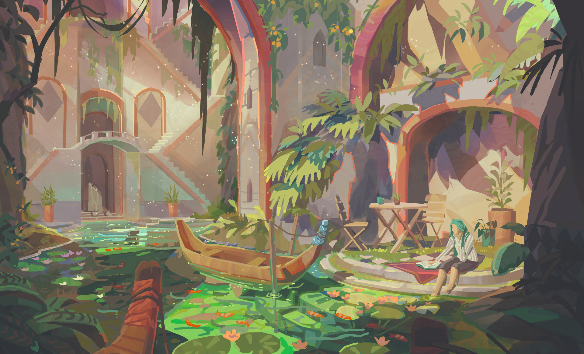
The aim of this tutorial is to create a beautiful place from your imagination that perhaps you’d like to spend time in. Maybe a cosy room, a secret temple or a relaxing café.
I like to work over a 3D base that I’ve modelled in 3ds Max and lit in Unreal Engine 4 (UE4). This isn’t essential, but because the aim of my process is getting to the fun decision-making bits as quickly as I can, it might be helpful to understand some basic 3D modelling. And if you ever wish to model your concepts, having a base already modelled saves you time because the basic forms are already there for you to work from.
Once I’ve made my 3D base and lit it in a simple UE4 scene, I’ll begin overpainting a screenshot where we can start having fun with colour, lighting and storytelling. I use basic Photoshop brushes, and a lot of how I make images is about choosing the placement of shapes, patterns and colours carefully.
Creating beautiful environments is all about finding what you like and condensing it into an image. If you work on what you want, and not what you think others want, you’ll create work that you love and are passionate about. People will love your work when you love it first!
Want to hone your Photoshop skills further? See these Photoshop tutorials for more advice. Or to get into 3D, check out the best 3D modelling software.
01. Plan your painting
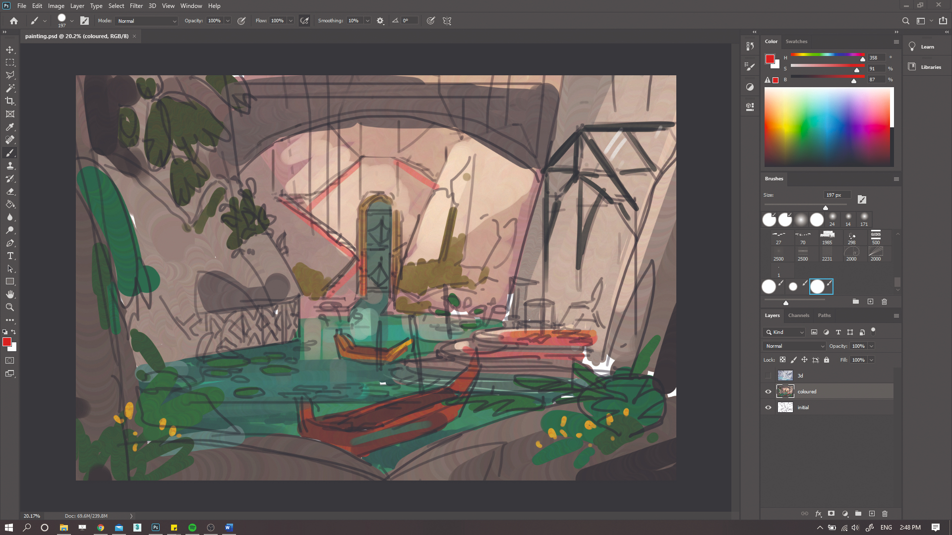
When I start a painting I always have a very rough idea of where I want it to go. I put together a quick mood board that features inspiring colours, patterns, plants… anything that’s interesting to me. It could be something as simple as a pretty colour, or a wall tile design that I like! Then I start sketching. I’m not concerned about perspective yet, because the 3D modelling will do that for me. I just use a Photoshop hard Round brush to get down some colours and line.
02. Experiment in 3D
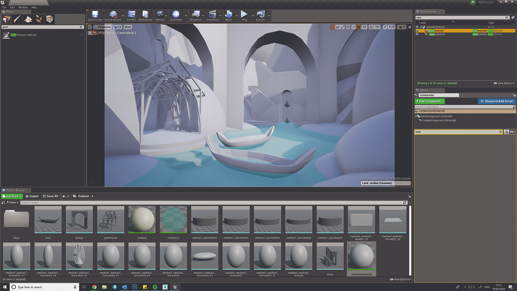
3D is a wonderful resource that enables you to experiment quickly and efficiently. I make my basic models such as rocks, plants and boats in 3ds Max, and then set them up in an Unreal Engine 4 scene. Inside UE4 I just have a Skylight, which controls the shadow colour, and a DirectionalLight, which acts as the ‘sun’. All models have a plain grey material applied except the water, which is transparent blue so I can see under the water.
03. Consider the composition
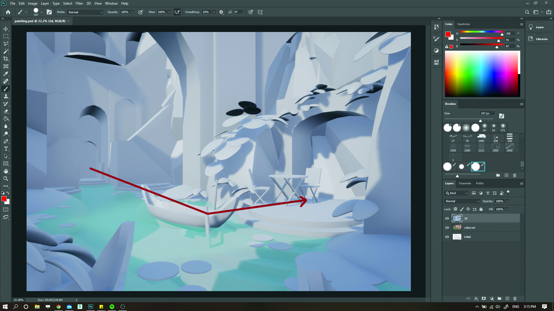
Now I can start to experiment with composition and lighting, by moving objects around and rescaling them, and rotating my sun until I have something that I like. I’ve scaled a lot of objects up so the scene feels more intimate and small and have also flipped the composition. This means the viewer starts ‘reading’ at the left, with the archway in the distance, then naturally reads left to right, to the focal point in the sun.
04. Sketch over your 3D model
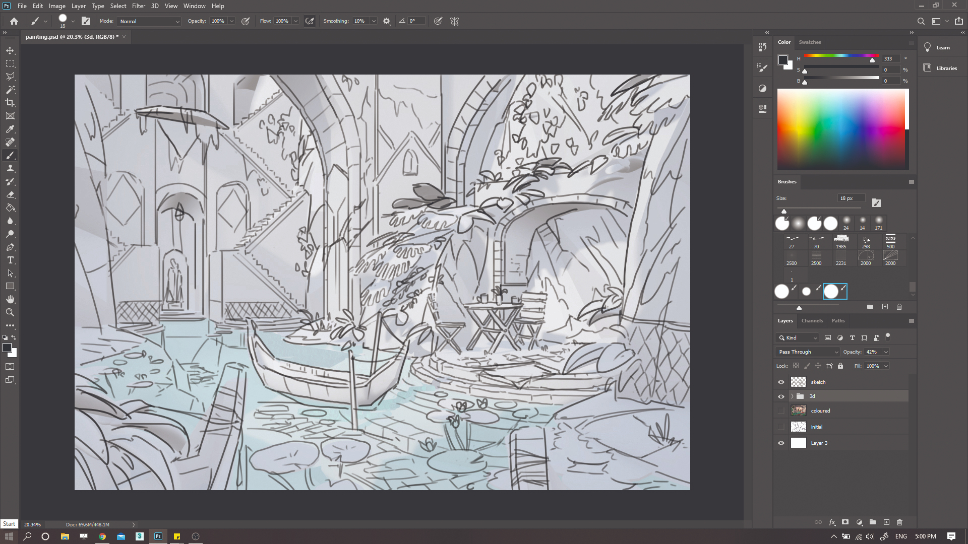
My 3D environment is complete and acts as an excellent reference base for painting. However, it’s very simple and doesn’t give me much to work with, so back in Photoshop I start to draw in the details that I’ll eventually paint. I use the same hard Round brush as for my initial sketch, and start to have some fun with sketching plants, props and details in the scene.
05. Make use of values

Our 3D base provides a good starting point for our values. However, there are some areas that could be improved. I’m not focused on making the image physically correct so much as bending reality to improve the lighting and enhance the image. On a new layer with a large Round brush I just colour-pick from the 3D base and paint in some edits such as new pools of light, areas of shadow and darkening of the foreground.
06. Introduce colour
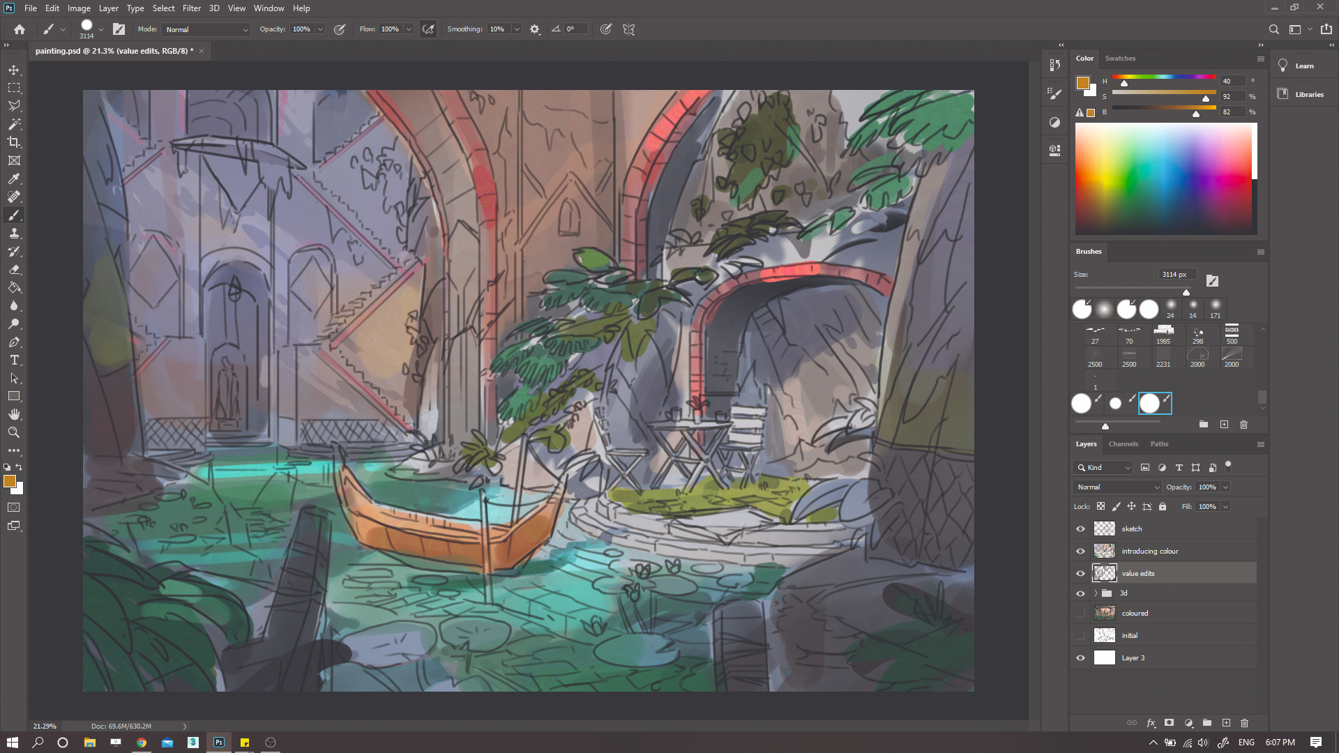
Colour can be difficult to get right so I always make sure I have plenty of reference images for this part. I create a new layer and work over my value edits with a hard Round brush with Hue Jitter. I paint quite softly so that the values still show through underneath, and roughly block in some colours to represent different materials such as rock, water and plants. At this point the colours are simple and quite desaturated.
07. Layer colours and experiment
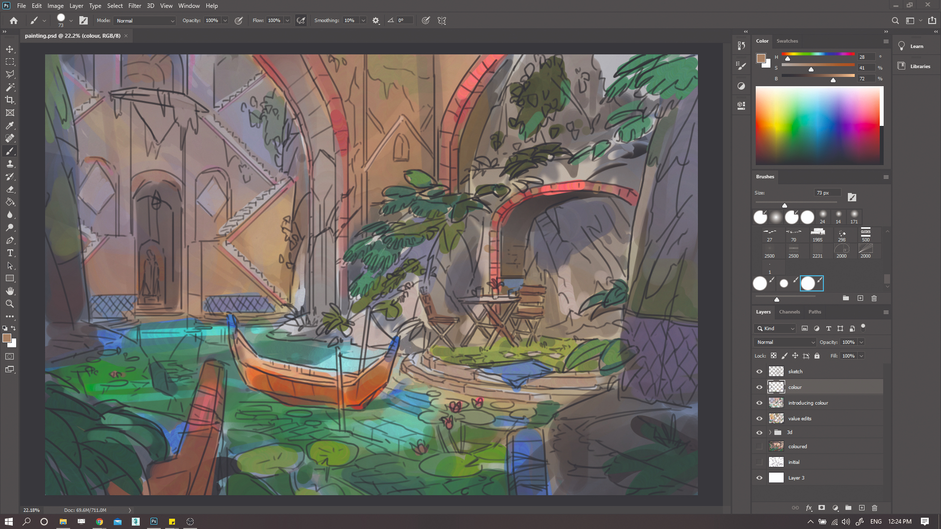
A lot of my colour choices come from ‘happy accidents’ when experimenting with layers and layer modes (such as Screen, Exclusion and Lighten) rather than knowing exactly what colour I’m going to put down for every aspect of the painting. I begin adding new layers underneath the existing colour layers, and painting in blocks of colour with Hue Jitter on to see how it looks. I also add new top-level colour layers and keep roughly laying down new colours.
08. Reintroduce value, but with different Layer modes
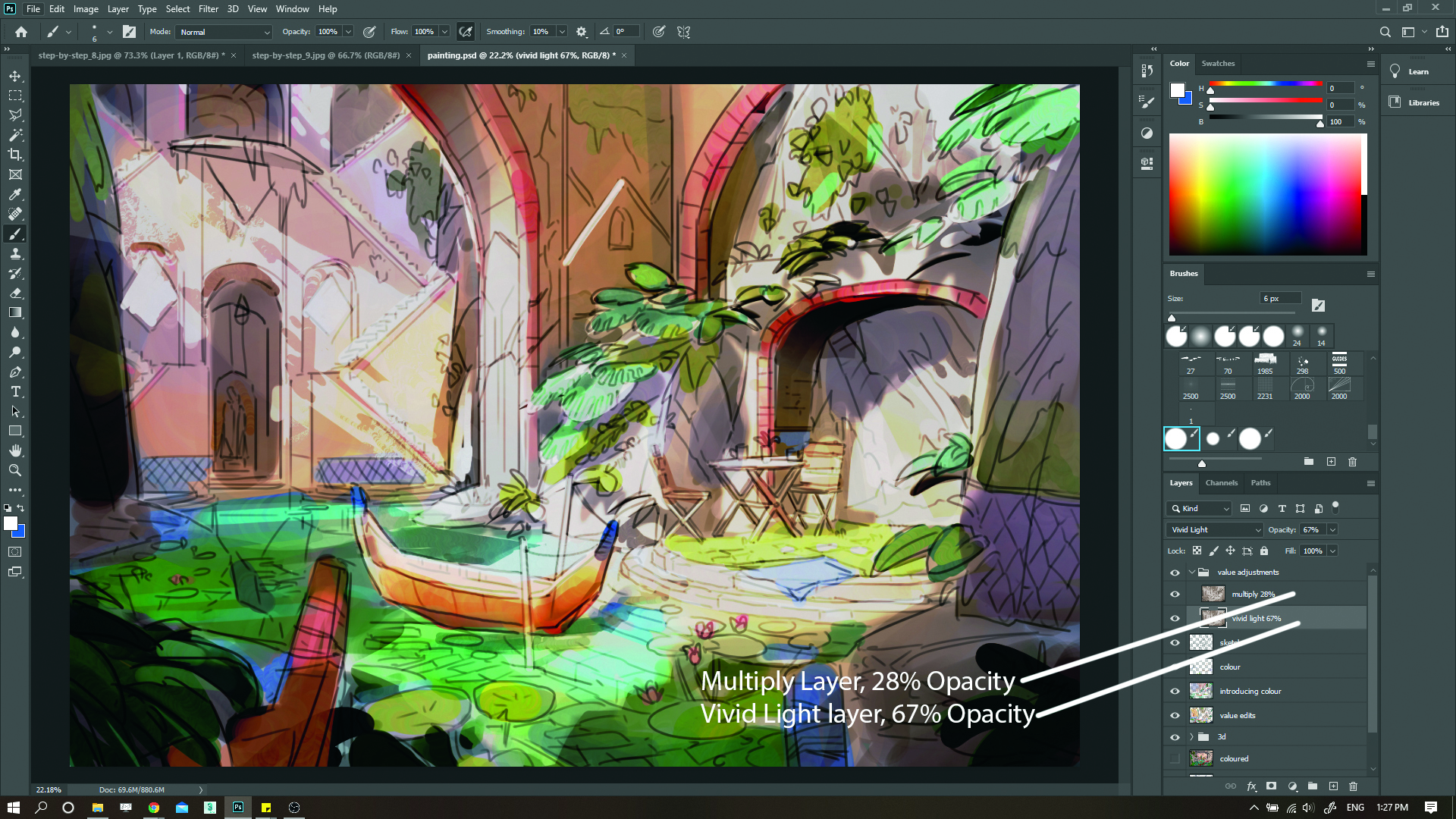
Painting over with colour causes us to lose our values, so I take my 3D layer with the value edits we made earlier, duplicate it and then bring it to the top of the layer stack. Then I try the layer on different Layer modes. For mine, I choose Vivid Light. I also adjust the hue of the value layer so that it’s warmer by going to Image>Adjustments>Hue/Saturation and moving the sliders.
09. Unify the colours
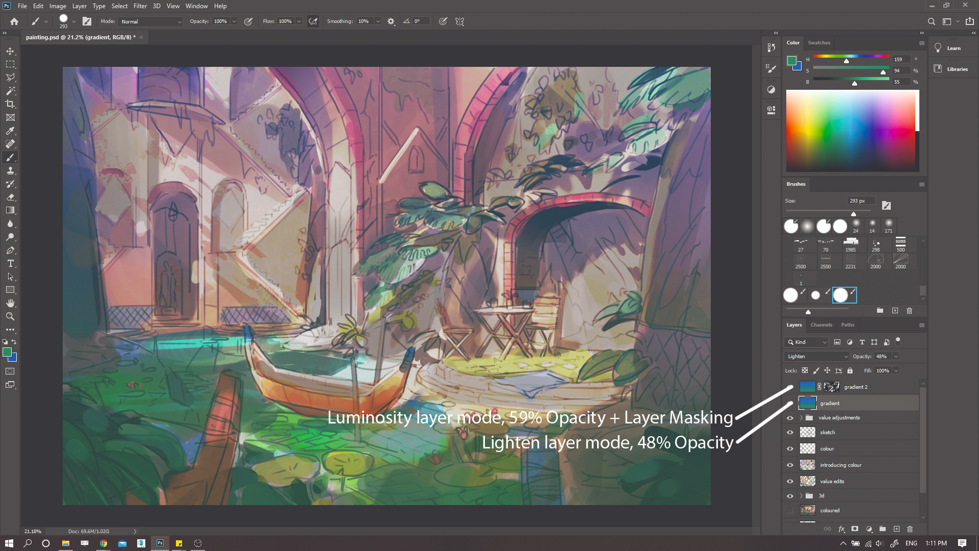
Now that I’ve fixed my values, I make a new layer and add a simple gradient with the Gradient tool. The gradient consists of two colours that are relatively similar, such as orange and yellow or green and blue. I test out lots of different Layer modes, and change the Opacity and the Hue (using the method in step eight) of the layer, until I find something that I’m happy with.
10. Get painting!

Now I can start the actual rendering and painting process. Using the Polygonal Lasso tool, I start selecting medium and large areas to paint, such as rock faces. I use a hard Round brush again, and I often have Hue Jitter switched on for colour variation. Switching my 3D layer on and off, I fill in one area at a time with colour, carefully considering where the light and shadow is.
11. Work up detail
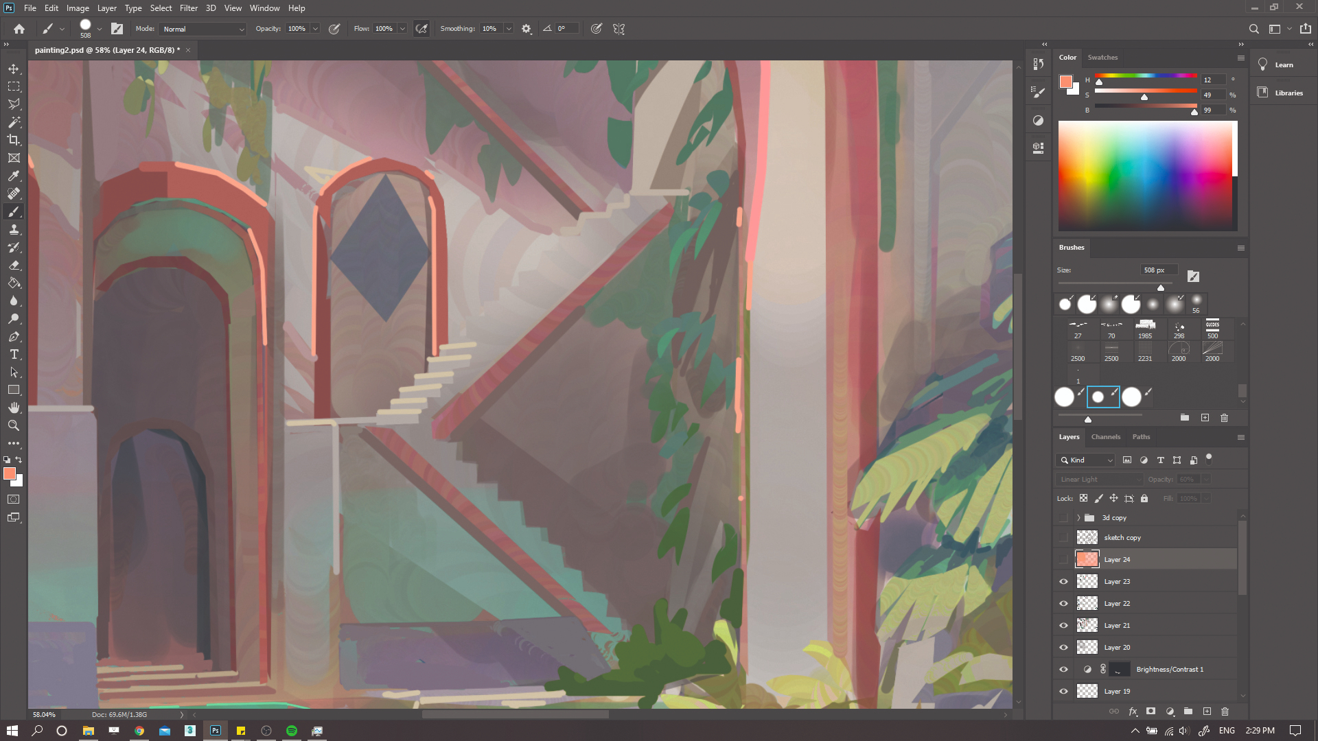
Once I have painted colour in the larger volumes I start painting in more details. At this stage I begin working into the water, painting what’s under the water but not the surface reflection yet. I tackle other areas such as foliage and variation in stone colours, such as edge trims. I also add edge highlights, which are a great way of creating the illusion of detail.
12. Reconfigure values and colours
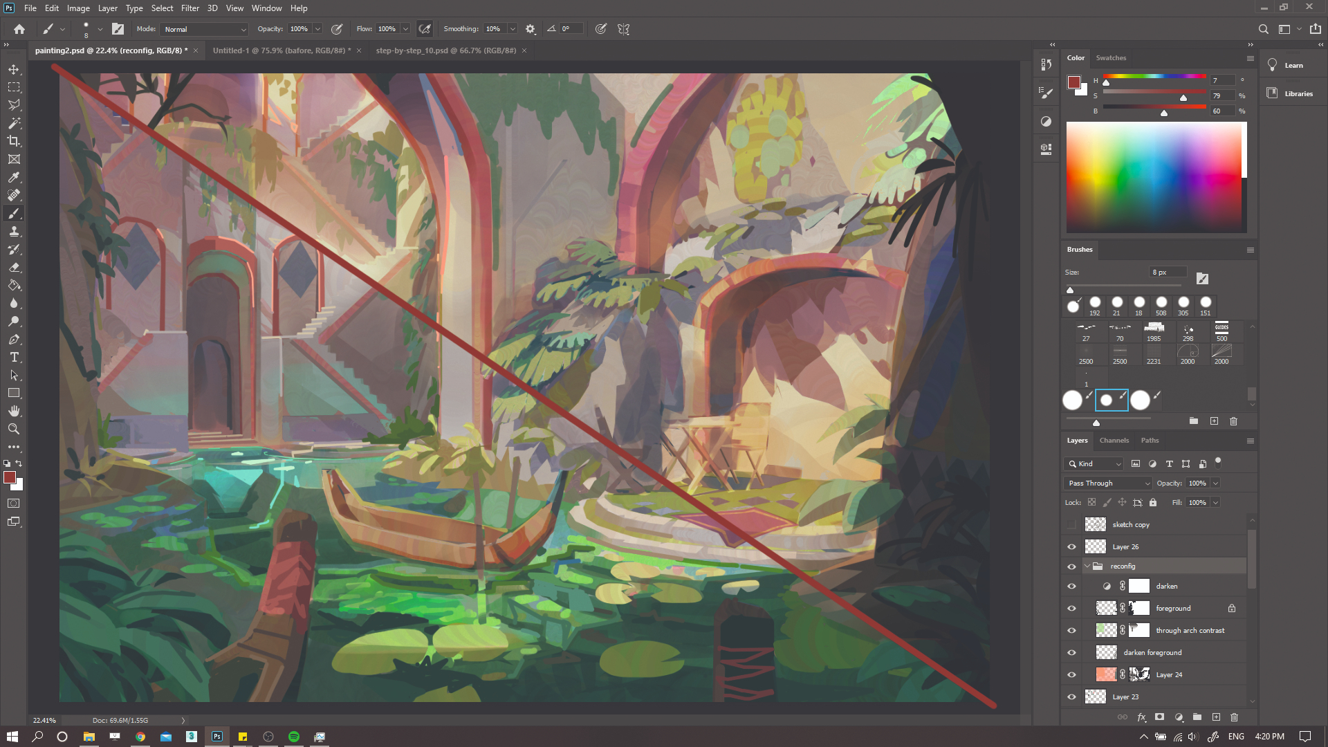
It can be easy to lose sight of values when painting, so I check them regularly. Here I decide to make the painting easier to read by decreasing the contrast in the background and darkening elements in the foreground. I use a mixture of Multiply, Linear Light, and Screen layers to push areas back or pull some forwards. I also use these layers to improve the colours so that they’re less blueish.
13. Render and create clean edges
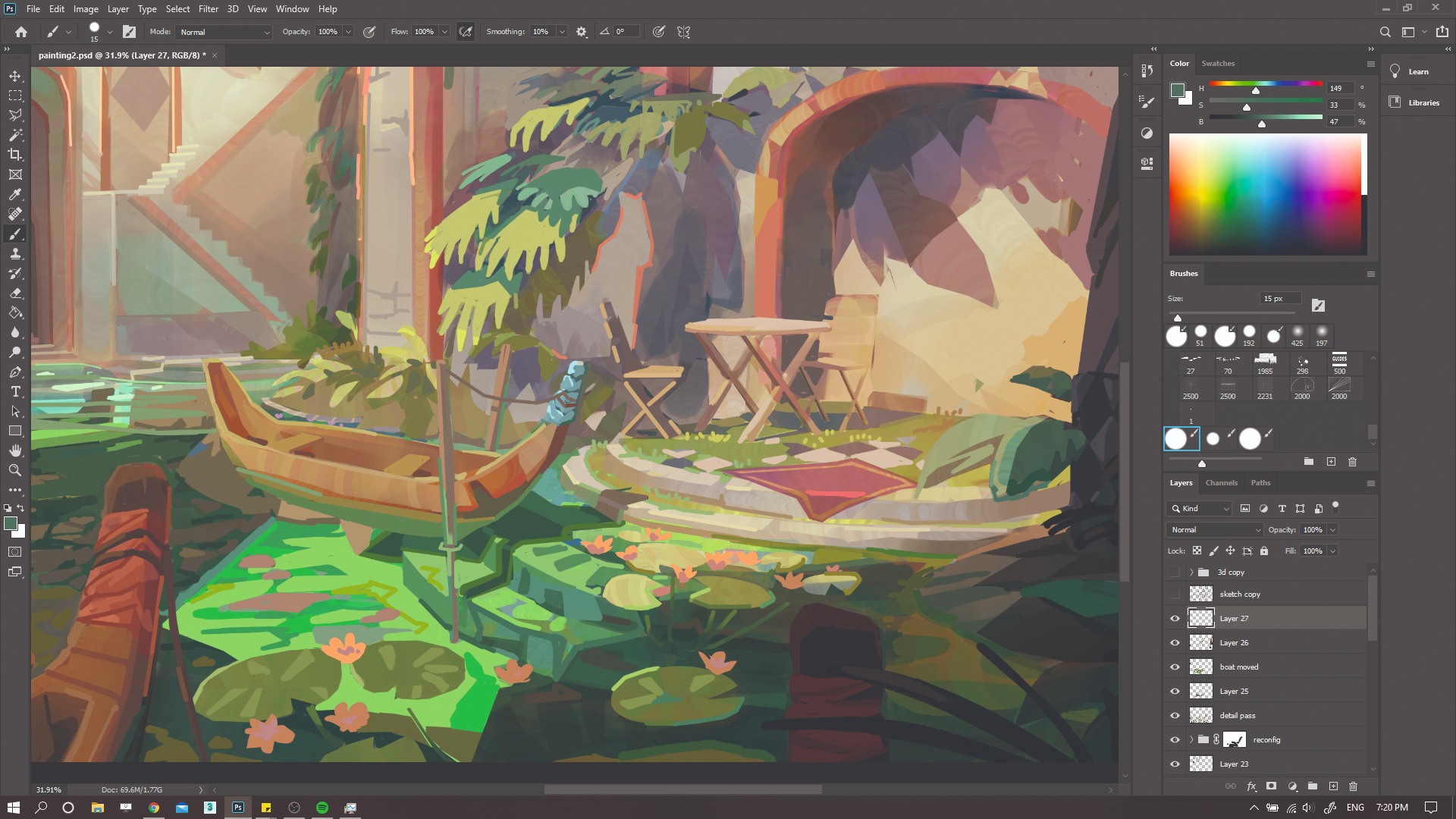
For the final render, I use a hard Round brush with no Transparency. Holding Shift, I tap with my pen to create a ‘dot-to-dot’ of lines, which I then hand paint with colour. This creates clean edges. I use this method in certain areas of the painting so I have clean areas to contrast other areas where I’ve left messy brush work and Hue Jitter exposed. I constantly refer to my 3D render for shadows reference.
14. Make the final touches
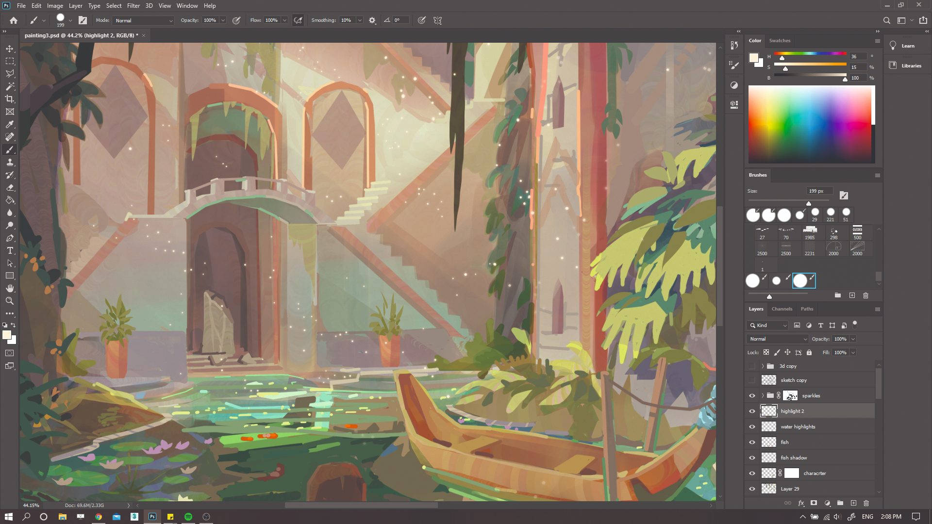
Lastly, I add small props and details such as plant pots, fish, water highlights and light sparkles in the air. These are the highest detail level in my painting, and they give the illusion of overall detail in the rest of the scene. The light sparkles also add a sense of magic to the environment. Once I’m happy with these final small touches, I call the painting done.
This article originally appeared in ImagineFX, the world's best-selling magazine for digital artists. Subscribe here.
Related articles:
Get the Creative Bloq Newsletter
Daily design news, reviews, how-tos and more, as picked by the editors.

Thank you for reading 5 articles this month* Join now for unlimited access
Enjoy your first month for just £1 / $1 / €1
*Read 5 free articles per month without a subscription

Join now for unlimited access
Try first month for just £1 / $1 / €1
