Modelling a spaceship for gameplay design
Learn how to create an in-game model ready to launch into Fractured Space.
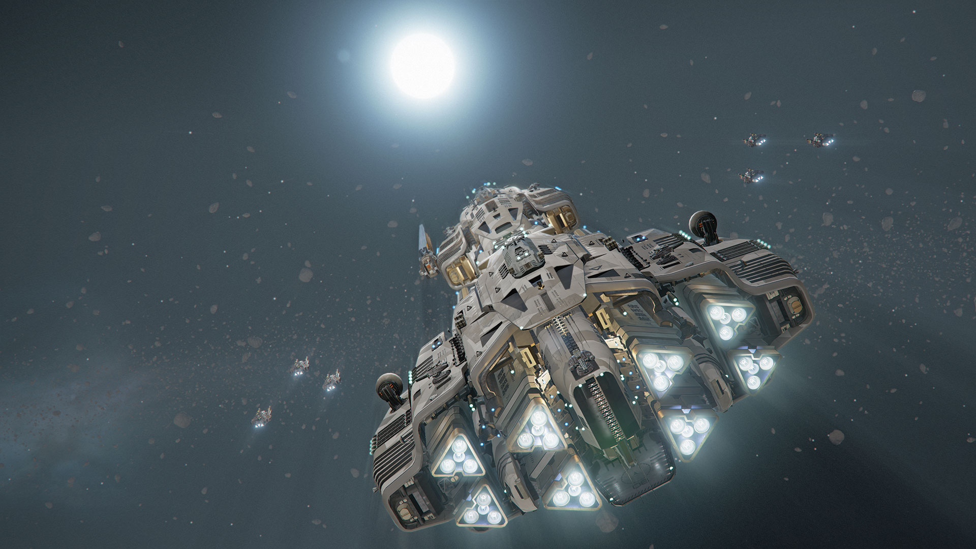
With Fractured Space being what it is – a free-to-play team combat game – the ships and their abilities are the stars of the show. Each one has its own personality that's a reflection of its own function, and it's largely my job to craft a design that on the surface visually communicates what that ship's role is.
We have worked very hard to create a universe within the game that exists within the realms of possibility and future science. This appeals to a particular type of sci-fi fan that likes to see realistic designs that are based on function rather than aesthetic. This doesn't mean that aesthetic doesn't drive the conception of a spaceship design; it just means that a stylistic decision has to be justified and not just there because it might look cool. This rule might be bent from time to time but it exists to make sure that the universe remains consistent and purity of the original art direction remains true.
There are three different manufacturers that have their own style and visual language. We originally enlisted Mike Hill and Long Ouyang to develop the visual styles for the three manufacturers in the game. The USR style is stacked cylindrical modules with NASA style details; the Zarek style is composed of brutalist cubic shapes with layering and exposed structural and internal details; the Titan is based on naval vessels – large modular shells with exposed internal workings.
It's important to maintain this style in each new ship, while simultaneously allowing room to build on that design for such things as Premium and Legendary variants.
In this tutorial you'll learn how I consider gameplay, form, detail, silhouette and more, when designing a new ship for Fractured Space. The workflow is universal, so you can adapt it.
Get all the assets you'll need here.
01. Design choices
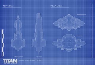
Design from the back! In game you spend most of the time looking at the rear of the ship. I tend to design from the back as that's where you will spend most of your time looking. The Interceptor's chassis is based on a previous ship design of mine – the Reaper. It tapers towards the front and has sponsons on each side to balance the weight of the ship. The rear of the ship is a cluster of primary thrusters that protrude from the back of the ship.
Get the Creative Bloq Newsletter
Daily design news, reviews, how-tos and more, as picked by the editors.
02. Understanding scale
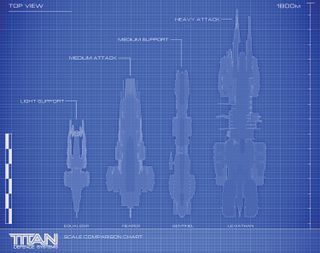
Building anything of this scale presents problems in itself, as most man-made structures aren't even close to these sizes. Real world visual elements are needed to give scale reference to the ships. Window lights, small scale storage and airlocks help to re-enforce scale. Characters are dropped in at a scale of 1.8m high to assess comparable scale at a human level, and we add details such as radar elements and landing pads at a common real world size.
03. Consider the silhouette
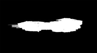
The Interceptor will be fast and powerful. It's also a sister ship to the Reaper, so it will carry some commonality with this vessel in terms of silhouette. This gives me a good starting point for designing the look and proportions of the ship. Due to the rail gun's firing range, it needs to have a threatening silhouette and be easily identified across the map. I favour an arrowhead shape language for the overall silhouette as it infers danger.
04. Kitbashing the ship
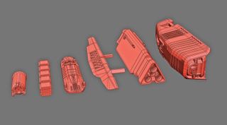
I start a new ship by taking a series of existing modules and kitbashing them together in 3ds Max 2014 to form a basic ship block out. It allows me to maintain the correct scale and ensure that the style remains consistent. I start out with a rough 3D blockout then take familiar shells from other Titan Defence Systems ships to start to kitbash those modules, in order to get a rough shape.
05. Using modifiers
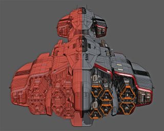
I use FFD modifiers in the Modifier list to extend certain shells and symmetry modifiers to create new shapes, while retaining the same chamfer angles and consistent detail. The ship is separated out into different parts and assigned different material IDs. A multi-sub object material is created with multiple IDs and is applied to all mesh components, which allows for different materials on various parts of the ship.
06. Lighting passes
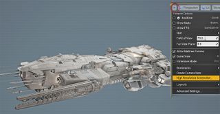
I separate out the layers to line art, shadows, base colours and shading layers. I usually generate a few lighting passes from UE4 using the High Resolution Screenshot tool to help build up the image. This can be found in the top left corner of the main viewport under the triangle drop-down menu. Select High Resolution Screenshot and use the slider to apply a multiplier to your screen resolution; don't crank it up to the max as you may crash Unreal.
07. Form the base structure
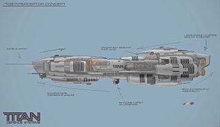
The lines of the ship flow from the nose to the tail, with a convergence point in the middle. I look at the ship as a solid mass, but remember that it's constructed from many elements. At this point I will take screen shots and do a few paint overs in Photoshop CC 2015 to refine the shapes and work out areas of interest. The key elements such as the engines, sensor arrays, weapon systems and hangar bays are placed, and the base structure is formed.
08. Weapon systems
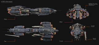
This is one of the most important parts of the process. I work very closely with design, and in this case, it's the very talented James Mitchel. I pass the model to him and we work out where's best to place the turrets for maximum coverage. This is all tested in game and I generate a visual overview of weapon placement. From here we can start making a more advanced blockout that's closer to the final asset, with turret locations marked and cut into the hull.
09. Testing and lighting
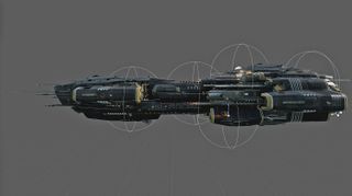
At various stages of the design process, I will jump into game with the ship's flight model and take it for a test flight. It allows me to view the ship institute and decide where to spend polygons. Lights are added to the UE4 ship blueprint to illuminate the internal structure. This helps to add scale and pick out areas of interest.
10. Using blueprint
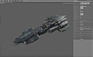
The mesh is placed inside a blueprint in UE4 and we add various weapons systems and lights inside this blueprint. The process is simple, we open the blueprint, click Add Component, and select a point light from the list. In the Details tab, Dynamic Shadows are turned off to reduce cost and the Intensity and Attenuation radius are tweaked to give the desired look on a per-light basis.
11. Verniers
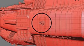
Secondary vernier thrusters are placed on the hull in 3ds Max and our FX artist creates a mesh to reflect these placements. These are important for manoeuvring the vessel and will fire when the player moves in the relevant direction. There must be enough of these in every axis to ensure not just visual feedback on directional thrust, but also visual interest.
12. Materials
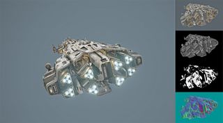
When the basic ship design is finalised, the UVing and material assignment stage begins. Each manufacturer has a library of textures and materials that are specific to that style. Here I have chosen to dress the ship in a non-standard camouflage pattern. It's important to break up the areas of detail with metallic and non-metallic materials. The larger surfaces will invariably be treated panels and we add metallic trims and tech details to catch the light and add interest.
13. Creating textures
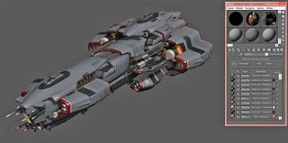
We use a mixture of methods and techniques to create our textures, from Quixel Suite render to texture and hand-painted details. We‘ve built master materials in UE4 that are set up for physically-based rendering. Some are more specialised than others but our ships mostly use semi-complex materials that are instanced to multiple materials within the game. It allows us to change multiple parameters such as textures, tiling, roughness and detail maps on a per-instance basis.
14. The value of decals
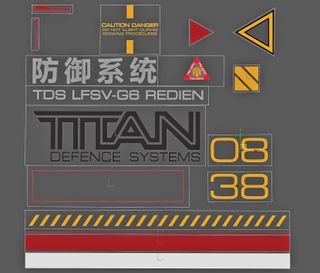
Decals add visual identity and set a colour theme that helps to further distinguish the ships in-game. They also add scale and define particular areas, such as thruster ports, landing bays and warning iconography for service personnel and drones. Care must be taken to ensure the decals are of a reasonable size. If they are too small they will filter out in-game; if too big they will descale the ship.
15. Adding decals
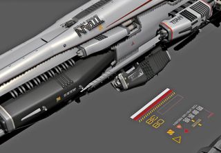
I start by creating a new material ID in 3ds Max and apply this to a plane. Because most of our materials are tiling, I place decals by hand in 3ds Max and use an alpha material to apply the decal in UE4. I separate out all my decals as per the texture to individual objects, then copy them and place around the ship as needed.
16. Position decals
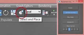
I centre the pivot point to the object and use the Select and Place function on the main toolbar. I right-click on this button and make sure Use Base As Pivot is selected. I hit [W] to turn on Select and Move, left-click Select and Place, and then left-click on the decal. While holding down the left mouse button move the decal to the surface you want to apply it to. This will align the decal to the surface normal so you can apply decals to curved surfaces easily.
17. Test the model
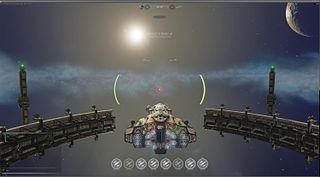
Once I am happy with the asset LODs are made, dropping out half the tricount on every LOD until it's down to a cheap distance version. Internal playtests ensure that the ships are quality assured and functioning as expected. I will generally go through the asset doing a final sanity pass in UE4, making sure there are no clipping issues, holes of missing geometry. Finally, I drop the finished asset into one of our environments with some fighters for scale.
This article originally appeared in 3D World issue 210; buy it here!

Thank you for reading 5 articles this month* Join now for unlimited access
Enjoy your first month for just £1 / $1 / €1
*Read 5 free articles per month without a subscription

Join now for unlimited access
Try first month for just £1 / $1 / €1
