Make your characters pop with colour and light
Learn how to create a bright and charming portrait in Photoshop.
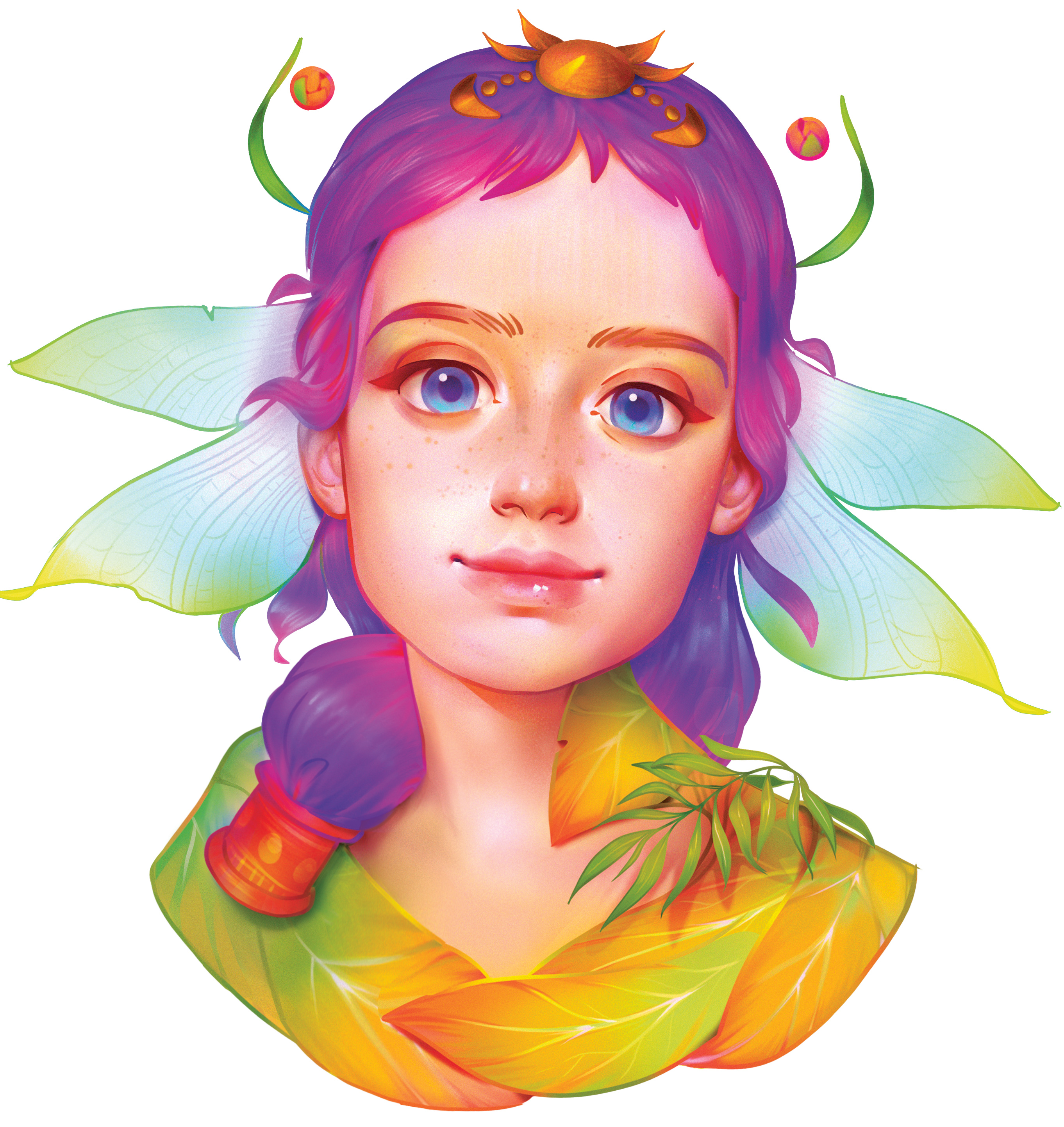
I really like working in colour, whether it's in Photoshop CC or painting traditionally with watercolours. Vibrant colour will often make an illustration more decorative, but there's also a danger of it becoming flat. However, you can counteract this by adding a sense of volume in the right places throughout the composition.
In this tutorial, I'll share the art techniques I use to create a bright, light portrait in Photoshop. Watch the video below to see my screencast for this tutorial, or scroll down to read the step-by-step guide. For more portraiture advice, take a look at our article on how to draw people.
For inspiration I often study classic artists. You can learn a lot from them, such as how to guide the viewer's eye with help of the light, shadows and colour. I particularly like the art of Klimt, Mucha and Van Gogh.
Klimt was able to capture a strong sense of character and nature with brush strokes and colours. I adore Mucha's line art. He depicted feminine beauty perfectly, and had an eye for decorative details, brilliant composition and gorgeous colours. And Van Gogh was just a genius.
01. Find some inspiration

The first thing I do before starting an illustration is to browse through my folder of inspiration. Inside are plenty of sub-folders, containing images of lighting, faces, human figures, clothing, illustrations from my favourite artists, animals, caterpillars, flowers and plenty more besides.
I quickly look through some folders, keeping in mind my theme or work brief. I notice what makes a particular image look good, what emotion it brings out in me, or what's actually beautiful in it. My own idea comes from studying these images. When working with colour the most inspiring thing is nature: flowers, butterflies, caterpillars, especially tropical species.
02. Produce a rough sketch
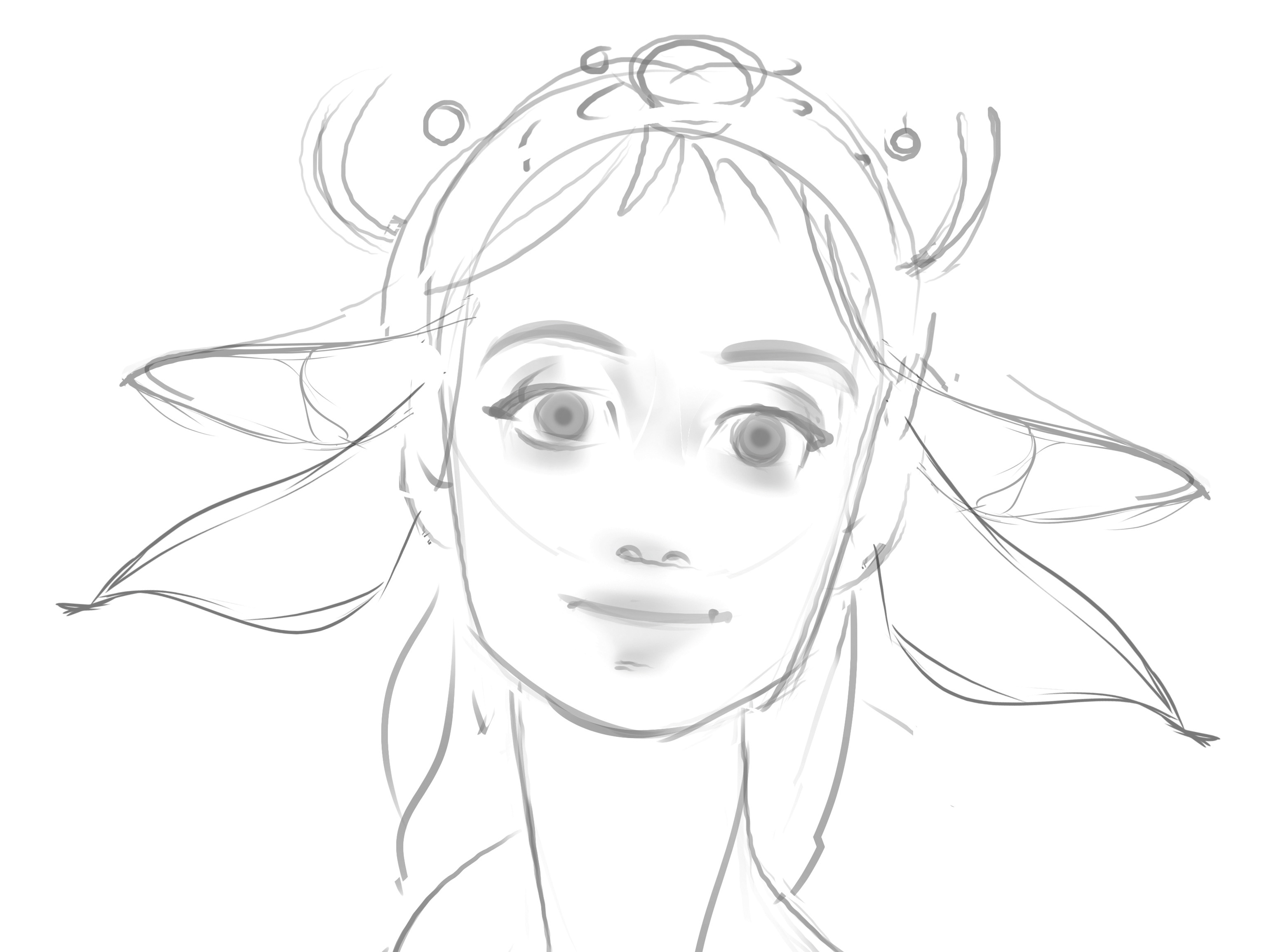
Next, I need to visualise my idea, so I produce a series of small sketches, which are made up of flowing lines. This acts as both a warm-up exercise and a way of focusing on the task in hand. After I've finished drawing, I narrow down the options and continue to refine them, until the best one is ready to be used as a base.
Get the Creative Bloq Newsletter
Daily design news, reviews, how-tos and more, as picked by the editors.
03. Start refining the line art
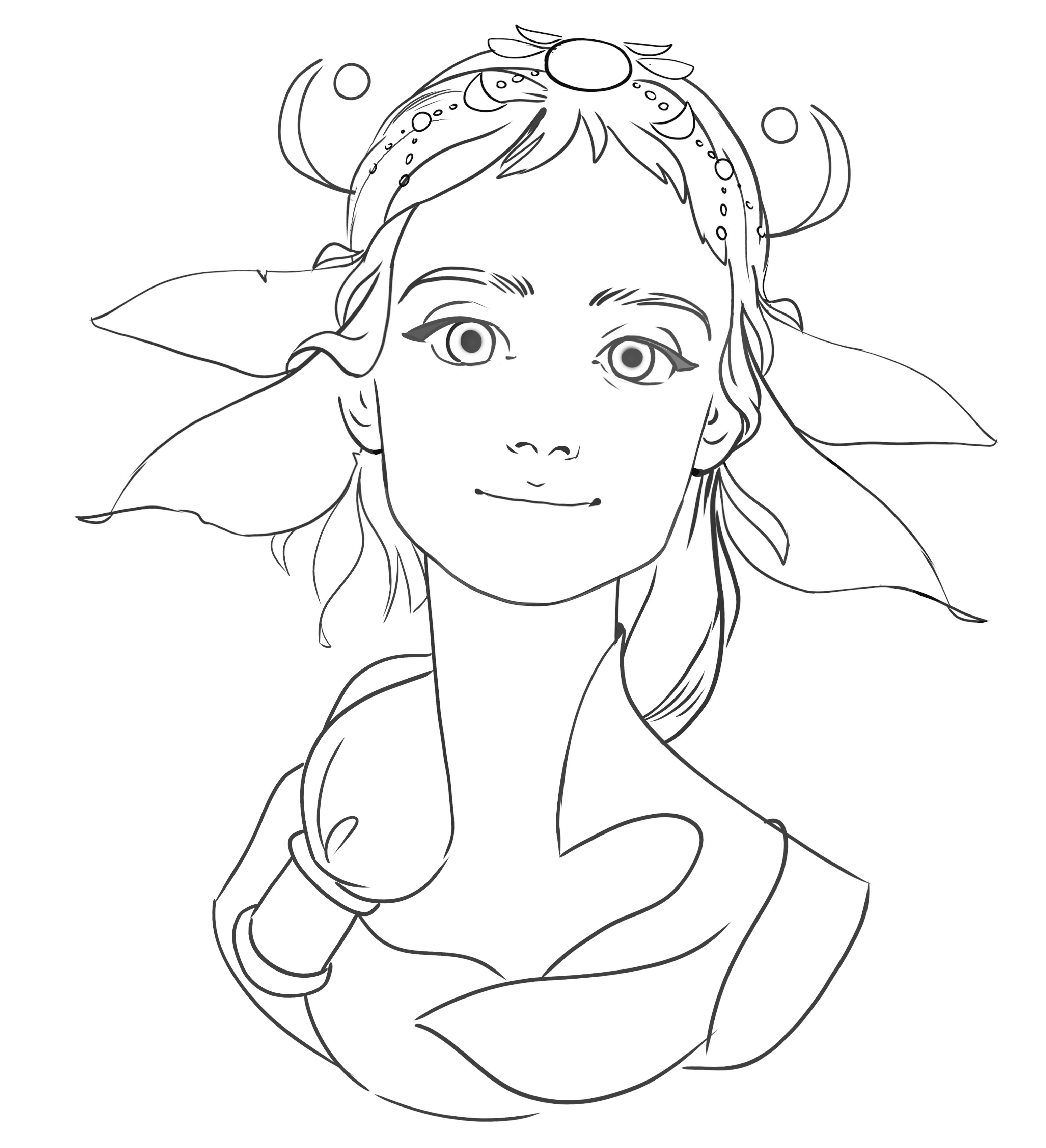
I create a new layer, then reduce the Opacity of the sketch layer and select an opaque brush. Then on a new layer I create the line art. I try to do this as cleanly as possible, so that there are no unnecessary lines, and every stroke and dot serves a purpose. I lay down flowing, soft lines for this portrait of a pretty young woman, because they help to create the correct mood in the piece.
04. Pick a colour palette
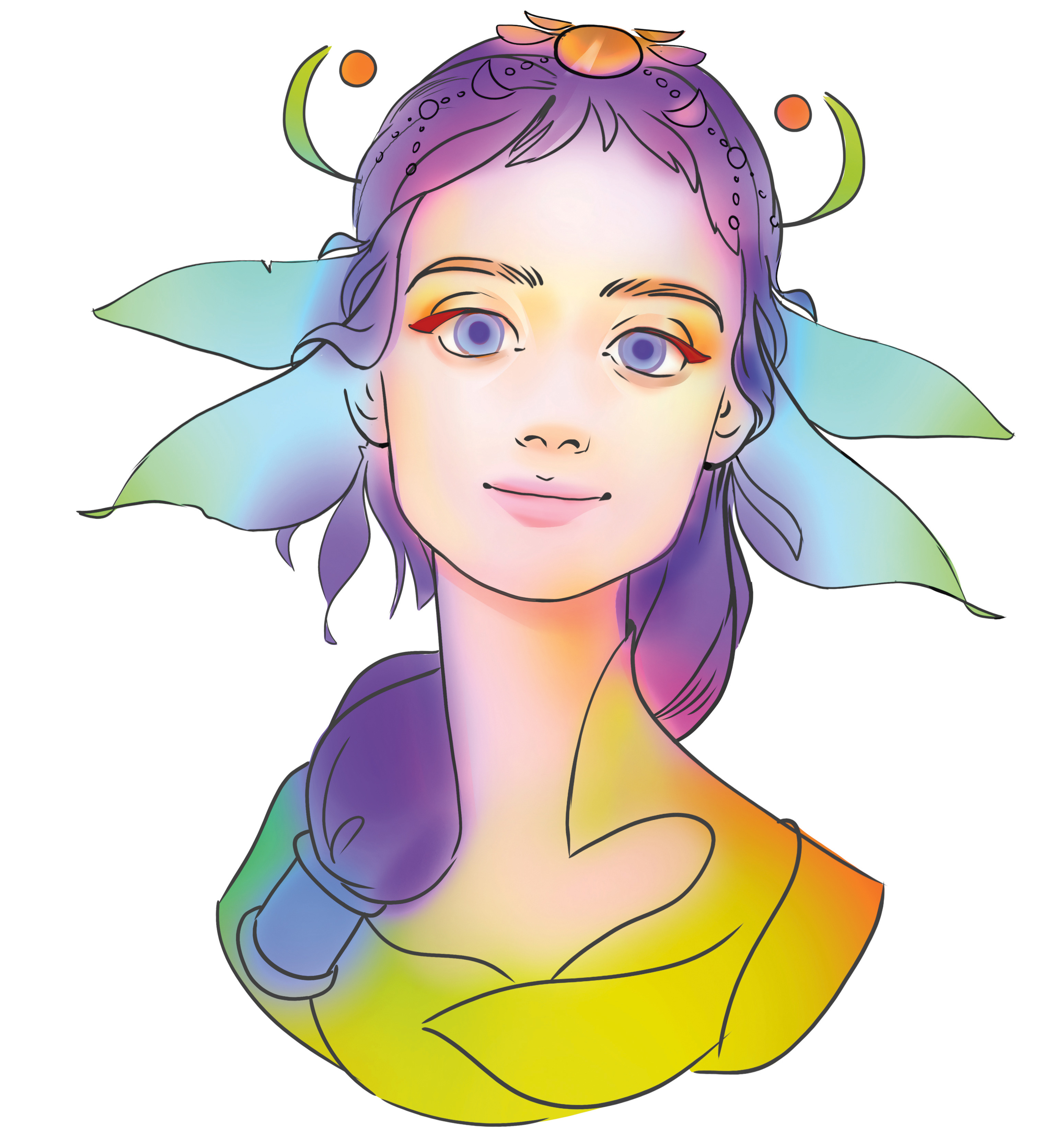
As I said earlier, nature is a great source of inspiration, especially for developing colour combinations. Look how bold the colours are on insect and fishes, for example. So follow nature's lead: pick a vibrant colour, select a big Soft brush and start to draw. I select colours that I know work together well, and bear in mind that every colour has its tone. It's best not to rush this stage.
05. Colour the line art
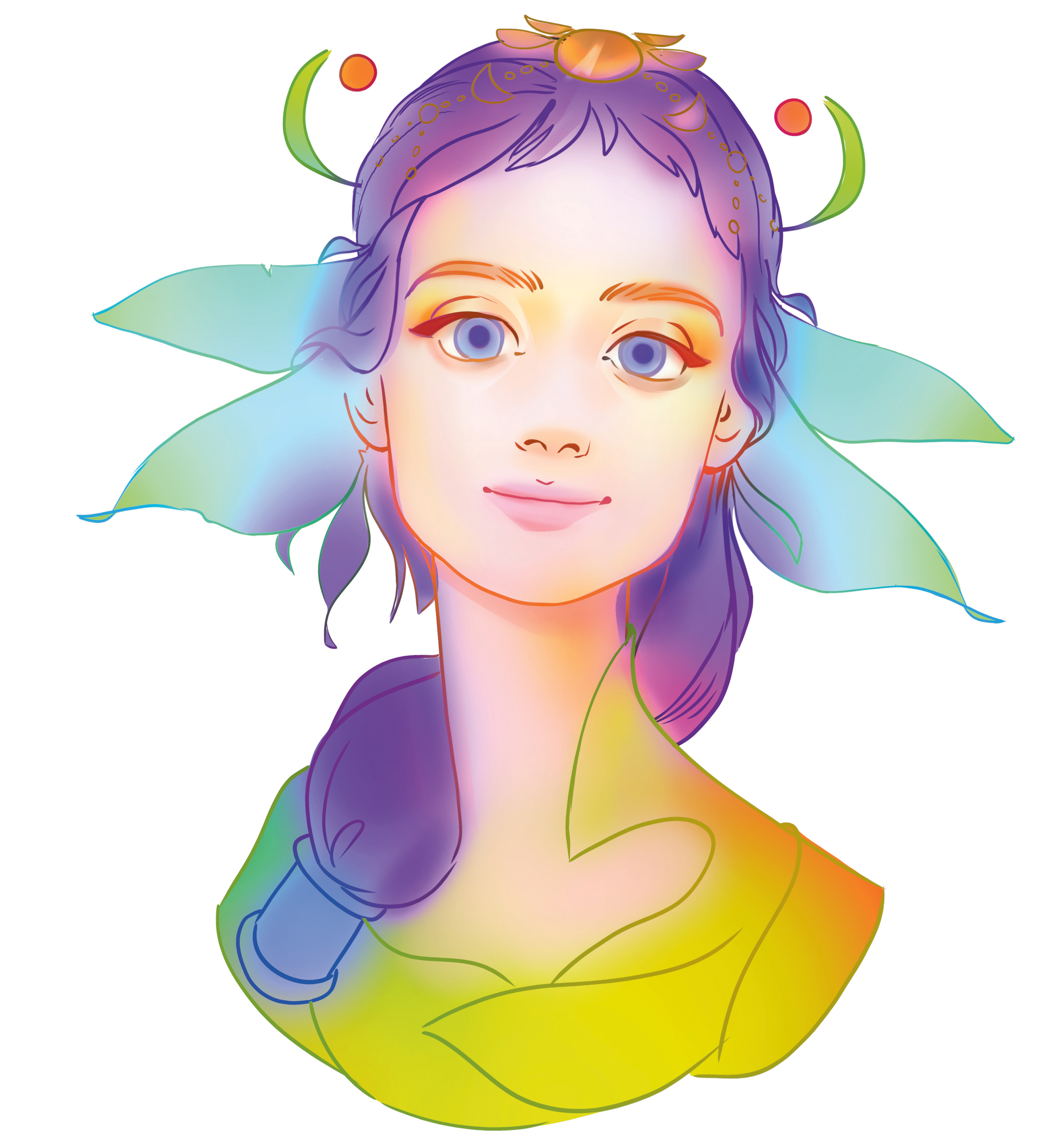
I want to retain some of my line art in my final image. There's an interesting way to do this: I lock transparent layer pixels on the line art layer, select the big Soft brush and paint in my colours. The results vary – sometimes they’re the same tone, sometimes they’re darker and sometimes they’re lighter and brighter. Whatever the outcome, it’ll add interest to your artwork.
06. Develop the facial details

My favourite part of illustration is painting the face. Because I've chosen to keep the line art on show in the finished piece, I sense this illustration will become more decorative and graphic. I try to add volumetric shading only in a few spots, and at the same time, work on shaping a nose, lips and eyes. Most of the time I work with a big Soft brush, but I use a textured brush for the highlights. It's always exciting to paint!
07. Colour the face
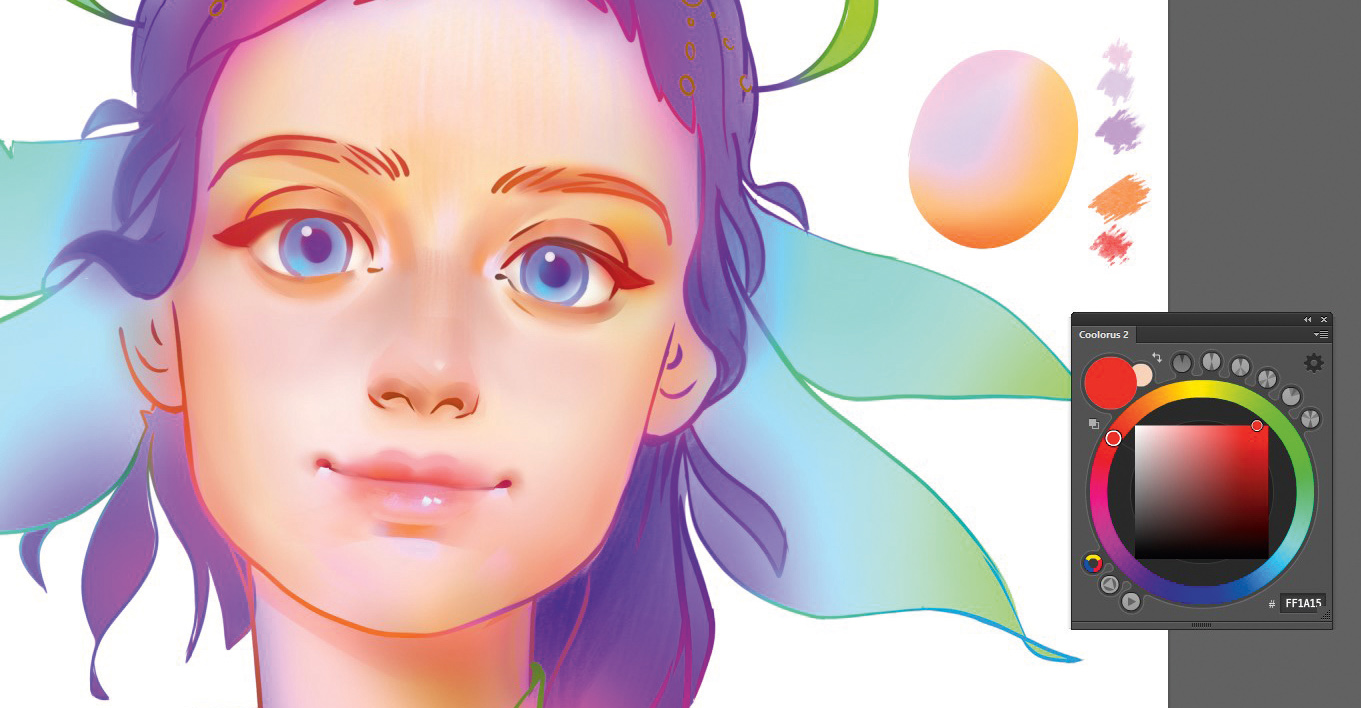
I refine the colours of the face using the principles of warm colour theory. In this image I paint with bright, vibrant colours: the shadows are orange and the light is colder. Sometimes it's hard to do all at once. One solution is to first paint the face with a neutral skin colour using shading techniques, rather than simply filling in the face with a single tone, then create a new layer, set it to either Hard Light or Soft Light, and add orange in the shadows and a light purple to the brighter areas.
08. Make use of blending modes
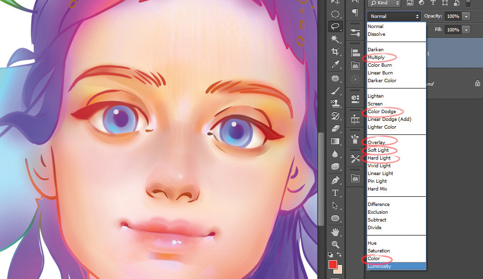
I often use a range of blending modes: Soft Light, Hard Light, Overlay, Multiply and Color. All of them (except Multiply) help me to create bright, saturated colours. Try creating a new layer and setting the blending mode to Soft Light. Then pick a big Soft brush, choose a light colour and experiment here and there on your canvas.
09. Don't forget the shadows
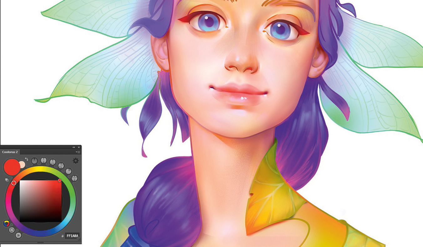
I always like to experiment with colour. It's easier to do this in light areas on the canvas, but don't forget the shadows − try to paint with bright and saturated colours. There's no need to do this with all your shadows; it can just be in a small part of your illustration. Here, I've selected a bright red. This will add variety to my overall colour palette, and ensures my shadows won't look dull and boring.
10. Add hair and wings
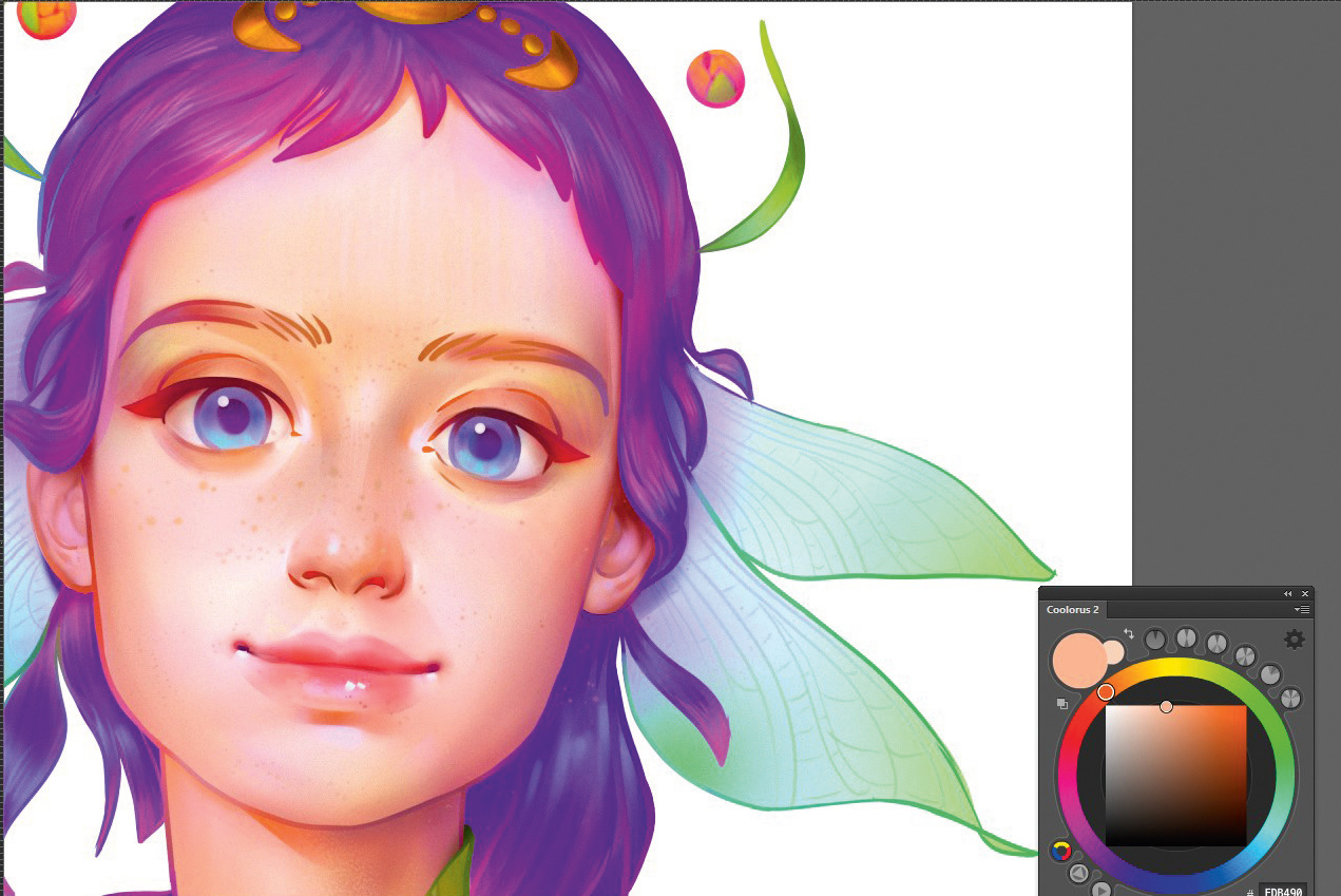
I leave the face as it is and turn my attention to the hair. I paint it in purple with bluish highlights, then decide to add pink in the shadow. I like this effect because it enables me to get rid of the strong dark shadow on the bottom, which otherwise might prove distracting for the viewer.
11. Take time to set up an efficient workspace
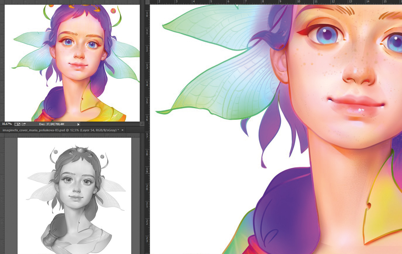
I keep three windows open during my painting process. I paint in the main window, but also have up a smaller version of my WIP so I can see how the image is developing and spot any mistakes, and a black and white version that enables me to check my values.
To set up your workspace, go to 'Window > Arrange > New window for…(name of your file)', once for small version and second time for black and white. To set up the black and white window go to 'View > Proof Setup > Custom > Device to Simulate > sGrey'. Then press ctrl+Y when the black and white window is active.
12. Understand how the face works
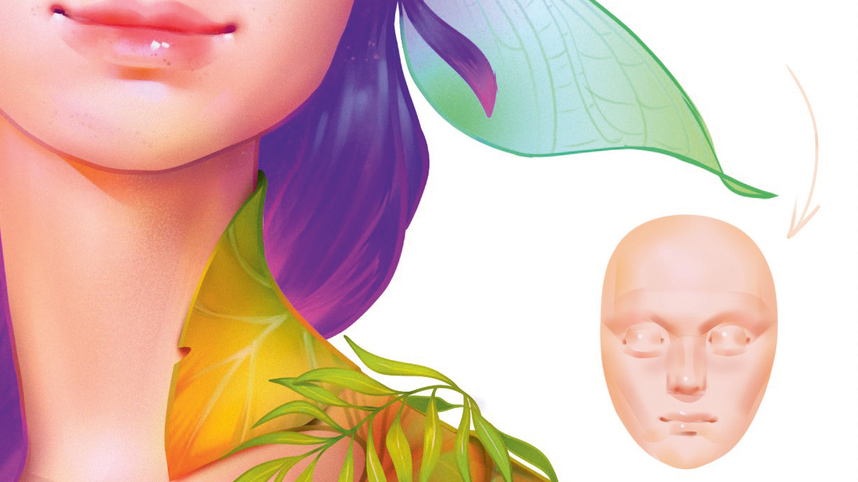
As an artist, it's vital to be able to draw a face. You need to know the anatomy and be able to imagine it as a simplified geometrical form. I often sculpt faces in clay, which is a great way to break down a face into basic structures such as a sphere (an eye) or two cylinders (the lips). And every shape has its own shadow, light and highlight.
13. Construct an outfit

Because this is a stylised illustration, I don't need to draw the leaves of the figure's clothing realistically. This is why I create soft transitions of colour using light, subtle strokes. In just a few places I add contrasting shadows, which helps to boost volume. Placing a branch on one shoulder helps to add visual interest to the right-hand side.
14. Make final tweaks

I review areas that need polishing, and adjust colours using the Levels tool. The Selective Color tool enables me to adjust individual colours during this review stage. Finally, I add a layer of noise to my image, sit back and call it done.
This article was originally published in ImagineFX, the world's best-selling magazine for digital artists. Buy issue 156 or subscribe.
Read more:

Thank you for reading 5 articles this month* Join now for unlimited access
Enjoy your first month for just £1 / $1 / €1
*Read 5 free articles per month without a subscription

Join now for unlimited access
Try first month for just £1 / $1 / €1
