Make a hi-fidelity prototype in Atomic
Discover how to prototype an interactive recipe app with cloud-based tool Atomic.
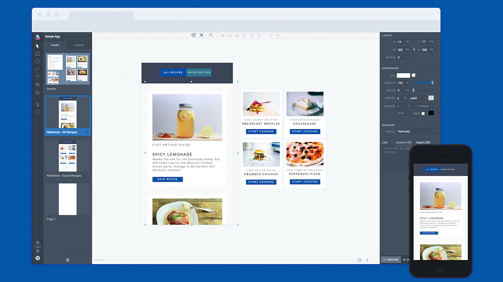
It's easy to get caught up in trying to develop an idea within a static mockup or flat file drawing tool, but a prototype is worth a thousand meetings. Why would you settle for anything less than exploring your ideas in an interactive way?
Maybe you have an idea for how a transition could behave, but you're not quite sure if it would feel right to the user. Quickly prototyping the transition and interacting with it directly gives you a much more realistic experience of how the final product could work in the real world.
We've seen tools bring prototyping to the design space, but none quite like Atomic. Now there's a way to build fully interactive, hi-fidelity prototypes that look and behave like the real thing.
Prototyping in Atomic is incredibly fast: you can create beautiful, advanced mockups in minutes, without writing any code, installing any software or drinking too much coffee. You'll be able to preview with the prototype directly on your mobile device, or share it with a teammate for feedback. We've also pre-made all the assets you need to get started so you won't have to import a thing (but you can import from Sketch and Photoshop CC too).
In this tutorial we'll explore a simple swipe transition inside a weather app that we'll create in Atomic. We'll walk through the easy steps for crafting transitions, and if you need a challenge, I'll also cover some more advanced prototyping features for you to explore.
01. Sign up
Let's get started! If you don't already have an account, open up Google Chrome, visit atomic.io and sign up for a free trial. This lasts for 30 days, which should be plenty of time for you to explore Atomic and make your first prototype.
02. Have a look around
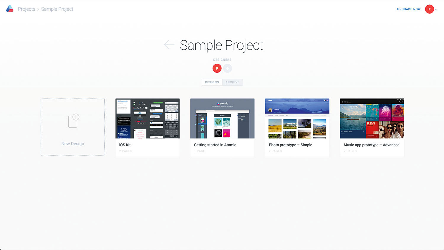
Now you're signed in to your account, this is a great time to explore. You'll notice a sample project has been set up for you. This has some introductory sample files you can play around with while you're getting familiar with Atomic. Alternatively you can visit our Showcase, which has a collection of prototypes built by others. If you get stuck, the best place to look for a solution is our help centre.
Get the Creative Bloq Newsletter
Daily design news, reviews, how-tos and more, as picked by the editors.
03. New project
Create a new Project by clicking 'New Project' and name it 'Recipe App'. Pressing Enter will open the project folder. Here you can view all the designs within this particular project. As this is a new project, it's empty. However, designs will fill up here over time as you create them.
04. Grab a sample
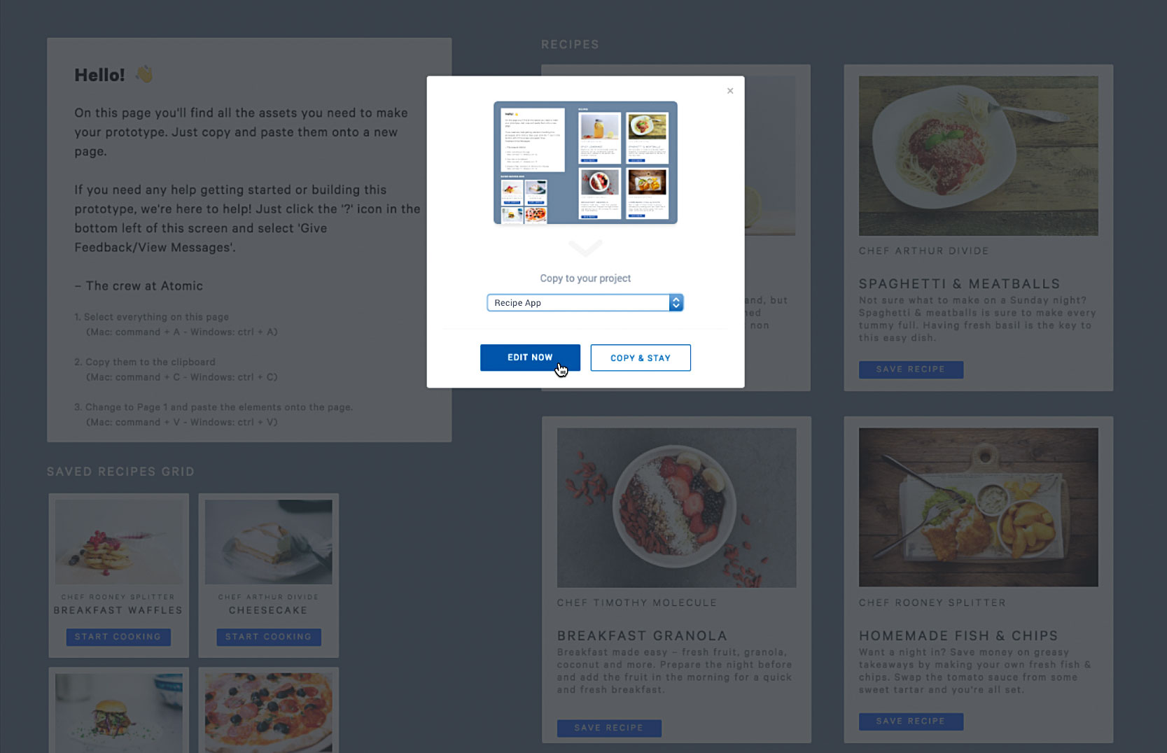
Instead of creating a new empty design, head here. This will open a sample file we've created to help you get started.
See the 'Copy and edit' button in the bottom right corner? Click that and add it to your Recipe App project. Click 'Edit now'. Just like that, a copy of our sample file is now inside your project ready for you to edit.
05. Explore the editor
Welcome to the Editor! If you've used a design tool in the past, Atomic will probably feel familiar. Let's look around. On the left you'll find access to drawing, layout and prototyping tools, as well as two tabs that let you switch between the Pages and Layers panels. On the right you'll notice the Properties panel, which lets you change your page size, as well as bringing up settings for styles and transitions.
06. Check out the elements
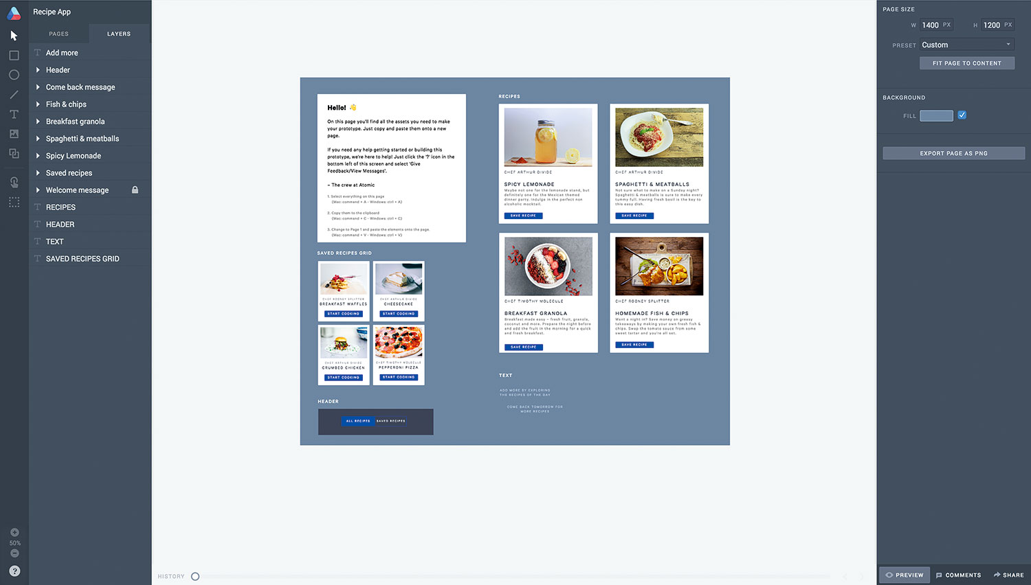
On the Assets page of the sample file you'll see we've created all the elements used in this prototype for you. Switch to the Layers panel, then click some of the elements on the canvas. The elements you select will be automatically highlighted in the layers panel. Speed up your workflow by pressing '?' to see the range of keyboard shortcuts you can use.
07. Preview
You can preview and interact with your prototype whenever you want to by clicking 'Preview' in the bottom-right corner of the Editor. We'll use this later to test out how our transitions feel. Selecting 'Preview' now will show you the assets in fullscreen mode, but if you navigate to Page 2 using the arrows, you'll see a reference example of the first state of our prototype. Try interacting with the reference example by clicking on the 'Saved Recipes' button in the header to preview what we're going to create.
08. Get started
Now you're familiar with the prototype we're building, it's time to get started! Select 'Edit', to get back into the Editor, and then on the Assets page select all the elements and copy them to the clipboard. Go to Page 1 and paste the elements onto the page.
09. Arrange your assets
Without any elements selected, set the background fill of your canvas to #F6F7F8 (look in the right-hand Properties panel). Place the Header on the canvas, top and centre.
You'll want to rearrange the assets so your first state (All Recipes) is positioned on the canvas, and the assets for your soon-to-be-created second state (Saved Recipes) are off the canvas to the right. Here's why: when the same object exists on Page 1 and Page 2, Atomic will animate any changes between them automatically.
10. Stack your cards
When you initially previewed the prototype, you may have noticed the newsfeed of recipes on the 'Reference – All Recipes' page is vertically scrollable. To add this effect, arrange the recipe cards in a vertical stack, including the 'Come back tomorrow' text that should be placed last, at the bottom.
11. Create a scrolling container
Select the recipe cards and 'Come back tomorrow' text, and choose the Container tool that will have appeared at the top centre of the Canvas. Select 'Create scrolling container'. The content will then be grouped and placed inside what we call a scrolling container, with vertical scrolling enabled by default. Make sure you define the boundaries of your container by dragging the bottom boundary up to mask the elements and meet the canvas.
12. Place your elements
For this particular transition, we want the 'Saved Recipes' grid coming in from the right, and the 'Add more' text coming up from below. To make sure this happens, place each element in its respective starting position. For example, 'Saved Recipes' should be placed on Page 1, off the canvas and to the right; whereas the 'Add more' text should be placed on Page 1, off the canvas and below.
13. Tap transition
As we're creating a tap transition, where we want the elements on our next page to slide in, it's important they also exist on Page 1, off the canvas, to define their starting position. At any time you can refer to the 'Reference – All Recipes' page to see how this page should be arranged.
14. Duplication
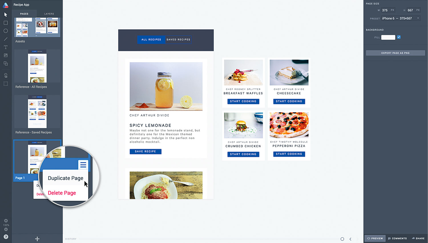
Now we've set up the first page, it's time to create the second state for the transition, which we'll do on a new page. Make sure the Pages panel is selected, then hover over Page 1 to bring up the hamburger menu in the bottom right of the Page card. Click the menu and select 'Duplicate'.
15. Saved recipes
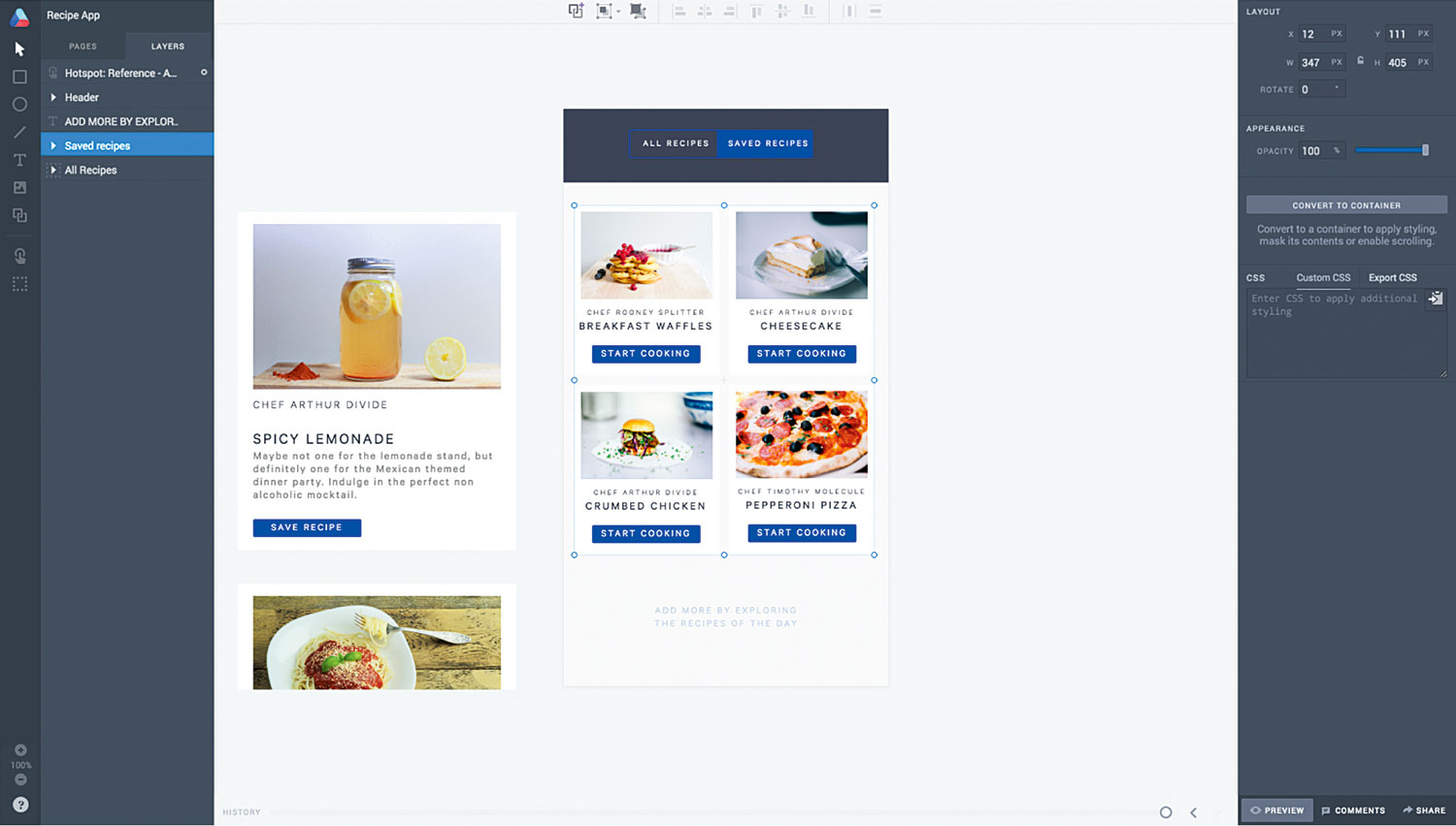
Navigate to your newly duplicated page to create the second state: your Saved Recipes. It's important here not to delete any elements on the page, as this will break the transition. Because we've duplicated the page, Atomic knows that the elements on both pages are the same connected elements. Therefore it knows to animate any changes we make to the properties of the elements on Page 2 (size, position, rotation, opacity, colour and so on).
16. More transitions
First move the 'All Recipes' scrolling group to the left, off the canvas, and the 'Saved Recipes' element and 'Add more' text into their new positions: in the body (in place of the 'All Recipes' group) on the bottom half of the canvas, and in the centre respectively. The only element we're not moving in this transition is the Header. This is because the header remains on screen and only changes subtly – we'll get to that soon.
17. Further animation
For the header, we want the blue background to slide across on the second state. While on Page 2, with the Layers panel open, expand the group titled 'Header' and select the blue rectangle. Then move this to the right so it's placed behind 'Saved Recipes'. Nice!
18. The fun part
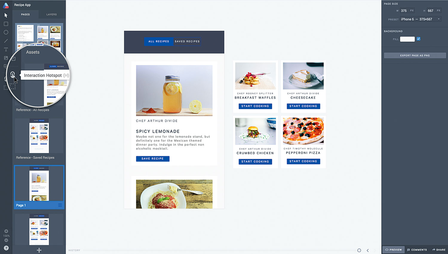
Now comes the fun part of creating the transition. On Page 1 we're going to draw a hotspot over the 'Saved Recipes' text in the Header, as this is the area we want our user to interact with. Select the Interaction Hotspot tool from the Tools Panel at the far left of the Editor (or just press H). You can draw hotspots using the same method you'd use to draw a rectangle on the canvas: just click and drag.
19. Transition settings
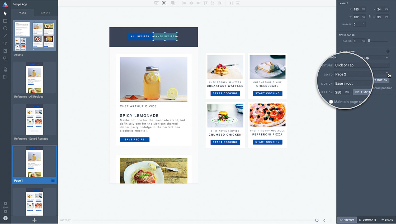
Once you've drawn your hotspot, with it still selected, you'll see an Interactions section appear in the Properties panel to the right. This is where you can specify the trigger gesture, destination page, motion type and duration of the transition. For this transition specify the following settings: Gesture: Click or tap; Go to: Page 2; Motion: Ease in-out; Duration: 250.
20. Back and forth
We want to be able to toggle back and forth between the two transitions, so we'll also now need to place a hotspot on Page 2 to take us back to Page 1. Copy the hotspot from Page 1 using the keyboard shortcuts, and paste it on Page 2 over the 'All Recipes' text in the 'Header'. Remember to update the destination page setting of the new hotspot to Page 1.
21. Preview
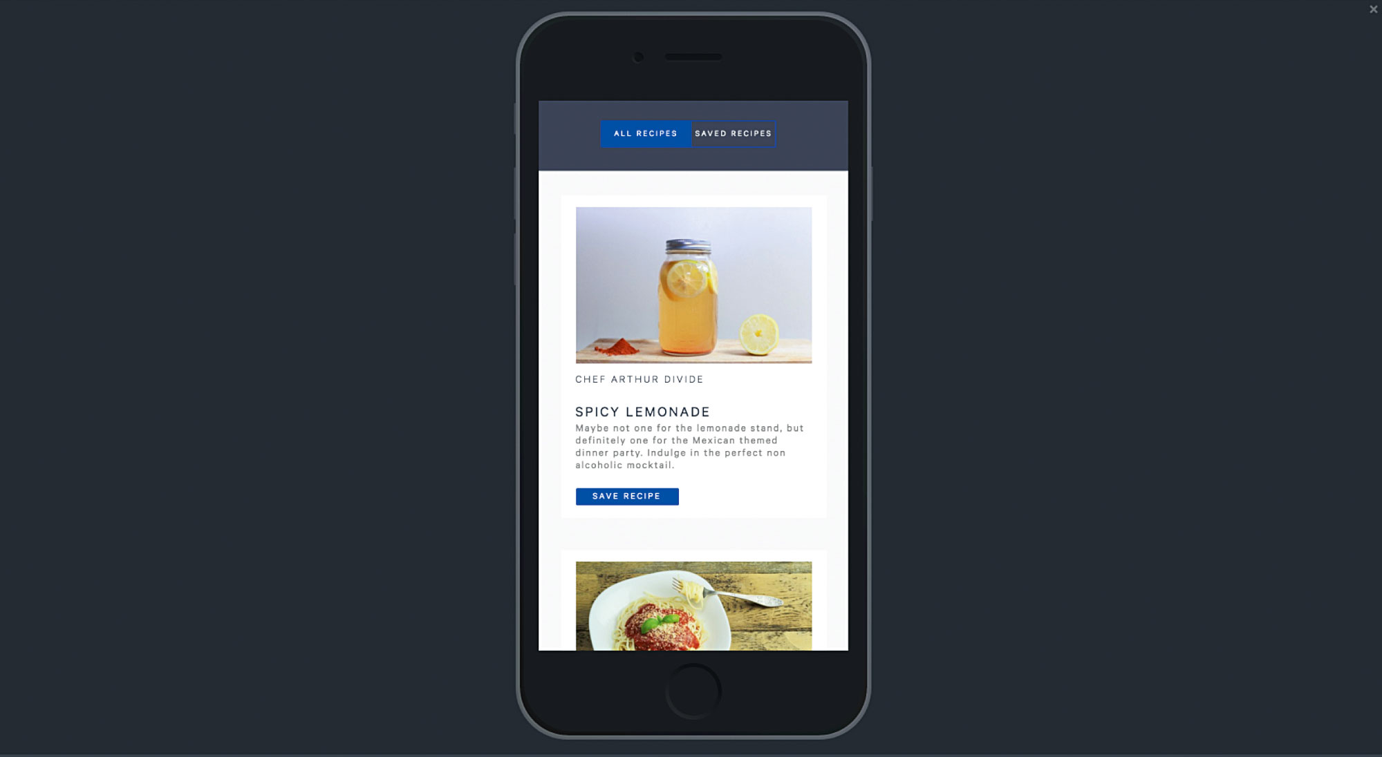
It's time to preview your transition! Navigate to Page 1 in the pages panel and click Preview in the bottom right of the editor (shortcut cmd+enter). Click or tap on 'Saved Recipes' on your prototype to go to Page 2. Then, select 'All Recipes' prototype to be taken back to page 1.
22. All done!
Now you're a pro! Select 'Edit' to return to the editor, then if you delete the assets and two reference pages (by selecting the page's hamburger menu and then 'Delete page'), the prototype you've just made is ready to share. You can easily create a Share link by pressing 'Share' in the bottom right of the editor.
This article originally appeared in net magazine issue 283; buy it here!

Thank you for reading 5 articles this month* Join now for unlimited access
Enjoy your first month for just £1 / $1 / €1
*Read 5 free articles per month without a subscription

Join now for unlimited access
Try first month for just £1 / $1 / €1
