Logo typography: Nail the typeface for your logo
Choosing the right logo typography is vital, here are 5 tips for getting it right.
Selecting the perfect logo typography is a key part of your design process. Indeed, many of the world's most recognisable brands are wordmarks, which rely entirely on typography to convey their message, proving how the impact typography can have on your brand message.
Here, we set out our tips for making sure you nail the typeface for your logo from picking the design that reflects your brand to implementing it perfectly. We explore brilliant examples of the biggest brands getting it just right, and explain how you can do it yourself. For more tips for designing a banging logo, check out our logo design guide. And if you need some font inspiration, head to our comprehensive list of free fonts.
How to nail your logo typography
01. Choose your typeface carefully
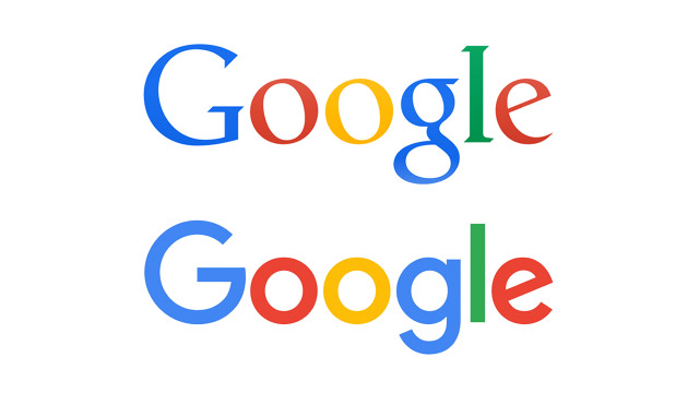
Sans serif fonts have dominated logo design in recent years, often going hand-in-hand with the minimalist movement – examples include Pentagram’s high-profile rebrands for Windows, MasterCard and the University of the Arts London.
Back in 2015, Google famously exchanged its longstanding serif logotype for a much friendlier, more contemporary sans serif. But don’t let trends cloud your own judgement: a serif font could still be the right choice for your latest project, particularly if you need a stylish and luxurious or traditional and professional feel, so take the time to research your options.
02. Tweak and refine to add personality
If you use an existing typeface in a logotype, particularly a near-ubiquitous one such as Helvetica, there is often more pressure on other touchpoints, such as imagery, colour palette, tone of voice and so on, to develop and enhance the brand’s personality.
Skilful tracking and kerning is essential when setting a simple logotype in an existing typeface. Wide-tracked type can feel sophisticated and authoritative, while tight, meticulous kerning can help lock individual letterforms together as self-contained unit.
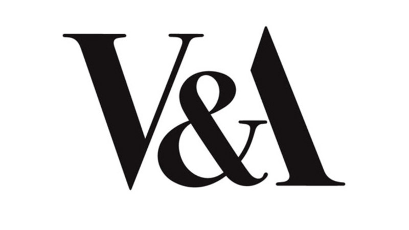
Once in logotype form, tweaking and modifying the typeface can also smooth links between letterforms, or add a unique twist to fit the tone of the brand – one example would be shearing off letter terminals at matching angles to give a sharp, progressive feel. An excellent example of this is the V&A logo, crafted in 1989 by Alan Fletcher.
03. Consider illustrated, fully-bespoke type
Sometimes an existing typeface just won’t cut it, and a hand-drawn typographical treatment feels much much more appropriate for the brand. Perhaps the most iconic example, which has evolved gradually over more than a century, is Coca-Cola.
With only relatively subtle tweaks over more than a century, Coca-Cola is proof that illustrated type can stand the test of time in logo design. Compared with its fierce rival Pepsi, which has been through at least seven major iterations, the market leader sports much the same logo as it did in the late 1800s. If Coca-Cola had ditched that familiar scrawling script for a sans serif, like Pepsi did in the 1960s, there would have been uproar.
The point is simple: get a truly unique, custom bit of illustrated type spot-on and you’ve bought yourself some powerful brand recognition with genuine longevity. (Although if all else fails, these free handwriting fonts are pretty great options).
04. Explore serendipitous letter combinations
Monograms don’t have to be restricted to dressing gowns and wedding invitations, and when given the right treatment, company initials formed into a typographic lockup can make for a simple but effective emblem for a brand.
This is notably true in the fashion sector – Coco Chanel’s interlocking Cs and Yves St Laurent’s dollar sign-esque lockup being standout examples. Also see our best 3-letter logos for other marks that combine characters in effective ways.
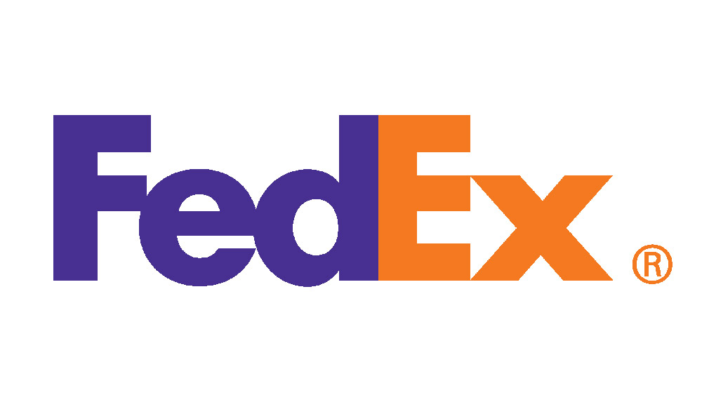
Sometimes even the simplest typesetting can reveal serendipitous ‘accidents’ that, developed properly, can lead to twists of genius. One classic example is Landor’s FedEx mark, the hidden arrow between the ‘e’ and the ‘x’ making an otherwise plain sans-serif logotype the toast of logo design critics the world over.
Try typing out the brand name in different typefaces and perhaps a similar happy accident could occur in your own work. See our post on logo Easter eggs you might have missed for more examples of hidden messages in logos.
05. Take ownership of an entire typeface
Fontsmith’s award-winning logotype for ITV was expanded into a brand-wide typeface, to ensure a consistent tone of voice across all channels and applications.
If your client can afford it, working with a specialist bespoke type design agency such as Dalton Maag or Fontsmith to develop a fully branded typeface family can put typography front and centre of a brand’s personality, transcending the logotype and permeating all brand communications.
Between them, these two agencies have worked for an array of brands including Nokia, Lush, Rio 2016, Sainsbury’s, ITV and Lloyds. “Type defines the tone of voice of a brand by its emotional qualities,” Dalton Maag founder Bruno Maag told Computer Arts in the video interview above.
“A grotesque typeface such as Univers, Arial or Helvetica feels more masculine, mechanical and engineered – colder – than, say, a Frutiger, which is a humanist sans serif with more open, warm, friendly, approachable tones. Whereas a serif typeface may appear old-fashioned, or bookish.”
Read more:
- Where to find logo design inspiration
- The best premium and free logo designer software
- Brand typography: A complete guide
Get the Creative Bloq Newsletter
Daily design news, reviews, how-tos and more, as picked by the editors.

Thank you for reading 5 articles this month* Join now for unlimited access
Enjoy your first month for just £1 / $1 / €1
*Read 5 free articles per month without a subscription

Join now for unlimited access
Try first month for just £1 / $1 / €1

Nick has worked with world-class agencies including Wolff Olins, Taxi Studio and Vault49 on brand storytelling, tone of voice and verbal strategy for global brands such as Virgin, TikTok, and Bite Back 2030. Nick launched the Brand Impact Awards in 2013 while editor of Computer Arts, and remains chair of judges. He's written for Creative Bloq on design and branding matters since the site's launch.
