How to develop a killer logo strategy
Get your logo strategy spot on before designing your new logo.
A strong logo strategy needs to be decided upon before pen even hits paper on a new logo design project. This means thorough research and planning, so you understand your market, the competition and exactly how you want to deliver your brand message. While it's important to be aware of any trends, your logo needs to strike the balance between being relevant and merely joining the hoards of others doing the same thing – you don't want to get lost.
In this guide, we share five tips for developing a killer logo strategy that will deliver a logo that gets you noticed. For more logo tips, see our guide to logo design and then find out where to find awesome logo design inspiration. Want some examples? Here are the best logos ever.
How to develop a killer logo strategy
01. Understand your competition
Before you even start working up a logo design concept, ensure you research your target market thoroughly. Your client should be able to provide some information about their competitors to get you started.
Compare all the logos in their competitive set. This research may well reveal some entrenched branding conventions in that market sector, and that can sometimes help your process by playing on familiar visual associations.
But bear in mind that many of the world’s most recognisable logo designs stand out specifically because they eschew trends and think differently. Apple cut through the traditional computing sector like a hot knife through butter in the '80s, and has since evolved into one of the world’s most valuable brands
02. Ask the right questions
Strategy is becoming an increasingly important part of the branding process. What this means in practice will often depend on the scale of the project, but it all starts with asking the right questions.
Michael Johnson’s book Branding: In Five and a Half Steps is dedicated to Johnson Banks’ creative process, and covers complex challenges such as formulating brand strategy in far more detail than we could ever hope to here.
In it, Johnson advocates asking the following six things of the brand you’re working on as a starting point:
- Why are we here?
- What do we do, and how do we do it?
- What makes us different?
- Who are we here for?
- What do we value the most?
- What’s our personality?
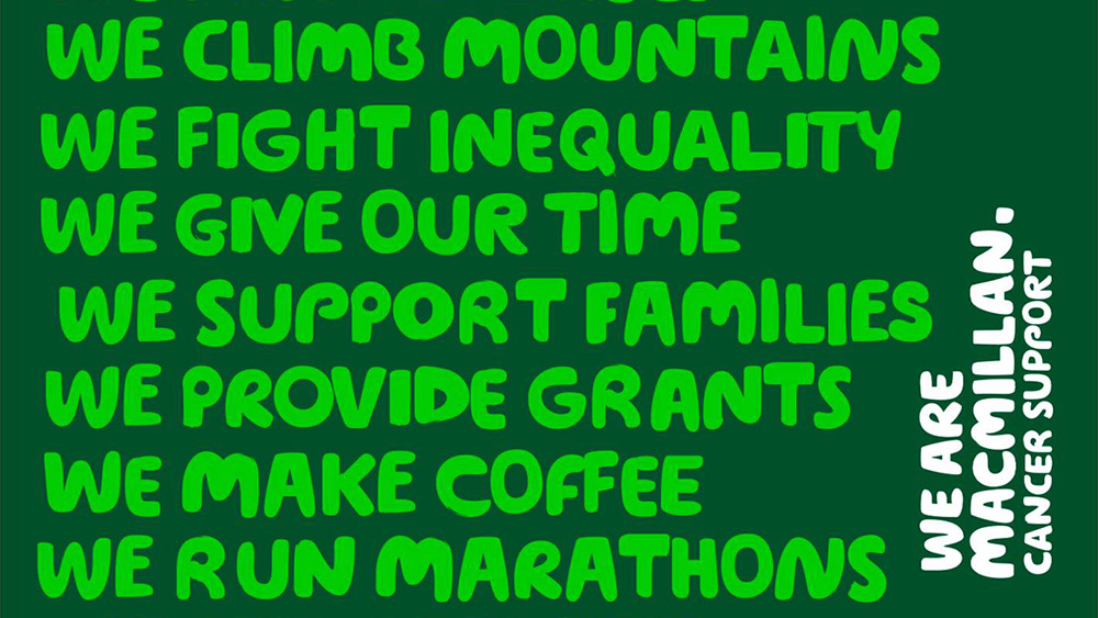
Wolff Olins’ copywriting-led branding for Macmillan Cancer Support, referenced in Johnson’s book, was built around a series of ‘we…’ statements that help answer some of the key brand questions
03. Stay flexible during the process
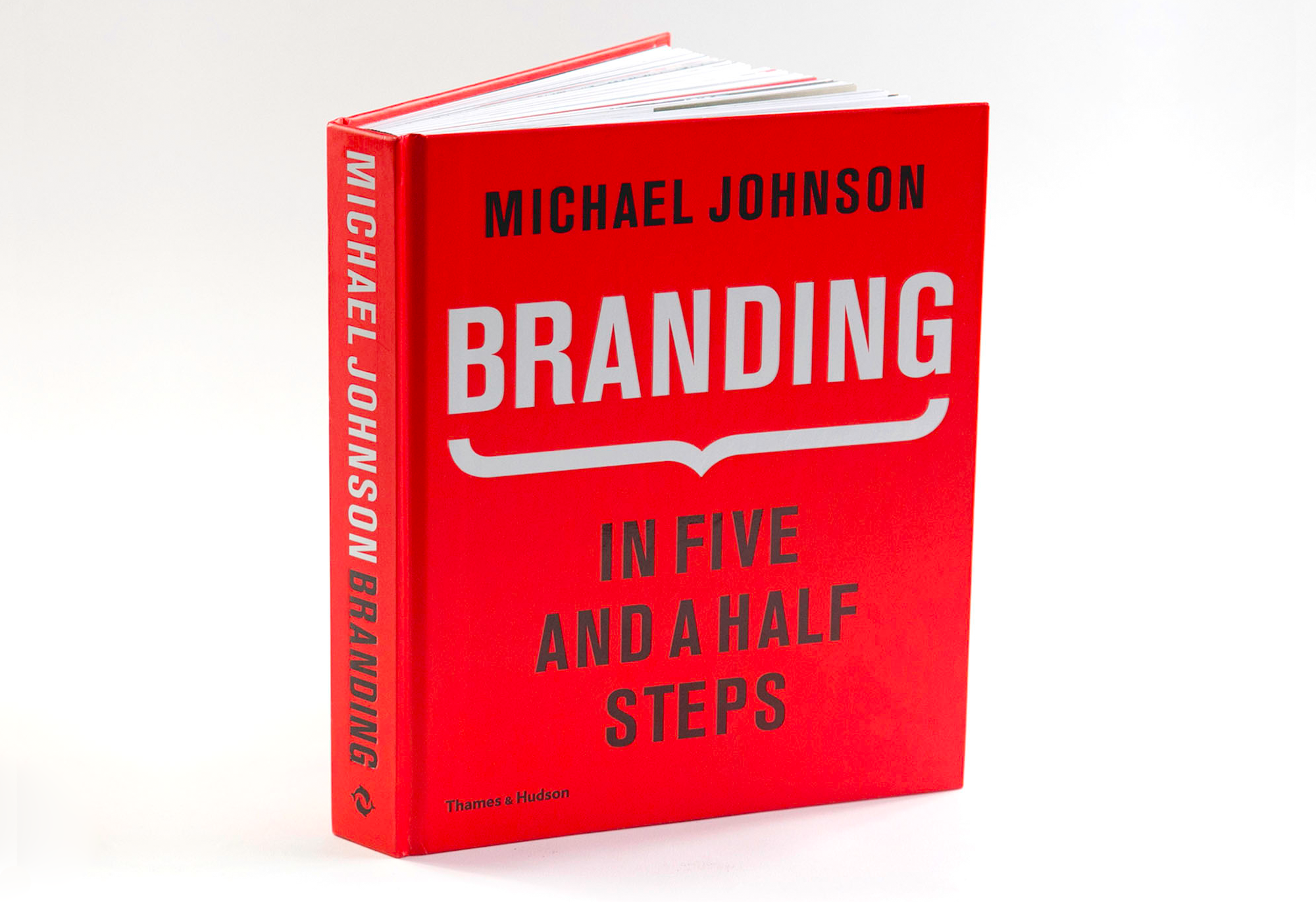
Once you’ve formulated a strategy, you don’t have to set it in stone. There’s a reason that Johnson Banks’ creative process has that extra half step: that 'and how do we do it' part of the question represents the grey area between strategy and design. Branding: In Five and a Half Steps is highly recommended reading to help you get to grips with all the key stages of the branding process, and the grey areas between them.
According to Johnson, it can be a two-way street. Some conceptual, strategic ideas that work in theory may fall apart in practice when visualised; conversely, a compelling visual solution that emerges from left-field during the design stage can feed back into stage two and help evolve the strategy retrospectively.
04. Respect a brand’s heritage
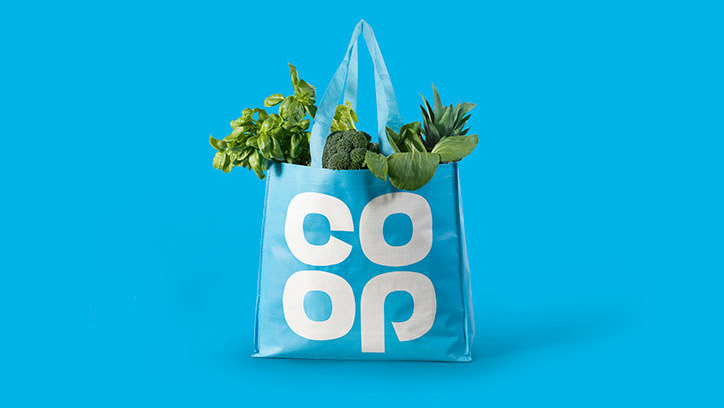
The so-called ’retro branding’ movement was kicked off by North’s much-lauded rebrand of Co-op in 2016, which reinvigorated its original 1960s mark and won one of Computer Arts magazine’s coveted Brand Impact Awards in the process.
We've seen countless examples in the years since, including Peugeot's return to its heritage with its 2020 rebrand (above), which saw it ditch the distinctive silver lion in favour of a black and white flat design.
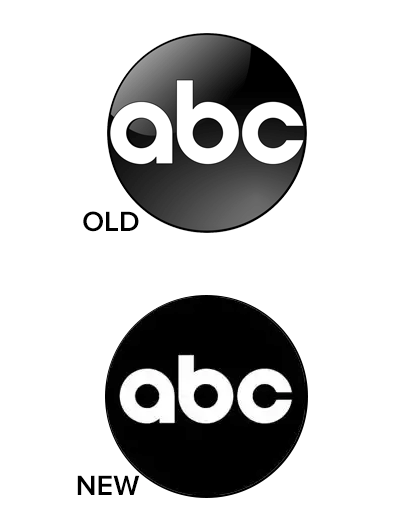
And most recently, we saw the ABC network go back to its 1960s style with another flat, black and white design (above). Interestingly, the return to retro design fits well with the UI-friendly, accessibility of the recent flat design trend (though some feel flat design has gone too far). Invoking a time before fancy graphics and Skeumorphism, heritage design is a neat way to tick the flat design boxes whilst remaining meaningful.
Brands need to be wary of jumping on the bandwagon for the sake of it, but where genuine heritage and untapped potential exists in a mark, avoid throwing the baby out with the bath water and consider bringing it to the fore – see our advice on how to reawaken a brand's heritage.
“It's vital to put your ego to one side and not dismiss designs created by others – and in doing so consider evolution as well as revolution,” argued North co-founder Stephen Gilmore in an essay in Computer Arts.
05. Remember: a logo is just one ingredient
As Bruce Duckworth and Mark Bonner discuss in this video, logo design is just one small part of the modern branding process.
As Bonner puts it, the pyramid has inverted: people now engage with a brand through a huge variety of different touchpoints, and the logo is not always their first point of contact with a brand.
Keep this in mind as you develop your logo design: stay versatile and flexible, and consider how the logo interacts with the rest of the brand experience, from packaging to tone of voice.
Read more:
- Logo designer software: Premium and free options
- Colour in branding: Outstanding uses of colour in branding
- The best branding books: Books for brand inspiration
Get the Creative Bloq Newsletter
Daily design news, reviews, how-tos and more, as picked by the editors.

Thank you for reading 5 articles this month* Join now for unlimited access
Enjoy your first month for just £1 / $1 / €1
*Read 5 free articles per month without a subscription

Join now for unlimited access
Try first month for just £1 / $1 / €1

Nick has worked with world-class agencies including Wolff Olins, Taxi Studio and Vault49 on brand storytelling, tone of voice and verbal strategy for global brands such as Virgin, TikTok, and Bite Back 2030. Nick launched the Brand Impact Awards in 2013 while editor of Computer Arts, and remains chair of judges. He's written for Creative Bloq on design and branding matters since the site's launch.
