Learn to model a 3D person in ZBrush and Maya
Pro techniques for capturing personality, expressions and emotions.
15. Create tileable pattern textures
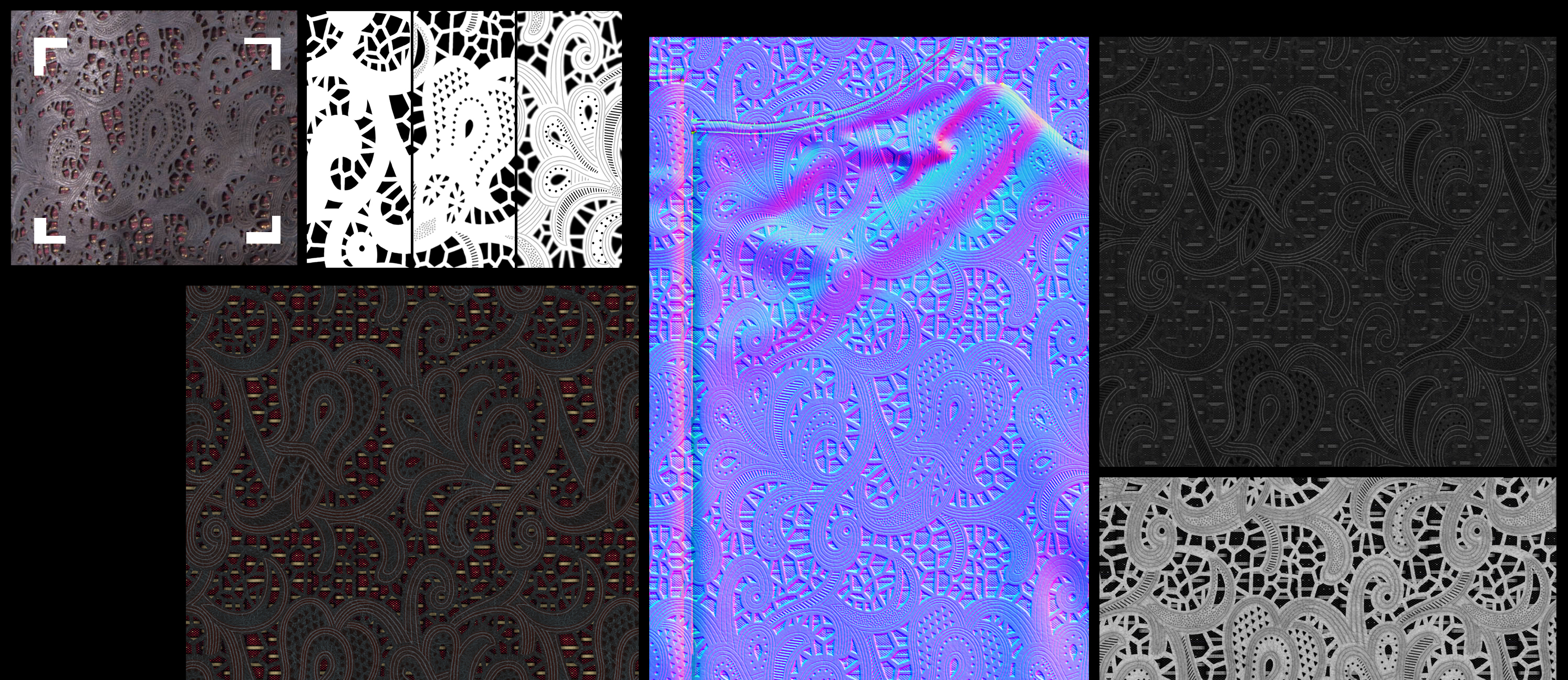
I took a decent photo of the pattern and imported it into Photoshop. After removing photo distortion, I traced the pattern onto a layer and made it tileable. For the normal map, I baked the folding of the sculpture from ZBrush in Handplane and then, using my tileable pattern layers, I created a normal map focused just on the jacket pattern. All other channels duplicated the Diffuse one in grayscale, before editing in Photoshop. I painted the dots and the lines in two layers to save as separate patterns to then fill the jacket texture.
16. Make sleeves and inner layer
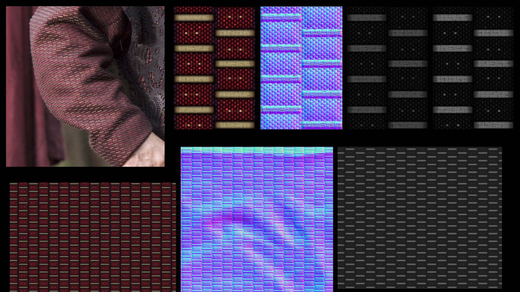
I painted this tileable pattern by hand and used it to fill the jacket and the sleeves. For the normal map, I baked the sculpted wrinkles with Handplane and using my three pattern layers, created an additional normal map for just the jacket pattern. This was overlaid onto the basic Normal Map channel. All other channels were from duplicating the Diffuse one in grayscale.
17. Marmoset file setup
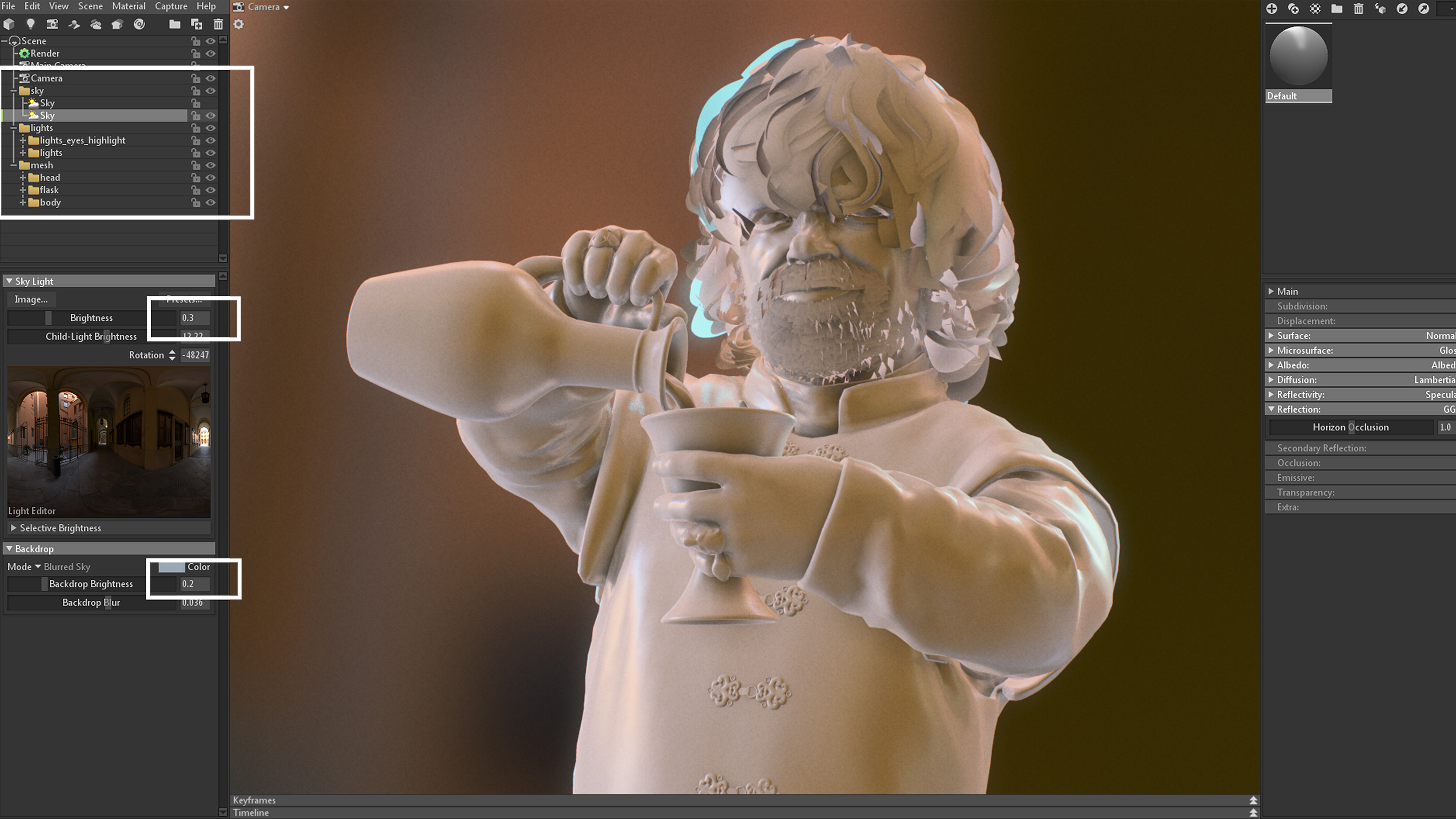
One way I use Marmoset to handle lighting is choosing an HDR environment, but limiting visibility to 0.3. This way, reflections are visible mainly on glossy surfaces, but not so much on rough surfaces. A good tip is if you put all lights into a group, but NOT inside the HDR sub-group, it is possible to spin the lights group and HDR independently.
18. Create the head and hands shader
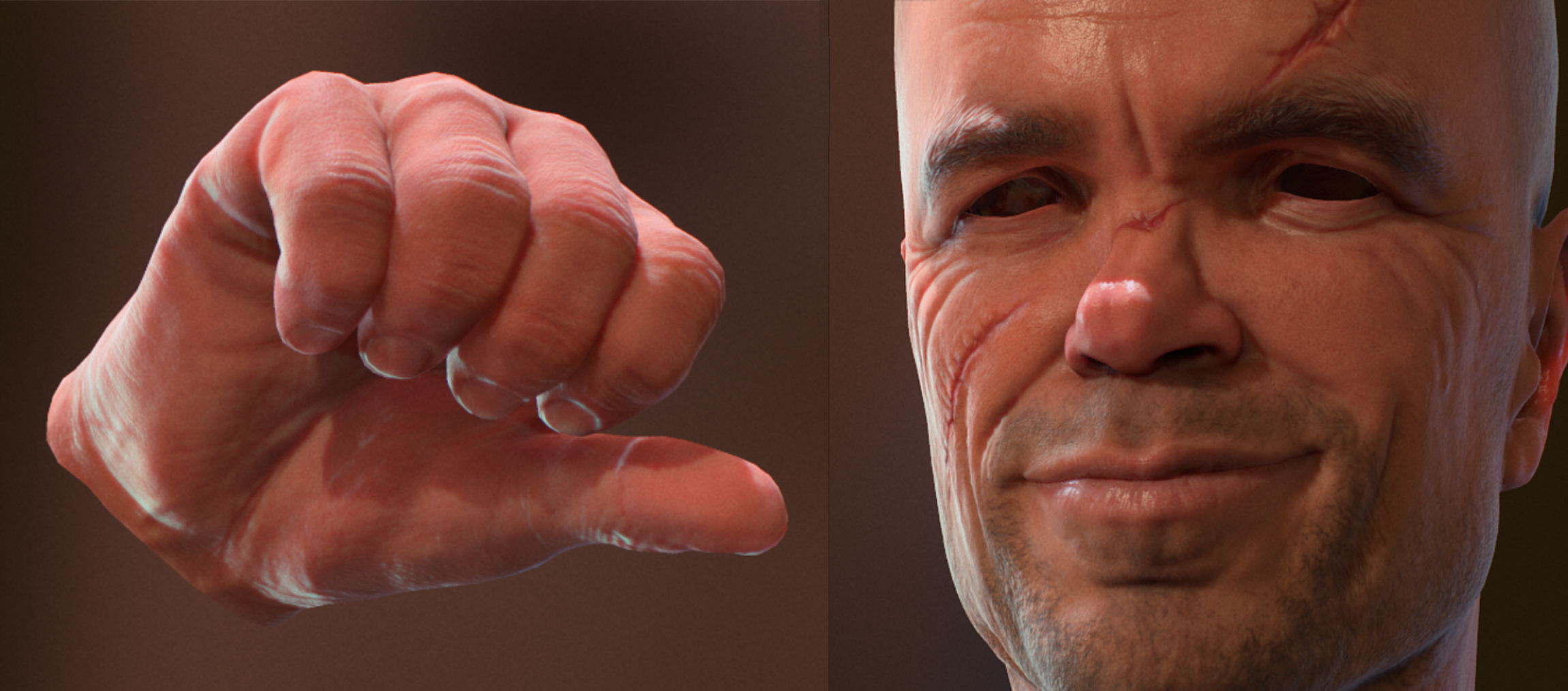
The main channels of a PBR material are the Normal Map and the Glossiness. I just set the Specular value to 0.04, but didn't add any texture. I spent some time detailing the Glossiness one instead. You'll notice that the forehead, nose tip and areas around the nostrils, lips, and ear tips are more oily than the cheeks, neck, chin, and all the surfaces where hair grows. Scatter, Translucency and Fuzziness textures need some testing to work properly. Depending on your model you could decide to use different values.
19. Make the eyes shader
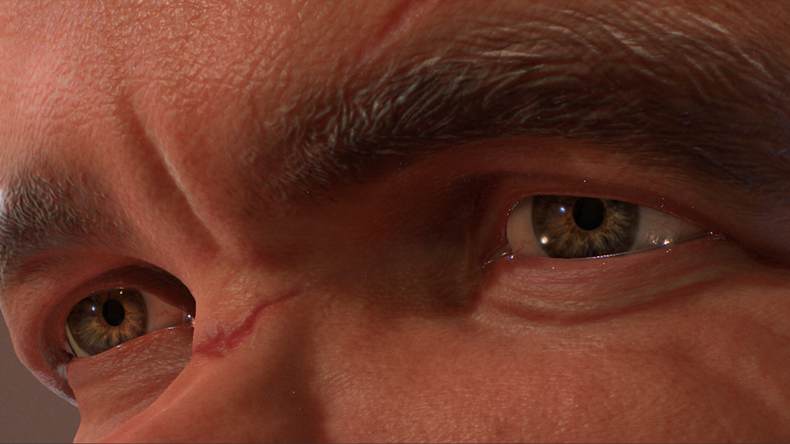
The bumping volume in front of the iris is one of the most glossy and perfect materials in nature, so Glossiness should be set at 1.0. The actual iris is almost non-reflective. The eyeball is a translucent material, and veins in the sclera are thin but the glossiness comes from the wet layer on top. This blurs the effect, making it look more neat and homogeneous.
20. Add the hair shader
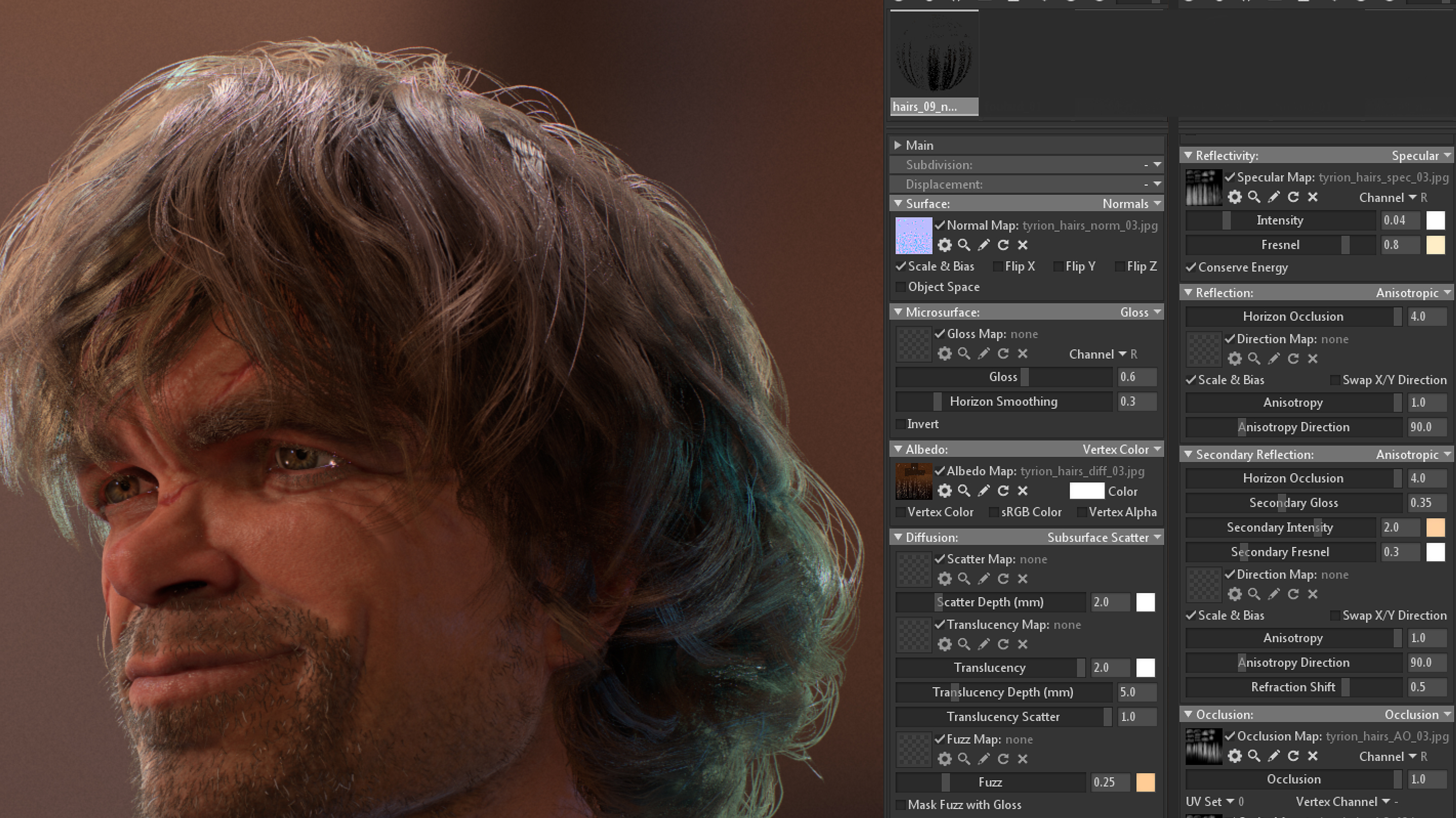
I had to do some experiments with the hair. I initially set up my Specular channel with a Microfibre algorithm, but it wasn’t the result I was hoping for. I ended up using the Subsurface Scatter, like the face and the hands. Using the Ambient Occlusion channel, together with the cavity map, helped break the flatness of the Specular highlight along the even polygons. Using a secondary reflection gave the best result on the hairs, more than on the other materials. Remember to set both your reflection channels to Anisotropic.
21. Rings shader
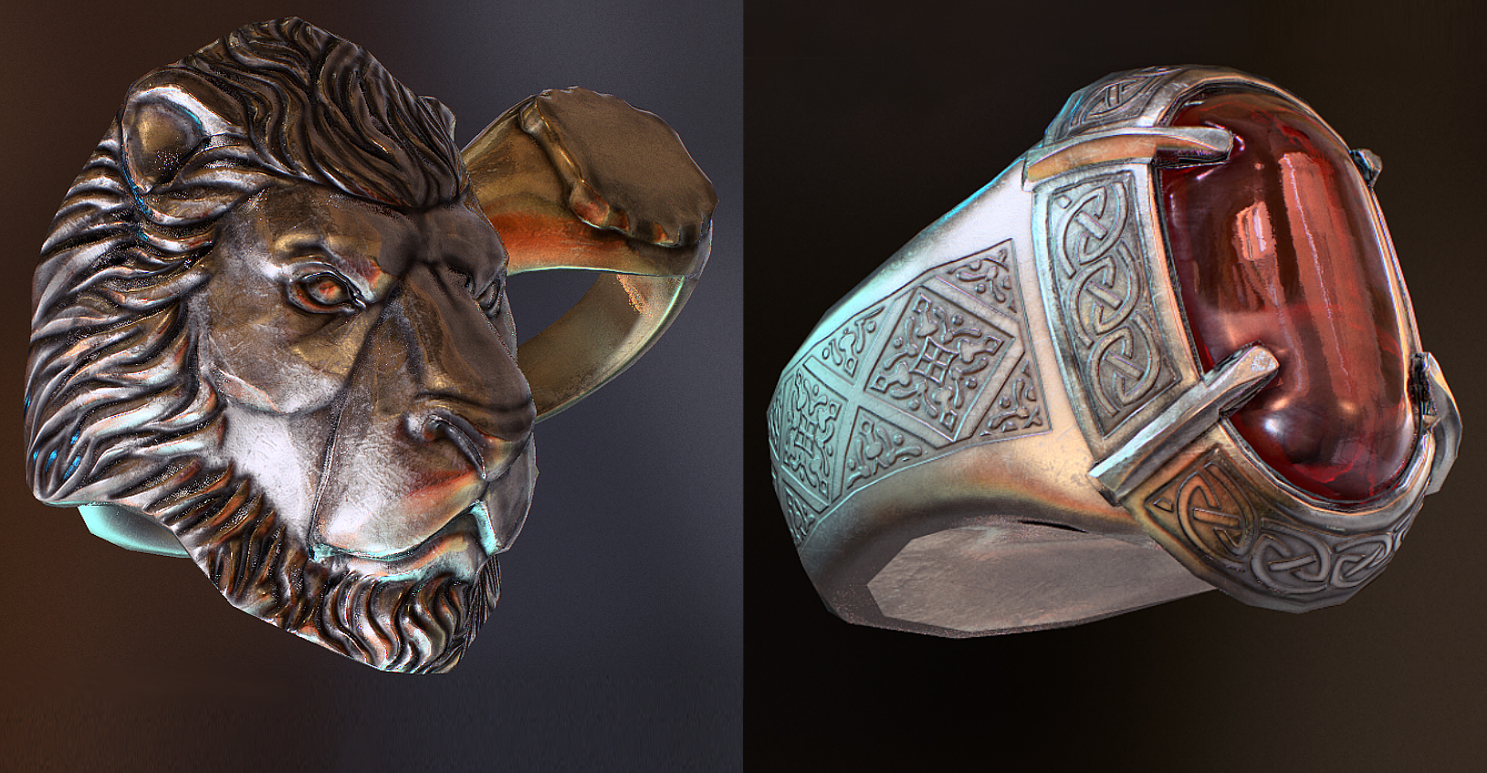
The rings were an easy setting. The most important value came from the tone of reflectivity, which can be found online. Everything else is a picky use of Normal Map and Glossiness to create variations along the surface. Adding some fingerprint marks in the Glossiness channel helps the final result. Just remember to model the ruby socket, and then place the gem into it so that they do not intersect. If you model this ring as a unique object, the ruby will end up looking transparent.
Get the Creative Bloq Newsletter
Daily design news, reviews, how-tos and more, as picked by the editors.
22. Glass shader
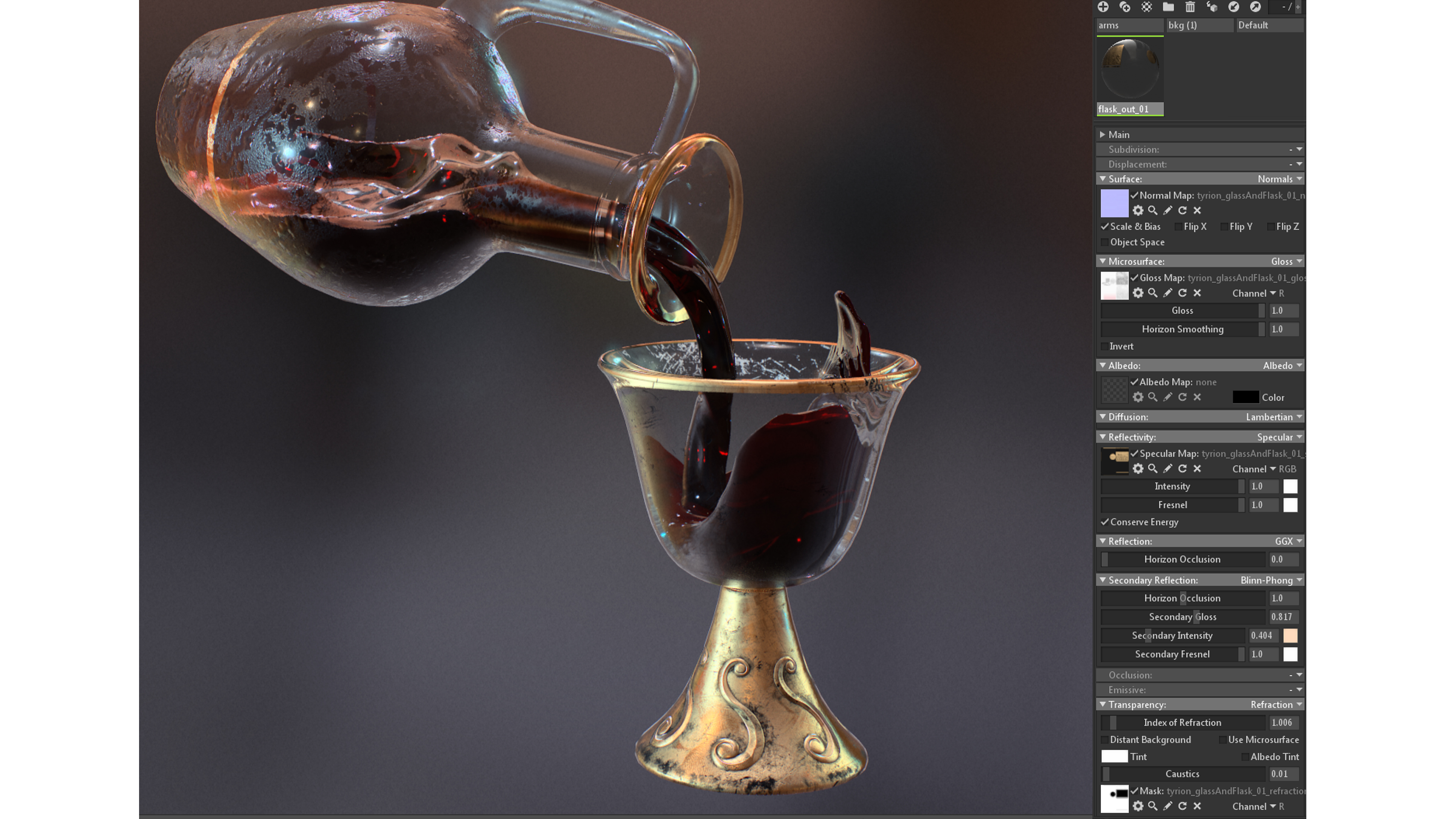
The best way I found to obtain decent glass was duplicating my whole mesh for the glass and flask (and ruby), and inverting the normals of each polygon. But this means values of refraction will be calculated twice. Also, in order to make this material more interesting, I suggest adding a lot of details like fingerprints, scratches and water drops on top of it.
23. Wine shader
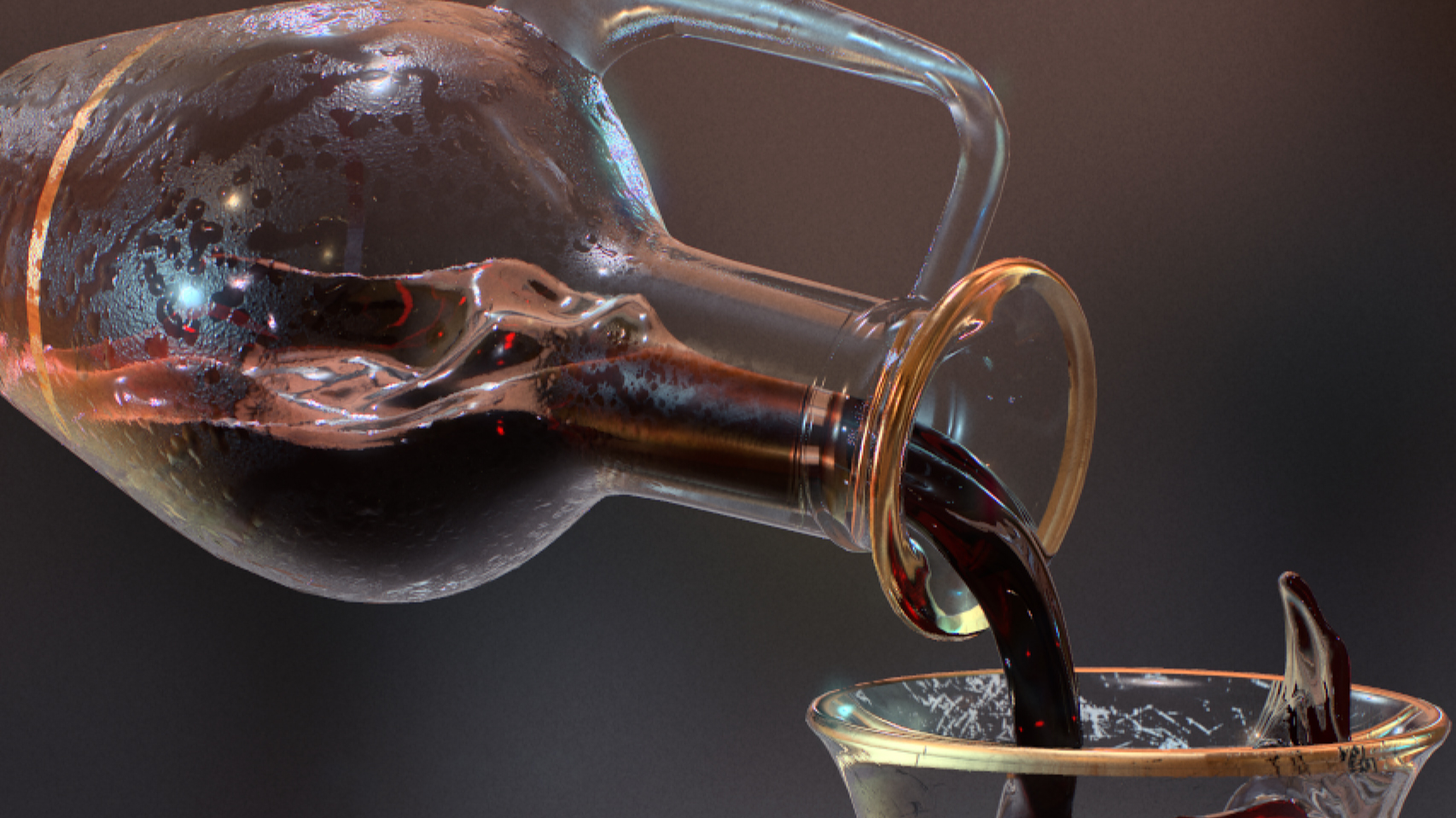
I treated wine the same way as the glass. The only difference is that red wine’s transparency gets higher near the surface. That’s why, in Photoshop, I painted a refraction texture, gradually turning to black as it got closer to the bottom of the flask and the glass. Also, in order to make it more believable, there is some noise in it, so that the final result looks thicker. But let’s face it; it still looks like black cherry syrup! I’ll keep testing Marmoset to see if I can find a better way to handle these refractive shaders.
This article originally appeared in 3D World magazine; subscribe here.
Related articles:

Thank you for reading 5 articles this month* Join now for unlimited access
Enjoy your first month for just £1 / $1 / €1
*Read 5 free articles per month without a subscription

Join now for unlimited access
Try first month for just £1 / $1 / €1
