Visual development tips: Tell a story with your artwork
Learn the basics of visual development to create a sense of storytelling within a single painting.
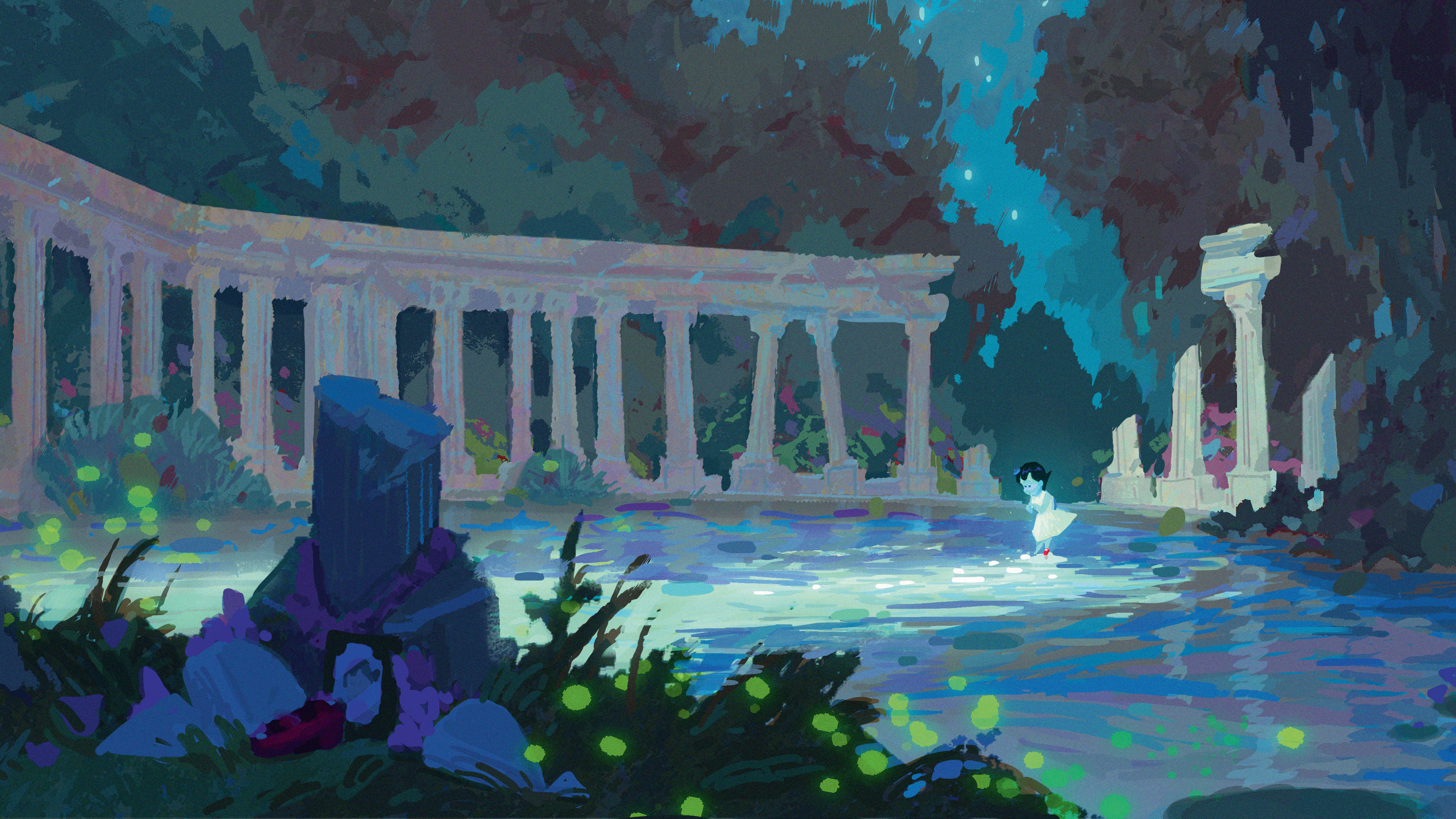
What is visual development? Well, it’s designing anything that can help to visualise a story. In this workshop I’ll be focusing on pre-visual development, which is about painting scenery.
In the pre-visual development phase, artists paint a lot of scenes that can help visualise the world of the story. I’ll cover what the different art techniques you need to focus on when you’re working on your painting. I consider this as one of the most enjoyable roles in vis-dev work, and I recommend that everyone tries their hand at doing it.
When you paint, the most important thing to consider is the concept of values (take a look at CB's guide to colour theory for more on this). My mentor at Pixar once told me that, "A painting will still look good - even with bad colours - as long as its value is perfect." In this workshop I’ll pass on my advice on values, composition and colours that will help to improve your art.
Let’s go through the steps to help you visualise your imaginary worlds…
01. Gather references
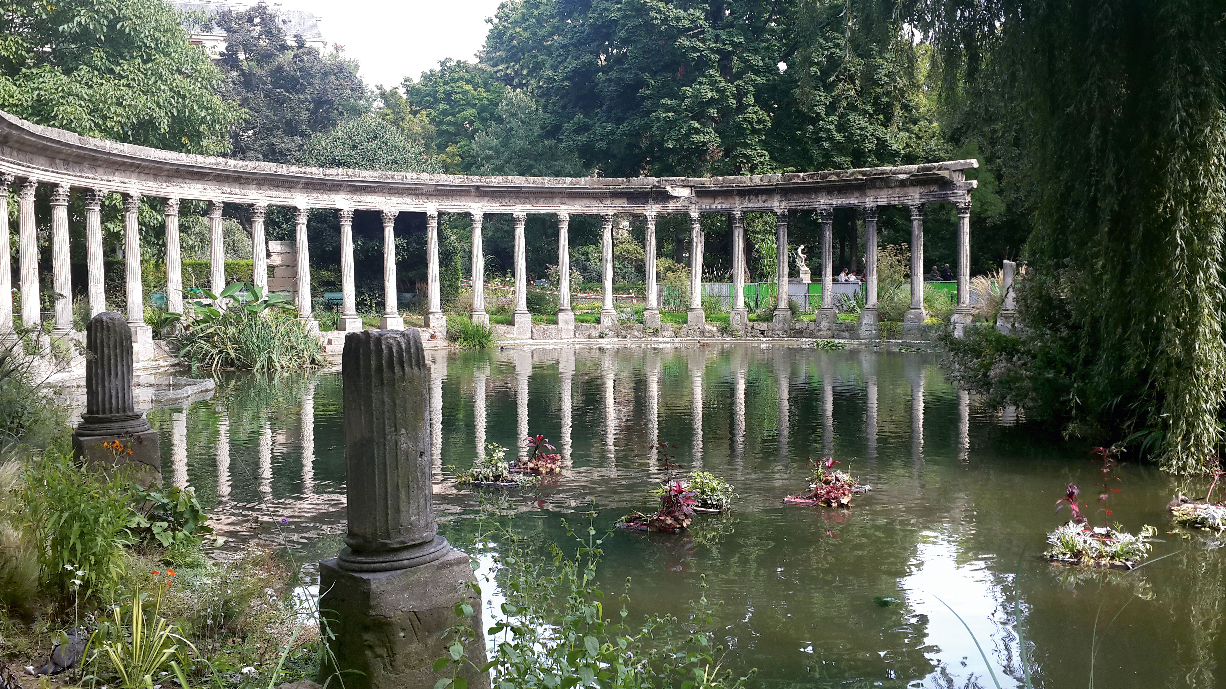
One of my hobbies is travelling, and I’ll take photographs when I see a landscape that inspires me to paint when I get back home. Even if you’re not keen on travelling or photography, you still need a good source of real-world reference to help you paint imaginative art. Try looking around online for reference that will help take your painting project to the next stage of development.
02. Produce thumbnail sketches

I begin drawing thumbnails on grey rectangles that match a cinema screen’s proportions (2.39:1). I prefer working at theatrical film ratio because it helps me check that my ideas will look interesting on the big screen. I have a tendency to work small, so I can see the whole composition within the frame. I identify and then correct any composition issues at this stage.
03. Enhance the basic composition
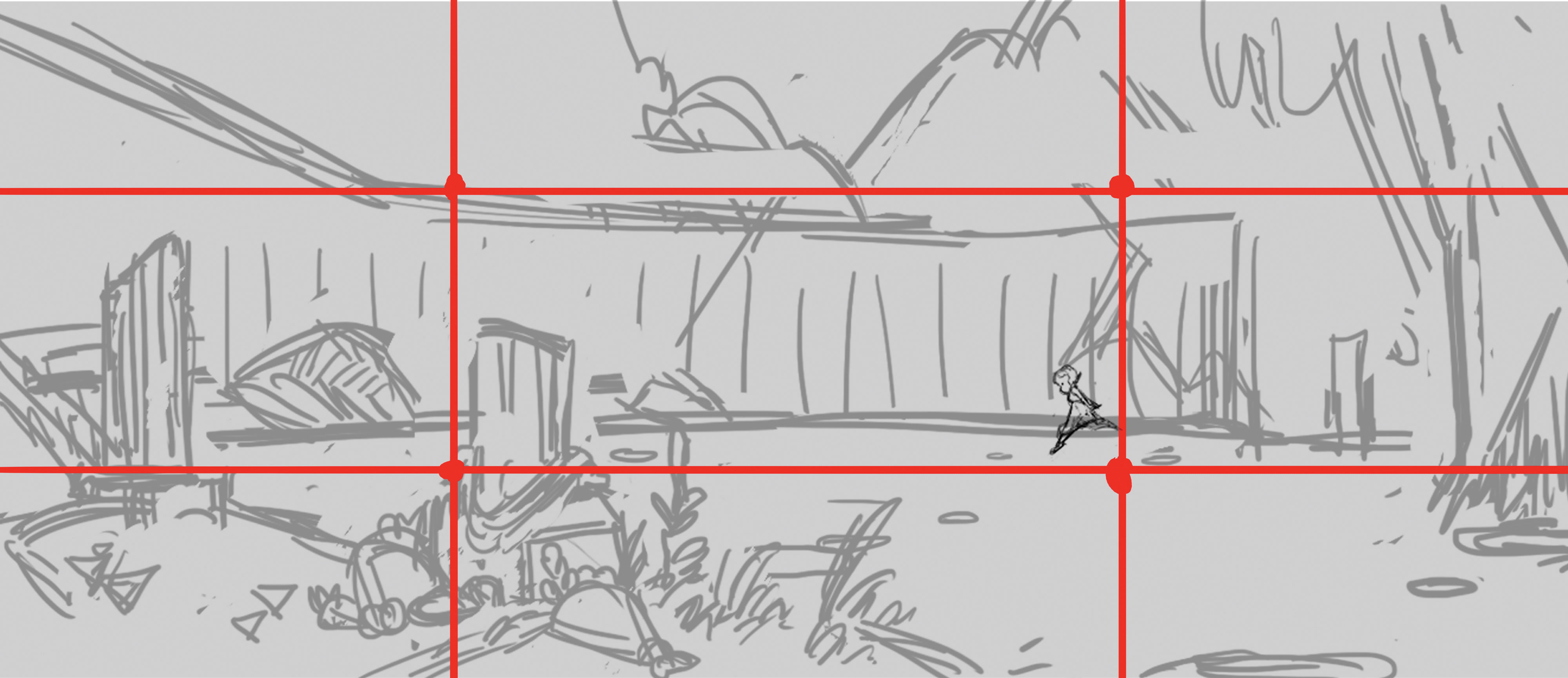
Composition helps to lead the viewer’s eyes to where you want them to be. The basic composition tool is the Rule of Thirds, which divides your painting into sections. It’s recommended that you place your focal point on the division lines, which you overlay on your frame.
Get the Creative Bloq Newsletter
Daily design news, reviews, how-tos and more, as picked by the editors.
04. Place diamonds and zig-zags

You can place a diamond frame around your focal point by creating lines of direction. Each shape exists to help the viewer to follow it. Zig-zags help you to organise your shapes and create visual variety. They also encourage the viewer’s eyes to move in certain directions.
05. Perfect value studies
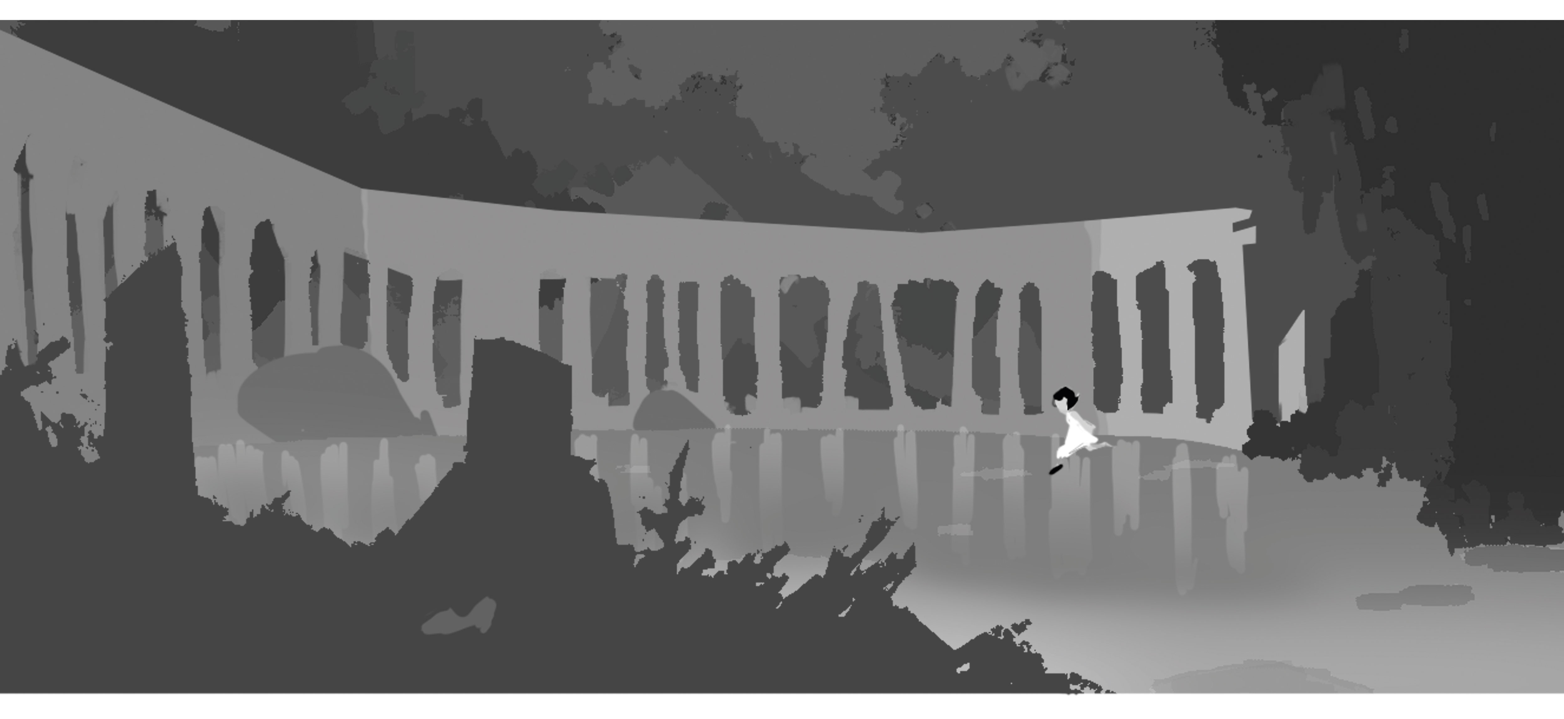
This is the most important part of the painting process. The values have to look correct before the addition of light or colour. Viewers should be able to read your focal points even at a distance. Make sure you work small so you can check them. Your focal point should be the lightest or the darkest in your values study, or both.
06. Group values sensibly

Even if there is light or shadow, value always works within a similar value range. Neither light nor shadow should break the value range that you choose to work with, unless there’s a good reason. For example, shapes within that value range can also help to lead the viewer’s eyes.
07. Create contrast through the use of opposites

You can contrast value by using the lightest and darkest colours in the scene. They will capture the viewer’s attention right away. Our eyes tend to focus on either the most saturated colour in the painting, or grey that’s surrounded by strong colours. Opposites attract the eye, and the same principle applies to shapes, too.
08. Building up the structure of the scene
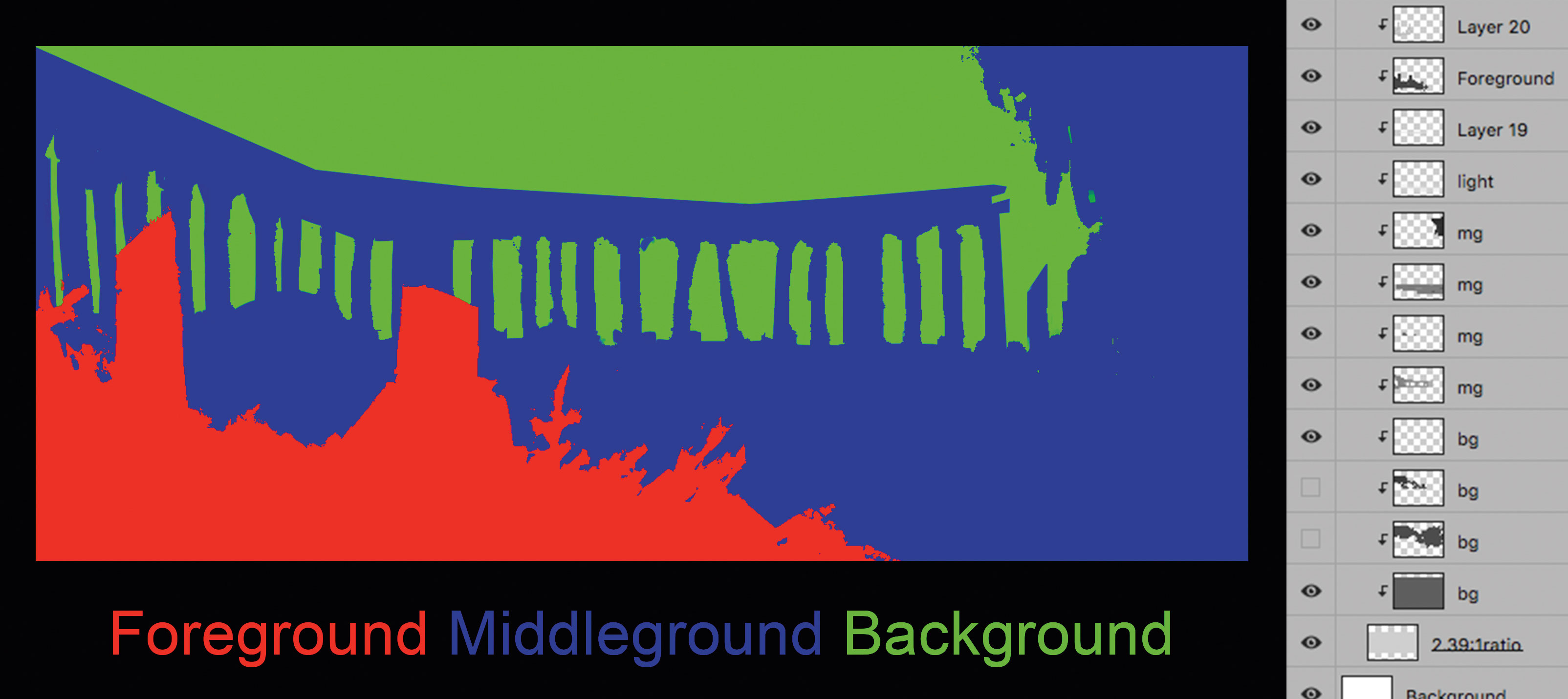
I always divide my values into three sections: fore-, middle- and background. Each structure divides into more values within the range of the group. You can generate more depth by creating an overlap of shapes. I recommend designing your shapes within a larger structure.
09. Creating a sense of space

My image will help you see how I create a sense of space between each ground structure. Overlapping light and dark values will help to create depth. You can adjust your value range in Image>Adjustment>Brightness/ Contrast. This approach will help you group your values.
10. Local colour considerations
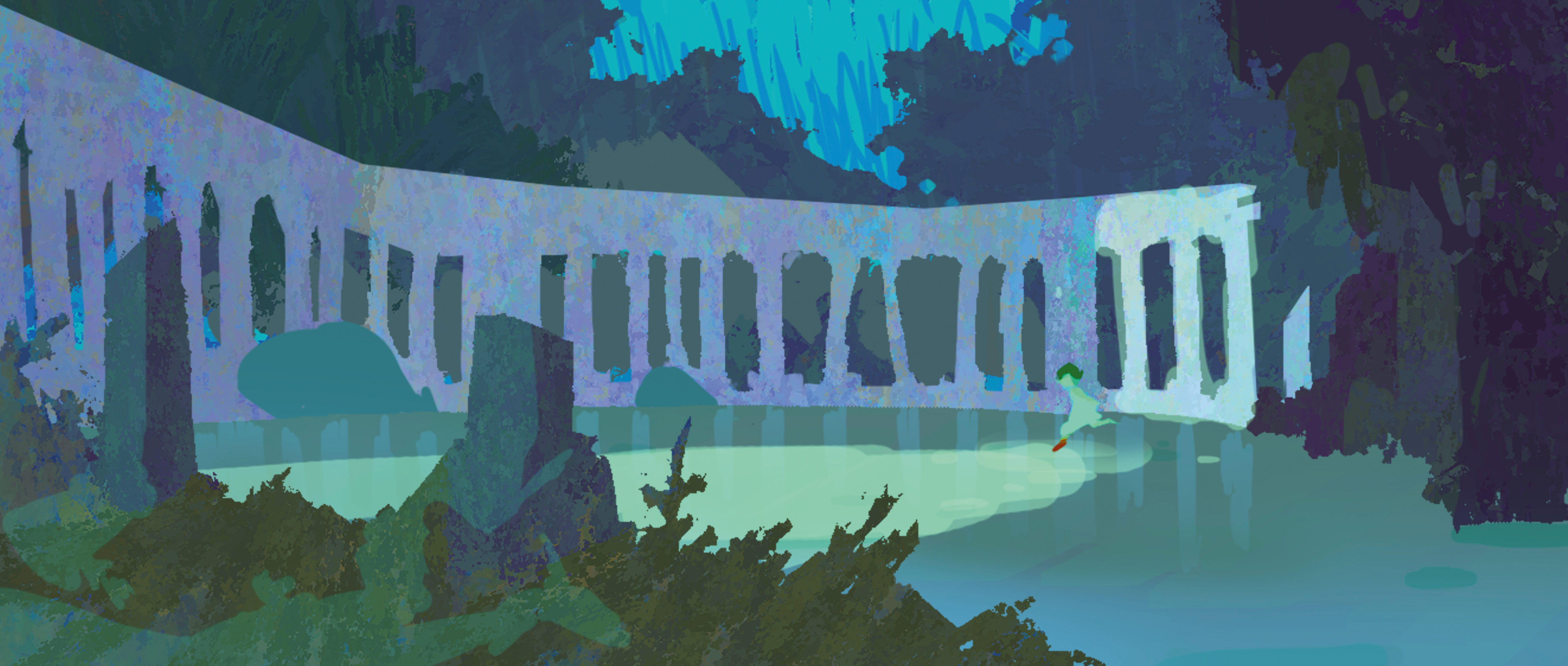
You can use any colour you like, but it’s crucial to focus on your value structure. Furthermore, try to use a colour or hue that’s next to each other on the colour wheel. It will help to create harmony in the scene. Don’t be afraid to play around with colours. You can always use a Hue/Saturation layer to change them.
11. Refine colours and add lighting
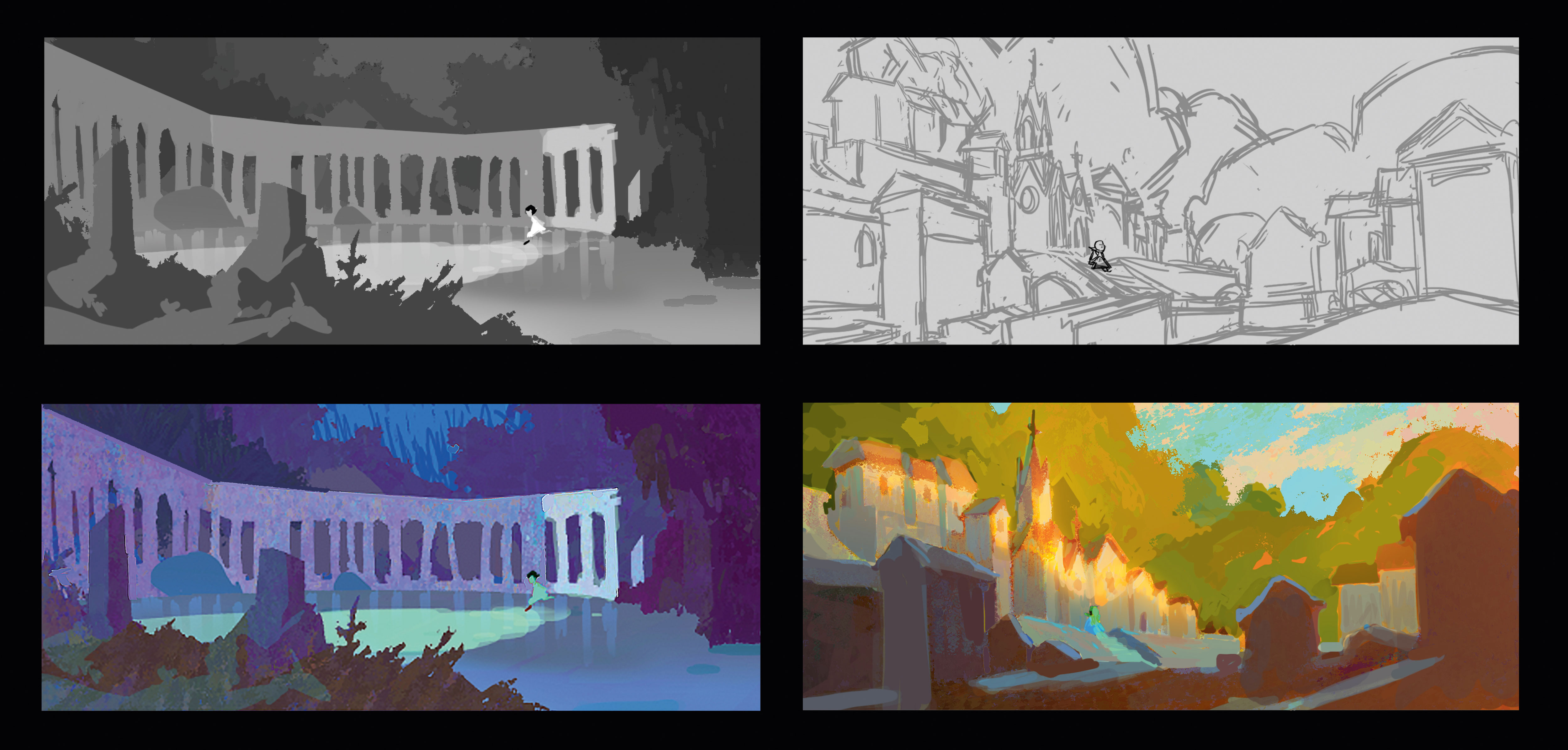
I add more blue and purple to my local colours. You can change your colours by using the Hue/Saturation tool or Color Balance adjustment layers. Next, I use a Hard Light adjustment layer to light the scene: this will mix colours of light and the local colour of your choice.
12. Start painting into the environment
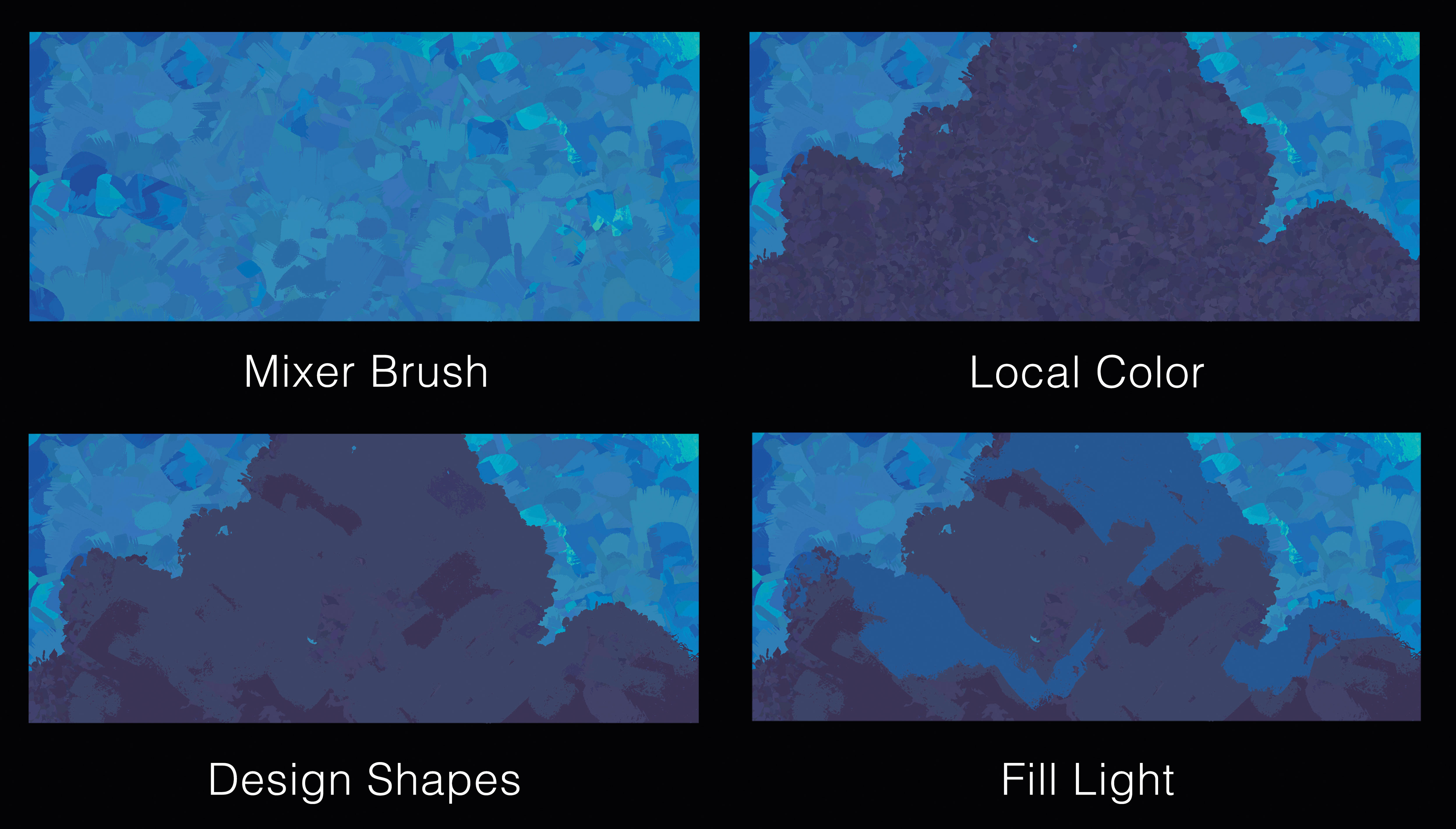
First, I use the Mixer brush to generate variations of colours. I add the local colours of an object and then design shapes that enable you to direct the viewer’s eyes. Note that to achieve this, your shapes must stay within a similar value zone.
Working with colour is identical to building up a value structure, and you can spend time playing with individual colours within that particular range of colours, to see what works best.
13. Identify compositional flaws
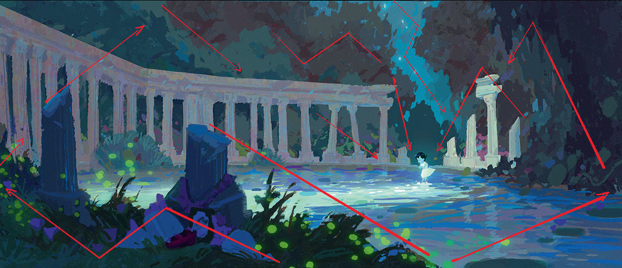
I make a huge change at this point. The ghost girl’s value is too close to the column on the back. My solution is to remove the column and make a zig-zag shape instead (refer back to my advice from step four).
Remember that light over dark shapes generates depth and makes an object easier to read. Here, the sky and the forest are framing elements that work together to enhance my focal point.
14. Read it once, then read it again
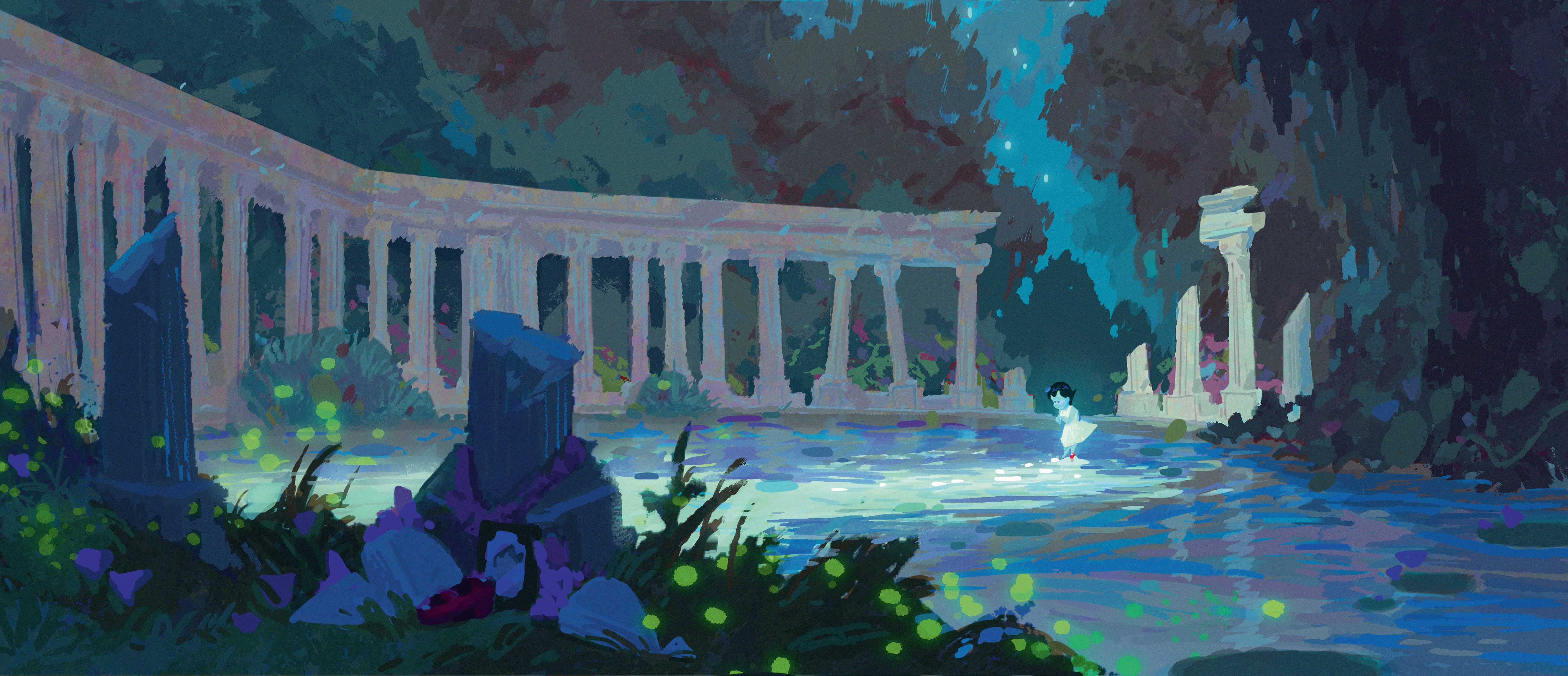
The first thing that catches your eyes in this painting is the ghost girl, and the second is the grave-side objects next to the column in the foreground. The girl’s bright red shoes help to make the connection with the tombstone. And so this scene is about a little girl who passed away in this pond. She’s looking at the pond, but she can’t see her reflection. And that’s my story in a single painting!
This article was originally published in ImagineFX, the world's best-selling magazine for digital artists. Subscribe to ImagineFX.
Related articles:

Thank you for reading 5 articles this month* Join now for unlimited access
Enjoy your first month for just £1 / $1 / €1
*Read 5 free articles per month without a subscription

Join now for unlimited access
Try first month for just £1 / $1 / €1
Simon is a visual development artist who’s worked at Pixar, and is now at Titmouse, Inc as a layout designer.
