How to paint a cityscape with blocks of colour
You can tackle a busy cityscape by working with blocks of colour and layers.
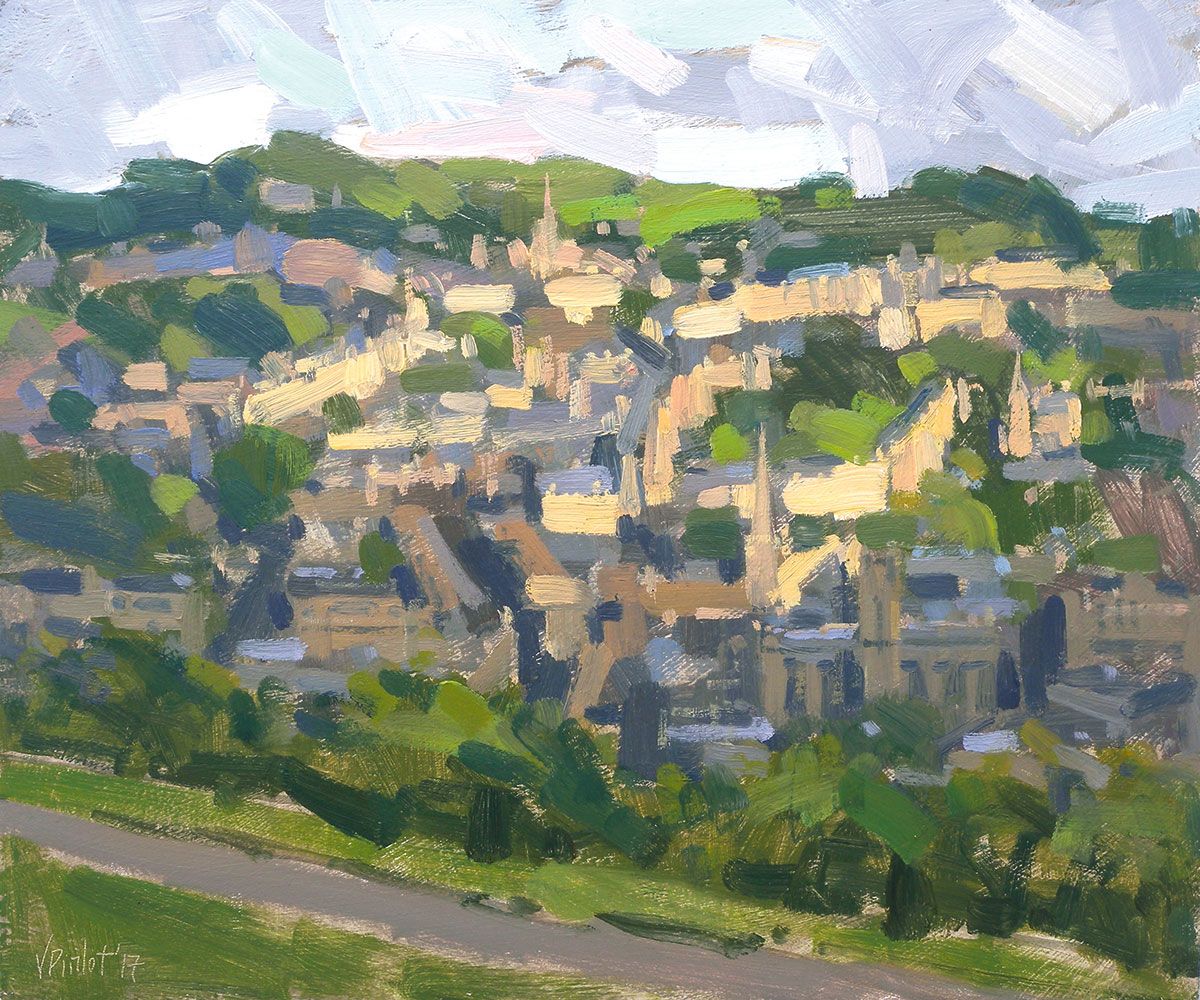
Breathtaking views, stunning skylines and beautiful cityscapes make great photographs, but can be rather daunting from the artist's point of view. The amount of details can be overwhelming and it is difficult to know how to draw and paint it all.
Instead of capturing all of the detail, try to view the scene in an abstract way, as a series of shapes and colours, or patches of light and shadows. Squinting is one of the best things you can do to break down a busy scene.
In this step by step oil painting tutorial, I'll show you how to simplify a complex cityscape and work layer on layer to build the painting. I painted this in plein air, but there's nothing stopping you from applying the same method when working from a photograph. When working outside, one of the greatest challenges is capturing the changing light. When I was painting, the clouds kept moving, so I had to choose which area I wanted to be in the sun, and then wait for the right moment to carry on.
Finally, just remember to have fun and don't worry too much if you have forgotten a house here, a tree there or even an entire street! What matters is that you capture the essence of the place in a personal and convincing way.
01. Add ground colour
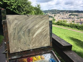
As usual, I cover my blank board with a ground colour so I won't have to fill every gap at the end. This also helps achieve colour harmony in the piece. Make sure you pick a colour that is present in the scenery so it can be used in the final painting. The ochre here can be seen in the stone of the buildings.
02. Create a basic drawing
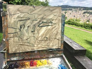
The clue is in the word 'basic'. A cityscape is so complex that it would take hours to draw every single house and street. Instead, remember to approach the scenery in an abstract way and only lay down a few marks that will help you locate these elements. Here, I've drawn the placement of the green areas as simple blocks that will help show the limits between buildings and trees.
03. Block in the greens
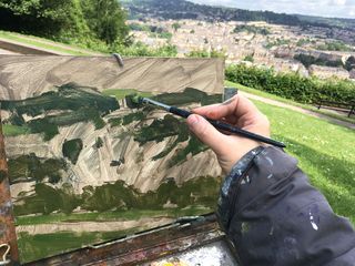
Roughly fill in the outlines with various shades of greens. Have fun with big bold brushstrokes and don't worry about making it look neat or accurate. Just make sure you use more than one green to depict the variety of the vegetation and give a sense of distance too. The elements in the distance should be cooler, or bluer. The negative spaces left represent the sky and the buildings.
Get the Creative Bloq Newsletter
Daily design news, reviews, how-tos and more, as picked by the editors.
04. Paint the dark tones
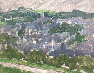
I'm one of many artists who prefers working dark to light in oils. This is why I've decided to paint the dark areas of the buildings first. Look at the colour of the shadows in the cityscape and use this to cover most of the canvas with spontaneous brushstrokes. Loosely suggest some key elements (like a church or a street) with some stronger marks.
05. Add the middle tones
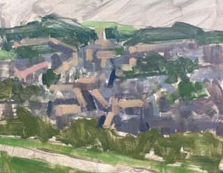
Load your brush with a middle tone present in the cityscape and start 'sculpting' your painting with directional brushstrokes. The aim is to depict large elements as solid blocks (such as a street or a row of houses). Remember to squint a lot to simplify the scene and detect what stands out. Don't worry if the painting doesn't look great at this stage, it will come to life in the next step.
06. Create highlights
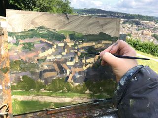
All the groundwork has paid off, this is now the fun part of the painting. Use a smaller detail brush and load it with the lightest colour seen on the buildings. Apply the paint where you can see the brightest highlights of the cityscape, where the sun hits the buildings. Try using and mixing various light colours (such as light yellow, pink and white) to bring interest and variety to the scene.
07. Block in the sky
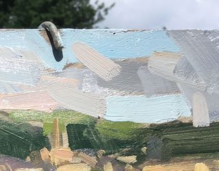
It is now time to capture the sky and its moving clouds. My biggest tip is to avoid too much blending. Instead of filling the whole space with blue and then adding some clouds, I recommend treating the sky as blocks of different colours (white, pink, blue and grey) and applying the paint in each block without feeling the need to merge. This will convey a sense of structure and energy.
08. Brighten up greens
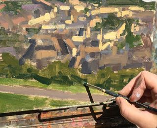
The previous steps have helped capture the essence of the scene. What the painting needs now is more details, structure and contrast. The green blocks painted at the start have been partly absorbed by the board surface and now look a bit dull. They need more definition. Look at the view, squint, spot the darkest green areas in the scenery and reproduce them on your painting.
09. Add light green
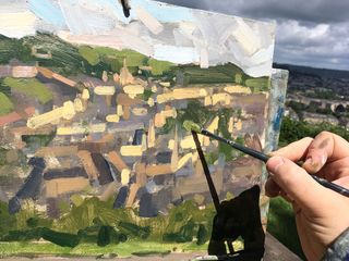
You can now do the same with the highlights of the greens. Add touches of light green where the sun hits the trees and the grass. Remember to use different greens depending on what you are painting – the colour of a patch of grass is usually more saturated than a group of trees. Avoid blending the paint too much and try to keep your brushstrokes fresh and spontaneous.
10. Work on shadows
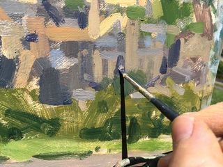
The aim of this step is to bring more contrast to the buildings and street, and redefine the drawing of the scenery. Use a small brush and make sharp, directional marks to clearly define items in the shadows, such as house facades and sections of streets. Don't forget to keep looking and squinting at the scenery to spot the darkest areas that need emphasising.
11. Take a step back
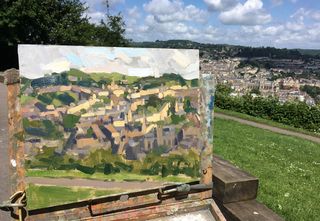
It's time to stand back from the easel and assess the painting. All the elements in the scene have now been addressed and there is a satisfactory sense of composition, light and shadows. The painting could benefit from applying final touches, such as sharpening the spires on the churches, and adding finer details – the suggestion of chimneys and windows, for example.
12. Add final touches

Adding finer details can sometimes be easier when the paint has dried a little, so I went back to the studio and applied those final touches later in the day with a steadier hand and fresher eyes. Only a few brushstrokes were needed to finish the painting. I like to keep my style loose and fresh, but there's nothing stopping you from adding more details if you prefer a more refined result.
This article was originally published in issue 12 of Paint & Draw, the magazine offering tips and inspiration for artists everywhere. Buy issue 12 here.
Related articles:

Thank you for reading 5 articles this month* Join now for unlimited access
Enjoy your first month for just £1 / $1 / €1
*Read 5 free articles per month without a subscription

Join now for unlimited access
Try first month for just £1 / $1 / €1
Originally from Belgium, Valérie has lived in the UK for the past 11 years. She works mainly in oils and enjoys working plein air.
