How to master 3D fan art
Here's a detailed look development workflow for creating TV's Daredevil character.
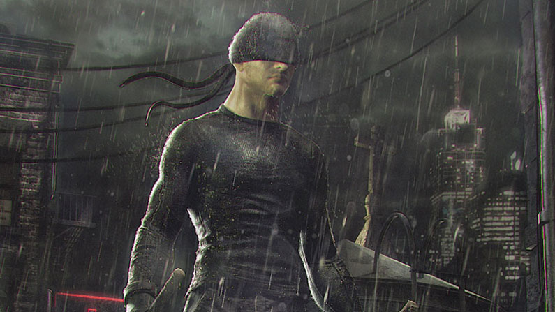
After watching the first season of the TV series Daredevil, I knew I had to make my own 3D art of the Daredevil character wearing his black vigilante suit. For this scene I really tried to create a likeness of the actor Charlie Cox and get the overall dark feeling of the show. Creating that feeling was actually more complex than I imagined, since it’s very dark and contrasty. I therefore had to tweak a lot of the lighting and the shaders to get the look I wanted.
First, I planned my scene and my composition, gathered a lot of images from the show and concept art of the Daredevil comics, then I started breaking down what tools I would need to complete my character. From the beginning, I knew the most challenging process would be creating the rain and 'wetness' because of the amount of machine resources used to achieve this.
I used Maya and ZBrush for modelling and sculpting, Mari and Quixel for texturing, and V-Ray as the main renderer
The main tools I used were Maya and ZBrush for modelling and sculpting. I spent a good amount of time doing the anatomic features so I didn’t have to go back to this process. I used Mari and Quixel for texturing, and V-Ray as the main renderer.
Everything was rendered in 32.bit .exr passes and every light was a different pass. This way, I had full control of the scene and I could play with intensity, saturations, contrast and other things in Photoshop.
This tutorial will demonstrate my look development workflow, which will hopefully be useful to you. I choose to do most of my personal projects so that they can fit into a cinematics or a VFX pipeline. Let’s get started!
Find all the assets you need here.
01. Blocking the Mesh
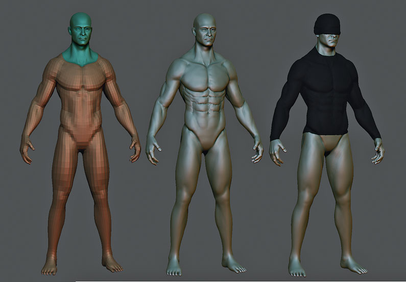
Once I have the base mesh with the right topology and proportions, I sculpt the anatomy and the facial features. I then polygroup the face so I can split it later on and go higher with the amount of polygons. Once the whole mesh is finished, I start testing the clothes by extracting geometry from the main mesh. For sculpting anatomy, I only use simple brushes – usually six: Standard, Clay, ClayBuildup, Dam_Standard, Move and hPolish.
Get the Creative Bloq Newsletter
Daily design news, reviews, how-tos and more, as picked by the editors.
02. Refining the Shirt
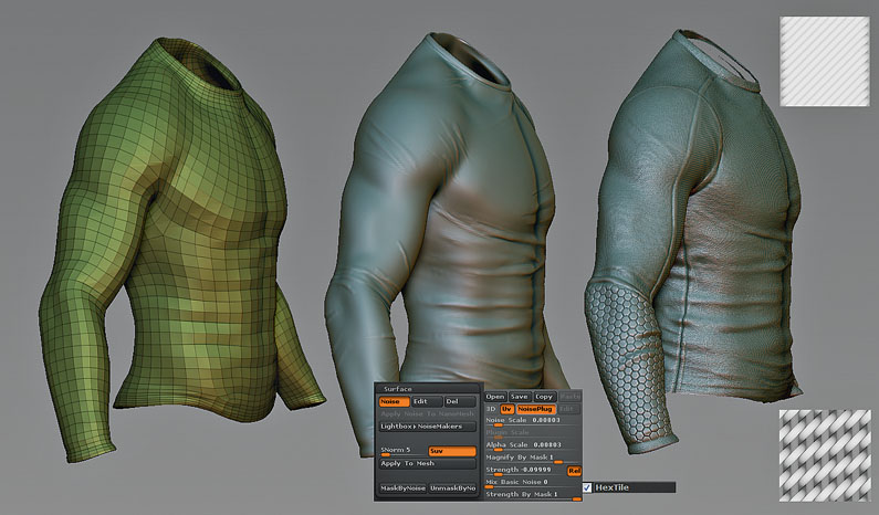
When I’ve got the right topology for the shirt, I then start sculpting the folds. Since it’s a very tight garment and it’s going to be wet, the folds have to have that close-to-the-body feeling. I decide to do the fabric pattern in the modelling process, instead of the texturing. So I choose two tileable images; one for the overall body of the shirt and another for the half sleeves. Then for the arm pads I apply the HexTile pattern to the Surface Noise tab.
03. Refining the trousers
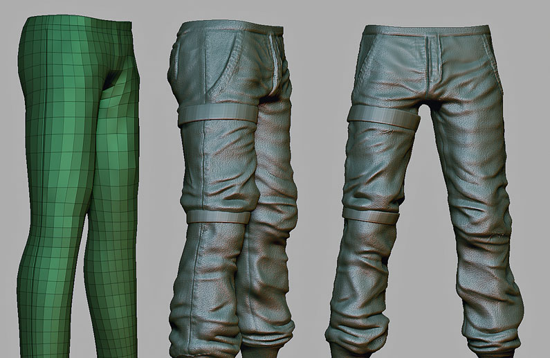
For the trousers, I use a similar process to the shirt but this time the folds are much more intense, as the fabric is much thicker and looser. I also need to have the necessary tension in the right leg with the stick holders, which are tightening the cloth. For the folds I use the Standard, Slash 3, hPolish and Dam_Standard brushes.
04. Seams and Stitches
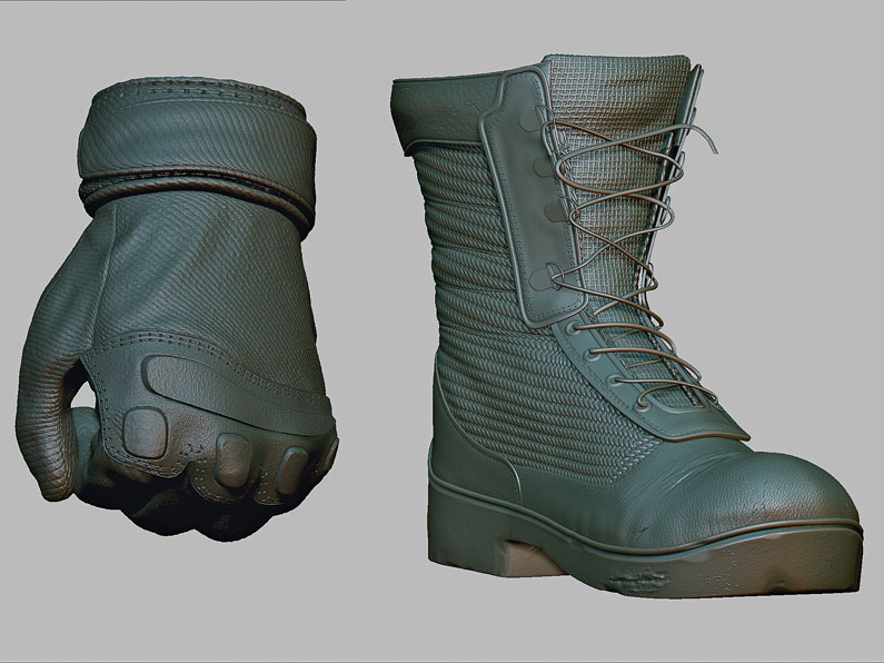
After the refinement on the details I add the stitches and seams using the Dam_Standard and the Standard brush, with an alpha applied and with the Lazy Mouse function enabled. You can use this process when texturing, or directly in the normal map, however I always try to incorporate it into the modelling process.
05. Displacement Map
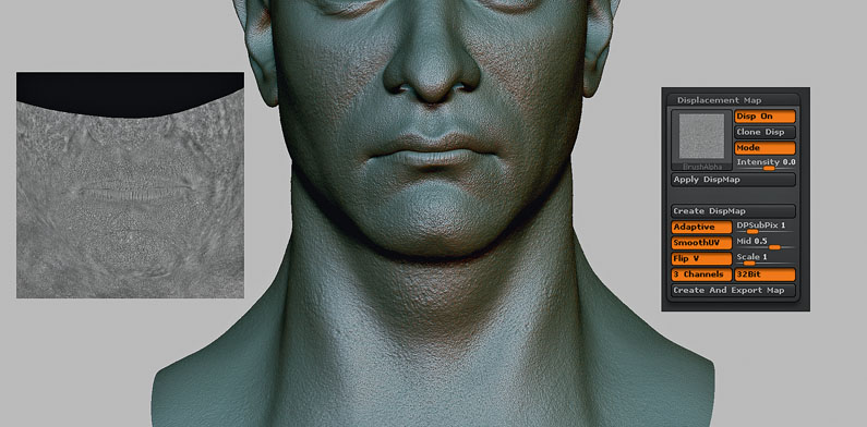
Before I start the colour texturing in Mari, I import the face mesh and make a Displacement Map using desaturated scan data. Then with the map I created in Mari, I import a Displacement Modifier into ZBrush, which I bake to the model. I then add the extra sculpting detail, particularly the wrinkles that the actor has. This is what I export as my 32.bit Displacement Map.
06. Testing surface maps
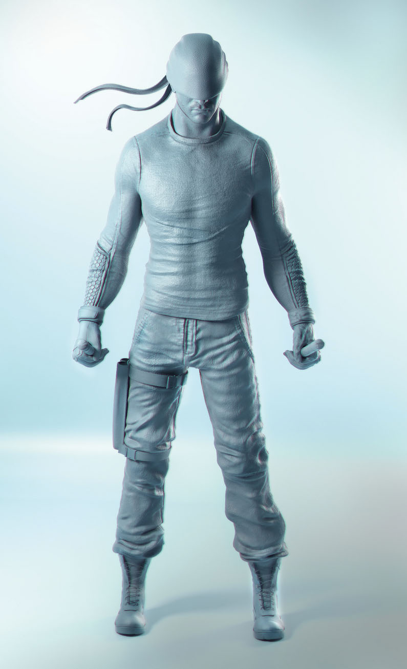
When using displacement or normal maps, it’s always tricky to know if the intensity is good enough. So once I have all the surface maps for the character, I move to Maya and create a studio two-point lighting and make a rough Clay Shader for every map I use. I then test this in V-Ray. It helps me to notice the tweaks I need to make to the maps. I then export again, so I have everything ready to paint the texture.
07. Texturing in Mari

I like texturing faces in Mari because you have a huge range of actions and resources available. I start using procedural layers for the base colour. I then add photographic information and some adjustment layers in saturation and contrast. Finally, I hand paint the stubble. Once the colour map is ready, I move to the secondary maps such as Specular, Gloss, SSS, SSS Amount, Second Specular and Gloss.
08. Texturing Clothes
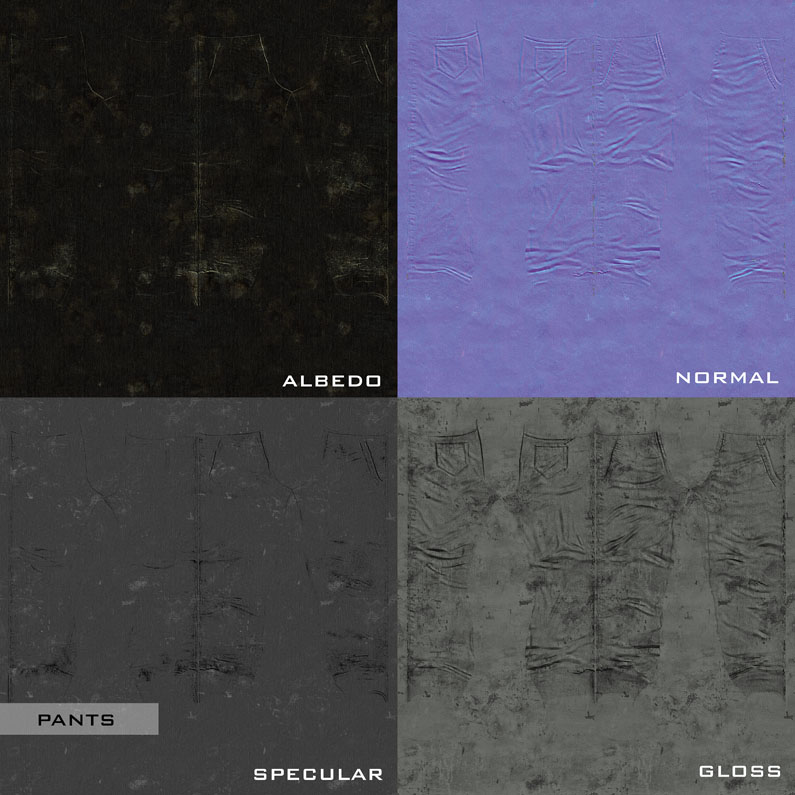
For the clothes I use the Quixel suite. This is a great tool if you want to reduce your time painting textures, as you basically work on every map at the same time and have the freedom to go and tweak each document. For the fabric, I use the smart materials and tweak the masks in gloss and specular. I then add some dirt and tear all inside Quixel and do some tweaking directly in the maps in Photoshop.
09. Hair and Stubble
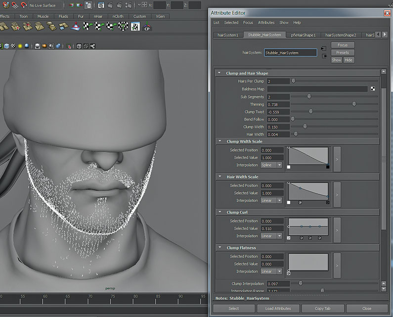
I use the nHair system for creating the hair and stubble. Using nHair with the VRayHairMtl you can achieve a very realistic look. I set up three hair systems in order to have different variations in the behaviour of the flow of hair, and also in tone, scale and width.
10. Look Development Viz
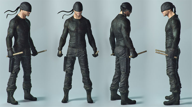
With everything now set, it’s time to press render and see how the character is looking. For the look development preview, I set a studio three-point lighting and a HDRI, just as environment lighting. This helps a lot when tweaking your shaders, especially the hair and skin, because these are probably the most difficult shaders in which to achieve a natural look.
11. Prop texturing in Quixel
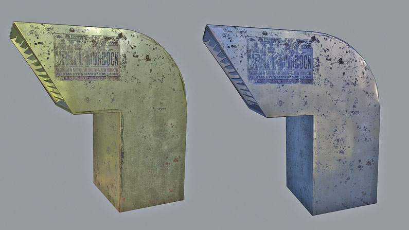
Every asset and prop in the scene is textured in Quixel, but this time instead of using its 3DO viewer, I use Marmoset for testing the textures. I follow a specular/roughness PBR pipeline; this way I know if it looks good in Marmoset, in V-Ray it will look even better. Since V-Ray doesn’t support a roughness slot, you just have to invert your map and plug it into the glossiness slot, and the specular map into the reflection slot.
12. Scene assembly
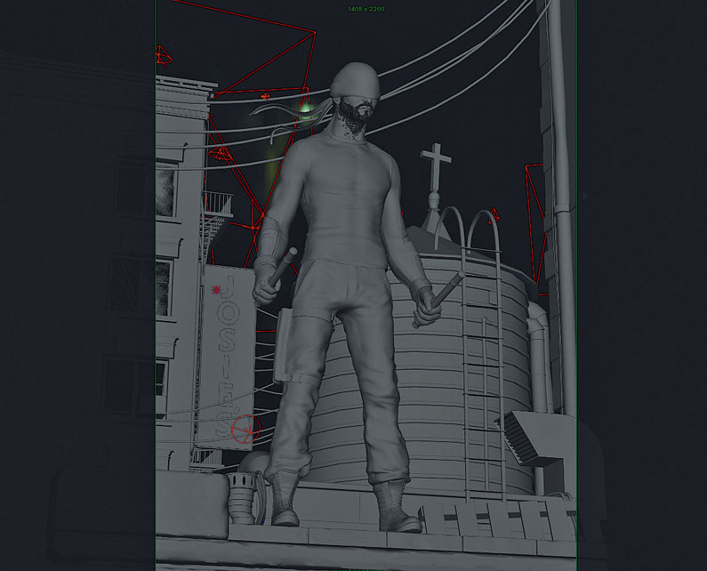
Now it’s time to render the final image. It’s important that the composition layout is good so it’s wise to give your scene depth by overlapping. Overlap your objects as much as you can, this way your image will read better and you’ll get the depth you need. I set around 12 lights for the whole scene, so I can get the light mood I want.
13. Compositing the Passes
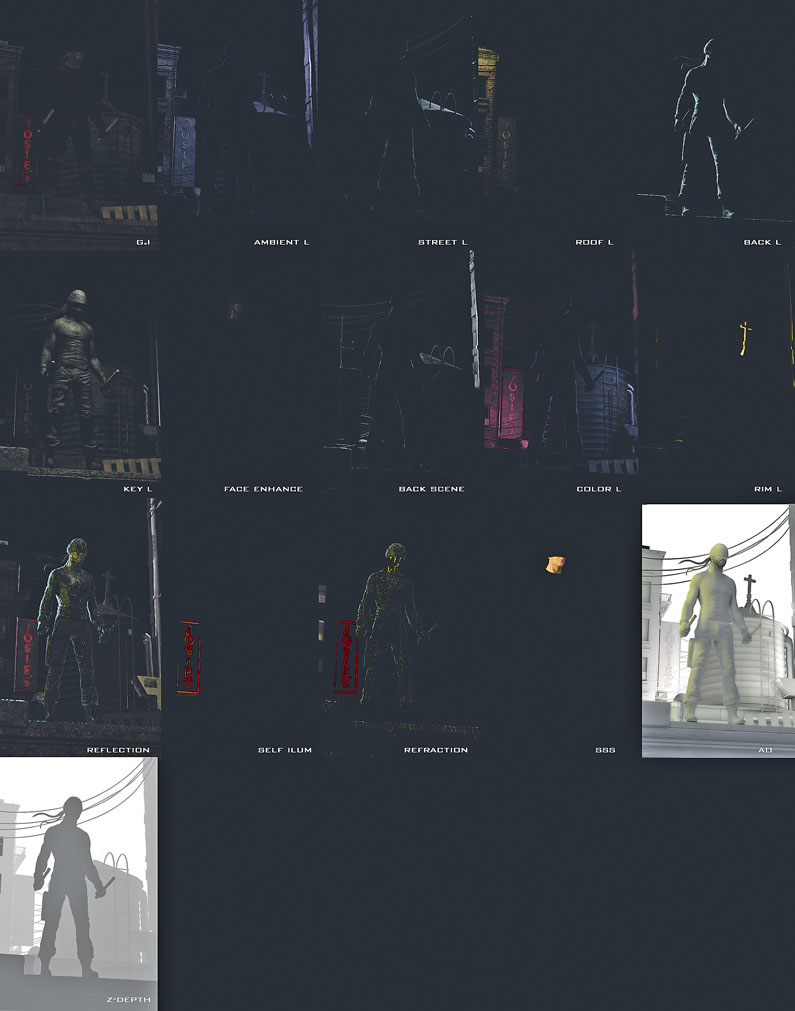
Each light is a separate pass, to give full control over the image. I end up with 25 passes in Photoshop. For the compositing, I set the ambient lights and GI then multiply the ambient occlusion. I add the light passes using the Linear Dodge or Screen Blending mode, and above the lights I add the SSS, self illumination, reflection and refraction using the same blending mode. At the top I use the Z-Depth, colour correction layers and post effects as the smoke.
This article originally appeared in 3D World magazine issue 211; buy it here.

Thank you for reading 5 articles this month* Join now for unlimited access
Enjoy your first month for just £1 / $1 / €1
*Read 5 free articles per month without a subscription

Join now for unlimited access
Try first month for just £1 / $1 / €1
