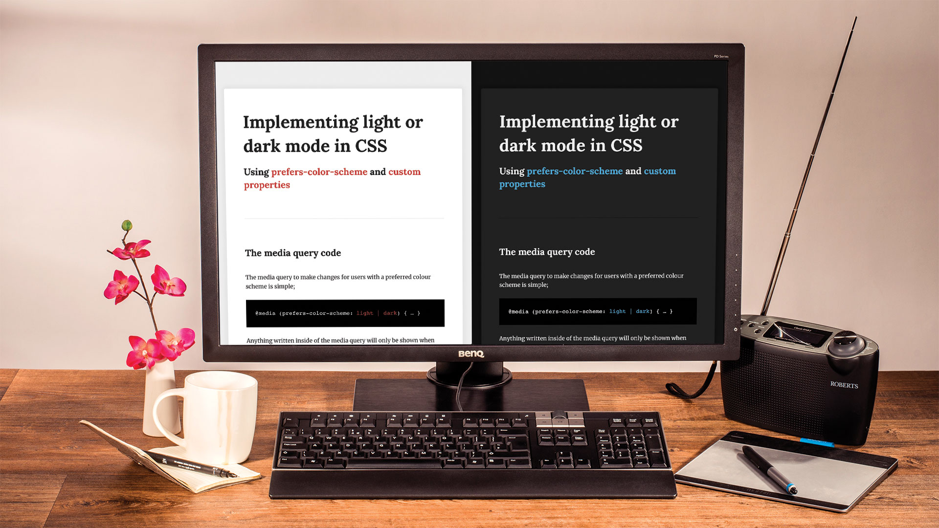
How to implement light or dark modes in CSS
Use the 'prefers-color-scheme' media query to implement light and dark themes.
Sign up to Creative Bloq's daily newsletter, which brings you the latest news and inspiration from the worlds of art, design and technology.
You are now subscribed
Your newsletter sign-up was successful
Want to add more newsletters?

Five times a week
CreativeBloq
Sign up to Creative Bloq's daily newsletter, which brings you the latest news and inspiration from the worlds of art, design and technology.

Once a week
By Design
Sign up to Creative Bloq's daily newsletter, which brings you the latest news and inspiration from the worlds of art, design and technology.

Once a week
State of the Art
Sign up to Creative Bloq's daily newsletter, which brings you the latest news and inspiration from the worlds of art, design and technology.

Seasonal (around events)
Brand Impact Awards
Sign up to Creative Bloq's daily newsletter, which brings you the latest news and inspiration from the worlds of art, design and technology.
The CSS specification is ever-evolving. The process for implementing new features in CSS is complicated, but the simplified version is that the CSS Working Group decides on the new elements to be added to the specification. It is then up to the browsers to implement these new elements, and the browsers choose in which order to implement them, which is why we now have a mismatch of support for new features. While this may be annoying at times, it's a much better way to do it than the browsers implementing the full specification, as we saw in the early days of the web. If you're worried about your site working to its full capability, enlist the support of a supportive web hosting service.
All this sound like too much work? Keep things simple with a website builder.
The CSS Working Group is made up of members from all major browser vendors and other technology companies like Apple and Adobe. Apple, having recently launched its new version of MacOS, wanted a way to detect its snazzy new dark mode in the browser. In order to do this, Apple pushed a recommendation to the specification for a new level 5 media query.
@media (prefers-color-scheme: light | dark)
{ … }
Using this media query, we can detect if the user is currently using light or dark mode in the OS. At the moment this is only supported by Safari Technology Preview 69 and above, but the other browsers shouldn't be far behind.
In order to test this you will need to be upgraded to Mojave 10.14 (MacOS) and have selected Dark appearance in System Preferences. There's a few ways we can use this new media query to implement different themes. We'll explore a few of them now in this tutorial.
01. Set up the page
To begin, we need to create some HTML elements to style, so we'll start by creating a new pen on CodePen and adding some elements. We'll add a container for our content, in order to centre it, and some headings and text. We'll set the CSS to use Sass in order to use nesting in CSS.
<div class="content-container">
	<h1>Heading One</h1>
	<h2>Heading Two</h2>
	<hr>
	<p>…</p>
	<p>…</p>
</div>
02. Style basic elements
Next we'll add some basic styles and include some fonts from Google in order to make our page look a bit nicer. We'll style all of our basic elements, applying new font sizes, colours and fonts.
Sign up to Creative Bloq's daily newsletter, which brings you the latest news and inspiration from the worlds of art, design and technology.
body {
	font-family: 'Merriweather', serif;
	background-color: #ededed;
	color: #212121;
	padding: 1.618rem;
	line-height: 1.618;
	font-size: 16px;
}
03. Style container
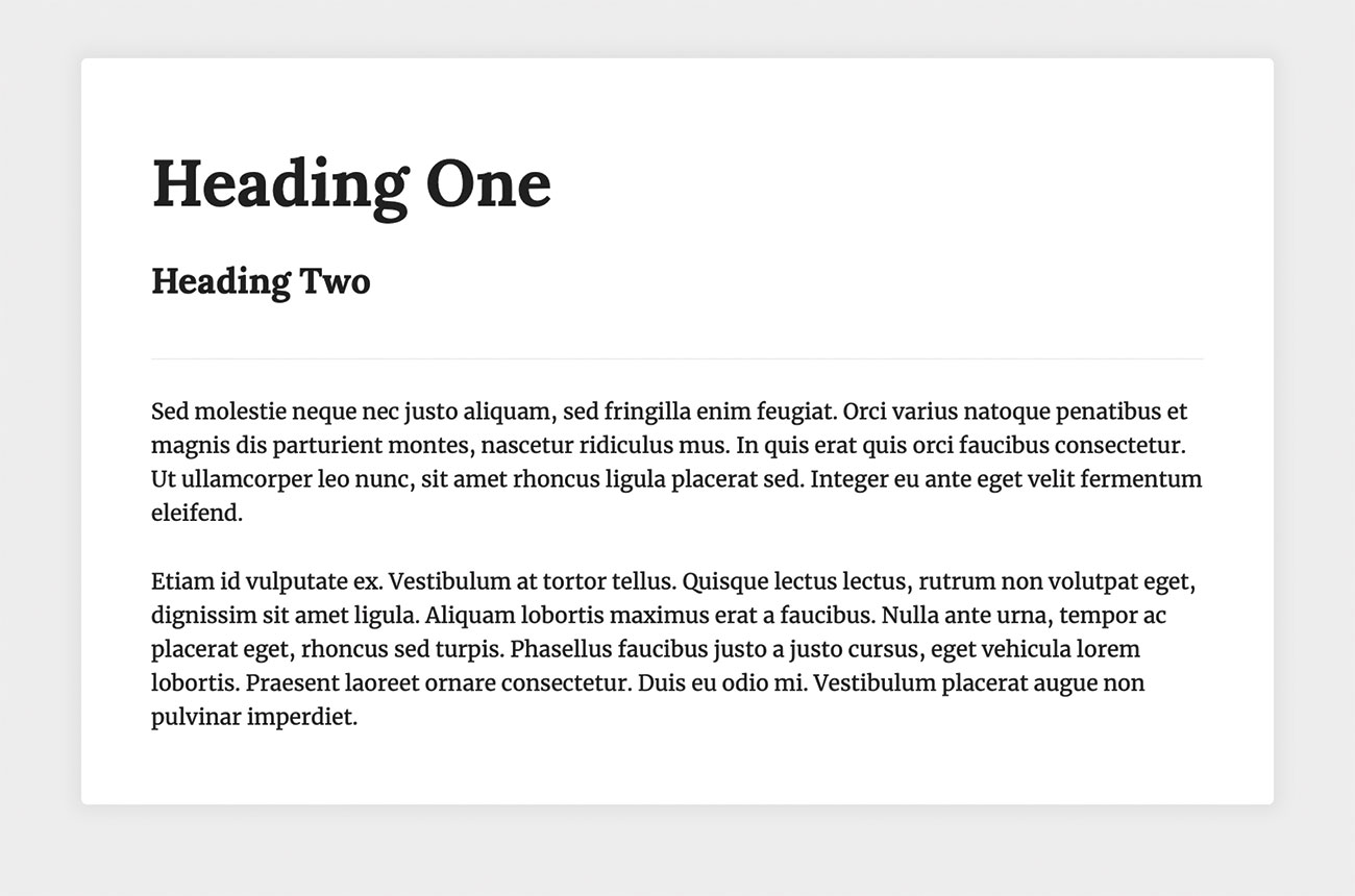
Next we'll style our container to make the content a comfortable line length for reading. We'll also add a background colour and drop shadow. In order to centre the content box in the page, we'll use the keyword 'auto' on the margin properties' left and right values.
.content-container {
	padding: 1.618rem 3.236rem;
	max-width: 48.54rem;
	margin: 3.236rem auto;
	background-color: #fff;
	box-shadow: 0 0 12px 6px rgba(0,0,0,0.05);
	border-radius: .269666667rem;
}
04. Add highlight colour
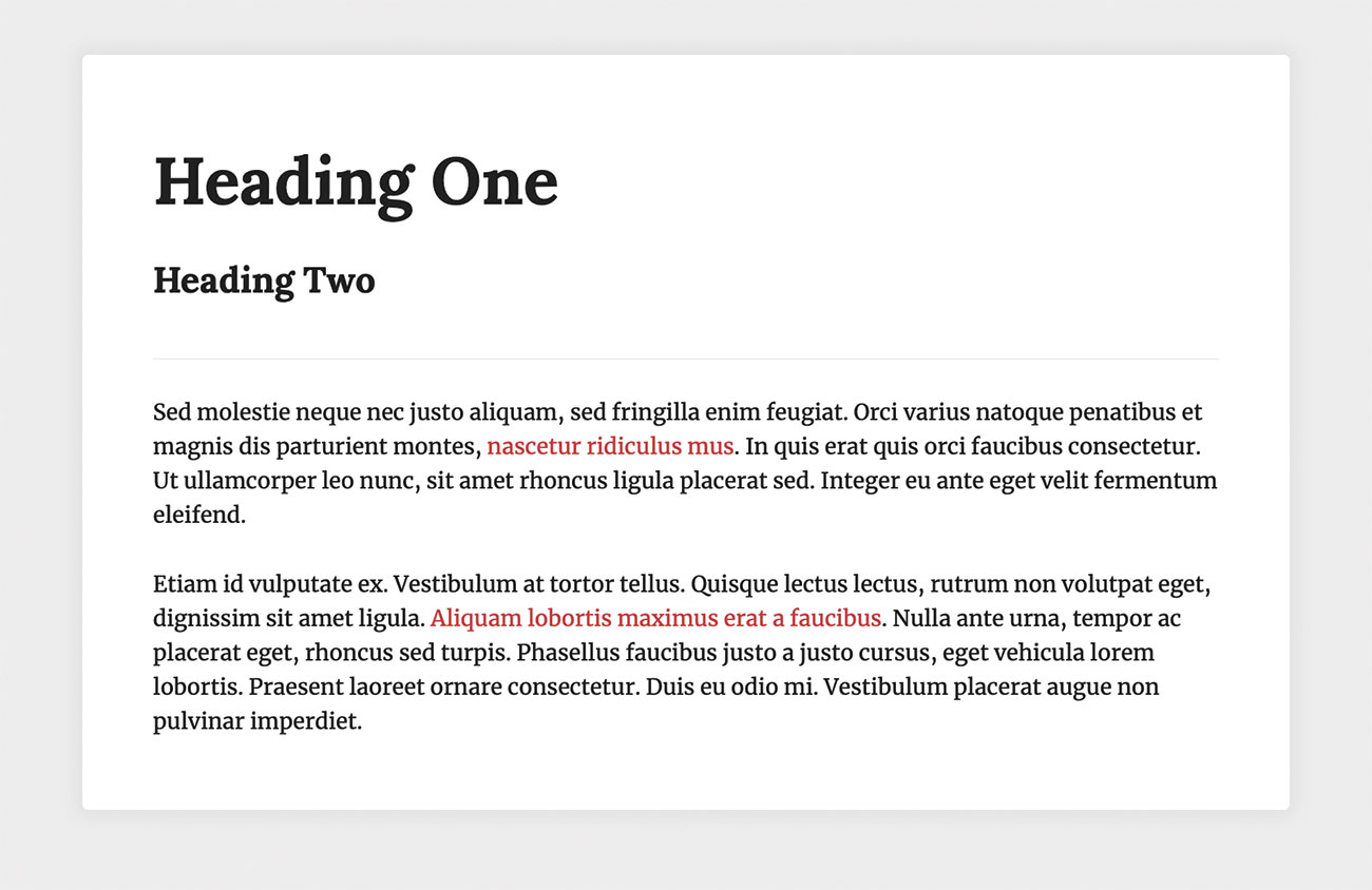
Most websites make use of colour somewhere, and at the moment we only have whites and greys, so now let's choose a highlight colour and create a style for applying this colour. We will apply the colour using a span tag, and will use it to highlight something in our content.
<span class="text--alpha">Lorem ipsum</span>
.text--alpha {
	color: #c3423f;
}
05. Implement the media query
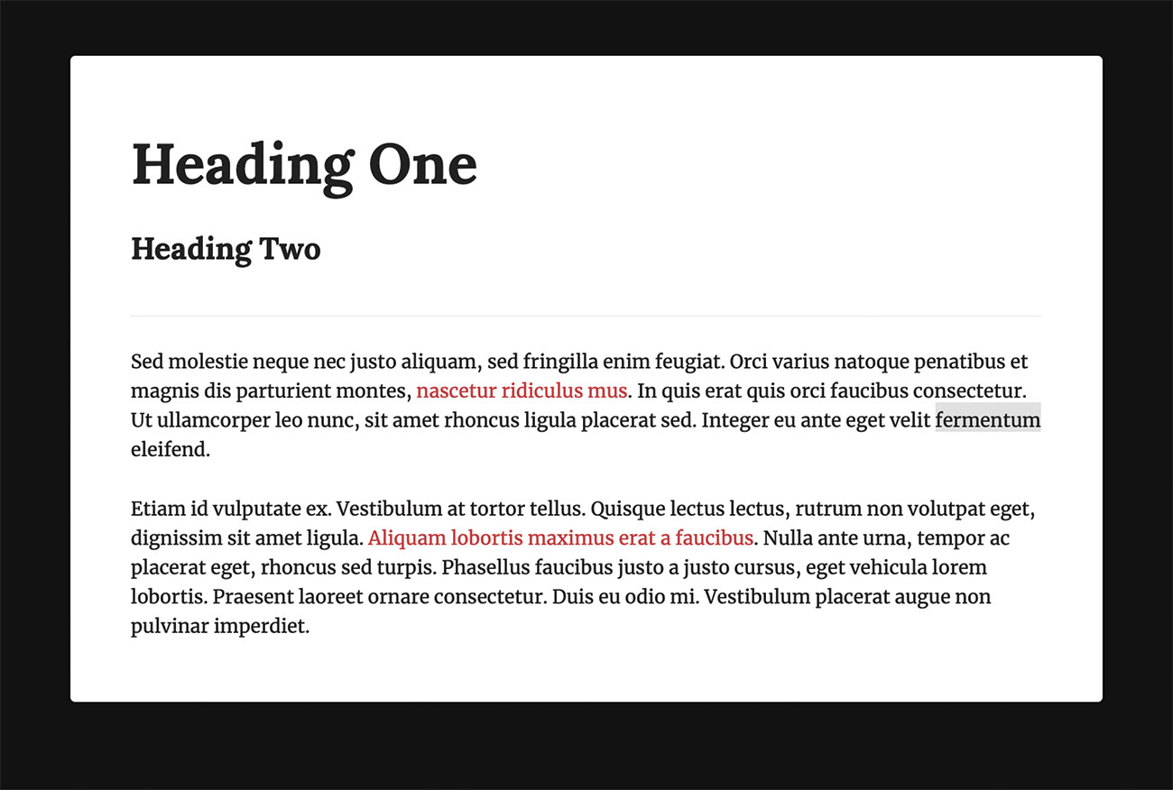
Now we have a page with some basic styles, let's look at ways we can implement the media query. Let's include it and start overriding some of our styles. We'll start with the body styles.
@media (prefers-color-scheme: dark)
{
	body {
		background-color: #111;
	}
}
06. Override the remaining styles
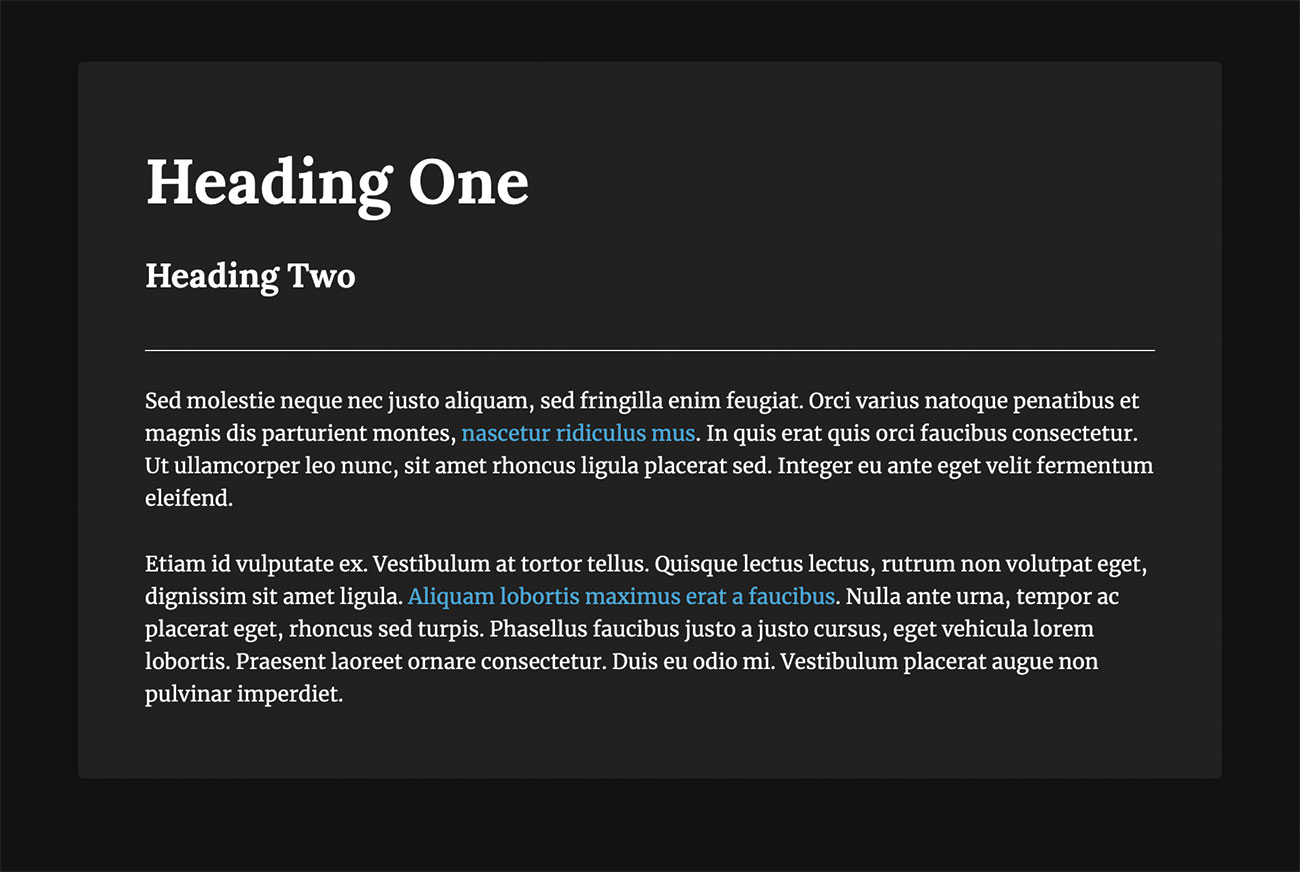
Now that we can see the media query is working and our body background colour has changed, we need to override all of our remaining styles.
.content-container
{
	color: white;
	background-color: #212121;
}
.text--alpha {
	color: #50a8d8;
}
07. Maintainability
While what we've just done works perfectly well for our demo and could be maintained on smaller websites, this method would be a nightmare to manage on a larger project, with lots of different elements that all need overriding. We're also making heavy use of the cascade in our example above, whereas a large system may require more specificity in order to target all elements.
08. Take another approach
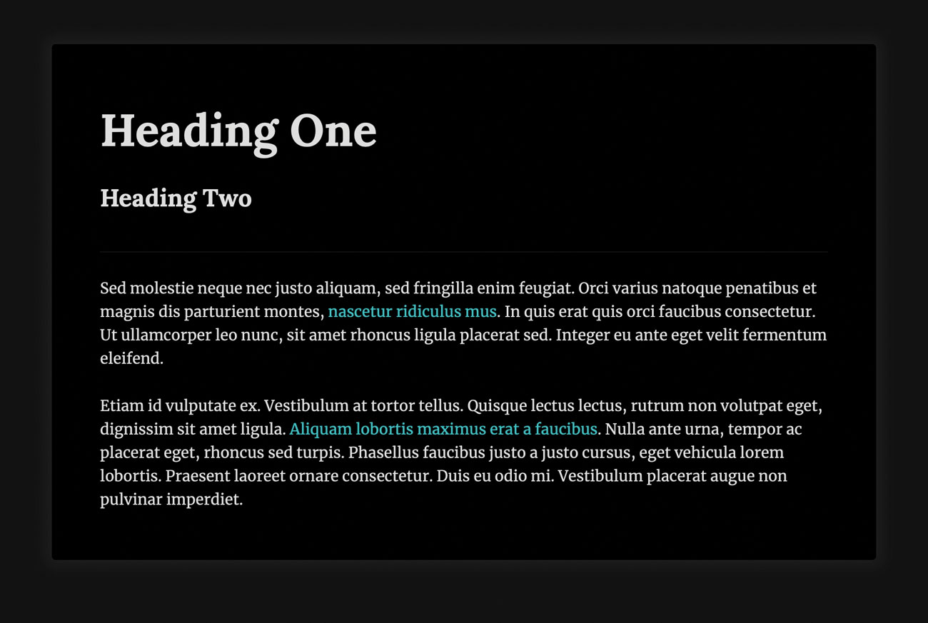
So how else can we tackle the problem? Let's look at CSS filters. One of the values we can use on CSS filters is 'invert', so we could just apply this to the HTML and invert all of the colours, giving us a 'dark mode'.
@media (prefers-color-scheme: dark) {
	html {
		filter: invert(100%);
	}
}
09. Add images

While the filter method works with the content we have in our document it still doesn't look great – our box shadow, for example, has also inverted, which looks quite strange. We have lost control over the styles, which becomes an even bigger problem when you have coloured backgrounds. We also have a whole new problem to consider when images are involved. Let's see what happens when we add an image to our page.
10. Use custom properties
The methods we've explored so far either cause us to lose control over the styles or require a lot of maintenance in order to make sure everything is updated in dark mode. There's another way we can approach this: we can use custom properties in order to define our colours and then override them using the media query.
11. Create custom properties
In order to use custom properties, we define them at the top of our CSS inside the ':root' element. The root element has the same scope as HTML so will be available globally. We need to decide on the variable names and define their values.
:root {
	--background-color: #ededed;
	--page-background: #fff;
	--text-color: #212121;
	--color-alpha: #c3423f;
}
12. Apply our custom properties
Now we have some custom properties defined we can use them in our CSS. We'll start with the body and apply the background and text colours. In order to use a custom property we use the 'var(--custom-property-name)' syntax.
body {
	background-color: var(--background-color);
	color: var(--text-color);
}
13. Apply remaining properties
Using the same method, we can also update the 'background-color' of our container and the 'color' of our 'text—alpha' class to use our custom properties. All of the colours in our page are now controlled using custom properties.
.content-container {
	background-color: var(--page-background);
}
.text--alpha {
	color: var(--color-alpha);
}
14. Re-add the media query
Now we can re-add the media query, but this time we can override the custom property values that are inside of it. We will place this right after the original root definition, and inside the media query we can now simply choose new values for all of our colour custom properties.
@media (prefers-color-scheme: dark) {
	:root {
		--background-color: #111;
		--page-background: #212121;
		--text-color: #ededed;
		--color-alpha: #50a8d8;
	}
}
15. Take full control
Custom properties give us full control to choose what colours and other properties we change and use. Let's update the box shadow on our page container to make it less transparent when using dark mode. To do this we need to create a new custom property for the page shadow.
:root {
	…
	--page-shadow: 0 0 12px 6px rgba
	(0,0,0,0.05);
}
16. Apply the shadow
Now we've created another custom property we need to apply it to the correct element on the page. We can then override the value inside our root element in order to reduce the transparency.
@media (prefers-color-scheme: dark) {
	:root {
		…
		--page-shadow:
			0 0 12px 6px rgba(0,0,0,0.33)
		;
	}
}
.content-container {
	…
	box-shadow: var(--page-shadow);
}
17. Add an image
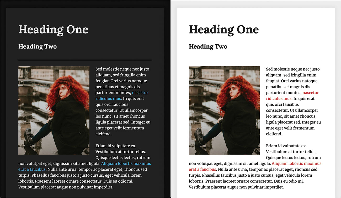
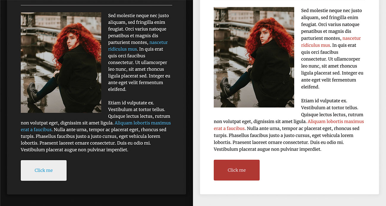
Now let's add an image back into our content, and then we can add some basic styles to float the image next to the content.
img {
	width: 100%;
	height: auto;
	float: left;
	max-width: 300px;
	margin-right: 1.618rem;
	margin-bottom: 1.618rem;
}
As we can see, since we're not using any filters the image is not altered between the two themes.
18. Add more components
Now we've got our custom properties we can keep adding elements to the page and styling them with our variables. Let's create a button class and add a button to our page.
.button {
	display: inline-flex;
	font-family: inherit;
	background-color: var(--color-alpha);
	color: var(--text-color);
	padding: 1.618rem 3.236rem;
	border: 0 none;
	border-radius: 0.25rem;
	text-decoration: none;
}
19. Create button hover styles
Using the same variables, we can also create a hover style that can be used for both themes. In order to achieve this, we will invert the colours when the user hovers over the button and transition those properties in order to make the experience less jarring.
.button {
	…
	transition: background-color 150ms,
	color 150ms;
	&:hover {
		background-color: var(--text-color);
		color: var(--color-alpha);
	}
}
20. Make button custom properties
Custom properties have the same scope as regular CSS elements; this means we can override them using a more specific selector. We can take advantage of this and create some variables that are scoped to our button.
.button {
	--button-background: var(--color-alpha);
	--button-text: var(--background-color);
	background-color: var(--button-background);
	color: var(--button-text);
	…
}
21. Utilise scope
We can utilise this scope in order to create different styles and hover interactions for our button in dark and light themes. We can change the value of our variables based on the media query or the state of the element, instead of repeating the property with a new value as we normally would.
.button {
	…
	&:hover {
		--button-background: #ae3937;
		@media (prefers-color-scheme: dark) {
			--button-background: #2e98d1;
			--button-text: var(--background-
			color);
		}
	}
}
Working on a build with a team? Keep your process cohesive with decent cloud storage.
This article was originally published in issue 283 of creative web design magazine Web Designer. Buy issue 283 or subscribe to Web Designer here.
Related articles:

Steven is a digital creative from Stockton-on-Tees, UK. An experienced Head of UX, Steven has written a number of articles on web design and front-end development, as well as delivering a talk at CSSConf Budapest on the potential of CSS animations. He is currently Head of UX at Aero Commerce.

