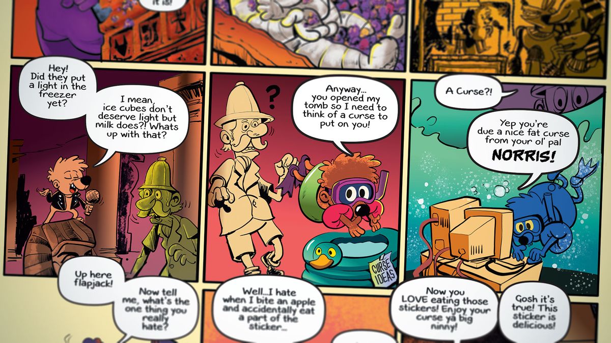
Affinity Photo for iPad is a great photo editor, but how does Serif's app fare when it comes to creating illustrations from scratch? For this article, I've put the app through its paces while drawing and colouring a full comic page.
Just to spice things up a little, I decided to create this page far away from my usual studio mess, using Affinity Photo on the new iPad Pro 10.5-inch with the Apple Pencil. It felt great to be truly mobile and to work whenever inspiration struck: in the back of the car on the way to the supermarket, a hospital waiting room and (of course) a couple of dive bars.
01. Set up and Undo

Let's start with finding Undo. This threw me at first because I assumed it was a two-finger tap gesture. It can be found in the bottom right, along with Redo and the Tooltip Assistant. Using the Rectangle tool I draw one square and then duplicate it to make a row of three. To duplicate something tap Commands>Duplicate. Then I duplicate that row vertically to create a 10-panel layout.
To change the stroke width, tap Pen and change Width. You can drag the values up and down by pressing Width or tapping it and typing values numerically.
Then I tap Use Fill to remove the colour inside the rectangles. I group all panels and lock them by tapping Layer the More (the circle with three dots) and hitting Lock. You'll find Layer Opacity and Layer Blend Modes here, too. Ideally, these would be in the main Layers panel and not an additional tap away because we're going to be changing and locking layers a lot in this workshop.
02. Sketching and layout
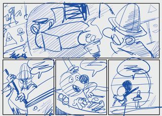
Now I pick any random brush and draw the rough layout of the comic. This is to check that the story flows correctly and that there's enough room for the speech bubbles. A newbie mistake is not to leave enough space for the bubbles; a comic pro uses them to save time. If you know a bubble will obscure a large part of the background, it means less drawing and a longer lunch!
Traditionally, comic artists draw with non-reproducing blue pencils and this has carried over into the digital realm. Choosing blue has no real function, but it makes it easier to draw over. The thinking behind page layout is a tutorial for another day, but the basic idea is to vary the camera angle. If the two characters were just placed side by side in every panel, the comic would soon feel boring.
Get the Creative Bloq Newsletter
Daily design news, reviews, how-tos and more, as picked by the editors.
03. Adding text and speech bubbles
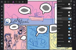
In order to get the job signed off by the editor I add quick speech bubbles with the full text. There's a huge range of fonts installed in Affinity Photo, but at the time of writing you can't add your own fonts, so I'll letter it properly later on in Affinity Designer using my desktop computer that's back home.
A great way to rapidly create speech bubbles is to first type your text by pressing Text and then Frame Text. Then on a new layer draw a rough shape around the each text block. It doesn't matter what colour this is. Then open Layer FX Studio and apply Outline (black) and Colour Overlay (white fill). Now you can draw speech bubbles on your page layout.
A bonus tip is to add 'mockup text' by selecting Inner Glow. This helps you see the layout better without the hassle of typing in text.
04. Select your brushes
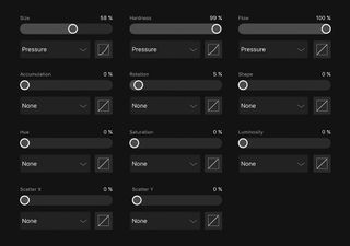
The 12 DAUB brushes that come installed by default are fantastic, but I prefer a much more basic brush for inking. You can create your own brush category by tapping Brush Studio, and then the hamburger icon. Press Add Category and then name your brush. Now press the hamburger again and then New Round Brush.
Here are the settings I used. It's all pretty basic stuff. All I need really is a solid brush that tapers towards the ends. You can fine-tune your brush settings in the app to an amazing degree, including Tilt Sensitivity, Hardness by Angle and so on. I should mention at this stage that I'm using an Apple stylus. Do you really need an Apple Stylus to use Affinity Photo on the iPad? For photo editing I don't think it's essential, but for illustration I would say yes. To create lines with variable width it's all about pen pressure.
05. Brush stabiliser option
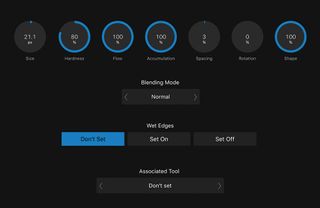
I was playing with the app for over a week before I noticed the tiny white arrow icon to the right of the sub-tool menu. And what lay hidden there really made my day.
I thought the Brush Stabiliser tools were only currently available in the Beta of Affinity Designer 1.6. But here they are! To use the familiar phrase, this tool is a game changer. It enables you to draw smooth curves and lines in a very satisfying way. I love playing with this. So armed with my custom brush and Rope Stabiliser I get to work inking the page.
One thing to bear in mind is that in the current version of the app (1.6.3) there's no line tool. The solution is to simply whip out your credit card and use that as an old-fashioned ruler directly on the iPad.
06. Keep your layers and folders organised

One drawback of digital freedom is that you can get lost within too many layers. I used to suffer from “fear of commitment” and keep dozens of ink layers active, which ended up slowing down the software, and my creative process. Now I've found that the best way to structure your project is to limit yourself to three ink layers. I name them as follows:
* INK 1 *
* * INK 2 * *
* * * INK 3 * * *
Now you can easily identify them. To add these three layers to a master INK folder, slide select or hit the checkbox on your layers and then tap the folder icon. To change the name from Unnamed, tap More (the circle with three dots) to reveal more options. This confused me initially because my folder is called Unnamed while the label says Group. Tap Group and rename your folder. You can rename individual layers the same way.
To merge multiple layers or folders into one layer just select the ones you want and tap Commands>Rasterise.
07. Colouring the page

Now that the full page is inked, I'm ready to colour it. Tapping Layer>More>Multiply enables you to colour 'behind' your line art. I draw rectangle shapes behind each comic panel. This makes it possible to block out the colours and also use the rectangles as a rough 'n' ready folder to clip all the sub-layers into. When adding the colours I create a new layer and use some of the DAUB Dry Media brushes. Depending on how you prefer to work, you can set the app to create a new pixel layer automatically every time you use a brush. You can turn this feature on or off by selecting Document>Assistant.
For large shapes such as the coffin and the Explorer character I create a vector shape with the Pen tool. This means that I'm able to clip in sub-layers easily and dynamically change the overall colours and shadows using the Gradient tool.
08. Lighting and textures
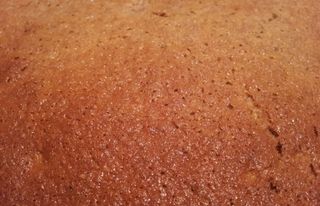
As a final touch I'll import a real-world texture to the character and introduce lighting to the scene. For textures you can use any photo or image, and you'll always be surprised with the results. Import images to your file by tapping Commands>Place and then choose the location: either from your Photos or Cloud storage.
I place a gingerbread texture, resize it and then clip the image into place. To add a powerful lighting effect, tap the Filters Studio>Lighting and drag the control lines. Then have fun experimenting with the Ambient, Specular, Shininess and Diffuse settings. I could play with textures and lighting all day long!
This article was originally published in issue 154 of ImagineFX, the world's best-selling magazine for digital artists – packed with workshops and interviews with fantasy and sci-fi artists, plus must-have kit reviews. Buy issue 154 here or subscribe to ImagineFX here.
Related articles:

Thank you for reading 5 articles this month* Join now for unlimited access
Enjoy your first month for just £1 / $1 / €1
*Read 5 free articles per month without a subscription

Join now for unlimited access
Try first month for just £1 / $1 / €1
