How to draw a landscape with pastels
Top tips on how to draw a landscape with pastels.

This post will teach you how to draw a landscape with pastels. When using soft pastels, you are able to draw and paint at the same time, with immediate and tactile results. You hold the stick in your hand and apply it directly to the surface – with no drying time to hold you back or brushes to swap around.
The process shown here will help you to make the best use of the varied types and grades of pastel that are available to create a stunning pastel landscape. If you're just getting started with pastels, you might want to check out our guide on how to start pastel drawing. Or, for more drawing lessons, we round up the best tutorials in this how to draw article.
Read on for Rebecca Mendonça's tutorial.
01. Pick the right pastels
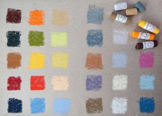
For this painting, I want to capture the feeling of distance in the landscape by varying colour and tone. I need the rich and pure pigments of quality pastels, such as Unison, to go from saturated colours in the foreground to soft hues in the distance, with lights, mediums and darks of each colour.
02. Create a tonal sketch
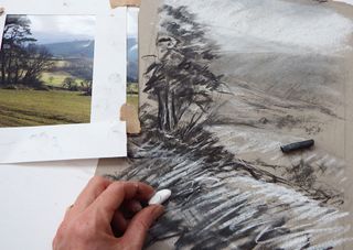
To focus on the tonal recession in the view, I do a sketch in charcoal and white pastel on neutral grey paper. I can see how the biggest contrast of light and dark is in the foreground, with soft grey mid-tones in the distance. This exercise helps me keep calm when I start to deal with colours.
03. Test your colour choices
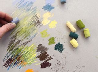
Thinking of tonal recession, I pick the pastels from the box and test each one by making marks on a sheet, hatching to combine them. By hatching the marks and letting the integrity of each colour show, I'm able to produce lively mixes. Experimenting with colour choices first means I can paint later with confidence.
04. Start in the distance
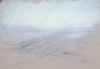
Using light blue, lilac/grey and cream, I sketch in the sky and far distant hills, using the pastels on their side, applying several layers and softening and smudging constantly with my fingers. These hills have to be subtle, soft and muted. By smudging the sky colours down into the hills I can make them appear even more distant.
Get the Creative Bloq Newsletter
Daily design news, reviews, how-tos and more, as picked by the editors.
05. Create atmosphere
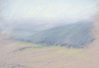
I introduce a soft grey/blue for the next hill, but still mixing and blending softly with the lilac and cream. I take each colour further down into the picture, so that they all intermingle and are related. I then hint at light greens and yellows for the far fields, dusting these into the blue hill to give it form.
06. Move to the mid-ground
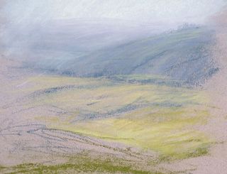
In the foreground the colours can become warmer, with yellows and greens growing progressively richer as they get closer to the viewer. Time for some stronger marks – there's no need to smudge so much now. If a colour looks too strong, I use the cooler distance colours to knock it back. I lay down some energetic marks for the foreground base.
07. Introduce the foreground darks
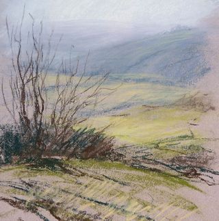
Sketch the foreground trees using sharper, more defined marks and darker shades of browns and greens. I use a deep brown for the foreground and a softer greyer brown for the middle distance. I also have a warmer red/brown for the very front of the picture, to emphasise the tonal recession. I use energetic marks rather than detail at this stage.
08. Create intensity
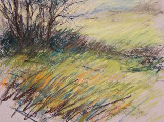
Now the fun really starts, as I introduce a collection of more vibrant, saturated colours to enrich the field in the foreground by hatching these on as long grasses, without any smudging, I create a vibrant mix of hues and tones that blend optically. Blues, yellows, orange and warm brown are a contrast to the cooler distance.
09. Add hatching and highlights
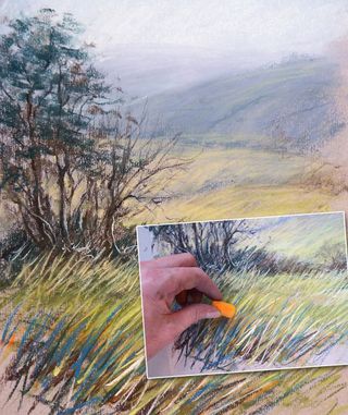
To bring the piece together, I hatch lighter areas to describe the curve of the field, and detail among the trees. I add lighter patches of yellow between the trees, and shadows and lights to the trunks. The joy of using good-quality pastels is that you can apply lights over deep darks to add sparkle.
This article originally appeared in Paint & Draw.
Related articles:

Thank you for reading 5 articles this month* Join now for unlimited access
Enjoy your first month for just £1 / $1 / €1
*Read 5 free articles per month without a subscription

Join now for unlimited access
Try first month for just £1 / $1 / €1
Rebecca specialises in pastels, producing lively and energetic work. She teaches around the UK and in Italy, and co-founded The New Pastel School. Her book Pastels for the Absolute Beginner, published by Search Press, is available now.
