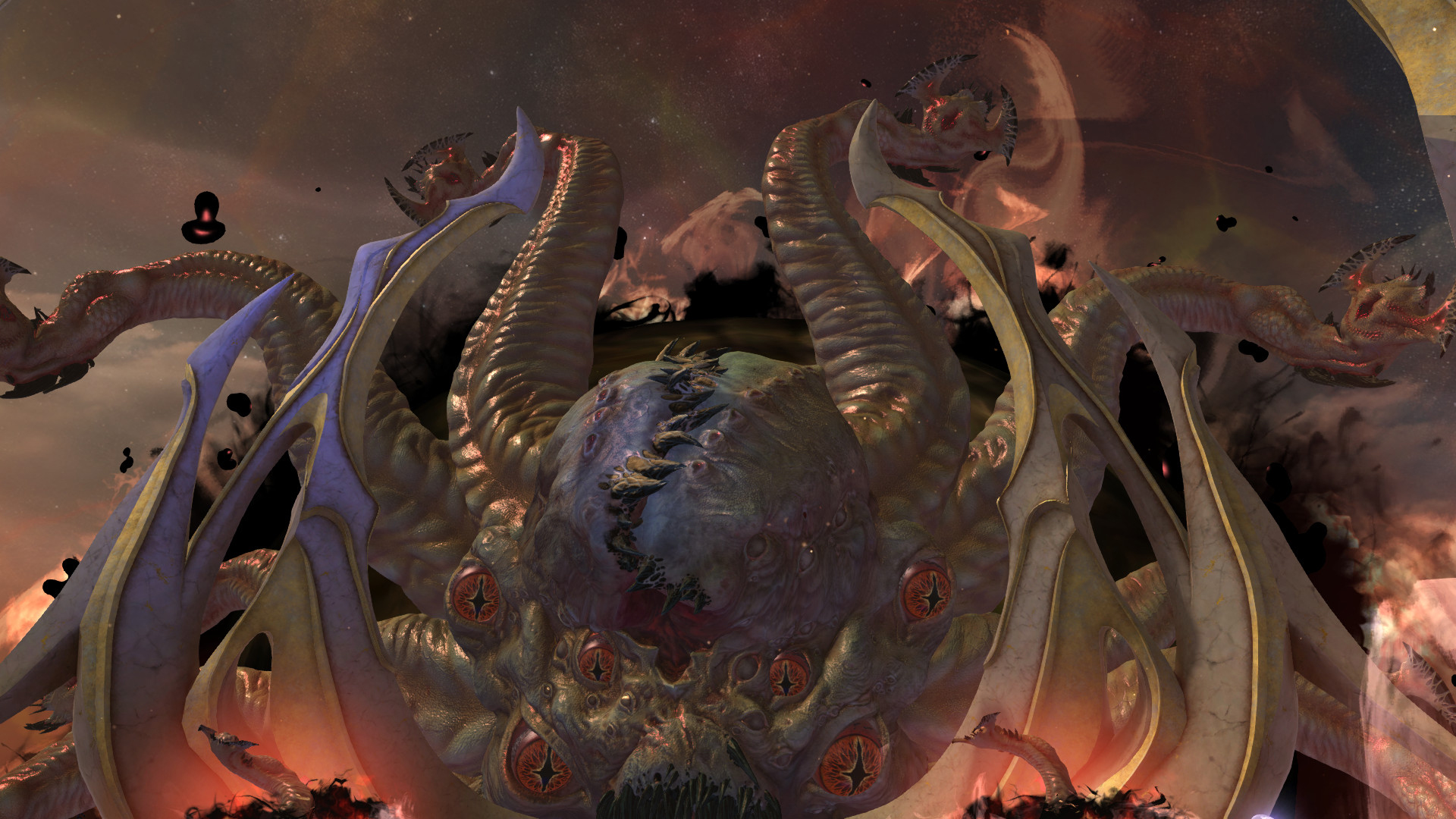
How to develop mythical creatures
15 steps to modelling impactful creature designs for films, games and TV shows.
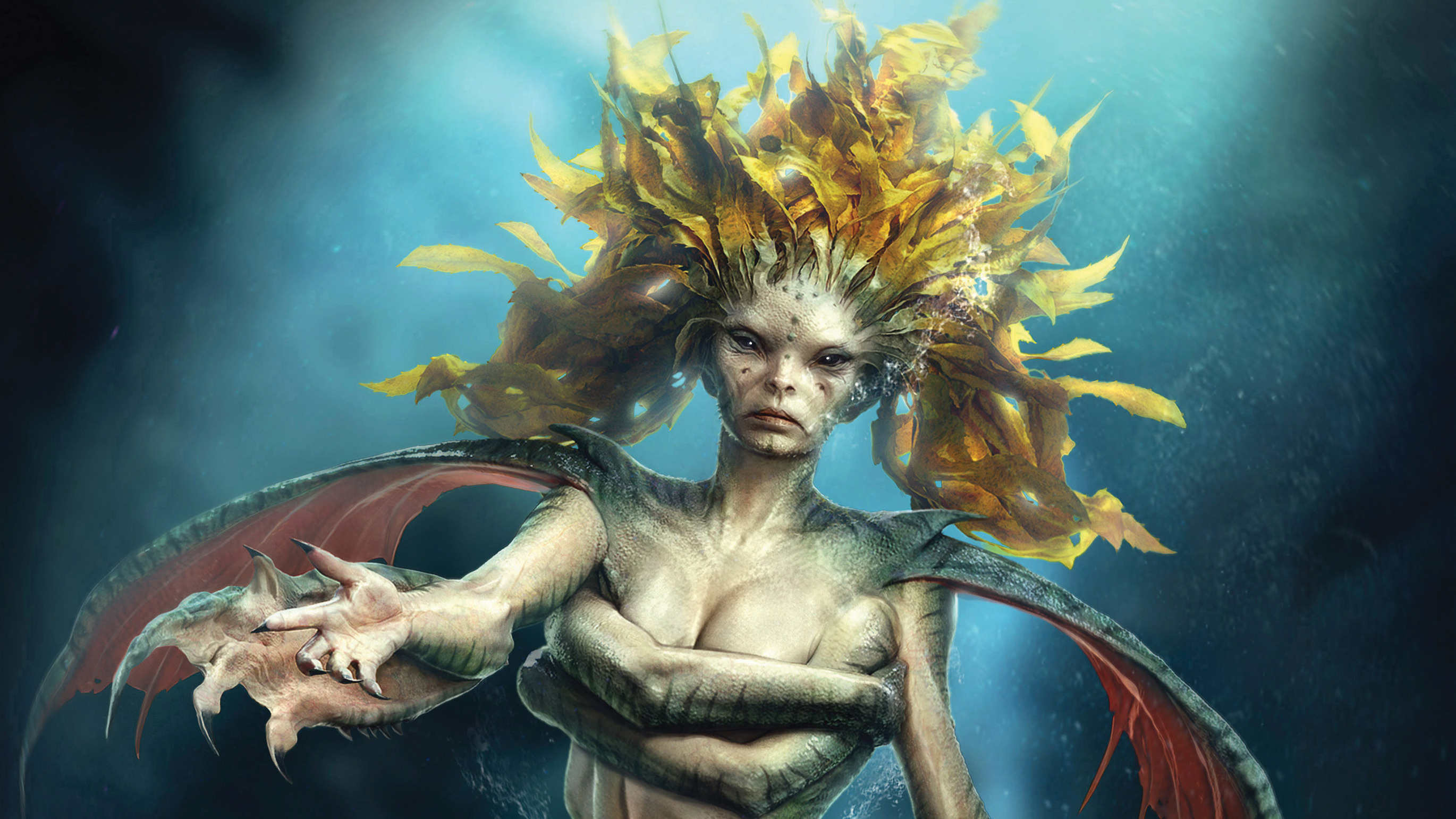
Those looking to create realistic creature designs using a mixture of software –
ZBrush, Marvelous Designer, KeyShot and Photoshop – should look no further. I use this pipeline in my everyday work for movies, TV shows and video games – and it never disappoints.
I start the process by sketching on paper and decide on the best design direction. Once I have a stronger idea of what to do, I jump into ZBrush to flesh out the design in 3D.
01. Create base mesh in ZBrush
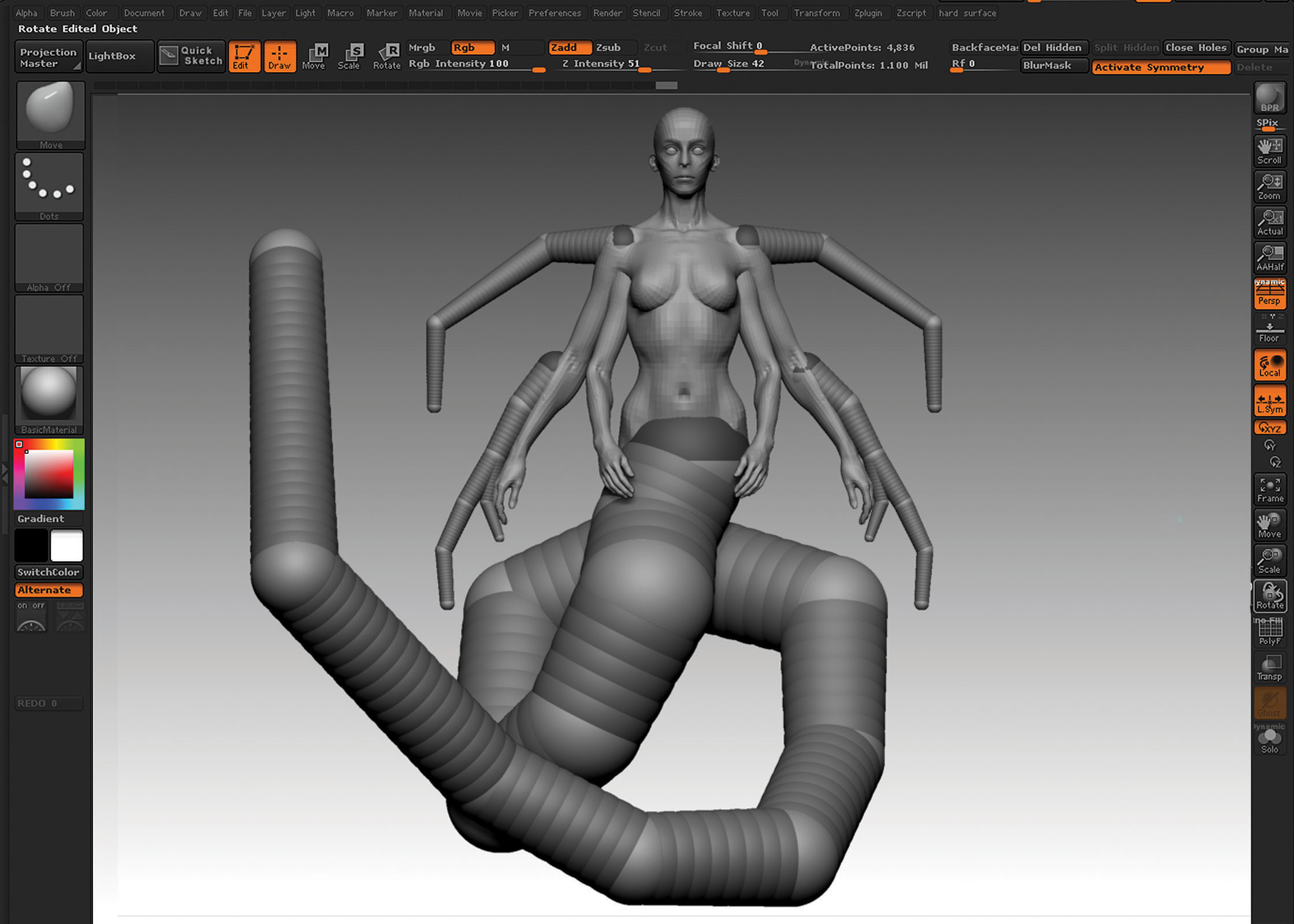
I start the model using one of the female base meshes I created a while back. This really cuts down the working time – I suggest you create your own library of base meshes that you can use on every project. For all the other elements that I need to create from scratch, I use ZSpheres. The objective at this stage is to get a strong sense of gesture in the base mesh.
02. Sculpt the face
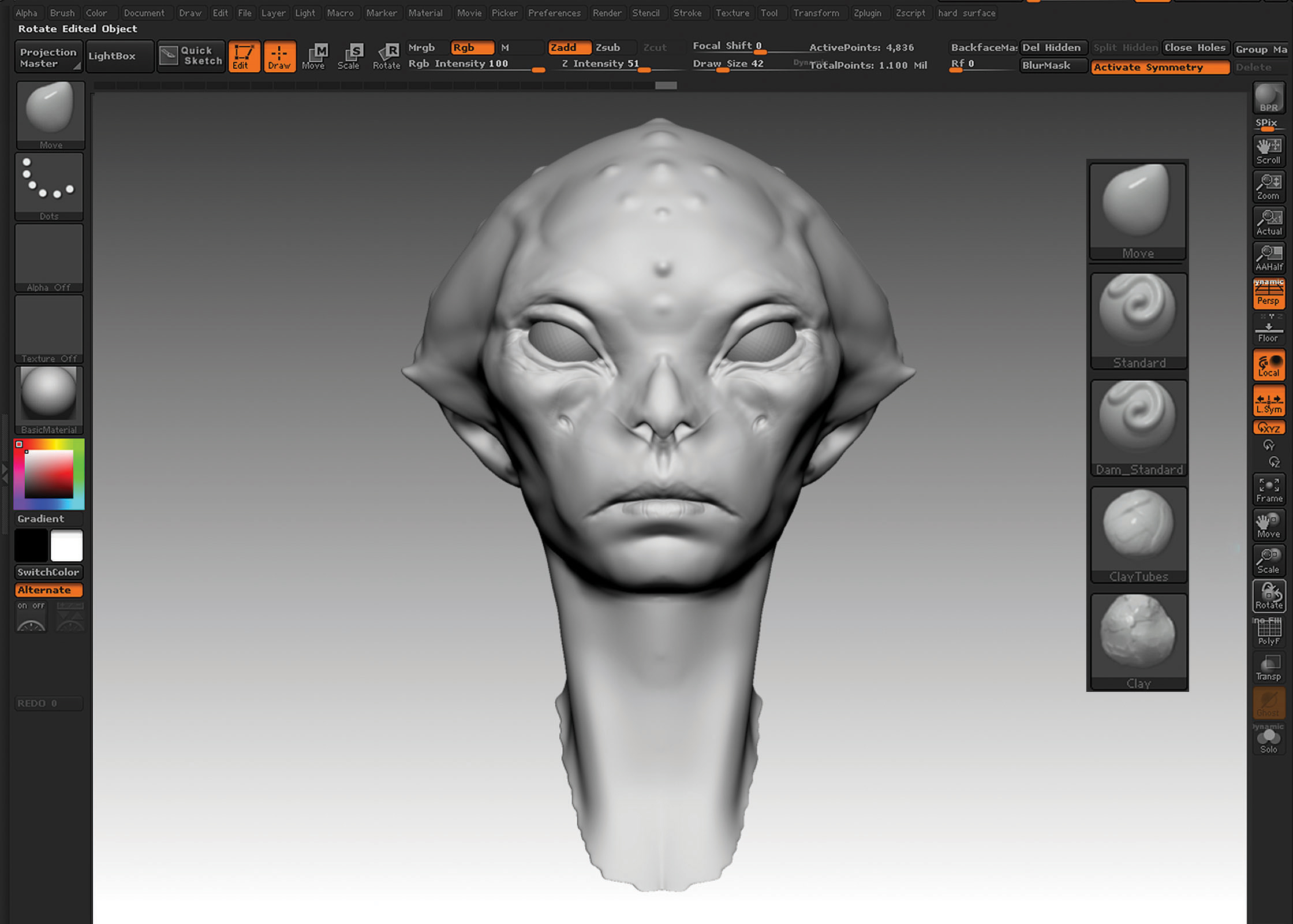
One of the main focuses early on in my sculpting is the face. I really want something that looks a bit creature-like, not wholly human, but is still beautiful. I decide that pushing the proportions and the features of a human face is the way to go: spreading the eyes out further than usual, enlarging the mouth, flattening the nose and pushing the bone structure in general. For the final image, I want strong eye contact with the viewer. To sculpt, I use just a few brushes: Clay Tubes, Clay, Dam_Standard, Move and Standard.
03. Detail the body
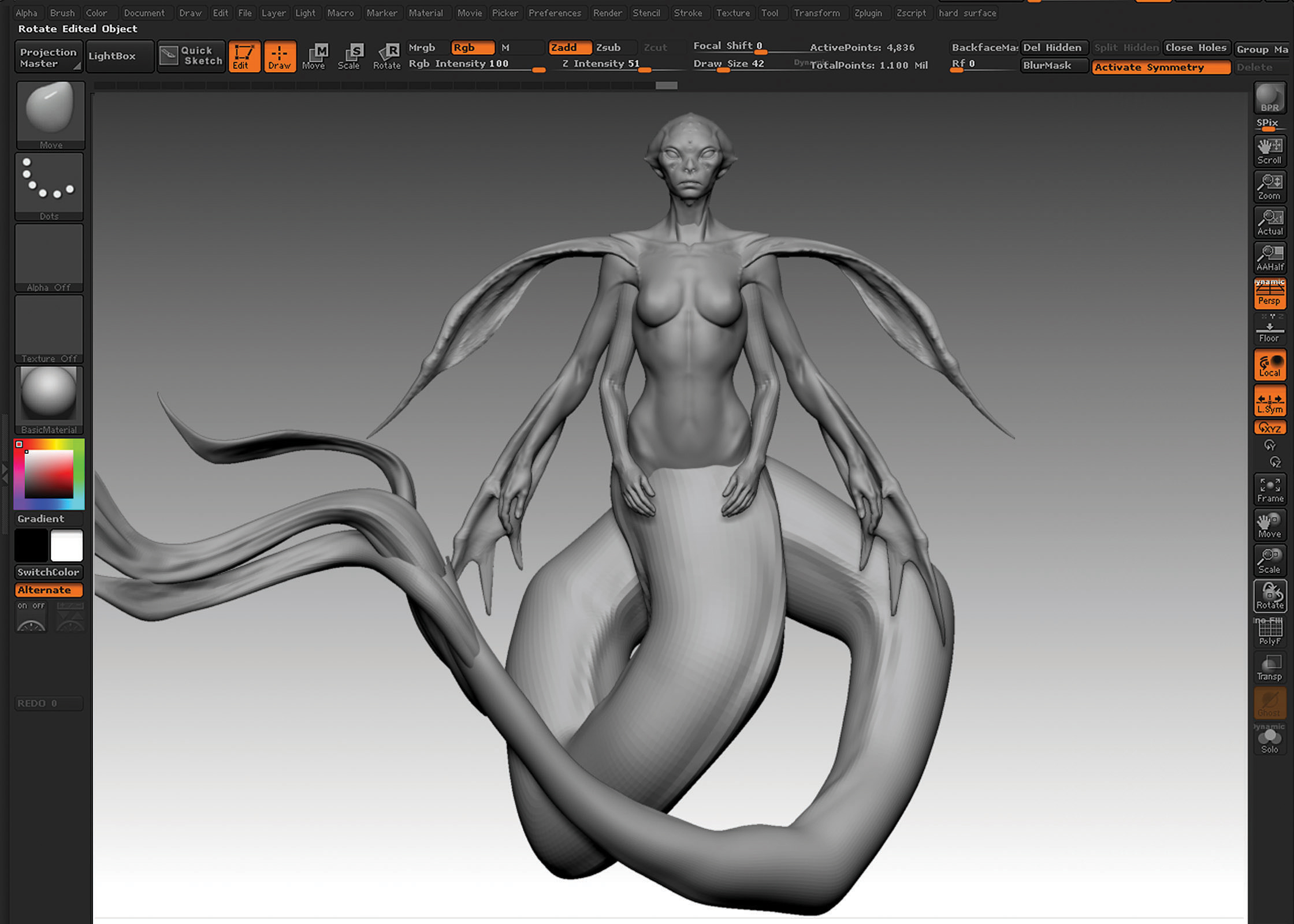
Now it’s time for the body, I start to sculpt in more details and to really finalise the entire design. It’s important to always model with anatomy references in front of you: that’s how you make sure everything looks realistic and anatomically correct. At this stage I use the Clay brush instead of the Clay Tubes brush to build up some of the forms, so that my strokes are more delicate and controlled.
04. Pose the model
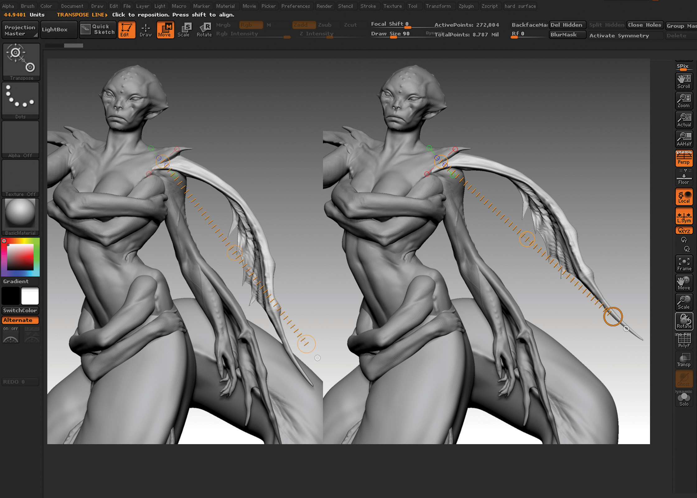
With the main sculpting done, it’s now time to pose my model. The tail is pretty much in the right pose already, since I modelled it directly with Symmetry turned off; so now I am able to focus on the upper body.
Using the Transpose function, I can move the lowest subdivision levels around; and with minimum re-sculpting of some areas, like the neck and the shoulders, I can achieve the desired pose pretty easily this way.
Get the Creative Bloq Newsletter
Daily design news, reviews, how-tos and more, as picked by the editors.
05. Create seaweed hair
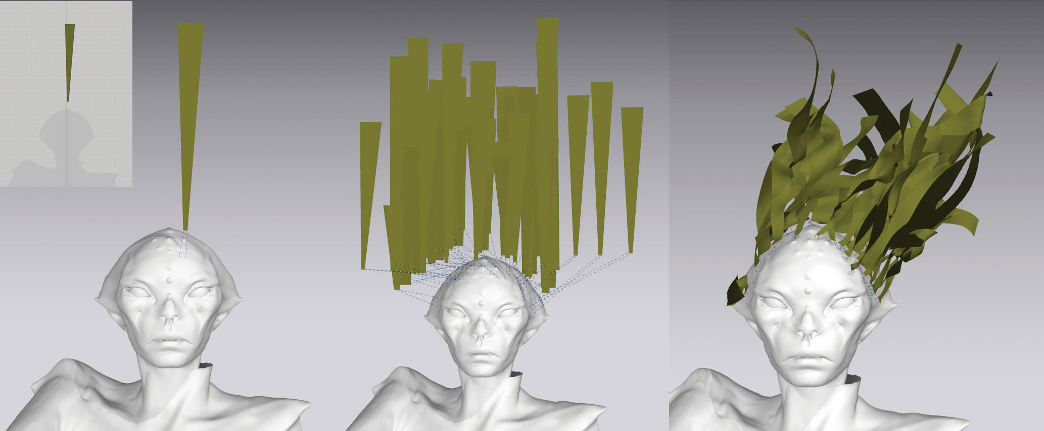
Marvelous Designer is typically used for clothing, but I thought of using it in a more creative way, using its simulation power to create seaweed hair. I simply create strings of cloths, attach one end of each string to the head of my creature and create a medium-strength wind system. Once you let it simulate, the strings of cloth will interact and intersect; to get the underwater effect just quickly let go of the wind and freeze the result right away.
06. Detail the seaweed hair
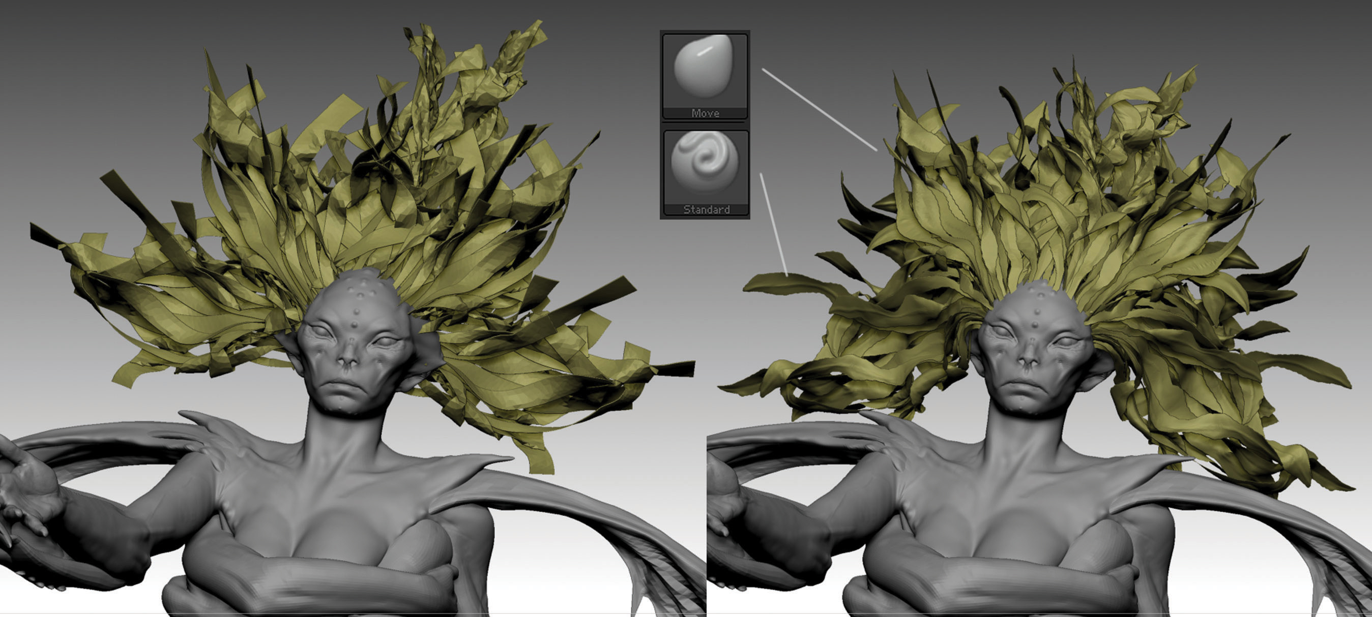
After creating different patches of simulated seaweed hair, I go back to ZBrush, where I can start the detailing process. With the Pinch brush, I make the end of each string pointy and finish the detailing with the Standard brush. With the Move brush, I make sure every patch of seaweed hair is interacting perfectly with the rest, and that each part is attached correctly to the head.
07. Polypaint the model
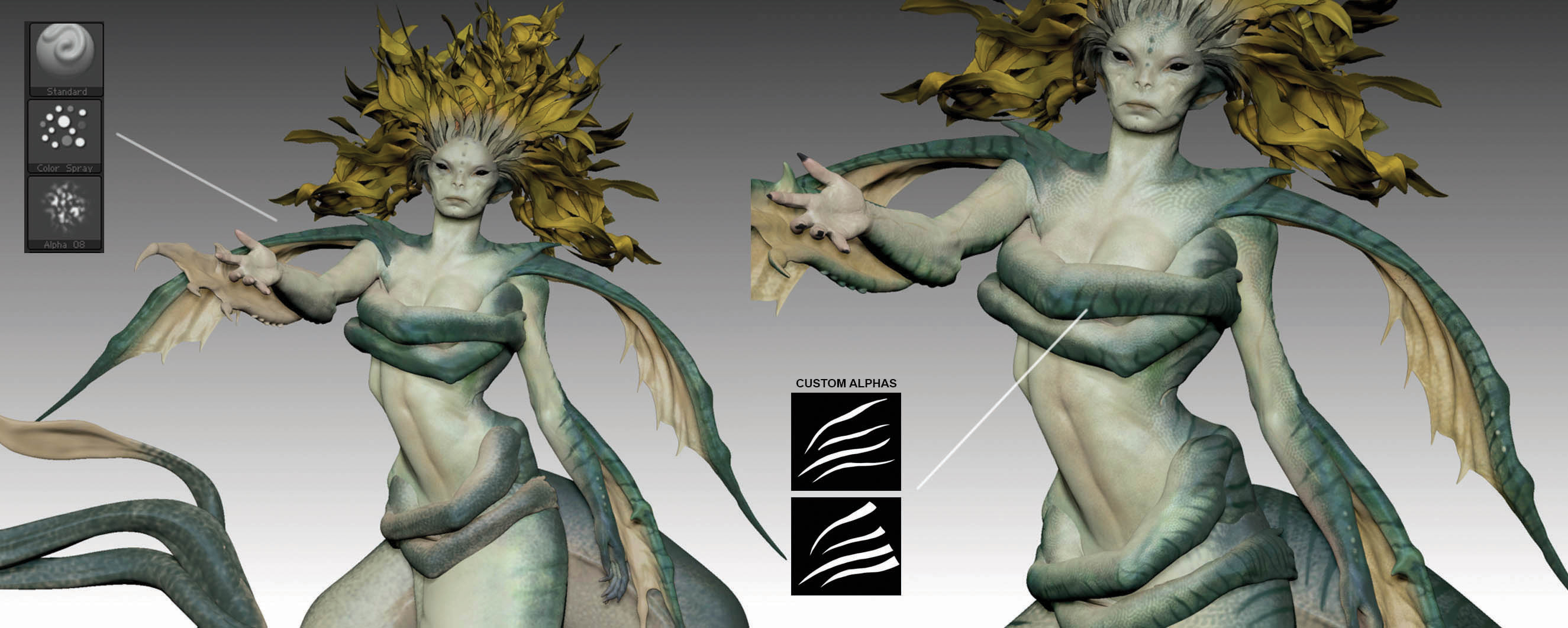
Before rendering, I do a quick colour pass to help me out with the final compositing. I use the Standard brush set to RGB and in Color Spray mode with Alpha_08: this way I can select two colours in the palette that I want to mix with a bit of pattern, following the principle of darker colour on the back and lighter colour on the front. With the help of some custom Alphas, I detail the first colour pass.
08. Render in KeyShot
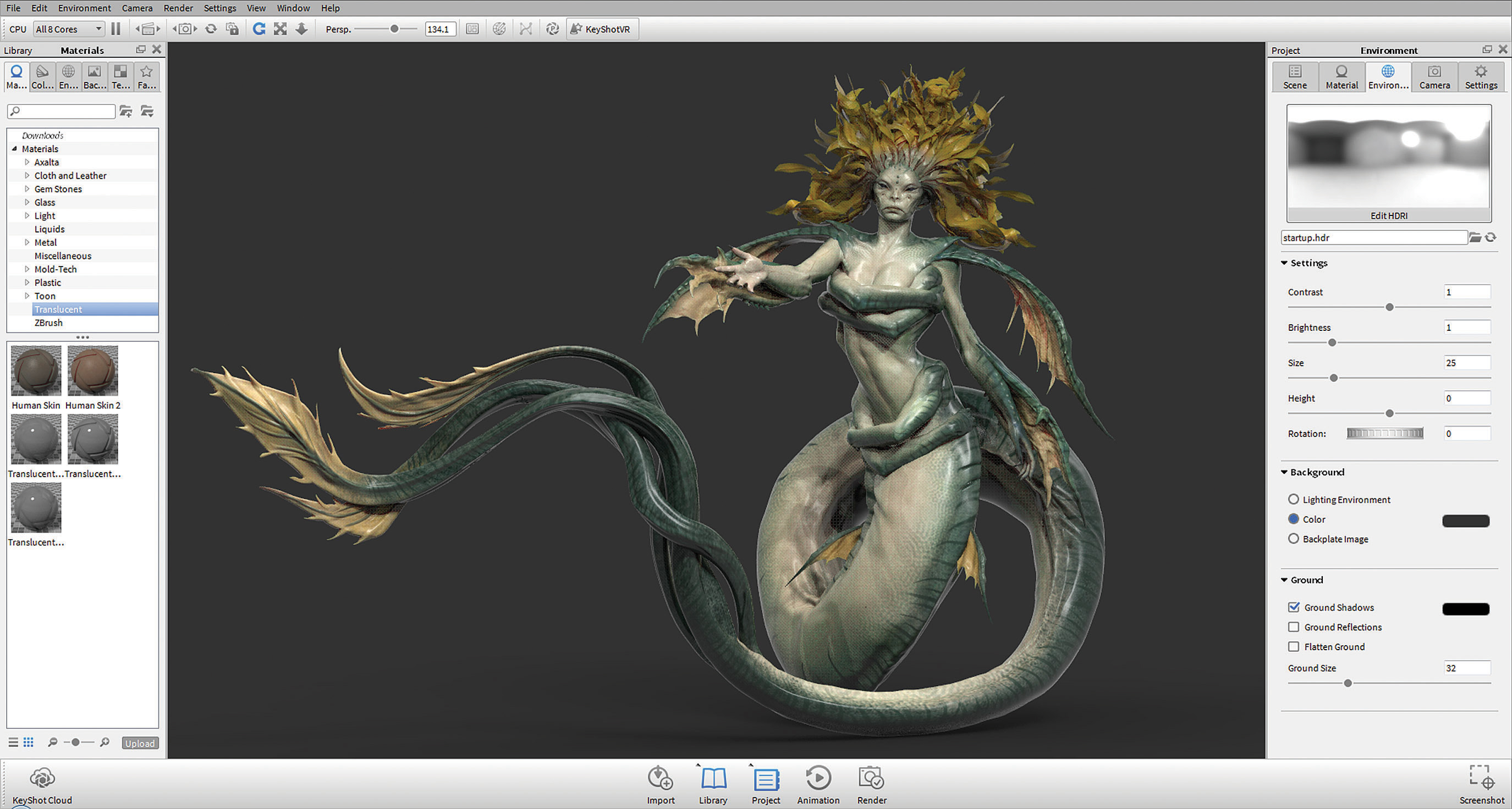
With the ZBrush To KeyShot Bridge, I can transfer my model into KeyShot to render with one button. In KeyShot I create a new camera angle for my renders and, with minimum adjustments to my pose in ZBrush based on the new camera, I’m ready to go. Holding [Ctrl] on my keyboard while dragging the skin material on my model, I keep my textures from ZBrush intact. For my main lighting, I use the Factory HDRI preset in KeyShot and a simple top panel I place in ZBrush.
09. Render passes in KeyShot
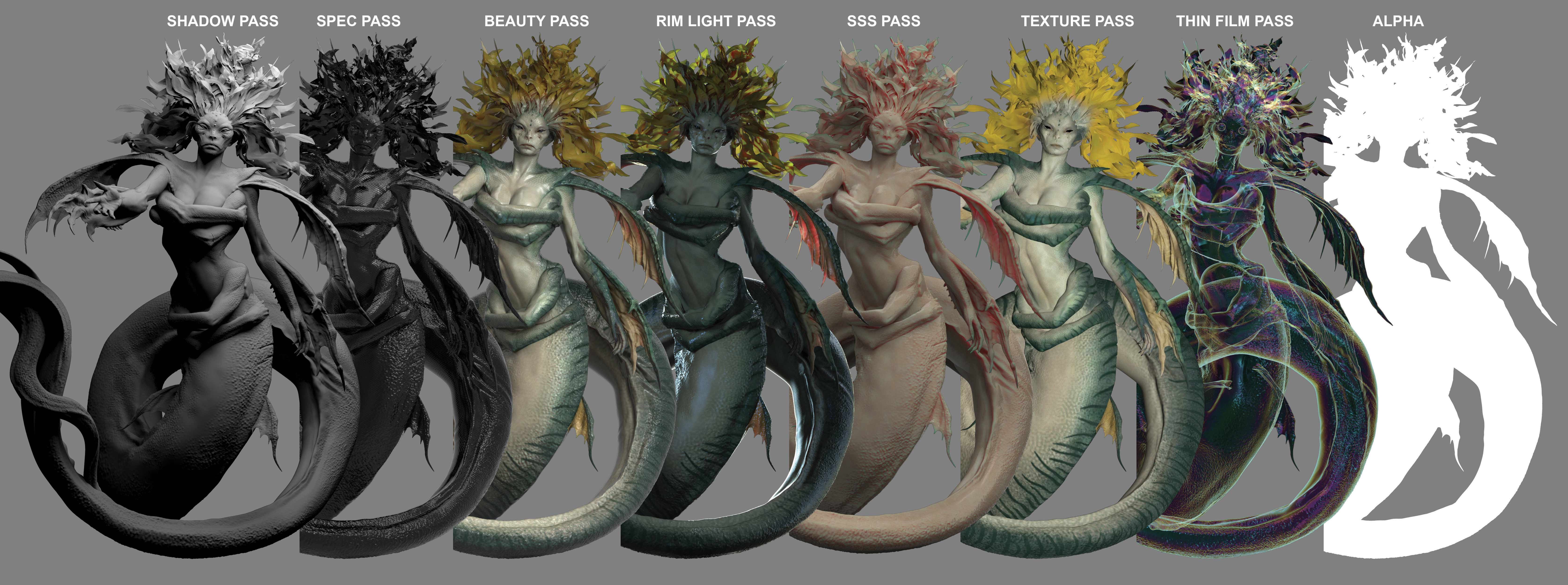
My render passes consist of a Shadow Pass, Spec Pass, Beauty Pass, Rim Light Pass, SSS Pass, Texture Passes, Thin Film Pass and Alphas. The most important is the Shadow Pass, realised with a grey material on the model and a top panel with a light material in KeyShot; and the Beauty Pass, realised with a skin material, original textures from ZBrush and the Factory HDRI preset for the lighting.
10. Composite in Photoshop
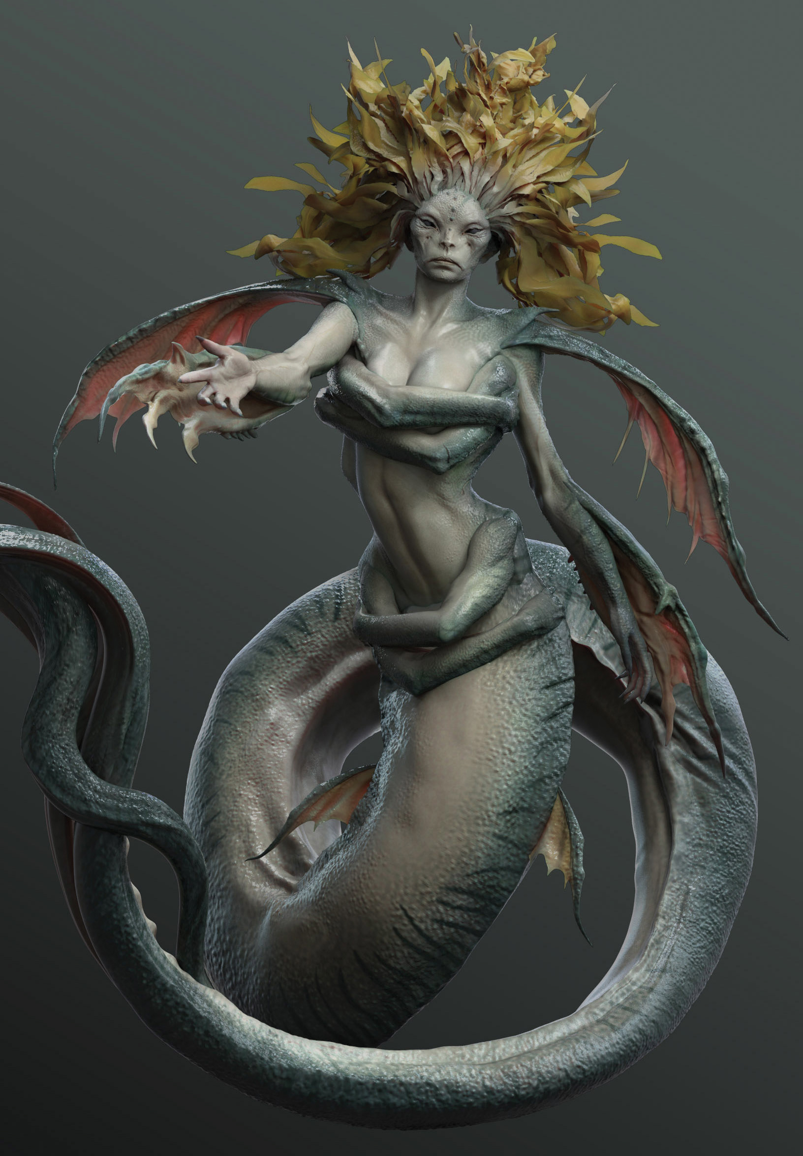
Using Photoshop, I can merge all my renders into one image, trying to find the right balance between the different passes. I place the Shadow Pass at the bottom then apply the other passes on top, lowering their Opacity and playing with the brightness and contrast to blend them all together. The Spec Pass should always be on top of all the other passes, applied with the Screen blend mode to just have the light areas coming through.
11. Start photo-bashing
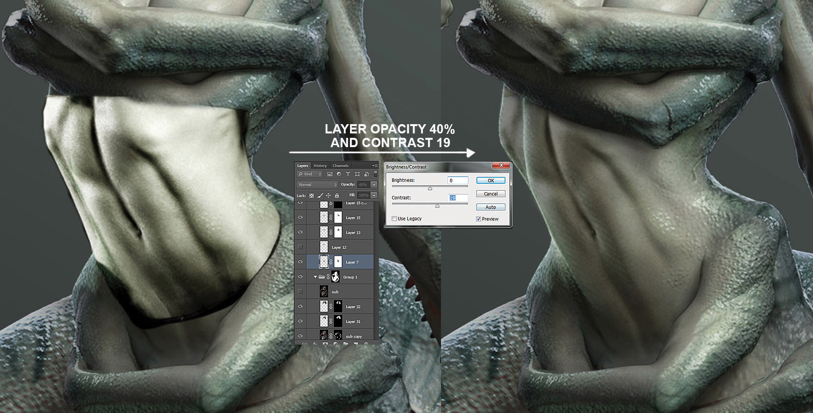
To take the concept to the next level, I start the process of photo-bashing, which is basically the process of blending photos with my 3D renders. I use photos of people and animals to get realistic details, always making sure that the photos I use have lighting that follows what I established in 3D. The best way to blend the photos is to lower their opacity, then enhance the contrast and erase what you don’t need.
12. Detail the photo-bashing
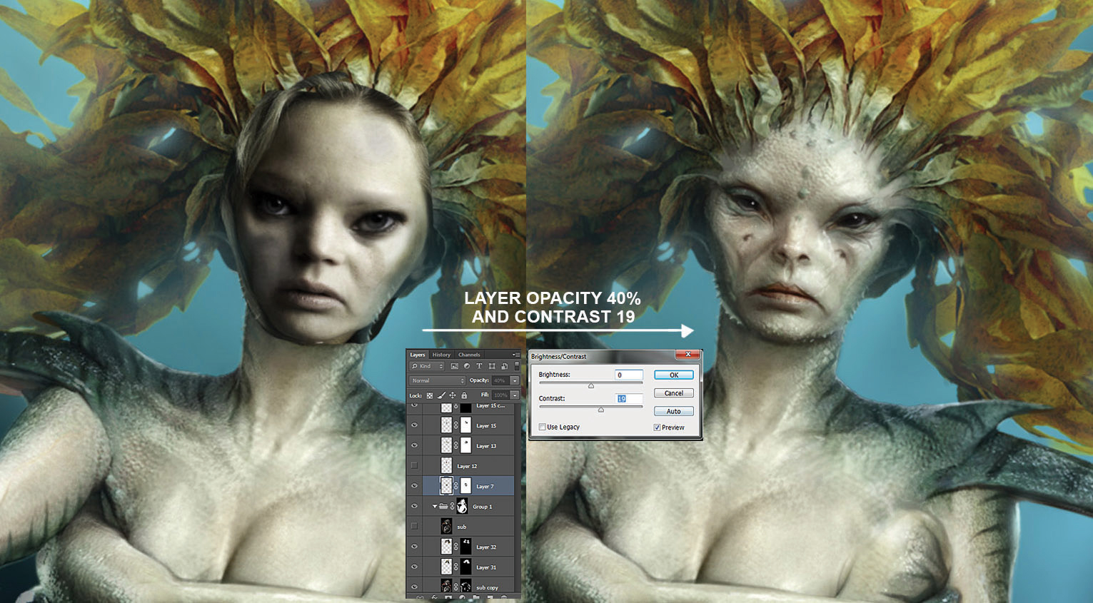
I continue my photo-bashing process by blending a photo of an actress over the face of my creature, using the Liquify filter (Filter>Liquify) to match the position of the photo’s eyes and mouth to the face in my ZBrush sculpt. This way I’m able to obtain some subtle details that I didn’t have before, and also to get better translucency in the skin. I also use the same photo-bashing technique for the background: I blend together some underwater photos that I then blur with a Gaussian Blur (Filter>Blur>Gaussian Blur).
13. Paint on top of photo-bashing
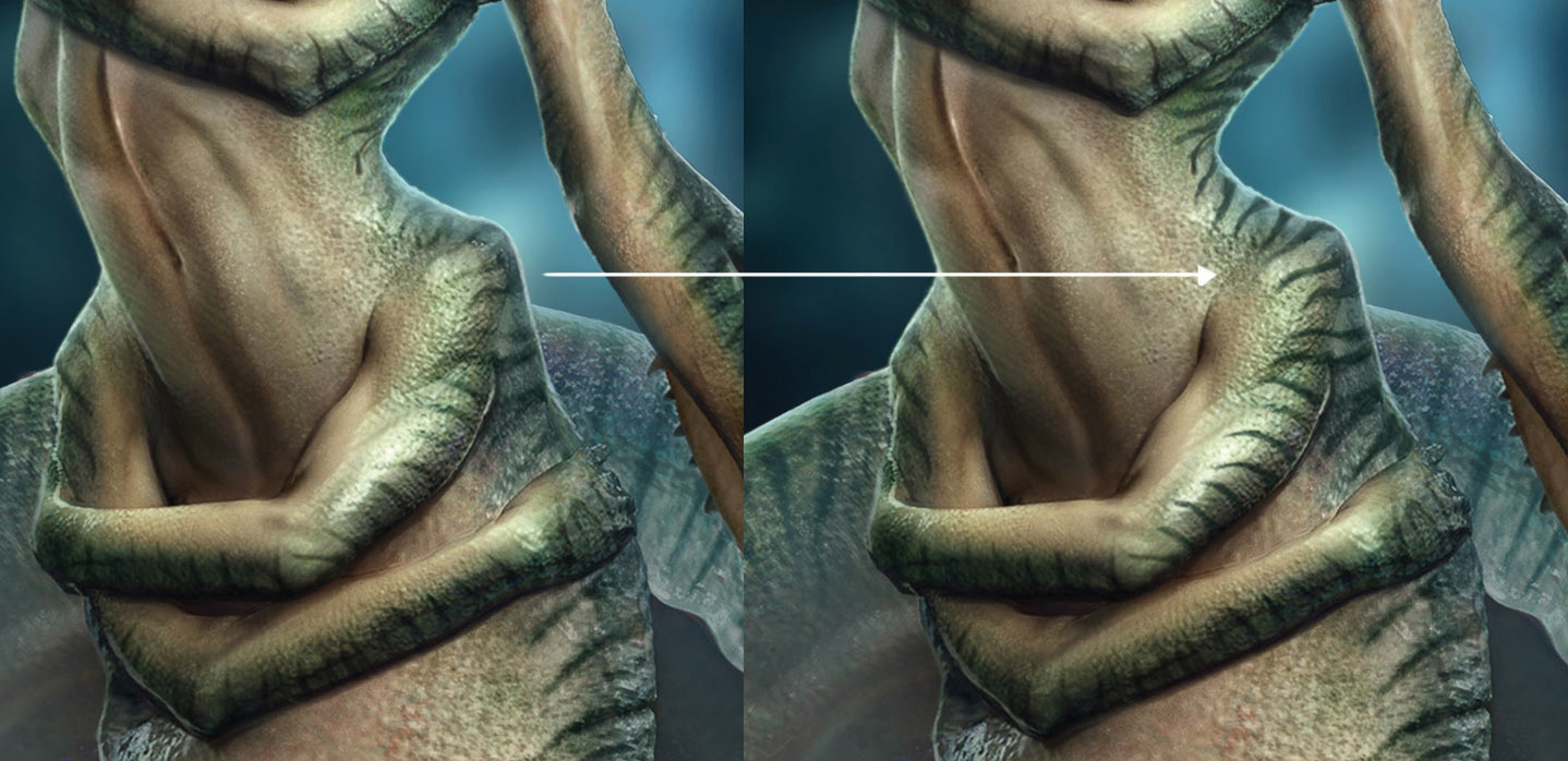
To perfectly blend the photos and my 3D work together, I start painting on top of my photo-bashing: this way I’m able to add more details and fix some elements. To blend everything even better, I can paint shadows with a dark colour and light areas with a light colour on a Soft Light layer. The last pass here is to paint in some foreground details to frame my creature, and some atmospheric effects using a large soft brush.
14. Add effects
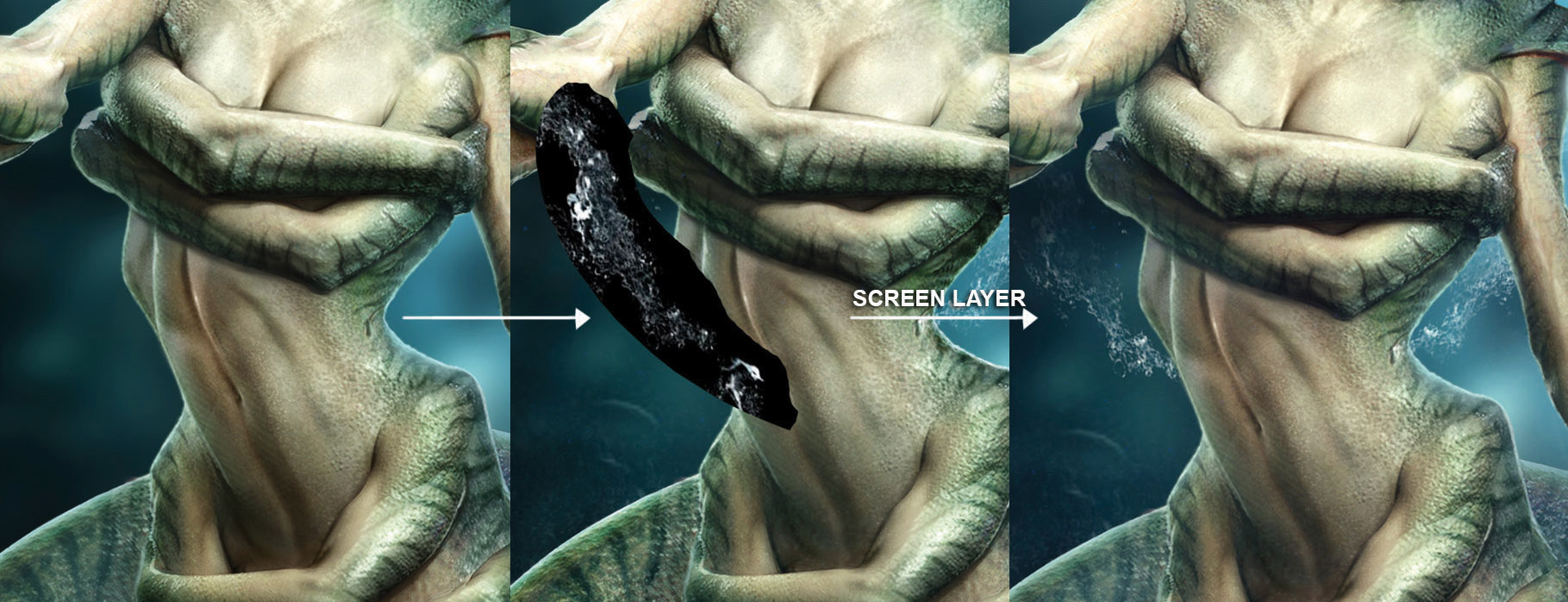
To make the painting feel less ‘3D’, I use some dust and bubbles photos. You can easily find photos with this kind of effect online: you need them to be on a black background so that you can blend them using a Screen layer, which eliminates the background and leaves you with the details you want.
15. Finalise the image
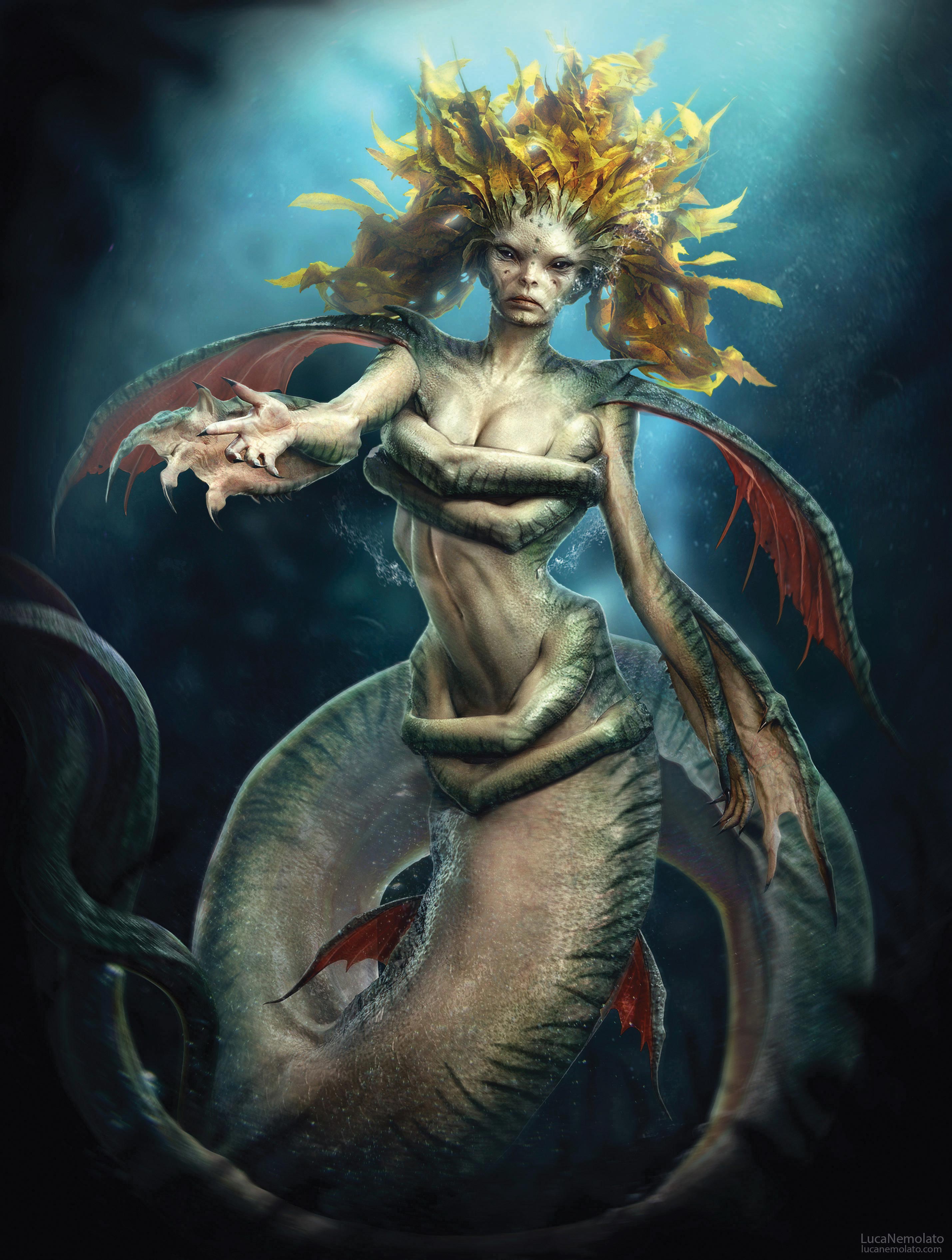
The image is basically complete, so I flatten down all the layers. The last steps now are to use Unsharp Mask (Filter>Sharpen>Unsharp Mask) to make the image sharper; before I apply a Radial Blur (Filter>Blur>Radial Blur), which I focus on the centre of the image. This helps to focus the attention of the viewer on the creature, and also to make the image more dynamic. You can also play with applying a Gradient Map to the image to lend more colour to your shadows.
This article originally appeared in 3D World issue 224. Buy it here.
Related articles:

Thank you for reading 5 articles this month* Join now for unlimited access
Enjoy your first month for just £1 / $1 / €1
*Read 5 free articles per month without a subscription

Join now for unlimited access
Try first month for just £1 / $1 / €1
