How to design the perfect book cover
How to make sure people do judge a book by its cover.
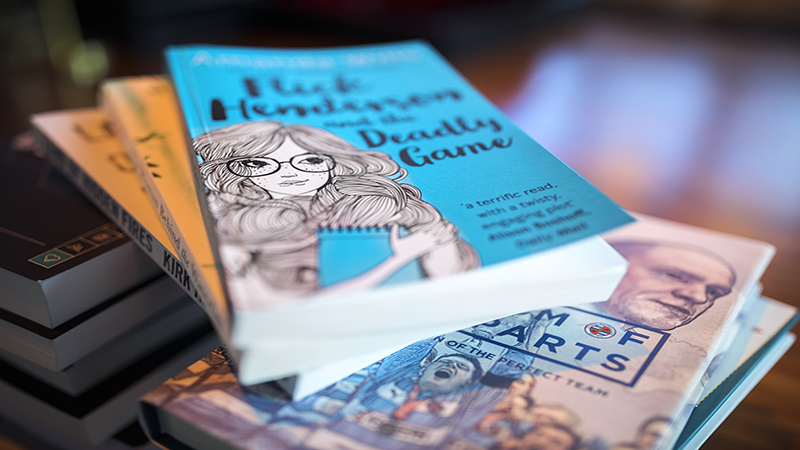
Self-publishing accounts for 22 per cent of the UK ebook market and is continuing to grow, meaning authors are increasingly liaising directly with designers to achieve the finished look for their manuscripts.
With so many books hitting the market, a striking cover can make the difference between a hit and a flop, making experienced designers in this field highly sought-after. A memorable book can be a valuable addition to your design portfolio. Which poses the question: what exactly makes a successful book cover?
01. The brief: Understand the author and readers
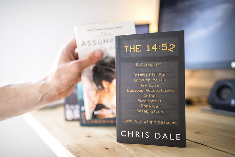
When creating a book cover, you’re tasked and trusted with encapsulating someone else’s story in one powerful design. Before you even begin, it’s vital that you familiarise yourself, not just with the story between the pages, but also with what the writer is setting out to achieve and who their audience is.
So ensure you’re given a clear brief, including aspects such as genre, target readership and whether it will be printed, an ebook or both. A gritty crime thriller will need a very different look and feel from a business-focused or self-help book.
A healthy relationship and fluid line of communication between designer and author throughout will ease the entire process and lay solid foundations for a successful book cover.
02. Cover images: Teasers not spoilers

A well thought-out cover design should say a great deal to a person about a book without them even needing to turn to the first page, but without knowing every detail. As a designer, you want your cover to give away just enough to entice the reader, and capture the story inside, without revealing too much.
The imagery you choose can be a great way to connect the reader with the book on a deeper level.
Get the Creative Bloq Newsletter
Daily design news, reviews, how-tos and more, as picked by the editors.
03. Typography: Creating a brand
However, book cover design is not just about the images, it’s about the entire aesthetic of the book – which brings us onto typography and formatting. As the designer, your typography needs to support both what the title expresses, as well as the tone of the story itself.
For example, sans-serif fonts often dominate the nonfiction genre, as they express modernity and professionalism, while romance novels often feature whimsical and fanciful fonts such as Lavenda (take a look at our article on the different traits that can define a typeface's personality).
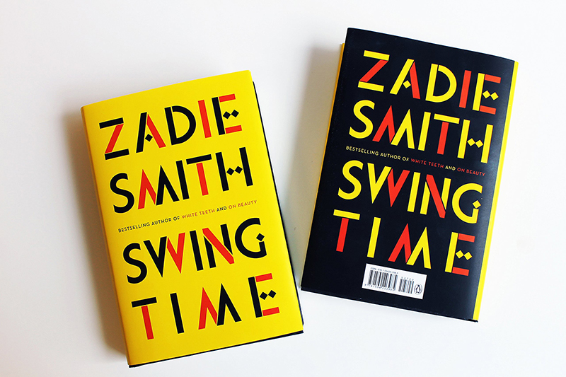
Alongside the title and imagery sits the author’s name. Readers often buy a book because they are familiar with, and trust, the name on the cover. The typography you choose for a title and the author’s name can grow to become a brand in the eyes of their readers. For example Zadie Smith’s book covers are recognisable from the bold and consistent font and use of colour, often accompanied by very little in the way of imagery.
04. The spine: Bringing everything together
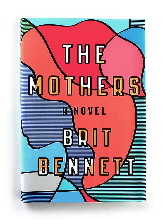
Even though it literally holds the entire printed book in place the spine is often an afterthought for many designers. When placed on a bookshelf, the spine is all you can see, so continuation of a good cover design is important here.
Whilst the cover is all style, the design of the spine is typically about substance. It will include the title and author’s name, remaining consistent with the style on the front and back cover.
There can still be room to be playful however — Rachel Willey’s clever cover for The Mothers, presents a woman whose face isn’t fully revealed until you get to the spine. It’s a great example of how you can incorporate the spine into the whole cover of the book, and make it interesting.
05. The finished cover: Finding balance

It’s important to note that typography and illustration are two quite different crafts, so you may require training and focus in whichever area isn’t your specialism. However, should you be tasked with creating a cover that’s slightly out of your comfort zone, resources such as Pinterest are a great place to gain inspiration.
Great cover designs don’t have to be complex either. Take Noma Bar’s concepts for the fiction of Murakami, which are an exercise in simplicity and restraint.
Ultimately, a successful book cover design implements and balances all of the above. A cover that achieves the right harmony of art, type, and concept will ultimately be the one that makes it off the shelf, or online store, and into a reader’s hands.
Related articles:

Thank you for reading 5 articles this month* Join now for unlimited access
Enjoy your first month for just £1 / $1 / €1
*Read 5 free articles per month without a subscription

Join now for unlimited access
Try first month for just £1 / $1 / €1
