Create forms that work perfectly for mobile devices with this expert advice.
Whether it is a signup flow or a multi-view stepper, forms are one of the most important components of digital product design – so you need to design them so they work effectively on mobile devices.
Here's how to design forms for mobile devices, including a quick look at how to use Flexbox.
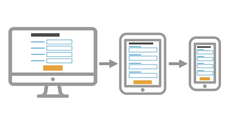
01. Design for vertical scroll
A single column layout works better
Regardless of the device size, the easiest way to complete a form is in a linear fashion. Multiple columns disrupt a user's momentum (the users are likely to interpret the fields inconsistently, which is a negative factor in terms of usability) and can result in users having to resort to horizontal scrolling.
Latest Videos From Creative Bloq
When it comes to laying out forms, you should design the entries in one column: if a form is in a single column, the path to completion is a straight line down the page.
02. Place labels above fields
Place labels above form fields
Labels tell users what the corresponding input fields mean. When choosing where to place your labels you have two options: left-aligned or top-aligned.
Left-aligned labels work well if the form is being completed on a desktop or tablet. However, they are an awful solution for mobile devices where there is limited screen estate. Since left-aligned labels need to sit before the field, the narrow screen leaves very little space for the field itself – especially if the device is in portrait mode. This creates two serious usability issues:
The form field won't be wide enough to display the user's entire input, making them more likely to mistype their responses and leading to more erroneous forms being submitted
When a user is notified that they have entered erroneous information, they may have a hard time spotting and fixing the problem as they won't be able to see the entire invalid input
Placing the label above the form field when a user is browsing from a mobile device will ensure users can see the maximum width to input their details, since you don't need to use up any for the label.
Get the Creative Bloq Newsletter
Daily design news, reviews, how-tos and more, as picked by the editors.
Writing your labels above the input fields also makes it much easier for you to write clear and meaningful field labels, as you won't be limited to one or two words.
03. Use tap targets
Tap targets should be easy to use no matter what size of device they are displayed on. Larger targets (input fields and buttons) are easier for users with lower dexterity, whether that is a permanent condition or a temporary one caused by the environment.
At the moment, the largest target size is for touch devices, so you need to design touch-first. This ensures users won't have to zoom in to enter the text or select an option. Clickable areas should follow the fat finger rule and not encroach on surrounding areas: the average human finger pad is 10 x 14mm and the average fingertip is 8-10mm, making 10 x 10mm a good minimum touch target size.
But not only should a tap target be properly sized, you should also ensure there is enough space between multiple tap targets. In fact, if you are getting the 'Tap target size' error on mobile SEO tools, it is often because your tap targets are too close together, rather than the actual tap target being too small.
It can be tough to read content on mobile devices, so making the inputs 100% and ensuring the text is set to at least 16px (1em) will make a big difference. That way, no pinch zooming or extra scroll will be required to read the required information.
04. Use HTML5 form fields
Mobile devices offer custom software keyboards for different input types, and HTML5 form fields are the single easiest way to improve the user experience of your forms. These input types give hints to the browser about what type of keyboard layout to display for on-screen keyboards.
Include the input types of number, email, tel, url and date, and the keyboard input on your mobile devices will update to make it easier for the user to filling in the form. It does not require you to add extra classes to style form inputs, all you need to do is to use valid HTML5 input types:
<input type="email" id="input-email">
05. Use Flexbox
Let's face it – it's difficult to create a responsive layout in HTML. Most of us have struggled with this at one point or another. Although it's always been possible to make layouts behave as expected using specialised technologies, the process has never been easy.
Technologies to deal with structured layouts have come and gone over the years: developers have used HTML frames, HTML tables, float-based layouts, and, more recently, various grid systems popularised by CSS frameworks such as Bootstrap.
But with the advent of the HTML Flexible Box model (or Flexbox), HTML has finally gained a rich box formatting engine that addresses complex layouts, including HTML forms.
Flexbox gives us great flexibility for quickly building beautiful forms. The key thing to understand about Flexbox is that it's a container manipulation tool: it aims to provide a more efficient way to lay out, align and distribute space among items in a container, even when their size is unknown and/or dynamic (hence the word 'flex').
What's interesting is that Flexbox gives us great flexibility for quickly building our form without using any media queries. Plus, all current browsers support it.
Our Web designer's guide to Flexbox article tells you more, but for now let's do some practice and learn how to take advantage of Flexbox to create a responsive form. First things first, let's define the HTML structure for our form:
<form>
  <ul class="flex">
    <li><label for="first-name">First Name</label><input type="text" id="first-name" placeholder="Enter your first name here"></li>
    <li><label for="last-name">Last Name</label><input type="text" id="last-name" placeholder="Enter your last name here"></li>
    <li><label for="email">Email</label><input type="email" id="email" placeholder="Enter your email here"></li>
    <li><label for="phone">Phone</label><input type="tel" id="phone" placeholder="Enter your phone here"></li>
    <li><label for="message">Message</label><textarea rows="6" id="message" placeholder="Enter your message here"></textarea></li>
     <li><button type="submit">Submit</button></li>
  </ul>
</form>
Notice that each of the list items in our form has a class of flex. This class identifies the flex container in our form. One of the big benefits of Flexbox is its ability to use any HTML element to define its containers and elements.
You can apply Flexbox styling to any HTML element, which means you can easily restyle and reflow elements independently of each other. Keep in mind that Flexbox is just a styling mechanism, which means that you can add and remove it at will.
Let's identify the flex containers in our CSS. Additionally, we want to vertically centre the flex items across the cross-axis. It's pretty easy to specify that, we just need to set up a simple CSS rule:
.flex li {
  display: flex;
  flex-wrap: wrap;
align-items: center;
}
The next step is to specify the widths for the flex items. The main requirements:
Labels should be at least 100px and at most 200px
Form elements that come after the labels should be at least 200px
What does this give us? Each label and its associated form element will be displayed on a single horizontal row when the width of the form totals at least 300px (remember, we're using right-aligned labels here).
Lastly, for the submit button, which is also a flex item, we define a few basic styles:
.flex li button {
  margin: auto;
  padding: 22px 46px;
}
As you can see, with minimal markup and the power of Flexbox, we've built a responsive form.
With more users carrying mobile devices, it's crucial to deliver a user-friendly experience on any device. The key point is to adapt to both the user's needs and the device's capabilities.
This article was originally published in issue 287 of net magazine, the magazine for professional web designers and developers – offering the latest new web trends, technologies and techniques. Subscribe to net here.