How to design an animated hero
Discover how to create a character with Maya 2016 and explore its personality through animation.
The following tips break down my process for animating Bink for Eric Miller Animation Studios' upcoming web series. Bink is a curious little seafaring creature who was captured and taken to a testing laboratory. My challenge was to make the most appealing introduction to the character as possible, in just a short amount of time.
When I joined the production, rough blocking was already in place. I had to incorporate Eric Miller's vision and existing setups, while trying to define Bink's unique personality. It was essential to learn the background of the character and the larger story being set up. There was a lot to convey in each shot – every frame was important. Luckily, a versatile rig made it possible to really push the character poses and find the most appealing version of him possible.
With such an experienced crew, I needed to make sure my animation was as professional and polished as possible. Sometimes a minute of your time can save hours of someone else's time down the road. You'll find some of these best practices listed as well. Being a good co-worker and great collaborator is probably one of the most important skills to have as an animator.
For more tips on animating 3D movies we have plenty more Maya tutorials for you, covering everything from the basics to incredible photorealism.
You can learn more about Bink here. To download all the assets you'll need, click here.
01. Understand blinks
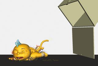
Blinks become even more impactful with a large-eyed character design like Bink. Break the shot down into the different kind of blinks. There's reactionary, such as when he hits the ground or gets poked. There's natural blinks, such as during a head turn or to help keep a stationary pose alive. Finally, there's motivated blinks, which help show us what the character is thinking, such as a change of thought or a realisation.
02. Control blink curves
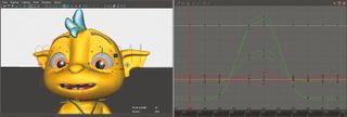
With large eyes, really polish the blink animation curves – they will take longer than typical blinks. Build in the slow-in and slow-outs, taking care that there's always a bit of the pupil showing (preventing a dead-eyed frame). Also, be sure to hold the close position at least two frames for it to be readable, or it will look like a flash frame. The top lid should be doing at least 80 per cent of the movement to meet the bottom lid.
Get the Creative Bloq Newsletter
Daily design news, reviews, how-tos and more, as picked by the editors.
03. Using dialogue
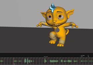
The dialogue was interesting because it was a unique vocalisation rather than traditional words and phonemes. Relying on reference, I'd mimic the sounds and look in the mirror to see what shapes my mouth would make. It also helps to increase the height of the Time Slider. This lets you see the waveform larger and you can better visualise all the dialogue moments. Go to Preferences>Settings>Time Slider: Height 4x.
04. Motion blur
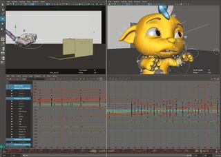
It's important to remember that your animation needs to exist beyond the first and last frame. Animate a five frame buffer so that the animation will motion blur properly at the start and end of the shot. The same principle applies as to why you don't cheat and move a character or prop into place in one frame – the resulting motion blur will give you away. You may not see it until lighting, which is a costly place to discover the problem.
05. Head follow
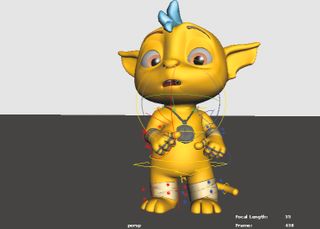
The Head Follow control is a powerful tool if your rig has it built in. It can usually be set to follow the Body, the Local Axis, or a more traditional All. Depending what movement your character is doing, this can save you lots of extra animation and give a natural feel to the character. However, be careful trying to match poses between shots with a different follow type!
06. Use references
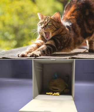
The secret to good animation is good references. Initially for the shot of Bink waking up, I had used some cat stretching reference I found online. Talking with our producer/director Eric Miller, he wanted Bink to be more of a curious toddler than animalistic. Fortunately, I have two young kids myself, so I studied how they woke up from a deep sleep. Adding those specific, unique moments makes it feel grounded and real.
07. Backstory is essential
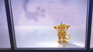
Eric and I talked about the character of Bink – he has an entire backstory that isn't revealed in this first short, but it was essential to help find his character; it changes how to approach each moment of the short. Him falling out of the cage or seeing his human captors could've been played many different ways. The backstory tells you which approach gives the proper subtext and supports the overall narrative best.
08. Explore the rig
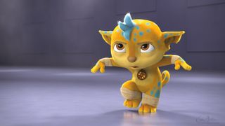
The first thing to do with a new character is just spend a day playing around with the rig. You'll find what it can do and what makes the character the most appealing. Really spend time finding good face poses. I keep a collection of good face and mouth poses saved on frames outside the shot timeline that I can always reference/copy from. With a character like Bink, keeping the eyes wide really helps with the curiousness and appeal.
09. Camera view
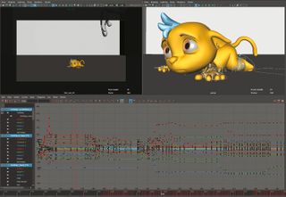
I always work with two camera views open. One is in perspective, which I pose most of the time in. The other is a camera view so I always see what the viewer will see. Often, to get the perfect staging for the camera, the rig is breaking out of view. Also, be sure to keep playblasting your animation constantly. With a professional level rig like Bink, it won't ever play back full speed just within the Maya viewport.
10. Display Layer Editor
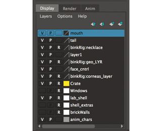
With a detailed rig like Bink, use the Display Layer Editor to break up the rig controls and shot assets. Always simplify the scene and only look at what you are currently focusing on. I broke up the rig for face controls, body, tail, ears, and necklace. I also set the geometry of Bink and the set/props to other layers so I could easily control their visibility.
This article originally appeared in 3D World issue 211; buy it here!

Thank you for reading 5 articles this month* Join now for unlimited access
Enjoy your first month for just £1 / $1 / €1
*Read 5 free articles per month without a subscription

Join now for unlimited access
Try first month for just £1 / $1 / €1
