How to design a promo for an imaginary brand
Discover how to create striking promotional design for an imaginary brand.
When designing for a brand, whether it be an established one or a startup that you’re taking the creative lead on, consistency across all touch points is key.
It’s essential that any design relating to the brand is instantly recognisable and so all the elements must be consistent.
In this post, I’ll walk you through how to create a simple A5 promo for a contemporary brand, detailing how to create and then archive graphic elements in an InDesign library.
01. Set up a grid
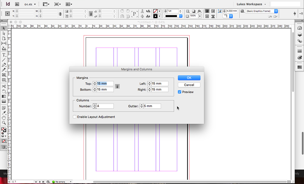
Begin by launching InDesign and creating a new two-page A5 document. Ensure that ‘Facing Pages’ is unchecked, because we’re creating a two-sided card, not a publication.
Navigate to Layout > Margins and columns, and enter 15mm for the margin values; 4 for the number of columns; and 5mm for the gutter width.
02. Add basic elements
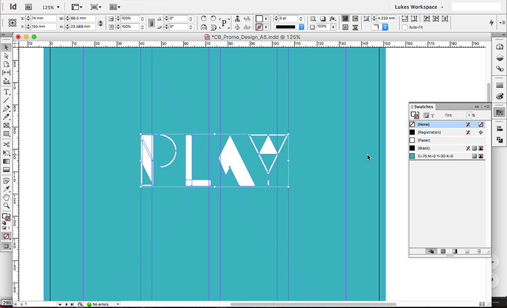
Next, using the rectangle frame tool, draw a box that snaps to the bleed of the document and fill it with a colour of your choice.
Now paste your logo into the document and position it in the centre of the document, which will be easy if you have smart guides switched on.
Get the Creative Bloq Newsletter
Daily design news, reviews, how-tos and more, as picked by the editors.
03. Create graphic brand elements
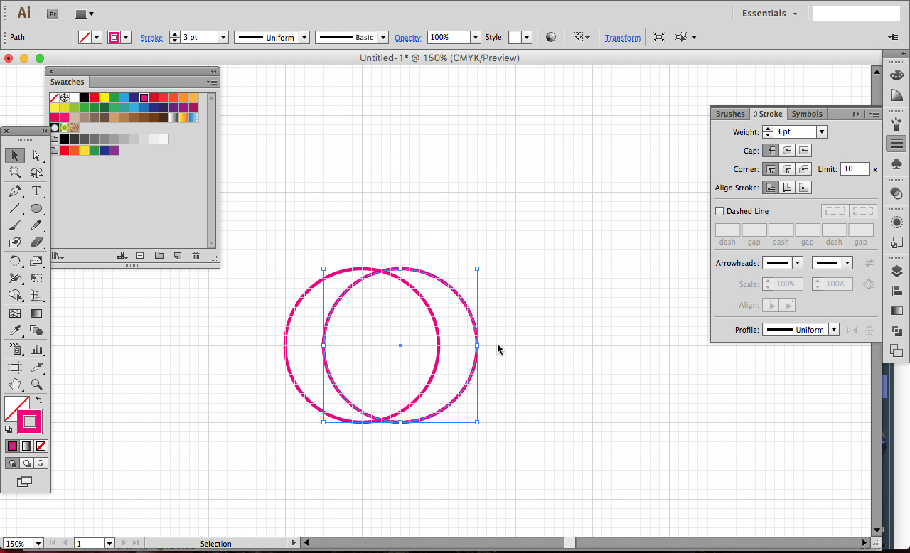
Now to create a set of graphics that will form part of our brand language and provide us with elements that can be deployed whenever any new designs are needed.
Switch over to Illustrator and create a new document. With Snap to grid turned on in the View menu, begin by drawing a perfect circle using the Ellipse tool whilst holding Shift. Ensure that it snaps to four of the larger grid squares, as shown.
Now, whilst holding shift and alt, drag and duplicate the circle and then using the shortcut ‘Cmd + D’, duplicate the graphic a number of times until you have a sort of slinky effect.
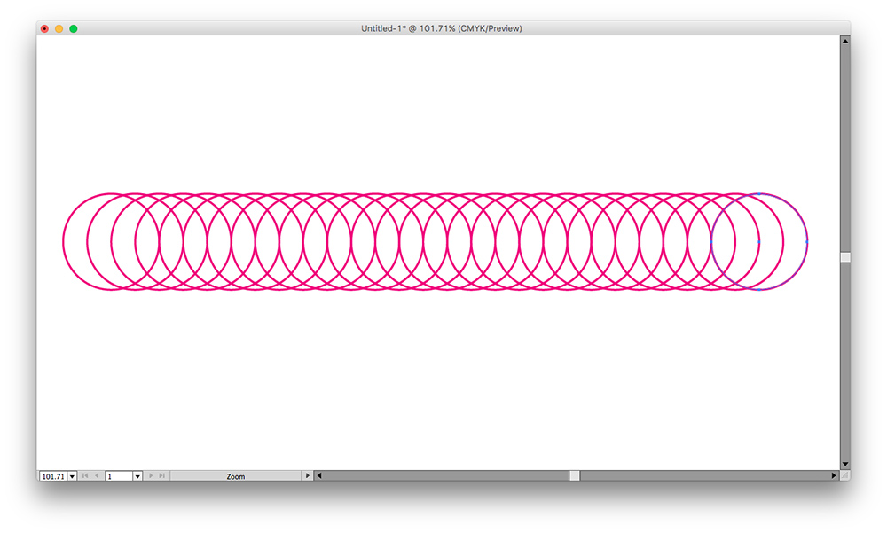
04. Create a radial graphic
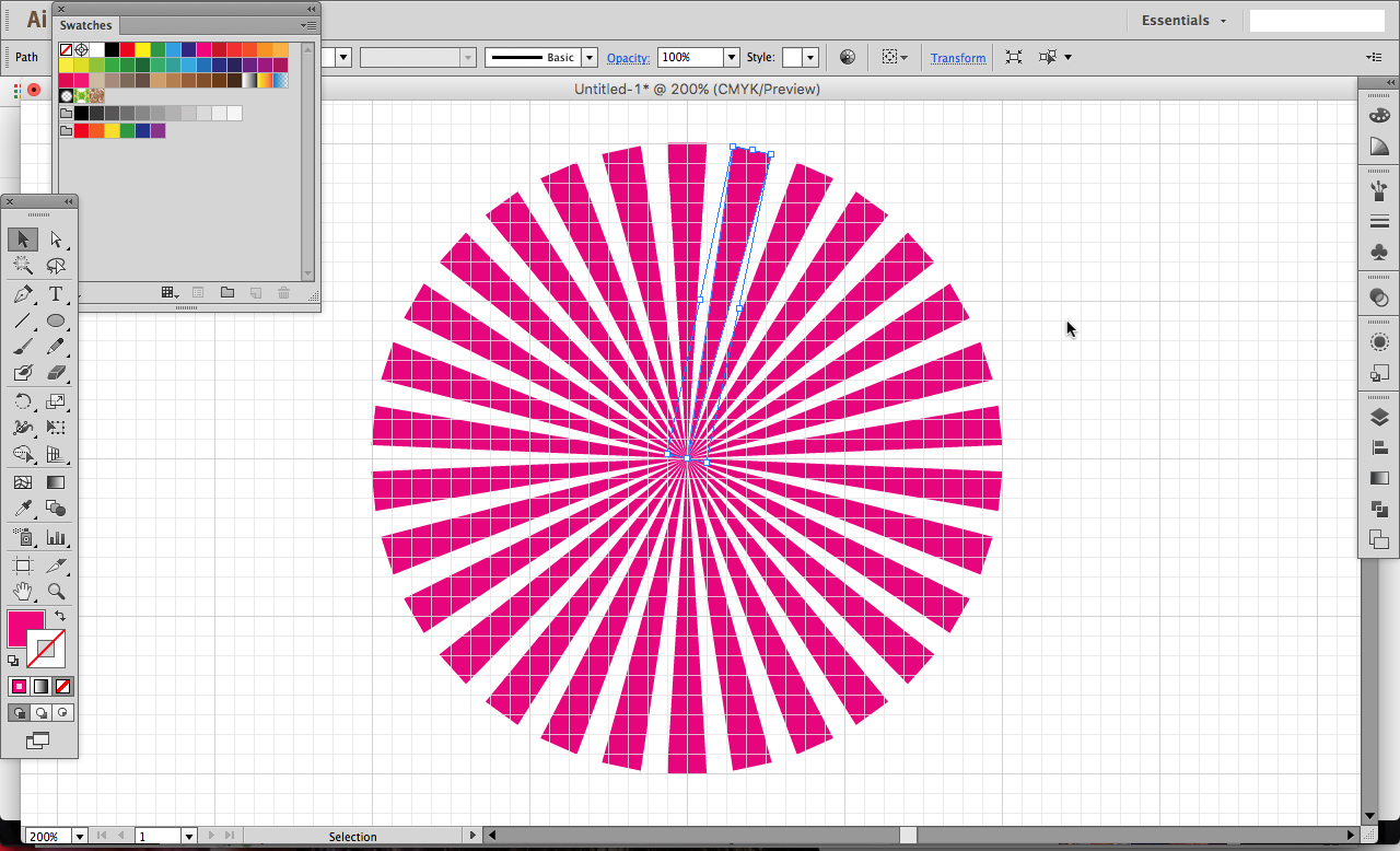
Next, with Snap to grid still on, draw a long triangle that snaps to the grid as shown in the example above.
Hit ‘R’ to bring up the rotation tool and holding alt, click on the thinnest point of the triangle to bring up the rotate panel.
In the angle box, enter 360/12 and hit the Copy button. Now use the same ‘Cmd + D’ technique to duplicate the triangle through 360 degrees.
Repeat these two process for various different graphics until you have a small arsenal of elements that you can use within your designs.
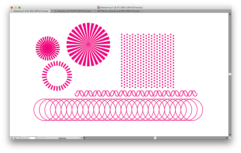
05. Integrate your newly created elements
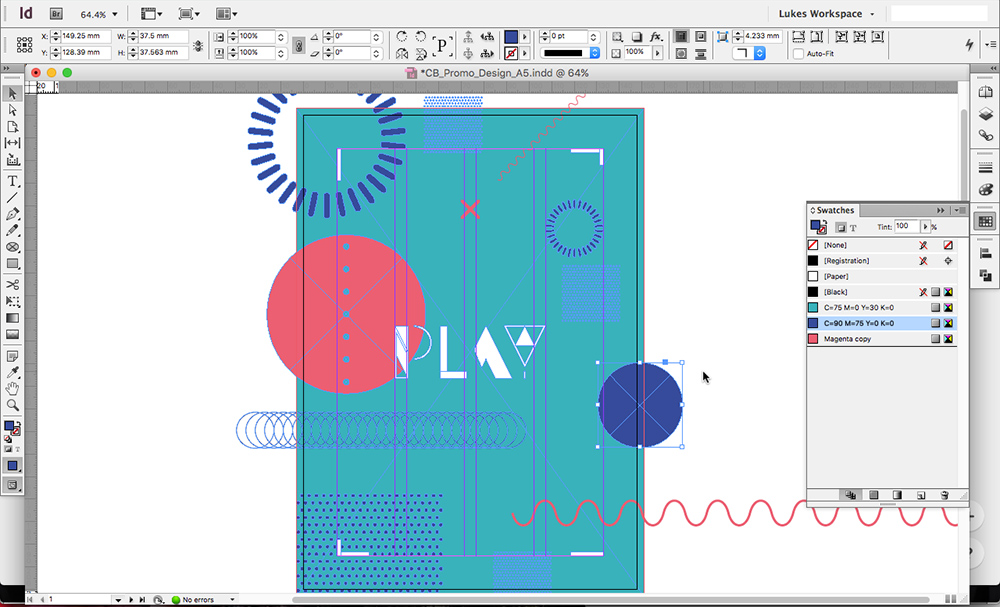
Now for the fun part. Simply start pasting in your newly created elements into your InDesign file; as they both work on a vector engine, there’s no need for linked files.
Colour up your elements in complementary colours and begin placing them around the document, looking for interesting layout and composition options. At this point, feel free to add some basic shapes like circles to complement the graphics that you’ve already created.
06. Set up a library
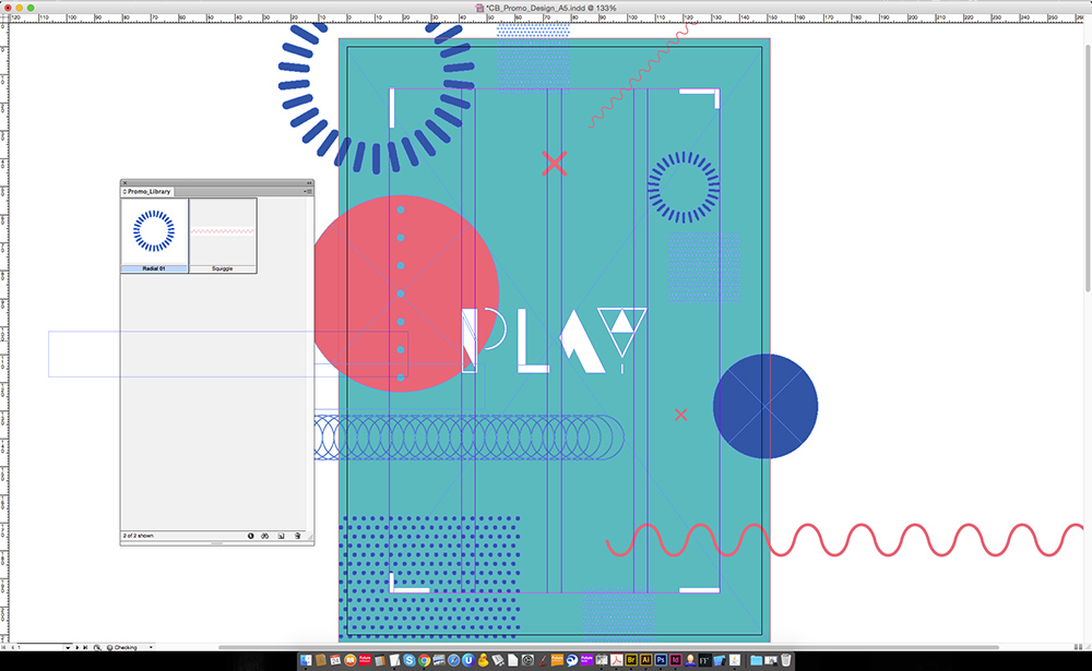
Now that we have a number of brand elements that we’ve created and used in a design, we can create an InDesign library so that they’re ready and waiting whenever we need them.
Go to File > New > Library and them name the library something appropriate. Now simply drag and drop elements from the design that will be used regularly in other designs for the same project. This can be anything from backgrounds to logos and graphics.
07. Set the text
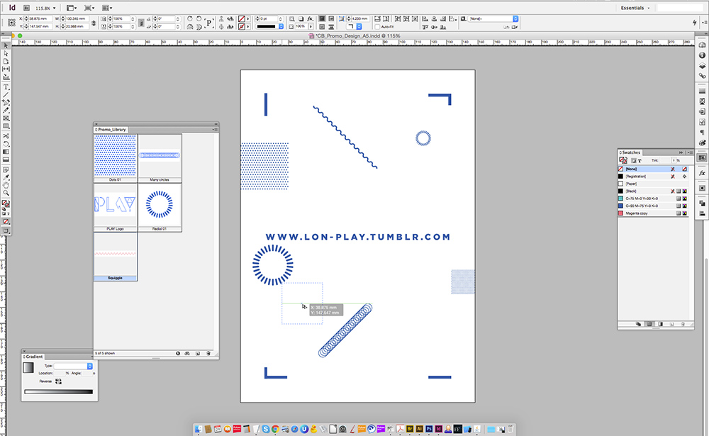
It’s now time to move on to the second page of the InDesign document. As this is a teaser promo, I’m keeping it simple, with the copy by featuring just the web address on the back to entice the recipient to check it out.
Choose a font that suits the overall look and feel of your design. In this case, I’ve chosen Gotham in its black weight and tracked it to 250 to give it a more contemporary feel.
As we’ve set up our library with all of our graphic elements, it’s easy as pie to simply drag and drop elements onto this page. I’ve chosen to be quite sparing in terms of the amount of elements featured on the back, as I want the URL to be the main focus.

Thank you for reading 5 articles this month* Join now for unlimited access
Enjoy your first month for just £1 / $1 / €1
*Read 5 free articles per month without a subscription

Join now for unlimited access
Try first month for just £1 / $1 / €1
Luke is a creative director, visual designer and digital artist, who works at THG Studios in Manchester as creative director of beauty. He previously worked for Future Publishing, where he was art editor of leading magazines such as Guitarist, T3 and Computer Arts.
