How to design a book cover in InDesign
Follow this essential 11-step checklist to make sure your book cover designs are perfect, every time.
The saying might be, ‘Don’t judge a book by its cover’, but the design of a cover can, in fact, make or break the success of a book. If you’re like me, the design of the front cover is the easy part. Your creativity can really flow when you’re making a compelling design that reflects the story.
But then comes the spine. How big should it be? And don’t forget the back. Have you got all information you need for the back cover to look official?
Over the following steps I'll walk through everything you need to know to design a book cover in InDesign Creative Cloud. This tutorial is based off Pariah Burke's course on Pluralsight.
01. How big will your book be?
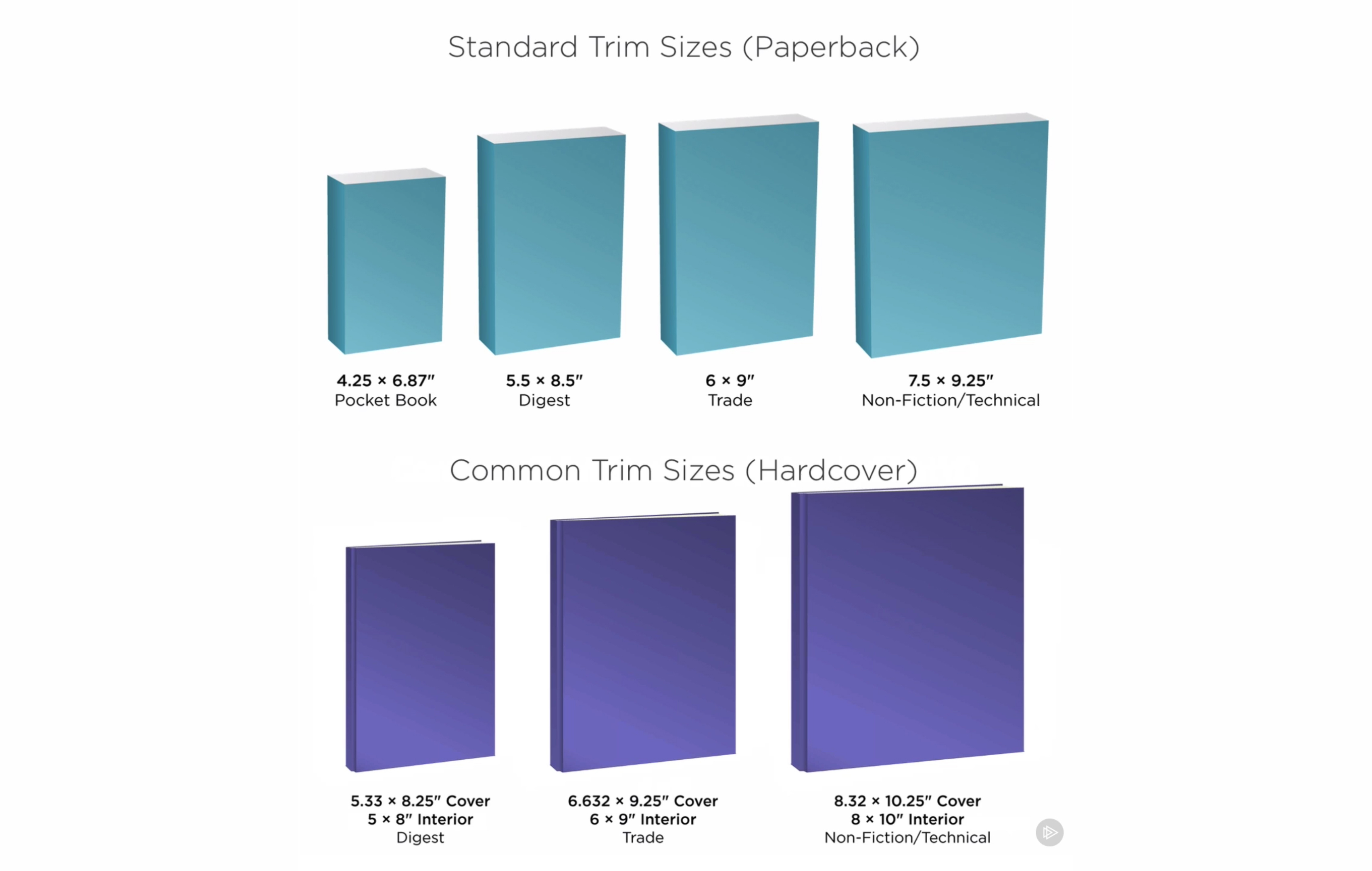
First, let’s look at some vocabulary. Trim size refers to the final dimensions of a printed page after all the bleeds are cropped. It’s the size of the front and back covers of your book – not including the spine. (Sometimes you’ll see the words ‘back cover’ written as ‘bacover’, which is an industry standard term.)
Most of the time, if you’re designing a book cover, the printing of the book will already be determined and the printer will have a template for you. However, in special cases, you might need to calculate some of these things yourself.
Ask yourself: am I designing for paperback or hardcover? Is my book fiction, non-fiction, digest, trade or technical? Will it have a lot of images or be mostly just text?
Smaller books work well for text-heavy publications without pictures or diagrams. You’ll see bigger sizes used when images are necessary. Standard trim sizes for paperback are the same dimensions for front and back, while hardcover designs allow for some overhang.
Get the Creative Bloq Newsletter
Daily design news, reviews, how-tos and more, as picked by the editors.
02. Set up your template in InDesign
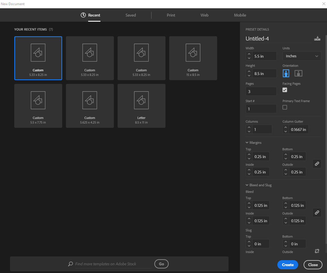
You might think it makes sense to design the entire cover – front page, back page and spine – on a single-page layout. After all, it's all printed on the same piece of paper, right? However, this isn’t the best approach if changes will be made at some point during the process.
If you don’t have the final page count, for example, or if another design element changes half-way through, you would have to make those changes and realign the design across the whole cover. It’s better to assign each piece of the cover an individual page. I’m going to be using digest size for paperback.
03. Set up the bleed
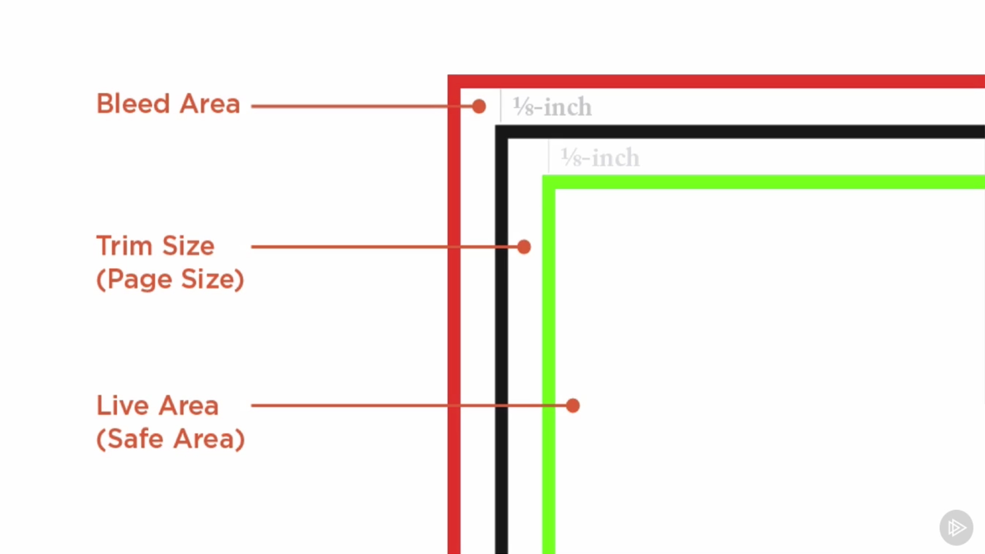
Don’t click okay just yet. We still need to set up the bleed, which is when the images, text or colours are printed all the way to the edge of the paper. Have you ever tried to use scissors to cut the border off an image you printed? It’s difficult not to get little white edges if you’re cutting right where the colour transitions to paper.
Anything that’s meant to go off the edge of the page should extend to the bleed boundary when you’re setting up a template like this one. This is so if anything shifts in printing, you'll still have a small margin for error before the final cover is accidentally cropped.
To set this area up, go to the bottom of the New Document dialog. Open the Bleed and Slug drop-down menu. InDesign calculates bleed by ⅛ inch increments, so if you click the up arrow, it will change the bleed from 0 to 0.125 inches (which is the same as a ⅛ inch). 0.125 inches is a standard bleed area, but don’t be alarmed if your printer asks for something different.
Next, let’s set the margins: this will be the guide for the live area in our document. Give yourself a minimum of 0.125 inches; I prefer 0.25 inches for a lot of projects. We’ll leave the slug alone, so click okay.
You have now set the bleed and live areas in your document. It’s time to make it look like a cover.
04. Arrange the cover panels
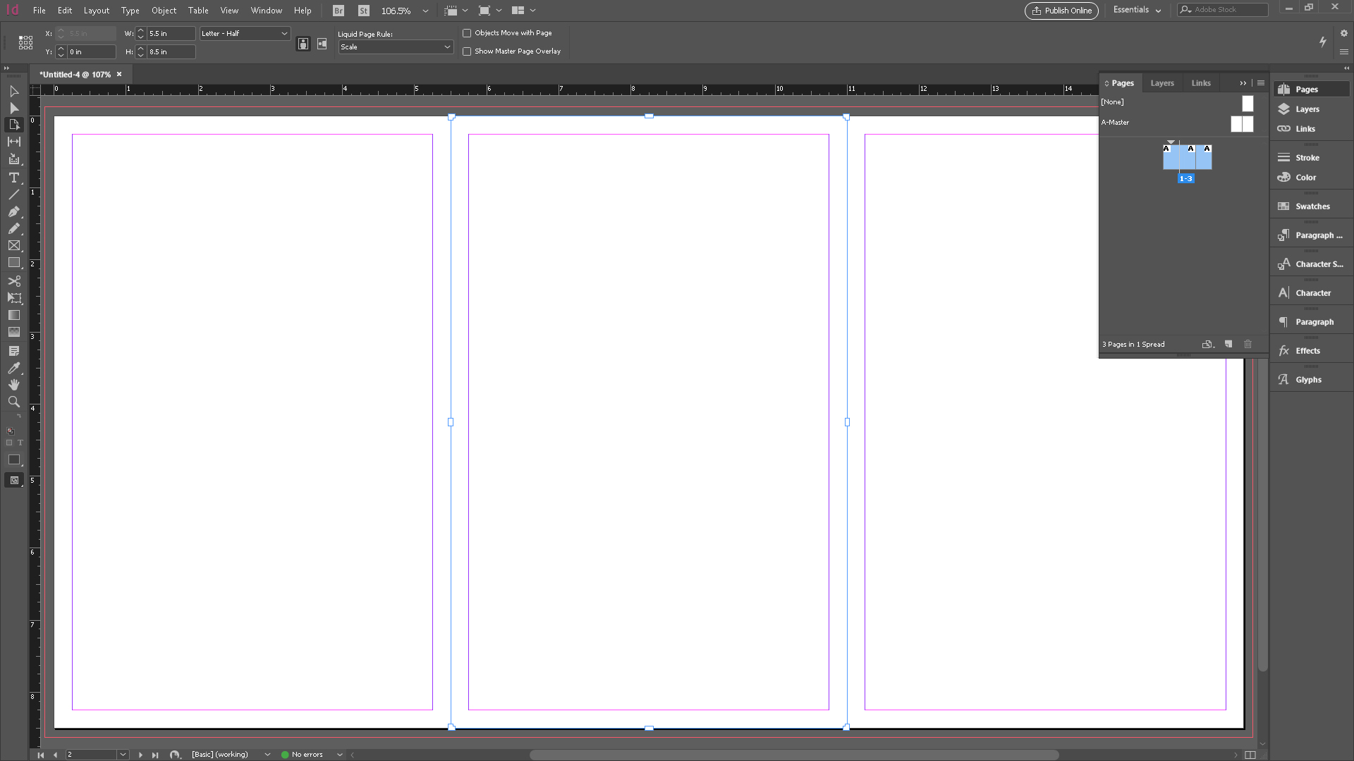
Open the Pages panel from the Window menu. You’ll see the typical two-up shuffle. Click the top-right fly-out menu in the Pages panel and uncheck Allow Document Pages to Shuffle. Now drag-and-drop page one between pages two and three. Imagine these pages from left to right as your back cover, spine and front cover.
Now, let’s resize the spine. Choose the Page tool from the Tool panel. In the control panel at the top, you’ll see the Liquid Page Rule field appear. This is set to Controlled by Master, but for us to get the most flexible options for making changes later on, select Scale.
Next, hit Opt/Alt and pull in one of the edges of the spine to roughly the width that you think your spine will be. When you let go of the mouse, the pages will snap back together.
05. Calculate the width of the spine
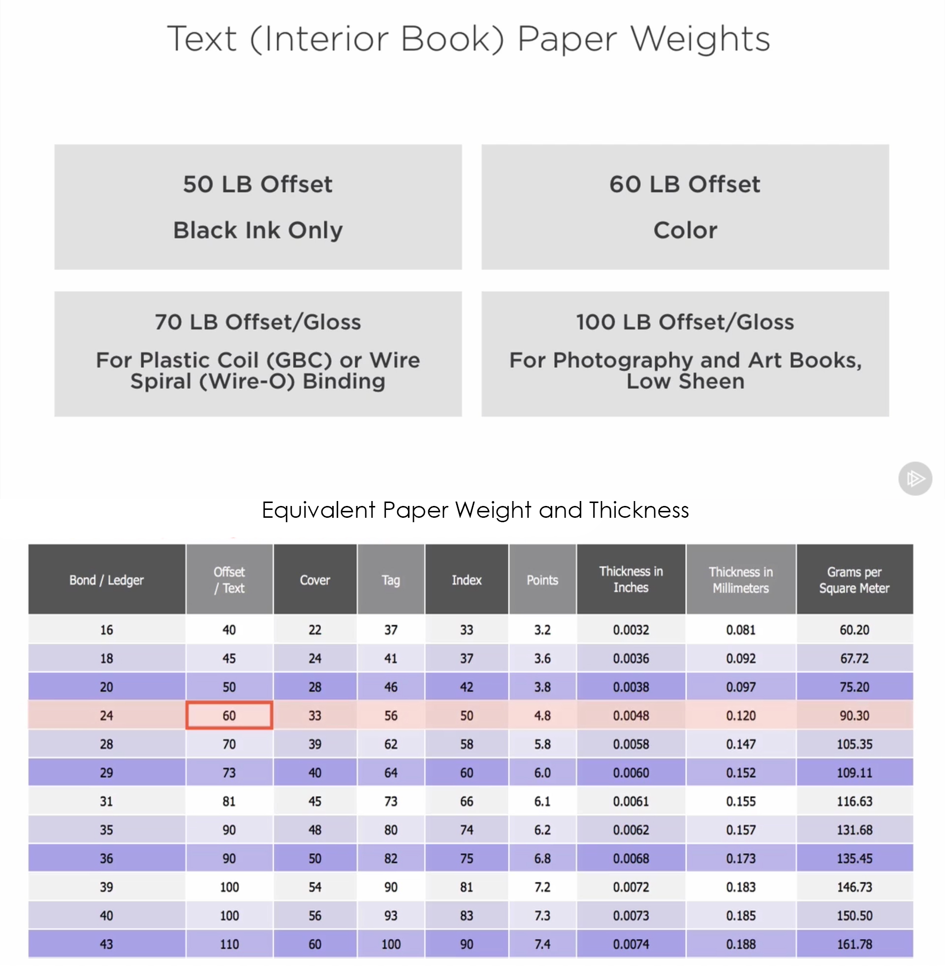
There are two major pieces of information you need to calculate the width of a perfect bound spine. You must know the number of pages in the book – which will always be a multiple of four, even if it means including blank pages. You’ll also need to know the paper thickness for the inside pages of the book, which is called ‘text stock’. This chart will give you an idea for selecting the appropriate page thickness, and shows how to calculate the spine width.
Let’s say you have 348 pages and use 60lb stock. To calculate the spine width, find the thickness in inches and multiply by page count: 348 x 0.0048 = 1.6704 inches.
Now jump back into InDesign. With the Page tool still selected, you’ll see a Width field in the control panel at the top. Enter the value you calculated here – in my case, it’s 1.6704 inches. Now your spine is the right size, and you can drop in your design.
06. Design the background of the cover and spine
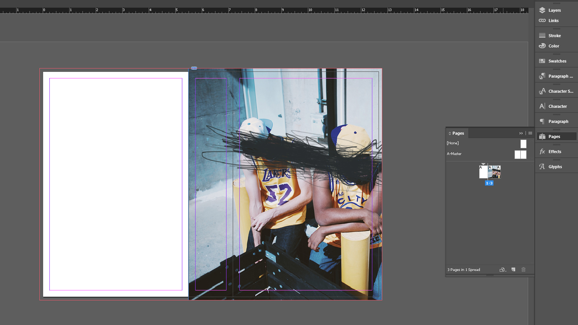
Next, it’s time to place the images you plan to use in the design. You can use an image for one panel, or on all of them, or over a combination of them. However, just make sure there’s enough negative space in the image for all the important information on the spine – like the title – to be legible.
I’m using a photo for the background of my front cover and spine. Then, I’ll use a solid colour on the back. To create the frame for the picture, select the Rectangle Frame tool and drag it along the panels you want. Don’t forget to include the bleed area all the way to the edge of the other page.
Now place your image in the box and resize it so that the brown box fills the whole rectangular frame. Do this with the Direct Selection tool.
07. Design the back cover
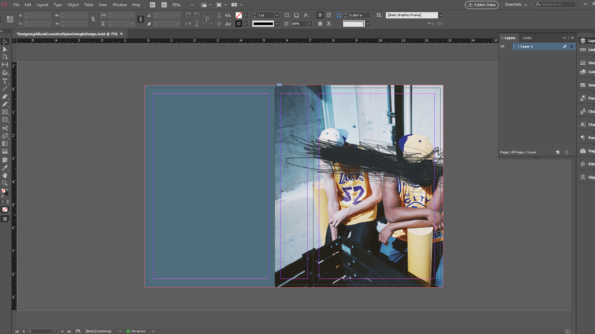
Let’s add a background colour to the back of the book. First, grab the Rectangle tool – not the Rectangle Frame tool – and draw a box covering the back panel, bleed to bleed. If you have trouble getting it exactly the right size, use the Width and Height fields in the control panel to put in the correct measurements.
We know the width is 5.5 and the height is 8.5. InDesign lets you type the addition of the bleed right into the Width and Height fields, so type 5.5 + 0.125 for the width, and 8.5 + 0.25 for the height. This way, InDesign will calculate and resize everything in one step.
Now select the rectangle. In the Fill and Stroke settings, set it to have no stroke. The default black fill will work for now. Next, select the Eyedropper tool and, with the rectangle selected, choose one of the colours from the image on the front and spine (I’ve chosen a blue tone). Jump over to the Swatches panel and add this colour as a swatch.
08. Lay out the typography
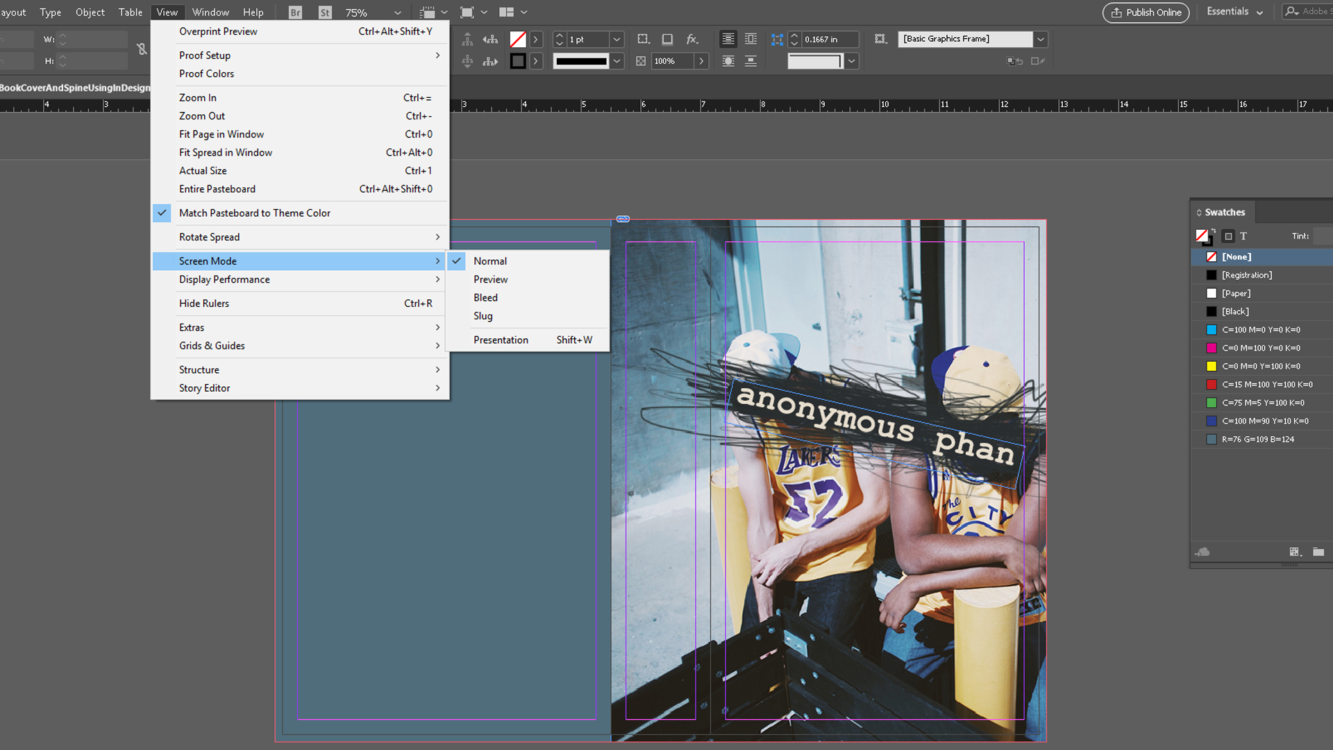
Create a text box that spans from live area to live area on the front cover using the Type tool. Now add in your title – here, ‘Anonymous Phan’. Highlight the text, go to the Fill and Stroke settings (which will now show the T symbol for type, instead of the square swatch) and double-click the fill colour.
The Color Picker dialog will open. In the lower-right corner, you’ll see an eyedropper. Select a colour from the front cover that you’d like to use, and click-and-drag it. In my case, I’m picking the light yellow from the hat. Click OK. Don’t forget to add this second colour as a swatch.
I’m using Courier New for the title because it makes sense for this book. We’ll also use a nice sans serif for the additional text that we have on the back, and for the author’s name. With the title highlighted, choose Courier New from the control panel at the top. Choose a bold weight. I also want to rotate the type frame so that it’s diagonal, along with the scribble. It might be helpful to change your Screen Mode to Preview to get the angle just right.
09. Add the author's name
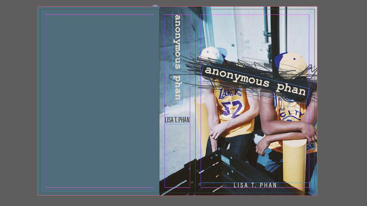
Now I’m ready to add the author’s name at the bottom of the front cover. I’m going to use Acumin Pro Condensed in a regular weight, aligned to the bottom live area. I want this to be all caps to contrast the title, but I’ve also tracked it out to around 200 to further lighten the overall value. (I went with 21 pt and 225 in the tracking.) I’ll reuse that yellow swatch from the title for the colour of the author’s name too.
Now let’s add the text to the spine. Press Opt/Alt and drag the title to make a duplicate of it. Rotate it until the beginning of the title is at the top and it’s at 90 degrees. Next, duplicate the author’s name. You may need to choose a more condensed version of Acumin to get it to fit horizontally on the spine. Let’s also change the colour of the author’s name to a dark colour, since it’s not on the dark background anymore.
10. Add the barcode
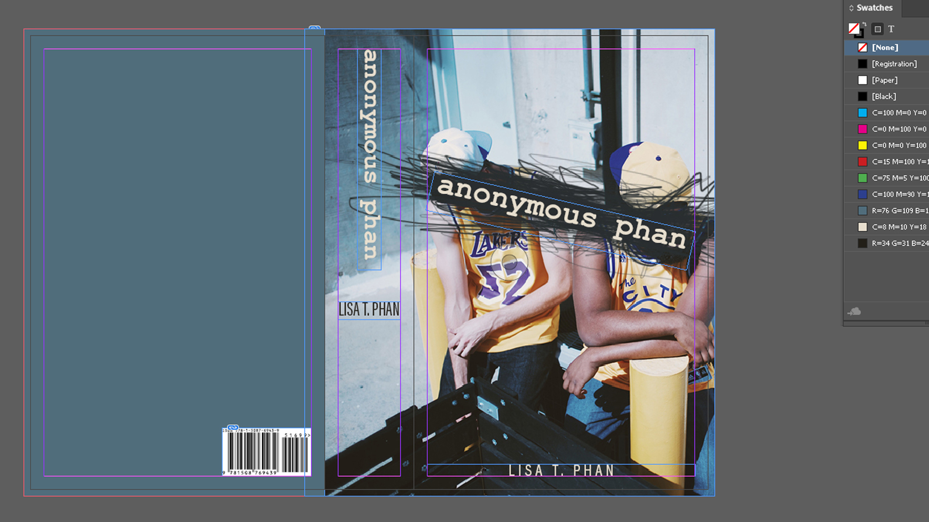
Lastly, let’s move onto the bacover. You must include an ISBN (international standard book number). This is a 13-digit unique number that identifies your book. You must also have a barcode. This is based on the ISBN number and allows your book to be sold. You’ll also need the price and category. In addition, one of the most professional and essential things to add is the publisher logo; even if that publisher is you.
There are also some recommended but non-essential items to consider. You’ll likely want a summary of the story or some other information. You might want to include any endorsements or awards, for example, and maybe an author bio. Sometimes if there isn’t room for an author bio on the back, it might go at the very end of the book or on the jacket. You can also add bullet points. These would provide quickly scannable information that helps sell your book, but it's more relevant to non-fiction works.
To add these elements to the Bacover, first get an ISBN. You can do this through this website My Identifiers. Fill out the info as needed, and you’ll get an ISBN number that you can use to generate a barcode. You can pay for a barcode through the same site, but you can also get one here for free. Enter your ISBN code, fill out the rest of the fields and choose whether you want a PDF or PNG format for the barcode. Once you get your barcode, place it into your document.
11. Flow in the copy

Sometimes the barcode might look like it’s right up against the edge of its white background. You can add a white rectangle behind it and if you give it a little extra room, you now have the perfect place to add the category they’ll need at the bookstore. (In our case, it’s juvenile fiction)
Now flow in the copy for the back of the book. Don’t forget to add the publisher's logo on both the spine and the back of the book. And that's it: you have a book you can be proud of – and one that’s taken the guesswork out of whether everything will be printed in the place you intended.
About Pluralsight
Pluralsight is an enterprise technology learning platform that delivers a unified, end to end learning experience for businesses across the globe. Through a subscription service, companies are empowered to move at the speed of technology, increasing proficiency, innovation and efficiency. For a free trial and more information, visit www.pluralsight.com.
Related articles:
- How to bind a book: a 10-step guide
- 5 tips for improving your book design
- 10 of the best graphic design books to read in 2017

Thank you for reading 5 articles this month* Join now for unlimited access
Enjoy your first month for just £1 / $1 / €1
*Read 5 free articles per month without a subscription

Join now for unlimited access
Try first month for just £1 / $1 / €1
Laura is a passionate visual effects and motion graphics author at Pluralsight. Her favourite projects are her two in-depth After Effects introductory courses on Pluralsight, which were each built around training motion artists and VFX artists, respectively. Using her vast skill set, Laura has taught thousands of artists everything from shot-tracking and rotoscoping to motion design.
