How to create furry cartoon characters
Tips for how to master Yeti to create cartoon fur.
17. Understanding clumping
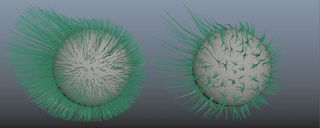
The Clumping node is one of the most important nodes in Yeti. To apply the Clump, select your current network and duplicate it; create a Clump node. Play with the Density and the Length parameters on one of the networks to enhance the effect. You can play with this technique many times in your grooming network to make multiple clumping effects. Note that you can also use the Clump tool to enhance the clump effect in some areas.
18. Bend the clumps
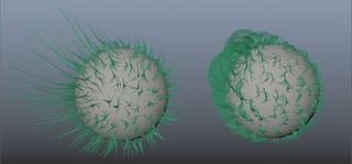
To finish my base network, I add a Bend node (which in this case is crucial to bend the clump we previously made and get the look we want). Playing with the combination of different nodes allows you to get subtle and very cool effects. This leads us to the Merge Node…
19. The merge node
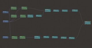
In order to make the sheep look better, I create a few networks with different looks – the only thing I need to do is merge them. You can create different pgYetis and let them overlap each other but this is not the best option for my sheep. I prefer to create everything in one pgYeti network and merge them by creating a Merge node and connecting input one and two to the desired networks.
20. The Width node
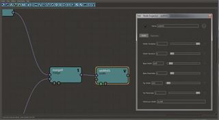
To complete my graph, I need to control the width of my fur. I create a Width node and put it at the end of my graph, then I am able to control the width of the base and the tip. I get pretty good results with a value of 0.07 for the base and 0.03 for the tip. There is also the Multiplier parameter if needs be.
21. Optimise your display
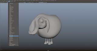
Optimisation is obviously very important when dealing with fur. The more fur you have in your scene, the harder it will be to navigate. You can hide the Yeti Node by going into the Show Panel (Viewport) and unticking Plugin Shapes, or by using the attribute provided in the pgYeti Node. In the pgYeti, you will find a Display tab. Three parameters are available to control the display (and only the display) in the viewport: the density, the length and the width.
22. Optimise your render
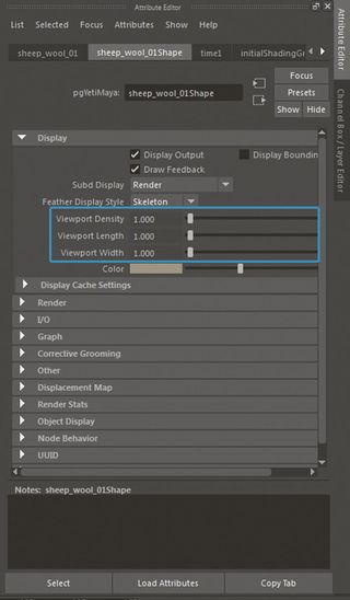
In the pgYeti under the Display tab, there is a tab called Render. You will find the exact same parameters as in Display, but for rendering. I like to set my density value in the Scatter node and set the render density after that.
On some shots, the sheep are quite far from the camera so don't need much density. I decrease the render density accordingly.
Get the Creative Bloq Newsletter
Daily design news, reviews, how-tos and more, as picked by the editors.
23. Limit of the Viewport
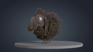
The preview of Yeti in the viewport is great but it has some limitations. At some point, you need a render to see if you’re going in the right direction. When I start the grooming of my sheep, I import my light rig and render a couple of images at each stage of the Yeti graph in order to get a better look of what my fur is going to look like. I use the PxrMarschnerHair available in RenderMan RIS to shade the fur.
24. Create the stripes
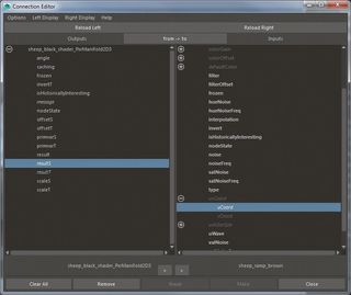
The final thing to finish the sheep is to add the stripes. I could use the same techniques that I used for the grass but with fur, but there is another method. After creating a ramp with a series of stripes, I create a Pxr Manifold and I connect it to the Maya ramp. Without the Pxr Manifold, it won’t work properly. In the Connection Editor, connect the Result S (Pxr Manifold) to uCoord (Ramp) and ResultT (Pxr Manifold) to vCoord (Ramp).
25. Finish the stripes
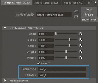
To last thing to do in order to make the stripes work is to add the correct information in the Pxr Manifold. Add surf_s in PrimVar S/ST and surf_t in PrimVar T. Note, if you are not using a Maya node – you want to use a texture that you painted, for instance – simply create a PxrTexture and drag and drop the Pxr Manifold in the Manifold field of the PxrTexture. Once the stripes are set up, I work more on the shader in order to get a nice look.
26. Importing the scene
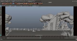
Now all the assets are created, textured and shaded, it's time for me to gather them all into the scene. I start by creating a new scene in Maya and I import my main assets. I add the grass at the end of the process because it's quite heavy for Maya and not essential at this point. The important thing is to get the main elements to start the lighting. Keep your Outliner as clean as possible in order to stay organised.
27. Start the lighting
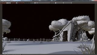
The lighting of my scene is daylight, the sun is high and some clouds are casting shadows on the ground. I create an HDR of one of our scenes that we use as a base in the main environment shot. Then I add a simple Directional Light to enhance the lighting direction. To enhance certain areas, I put some colours in the light and shadows or plug in some textures. This creates contrast.
28. Adding the grass
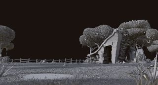
Using the technique that I explained before, I apply the grass to my main terrain. With my camera angle, I don't need the same density of grass everywhere. I simply split the terrain into different meshes and create a different Yeti node. I reduce the Render Density of the grass. The scene looks the same but the caching time is reduced. Optimise your scene as much as possible, especially when you are working with instances, otherwise it can become too large.
29. Placing plants

It's time to go into detail. I start by adding mushrooms all around the scene, then some plants. I also add trees in the background to add variation. The more variation you add, the better it will be. Our universe is very colourful and it was not always easy to deal with it. Most of the time, I import a simple version in Photoshop and do a couple of tests with various colours. The important thing is to keep the image clear and readable.
30. Adding rocks
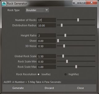
I want to make the ground more interesting so I add more variation of colour and textures in the grass. I decide to add some tiny rocks. I've found a very cool, free script called RockGen from Creative Crash. I launch the script, choose the number of rocks, and their height and click Generate. I can now place these rocks in my scene.
31. Using spPaint3d
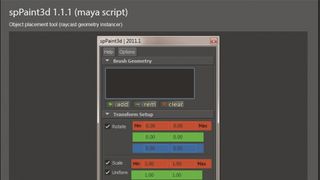
spPaint3d is a must-use script on Creative Crash. It enables you to duplicate or instance a series of meshes on a surface. This is very useful for an environment scene like this one. It allows me to place all the clovers, the rocks and the plants randomly in a very short amount of time. There are a lot of parameters I can tweak just to add variation in the placement of my meshes.
32. Splitting your scene
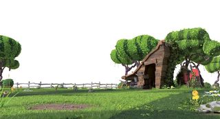
In order to have more flexibility in compositing, I split my scene into different parts. Splitting your scene really helps when you need to tweak particular elements separately. I use different render layers to split my assets and recombine them in Nuke. For the background, I create a Yeti node on the hill using the same technique as the grass. I work in a different Maya scene to keep it light. Once the hill is created, it can be reused in other shots.
33. Finishing using Nuke
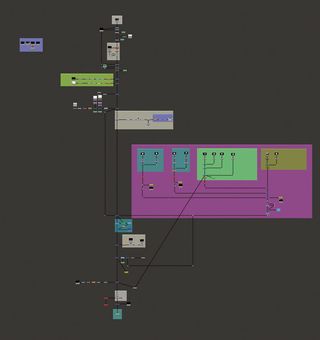
We use Nuke for compositing. In an environment scene like this one, I really recommend adding a bit of atmosphere (using the ZDepth as a mask)
to help the legibility of your image. After this tiny modification, I use a few Grade nodes to enhance some parts of the image using the ID channel. To complete, I add a bit of vignetting, a spot of depth of field and a touch of chromatic aberration.
This article was originally featured in 3D World issue 214; buy it here.
Related articles:

Thank you for reading 5 articles this month* Join now for unlimited access
Enjoy your first month for just £1 / $1 / €1
*Read 5 free articles per month without a subscription

Join now for unlimited access
Try first month for just £1 / $1 / €1
