How to create a winter environment
Discover a workflow and thought process for creating a bustling environment on an overcast day.
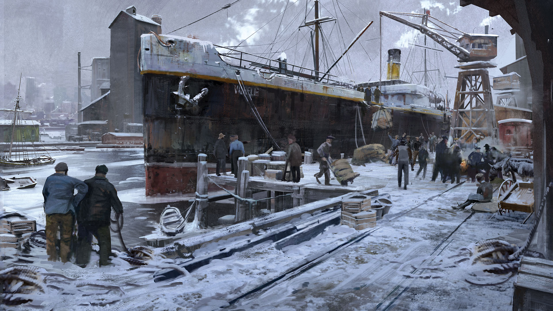
Before I start working on a personal image I usually start thinking about what I want to see in the finished work. In most cases I'm interested in creating a certain effect, such as how to paint fire or illustrate a portrait under unusual lighting conditions.
When I read something about composition or a colour scheme, or an interesting thought comes to my mind, I make a note of it. Sometimes it's also about a specific painting technique, but almost never about a subject. I keep my ideas in a text file: it's simple to maintain, and has grown in size over the years.
So here are my thoughts for this workshop. I want the setting to be an overcast day, with no cast shadows. This is partly because I can't remember ever painting a picture like that before. I usually like to use some strong lights or cast shadows to add visual interest and guide the viewer's eye through the painting, so I'll have to come up with alternative ways to do that. Of course, there'll still be shadows, they just won't be as obvious. I'm also keen to paint a crowded locale with interesting-looking groups of people, or micro-compositions.
Let's get started....
Download all the assets you'll need here.
01. Brainstorming and sketching
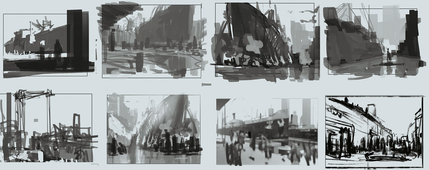
I want to paint an overcast day, but what do I want the viewer to see? I have different scenarios in mind that I scribble down quickly. Some ideas sound great initially, but turn out to be visually weak or even contradictory. I go back and forth between different techniques and art programs. I find it useful to do some sketching, line drawings, volume drawings or renderings in 3D, because the technique influences my finished image. I also gather some photo references.
02. Finding a colour scheme
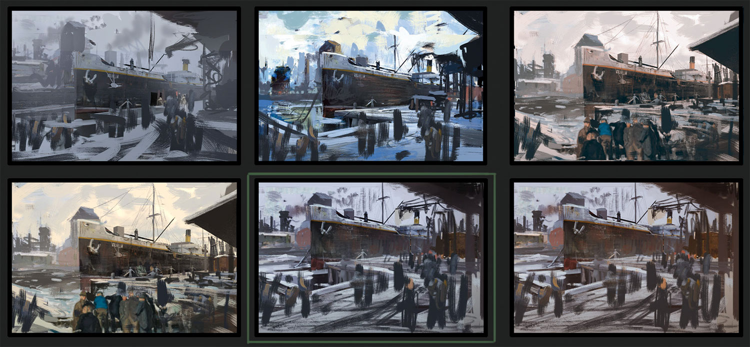
These colours are influenced by the impressionistic painters of the Ashcan School, who portrayed the lives of the lower working class in New York in the beginning of the 20th century. I like the grainy, realistic feel of some of their paintings. My colour scheme has its roots in the sky: its dominant colour creates a unifying scheme in this environment. The colour of large objects, such as the buildings, change according to the environment. I choose some local colours to create a unifying look and add visual interest. I want harmony, but want to avoid a monochromatic image.
Get the Creative Bloq Newsletter
Daily design news, reviews, how-tos and more, as picked by the editors.
03. Blocking out in 3D
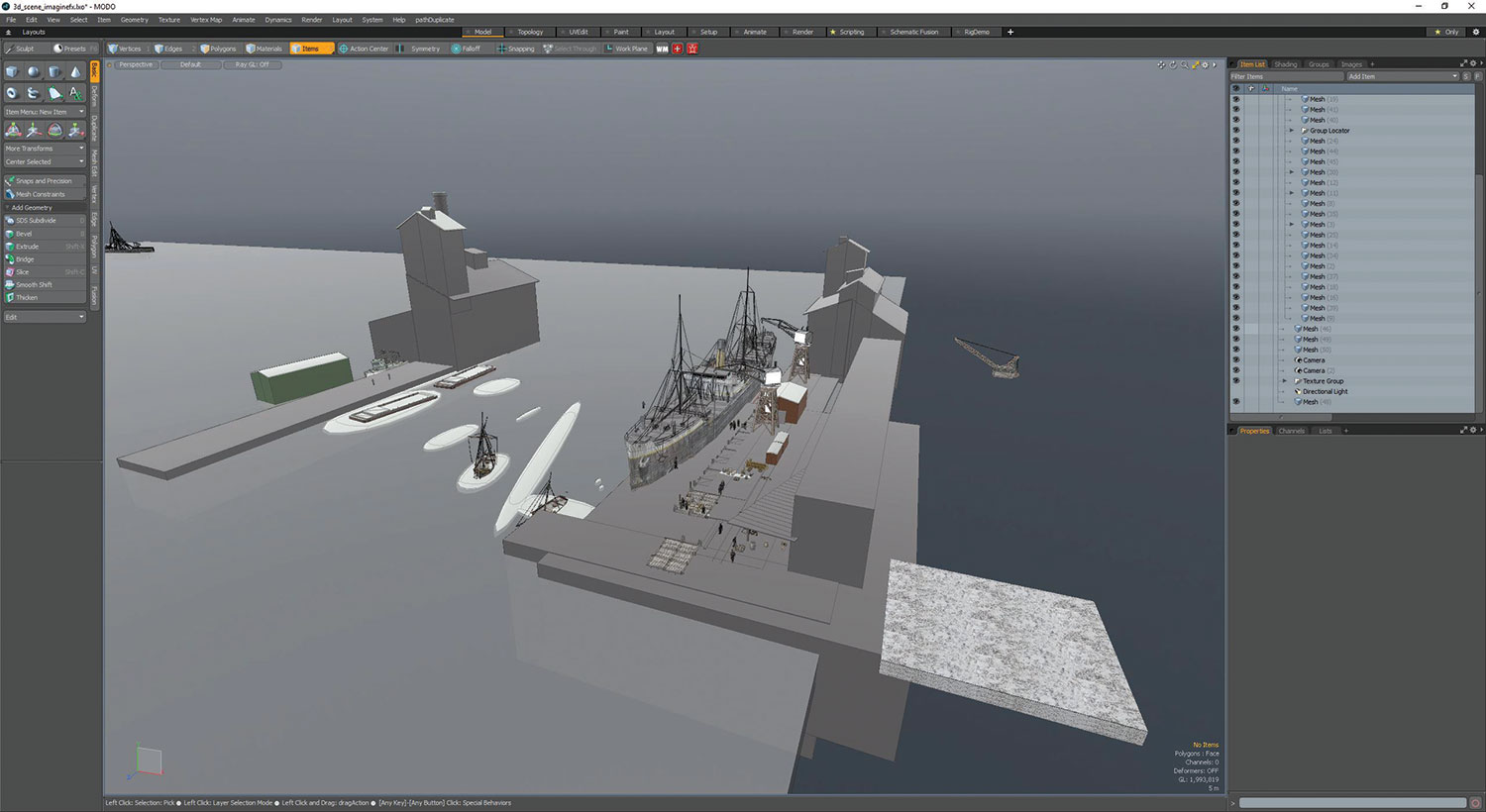
Now I build the scene in 3D together with my colour scheme. I create a ground plane and add some boxes. As I develop the scene, I subdivide my boxes, or replace them with objects from a custom 3D library: crates, wagons and so on. I often use them to populate a scene quickly. In most instances they're replaced by brushstrokes during my painting process.
04. Developing the ship's diffuse colour
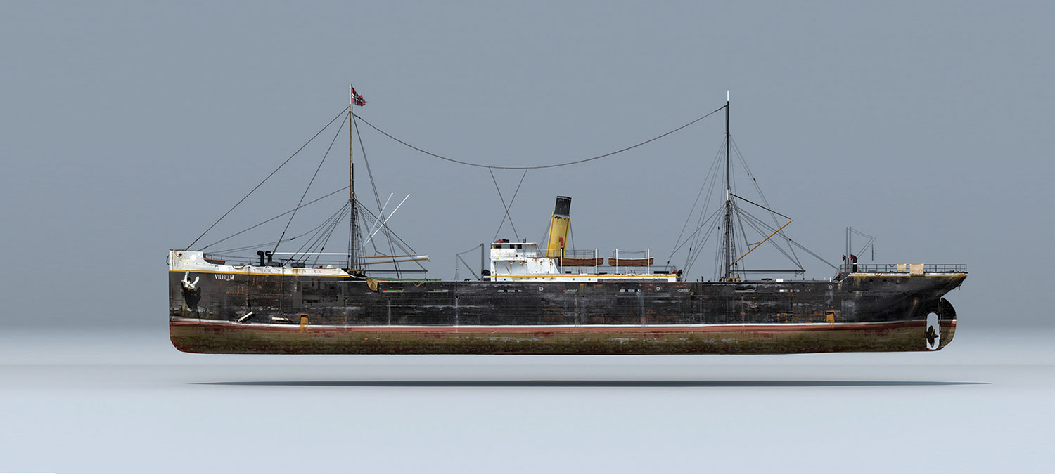
This image shows an older texture concept that I did for personal purposes. I've never used it in 3D and I'm glad that it comes into its own now. I make a rendering from the side of this ship, paint over it and project it through the same camera back on to my ship. It provides a decent base for further painting. I use the same Imagemap to create variation in a Roughness/Gloss map and a simple Bump map. Both of these two maps are highly inaccurate, but provide me with an interesting variation in the ship's texture.
05. Preparing for the render
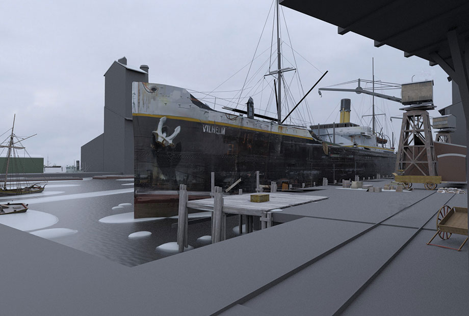
Before hitting the Render button I explore several variations with my camera settings – including position, height and focal length – to develop the best results. I also decide to create a water material. It's certainly worth doing, because I know that I'll reuse it in other projects. I also change the local colour of my objects according to my colour sketch.
06. Gearing up for the painting stage
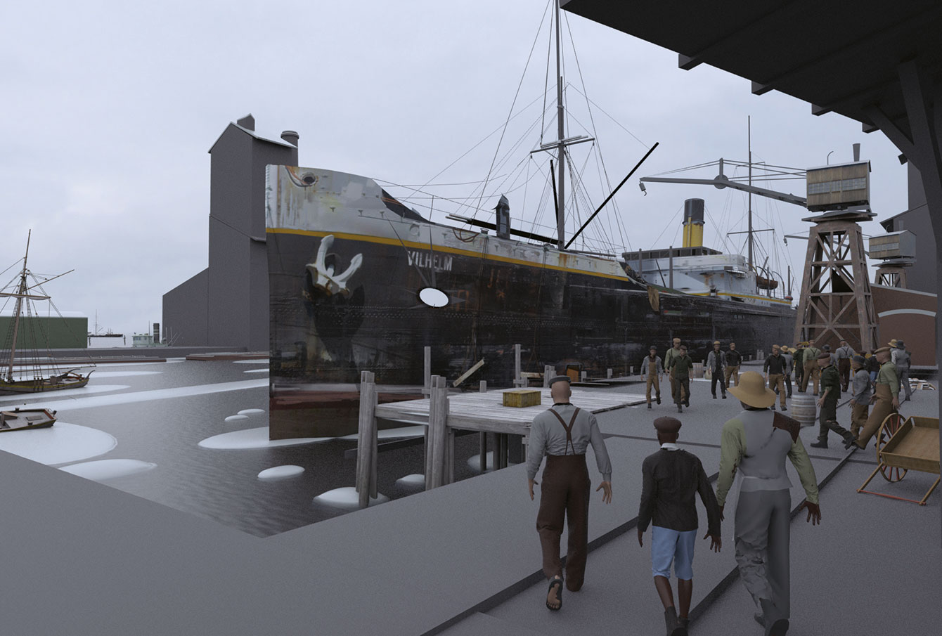
Now I process my rendering, focusing on Final Color, Alpha, Element ID/Material ID, Total Illumination, Ambient Occlusion, Normals and a Depth pass. I'll use my passes to achieve the best possible starting point before starting to put my brush on the canvas. I use my Ambient occlusion Pass and put it on a Multiply layer in Photoshop CC, set to 25 per cent Opacity. The Depth pass is used to create a fog layer. I render the people in my scene separately, so I can easily take them out of the painting later on, if necessary.
07. Layer preparation
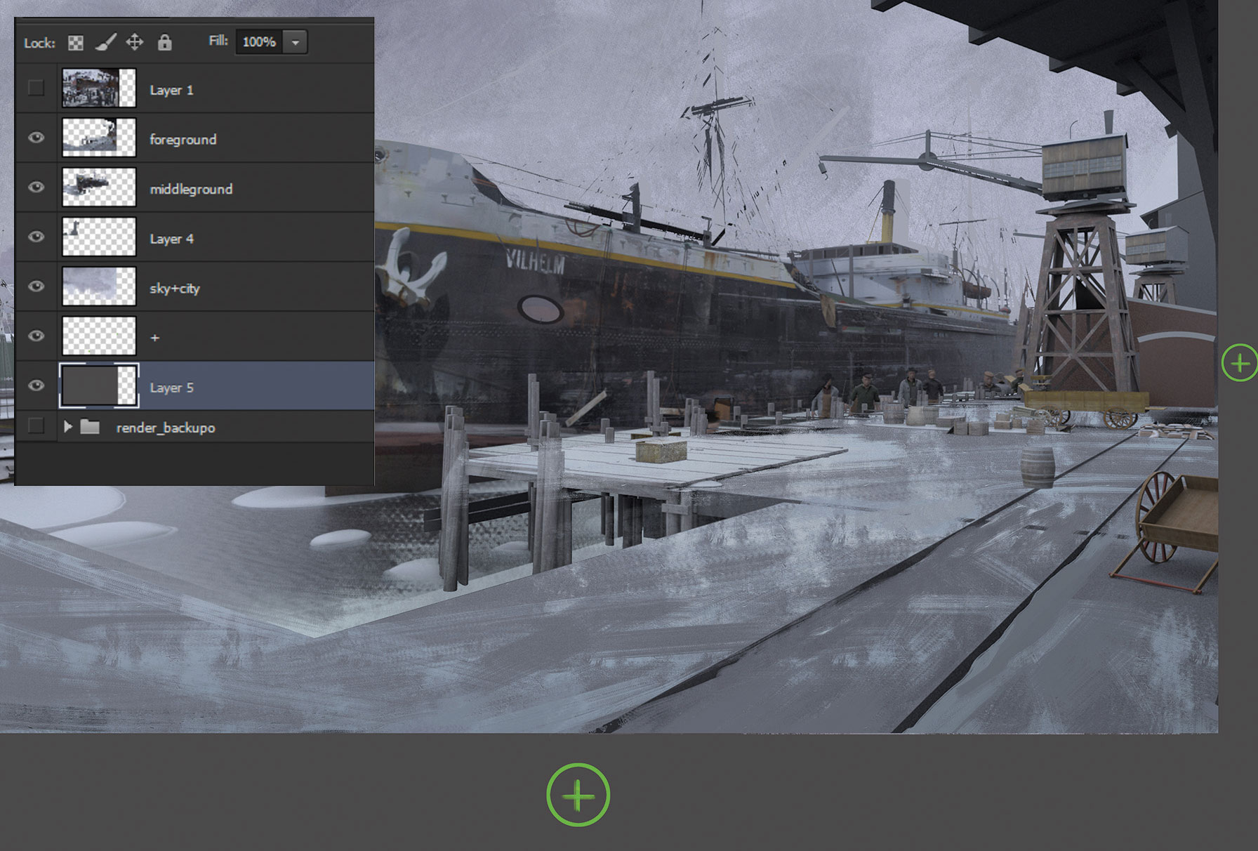
I divide the scene into the fore-, mid- and background, and sky and city to speed up my workflow. I use Content Aware Fill near the edges so I can move my layers without the blank canvas showing through. My composition doesn't offer a lot of places for the eye to rest, so I crop the image. I also establish the background because it will affect my colour choices.
08. The darkest darks and lightest lights
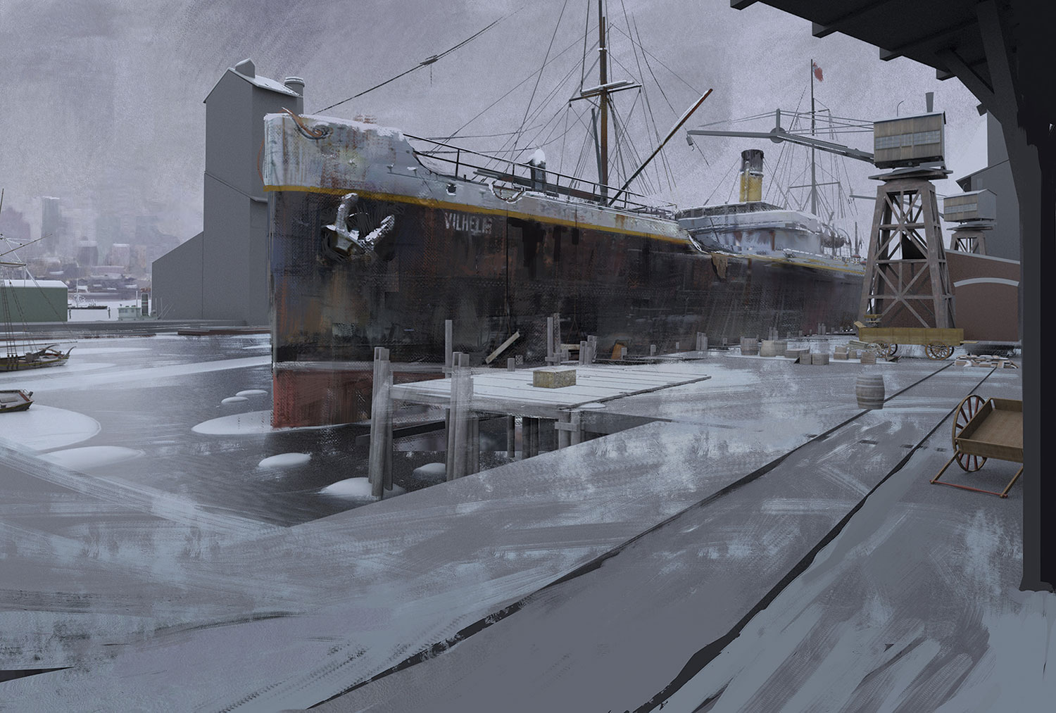
I fill in the blanks. Sometimes I use Content Aware fill for this task: it's an amazing tool. Finally I can start painting. I can't wait to get my hands on the ship's surface. It's also good to put my first marks here because it's a focal point of my picture, where I can establish my darkest darks and my lightest lights. This will help me when judging what colours to use in the rest of the painting.
09. The battle plan
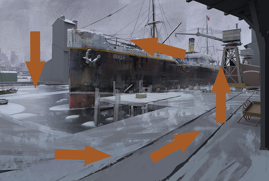
I want to explain my thoughts about the composition, because everything that I do from now should support the composition and not harm it. I decide to create no key focal point, because I want the viewer to explore the scenery instead of being stuck in a specific place. Therefore I try to lead the viewer's eye in a circular motion through the picture.
10. Progressing through the paint stage
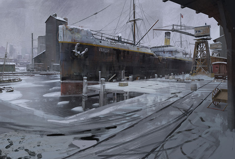
I keep adding colour, values and details to the image. I'm careful where I place my details: the surface of the big warehouse in the background is left blank on purpose. I only add some colour and value variation to it. I don't want the surface to attract too much attention: the silhouette is far more important because it'll guide the eye further in the aforementioned circular motion.
11. Establishing micro-compositions
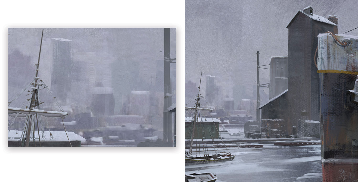
The overall composition comprises several micro-compositions that follow the circular motion. These are basically paintings within the paintings. If you draw a vertical line through the middle of the image, the left and right parts of the image are micro-compositions, which in turn contain micro-compositions. I do this to create visual interest.
12. Populating the scene
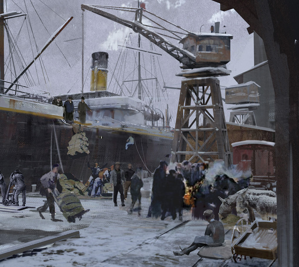
I add several people to the scene. I cut some of them out of historic photos, or paint them from references. If any figure stands out too much, I can tone them down by painting over them. I also notice that my crane isn't working the way I created it. So I jump back into Modo and rotate the crane slightly, so that it looks like it's able to put freight on to the ground.
13. Introducing more people
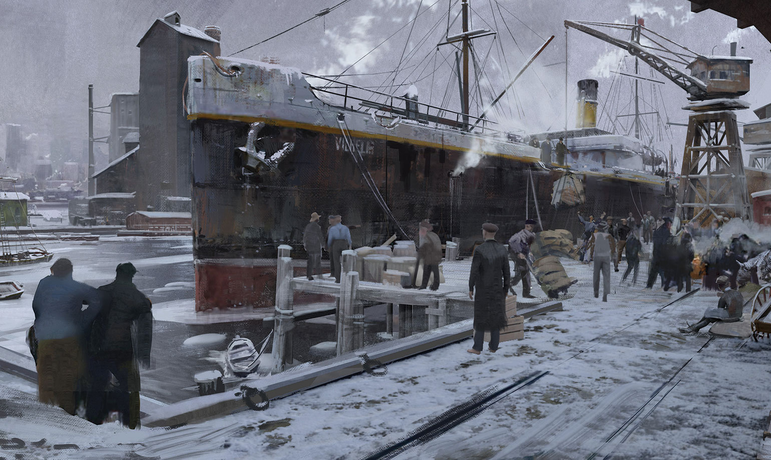
As you can see from my sketches, I planned to have a big crowd working at the harbour. So I keep adding more people and details. However, I find it difficult to add more details at this stage: the composition feels already quite complete to me and I'm worried I might mess it up. I add more people and some smoke anyway, only to take it away in my next step…
14. Chaos and detail
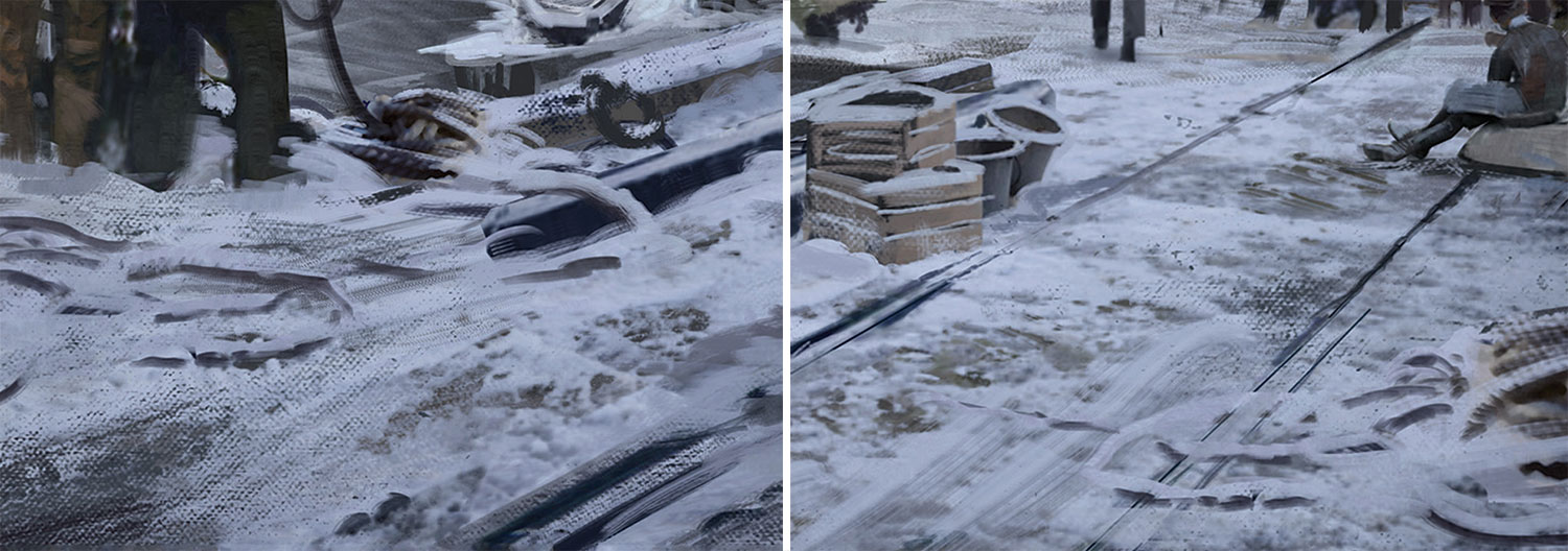
I think I'm searching for visual interest on the ground. Something has to happen here, but painting more people doesn't help. Instead I add more objects lying around, creating a greater sense of chaos and activity, and informing the story of a busy harbour side. And in the end it's all about telling a story. Now I add values here and there, then call the painting done.
This article originally appeared in ImagineFX issue 137; buy it here!

Thank you for reading 5 articles this month* Join now for unlimited access
Enjoy your first month for just £1 / $1 / €1
*Read 5 free articles per month without a subscription

Join now for unlimited access
Try first month for just £1 / $1 / €1
