How to create a Pan's Labyrinth-style monster
Follow these steps to create an atmospheric mixed media painting inspired by this cult film.
09. Bring in charcoal shadows
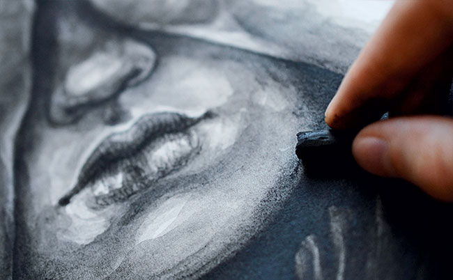
Before I switch to dry media I make sure the paint has dried completely to avoid nasty surprises. I like using charcoal to deepen dark areas even further without adding new marks or distorting the existing textures. I also use it to smooth the edges, in this case around the faces. For smudging I use my fingers.
10. Get splashy
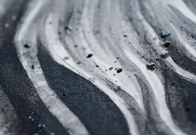
I add splashes of acrylic paint to areas I want to gain more texture, whipping my brush around like a wand. If too many droplets accumulate in one spot, I use my fingers to wipe them off before they can dry. Areas I want to remain untouched by the paint can be covered with scrap paper.
11. Add some white
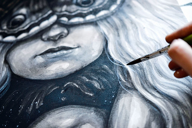
I use gesso to paint thin layers over faces, hands and hair to soften the underlying textures and lighten these areas. I work on details such as the eyes using opaque paint. I prefer using gesso over white acrylic paint because its chalky nature leads to a surface that takes dry media very well.
12. Introduce white noise
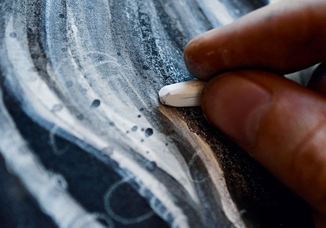
I use white charcoal sticks to create broad textures that add some noise to darker parts of the artwork. I want the hair of the blonde figure (Edith) to fade to white towards the background, forming a contrast to the blackness behind the second figure (Ofelia). To achieve this I use the charcoal to lighten this area.
13. Draw in highlights
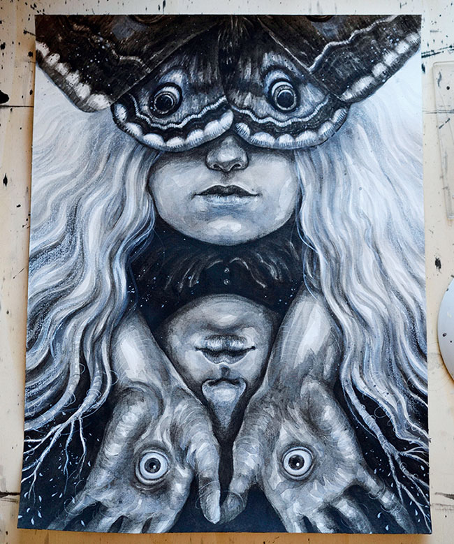
I draw in highlights, the final details and dynamic lines with a white charcoal pencil. For extreme highlights I use a white coloured pencil by Derwent, which is very soft and creates brighter lines than the charcoal, but can't be revised or drawn over as easily because of its oily composition.
14. Keep the eyes engaged
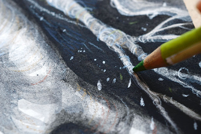
To make the otherwise monochromatic image more engaging I use pencils to add a few colours, while keeping it subtle so I don't mess up my tonal values and contrasts. This makes the picture seem much more alive and interesting. Mostly, I use clay tones, but also add blue to light areas and green to contrast the reddish lines.
15. Check it on screen
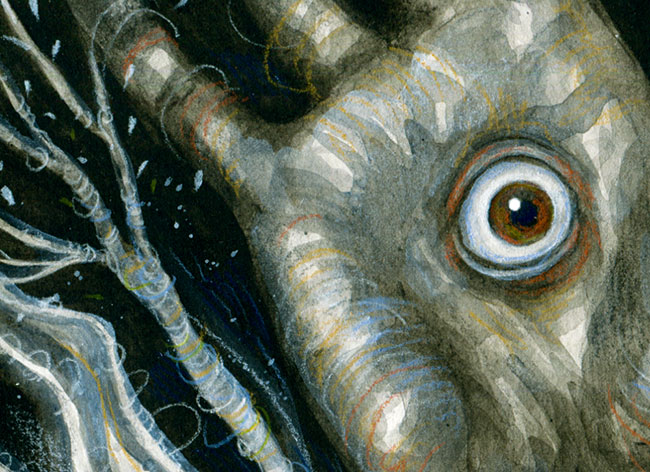
After scanning the artwork into Photoshop CC I use Levels and Selective Colour to achieve the right contrasts. I also play around with the saturation of the image, to amplify the subtle colours of not only the pencil lines, but the different hues of the black and white paints.
Get the Creative Bloq Newsletter
Daily design news, reviews, how-tos and more, as picked by the editors.
This article originally appeared in ImagineFX issue 142; buy it here!
Related articles:

Thank you for reading 5 articles this month* Join now for unlimited access
Enjoy your first month for just £1 / $1 / €1
*Read 5 free articles per month without a subscription

Join now for unlimited access
Try first month for just £1 / $1 / €1
