How to create a comic page
Learn how to take a comic page from script to finished output.
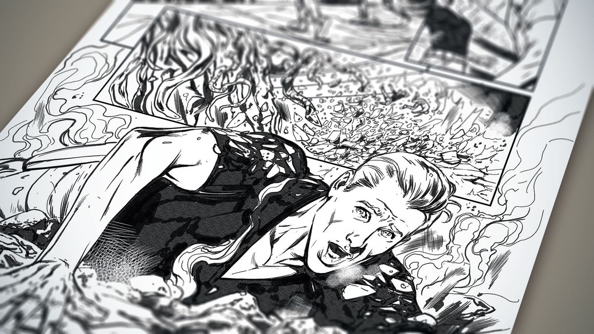
This tutorial will show you how to create a comic page. Although we're using Clip Studio Paint here, there's plenty of advice that can be applied to different digital art software. My favourite part of working on a comic book is thinking through the script in my mind and considering possible alternate versions.
This example comes from an old project: a Torchwood book book that follows Captains Jack and John adventuring on a techno-jungle planet. It's a strong action page that shows a variety of shots, strong character design and some good texture rendering (for more inspiration, take a look at this roundup of the best web comics).
You'll learn how to create a comic page, including designing the initial thumbnails, using references, and techniques for building up the page. Watch the time-lapse below for an overview of the creation process, or read on for a step-by-step guide.
Every page is always challenging and hard work, but thoroughly rewarding, so always try to push yourself and above all have fun with it.
Download a set of custom brushes for this tutorial
01. Read the script
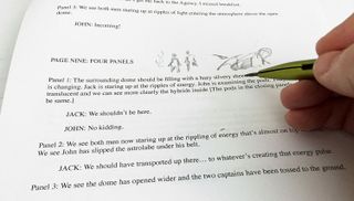
Once the panic attack from the scary white page has subsided, it's time to read the script. Identify moments that stand out in the text for each panel, looking for dynamic and clear storytelling events to move the story forward effectively. It's a good idea to make thumbnails as you read, and jot down any references you might need.
02. Produce prelims
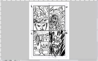
At this stage it's vital not to be precious over what you put down, because nothing's set in stone. Rough out the prelim very quickly, ignoring anatomy and rendering, then work over it – bearing in mind where the speech bubbles are going to be placed.
03. Bring together references
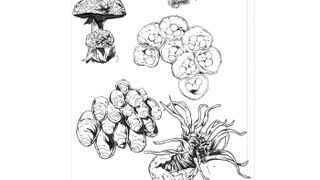
The script calls for lots of vegetation, so I start researching vines, jungles, mushrooms and fungi. I usually pencil up some references during this early stage, to give me an understanding of how to make the environments fit and feel right within the page.
04. Block in your characters
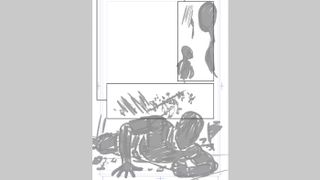
With the prelims approved and some storytelling elements refined, it's time to start on the under-concept drawings. I draw the panel borders with the Frame tool, and then block the figures in as silhouettes using the default basic Darker Pencil brush. This gives me the correct mass of the characters to work with.
05. Add detail to the under-drawing
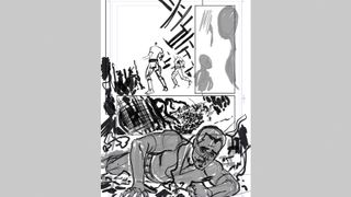
Once I'm happy with the placement of the figure, I create a new layer and knock back the silhouette, working on fixing my centre lines and anatomy. I'm using the basic Darker Pencil brush again. After all the elements are roughed in, I can start refining them.
06. Develop the line art
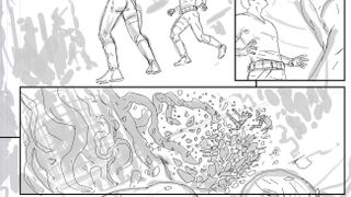
Once you're happy with the proportions and placement of elements on the page, it's time to create a new layer and work on the proper drawing. I start by using my custom Ink Pencil line brush and put down the line work that I want to eventually work over. During this stage it's important to work lightly, but include some basic rendering and lighting wherever possible.
07. Identify errors
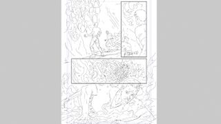
Once you've wrapped up the line art, cast your eye over the page, looking for elements that need amending. It can help to flip the page to see what mistakes jump out, then take a couple of notes before correcting them. Remember that even at this stage, nothing is set in stone.
08. Add weight to the lines
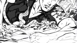
The next stage is to increase the line weight and introduce flow to the drawing using my custom Ink Pencil brush (I really should come up with a better name!). The line should define the light source and weight of the character, so be careful that the linework doesn't end up looking flat and characterless.
09. Add some detail to the scene
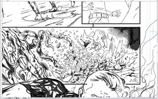
Still using the Ink Pencil brush (I know, I know), I start adding selective line weight and shadow to the detail elements. Aim to be suggestive with your lines rather than over-rendering things, and avoid filling the page with too much detail. Remember that the absence of something can be just as effective as its inclusion.
10. Make corrections
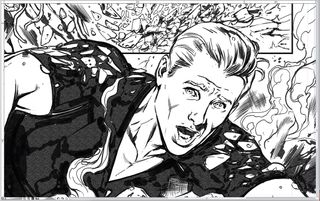
After looking over the page, I decide I'm not happy with Captain John's head. I sketch out a replacement on a new layer and then refine the expression. References may be useful at this stage, so consider using a mirror or taking a photo with your phone to help capture the look you want.
11. Take care with minor elements
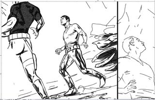
As with the debris elements in step 09, I'm careful not to over-render the minor figures on the page. In particular, I watch my line weight as the scene recedes into the background. Using silhouettes and strong shadow can help define smaller characters, too. However, it's a bit of a balancing act – smaller characters might get lost in amongst background elements if they're drawn too subtly.
12. Make the anatomy look natural
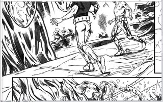
I'm also not happy with Captain John's legs: they came across as a bit odd in my initial layout, so I recreate them in a more balanced stance. Always aim to make your characters look dynamic and natural, rather that stiff. I also alter the stance of the smaller characters so that they better suit the background's perspective.
13. Bring in texture elements
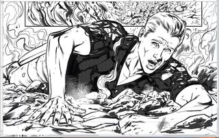
Using Clip Studio Paint's powerful texture and crosshatching brushes, I add smoke and air debris elements to give greater density to the page. I also add freehand crosshatching to introduce a more organic and traditional feel to the scene. Finally, I introduce some more vegetation detail to the background, and bring in a couple of light sources in panel one.
14. Final refinements
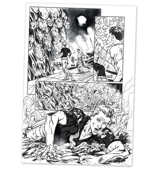
With the page almost finished, I refine Captain John's face on the bottom panel and add some more freehand crosshatching in the background. I then move on to the top right panel and draw the energy waves. Once I'm happy with the page, I output it as a greyscale TIF at 500dpi, then collapse back in my chair. Phew!
This article originally appeared in issue 149 of ImagineFX, the world's leading magazine for digital artists. Subscribe here.
Related articles:
Get the Creative Bloq Newsletter
Daily design news, reviews, how-tos and more, as picked by the editors.

Thank you for reading 5 articles this month* Join now for unlimited access
Enjoy your first month for just £1 / $1 / €1
*Read 5 free articles per month without a subscription

Join now for unlimited access
Try first month for just £1 / $1 / €1
