How to create a beautiful watercolour landscape painting
Photos and a large amount of creative license help to create a harmonious, impressionistic landscape.
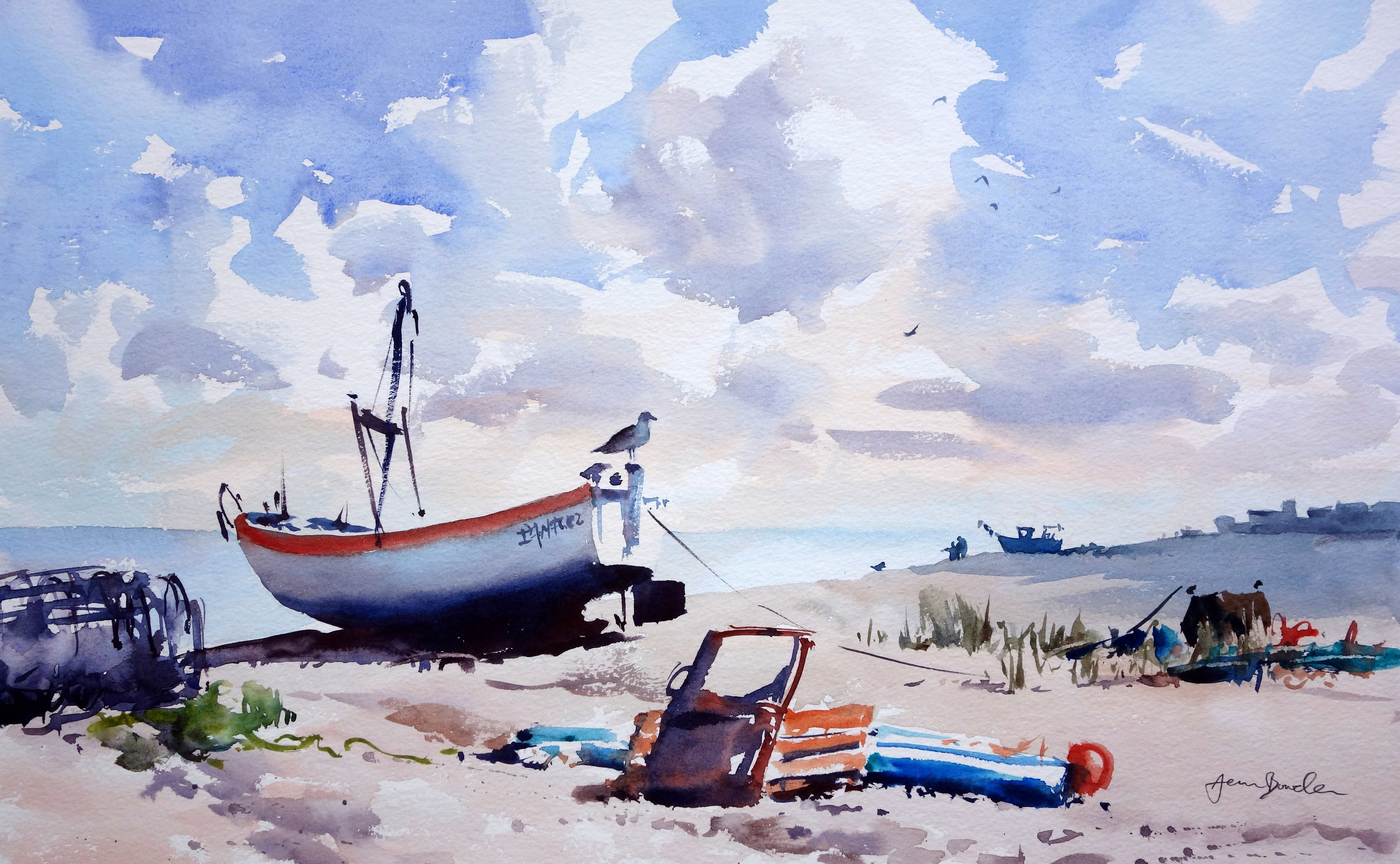
Mine is a fairly impressionistic style of a watercolour painting technique, where detail is less important than a sound composition, good atmosphere and a bit of verve and directness.
In this way, I try to capture the overall sense of a place, at the same time as allowing the medium itself to shine. I paint outdoors – “en plein air” – as often as possible, as I like to interpret from life with the influences of the weather, sounds and smells, and the compulsion to work quickly. Working from photos, however, allows for a bit more reflection, with a different element of creativity and fun added to the process.
Although this scene was sunny, there was a strong wind that would have blown over my easel, so instead I walked all around the scene, snapping it from different angles, towards the light, away from the light, recording as many potential compositions as possible.
Don’t worry about the result when painting, focus on the process!
Taking a lot of photos will give you some facts about a place. From this you can take or leave whatever you need to create a painting that will work on its own terms. Use “artistic licence”, to move or exclude items, change colours and so on. It’s a fun process, and you’ll see that even “bad” photos can be useful to you.
In the stages I follow, the brushwork is done swiftly, with regard for some important aspects of the photographic reference but not restricted by it. Don’t worry about the result when painting, focus on the process! Enjoying your painting brings good results.
01. The reference photo
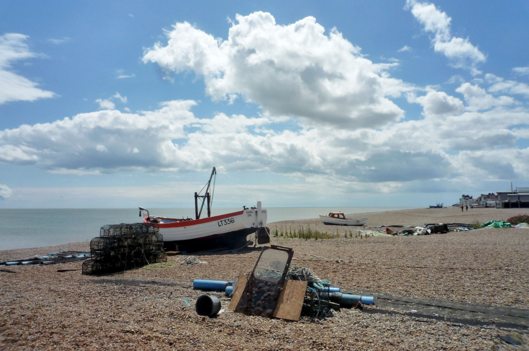
The photo has a nice atmosphere, typical of the beach at Aldeburgh. I like the composition in general because it has depth. The eye is led into and around the scene by a series of virtual zigzags, from foreground to distance. The sky is interesting, and will be fun to paint. There are some bright colours we can make the most of, and some things we can change... Have fun with “artistic licence” to improve on photos. Alter composition, contrast or colours, as necessary, to spice them up.
02. Creating an initial working sketch
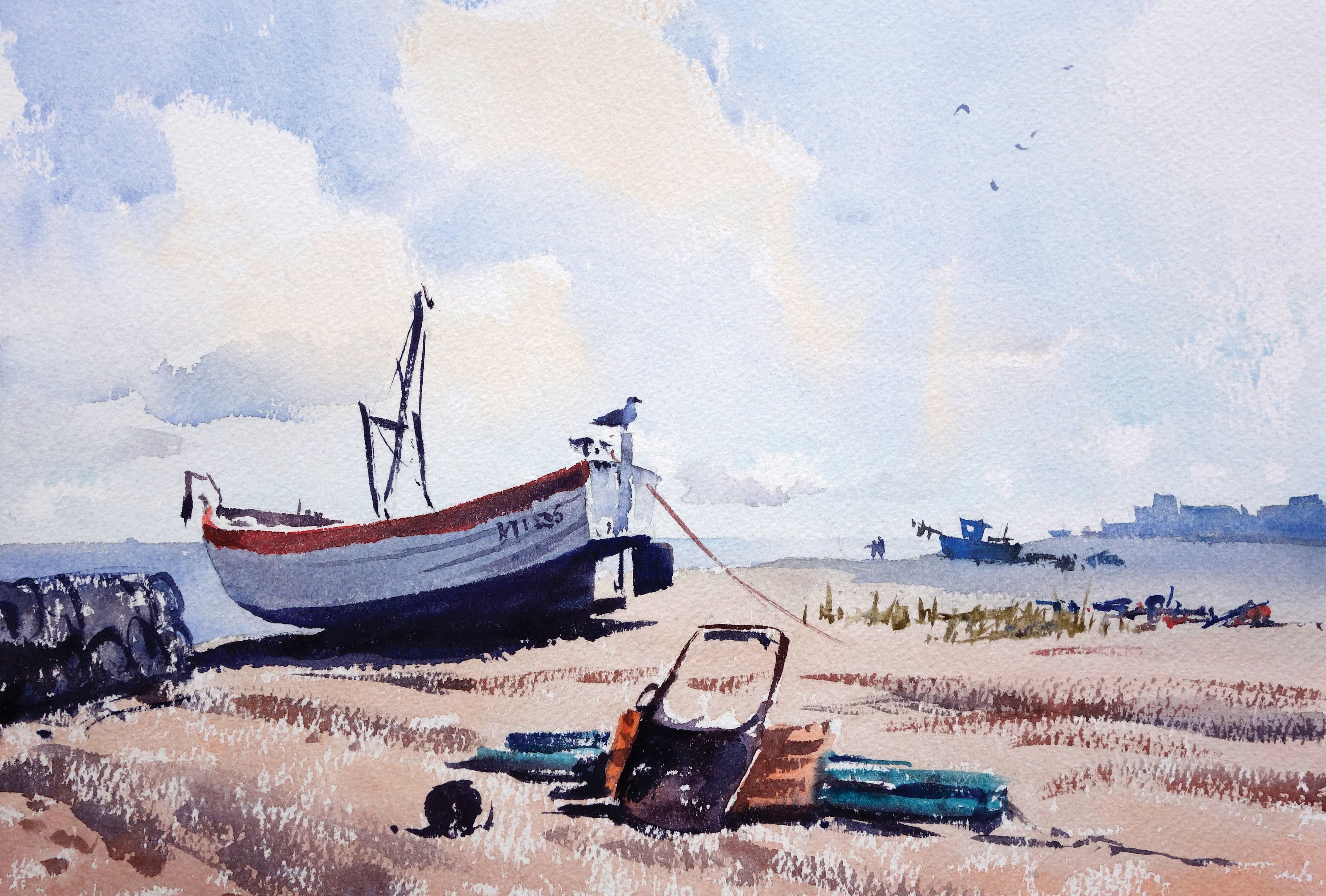
First, I created a small watercolour sketch. To lighten up the scene, I tried out a sunnier sky. I also increased the size of the main boat, moved the crab baskets to the left, and added a couple of figures by the distant boat, to create more of a focal point. I also changed that boat to a dark one so it stands out. Finally, I put the whole background under the shade of a cloud. This could work, but the sky could contribute more. Let’s go for it!
Get the Creative Bloq Newsletter
Daily design news, reviews, how-tos and more, as picked by the editors.
03. The exciting sky!
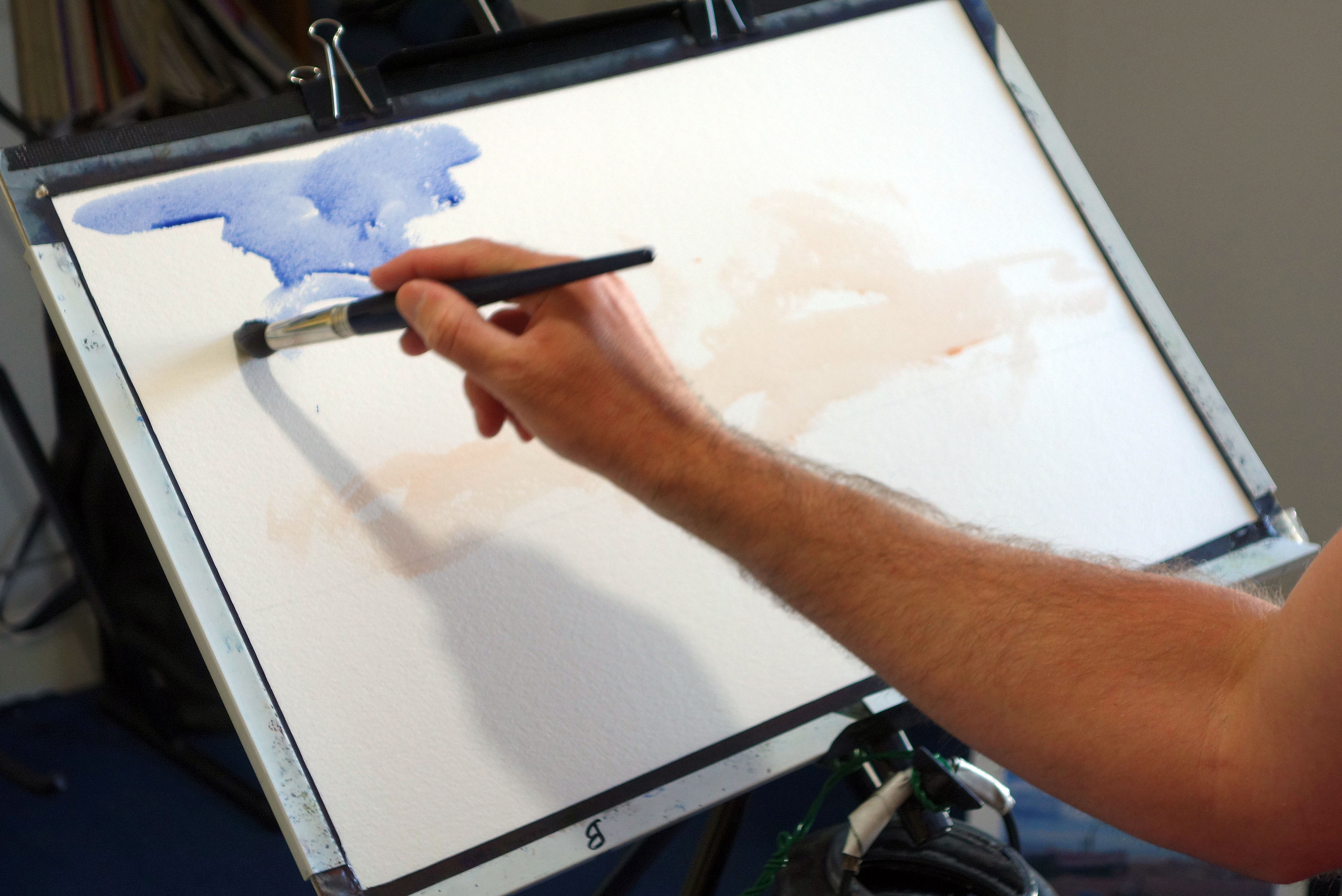
I draw out a horizon line with a soft 8B pencil. Having mixed plenty of paint for the sky colours, I dive straight in. First I wash on some Light Red near the bottom in a random fashion with the medium mop brush. Using my large mop brush loaded with French Ultramarine, I put in blue-sky sections. I move the brush fast to cover paper, looking at the photo for inspiration but not copying it closely. It’s the general character we’re aiming for.
04. Work fast with energy
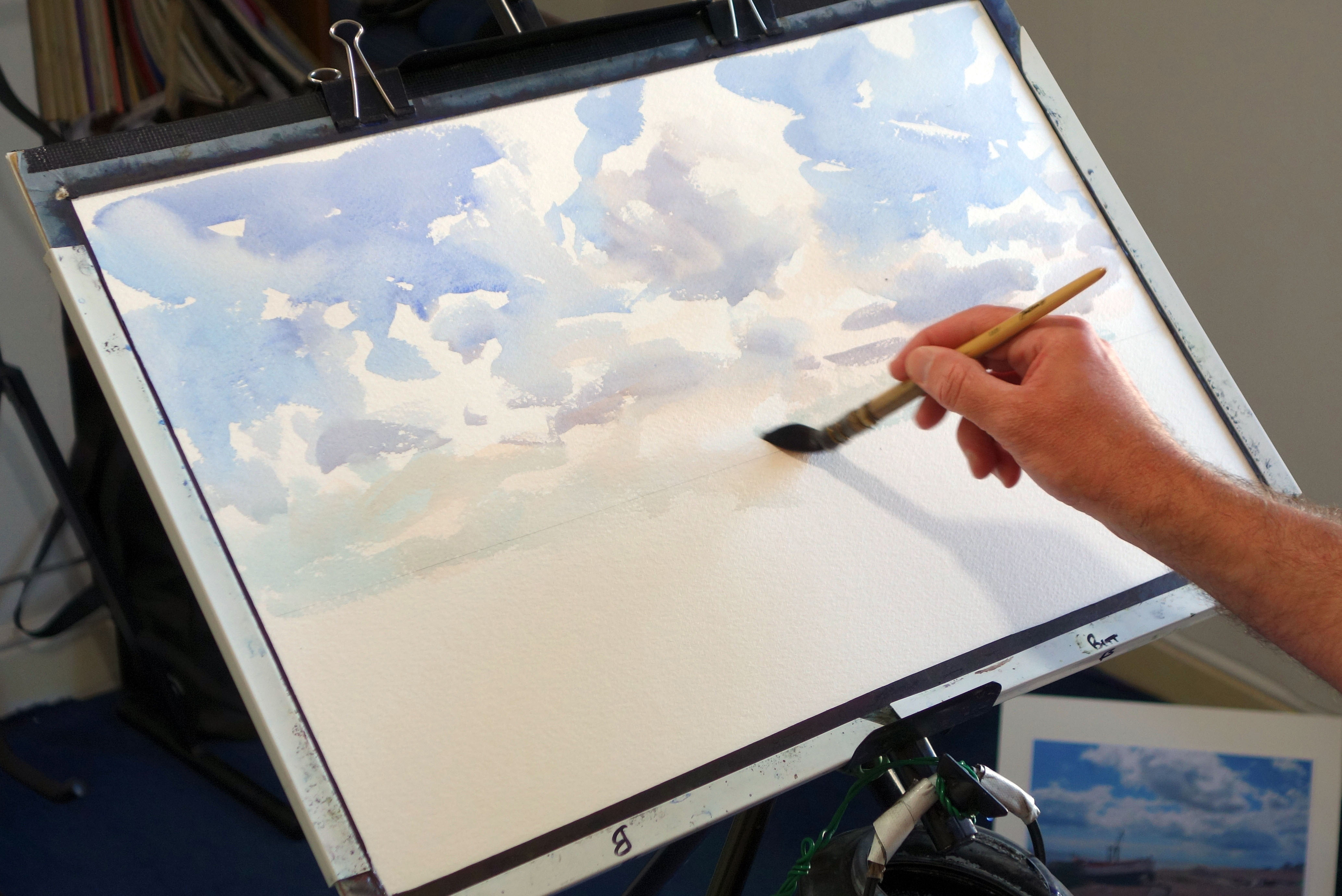
Being careful to keep some white paper where sun is catching, I add in a greyish mix of Light Red, French Ultramarine and a bit of Indian Red (for variety) for shaded parts of clouds. This touches into the blue-sky areas “wet against wet”, so the two blend into soft edges. Where the blue or grey meet white paper there are hard edges. Moving downwards I work into the Light Red areas I did first, which are still damp, giving mainly soft edges.
05. The completed sky
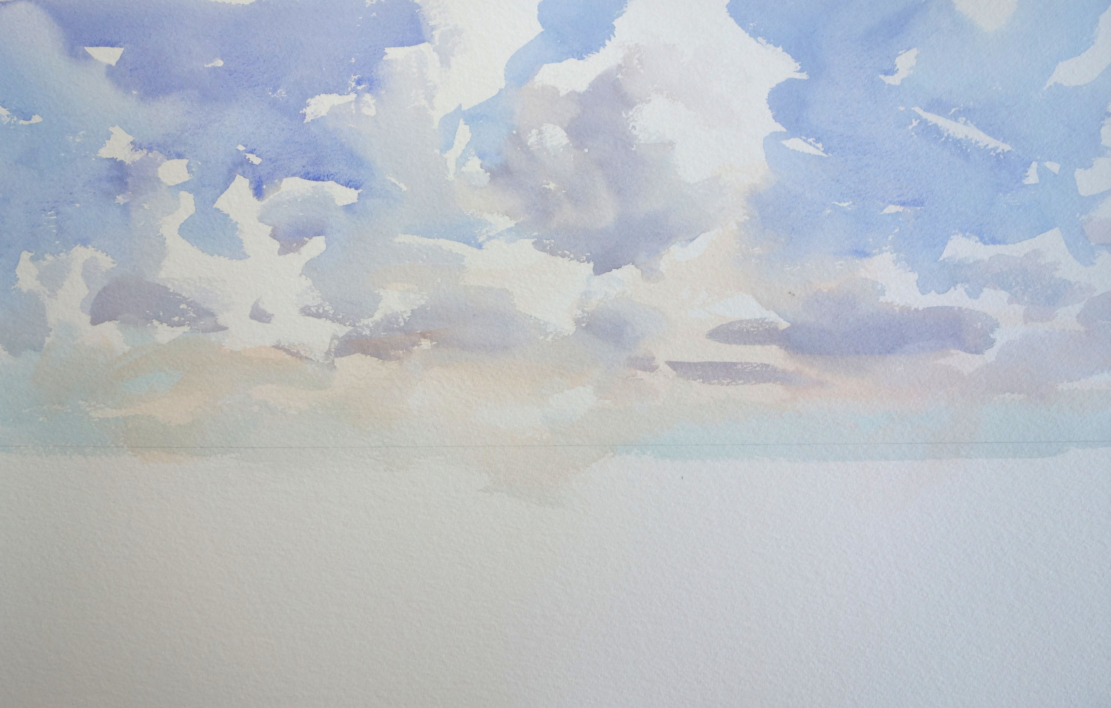
This mix of edges is key to an exciting watercolour technique. You need to work fast, so make sure to have plenty of paint mixed before starting. It’s a good idea to practise on a small scale, on scraps of watercolour paper. I wanted a couple of bold “dark against light” clouds near where the background boat will be, to help draw the eye. Some marks may look a little stark, but don’t ever lose faith in a sky until you see it with land added.
06. Sea and beach washes
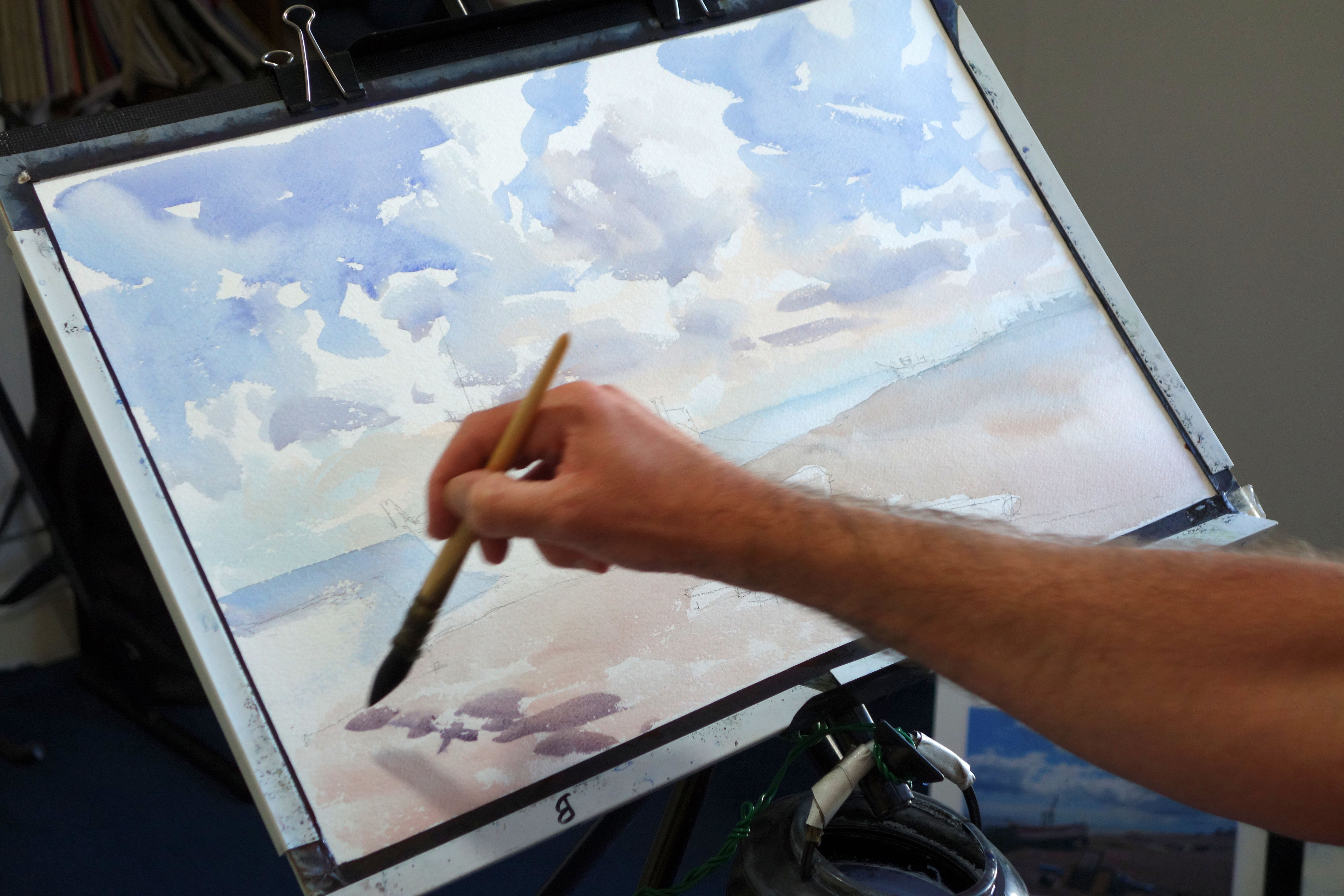
I draw in the main shapes of boats etc loosely in pencil. Next I add the sea, in a similar blue to the sky and clouds, adding water to dilute the mix paler on the right. I let this dry before I paint the beach, starting in the distance and working down to the foreground, using first a mix of Light Red with a touch of blue, then pure Light Red towards the foreground. Before it’s dry I add in some darker patches, Indian Red with French Ultramarine.
07. The main boat
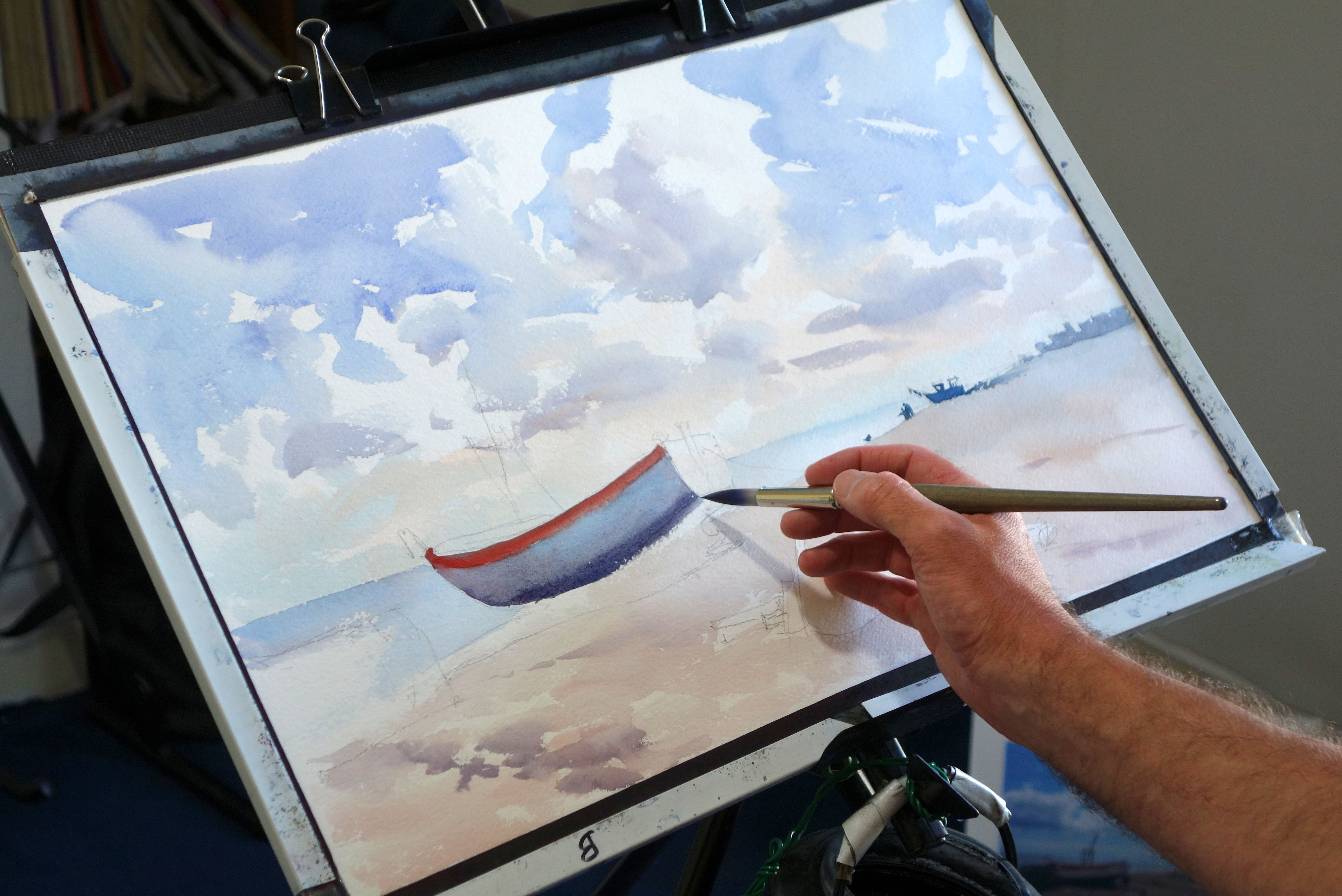
My techniques are very traditional, using the white of the paper and the transparency of the medium to capture the light. Using the synthetic brush I take thicker mixes of paint to get darker tones. Tube paints are essential for this. It’s great fun using really thick paint! Don’t be afraid to go dark first time. Watercolour looks fresher if you don’t overlay more washes than necessary to build up tone.
08. Taking shape
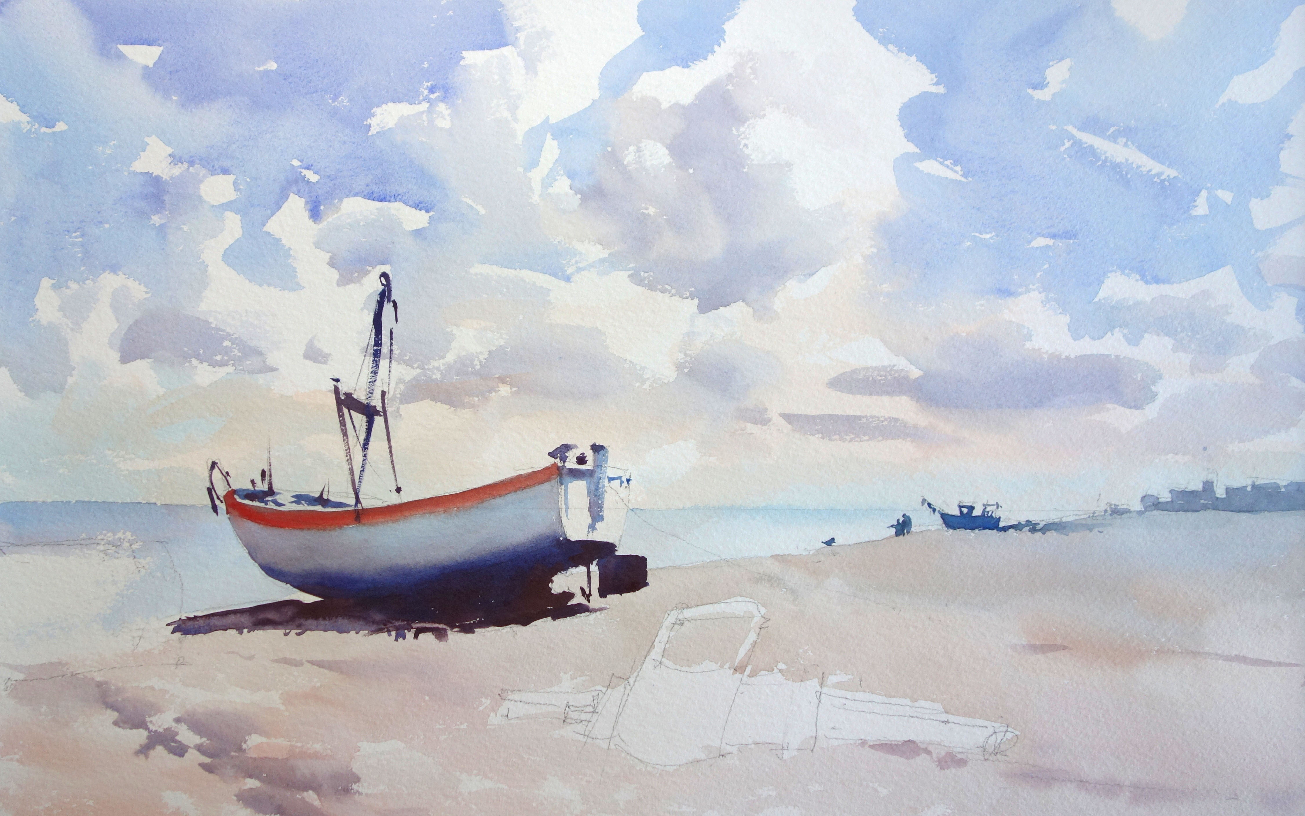
The shadow is painted in the same wash as the boat hull, so they look unified. Strong darks set off the lighter tones and put the background into its place. Other details on the boat and in the background are done loosely, in as few brushstrokes as possible.
09. Bits of stuff and background shadow
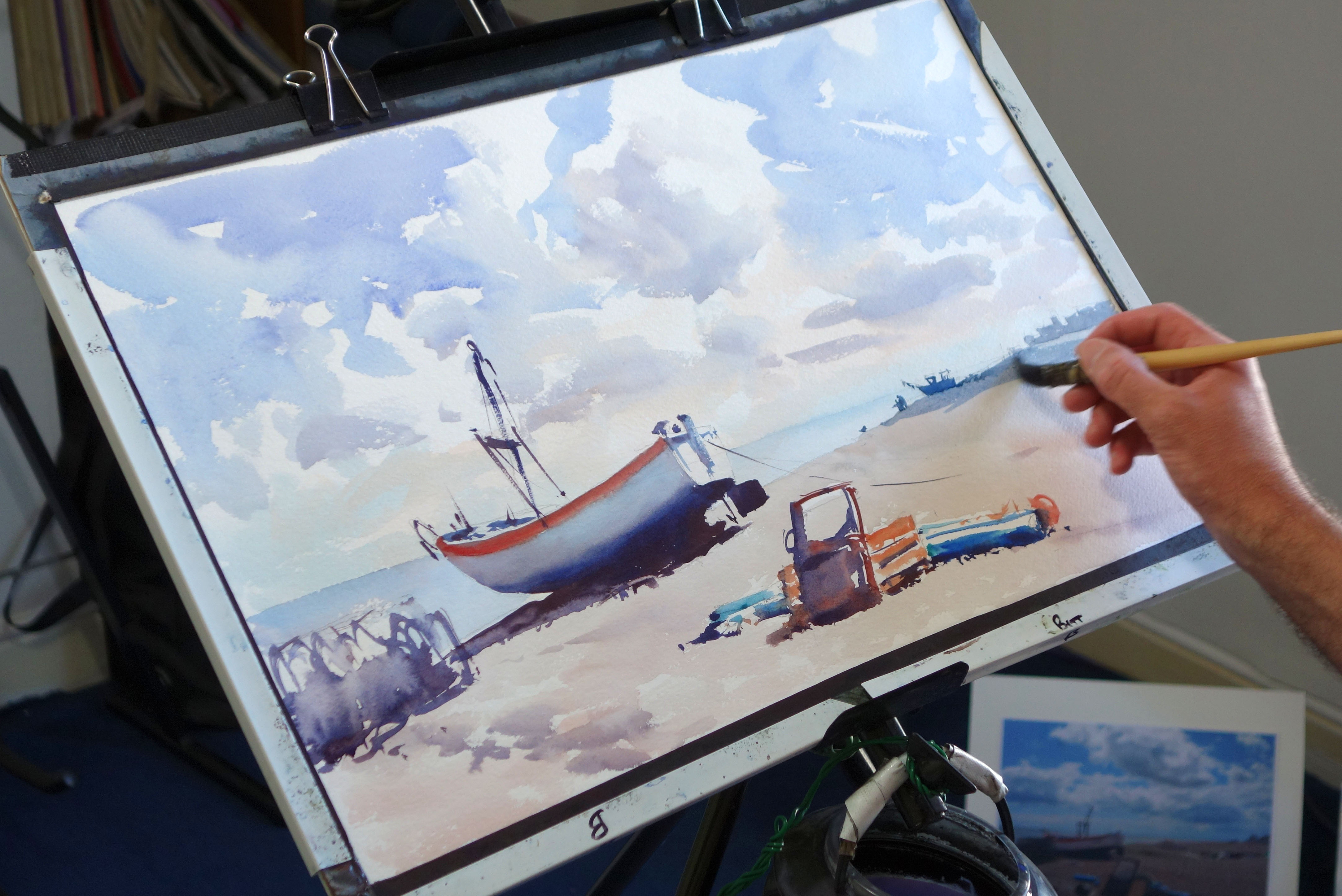
Next I paint the pile in the foreground, not worrying about what it actually is! What’s important is the bright colours, which convey the notion of fishing gear. I put in a first wash for the baskets on the left, using free, fast and random brushwork to suggest their form. Next, a wash of grey goes over the whole background area, putting it into shade to draw the eye with added contrast.
10. Adding in detail
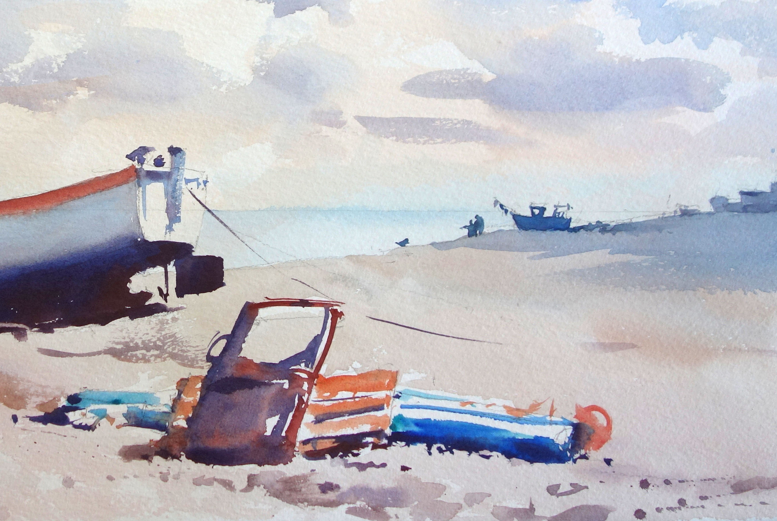
Next I add marks that suggest detail – some dots, some drybrush marks (by dragging a brush quickly on its side), and a bit of judicious spatter. Spattering is where you fling spots of paint from your brush by tapping it against your other hand while holding it over the paper. Less is more with this. I did the line from the boat using the pointed tip of the synthetic brush, held high up the handle and swiped from the wrist.
11. Beach grasses and further stuff
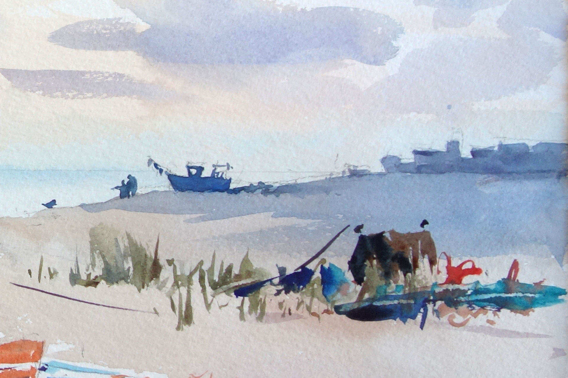
I move the beach-grass section from the photo to where it best balances the composition in the painting. Again it is random shapes, allowing the key turquoise and orange colours to mix with the greenery. I swipe a couple of linear marks with a fingernail. This reveals the pale underlying paper and can be done in relatively thick paint, when it is just beginning to dry. Give it a go!
12. Finishing touches

To complete the scene I add a bit more random detail to the baskets on the left, dot some distant birds into the sky and put a cheeky gull on the main boat, for a key bit of focal interest. When all is dry, I remove the pencil lines with a putty rubber. Aim for fresh and loose by resisting details and keeping your eye on the bigger picture.
This article was originally published in Paint & Draw magazine issue 1. Buy it here.
Related articles:

Thank you for reading 5 articles this month* Join now for unlimited access
Enjoy your first month for just £1 / $1 / €1
*Read 5 free articles per month without a subscription

Join now for unlimited access
Try first month for just £1 / $1 / €1
