How to combine Painter's watercolour sets
Build up your image using Painter's extensive watercolour tools.
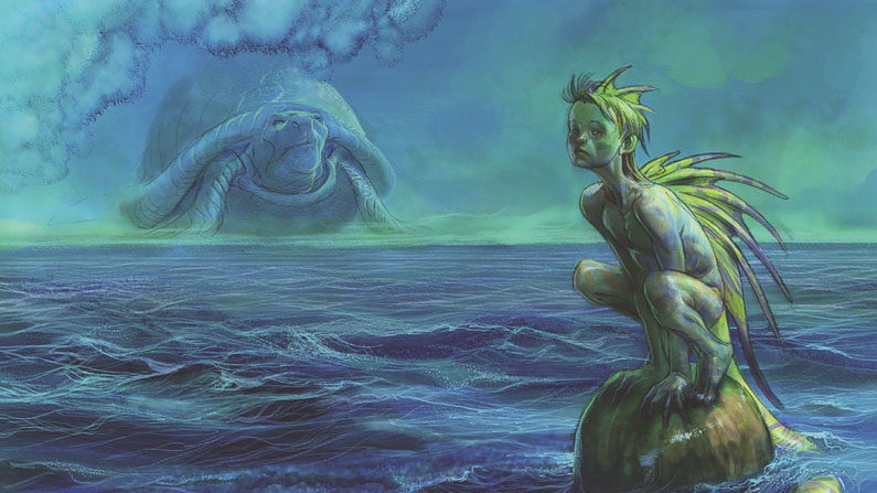
Corel Painter offers a banquet of watercolour tools. It boasts Digital, Real and Watercolour tool categories, each with a range of brushes. While Real and Watercolour categories require a specialised layer blend mode called Watercolour, the Digital Watercolour will work with other blend modes and consequently tool sets, but it has fewer tools.
I come up with a loose sketch first, flood fill the background layer, duplicate it and set the new layer to either Multiply or Gel. The latter kills the white and gives you a head start on colour. Then simple Water Brush strokes at lower Opacity lay the groundwork. Using that brush, along with the Simple Diffuser, Salt and Gentle Wet Eraser, I work up some tones. I duplicate that layer, then block in the figure with solid colour on a new layer. I then place that layer below the two watercolour layers.
01. Define your shapes and planes
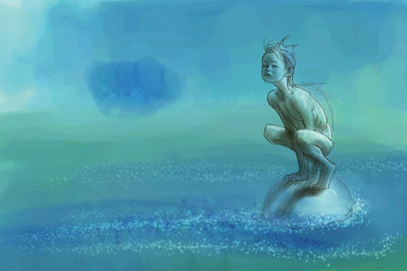
To start defining shapes and planes, I work with the Erasers and Blenders appropriate to each watercolour type on my layers. I develop some form and lighting on everything, as well as introducing some darker areas with washes on another layer (Real Watercolour). I can then work back into that layer with the Erasers and Salt to create waves and froth effects.
02. Build up interest and form
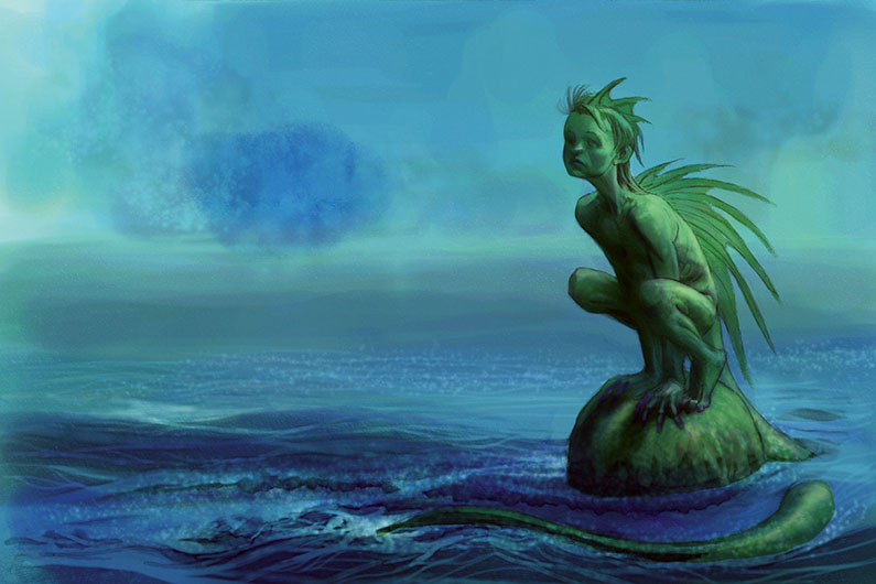
I work with the Oil Pastel (pick whatever Paint tool you prefer) to build up interest and form on the character’s base colour layer. I take the chance to bring green hues in.
I also add another Digital Watercolour layer to add depth to the shadows on the character. I build more form into the foreground waves, using Salt and the Erasers to hint at froth and splash effects.
03. Use oil pastel on a lower layer
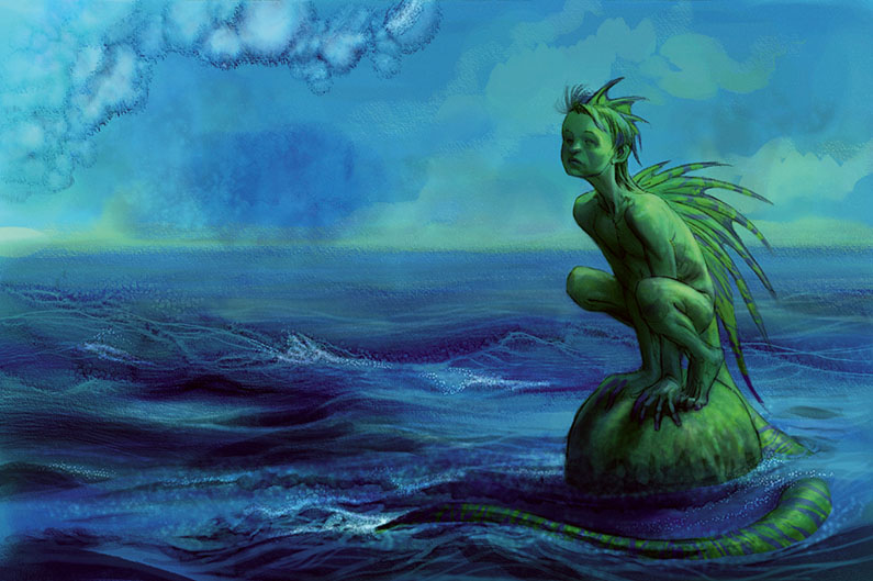
By working with body colour (Oil Pastel again) on a lower layer, set to the default Blend mode, it’s possible to build up more nuances and subtlety with the watercolour layers above. This is the way I like to work and if you’re aiming for a more purely watercolour look, then it might not be for you. We all find our own preferred way of working, given time to try things out.
04. Use Flow Maps for a paper effect
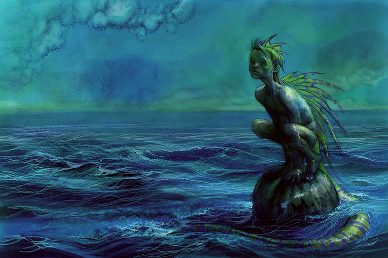
I carry on building up tones and interest all over. This includes introducing an effect called Flow Maps. These can exaggerate the Paper effect if you select Create from Current Paper (on the drop-down from the Flow Map panel). They work with the appropriate Flow Map brushes in Real Watercolour. I tweak Layer strengths and finish off with added highlights.
Get the Creative Bloq Newsletter
Daily design news, reviews, how-tos and more, as picked by the editors.
This article was originally featured in Imagine FX issue 138; buy it here

Thank you for reading 5 articles this month* Join now for unlimited access
Enjoy your first month for just £1 / $1 / €1
*Read 5 free articles per month without a subscription

Join now for unlimited access
Try first month for just £1 / $1 / €1
English artist Nick Harris switched to a digital canvas in 2000, after 18 years of using traditional media. Most of his work involves creating artwork for children’s books, though he has also dabbled in animation, including some background work on the hit 1988 film Who Framed Roger Rabbit?. He has supplied a wealth of advice and tutorial help for illustrators in ImagineFX magazine.
