How to build worlds for the cinema
Pro advice on how to develop an engaging environment for the big screen.
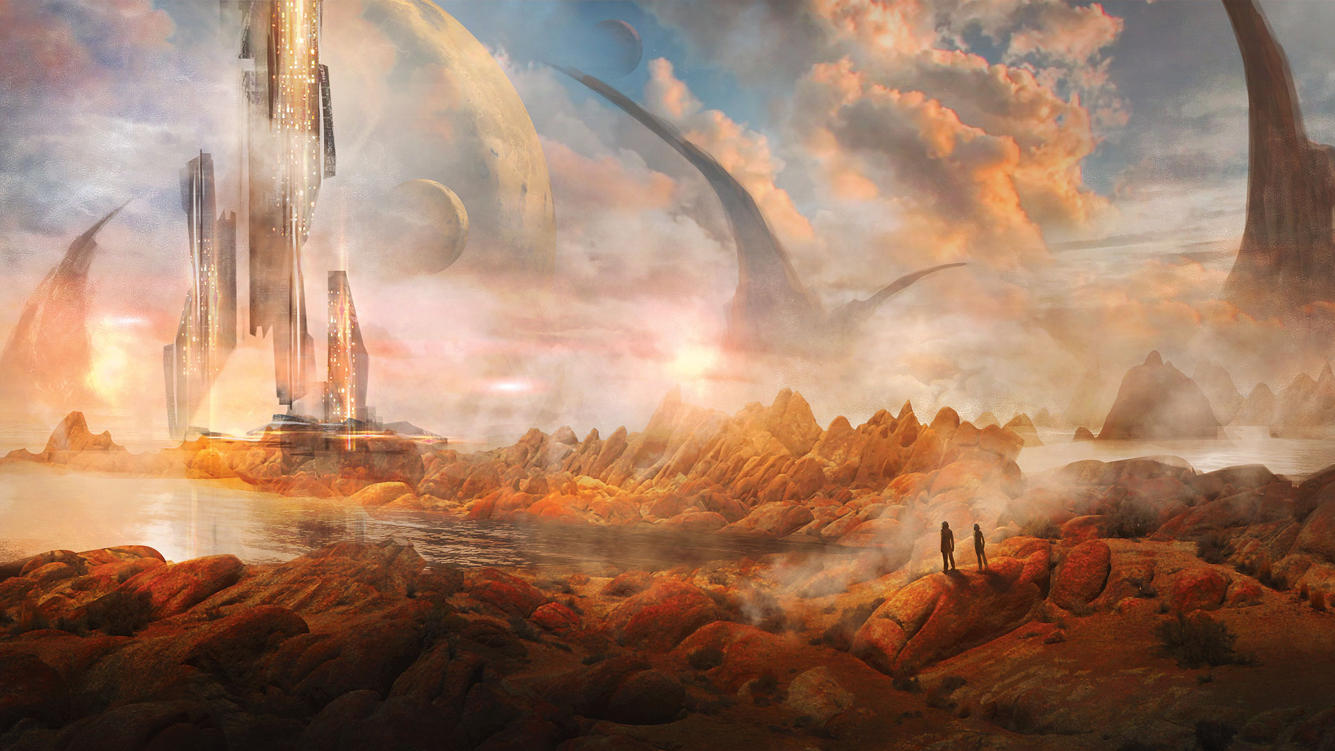
When asked to do a workshop on creating a fantasy environment, I thought it would be fun to pay homage to one of the most well-known fantasy stories of all time, The Wizard of Oz, and set it in outer space. It's also a bit of a throwback to those amazing sci-fi artworks pieces from the 1970s.
I have our outer space explorers staring off into the horizon, at my version of the Emerald City. Obviously, the story could be anything, but quickly, we've set up a few important conditions – outer space, an alien planet and astronauts – and these parameters will create the most important part of the piece: the narrative. Remember to always tell a story and be mindful that a successful concept piece does just that.
In this tutorial I'll show you how I turned this concept into an effective fantasy world.
01. Create your foreground elements

For my foregound, I selected a photograph that I took of a landscape in Alabama Hills, California. It strikes me as being otherworldly and serves as the inspiration for this piece. Concept art can be a mix of media, so don't be afraid to use photos, free 3D models, sketches, drawings and so on. Rely on your artistic abilities to make these images your own, and to bring these sources together into a single, coherent piece.
02. Put together your background

I chose a photo I took in Hawaii for my sky. I've already done a bit of touch up to the image, adjusting the Curves (cmd+M) to boost the contrast. Feel free to get creative and stitch together multiple sky images to make a more complex backdrop. For now, I'll keep things simple and stick to one sky photo that I'll paint into later on.
03. Remove the unwanted sky
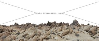
I want to remove the sky in my foreground landscape photo. For this, I'll use Photoshop's Quick Mask mode (press Q). In this mode you can use your paint brush to paint the area you wish to select, then when you exit the mode you'll see that it's converted your painted area into a selection.
Press cmd+Shift+I to invert the selection. Once you have the correct area selected, remove it by hitting Delete.
Get the Creative Bloq Newsletter
Daily design news, reviews, how-tos and more, as picked by the editors.
04. Composite the foreground and background
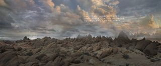
Now you can combine your source images into one scene. Here, I've taken the original photos and adjusted the Levels (cmd+L) and Curves (cmd+M) to suit the overall painting. I've included additional mountains in the background by duplicating and adjusting my foreground image – this adds depth to the piece by pushing the horizon back. I've also painted in a bit of atmosphere using my Soft Round brush to add haze along the horizon.
05. Apply the rules of proportion
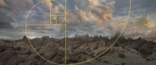
Many people advise using perspective grids when laying out your composition, but it's equally important to maintain proper proportions in your piece and place elements in a harmonious way. So I'm using the Golden Ratio as the foundation for my composition. I've already cropped my foreground photo so the outermost peaks align with my Golden Ratio spiral.
06. Paint into your piece
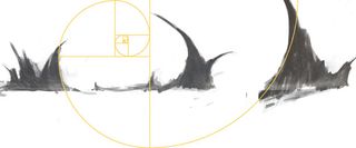
When working from a photo reference, you'll want to paint into it to add unique elements that will make the piece your own. Here, I'm adding in some alien mountain peaks by painting and erasing away until I develop shapes that I like.
I find that using a Hard Round brush or Chisel brush provide good results. You can also add textures and tones to suit the piece until you achieve the result you want.
07. Build up the composition
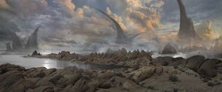
I add my mountain elements into my composition, and adjust them using Levels and Curves until they blend with the tones of the rest of piece. I also erase away, or mask out some of the bottom bits so they fade into the horizon atmosphere.
I add water using the same techniques as the alien mountain peaks: First, by painting shapes that define the bodies of water, then by adding water textures and paint strokes until I'm happy with the look of the water.
08. Introduce otherworldly elements
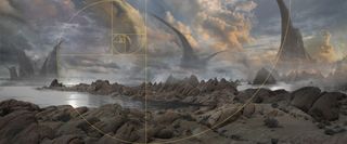
I want to further describe this scene as being that from an alien planet. One simple trick is to introduce planets and moons that immediately differentiate this world from Earth.
Here, I've added three moons into the sky. Using my Golden Ratio template enables me to place them into the scene in a way that's in-keeping with the proportions and layout of the piece.
09. Develop lighting and atmosphere
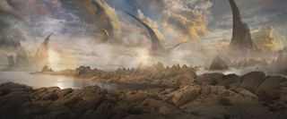
Atmosphere can be achieved by using a soft Round brush set on a low Opacity. To set the colour of the brush, I sample a lighter colour from the scene. I then build up atmosphere or haze by painting it in on a separate layer, on top of the background layers.
Next I want to add lighting. I create a new Overlay or Color Dodge layer as the top layer, and using a soft Round brush experiment with different colours and opacities and see how this affects the image on the layers below it.
10. Bring in a focal point
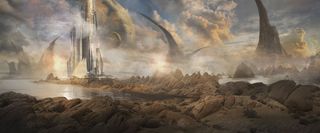
From the beginning, I knew I wanted to have an element off to the horizon that directs your eye through the piece. You should always keep in mind what the narrative of the piece is, and prior to jumping into a painting you may want to sketch it first. Having an idea of where you want to direct the viewer's eye is key – in this case I'm using architecture as a point of interest.
11. Add figures as a secondary focal point
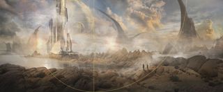
I'm going to employ the old trick of dropping in a couple of small characters towards the foreground, in order to create another focal point that complements the background one we just created. This also adds scale to the piece, since we can all relate to the general size of a person.
The viewer's eye will travel between the foreground figures and the object they are looking at: the architecture. I've painted in bits of steam behind the figures, so there's more contrast between them and the background.
12. Adjust colour
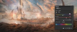
I want this piece to feel more like fantasy and less like my original source photographs, so I adjust the colour. This is done by creating a Hue/Saturation layer. Within the Hue/Saturation Properties palette you can tweak the overall saturation as well as the separate colour channels. Experiment with this and have fun – you may find it produces some interesting results.
13. Make further adjustments
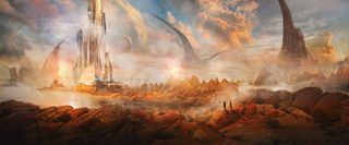
I add another Hue/Saturation Layer on top of the previous layer I created. By having multiple Hue/Saturation Layers, you'll find that you can create even more dramatic effects than you could with just one single layer.
I also create a new Curves Layer to adjust the image further. The Curves Property palette will enable you to edit and refine the tones in your image.
14. Final additions… or last-minute experiments?
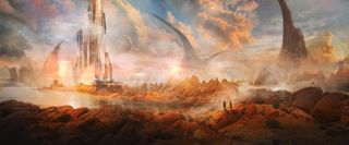
At this late stage you may want to add a few more elements of lighting or interest to further enhance the piece. Don't be afraid to experiment and don't be too quick to consider your piece done. Step away from it and look at it with fresh eyes.
It's always helpful to have a plan and to design accordingly, but it's also good to keep things organic and allow for happy accidents. Here, I've introduced some lens flares by creating Color Dodge layers that add lighting effects when I paint into them.
This article originally appeared in ImagineFX issue 142; buy it here!
Related articles:

Thank you for reading 5 articles this month* Join now for unlimited access
Enjoy your first month for just £1 / $1 / €1
*Read 5 free articles per month without a subscription

Join now for unlimited access
Try first month for just £1 / $1 / €1
