How to add fun CSS backgrounds to your sites
Liven up your backgrounds with CSS gradients and collages.
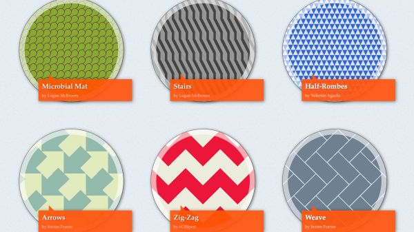
Time was a web page background was a tiny tiling image – and often hideous, assaulting every visitor’s eyeballs. Today, backgrounds form the foundation of much online graphic design.
This revolution in backgrounds on the web has been driven by advances in CSS. Web standards now afford far more control, so you can carefully define a background’s position, work with gradients, and add multiple backgrounds to a single element.
Covering everything in this area would require a book, and so we’ve picked some important starting points to get you going, and the odd choice link for you to explore further. Enjoy!
Add CSS backgrounds to web page elements
CSS backgrounds require the background shorthand property, or the use of more specific properties, such as (but not limited to): background-color; background-image; background-position; background-size; background-repeat; and background-attachment. These can be defined for the web page’s background (through the body selector) or page elements like headings, divs, and so on.
At the most basic level, you could use background to turn a page red:
body {
 background: red;
 }
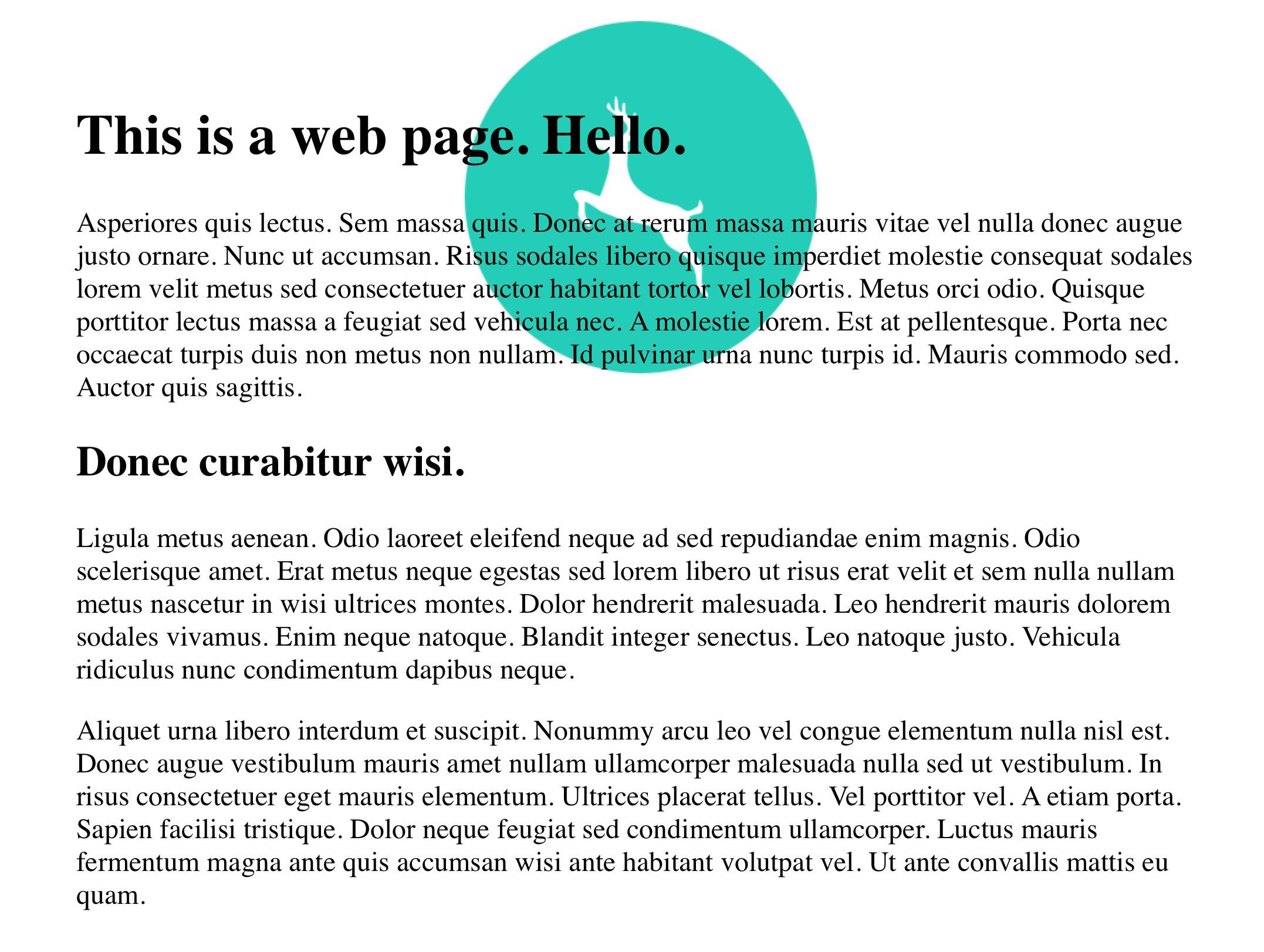
Going a little more advanced, you could add an image that’s horizontally centred, 20px from the top of its container, not repeated, and fixed in place as the web page scrolls:
body {
 background: url(image.png) center 20px no-repeat fixed;
 }
If you wanted to write that out without using background shorthand, it would look like this:
Get the Creative Bloq Newsletter
Daily design news, reviews, how-tos and more, as picked by the editors.
body {
 background-image: url(image.png);
 background-position: center 20px;
 background-repeat: no-repeat;
 background-attachment: fixed;
 }
Should you want to add multiple backgrounds to an element, you can comma-separate value sets in the CSS declaration. Note that whichever item is specified first is at the top of the stack, meaning it’ll be displayed ‘above’ other backgrounds.
body {
 background: url(image.png) center 20px no-repeat fixed, url(image-2.png) center center no-repeat fixed;
 }
In this case, one image appears as per in the previous example, and the one ‘below’ directly in the centre of the content area.
Resize background images
So far, we’ve avoided background-size. But that one’s pretty important, because it enables you to control the size of a background image. Specifically, you can define the horizontal and vertical dimensions of an image in pixels or percentage terms, such as:
background-size: 200px 50px;There are also two keyword values, which can be used instead: contain and cover. These are broadly similar, in providing a way to scale an image within an element’s content area. The difference is that contain is designed to make an image as large as possible, while still showing all of it within the content area (meaning you usually get gaps around it), whereas cover completely covers the content area, but may result in some of the image not being visible. The latter is commonly used on sites that use photographs as backgrounds.
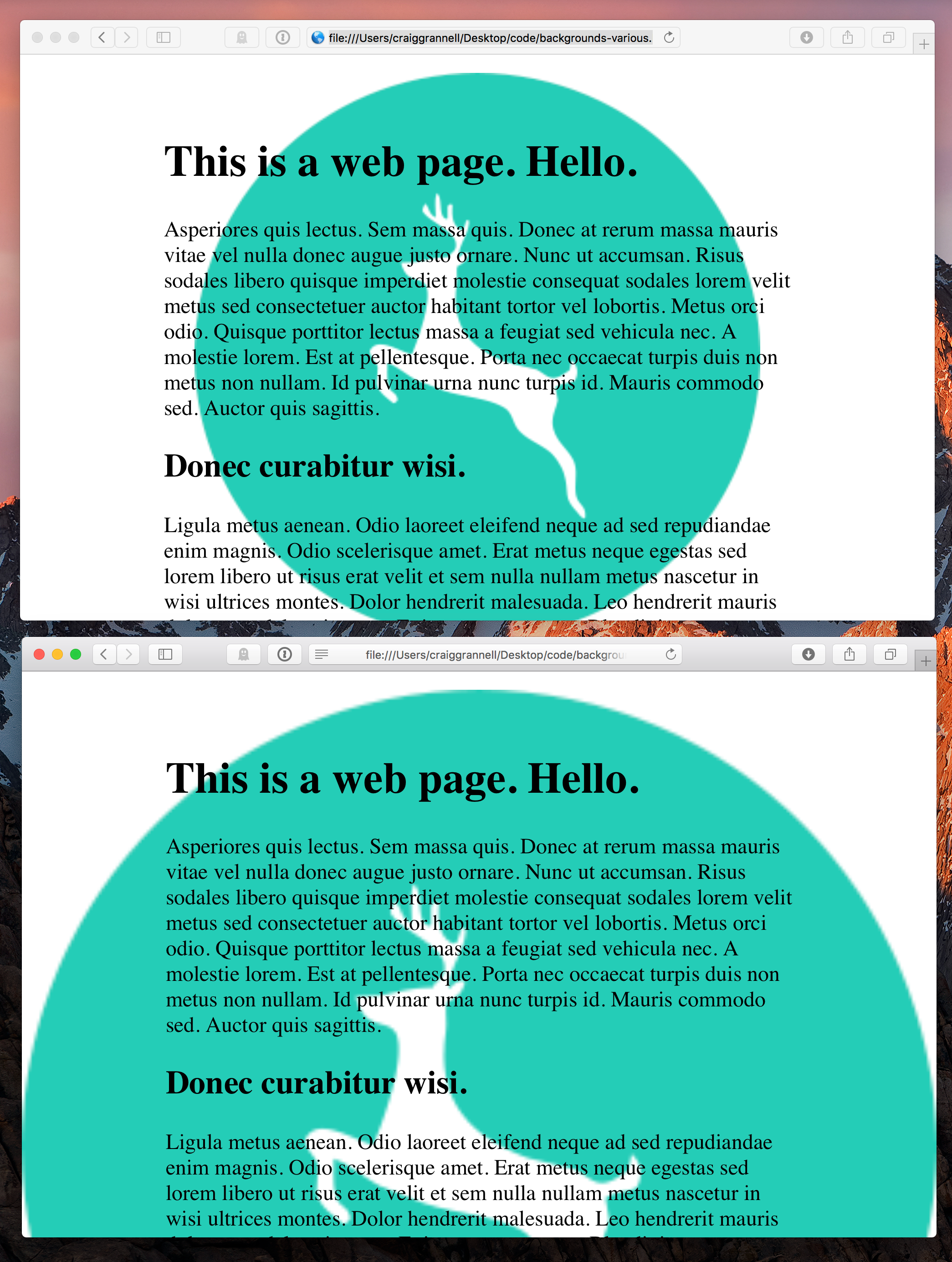
Note that you can add background-size to a background shorthand definition – place it after the background-position values, with a forward slash separating the two:
background: url(image.png) center 20px/contain no-repeat fixedUse high-res Retina background images
When adding high-res Retina backgrounds, background-size is also useful for forcing such images to appear at the correct size.
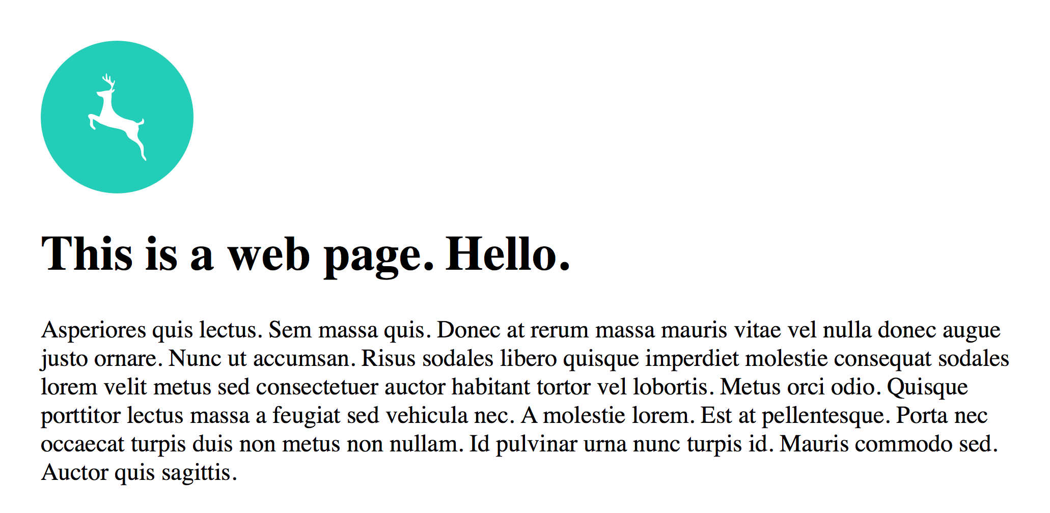
For an example, imagine a div with an id of logo. This, suitably, has a logo applied as a background in CSS. It’s 150 pixels square, and so the basic CSS you’d use is:
#logo {
 width: 150px;
 height: 150px;
 background: url(logo.png) no-repeat;
 }
High-res complicates things. We don’t want to force older hardware to load larger images, and so a media query must be used to load the higher-resolution logo only on supported hardware.
@media (-webkit-min-device-pixel-ratio: 2),
 (min-resolution: 192dpi) {
  #logo {
   background-image: url(logo@2x.png);
  }
 }
The problem now is the @2x high-res image is 300 pixels square (since it has twice the resolution of the original), but used as the background for a 150-pixel-square container. So at this point, you only see a quarter of it.
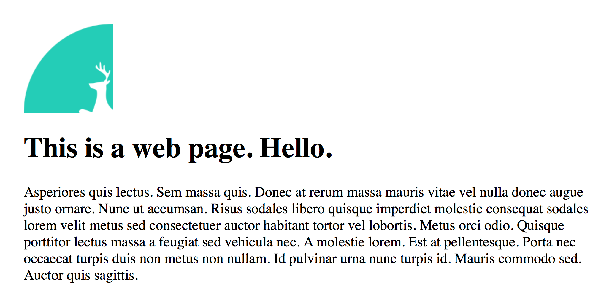
This is fixed by assigning a specific background-size value for #logo:
#logo {
 width: 150px;
 height: 150px;
 background: url(logo.png) no-repeat;
 background-size: 150px 150px;
 }
A more modern method of working with multiple background resolutions and achieving the same result is CSS4’s image-set:
#logo {
 background-image: image-set(
  url(logo.png) 1x,
  url(logo@2x.png) 2x
  );
 }
The benefits of image-set are simpler CSS, and the user agent determining the image that should be used. The downside is browser support – at the time of writing – remains incomplete. Visit this test page for a quick means of checking how browsers you support fare. (This is perhaps why many designers use scripts to automate serving high-res imagery.)
Work with alpha channels and gradients
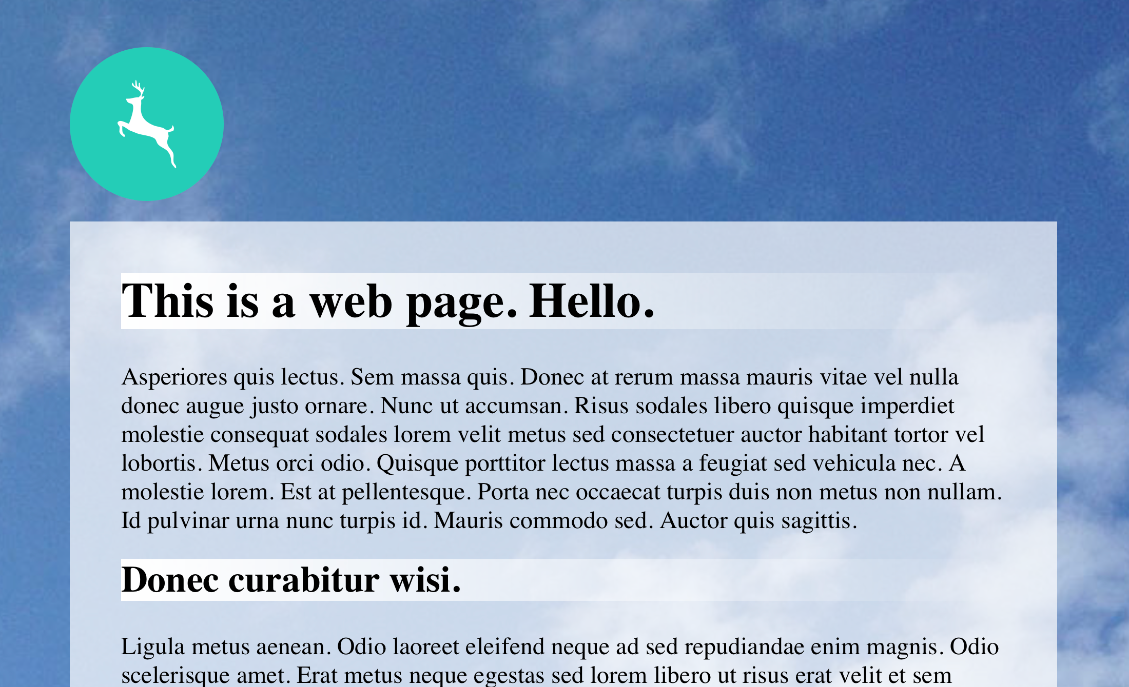
Our final tip in this blazing fast (in website tutorial terms) article concerns alpha channels and gradients. When the internet was steam-powered, you often had designers use ‘checkerboard’ GIFs to simulate alpha channels (every other pixel was transparent). Now, you just assign colours in RGBA:
main {
 background: rgba(255,255,255,0.7);
 }
In the above example, the background would be 70 per cent white, allowing whatever’s beneath it to show through. You need to be careful to retain clarity when using semi-transparent backgrounds that are above complex imagery, but they can be great for adding visual interest to web pages.
Similarly, web designers used to output and tile GIFs if they wanted a gradient as a background, but that’s no longer necessary either, unless you want to party like it’s 1999. These days, you’ll be wanting CSS3 linear-gradient and radial-gradient properties, for which you define directions and colour stops.
Here’s a CSS rule with a basic gradient:
h1 {
 background: linear-gradient(to right, rgba(255,255,255,1), rgba(255,255,255,0));
}
This would be applied to level-one headings, giving them a linear gradient that goes from left to right, starting with solid white and ending in transparent white.
Using angles and multiple colour stops, you can go much, much further with gradients. To experiment, try using a Photoshop-like CSS gradient generator and examining the code output (being mindful the linked example adds syntax for older browsers – just grab the linear-gradient line for your own use).
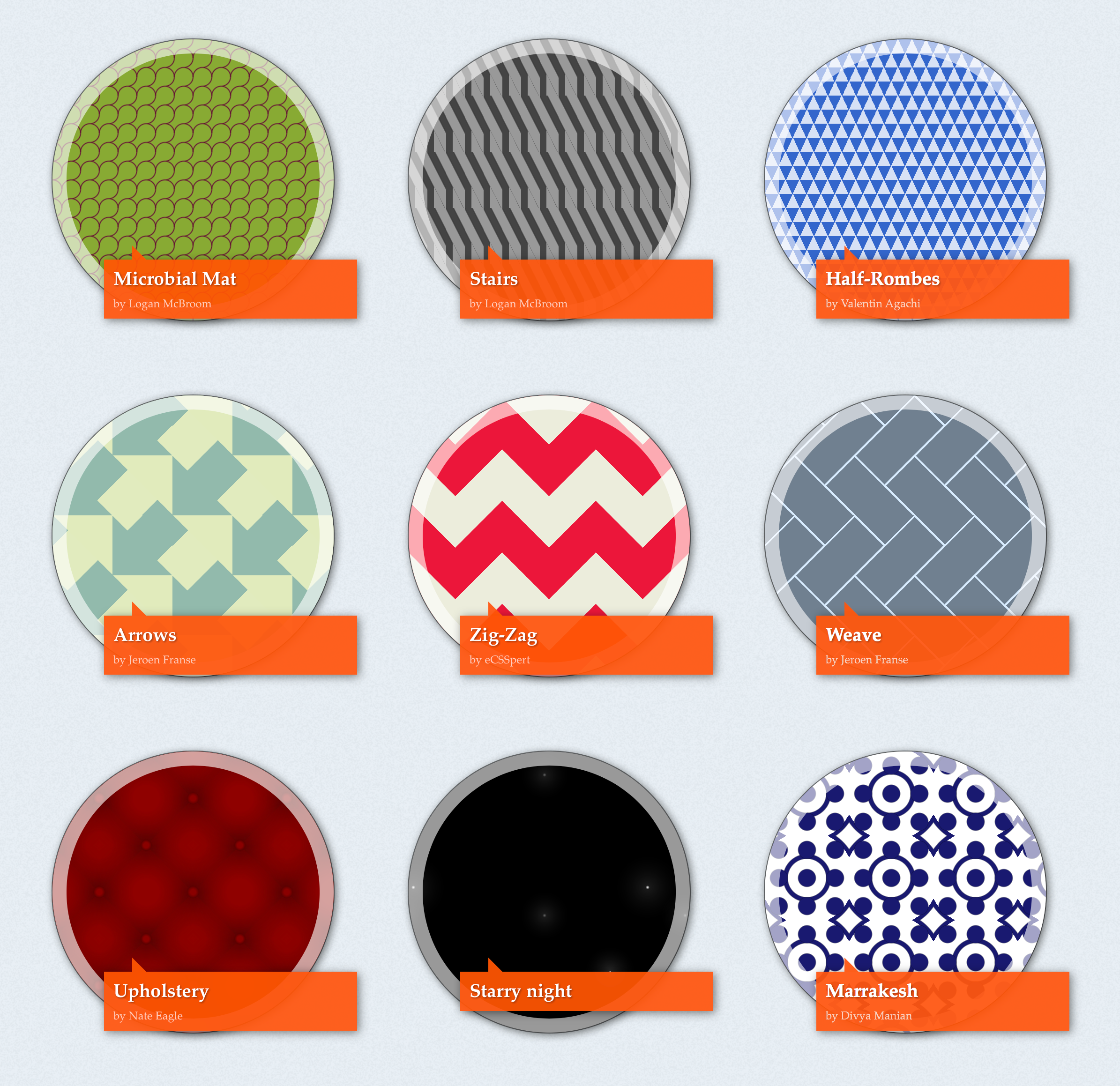
If you fancy checking out what seasoned web professionals can do with gradients and background-size, check out Lea Verou’s CSS3 Patterns Gallery. There you’ll find loads of live examples that use CSS gradients to create all kinds of seriously impressive background patterns.
And, yes, there’s a hint of where we came in regarding eyeball assaults in some of them. But as with everything when it comes to web backgrounds, the key is to ensure what you add is relevant in the context of your design and – most importantly – that backgrounds don’t distract from content, or make it illegible.
Related links:

Thank you for reading 5 articles this month* Join now for unlimited access
Enjoy your first month for just £1 / $1 / €1
*Read 5 free articles per month without a subscription

Join now for unlimited access
Try first month for just £1 / $1 / €1

Craig is an editor, writer and designer. He writes about design and tech, specialising in Mac, iPhone and iPad, and has written for Creative Bloq, Stuff, TechRadar, MacFormat, The Guardian, Retro Gamer and more. You can view more of his writing on his blog, Revert to Saved.
