Groom an irresistibly furry creature
How to make a cute furry 3D character that looks at home in his environment.
11. Make the hairs more realistic
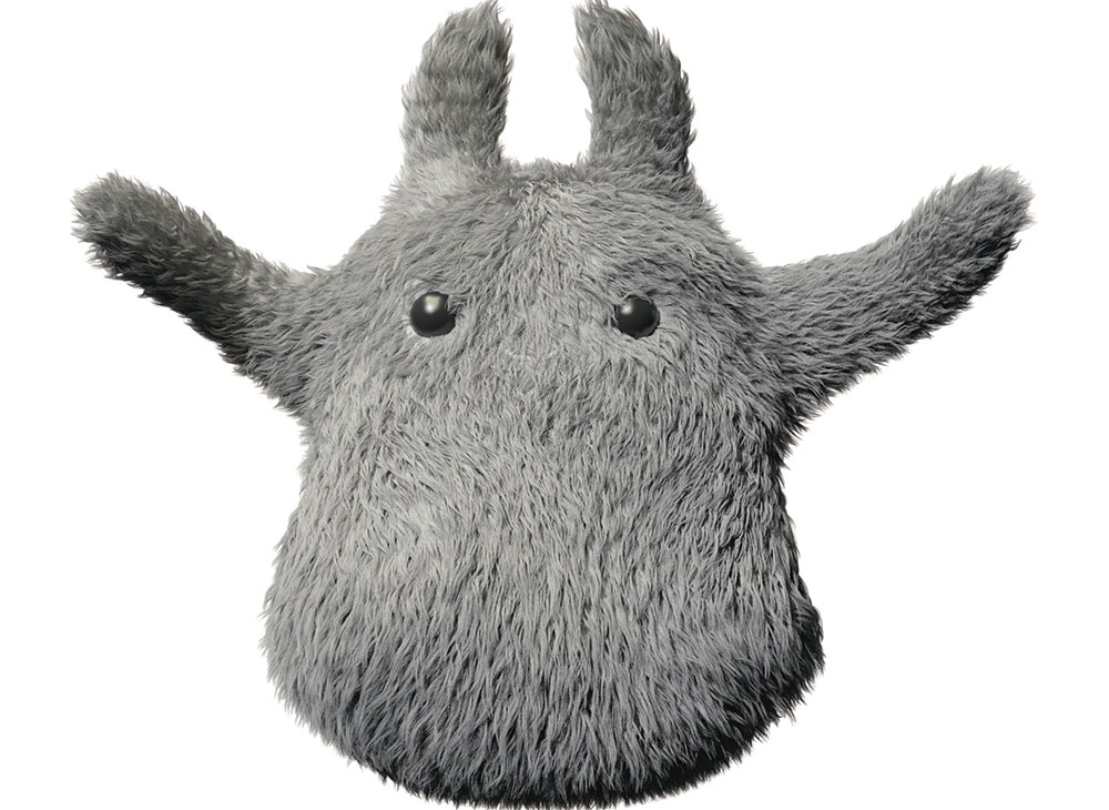
Now I use the Cut modifier to simulate some hairs to be cut, broken or shortened over a random parameter, giving a better shape at the edges and a more realistic look. I test the amounts depending on the scales of the hair until I'm pleased. I normally reduce 20% of the hair, and the values vary depending on the groom. For this character, I reduce between 0.0 and 0.2 units per hair.
12. Refine the shape
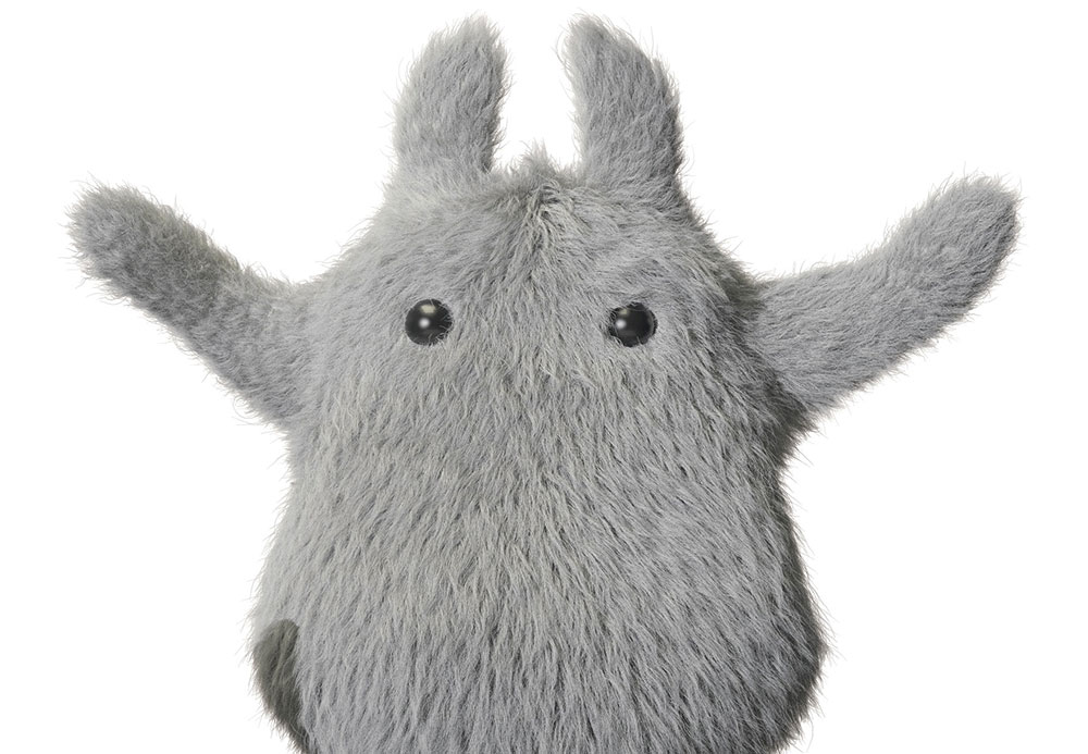
With all the basic modifiers in place, it's time to start grooming again. Now I can see how the groom will look in the future, and the shape is clear, I can adjust the basic groom to have more variance, or to be smoother, to have clumps and coils, or to have a different flow, in each part. The groom can change any time but with all the modifiers in place it's better to work out the shape now.
13. Set up the strays
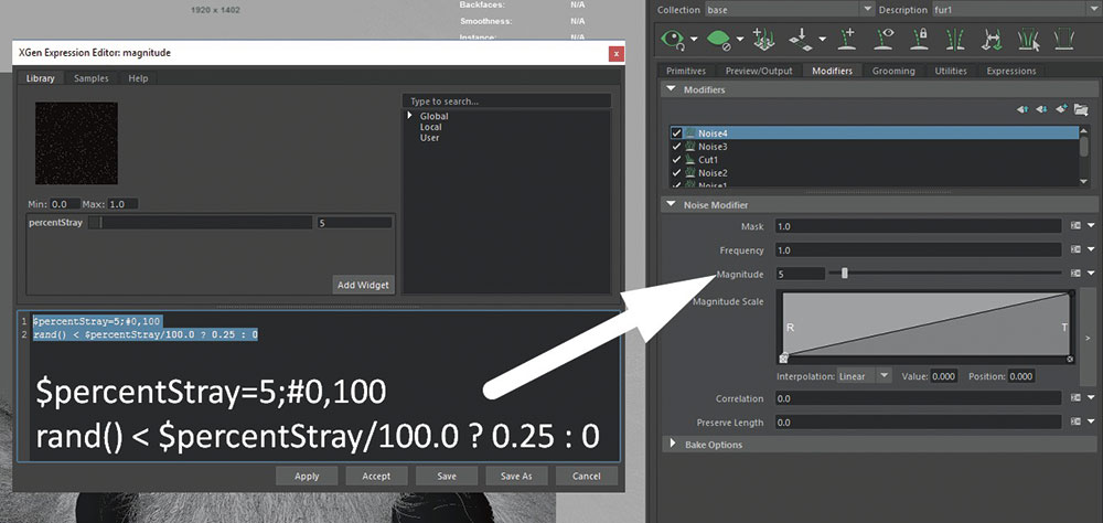
Next, I use an expression to define a custom percentage parameter on the Noise Modifier. With this expression on the Magnitude attribute, I can define how many hairs I affect with the noise parameters, giving me a custom stray attribute for a flexible frizz effect. Here I add two new Noise Modifiers on top of the Cut Modifier with different attributes to make the final look.
14. Test assembly
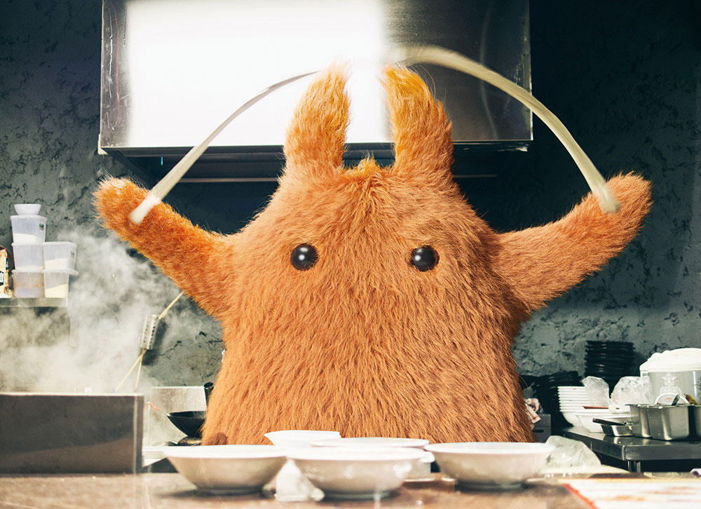
With all the modifiers in place, I do a second assembly test. This time I add a basic colour to my groom and render with the same set-up, with a colour correction for the backplate. I find some problems with the blending between the render and the actual photograph, but can see that the light is working.
In Photoshop I add an exposure adjustment with a gradient to add more light into the render to blend it better into the scene. The model isn't quite working, so I decide to start exploring different options.
15. Explore characterisation

When working on a scene, you need to explore and to correct yourself, feed your brain and sometimes even stay away from your work for a while so that you can see it with fresh eyes.
For this project, I needed to try out some different methods and add new elements into the scene. Here I try an apron, a chef's hat, different mouths and facial hair and even some weird mouth drawn onto a Post-it note. Finally, I decide to work with the apron and hat.
Get the Creative Bloq Newsletter
Daily design news, reviews, how-tos and more, as picked by the editors.
16. Adjust the pose
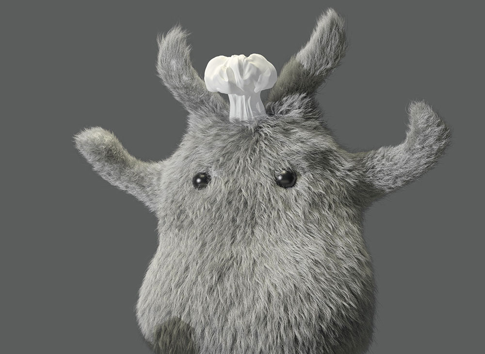
To make the props work I need to make the pose more flexible. I add movement to the hands and rotate the body, but keep the basic shape from the photograph as I still want to use the pasta from the backplate. I make the ears longer and separate them to give more movement and a better silhouette.
17. Model the hat
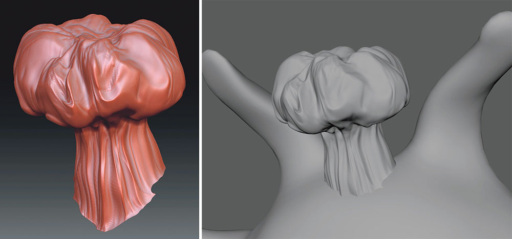
For the hat, I use a really basic workflow. With some references and taking the early concept into account, I model the base shape in Maya and play around with the model to see where it could work.The hat works in the centre of the head, between the ears, with a little tilt to look more relaxed and cool.
After that I take the model into ZBrush to work on the final detailing and use some cloth alphas to make the final look.
18. Model the apron
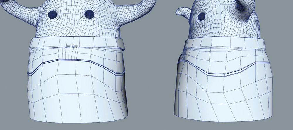
It takes me more time to finish the apron. I work on the base model directly in Maya and test it over the groom itself because it needs to collide with the hairs. I mainly model the basic shape on a really low-poly and set the parts where the stitches should be.
In ZBrush I decide to add a far higher level of detail and put a lot of work into making the apron look as realistic as possible. With the cloth alphas and also using the Dam_Standard Brush, along with stitches alphas, I manage to make a good-looking model and surface texture for the apron.
19. Test the props
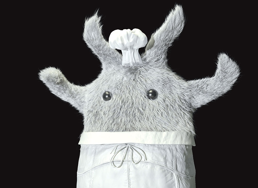
With all of the models done, it's time to test them in the scene. I import both objects and try them directly with the high-res models. I really like the hat but am not sure about the apron. There is still something missing in the main character, a kind of lack of connectivity. I know the image I have in mind but need to make it real in the scene.
20. Redesign the character
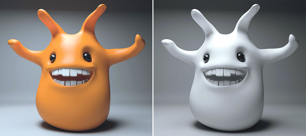
After some thought and a break from looking at the screen, I decide I need to reshape the main design. I work directly in ZBrush to adjust the eye cavity to make it friendlier. I also decide to add a big mouth with some gigantic teeth, and rework the hands. The main shape is still there but the character has a lot more personality.
Next page: Retopology, final render, and post production

Thank you for reading 5 articles this month* Join now for unlimited access
Enjoy your first month for just £1 / $1 / €1
*Read 5 free articles per month without a subscription

Join now for unlimited access
Try first month for just £1 / $1 / €1
